A room can feel more like you with a single favorite color repeated in a few thoughtful places. If your home feels polished but impersonal, color can bring more personality and lift your mood without making the space feel like a showroom. You do not have to decide how bold to be all at once.
Colorful living room inspiration can begin with a changed pillow cover, a painted surface, or one piece of furniture that makes you smile. Small changes let you try an idea before making a bigger commitment; a major statement can work just as well when it suits your style and daily life. This list offers 15 practical ways to bring in color, pattern, and comfortable details.
You can keep your favorite pieces and let the rest change at your own pace. The goal is a home that feels good to use, not a room that follows someone else’s rules. You can build the look gradually, keeping the pieces that make you feel at home and changing what does not.
1. Colorful Living Room Inspiration Starts With a Palette You Love
A useful starting point is three or four colors, with one doing most of the visual work. One dominant color, one supporting color, and one or two smaller accents give colorful living room ideas a clear structure without making the space feel overly matched.
The dominant color is the largest visual color area, such as a wall, sofa, or rug. A secondary color supports it across a smaller area, while an accent color is a smaller, repeated color detail. A living room palette commonly uses three or four colors. Choose shades that suit your home and the mood you want.
Use this table to compare room ideas before settling on a direction:
| Style direction | Palette | Best suited to | Avoid |
|---|---|---|---|
| Modern warm | Brown, cream, black, olive | Clean-lined homes with wood tones | Too many small bright accessories |
| Soft cozy | Terracotta, ivory, sage, blush | Relaxed family rooms | Flat beige without texture |
| Bold eclectic | Cobalt, pink, yellow, emerald | Art-filled spaces | Matching every color too closely |
| Minimal colorful | White, walnut, one bold color | Small or modern apartments | A room with no focal point |
| Retro earthy | Chocolate, rust, mustard, avocado green | Vintage-inspired interiors | Heavy dark tones without light balance |
The 60-30-10 rule gives you a flexible way to assign visual weight: roughly 60 percent dominant color, 30 percent secondary color, and 10 percent accents. It is a guide, not a requirement. Shift the proportions when your favorite piece or existing finishes call for a different balance.
Let one color carry the largest visual area, then repeat smaller shades to connect the room.
A colorful living room aesthetic can feel playful, calm, or polished depending on which shade dominates and how often it appears. For more guidance on mood and style, explore these modern living-room color palettes. If every shade feels equally prominent, quiet one or two before adding another.
2. Let a Favorite Artwork Set the Palette
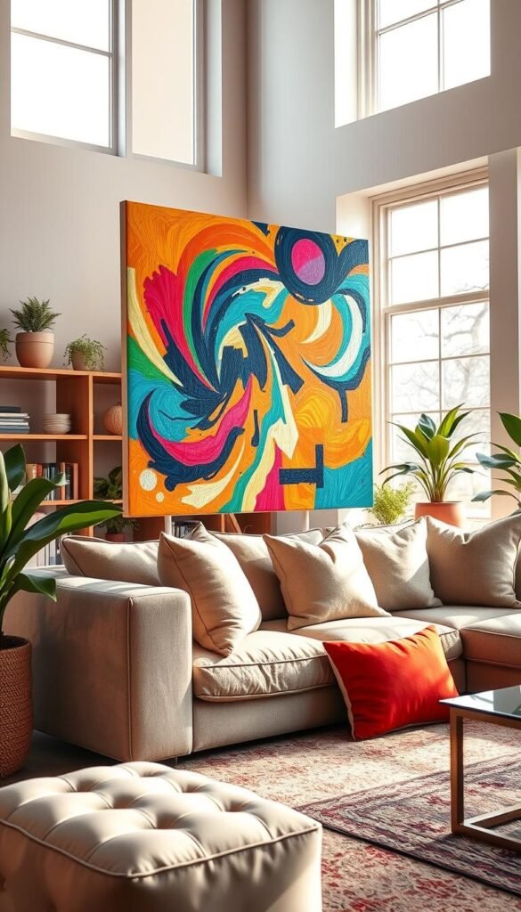
A piece you already love can make choosing a palette feel less like guesswork. An oversized abstract painting or mural can supply two or three anchor hues, giving your living room a personal starting point. Begin with the artwork you enjoy seeing, rather than trying to match a trend.
Choose a few colors from the art, then echo them in small details around the room. The shades do not need to match exactly: a softer version of a strong hue can work on a throw, while a bolder one might suit a vase. Interior designer Helen Armon-Jones of The Art Buyer describes art as one possible starting point for a room’s color scheme.
Look for these details as you study a painting, print, or mural:
- The background color that covers the largest area
- The strongest hue that catches your eye first
- The smallest bright accent in the composition
- The frame or mat color surrounding the artwork
Colorful living room inspiration images can help you compare how a few chosen hues work together, but pictures cannot reproduce the exact light or finishes in your home. A color that looks lively online may seem dull beside your flooring, or much brighter in daylight. Use images to collect possibilities, then judge the actual shades in the room.
Keep one or two of the artwork’s colors close by through an object you can move. A small ceramic piece or a book cover can repeat a hue without making every item coordinate. The artwork’s colors should inform the room, not dictate every choice. Let one unusual color from the artwork appear in a small detail so the scheme feels collected rather than copied.
3. Color-Block a Wall or Ceiling
A color-blocked wall can make a large blank surface feel intentional without requiring a room-wide repaint. One defined area can create a strong visual change while leaving other walls untouched. Try a two-tone wall, a painted arch, or a colored ceiling, depending on the room’s features.
A two-tone wall divides one surface between two colors. A lighter shade above a deeper lower section can keep a tall wall from feeling imposing. Farrow & Ball’s Bamboozle and Templeton Pink offer an example of a deeper lower wall paired with a lighter upper wall. Color-blocking can also make a spacious room feel more intimate.
A painted arch can frame a chair, cabinet, or other feature without adding another object. A colored ceiling changes the feeling overhead and creates a more immersive effect. If you want the room to feel wrapped in color, the ceiling can carry a shade already present elsewhere, rather than introducing a new one.
The boundary needs a reason to be there. A line that cuts across a wall with no connection to a window, mantel, or furniture line can look arbitrary. Relate the edge to something visible in the room, such as a mantel height or the top of a cabinet, so the change feels planned.
Use the room itself to judge where the division belongs. A line that looks balanced up close may land awkwardly from the main seat, where you see the whole wall. Painter’s tape makes the test easy to change before paint goes on. Mark the proposed boundary with painter’s tape and check it from the main seating position before painting.
4. Test Paint Against Light and LRV
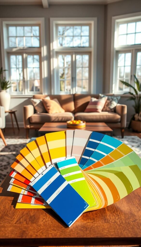
A shade’s LRV gives you a useful reflectance clue, but it cannot predict exactly how the color will look in your room. LRV means light reflectance value, a 0-100 measure of how much visible light a paint color reflects, with higher values reflecting more light.
LRV runs from 0 to 100. Higher values mean more visible light is reflected; lower values mean less reflection and more absorption. LRV stays the same in different lighting, while the paint’s appearance changes with the light it receives. Approximate categories can help you compare shades, but they do not tell you whether an undertone will suit your space.
These examples show how the scale spans dark shades through whites:
| Approximate category | LRV band | Example paint | Example LRV |
|---|---|---|---|
| Dark | 2-10 | Sherwin-Williams Cyberspace | 6 |
| Medium-depth | 20-40 | Sherwin-Williams Redend Point | 30 |
| Medium-depth | 20-40 | Sherwin-Williams Network Gray | 37 |
| White or very light, higher-chroma | 82-94 | Sherwin-Williams Pure White | 84 |
| White or very light, higher-chroma | 82-94 | Benjamin Moore White Dove | 83.16 |
North-facing rooms receive cool, bluish daylight throughout the day. East-facing rooms get warmer, yellow light before noon, while west-facing rooms receive warm, orange-red light after noon. A sample may shift from crisp to muted as the day changes, even though its LRV stays fixed.
Read the LRV scale before choosing a shade
Approximate LRV bands include 2-10 for dark colors, 10-20 for medium-dark shades, 20-40 for medium-depth colors, and 40-55 for light-medium shades. Light colors fall around 55-72, off-whites around 73-81, and whites or very light, higher-chroma colors around 82-94.
For a specific reference point, Sherwin-Williams Cyberspace has an LRV of 6, while Redend Point has an LRV of 30. Network Gray is 37, and Pure White is 84. Benjamin Moore White Dove has an LRV of 83.16. These values help you compare reflectance, not predict how a color will feel beside your furniture.
Check daylight, bulbs and sheen
Benjamin Moore recommends testing paint samples because screen colors can differ from actual paint. Incandescent bulbs cast yellow light, intensifying warm colors and tending to dull cooler ones. Higher-gloss paint reflects more light than matte paint and tends to enrich and brighten color, but finish cannot replace a sample test.
Try a sample near the surfaces it will sit beside, and look at it under the bulbs you use at night. The same wall can feel different at noon and after sunset. Check a paint sample in morning, afternoon, and evening light before committing to a full wall.
5. Borrow a Fresh Idea From 2026 Color Trends
A trend works best as a small invitation to experiment, not a checklist for your entire room. Borrow one detail that suits your home, then use familiar materials to keep it grounded. Modern Pinterest living room ideas can offer a starting point without asking you to copy a complete look.
Pinterest’s 2026 trend forecast used search data from September 2023 through August 2025. It identified four home-interior themes: FunHaus, Afrohemian Decor, Neo Deco, and Extra Celestial. FunHaus suggests theatrical shapes and color, while Afrohemian Decor brings textiles and motifs into focus.
The search increases in the forecast point to specific kinds of interest:
- “Afrobohemian home decor” rose 220%, “adire fabric” rose 130%, and “Berber motifs” rose 210%.
- “Circus interior” rose 130%, while “vintage circus aesthetic” rose 70%.
- “Red marble bathroom” rose 80%, and “antique bar cart” rose 100%.
- “Opalescent” rose 115%, fitting the forecast’s Extra Celestial theme.
Neo Deco offers geometric glamour, which could show up in a graphic lamp or a patterned side table. Extra Celestial brings iridescent or opalescent accents, such as a small glass object that catches the light. A single unusual finish can give a familiar room a new note without turning the whole space into a themed set.
Colorful living room ideas on Pinterest are inspiration, not a requirement to copy a whole look. Keep the parts that fit your usual furniture and habits, and skip details that would feel out of place once the novelty fades. A trend detail should earn its place through use, not just its online appeal. Choose one trend detail you can enjoy even after the trend has moved on.
6. Bring In Earthy Colors for a Warm Base
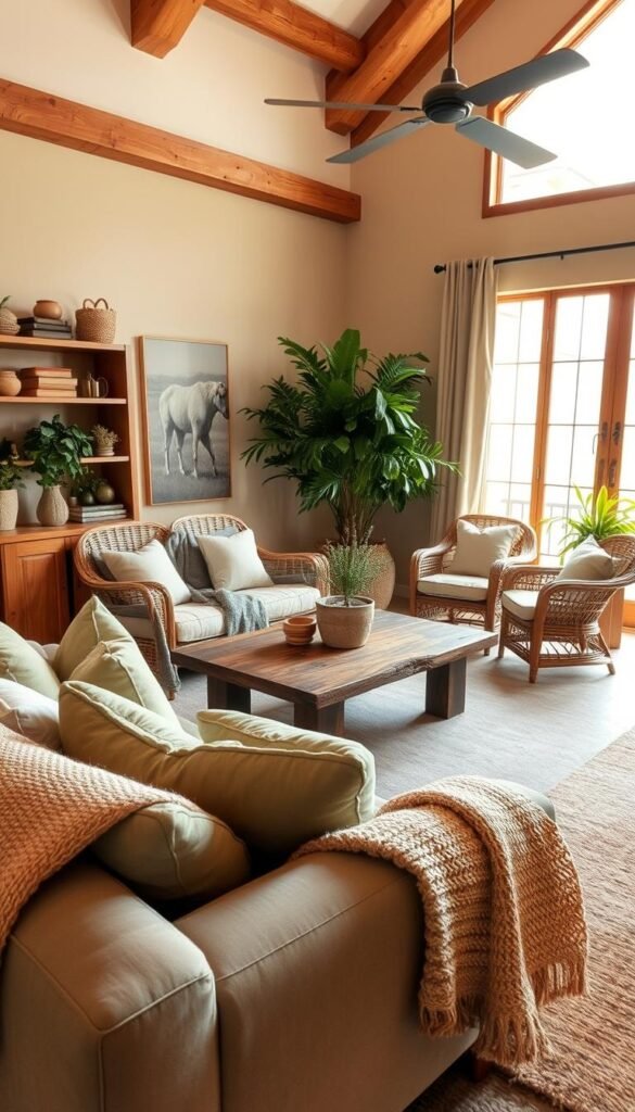
Earthy colors give a room warmth without requiring every surface to be bright. Terracotta, clay, sand, muted yellow, and sage can sit comfortably beside wood, woven materials, or cream upholstery. Their softer edges let brighter details stand out without making the whole room feel busy.
Try a clay-colored wall with natural wood, or use sage in a chair beside cream upholstery. Woven baskets and textured fabrics can add depth to these tones without introducing more hues. A room with a dark brown sofa, for instance, can feel warm when its nearby surfaces are lighter or naturally textured.
Benjamin Moore’s 2026 Color Trends palette includes Silhouette AF-655, Raindance 1572, First Crush CSP-310, Swiss Coffee OC-45, Batik AF-610, Narragansett Green HC-157, Southwest Pottery 048, and Sherwood Tan 1054. The names offer examples of earthy and softened shades, not a required shopping list.
Silhouette AF-655, Benjamin Moore’s 2026 Color of the Year, is described as a blend of burnt umber and charcoal. One dark anchor can give a space a grounded feel, especially when balanced by pale fabric or wood grain. Keep the lighter material visible rather than hiding it behind dark furniture.
If you are working with a brown sofa, try pairing warm neutrals with olive, navy, or terracotta through movable details. More ideas for styling a dark brown sectional can help you bring contrast to deep seating. If a dark base feels heavy, add one pale textile near eye level to break up the visual weight.
7. Let a Statement Sofa Lead the Room
A statement sofa is easiest to live with when the rest of the room repeats just one or two of its colors. Let the largest piece lead, then keep nearby furniture and details from competing for attention. A bold sofa can bring color to a neutral room, while a neutral sofa leaves more room for a vivid accent chair.
Interior designer Anne Hepfer used green and raspberry as favorite colors for a client’s colorful cottage. That pairing shows how a strong seating color can share attention with a distinct accent shade. Designer Lucy Barlow recommends blue seating tones with red or pink accents, a different approach that balances a cooler main color with warm details.
Choose the seating piece that feels right for your home:
- A colored sofa that carries the strongest hue
- An accent chair beside a neutral sofa
- A pair of contrasting chairs facing one another
- A colored ottoman that adds a smaller focal point
Modern colorful living room inspiration can look polished when a large furniture piece is balanced by a few repeated accents rather than a collection of competing colors. If you prefer a more flexible base, a tan sofa with colorful accents gives you an easy way to update the room through changeable details.
A vibrant seat should make sense beside the flooring, curtains, and existing wood finishes, not only in a store display. Check the color beside your fixed finishes before committing to a large piece. Before buying a large piece, place fabric or color samples beside your existing floor, curtains, and wood finishes.
8. Mix Patterns With a Common Thread
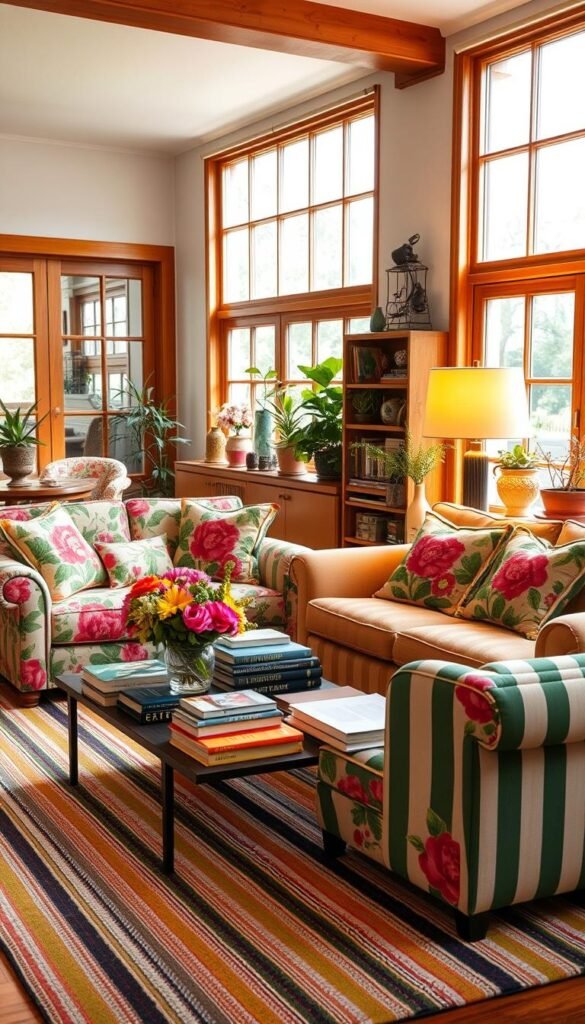
Pattern mixing feels intentional when the designs share at least one color or visual rhythm. A common thread helps florals, stripes, and geometric prints feel connected, even when they differ in scale. Choose a clear link between the patterns instead of expecting every design to match.
Try a large floral beside a narrow stripe, then use a smaller geometric print elsewhere. A repeated color can make those different scales feel related. Interior decorator Nicola Harding notes that greater color contrast creates more drama, while less contrast gives a calmer effect.
Use these checks as you bring prints together:
- Repeat one color across more than one pattern.
- Vary the scale so each print has room to read.
- Leave some solid surfaces between patterned areas.
- Keep one print from dominating every sightline.
A high-contrast mix can suit a lively room, while a lower-contrast mix is easier on the eye. Both can work when you decide how energetic the space should feel. A small stripe can connect a larger floral without asking for another loud color, and a solid surface gives your eye a place to rest.
If a room already has busy upholstery, let a simpler pattern take a supporting role. One shared hue and varied pattern scales give mixed prints a clear relationship. If a combination looks too busy from the doorway, remove the smallest competing print first.
9. Add Color With Wallpaper
Wallpaper can bring several colors into a room in one deliberate move. Choose the scale to suit the effect you want: a mural or large-scale design makes a bold feature, while a small-scale repeat gives the wall a quieter pattern.
A large mural can be striking behind a seating area, but it may dominate a compact room when the rest of the scheme also has high contrast. A small repeat is often easier to live with across a larger surface. Paneling can visually contain a busy print, making the patterned area feel bounded rather than overwhelming.
Jane Churchill’s Honeysuckle is a small-scale repeat that reads as yellow and includes pink and red tones. Upholstery accents can draw out those secondary colors, so the wall and furniture feel related without reproducing the full wallpaper design. Choose one of the less dominant shades for a smaller piece.
Think about the fixed finishes around the paper before settling on a design. Existing flooring, wood, or trim can change how a print reads. A sample beside the room’s fixed finishes is more useful than a pattern viewed alone. This is especially important when the wallpaper has several colors or a strong contrast between its background and motif.
Wallpaper also has a different visual weight from a movable print or cushion. A small sample lets you see how the design repeats and whether its colors suit the room. Order or view a sample beside the room’s fixed finishes before covering a full wall.
10. Anchor the Seating With a Colorful Rug
Start by measuring the sofa and the clear walking paths, not by choosing a rug color. Fit comes first: common living-room rugs are 8′ × 10′ or 9′ × 12′, but the best size depends on the seating group and available floor.
A rug should extend at least 6 inches beyond each side of the sofa, with 8 inches on each side described as ideal. Walkways between large furniture pieces can be 30-36 inches wide when space allows; 18-24 inches is the minimum range for tighter rooms. Keep furniture legs consistently on or off the rug when they cannot all fit.
Choose rug size and placement
Three common arrangements work for different seating groups:
| Layout | Rug position | Furniture legs |
|---|---|---|
| All furniture on | Seating group sits on rug | All legs on |
| Front legs only | Rug extends beneath sofa’s front | Front legs on, rear legs off |
| Furniture around rug | Rug sits within seating arrangement | All legs off |
Choose one arrangement and apply it consistently across the seating area. King Living recommends leaving 40 centimeters of floor between the wall and a rug for a spacious look, but that gap is an option, not a rule for every room. A close fit may suit the furniture and floor better.
A rug can also help a room’s colors feel connected, but its size affects how comfortably people move around the seating. Use the furniture edges and clear paths as your guide before settling on a pattern. Average living-room rug sizes offer a useful starting point when you compare common dimensions.
Pick a rug for the way you live
The Ruggable Morris & Co. Kelmscott Tree Green Rug has a 100% polyester top, a waterproof barrier, and sizes from 2′ × 3′ to 10′ × 14′. House Beautiful’s editors describe that Ruggable rug as machine-washable and say its rug pad helps it stay in place.
The Loloi Chris Loves Julia Humphrey CloudPile rug is also 100% polyester. It has a 0.38-inch pile height and comes in sizes from 2′ × 3′6″ to 8′3″ × 11′3″. Its listed details differ from the Ruggable rug, so compare the pile and size range with how you use the room.
In a tight room, protect the walkway before sizing up to a rug that leaves too little room to move.
11. Repeat Hues Through Pillows and Textiles
Textiles let you test a color combination without committing to paint or a new sofa. Small, movable pieces can echo shades already in the room and add softness where you sit. Try pillow covers, a throw, curtains, or a colored ottoman.
Repeat an existing hue rather than adding a new one each time. For instance, a pillow can pick up a chair’s green, while a throw brings a softer version of a rug’s warm shade. A curtain can carry a print already present elsewhere, tying two parts of the room together without matching every surface.
Linwood’s Scall Prints collection includes 10 small-scale repeat designs. Its examples show how different prints can appear in different places: a Hopscotch curtain, a Garden Gate stripe sofa, and a Maypole trellis ottoman.
For how to decorate a living room with simple things, start with changes that take only a few minutes:
- Swap pillow covers for ones that repeat a room color.
- Add a throw to a seat that feels bare.
- Move a colorful book or vase into view.
- Repeat one shade already present in the room.
These small decor choices can help your room feel more personal without adding a new large item. A colorful book on a coffee table may echo a print across the room, while a throw can make a chair more comfortable. Keep accents connected to colors your room already uses. Edit the mix by removing one accent that appears nowhere else in the room.
12. Hang Art at a Comfortable Height
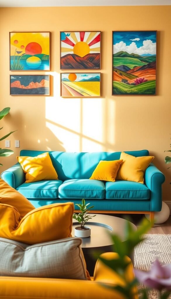
Artwork usually looks connected to a seating area when its size and height relate to the furniture beneath it. Use the furniture as your guide above a sofa or mantel, rather than relying on a wall measurement alone.
The 57-inch guideline places the center of a piece 57 inches from the floor, close to average eye level. Above furniture or a mantel, place the frame 6-8 inches above the feature. The furniture relationship takes priority when art hangs above a sofa or mantel.
These measurements help keep art connected to the room:
| Rule | Measurement | Applies to |
|---|---|---|
| Center height | 57 inches from floor | Single artwork near average eye level |
| Gap above furniture | 6-8 inches | Frame above a sofa, console, or mantel |
| Artwork width | Roughly two-thirds of furniture width | Single piece or gallery arrangement above furniture |
| Gap within a group | 3-6 inches | Pieces in a gallery arrangement |
For a single artwork above a sofa, consider both its distance from the furniture and its width. A work that is too small can seem disconnected, while one that spans nearly the whole sofa may feel crowded. Use the two-thirds guide as a proportion check, not a reason to ignore the furniture itself.
For gallery arrangements, treat the group as one larger shape when judging its fit above furniture. Leave 3-6 inches between pieces so the spacing feels deliberate. The 57-inch artwork guideline is a useful starting point for a single piece on an open wall, while a sofa or mantel calls for the furniture-based placement.
Artwork can bring contrast and personality, but a carefully planned arrangement still needs to work from the main seat. Before making holes, tape out the artwork’s outer edges and check the arrangement from the main seat.
13. Bring In Natural Greenery and Color
Greenery gives a colorful room a natural counterpoint to painted and printed hues. Living green can soften gray or off-white surfaces, while flowers and colored planters add extra color in smaller doses.
Try a larger leafy plant with a smaller one nearby, then add flowers in a vase that repeats a shade from the room. A planter can bring in a stronger color without changing the wall or furniture. Vary the shapes and sizes so the plants feel like part of the home rather than a row of matching pots.
Botanical details can extend the effect beyond live plants. Farrow & Ball’s Hegemone BP 5705 is an example of botanical wallpaper, where printed foliage can echo the green found in a plant or bouquet. A small botanical detail can connect natural color with the room’s other patterns.
Plants can bring warmth and personality to rooms with calm finishes, especially when a space feels hard or overly plain. Keep plants clear of the walkway and the room’s main sightline. A large leafy plant should add softness without blocking the view across the room or making it awkward to pass through.
Choose a spot that lets you check how the plant responds before giving it a more prominent place. Consider whether it receives the light and care it needs, and whether its container suits the room. Place a new plant where you can check its light and care needs before making it the room’s centerpiece.
14. Use Color to Zone a Reading or Play Area
A focused color cue can make a reading chair or play corner feel like a distinct destination. Use color to mark the activity, with paint, a chair, a rug, or a few accessories creating a visual boundary without a divider.
A sage-green reading nook with a mustard chair is one way to set apart a small place to read. Primary colors can give a play corner a lively cue that is easy to spot. A conversation area could use a rug or a colored chair to show where people naturally gather.
Choose a color detail that fits the activity and feels comfortable beside the rest of the room. A bright chair can mark a useful spot without needing a whole wall painted. For a softer effect, pick a shade already present elsewhere, then use it to define the smaller area.
Repeating a shared color elsewhere keeps the zone connected to the larger room. A green detail in another part of the space can make a green reading corner feel like part of the whole, rather than a separate theme. A zone needs a visual link to the rest of the room as well as its own cue.
In an open layout, rugs, lighting, and furniture can help identify activity areas while leaving the space connected. See more open-concept living room ideas for ways to create distinct areas without blocking sightlines. Keep the zone’s boundary aligned with the furniture or activity it is meant to define.
15. Keep a Small Living Room Feeling Open
A compact room can be colorful without making every large surface a bold shade. Keep the biggest surfaces light if you want a more open feel, then bring stronger color to one focal point such as a chair, rug, or artwork.
Light, neutral wall colors such as crisp white, soft ivory, and pale gray reflect more light and can make a living room look bigger. Walls, trim, and ceiling in close tones create a more seamless effect. Color can still come through a saturated chair, rug, or artwork.
Four useful choices can keep a small room feeling visually open:
- Choose light-toned walls for the largest background surface.
- Give the room one strong color focal point.
- Keep wall, trim, and ceiling tones close.
- Use round or low-profile furniture to preserve an open feel.
Round furniture can soften tight corners, while low-profile pieces make it easier to see across the room. These choices do not require a neutral-only style. A vivid chair can feel deliberate against pale walls, and a colorful artwork can provide a focal point without covering every surface in a saturated shade.
A dark color can also work in a small room when you want an intimate mood. It is one option, not the only way to show personality. Choose a look that supports how you want the room to feel, then leave clear space to move.
Keep one clear focal point and leave enough open floor to make the room easy to cross.
For a mid-century look, low-profile furniture and natural wood can help preserve an airy feel; explore these mid-century living room ideas for more inspiration. Keep one clear focal point and leave enough open floor to make the room easy to cross.
Give Your Living Room a Joyful Final Edit
A joyful room is one that feels like yours in the ways you see and use it every day. Personal meaning matters more than a perfect trend match. Your favorite color can start with a single object, then grow through details that feel useful and comfortable.
Take a moment to notice which pieces you reach for and which ones feel out of place. Keep the colors and objects that make the room more inviting to you, even if they do not follow a current style. A finished space does not need to look like a display or copy someone else’s home.
Choose one color already present in your home and bring it into the room in a small, visible detail this week.