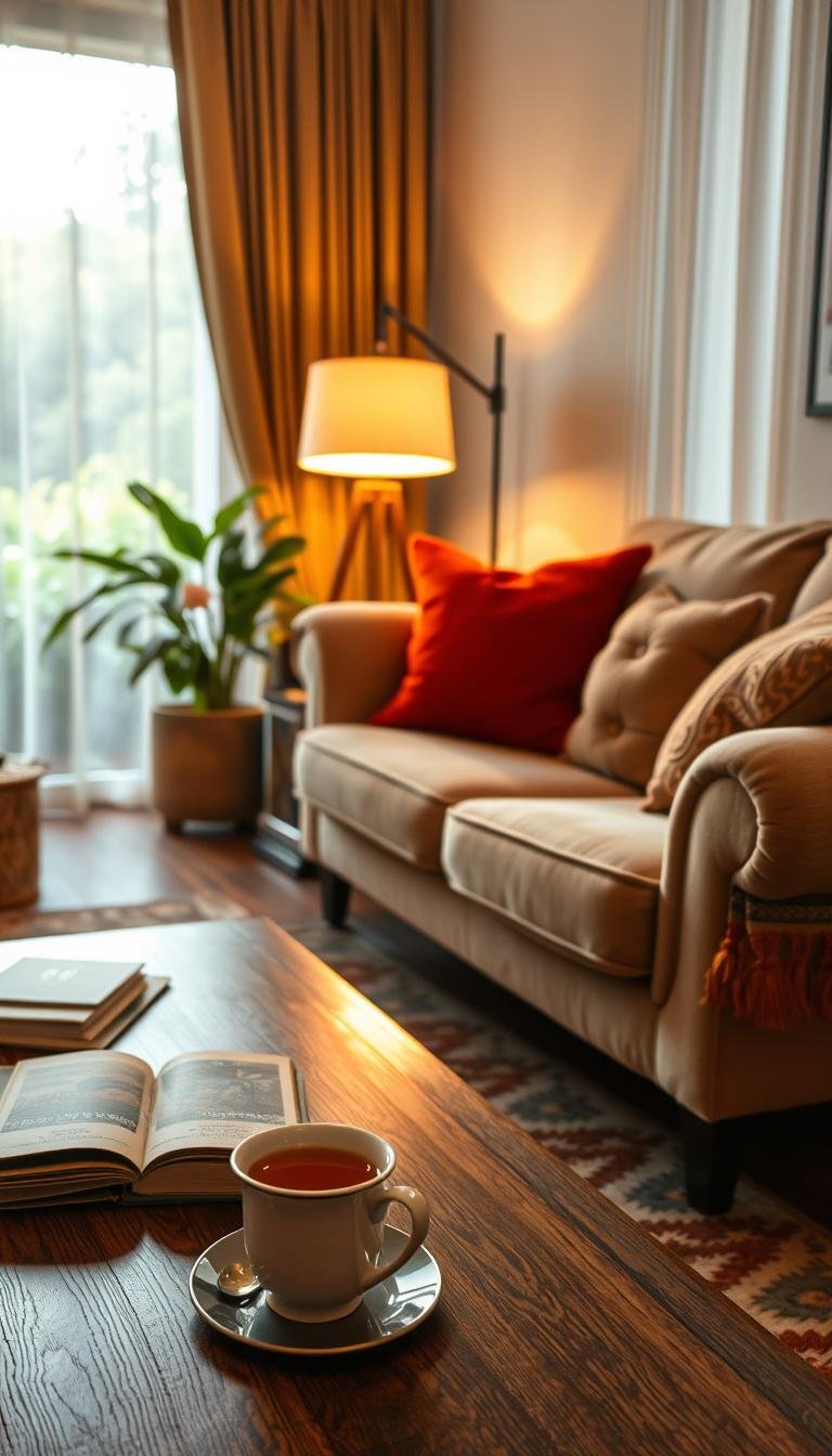
A comfortable room can feel like a welcome exhale before you have changed a single piece of furniture. If your living room feels bare, busy, or difficult to settle into, small, thoughtful choices can change how it works. Warm minimalism is a pared-back approach softened with natural textures, soft neutrals, tactile materials, and inviting layers.
Coziness comes from a combination of usable layout, inviting light, tactile materials, and personal details, not one decorating style. That gives you a practical route whether you are refreshing a few details or starting with an empty space. You can build comfort around what you already own, then make larger changes only where they improve daily life.
The goal is a room that fits your routines as naturally as it fits your taste. Your favorite place to read may need a lamp and a chair, while a busy family room might need flexible seating and surfaces that are easy to clean. Small touches can add warmth without crowding the space or making it feel staged.
Start by noticing where you naturally sit, read, or gather, because those habits should shape the design.
What Makes a Living Room Feel Cozy?
A cozy room feels gathered and personal, with places to sit, light that softens the mood, and details that reward a closer look. Comfort comes from how the room works as much as its style: seating invites conversation, soft surfaces ease the hard edges, and useful light makes evening activities pleasant.
Coziness is a feeling, not a style label. Coastal, Mid-Century Modern, Industrial, Boho, Modern Farmhouse, Minimalist, Rustic, Vintage, French Country, Art Deco, and Japandi can all support a cozy living room. The right living room ideas depend on your habits, the room’s shape, and the objects you want to keep close.
September 2026 U.S. search estimates show interest in Coastal at 39,550 average monthly searches and Mid-Century Modern at 37,090. Industrial has 32,450, though commercial-kitchen searches inflate that total. Boho draws 26,600 searches, and Modern Farmhouse draws 24,590.
September 2026 search estimates also put Minimalist at 20,690, Rustic at 20,590, Vintage at 20,220, French Country at 16,030, Art Deco at 15,560, and Japandi at 15,250. These figures measure search interest, not the number of homes using each look or what people prefer.
| Style | Estimated average monthly U.S. searches | Search volume |
|---|---|---|
| Coastal | 39,550 | Highest in this table |
| Mid-Century Modern | 37,090 | Second in this table |
| Boho | 26,600 | Third in this table |
| Modern Farmhouse | 24,590 | Fourth in this table |
| Minimalist | 20,690 | Fifth in this table |
Comfort comes from the way you use the room, not from adopting a style name. Gathered seating, gentle light, soft surfaces, and meaningful objects can make many styles feel inviting.
A mid-century room might pair streamlined wood furniture with a reading lamp and a soft rug. A minimalist room can feel just as welcoming with a few personal objects and comfortable upholstery. For inspiration, explore mid-century living room layouts that balance conversation and movement.
Treat search interest as inspiration for exploring styles, not as a score for how cozy any one style can be.
Warm and Cozy Living Room Designs Start With a Welcoming Palette
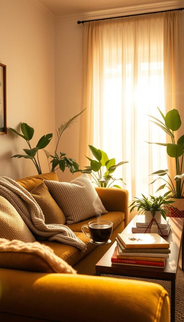
A palette feels warm when its colors work together and the room still has enough contrast to feel alive. Balance matters more than choosing only warm hues: a light, airy scheme can use cream, oat, and soft taupe, while a moodier room might lean on olive, rust, or deep blue.
Cream and soft taupe can soften stronger colors such as rust, olive, or deep blue. Use them on a larger surface, upholstery, or trim to give bolder tones room to breathe. Terracotta and rust add earthy energy, while olive gives a quieter connection to the outdoors.
A cool color can still make a cozy living room. Deep blue often feels calm and welcoming when warmer furnishings and a patterned rug ground it. If you are planning warm and cozy living room designs on Pinterest, save images that share a palette or material, rather than trying to copy every object in one picture.
A saved board can reveal the combinations you return to: perhaps cream walls, wood furniture, and rust accents, or blue upholstery with woven details. Look at how the colors relate to your flooring and the light entering the room. For more palette ideas, see modern living room color palettes that connect mood with color choices.
Light-blue living room decor also shows how warm materials can keep a cooler scheme from feeling stark. The same idea works with green or gray: a natural fiber, textured upholstery, or warm wood can add a comfortable counterpoint without changing the whole palette.
Test a color beside the room’s actual flooring and upholstery before committing to it on a large surface.
Use the 60-30-10 Rule to Balance Color
The 60-30-10 rule gives you a quick starting point for deciding how much visual space each color should occupy. Think of it as a guide for a dominant color, a secondary color, and an accent color, rather than a calculation for every object.
The guideline assigns 60% of a room’s palette to the dominant color, 30% to the secondary color, and 10% to the accent color. It can help you bring an existing mix into focus without making every surface identical.
| Palette role | Share | Example application |
|---|---|---|
| Dominant | 60% | Walls or largest visual area |
| Secondary | 30% | Upholstery or curtains |
| Accent | 10% | Pillows or a small art detail |
Give the dominant color the largest share
Walls, a large sofa, or a broad area rug can carry the dominant tone. A neutral base does not need to feel plain. In a mostly neutral room, texture can supply the variation that another color might otherwise provide.
Let the secondary color appear on a substantial but smaller group of surfaces, such as curtains and a chair. The relationship matters more than perfect arithmetic. A room with cream walls, taupe upholstery, and a few rust details can feel balanced even when the objects do not match precise percentages.
Let the accent color stay a small dose
Accent colors work well on a pillow, a small artwork detail, or a single ceramic piece. If you already have several colors in the room, an accent does not have to be a new hue. Repeat a color that is already present to make the arrangement feel deliberate.
The 60-30-10 guideline is for visual balance, not a requirement to count every item. If the room already feels balanced, keep the proportions as a guide rather than forcing a new accent color into it.
Mix Patterns and Period Styles With the 3-4-5 Method
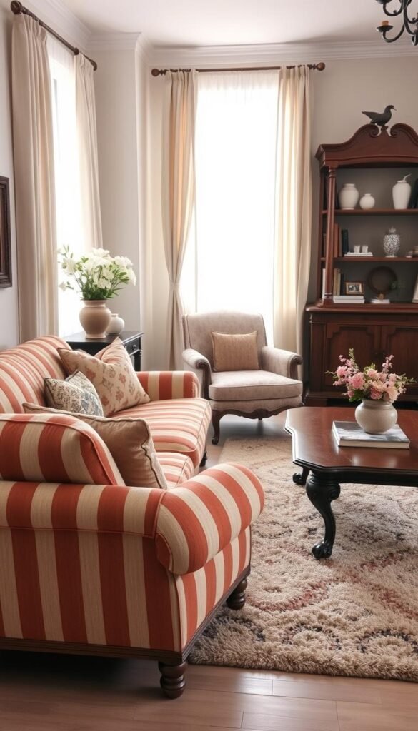
The 345 method can give you a starting structure when mixing patterns and period styles feels intimidating. Use it as a confidence builder, not a test you have to pass. New York-based interior designer Nancy Cavaliere proposed it as a flexible framework for making a room feel collected.
The method calls for at least three patterns, four period styles or eras, and five colors and/or textures. The mix can be subtle. Solid surfaces count as patterns, so a plain sofa contributes alongside a stripe or floral print.
- Identify three patterns, including solid surfaces.
- Mix references from four periods or eras.
- Reach five colors and/or textures; with two beige shades, use at least three distinct textures.
For example, a striped textile, solid upholstery, and a small-scale floral pattern can sit together without taking over the room. Bring in furniture from different eras through a vintage side table, a newer sofa, and a chair with a more traditional shape. The varied references create interest without requiring every piece to compete.
Two shades of beige can count toward the five-color-or-texture guideline when the room includes at least three different textures. A woven basket, smooth ceramic, and nubby upholstery offer distinct surface qualities while staying within a restrained palette.
The 345 method works best when you use it to spot what a room might be missing. If a space already feels personal and balanced before every count is met, trust the room rather than the formula.
For a restrained approach to mixing, browse minimal living room decor ideas that keep patterns and objects from overwhelming the space.
If the combination feels personal and balanced before every count is met, trust the room rather than the formula.
Layer Soft Textures With Rugs and Natural Materials
A room often feels more inviting when its surfaces offer a mix of soft, smooth, woven, and natural finishes. Texture adds depth without asking you to introduce more color or more decor. A throw at hand level, curtains at eye level, and an area rug underfoot can each change how the room feels.
Texture can do the work of extra color in a restrained palette. Try velvet cushions against linen upholstery, or wool beside woven fibers. Wood and matte ceramics add quieter contrast, so the room does not depend on a stack of decorative objects to feel finished.
Put softness where you sit and walk
Think about what your body touches most: a throw across your lap, cushions against your back, and an area rug under bare feet. A wool-and-silk area rug can soften a living room with industrial-leaning hard surfaces, bringing a more comfortable note beneath metal, concrete, or stone.
The surfaces do not all need to be plush. A smooth tabletop beside a woven rug gives your eye a place to rest, while a soft throw makes a seat feel ready for a quiet evening. Use a few materials with clear differences instead of layering similar fabrics everywhere.
Balance fabrics with wood and other hard surfaces
Natural materials make the contrast feel grounded. Wood brings visible grain, woven fibers add an open pattern, and matte ceramics keep a small display from looking shiny or formal. If your palette stays mostly neutral, this range of surfaces can make the room feel considered.
Too many competing tactile surfaces can feel cluttered, even when each piece looks good by itself. Add one tactile layer at a time so you can tell which materials are making the room more comfortable.
Choose Seating That Invites You to Stay
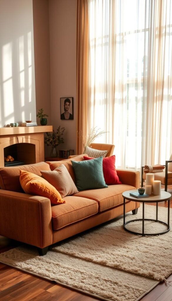
A comfortable sofa should suit the way you sit, stretch out, and get back up again. Seat feel, usable depth, upholstery, and ease of cleaning matter alongside appearance. Consider whether you curl up to read, host several people, or need a firm seat that supports standing.
A deep lounge seat and a more upright seat serve different needs. Deep seating gives you room to stretch out, while a shallower, firmer seat may be easier to rise from. If your household has different mobility needs, try to find a balance rather than choosing only for the person who lounges longest.
The Koala Torquay sectional offers one example of how a sofa’s design can address comfort and support. It has a 27-inch seat, a tensioned S-spring system, edge support, and plush top layers. Koala says its sectionals use FSC-certified timber and recycled-polyester fabrics.
The Torquay also has stain-resistant fabric and removable covers, features that may matter in a busy room. These details describe one product, not a rule for every sofa. Compare how a seat feels with how you care for upholstery, especially if pets or children use the room.
Try the seat in the posture you use most, not just in the quick sit you take while shopping.
Arrange Furniture Around Conversation
A room feels more sociable when the main seats are close enough for an easy conversation. Start with the people: arrange the sofa and chairs so they face or angle toward one another, then make sure the seating relates to one focal point.
Common rules of thumb leave about 30-36 inches for main walkways and 14-18 inches between a sofa and coffee table. These ranges help with circulation, but door swings, room shape, and household needs can change the arrangement.
Bring the main seats into one conversation zone
A sofa and chairs can form a conversation zone without lining up like a waiting room. Angle a chair toward the sofa, or bring two chairs together across from it. A single focal point, such as a fireplace or television, helps the pieces feel related rather than scattered.
- Face or angle the main seats toward each other.
- Keep a clear 30-36-inch main path.
- Leave about 14-18 inches between the sofa and coffee table.
- Choose one focal point for the seating zone.
The layout should support the way you move through the room, not just the way it looks from the doorway. If people watch television together, orient the seats accordingly. If conversation matters more, turn chairs toward the sofa and keep the focal feature secondary.
Keep pathways clear and choose a focal point
Some rooms need a route around the seating area; others work best when you pass through a side opening. For small spaces, one-bedroom apartment layout ideas can show how furniture and floor coverings help define zones without adding walls.
Walk the route from the doorway to the most-used seat to catch an awkward path before you settle on the layout.
Choose a Rug That Grounds the Seating Area
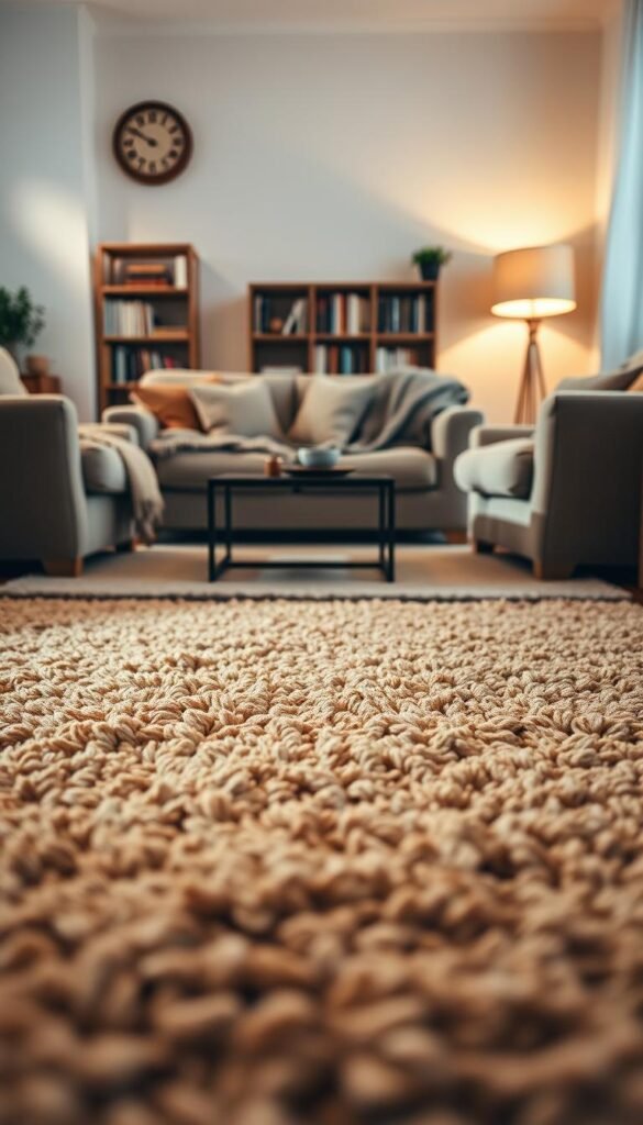
A correctly scaled rug helps the sofa, chairs, and table read as one purposeful zone. Measure the seating footprint, not just the open floor, before choosing among common 5×8, 8×10, and 9×12-foot area rugs.
When the layout permits, let at least the front legs of the sofa and chairs rest on the rug. That connection makes the seating feel gathered instead of adrift. The room’s shape and furniture arrangement determine which size works best.
A 5×8-foot rug may suit a compact seating footprint, while an 8×10-foot option can connect a larger sofa with nearby chairs. A 9×12-foot rug gives a broad arrangement more coverage, though a large rug can overwhelm a smaller room if it reaches too close to every wall.
Do not choose by the open patch of floor alone. A rug that looks large in an empty room may feel small once the sofa and chairs are in place. Likewise, an unusual room shape may need a different furniture arrangement before a standard size fits comfortably.
A small room can still use a smaller rug when the front legs of the primary seating fit on it and the walking route stays clear. The aim is a connected seating area, not wall-to-wall coverage. A narrow rug that sits only beneath a coffee table can make the main seats appear separate.
Mark the rug’s intended outline on the floor with painter’s tape before buying it.
What Sofa Shapes and Colors Feel Current in 2026?
In 2026, the sofa forecast favors softness that still looks considered rather than exaggerated. Soft modular shapes, often low-profile or grounded, began gaining mass-market attention in 2025 and are expected to continue through 2026.
Current directions pair soft forms with clearer proportions, stronger colors, and expressive prints. You can bring one of those ideas into your room through a pillow or chair instead of replacing a full sofa.
Look for softness with clearer proportions
A low-profile modular sofa can make a seating zone feel relaxed, while tailored details keep it from looking overly rounded. Measure the room before bringing home a large piece. Buying a sofa before checking its footprint can leave too little space for movement or other furniture.
| Direction | Defining detail | How to adapt it |
|---|---|---|
| Soft modular | Low-profile or grounded build | Choose a configuration that fits the seating zone |
| Tailored softness | Soft form with clearer proportions | Balance rounded upholstery with simpler surrounding pieces |
| Expressive color and print | Stronger colors or diagonal stripes with layered textiles | Repeat one color or motif elsewhere |
Use the shape as a starting point, not a command to fill the room with matching rounded pieces. A softer sofa can work beside a simple table or a straight-backed chair. That contrast keeps the room from looking like a showroom set.
Use color and print to add personality
Stronger colors, diagonal stripes, layered textiles, and unexpected combinations can add energy. Repeat a color or motif elsewhere, perhaps in a small artwork detail, so the sofa does not feel disconnected. A patterned chair can carry the same idea on a smaller scale.
For more ideas on 2026 sofa designs, consider how the shape works with your room before weighing its trend appeal. Choose the silhouette for your room and routine first, then use color or print to personalize it.
Build Warmth With Layered Lighting
A single bright ceiling fixture rarely gives you the flexibility to read, relax, and host in the same room. Layered lighting combines ambient, task, and accent light so you can change the mood to fit what you are doing.
Use ambient light for general visibility, task light for reading, and accent light for artwork or architectural features. A table lamp, floor lamp, or wall sconce can each fill a different role, depending on where people sit and what they do there.
Warm-white bulbs commonly fall around 2700-3000K, a useful starting range for a softer evening feel. It is not a strict rule for every fixture. A dimmer lets you lower brightness when you want a quieter room and raise it for a more active task.
A floor lamp beside a reading chair can add focused light without changing the ceiling fixture. A table lamp creates a lower glow near the sofa, while a wall sconce can highlight artwork or brighten a dark corner. Several sources give you more control than a single overhead light.
Bright overhead light still helps when you clean or need to see a task clearly. The aim is to add alternatives, not ban the ceiling fixture. For compact spaces, small-room lighting ideas can help you use light without crowding the floor.
Check how the room looks with only its lamps on before adding another decorative fixture.
Style Coffee Tables With Personal Details
A coffee table can feel finished without being covered from edge to edge. Keep it useful by grouping a few meaningful pieces and leaving working space for the things you reach for during the day.
Books, a candle, and a small vase can create a simple display without taking over the table. The rule of three is one optional way to group objects of varied heights. It can help a low arrangement feel more balanced, but you do not need to follow it every time.
Start with objects you use or care about, rather than filler decor. A book you return to, a handmade bowl, or a keepsake from a trip gives the display a reason to be there. Nearby shelves and walls can carry other personal pieces without making one surface do all the work.
A Brooklyn townhouse living room uses ceramics and artwork to create a lived-in look. That approach feels personal because the objects have character and sit alongside the room’s everyday furnishings. You can borrow the idea with one piece of pottery or a small artwork, even if your table is modest.
Change the grouping when it begins to feel like an obstacle. A low tray can gather small items, while taller pieces can sit toward one side. Avoid spreading objects across every corner if people regularly use the surface.
Leave a clear spot for a drink, book, or remote so the display works in daily life.
Make a Small or Open-Plan Room Feel Intimate
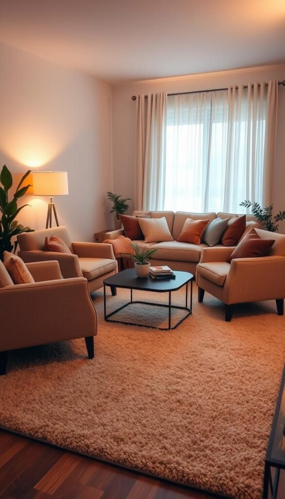
Small rooms feel comfortable when every piece earns its footprint, while open plans need clear zones to feel gathered. Plan before buying by measuring the room and sketching furniture footprints, so your layout has room for both use and movement.
A simple floor plan uses two-dimensional room and furniture footprints to test clearances. A few minutes with paper can show whether a piece blocks a door or makes an open area feel scattered.
- Measure the room’s width and length.
- Record doorways and fixed features.
- Sketch furniture footprints.
- Define a living zone with a rug, bookcase, or sofa placement.
A storage ottoman can offer a place to put up your feet and tuck away a few items. Nesting tables can provide extra surfaces when needed, then take up less visual space when stacked. Multifunctional pieces help a compact room work without making it feel crowded.
In an open plan, a rug, bookcase, or sofa placement can mark the living zone while keeping it connected to nearby spaces. A large room may feel less welcoming when all the furniture hugs the walls. Distinct areas give the room a sense of purpose without building a divider.
Explore compact living room solutions for more ways to make a small footprint feel usable. The key is to see the whole arrangement on paper before moving large pieces through the door.
Mark the full furniture footprint before shopping so a piece does not block a doorway or the route through the room.
Bring 2026 Color and Decor Trends Into the Room
The 2026 directions include both named paint colors and tactile details that can be introduced in small doses. Modern warm and cozy living room designs can pair clean-lined furniture with soft neutrals, tactile materials, and inviting layers.
One considered update can bring a current detail into your room without turning every forecast into a shopping list. A paint sample, a frame, or one woven window treatment can be enough to test an idea.
Try the named 2026 paint directions as a palette, not a mandate
Benjamin Moore named Silhouette AF-655 its 2026 Color of the Year and paired it with a palette of pale, midtone, and deep shades. HGTV Home by Sherwin-Williams named Universal Khaki HGSW6150 its 2026 Color of the Year, within its Honest Essentials collection.
The Honest Essentials collection includes Neutral Ground HGSW7568, Cordovan HGSW6027, Lemon Chiffon HGSW6686, Creamy HGSW7012, Universal Khaki HGSW6150, Griffin HGSW7026, Reddened Earth HGSW6053, Still Water HGSW6223, Hazel HGSW6471, and Secret Garden HGSW6181.
These named colors can guide a palette without requiring you to repaint every wall. Try a color on a small surface or bring it in through an object first. Daylight, lamps, and nearby finishes can affect how a shade appears in your living room.
| Pairing | Colors | Additional detail |
|---|---|---|
| Contrasting | Still Water, Creamy, Reddened Earth | Cool, soft, and earthy tones |
| Sunset-inspired | Cordovan, Reddened Earth, Universal Khaki | Rich red-brown tones with khaki |
| Nature-inspired | Universal Khaki, Creamy, Lemon Chiffon | Pair with a nature-inspired backsplash |
Mix wood tones and add fluted or reeded detail
Mixed wood tones can keep a room from looking like it came as one matching set. Let the grain and finish vary while keeping the overall mix comfortable beside your flooring and larger furniture. Fluted or reeded millwork adds a repeated line that gives a surface more detail.
You can test either feature on one piece before adding it across a wall. A reeded cabinet front or a side table in a different wood tone makes the idea visible without asking you to change every finish.
Use window treatments, frames, or metal for a smaller update
Thicker vintage picture frames can give artwork more presence. Patterned woven blinds bring visual interest to a window, while drapes paired with relaxed Roman shades in the same or similar fabric create a layered treatment.
Tin or tin-like decor offers another small point of contrast, such as a tray or wall accent. Choose the one current detail that supports the room you already have, then leave the rest as optional inspiration.
Avoid Five Choices That Can Make a Room Feel Dated
A room can feel dated or uncomfortable because of a few mismatched decisions, not because every piece is old. Look for friction between the way the room works and the way it looks before replacing anything.
These five common issues are worth checking, not universal rules every home must follow. A meaningful vintage piece can work beautifully, and a deliberate matching set can feel right when the whole room feels balanced.
- An undersized rug that leaves the seating pieces feeling separate.
- Furniture that feels out of scale with the room.
- Lighting that relies on only one overhead source.
- A clutter of small decorative objects.
- Finishes that match so closely the room feels flat.
A rug that misses the main seating can make a conversation area look accidental. Furniture that is too large can crowd a path, while pieces that are too small may leave a room feeling empty. The issue is the relationship between the pieces and the space, not a single furniture style.
Fix the issue that affects everyday use first. A room does not need to lose every old or matching piece to feel comfortable and current.
One ceiling fixture may be practical, but it can leave you without softer options for reading or relaxing. A pile of small objects may also make a surface harder to use. Removing a few pieces can sometimes restore calm more effectively than adding another decorative item.
Overly matched finishes are not automatically wrong. A deliberate set can look composed when other elements add variation, while a mixed collection can look scattered without a clear relationship. Judge the whole room, then fix the issue that affects everyday use first.
Refresh the Room Without Replacing the Furniture
You can change the mood of a room without replacing the sofa or buying a new set of furniture. Start with a low-cost change that uses what you own, then see whether it makes the space more inviting.
Four manageable first moves can shift the feel of the room without a major furniture purchase. Some may cost little; others depend on what you already have and what needs replacing.
Make a few low-cost changes first
- Switch to a warmer bulb.
- Add one substantial throw.
- Change the pillow covers.
- Rearrange furniture already in the room.
Try one change at a time, so you can tell what actually helps. A substantial throw can make a seat feel more inviting, while new pillow covers can shift the color mood without changing the sofa. Moving familiar furniture may reveal a better conversation area without bringing in another piece.
Keep the details personal and easy to live with
Framed art, books, and keepsakes make a space feel lived-in when they reflect your interests. You do not need to buy a matching display. A few objects that matter to you can say more than a shelf of generic decor.
Removing unused objects can matter as much as adding something new. Clear a surface you rarely use or put away a decoration that makes daily cleaning harder. Keep the items that help the room feel like yours and still leave enough space to relax.
Try one change for a few days before deciding whether the room needs another purchase.
Let Everyday Comfort Guide the Finished Room
The best test of a finished room is whether you want to settle in and stay awhile. Your habits matter more than a perfect picture: choose comfort and practical use over changes that only look good for a moment.
Prioritize how you use the room, and make changes gradually so comfort and personal character stay central. A small adjustment gives you time to notice what genuinely improves the space.
Choose one spot you use every day and adjust its light, seating, or softness this week. Let that change show you what the rest of the room needs, if anything. Pick one everyday seat and make one thoughtful change to it this week.