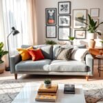
A blank wall can make a furnished living room feel unfinished, while one carefully chosen detail can change the mood of the space. You do not need to renovate every surface to make your home feel more personal. A considered wall treatment can give the room a focal point, bring warmth to plain surroundings, or create useful display space.
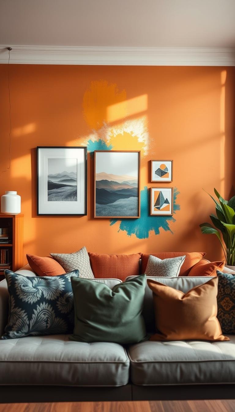
An accent wall is one intentionally emphasized wall that gives a room a visual focal point. You can create one with paint, wallpaper, art, shelving, or texture, then let the rest of the room support it. Small changes can feel just as deliberate as a full redesign when they suit the way you use the space.
The best wall designs for living room spaces start with what you want to see and feel every day. A soft color can make the room feel calm, while a personal display can bring memories into view. Shelves may help you use an empty wall, and a textured surface can add depth without filling the floor with more furniture.
Start with the wall you notice most from your usual seat, then decide whether you want it to add color, texture, storage or a focal point.
Wall Designs for Living Room Spaces That Feel Personal
A narrow slice of wall beside a doorway can become a deliberate vignette with two or three well-chosen pieces. A small display can give a living room wall character without asking you to cover every open surface. Personal, varied wall decor ideas often feel more distinctive than a matching set of frames.
Choose pieces that reflect your taste, then give each one room to stand out. A compact art stack can use two or three works with contrasting frames, shapes, or art styles. An asymmetrical frame placement also makes a narrow stretch feel intentional, especially when one larger piece sits slightly off center.
Unique displays for small or awkward wall stretches
A picture ledge gives you room to layer prints and swap displayed art without rehanging each piece. It works well above a low cabinet or in a spot too narrow for a larger gallery wall. A personal memento, such as a framed postcard or small family photograph, can make the display feel rooted in your home.
A single three-dimensional object can also make an overlooked wall feel considered. Try a small carved form or a sculptural wall piece, rather than adding several items that compete for attention.
Make art feel collected instead of matched
A collected display can mix a simple black frame with a wood frame, a photograph, and a small print. The works do not need to share a subject if their scale or colors connect. For more inspiration, explore living room wall decor ideas that combine personal art with flexible displays.
- Build a compact art stack with two or three varied pieces.
- Hang one frame asymmetrically on an overlooked stretch.
- Use a picture ledge to rotate prints and photographs.
- Display one sculptural object for a dimensional accent.
Leave open space around a small display so each object remains easy to notice.
A personal memento can connect the wall to a trip, a family story, or a favorite place without turning the arrangement into a scrapbook. Leave open space around the display so each object remains easy to notice.
Choose a Wall Treatment That Fits Your Room
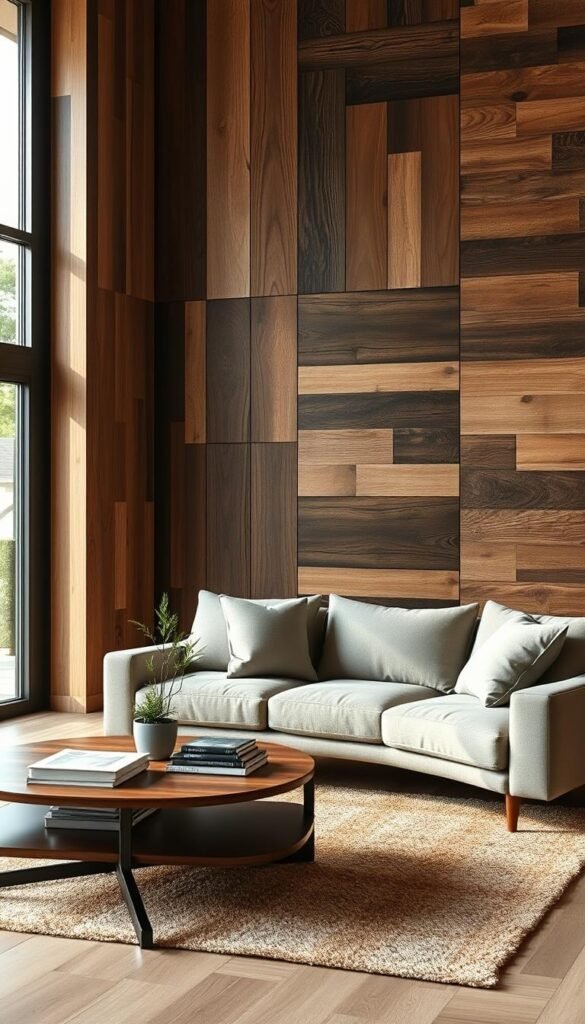
The right wall covering depends first on whether the room needs a paintable surface, moisture resistance, sound treatment or natural wood. A practical match between material and room conditions matters more than a finish that only looks right. Wall panels can add texture while serving very different needs.
Choose panels for the condition they are designed to handle, not just their surface appearance. Paint-grade MDF suits interior walls that need a smooth, paintable finish. Waterproof WPC or PVC composites suit moisture exposure, while acoustic wood-slat panels are intended for spaces where sound treatment matters.
Match panel materials to moisture and sound
Solid hardwood is a natural wood option when you want the grain and character of real wood. Acoustic slats can soften sound in a room, while decorative panels may add texture without offering the same acoustic benefit. The intended use helps you compare the options fairly.
Wet-area suitability depends on the material, not merely on how a panel looks. A wood-like surface does not automatically mean the panel can handle moisture. Check the material label and the room conditions before settling on a design.
Compare wood, composite and solid surfaces
Each material gives you a different mix of finish and function. MDF is useful when you plan to paint the panels to match the room. WPC or PVC composites suit moisture-exposed areas, and solid hardwood gives you a natural wood finish with visible grain.
| Material | Suitable condition | Useful feature |
|---|---|---|
| Paint-grade MDF | Interior walls | Paintable surface |
| Waterproof WPC or PVC | Moisture exposure | Composite construction |
| Acoustic slats | Where sound treatment matters | Slatted surface |
| Solid hardwood | Natural wood finish desired | Real wood grain |
Compare wall-panel samples against nearby flooring, trim, and furniture before you choose a finish. A similar color can still look different when one surface has visible grain and another is smooth. Check the panel’s stated material and intended room before choosing a finish.
Use Paint and Color to Set the Mood
A wall color works best when it supports the room’s light and furnishings instead of competing with them. A connected shade can make an accent wall feel intentional rather than separate from the rest of the living room. Start with the mood you want, then consider current colors as options, not rules.
In 2026, warm beige, tan, greige, and taupe are requested alternatives to gray, but they form a palette rather than one replacement. Warm, soft whites and grounded neutrals remain useful choices. Subdued blues with gray, mineral, or earthy-green undertones can also feel gentler than a saturated blue wall.
Build a 2026 color story
Icy blue offers a crisp, pale direction, while teal brings a deeper color note. Amber or burnt caramel adds warm, earthy character. HGTV Home by Sherwin-Williams named Honest Essentials its 2026 Color Collection of the Year, with Universal Khaki HGSW6150 as its Color of the Year.
The complete Honest Essentials palette includes Neutral Ground HGSW7568, Cordovan HGSW6027, Lemon Chiffon HGSW6686, Creamy HGSW7012, Griffin HGSW7026, Reddened Earth HGSW6053, Still Water HGSW6223, Hazel HGSW6471, and Secret Garden HGSW6181. A coordinated set gives you several ways to keep a room connected without making every wall the same shade.
Four palette directions can help you narrow your choice:
- Warm white with beige for a soft, light backdrop.
- Khaki with earthy brown for a grounded look.
- Subdued blue with gray or green undertones.
- Teal or amber with restrained neutrals around it.
Keep an accent shade connected to the room
Compare the accent shade with the adjoining walls, furniture, and natural light. A color that looks calm in a bright corner may feel stronger on a broad wall with little daylight. In an open layout, repeating a color or material in nearby zones can make the rooms feel connected.
Warm neutrals, tactile natural materials, and personal art make a flexible current direction for home decor; no single style suits every home. For a softer neutral backdrop, see warm neutral living room ideas that use texture alongside paint. Test a paint sample beside the room’s trim and check it in both daylight and evening light.
Try Wallpaper or a Mural for Pattern
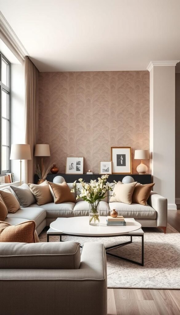
A patterned wall feels most intentional when the furniture and other surfaces leave it room to breathe. A simple print can bring interest to a living room without making every surface feel busy. Muted patterns and restrained single-wall prints are easy ways to add wallpaper with a lighter visual touch.
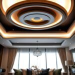
Use a strong print where enough of its pattern will remain visible. Peel-and-stick wallpaper suits people who want to change the look more easily. Traditional wallpaper can cover one wall or an entire room, while a ceiling can act as a fifth wall for a quieter but unexpected accent.
Choose a removable print or a lasting surface
A removable wallpaper design can be a practical choice if you like to refresh your decor or are not ready for a lasting surface. A full-room treatment creates a more enveloping effect, so the pattern becomes part of the room’s overall backdrop. Think about how much visual pattern you want around the furniture.
Muted botanicals, fine lines, and small-scale geometric prints can make simple wall designs for a living room. A mural-like print gives the wall a larger scene, but works best when you can see enough of it to read the image. A small fragment hidden behind a sofa may not deliver the effect you want.
Use a mural effect where it can be seen
A mural on a focal wall can add a sense of depth or a clear point of view. Wallpaper on a ceiling draws attention overhead, especially when the walls and furnishings stay visually quiet. Peel-and-stick wallpaper is also available in patterns that suggest murals without requiring painted artwork.
| Treatment | Where to use it | Commitment |
|---|---|---|
| Removable wallpaper | One wall | Easier to change |
| Full-room wallpaper | All room walls | Broad surface treatment |
| Mural-like wallpaper | Focal wall | Strong visual feature |
| Wallpaper accent | Ceiling | Fifth-wall treatment |
A restrained print can work well when you want pattern without a dramatic mural. If you prefer a scenic look, keep nearby surfaces simple enough to let the image register. Before applying a large print, check how much of it will remain visible behind furniture and curtains.
Add Architectural Texture With Wall Panels
Narrow, closely spaced ridges give fine-pitch fluted panels a more delicate rhythm than widely spaced battens. These fine lines can make a modern living room wall feel detailed without relying on a bold print. Fluting, reeding, slats, and board and batten all add architectural texture in different ways.
Decorative texture and acoustic treatment are not the same thing. Fine-pitch fluted panels have narrow ridges and tight spacing. For 2026, listed finishes include warm oak, natural walnut, navy blue, charcoal, and soft green.
Modern wall panels with fluting and board and batten
Fluted or reeded panels create a repeated vertical line, while board and batten uses wider, more visible divisions. Both can add architectural detail without using shiplap. Choose the pattern according to the scale of the wall and the amount of texture you want to see.
The narrow ridges of fluted panels can bring movement to a plain surface, while board and batten has a more structured, framed look. A simple finish lets the pattern do the work. The same design can feel subtle or bold depending on its spacing and color.
Acoustic slats for a media or open-plan wall
Acoustic wood-slat panels can add texture to a living room media wall and may help reduce echo in an open-plan room. Premium acoustic slat panels list a noise reduction coefficient of 0.50-0.85. The coefficient is a rating to consider, not a promise that the panels will make a room soundproof.
That distinction matters if you want both a strong visual design and better sound behavior. A decorative slat wall may not have the same acoustic properties as a panel built for sound treatment. In an open space, the slats can provide a textured backdrop while serving a practical role.
For installation, MDF-based panels should acclimate in the room where they will be fitted. Let them sit in that space for at least 48 hours before installation. Allow MDF-based panels to acclimate in the installation room for at least 48 hours before fitting.
Budget for Wall Paneling Before You Install It
Paneling estimates are easier to compare when you separate the material price from the installed price. A clear comparison helps you see how the panel choice affects the project before you plan the full wall. In 2026, listed costs vary by material and by whether installation is included.
Installed estimates range from $7.50-$16.00 per sq ft for MDF to $23.00-$50.00+ per sq ft for solid hardwood. Acoustic slats and WPC or PVC composites fall between those listed ranges. Room dimensions and installation details also change the estimate.
The material-only price is not the full project amount. Trim and hardware can add 12-18% to material costs, and a 10-15% waste margin is recommended. A wall with many corners, outlets, or cuts may need more planning than a broad, uninterrupted surface.
| Material | Material cost per sq ft | Installed estimate per sq ft |
|---|---|---|
| MDF | $3.50-$8.00 | $7.50-$16.00 |
| WPC or PVC | $5.00-$11.00 | $9.00-$19.00 |
| Acoustic slats | $7.50-$22.00 | $12.50-$25.00+ |
| Solid hardwood | $15.00-$40.00+ | $23.00-$50.00+ |
Use the table to compare like with like: material against material, or installed estimates against installed estimates. A lower material cost does not tell you what the full installation will cost. The final amount depends on the area being covered, the panel layout, and the installation work involved.
Take wall measurements before comparing estimates, including the height and width of the intended surface. Add the likely trim and waste allowance so your budget reflects more than the panel face alone. Measure the intended surface and include trim and waste before comparing quotes.
Size a Gallery Wall to Fit Your Furniture
A well-proportioned art grouping should relate to the furniture beneath it, not just to the empty wall around it. A useful starting point is the two-thirds rule: artwork or the complete composition should be about two-thirds the furniture’s width. This keeps the display visually connected to the piece below it.
For a 90-inch sofa, aim for about 60 inches of art across. For a gallery wall, measure from the outer edge of the first frame to the outer edge of the last, including the gaps between frames. The complete composition, not just the frames, is what counts.
Set art width over a sofa
A single framed piece above a sofa can use the same proportion as a grouping. The bottom of the sofa art can sit 6-8 inches above the sofa back. This gives the artwork a clear relationship to the furniture without letting the wall gap dominate.
For several works, decide how much space you want between the frames before measuring the full display. The gaps affect the overall width, so include them in the complete composition. A group can look too narrow even with large frames if the arrangement is measured incorrectly.
Measure the gallery as one composition
Two complementary works can be treated as one display when you measure their outside edges together. A picture ledge arrangement also has a total width, even if the frames overlap or sit at different heights. Measure the ledge and the objects as a single visual unit.
| Display type | What to measure | Placement check |
|---|---|---|
| One framed piece above a sofa | Outside frame width | Bottom 6-8 inches above sofa back |
| Multi-frame gallery | Outer edges, including gaps | About two-thirds of sofa width |
| Two complementary works | Combined outside width | Read as one display |
| Picture ledge arrangement | Ledge and displayed objects | Centered over furniture |
A paper layout on the floor can help you see the overall shape before you hang frames. Keep the arrangement in proportion to the furniture rather than stretching it to fill every inch of wall. Measure the outside edges of the entire arrangement before you mark hanging points.
Make a Statement With Oversized Art or a Mirror
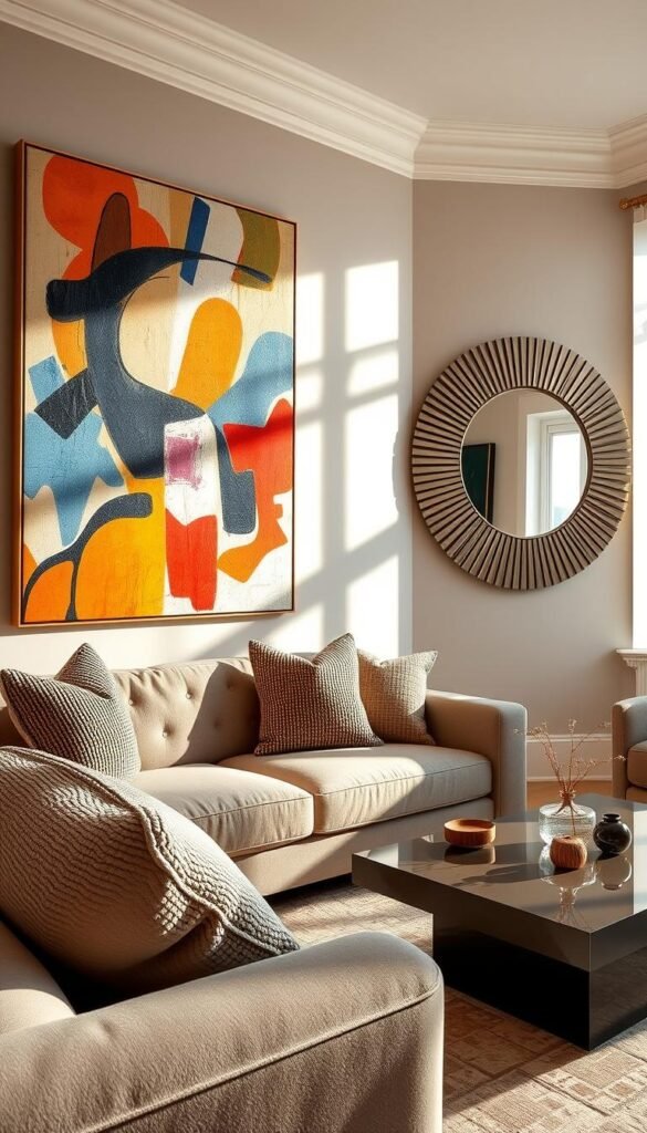
One substantial piece can give a broad wall a calmer focal point than a collection of smaller frames. A single focal piece also helps when you want the room to feel clear rather than visually busy. Oversized wall art can take the form of a 40×60-inch print or canvas.
Choose art for color, subject matter, or texture, and choose a mirror when reflecting available light matters more. A statement mirror can add brightness by reflecting the light already in the room. It can also make the space feel larger without introducing another image or pattern.
Two complementary large pieces offer a paired look without creating a full gallery wall. They can share a color, subject, or frame style, while still giving the wall more breathing room than many smaller works. Choose this approach when one artwork alone feels too slight.
A large tapestry brings a softer surface and visible texture. Its fabric can contrast with smooth furniture and hard wall finishes. A mirror offers a different effect, reflecting the room rather than adding a new subject to it.
For a spacious wall, a large print can provide a strong point of interest without filling the surrounding area. You can compare large formats with other large wall art ideas when deciding how much of the wall to cover. A substantial piece does not need to be loud; a restrained image can still anchor the room.
Look at the wall from the main seating position, since that is where the artwork or mirror will be seen most often. Check that the focal piece feels balanced with the furniture.
Add Display and Storage With Shelves or Built-Ins
A wall with limited floor space can still provide display and storage with shelves or built-in cabinetry. A useful wall can hold books, show a few favorite objects, and keep some belongings behind doors. The right setup depends on whether you want open display, concealed storage, or both.
Open shelving needs deliberate editing, while closed cabinet doors can hide clutter. Floating shelves can flank a fireplace or television, and picture ledges make it easy to change displayed art. A built-in bookcase gives you a more permanent display and storage area.
Style open shelves without crowding them
Open shelves keep books and decor visible, so the display affects the whole room. A picture ledge offers a shallower place for frames and can be refreshed without moving other furniture. A display cabinet provides a more enclosed setting for objects that you still want to see.
Try a few simple choices rather than filling every shelf:
- A small book stack.
- One framed print.
- A plant that suits the available light.
- One collected object with a personal story.
Choose built-ins for concealed storage
Living-room built-ins can include bookcases, benches, cabinets, and media centers. Floor-to-ceiling bookshelves can display books and objects while adding storage. Built-in benches may give you a seat as well as a place to keep items out of sight.
Closed cabinets are handy for things you use but do not want to display. Open sections can hold a few books or framed pieces, giving the wall a more personal feel. You can also explore greenery wall decor ideas if you want plants to add color and height.
Mixing closed and open storage lets you choose what stays visible. Leave some shelf space empty so useful storage does not turn into visual clutter.
Give the Wall Dimension With Objects and Textiles
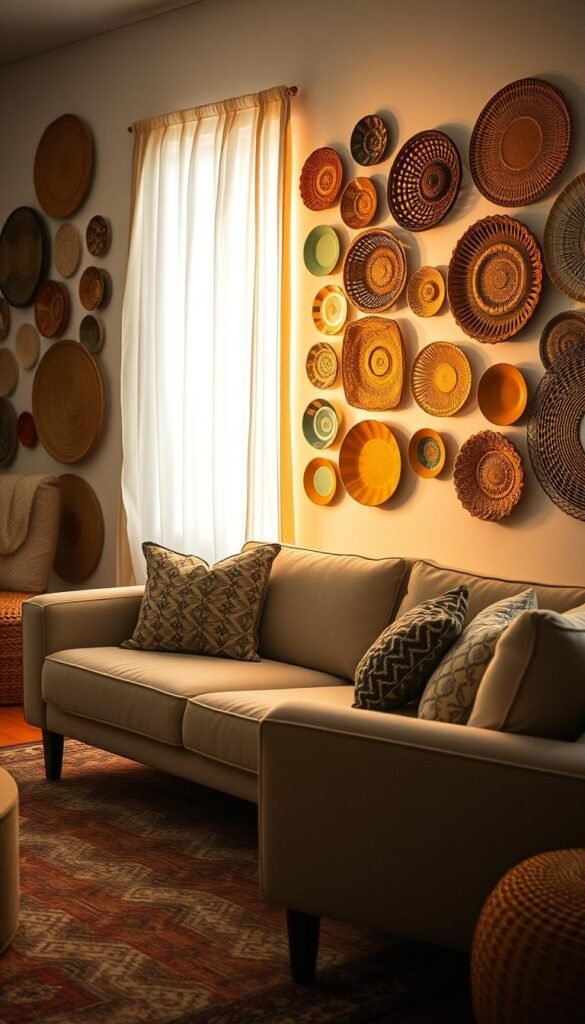
A woven hanging or a small collection of plates can add depth where another framed print would feel predictable. Dimensional decor gives a plain wall changing shadows and visible texture. It can also bring in materials that make the room feel more personal.
The 3-5-7 method groups objects in odd numbers of three, five, or seven and varies their heights, shapes, and textures. It is a styling option, not a rule for every wall. You can use the same approach for objects on a coffee table, bookshelf, or pillow arrangement.
Vintage plates can create a pattern with their shapes and colors, while a textile hanging adds softness against a flat wall. A metal sculpture gives a room a sharper outline and can catch light differently throughout the day. A few collected objects can suggest a story without needing a framed print.
Choose materials that relate to other details in the room, such as a woven texture that echoes a rug or a metal finish that appears on a lamp. These small connections make a display feel considered without forcing every object to match.
Four display directions offer different kinds of depth:
- Woven pieces with raised patterns and soft edges.
- Vintage plates with varied colors or shapes.
- Fabric art that adds a softer wall surface.
- Lightweight metal forms with a clean outline.
Use odd-numbered groupings when they help the objects feel balanced, then trust your eye if a pair suits the wall better. Leave enough open surface for each shape to read clearly. Give each three-dimensional piece enough space to cast a clear silhouette against the wall.
Use Lighting, Windows and Trim to Finish the Wall
A picture light or a contrasting window frame can make a wall detail register without adding another large object. Focused light can draw attention to art, while a sconce can bring out an architectural feature. These choices help the wall feel finished at different times of day.
Dimmers let you adjust the room’s light as the day changes. A picture light above artwork makes that piece easier to notice, and sconces near architectural details can add ambiance. Use light to support the wall’s main features rather than giving every surface equal attention.
Window trim can define the shape of a window against the wall. Benjamin Moore Hale Navy is one example of a contrasting color for window frames and trim. A strong frame color can make a window feel like part of the design rather than just an opening.
Large windows also change how the wall reads throughout the day. Window shades or drapery can add privacy and soften the broad area around the glass. Fabric brings a different texture from paint and trim, helping the room feel less stark.
Consider where a picture light or sconce will fall in relation to frames and architectural details. A dimmer makes it easier to lower or raise the light for a quieter evening or a brighter daytime setting. Check how the wall looks with both daylight and the room’s evening lighting.
Design a TV Wall That Keeps Cables Out of Sight
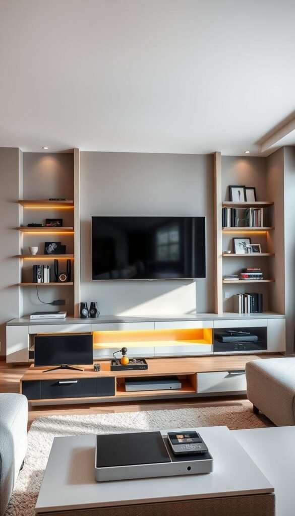
A TV wall looks calmer when the screen, wiring and storage are treated as one layout. A planned cable route can keep the display from feeling like a collection of unrelated pieces. You can hide wiring inside panel construction, cover a cable with a raceway, or use a freestanding stand.
A surface-mounted raceway hides a vertical cable drop without cutting the wall and holds 2-3 cables. A panel substrate can conceal home-theater wiring and LED lighting together. This option works best when the panel design is planned around the screen and the wiring route.
A raceway keeps the wall intact while covering a vertical run of cables. It can be a practical choice when you do not want to open the wall. The visible channel can be painted to blend with the surface, or treated as a neat line within the layout.
Panel construction offers another route for a media wall. Some panel designs hide LED lighting in grooves and home-theater wiring within the panel substrate. That can bring lighting and cable management into a single surface, though the route should remain planned before the panel closes it in.
A freestanding option avoids wall construction. The FITUEYES Master Series TV stand fits TVs from 32 up to 85 inches and includes an internal cable channel. It can suit a room where you want the screen supported without mounting it to the wall.
Compare the access each layout offers before settling on one. A no-cut raceway keeps the cable path visible and reachable, while an enclosed panel can make the wall look more seamless. Check that the cable route remains accessible before choosing a permanently enclosed panel design.
Make a Small Living Room Feel Taller and Brighter
In a compact living room, a few vertical lines can make the eye travel upward instead of stopping at the furniture. A vertical detail can make the room feel taller without changing its actual height. The goal is to keep the design open enough that a small space still feels comfortable.
Vertical wall paneling can make ceilings feel higher, even in rooms with standard 8′ or 9′ ceilings. The effect is visual, not structural: the panels do not physically change the ceiling height. Their vertical lines simply draw your attention upward.
Small wall designs for a living room can include a restrained wallpaper pattern, reflective surfaces, or one focal treatment. A quiet print gives the wall interest without taking over the room. Reflective finishes can spread available light, while a single focal wall helps avoid competing features.
A large pattern can feel crowded when it covers several walls in a compact room. Use one area for the strongest detail, then keep nearby surfaces quieter. This makes a clear point of interest while leaving visual breathing space.
Vertical paneling is especially helpful when you want the eye to move above furniture rather than across a short wall. A narrow repeated line can add rhythm without relying on many objects. Keep the largest pattern or strongest contrast on one area so the room retains visual breathing space.
Try Stone, Brick or Tile for a Strong Surface
Stone, brick and tile make the wall itself the focal point, so the rest of the room can stay relatively quiet. A strong surface gives you visible texture and joints instead of relying on artwork to create interest. The material can become the defining feature of the living room.
Peel-and-stick faux materials create a surface treatment, not the same construction as masonry or installed tile. They can suggest brick or tile without building the wall from those materials. Installed stone, brick, and tile have a more substantial surface character.
Texture and joints can draw the eye across the full wall, so nearby furnishings and decor often work best when they are comparatively simple. A tiled fireplace surround can extend from floor to ceiling and make the fireplace a clear architectural feature.
Choose the surface according to how much texture you want the room to carry. Exposed brick can feel raw and familiar, while stacked stone creates a more layered surface. A restrained stone-look finish gives you a quieter way to echo the material.
Four options can help you compare the effect:
- Exposed or faux brick for a pronounced masonry look.
- Stacked stone for layered texture across the wall.
- A tiled fireplace surround as a floor-to-ceiling feature.
- A restrained stone-look finish for a softer effect.
A peel-and-stick surface is not a substitute for installed tile or masonry construction, even when the pattern looks similar. Check that the selected material suits its location and can be installed over the existing wall.
Combine Wall Details for a Cohesive Living Room
A cohesive wall design usually connects two or three details through color, material or shape instead of making every surface compete. A clear connection helps your living room feel planned without making it look overworked. One wall can carry more emphasis while nearby features support it.
Pair a main treatment with one or two details that share a color, material, or shape. An accent wall with floating shelves gives you a focal surface and a practical display. Bold drapery flanking statement artwork can connect a large window with the room’s main wall feature.
An all-white room can gain detail through matching trim and doors, then add an architectural arch as a distinct shape. Repeating one finish across the trim and doors creates a quiet rhythm. The arch gives the room a focal detail without adding another strong color.
Warm neutrals, natural textures, and personal art are a flexible direction for current home decor, not a single style that suits every living room. You can use those elements in a traditional room or pair them with cleaner, more modern furniture. In an open layout, repeating a color or material across connected areas can help the spaces feel related.
For connected living, dining, and kitchen zones, open-concept living room ideas can help you carry details across the shared space. A repeated shape or finish can create continuity without making every wall identical. Keep the strongest feature where you want the eye to land.
Before adding another feature, remove one item that distracts from the wall’s main focal point.
Notice whether the wall already has a strong point of focus before adding a second one. A room often feels more polished when one feature leads and the rest remain quieter. Before adding another feature, remove one item that distracts from the wall’s main focal point.
Choose One Wall to Refresh First
A wall does not need several competing features to make the living room feel more like yours. Begin with one focal wall and decide what it needs to do: add color, create texture, show something personal, or provide useful storage. One clear purpose makes it easier to choose a treatment that fits your room and budget.
A small change can still make the space feel more considered. Pick a finish or display that suits your daily routine, not just a look that caught your eye elsewhere. A wall should feel connected to the furniture, light, and objects you already live with.
Choose one wall, take a photo of it from your main seat and make a short list of the color, texture or function you want to change.