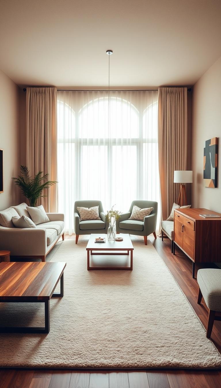
A thoughtful palette can make your home feel brighter, calmer, warmer or more dramatic before you change a single piece of furniture. Living room inspiration color schemes can help your rooms reflect the mood and style you want, while working with the natural light and furnishings already there.
You might want a relaxed place to unwind, a lively room for company, or a cozy spot for a quiet evening. The right colors help set that feeling, and you do not need to start from scratch to find them. A favorite rug, a wood finish, or a piece of art can give you a useful starting point.
This collection offers calm, bright, earthy and dramatic directions, along with practical ways to connect paint to what you own. Start with the mood you want to come home to, then choose colors that support it.
How to Build Living Room Inspiration Color Schemes
A balanced palette usually starts with one dominant shade, one supporting shade and a smaller accent, not a hunt for three matching paint chips. Start with the pieces you like, then use paint and decor to connect them. A palette of three to five colors can give a living room variety without making each surface compete.
The 60-30-10 rule assigns 60% of the room to a dominant color, 30% to a secondary color and 10% to an accent color. Walls often carry the dominant color, furniture and rugs the secondary color, and accessories or art the accent color. A color-design overview explains how these roles help balance an interior.
A color theory guide from Rocky Mountain College of Art and Design also discusses how colors relate on the color wheel. You can use those relationships as a starting point, not as a rulebook. A modern living room inspiration color scheme might pair a neutral base with one or two strong accents. For a simpler look, use two or three closely related hues.
Use the 60-30-10 rule as a flexible guide, not a strict formula; a two-color palette can work just as well.
Use the 60-30-10 Rule as a Starting Point
For a white, brown and green palette, white walls or a white rug can set the foundation. Brown wood or leather furniture brings warmth, while plants add green. A greige, black and gold scheme could use greige across most of the room, black on substantial furniture, and gold in small accessories.
These examples show how the color scheme can spread across different surfaces without making every item match. The proportions can shift to suit your room. You might use more of a favorite hue, or skip a third color if two shades already feel complete.
Let One Existing Piece Guide the Palette
A patterned rug, artwork, or an upholstered chair can give you a practical palette. Choose one neutral and one stronger hue from the piece, then add a third color only if the room needs another note. This is often easier than choosing paint first and trying to make the furnishings fit.
For more ways to use decor as a starting point, try these colorful living room decor ideas. If a patterned rug already works in the room, borrow one neutral and one stronger hue from it before choosing a wall color.
Choose Light and Airy Colors for the Room’s Conditions
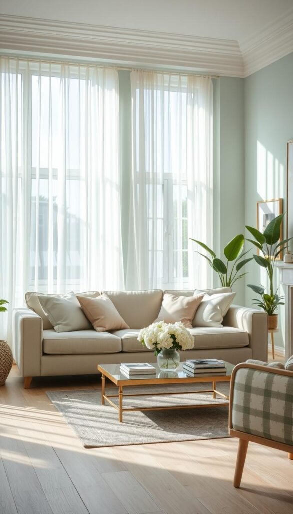
If your north-facing room feels cool and dim, begin by comparing warm neutrals with an LRV of at least 60. LRV means a paint color’s light reflectance value, a measure of how much visible light it reflects. North-facing rooms receive cooler, bluer light, so a lighter, warmer neutral can help counter that cast.
For a crisp, airy look, neutral paint colors with an LRV of 50-60 can also be a useful choice. The best color for living room walls depends on the room’s orientation and the mood you want. In a north-facing room, Rivers Edge SW 7517, Drift of Mist SW 9166 and Olympus White SW 6253 are warm-neutral options with an LRV of 60 or higher.
| Room condition | LRV | Paint colors | Intended effect |
|---|---|---|---|
| North-facing room | 60 or higher | Rivers Edge SW 7517 | Warm the cool light |
| North-facing room | 60 or higher | Drift of Mist SW 9166; Olympus White SW 6253 | Lighter, warmer neutral look |
| Airy, crisp look desired | 50-60 | Grayish SW 6001; Front Porch SW 7651; Worldly Gray SW 7043 | Bright, airy appearance |
The middle row groups two high-LRV options for the same room condition, while the last row gives three paints in the lower range. A room with strong natural light may show a paint color differently from a dim space, so the same wall color will not look identical everywhere.
Look at the whole room when you compare colors. Your floor, trim, and fixed finishes can add warm or cool notes that change the way a wall reads. Check the wall color beside the floor and trim, since their undertones can shift how light the paint appears.
2026 Paint Colors Set a Fresh Direction
If you want a current starting point, 2026 offers choices ranging from sandy khaki to charcoal-brown and restorative green. Use a trend shade to guide your palette, not to dictate every surface. A Color of the Year is an option, not a requirement.
Benjamin Moore’s 2026 Color of the Year is Silhouette AF-655, a blend of burnt umber and charcoal. The Benjamin Moore 2026 Color Trends palette also includes Raindance 1572, First Crush CSP-310, Swiss Coffee OC-45, Batik AF-610, Narragansett Green HC-157, Southwest Pottery 048, Sherwood Tan 1054 and Silhouette AF-655. Silhouette is paired with Swiss Coffee in 2026 room examples.
| Brand | 2026 color and code | Palette role | Named coordinating color |
|---|---|---|---|
| Benjamin Moore | Silhouette AF-655 | Charcoal-brown depth | Swiss Coffee OC-45 |
| Benjamin Moore | Swiss Coffee OC-45 | Warm foundation | Silhouette AF-655 |
| HGTV Home by Sherwin-Williams | Universal Khaki HGSW6150 | Sandy neutral foundation | Natural stone and wood |
| HGTV Home by Sherwin-Williams | Cordovan HGSW6027 | Deep accent | Not specified |
| Valspar | Warm Eucalyptus 8004-28F | Calmer green accent | Degas Blue 8004-35B |
Warm Neutrals as a Foundation
Universal Khaki HGSW6150 is HGTV Home by Sherwin-Williams’ 2026 Color of the Year, a sandy-shaded neutral intended to work with natural stone and wood. Swiss Coffee offers another warm foundation. Either can anchor a room while more saturated colors stay on smaller surfaces.
The Honest Essentials collection from HGTV Home by Sherwin-Williams also includes Lemon Chiffon HGSW6686, Creamy HGSW7012, Griffin HGSW7026, Reddened Earth HGSW6053, Still Water HGSW6223, Hazel HGSW6471 and Secret Garden HGSW6181. These join Universal Khaki and Cordovan in the collection.
Green and Earthy Accents for More Character
Valspar describes Warm Eucalyptus as restorative and serene, and names Degas Blue and Groundbreaking 8005-8F as coordinating colors. For a deeper look, Silhouette or Cordovan can add weight without covering every wall. A small accent is a lower-commitment way to try a strong shade. Keep the trend shade to an accent if you are unsure you want it on every wall.
Bring Greens and Blues Into a Restful Palette
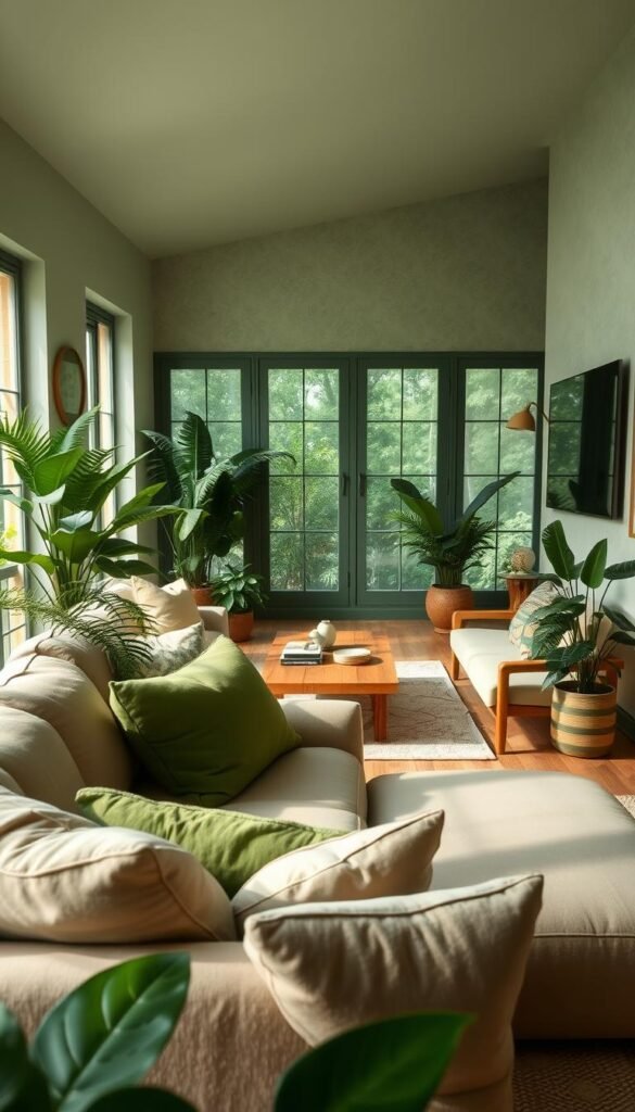
Green and blue can make a room feel settled, but wood, cream and fabric texture keep those cooler hues welcoming. Natural materials add a warm counterpoint to a cooler wall. Green often connects easily with wood, plants, creams or brass, while blue gains warmth from wood and layered textiles.
Benjamin Moore Van Courtland Blue is a midtone blue with subtle green and gray undertones. Its softened color can sit comfortably beside natural wood and pale fabrics. For a stronger blue-green, Sherwin-Williams Waterloo works with stained wood trim, so you can let the wood remain visible rather than painting over its character.
Pair Green With Warm Natural Materials
Benjamin Moore Gloucester Sage is an olive green that pairs with creams, browns, plums and brass accents. The mix can feel restful without looking plain: cream softens the wall color, while brass or a dark wood detail gives the eye a point of contrast. Dunn-Edwards Elemental Green offers a mossy alternative if you want a deeper, earthier direction.
Plants can add living color and bring a green palette into the rest of the room. If you are planning a botanical display, these greenery wall decor ideas include framed plant art and hanging installations. Real plants need suitable light, while artificial greenery can add a leafy note without watering.
Use Blue for a Cool, Layered Backdrop
A blue room can feel cold when every surrounding surface has the same cool cast. Bring in warm wood, a cream throw, and textiles with varied texture to make the palette more comfortable. Van Courtland Blue’s green and gray notes offer a less stark option than a clear, bright blue.
For a deeper blue, Farrow & Ball Hague Blue is a deep teal, not the only way to use blue in a restful room. Keep the surrounding colors more restrained if the wall is strong. A soft pink such as Farrow & Ball Tailor Tack has also been used in a living-room example, showing how a gentle contrast can soften the palette. If a blue-green wall sits beside stained trim, let the trim remain visible as a warm counterpoint.
Use Deep Contrast Without Losing Balance
A dark wall looks deliberate when at least one neighboring surface or furnishing gives the eye a clear place to rest. Give a saturated shade room to breathe with crisp white, warm wood, cognac, or a restrained jewel tone. Several saturated hues at the same strength can make patterns and furnishings compete.
Benjamin Moore Trailing Vines is a dark olive with a charcoal-gray cast, while Sherwin-Williams Patchwork Plum is a saturated mauve. Benjamin Moore Admiral Blue offers a separate direction, an inky blue that can anchor a room. Choose the shade that suits your furnishings instead of stacking all three together.
Try Jewel Tones Against a Quiet Base
Jewel tones can make a room feel rich, especially when they stand against a quieter base. Pair one deep color with ivory, warm wood, or a patterned neutral. This keeps your eye focused on the contrast instead of asking every object to be the focal point.
These four palette options give you different ways to use contrast:
- Charcoal with ivory and cognac for a dark anchor with warm, light relief.
- Inky blue with patterned neutrals for depth without several vivid wall colors.
- Dark olive with warm brown for an earthy, grounded combination.
- Blackened gray with white and gold for a crisp, graphic finish.
Make a Dark Wall Feel Intentional
Benjamin Moore Raccoon Fur 2126-20 is a blackened gray used with white. It can suit a room where you want a near-black backdrop without choosing a pure black look. Benjamin Moore Iron Gate 1545 and Regent Green 2136-20 are other deep choices, one a deep neutral and the other a deep green.
Use a dark color where you want a clear focal area, then keep a nearby surface or larger furnishing quieter. White trim, pale upholstery, and open floor space can all keep the room from feeling crowded. A designer may also use contrast in the art or textiles rather than adding another strong wall color.
Let a single saturated shade lead, then use texture rather than another vivid color to add depth.
Warm Earth Tones Make the Room Feel Grounded
If you want a room to feel enveloping, caramel, peach and softened brown are warmer starting points than a cool gray. Earthy color can be gentle or lively, depending on how much contrast you add. Keep a lighter or cooler note in the palette so warm shades remain distinct.
Little Greene Affogato is a mid-brown caramel shade with coffee and vanilla hues, a combination suited to a cocooning palette. Benjamin Moore Salmon Mousse moves in a different direction: its warm peach tone can feel lighter and more playful. Use one as the main color, then choose furnishings that give it enough contrast.
A retro palette can bring marigold and browns together with gray-blue, green and crisp ivory. The cooler colors stop the scheme from reading as one long stretch of gold and brown. A warm white can brighten the walls, while sandy brown carries the earthy character through wood or a small upholstered piece.
For a mid-century-inspired room, natural wood and varied textures can help those warm shades feel considered rather than themed. The combination does not need to rely on matching furniture sets. A single wood tone, a green plant, and a gray-blue textile can give the palette a more relaxed feel.
Choose the peach direction if you want a softer, sunnier wall, or caramel if you want more depth. Marigold works well as a stronger note when brown and ivory balance its brightness. Gray-blue can give the warm colors a cool edge without taking over the room.
Keep at least one lighter or cooler surface in the scheme so warm shades do not blur together.
Try a Two-Color Wall or Ceiling Combination
Two colors can change a room more visibly when each has a clear job, such as a quiet wall base and a more saturated ceiling or focal section. Give each color a distinct place so the room looks planned, not divided at random. A warm white with soft yellow, pale blue with white, or a deeper shade with a related lighter neutral can work well on living room walls.
Benjamin Moore White Dove OC-17 is a warm white option, and Hibiscus 2027-50 gives you a much more vivid color. You could use White Dove on most walls and reserve Hibiscus for one focal section. Another approach is to pair a deeper wall shade with a lighter neutral in the same color family.
Give the Walls Two Distinct Tones
Two-color wall schemes work best when you make the placement clear. A focal wall can hold the stronger shade, while the remaining walls stay light. You can also divide a wall into two related tones, using the lighter one above or below a defined edge.
Here are four distinct approaches, with a job for each color:
- Warm white on the main walls, soft yellow on one focal wall.
- Pale blue on the main walls, white on trim and adjoining walls.
- A deeper green on one wall, a related pale green on the others.
- Warm white on the walls, Providence Blue on the ceiling.
Add Color Above the Walls
A colored ceiling can add character without covering every wall in a strong hue. Benjamin Moore Providence Blue has been used on a ceiling in a wood-paneled room. Lighter walls can keep that approach from making the whole room feel enclosed, especially when the ceiling is the main surprise.
Benjamin Moore Black Raspberry 2072-20 and Gossamer Blue 2123-40 are vivid living-room paint colors that can also work as a focal note. Keep neighboring surfaces calmer if you choose one of them. In a low-ceilinged room, keep the ceiling lighter than the walls unless you specifically want a more enclosed effect.
Keep It Calm With Layered Neutrals
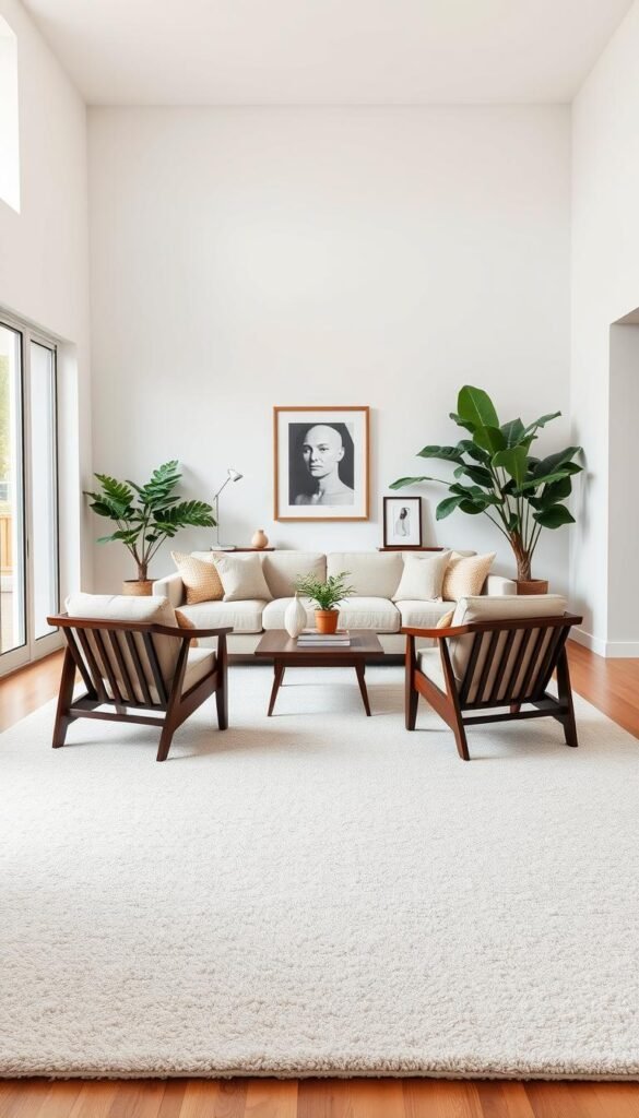
A layered neutral palette feels complete when its whites, beiges and wood tones have enough contrast to distinguish their roles. Subtle variation matters: an off-white wall, beige upholstery and a darker wood finish can read as three separate choices. Use texture and contrast to keep pale neutrals from feeling unfinished.
Farrow & Ball Dimity is a warm off-white that pairs with soft greens and blues. Sherwin-Williams Alabaster is another warm off-white that adapts to different lighting conditions. Either can sit beside muted color without turning the entire room into a cool scheme.
Benjamin Moore Brandon Beige 977 pairs with White Down 970, giving you a beige-and-white starting point. White Dove OC-17, Revere Pewter HC-172 and Classic Gray OC-23 are other neutral living-room paint options. A dark wood table or a leafy plant can define these lighter shades and make the room feel more settled.
Beige and greige can connect adjoining spaces when you want an open plan to feel related. You do not have to use one wall color throughout the whole home. Repeat a neutral or wood tone across a doorway or shared sightline, then adjust the other colors to suit each room.
Near-matching whites can look mismatched when their undertones clash. Compare each white beside the trim rather than judging it alone against a plain sample card. The trim gives you a fixed reference point that can reveal whether the wall color reads warmer, cooler, or too close to match.
For more ways to bring warmth to a quiet scheme, explore these warm neutral living room ideas. Keep adjoining open-plan areas connected by repeating one neutral or wood tone rather than matching every wall.
Pair a Gray Sofa With the Right Colors
A gray sofa is easier to coordinate once you identify whether its fabric reads blue, green or purple, or instead yellow, beige or brown. The undertone matters more than the label on the upholstery. A cool light-gray sofa suits crisp white and navy, while a warm greige sofa suits terracotta and warm oak.
A charcoal sofa can work with warm-white walls and natural wood, or with a deep green or navy accent wall. Warm-white ambient bulbs rated at 2700K-3000K can also help a room that feels cold around gray upholstery.
| Sofa type | Useful colors and materials | Lighting note |
|---|---|---|
| Light gray with cool undertones | Crisp white, navy, brushed silver, glass | Warm-white bulbs can soften a cold feel |
| Warm gray or greige | Terracotta, warm oak, mustard, brass | Warm ambient light suits the palette |
| Dark charcoal or slate | Warm white, natural wood, deep green or navy | Warm-white bulbs can add warmth |
Light Gray Sofas With Cool Undertones
A cool-gray sofa has blue, green or purple undertones. Crisp white walls make the upholstery look clean, and navy accents provide contrast without changing the room’s overall direction. Brushed-silver fixtures and glass tables can echo the cooler cast.
Light gray can also work with warm-cream walls, blush-pink accessories or muted-sage accents. Those softer colors create a gentler contrast than a strong navy. Let the sofa’s fabric guide whether the rest of the room leans cool or introduces a warmer note.
Warm Gray and Greige Sofas
A warm-gray or greige sofa has yellow, beige or brown undertones. Terracotta, warm oak, mustard-yellow cushions and brass accents build on those notes. This combination feels more natural than pairing warm fabric with a room full of icy whites and blue-gray details.
Dark Charcoal Sofas
A charcoal or slate sofa can take an emerald-green or midnight-navy accent wall. If you prefer less contrast, use warm-white walls, natural-wood furniture and terracotta or rust accents. Check the sofa in daylight and lamplight before choosing a wall color, because gray undertones can shift with illumination.
Choose Furniture and Curtains That Complement Your Sofa
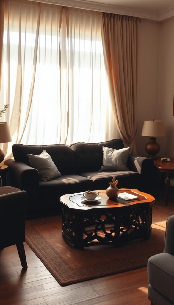
Curtains and nearby furniture work best when they either echo one sofa undertone or provide a deliberate contrast. A close match is not required for a room to feel coordinated. Let the window fabric relate to the sofa through color, texture, or contrast rather than trying to copy its upholstery.
Light-gray sofas can take navy-blue velvet or forest-green curtains for contrast. Dark-charcoal sofas can use sheer-white or soft-cream curtains to keep the room visually open. Warm-greige sofas pair well with terracotta, ochre or burnt-rose curtains.
That contrast gives the window its own role and stops the room from looking like one matching furniture set. If your sofa is cool gray, a rich curtain can bring a strong color to the room without repeating the exact fabric tone. A light curtain can soften a dark sofa and preserve a sense of space.
For other living room furniture color ideas, consider how a blue sofa could sit beside warm wood, chestnut or cognac brown, and a light neutral nearby. The warm materials keep the blue from making the room feel chilly. A pale rug or cream wall can give the darker furniture a clear outline.
Benjamin Moore Admiral Blue and Farrow & Ball Hague Blue are named deep-blue living-room wall colors. If you use a blue wall behind a blue sofa, vary the fabric or wood finish so the two do not merge visually. If the sofa is already dark, a lighter curtain can preserve visual openness without requiring another accent wall.
Test Paint and Finish Choices Before Committing
A color chip is a shortlist tool, not a reliable preview of how an entire wall will look. Paint changes with its surroundings, and a small chip cannot show the full effect of a broad surface. Compare the color in the room where you will use it, beside the finishes that will remain.
Benjamin Moore brush-on color samples are 8 oz, and its color swatches measure 4 by 8 inches. Farrow & Ball sample pots are 100 ml. A brush-on sample gives you paint to apply, while a swatch offers a larger paper comparison and a sample pot lets you try another brand’s paint.
Check Samples in the Room’s Changing Light
A color can look different across a larger painted area than it does on a small chip. View it at different times of day, then check how it reads near your floor, trim and fixed furniture. Natural light and room lighting can bring out different parts of a paint color.
Make three checks before you decide:
- View the paint in daylight.
- View it after dark with the room lights on.
- Compare it beside the floor or trim.
A favorite artwork or a large rug can also help you judge whether the color works with the room’s existing palette. If your first choice seems too bright or too gray after you see it on the wall, compare a neighboring shade. A smaller sample can narrow the options, but the room itself is the useful test.
Choose a Finish for the Room’s Use
Matte paint reduces reflections and can help hide wall imperfections. That softer surface may suit a room where you want the walls to recede behind art and furniture. The best finish also depends on how the room is used, including how much cleaning and wear the walls are likely to face.
Think about the walls around busy areas, not just the most visible feature wall. A finish that looks attractive in a quiet corner may be less practical where people brush past it. Make the final comparison at the spot where the color will be used, not only under store lighting.
Four Color Pairings With a Distinct Point of View

These four combinations show how a palette can feel playful, vivid, earthy or quietly dramatic without following one fixed style. Choose the mood before the exact shade, then adjust the intensity to suit your furnishings. In a five-color palette, let one color lead while the others appear in smaller amounts.
Compare these ready-to-picture color pairings:
- Blush pink, peacock blue and butter yellow for a playful, high-contrast mix.
- Jade green with salmon for a vivid pairing of cool and warm hues.
- Peach, olive and ochre for an earthy palette with layered warmth.
- Blue-green walls with a walnut-brown velvet sofa for a quietly dramatic room.
A practical five-color combination is warm white, walnut brown, olive green, terracotta and muted blue. Warm white can lead across the walls, walnut brown can anchor the furniture, and olive, terracotta and muted blue can appear in smaller doses through art and textiles.
One color should have the largest visual presence, while the remaining shades support it without competing. You can shift that balance by changing the wall color or choosing a more muted version of a strong accent. Choose the combination whose mood feels right in your own home, then adjust its intensity to suit the finishes you already have.
Let one color lead the five-color palette, then use the remaining hues in smaller amounts.
Choose One Palette and Make It Yours
The right palette is the one that suits the way you want to use the room and the pieces you plan to keep. Your home is the best reference: fixed furnishings and the mood you want matter more than trend pressure.
Choose the dominant color first, then write down the secondary color and accent color you want beside it. Keep the notes simple enough to guide your paint, textile, and decor choices without locking you into a rigid formula.
Write down your three chosen colors beside a photo of your room so your next decorating decision has a clear starting point.