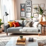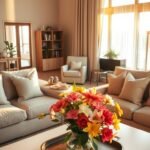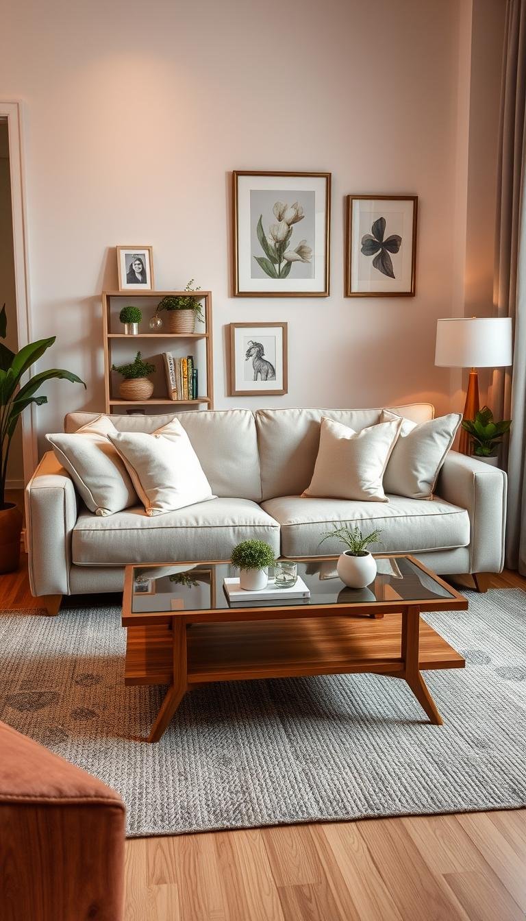
A small footprint can still hold a comfortable seat, a useful surface, and details that feel like you. Thoughtful small living room designs make limited floor space work harder without making your home feel staged or cramped.
Color drenching means using one color across several surfaces, such as the walls, trim, and ceiling. You can borrow that idea or keep your palette simple; the right choice depends on the mood you want and the light your room gets.
This guide brings together layout, furniture, color, lighting, and styling ideas for small spaces. Magazine-worthy rooms come from intentional choices, not a larger floor plan. Start by deciding what you want your room to do on an ordinary day.
Small Living Room Designs Start With a Clear Layout
The most workable small-room layout is the one that keeps the main route clear before it adds extra seating or storage. Start with movement: mark the doors, windows, outlets, and the route between entrances before shifting furniture.
Keep major living-room walkways at least 36 inches wide for unobstructed movement. In rooms under 150 square feet, furniture spacing matters even more, so a very small living room usually works better with one clear route and a compact seating group than with extra pieces.
Planning around fixed room features can help you map the space before moving anything. Draw the room, mark where doors swing, and note outlets you need for lamps or electronics.
| Plan item | What to mark | Layout goal | Watch for |
|---|---|---|---|
| Route | Door to exit | At least 36 inches clear | Keep the path continuous |
| Fixed feature | Window or doorway | Location on the sketch | Retain access |
| Focal point | TV or window | Face seating toward it | Do not obstruct circulation |
When you sketch the focal point, allow for how you use it. A window may be the main view during the day, while a TV serves the room in the evening. The furniture can acknowledge both without forcing every seat toward one wall.
Protect the main route before adding seating or storage. A clear path makes a compact room easier to use every day.
Keep your sketch simple enough to change. Paper cutouts can represent furniture, making it easier to compare arrangements without dragging heavy pieces across the floor. Sketch the room’s doorways and windows before trying a new furniture arrangement.
Choose Furniture That Fits Without Feeling Miniature
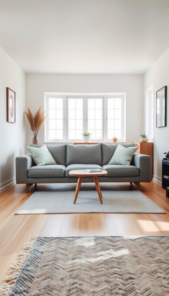
A sofa around 72 to 84 inches long is a practical starting point for many compact living rooms. Scale matters, but you do not need to fill the room with miniature furniture to make the plan work.
A suggested furniture footprint is no more than 60% of the floor area, leaving usable space for movement. In a 120-square-foot living room, that guideline gives a maximum furniture surface area of 72 square feet.
Match sofa size to the floor plan
| Piece | Suggested size | Best fit | Check before choosing |
|---|---|---|---|
| Sofa | 72-84 inches long | Small living room | Leave room for a route |
| Loveseat | 52-64 inches wide | Narrow layouts | Check remaining floor area |
| Small sectional | 80 × 80 inches | A corner | Check its full footprint |
Those sofa lengths are shorter than a standard 90- to 96-inch sofa. A loveseat can suit a narrow room, while a small sectional makes use of a corner and combines seating. Small living room designs for small spaces work best when each piece fits the footprint and leaves usable circulation.
Keep the furniture visually light
Furniture can feel lighter when its legs are exposed. Light passes beneath the frame, and more floor remains visible, so a substantial sofa does not have to look like a solid block.
A smaller room does not require every piece to be tiny. One well-scaled sofa can work better than several undersized pieces, which may make the room feel busy without providing comfortable seating. Pair the sofa with a chair or table only if the floor plan still supports them.
Check the total footprint of every piece together, not just the sofa dimensions. The full arrangement should leave the floor open enough for the way you move through the room.
Arrange Seating for Conversation, Not Just the TV
A comfortable conversation layout keeps seats close enough to talk without making the group feel crowded. Face people first: arrange the sofa and chairs so conversation feels natural, whether the TV is on or off.
Keep seating pieces 30 to 36 inches apart for a comfortable conversation area. That gives people room to sit and shift without stretching their voices across the living room.
Face-to-face seating works well when two seats can oppose each other without blocking the route through the room. It makes conversation the focus, though it may not suit a narrow layout or a room with one dominant focal point.
An L-shaped arrangement pairs a sofa with a chair, or uses a sectional and an additional seat. It fits a corner and keeps people oriented toward one another. This layout is especially useful when the room has a single focal point, such as a window or fireplace.
A U-shaped group uses a sofa and two chairs, or several connected seats, to surround a shared center. It encourages conversation among more people, but can take up too much floor space in a compact room. Choose it only when the seating pieces fit without crowding the rest of the room.
Each layout can still accommodate a screen. A chair angled toward both the sofa and TV connects conversation and viewing without forcing every seat to face the screen. That position helps when the TV shares attention with a fireplace or window.
Try the arrangement with the people who use the room most. A seat that looks balanced from the doorway may feel awkward when someone has to twist to join the conversation. Angle one chair toward the main seating group if you want a flexible seat that can serve two purposes.
Use the Area Rug to Unite the Seating Group
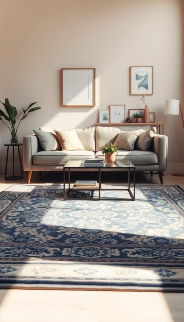
An area rug looks properly scaled when it reaches far enough under the furniture to connect the seating group. Let the rug relate to the furniture, rather than choosing a small patch that floats by itself on the floor.
A living-room rug should be at least 6 inches wider than the sofa on both sides, with 8 inches ideal. Typical living-room rug sizes are 8′ × 10′ and 9′ × 12′, though your furniture arrangement determines what fits.
Choose a rug size that reaches the furniture
A spacious-feeling layout places the rug under each furniture piece by about one-third of that piece’s depth. For example, a 21-inch-deep chair sits about 7 inches onto the rug. That overlap visually joins the chair to the seating area without covering its entire footprint.
Pick a placement that suits your layout
| Placement | Distance or position | Effect | Best suited to |
|---|---|---|---|
| Front legs on rug | Rug reaches under front legs | Grounds the seating group | Partial coverage |
| All conversational furniture on rug | About 8 inches to rug edges | Creates one unified area | A generous rug footprint |
| Sofa off rug | Gap no more than 5 inches | Prevents a too-small appearance | Anchoring only the seating area |
Leave 12 to 24 inches between an area rug and the wall to show a border of flooring. If all conversational furniture sits on the rug, leave about 8 inches between the furniture edges and rug edges. These are starting points, not reasons to force a rug into a cramped arrangement.
If the sofa stays off the rug, keep the gap between the sofa and rug to no more than 5 inches. That small distance keeps the rug visually connected to the seat. Rug placement in a compact home can also help separate a seating area from nearby uses.
Measure the sofa and chairs before buying a rug, then compare their combined footprint with the rug edges. A quick floor outline made with painter’s tape can show whether the planned size suits the room.
Find a Coffee Table That Leaves Room to Move
Keep the coffee table 14 to 18 inches from the sofa so you can reach it without losing legroom. Reach matters, but a table should not turn the space between seats into an obstacle.
A coffee table around two-thirds the length of the sofa is a common proportion starting point. The two-thirds rule is a guide, not a fixed measurement; the table’s shape and the available circulation affect the final choice.
A long rectangular table can suit a longer sofa, while a round table may fit a tight corner more easily. Leave enough room to stand up and pass through the seating group. When a table makes the route awkward, a smaller surface may be more useful than a broad one.
- Nesting tables give you flexible surface area when guests arrive.
- A storage ottoman hides items and can serve as a soft footrest.
- A round table softens tight corners and sharp furniture lines.
- A clear acrylic or Lucite table draws less visual attention.
A side table can replace a larger coffee table when the room has one main seat or a narrow route. It gives one person a place for a drink or book while leaving more of the center floor open.
Choose a top that suits what you actually set down. A tray can keep small items together on an ottoman, while a simple wood table gives a stable surface for daily use. Practical coffee table styling can keep the surface useful without filling it.
Test the gap from the seated position before settling on the table’s final place. A reach that feels easy from the sofa is more useful than a measurement that looks good on paper.
Make the TV Work Without Taking Over the Room
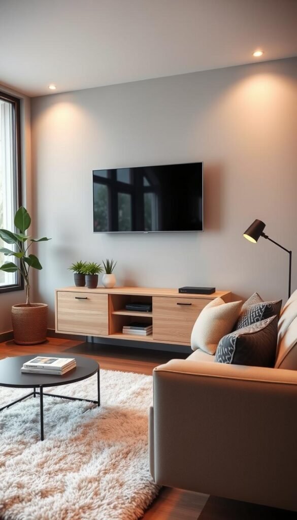
Wall-mounting a TV can free the floor area an entertainment center would otherwise occupy. Keep the screen contained by planning its storage and visual role alongside the seating.
A wall-mounted TV can eliminate an entertainment-center footprint estimated at 6 to 12 square feet. Mounting the screen does not remove the need to organize cords, media devices, and the remote.
Small living room ideas with a TV can use a few setups that keep the area streamlined:
- Mount the screen on the wall with a clear floor beneath it.
- Place the TV above a low floating console.
- Frame the screen with shelving and concealed media storage.
A floating console gives devices a home without a bulky base reaching the floor. Shelving can make the TV feel integrated, especially when doors or baskets hide equipment that does not need to stay on view.
The TV can share visual attention with artwork, a fireplace, or a window. You might position the screen on a side wall or use a console that looks like ordinary furniture, rather than making the screen the only focal point.
Think through where cords will run before mounting the screen. A clean setup also needs a place for the remote and media devices, so they do not end up scattered across the sofa or coffee table. Plan where the cords, remote, and media devices will go before mounting the screen.
Add Storage Up the Wall and Out of Sight
A small room gains useful storage when you use wall height and keep everyday clutter behind a door or lid. Use the walls for items that can stay visible, then reserve concealed storage for things you reach for often.
Floating shelves are often about 10 to 12 inches deep, depending on what they need to hold. They use vertical wall area without relying only on freestanding cabinets.
Use vertical shelving for display and books
| Storage | Size or placement | Useful for | Check |
|---|---|---|---|
| Floating shelves | About 10-12 inches deep | Books and small objects | Keep heavy items secure |
| Built-in bookcase | Floor-to-ceiling or alcove fit | Display and closed storage | Avoid crowding the main route |
| Storage ottoman | Seat plus concealed storage | Throws or toys | Leave room to open and use it |
A built-in bookcase can use an alcove or fit along a wall from floor to ceiling. Doors on the lower shelves hide everyday objects, while open sections hold books and a few chosen pieces. Vertical storage ideas can help you think beyond the floor area.
Choose closed storage for everyday clutter
Open shelves can make clutter more visible, so reserve them for edited displays. Closed doors or baskets work better for items you use daily but do not want on show.
A storage ottoman can hold throws or toys while providing another place to sit. It can replace a separate storage piece, but leave enough room to lift its lid and reach what is inside.
Place books and objects where you can reach them without climbing or moving other things. Store the items you reach for daily at a height and location you can access easily.
Choose a Color Scheme That Suits the Mood
A small room can feel airy with light neutrals or intimate with a deeper, coordinated color scheme. Choose the mood first, then use color to make the walls and furniture feel connected.
The 60-30-10 rule divides a palette into a dominant color, a secondary color, and an accent color. Treat it as a flexible planning tool, not a requirement that every room must follow.
Use light colors for an airy effect
Warm white and layered neutrals create a light base without making the living room feel stark. Add one restrained accent color through accessories, so you can change the mood later with a few smaller pieces.
Soft blue paired with white and natural textures can make a calm palette. You can try a light-blue living room palette and sample paint in different light before settling on a shade.
Try a bold or color-drenched palette
Light walls are not compulsory in a small room. Color drenching, or using one color across walls, trim, and ceiling, can create an enveloping effect when the room’s lighting and textures support it.
- Use a light neutral base with a restrained accent.
- Carry one saturated color across the walls and trim.
- Pair light walls with a darker built-in or trim.
A dark scheme can feel intentional when the room has enough light and varied texture. A painted built-in or trim can bring depth without darkening every surface.
Before committing, check how the color changes from morning to evening. Choose the feeling you want first, then test the palette in the room’s actual light.
Layer Lighting and Reflective Finishes
A mirror or polished finish can make a room feel brighter when it reflects a useful source of light. Choose the reflection with care, since a mirror shows whatever faces it.
Layer overhead light, a lamp, and focused task lighting to give the room more than one useful level of illumination. Warm light suits a relaxed seating area better than a harsh, cold glow.
A mirror can bounce existing daylight or lamplight across the room. Place it to catch a window, lamp, or attractive view rather than a crowded shelf or a blank wall you would rather not emphasize.
Reflective finishes add depth without requiring every surface to shine. Bronze mirrors, smoked or tinted glass, high-gloss paint, and polished metallics are four distinct approaches appearing in fall 2026 interiors.
Try one reflective surface as an accent. Tinted glass on a small table can catch light while keeping its color subdued, and a bronze mirror can add warmth instead of a bright silver flash.
Keep the seating area comfortable by balancing reflected light with soft materials. A lamp beside the sofa can serve reading, while overhead light helps when you need to see the whole room.
Check the reflection from the main seat before hanging a mirror. The view from where you spend time matters more than the one from the doorway.
Make the Walls Tell a Story
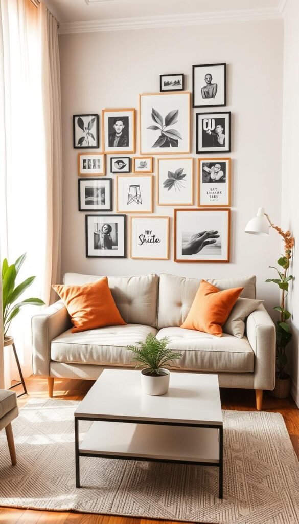
Wall art gives you a strong focal point without using any floor space. Make it personal with a piece, image, or pattern that suits the room rather than filling every open wall.
A common art-hanging guideline places the artwork’s center about 57 inches from the floor. Adjust that starting point to the furniture below it and the scale of the wall.
One oversized artwork can be easier to live with than a full wall of frames. A single image gives the room a clear focal point and needs less arranging than a gallery wall.
A compact gallery wall works when its frames or images share a color, subject, or visual style. Leave about 2 to 3 inches between frames in a compact grouping. If every image competes, the wall can feel busy instead of considered.
Patterned wallpaper or a mural brings color and detail across a larger area. It can suit a wall behind the sofa or a small alcove, where the pattern has a clear boundary rather than wrapping every surface.
Use the furniture’s height to guide the art’s position. Artwork above a sofa should feel connected to the seat, not stranded near the ceiling. A small print may need a group around it to hold its own on a broad wall.
Lay out a gallery arrangement on the floor before putting holes in the wall. You can adjust the gaps and overall shape before choosing the final positions.
Style Shelves and Tables With Intentional Layers
A styled surface feels more balanced when its objects vary in height and share a visual connection. Leave some breathing room so each object reads clearly instead of blending into a crowded cluster.
The 3-5-7 styling method groups decor in odd numbers, such as three, five, or seven objects. It is a useful option, not a rule for every shelf or table.
Group accessories in odd numbers
- Three objects make a small, simple grouping.
- Five objects can fill a wider shelf or table.
- Seven objects suit a larger display with enough open space.
A taller vase, a lower bowl, and a small framed photo make a clear group of three. The objects can connect through a shared material, color, or mood without matching exactly.
Mix texture, height, and personal objects
Vary the shapes and textures as well as the heights. Pair a smooth ceramic bowl with a rough stone object or a paper-covered book, then keep the palette close enough to feel related.
A personal object gives the display a reason to exist beyond decoration. It might be a small souvenir, a family photo, or a piece you found while traveling. Layering useful and personal decor can help a shelf feel collected rather than staged.
Choose objects that leave space for the surface to work. A coffee table still needs room for a cup or book, so move decorative pieces to a tray or one side when needed.
Edit the group until every piece has a visible shape and a reason to be there. Remove one item if the group starts to feel like a collection of unrelated small objects.
Bring in the Lived-In Design Trends of 2026
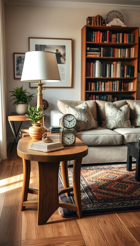
A room can look current in 2026 without matching every piece or hiding signs of age. Personal choices matter more than a showroom finish, especially in a compact room where each object stays in view.
Dark-toned woods, worn materials, patina, and personal objects are prominent themes in 2026 interiors. Walnut, espresso oak, and wenge bring depth without requiring a full room of dark furniture.
Choose materials with depth and patina
Patina is the visible character that develops as a material ages or wears. A marked wood surface or softened finish can make a room feel lived in, rather than newly assembled all at once.
Use a darker wood piece as an accent among simpler furniture. A walnut side table, for example, adds a deeper tone while leaving the larger surfaces of the room visually calm.
Mix periods, finishes, and personal pieces
Furniture from different periods, materials, and finishes can feel more personal than a matching set. Pair a vintage chair with a modern sofa, then connect them through a shared color or repeated material.
Modern small living room ideas can use these themes in a controlled way, such as one darker wood piece or one vintage object among simpler furniture. Small living room designs from 2022 can still offer layout inspiration, while personal objects and mixed finishes give an older look a current update.
Keep the mix deliberate by choosing a few pieces that matter to you. A room does not need to display every object you own to show its personality.
Choose one material or personal object that makes the room feel unmistakably yours.
Use Curtains and Height to Draw the Eye Up
Hanging curtains higher and wider than the window can emphasize the room’s vertical lines. Keep the glass clear when the panels are open, so window treatments do not block natural light.
Curtain rods are commonly placed about 4 to 6 inches above the window trim. Panels can extend about 3 to 6 inches beyond each side of the frame, depending on the wall and window.
Panels that reach close to the ceiling make the wall seem taller. When they sit wide enough to clear the glass, they can frame the window without covering daylight during the day.
A window close to the ceiling is an exception. Prioritize a clean fit over adding extra height above the trim, which may leave the panels cramped against the ceiling.
Other tall details can lead the eye upward. A tall plant adds a natural shape, a vertical bookcase uses the wall’s height, and a slim arrangement of art gives the eye a clear line to follow.
Choose fabric that hangs neatly without feeling heavy in the room. A simple panel can soften the window while keeping attention on the light and the view outside.
Open the panels fully during the day so they do not cover the glass.
Make Budget-Friendly Changes Before Replacing Furniture
The least expensive change is often to rearrange or reuse a piece you already own. Start with what is here, then decide whether a surface needs refreshing or a piece needs replacing.
A three-pass refresh prioritizes reuse, repair, and replacement in that order. The right choice depends on what the room needs, not on replacing everything at once.
- Rearrange the room or reuse furniture you already own.
- Refresh a surface with paint or washable textiles.
- Replace only the piece that does not serve the room.
Small living room ideas on a budget can begin with moving a chair or changing which side of the room holds a lamp. A washable throw or a new cushion cover can also alter the room’s look without changing its furniture.
Secondhand furniture and decor are available through Facebook Marketplace and estate sales. Check the dimensions and condition before buying, especially when a piece needs to fit a tight corner or pass through a narrow doorway.
Cost depends on the items, materials, and whether the work is DIY or hired. A paint refresh and a repair have different costs, so decide which change matters most before planning the rest.
Measure the space and inspect the condition before committing to a secondhand find.
Create Zones in an Open-Plan or Multiuse Room
A multiuse room feels more intentional when each activity has a clear place. Give each use a cue, such as a rug, lamp, or furniture arrangement that marks where one activity happens.
Two or three clear functions are easier to use than many small, competing zones. An open-plan room can support conversation, reading, and work without making each activity feel like a separate room.
A rug can anchor the conversation area and help the sofa and chairs read as one group. A floor lamp beside a comfortable chair marks a reading nook, while its light makes the seat useful after sunset.
A desk or slim surface can support work without taking over the room. Place it near an outlet if needed, and let its chair tuck close when the surface is not in use.
Lighting and furniture orientation can signal a zone without adding a divider. Turn the chair toward a reading lamp, or angle the sofa toward the main seating area, so the room keeps a natural flow.
A second rug may be unnecessary when the room is already narrow or its flooring clearly defines the area. Too many separate floor coverings can interrupt movement and make the layout feel chopped up.
Keep zone boundaries open enough for people to move through the room naturally. A useful division should clarify an activity, not create a barrier.
Try using furniture and light as the boundaries before adding a screen or bookcase. Keep the boundary between zones open enough for people to move through the room naturally.
Make One Change That Gives Your Room More Room to Breathe
A magazine-worthy room starts with a layout that works for the way you actually live. Useful beats crowded: a clear route and a few intentional pieces can matter more than filling every corner.
Choose one small change that feels manageable, such as moving a chair, clearing a surface, or changing the room’s focal point. Give the adjustment time to show whether it makes daily routines easier.
You do not have to solve the whole room in one afternoon. Choose one change to try today, then live with it long enough to see how the room feels.