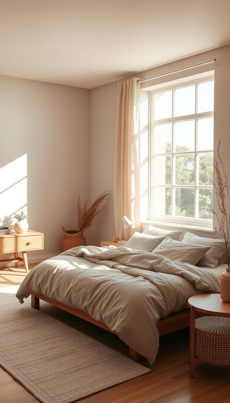
Your sleeping area deserves a fresh look. A simple coat of paint can work wonders. It transforms the entire feel of your room.
Choosing the right wall color is powerful. It sets the mood and creates a new atmosphere. Your personal space should feel like a true retreat.
This guide explores many creative options. We cover warm tones and cool hues. You’ll find bold statements and subtle shades.
These suggestions work for any size room. They suit various style preferences. Proper selection blends beauty with function.
We’ll share expert tips and designer insights. Learn how to coordinate with your existing decor. Create a space that promotes true relaxation.
Get ready for a complete makeover or a quick update. Let’s dive into the world of color possibilities for your walls.
Why Your Bedroom’s Paint Color Matters So Much
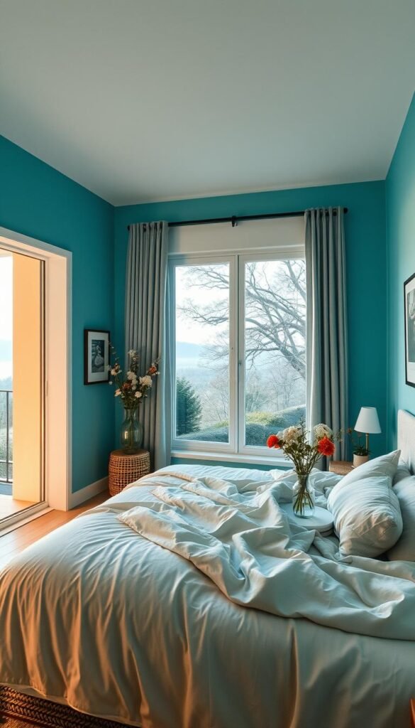
Your wall color selection plays a crucial role in how you experience your private sanctuary. It’s not just about aesthetics – the right hue can transform your entire daily routine.
Colors have profound psychological effects on your mental state. Cool blues and greens promote relaxation and calmness. Warm tones create feelings of comfort and security.
These emotional responses directly impact your sleep quality. A harmonious environment helps you unwind at night. It also sets a positive tone for your mornings.
“Paint is the quickest and most effective way to add instant impact and change the mood and atmosphere of a room. The darker the color the more light it absorbs – so reds, plums and terracottas will visually bring walls inwards, making a room look warm and inviting. Or opt for soothing natural tones that create an instant feeling of tranquility and calm.”
Your color choice can dramatically alter room perception. Lighter shades make compact spaces feel more expansive. Darker tones add cozy intimacy to larger areas.
Consider how natural light interacts with your walls throughout the day. Some hues amplify sunlight’s warmth beautifully. Others maintain their calm vibe under artificial lighting.
Your wall treatment serves as the foundation for your entire decor scheme. It should complement your existing furniture and bedding selections. A cohesive look creates visual harmony that promotes relaxation.
While personal preferences vary, certain colors have universal calming properties. Soft blues, gentle greens, and warm neutrals often work well. These hues create peaceful environments conducive to rest.
Remember that this is where you begin and end each day. Your surroundings significantly influence your mindset and energy levels. Investing time in selecting the perfect shade pays dividends in daily comfort.
The right interior design choice enhances your overall wellbeing. It creates a personal retreat that truly reflects your style. Thoughtful color selection makes your space feel like home.
How to Find the Perfect Paint Color for Your Space
Finding that ideal shade for your personal retreat requires thoughtful consideration. It’s not just about picking a color you like. You need to think about how it will work in your specific environment.
The process involves three key steps. First, define the feeling you want to create. Next, evaluate your room’s physical characteristics. Finally, test your selections before making a final decision.
Determine the Mood You Want to Create
Start by imagining how you want your space to feel. Do you crave a calming oasis or a cozy nest? Your color choice sets the emotional tone.
Cool tones like soft blues and greens promote relaxation. They create a serene atmosphere perfect for unwinding. Warm shades like browns and taupes offer comfort and security.
Think about your daily routine in this room. Your color selection should support your activities. A peaceful hue helps you drift off to sleep more easily.
Consider Your Room’s Size and Natural Light
Your room’s physical characteristics greatly influence color perception. Light plays a crucial role in how colors appear. The same shade looks different in various lighting conditions.
Large rooms with abundant sunlight can handle darker tones. These colors absorb light and create intimacy. Smaller spaces benefit from lighter shades that reflect light.
Observe how sunlight moves through your space during the day. Note which walls get direct light and which stay shaded. This awareness helps you predict how colors will behave.
“The amount of light in your room and the wall’s base color will affect the tone of the paint. Always consider how natural and artificial lighting will interact with your chosen shade throughout the day.”
Here’s a quick reference table showing how colors work in different conditions:
| Room Type | Recommended Tones | Visual Effect |
|---|---|---|
| Small, limited light | Light neutrals, soft pastels | Creates airy, spacious feeling |
| Large, abundant light | Deeper shades, rich colors | Adds warmth and coziness |
| Medium, balanced light | Mid-range tones, muted colors | Provides comfortable balance |
Always Do a Patch Test Before You Commit
Never skip testing paint samples on your actual walls. Colors look completely different in your home than in the store. Lighting, existing decor, and wall texture all affect the final look.
Paint large sample patches on different walls. Observe them at various times of day. See how they look under both natural and artificial light.
Test multiple options side by side for comparison. This helps you see subtle differences between similar shades. You might discover that your second choice works better than your first.
This simple step prevents expensive mistakes. It ensures you’ll love your final selection for years to come. Taking this extra time makes all the difference in your interior design project.
Warm and Cozy Paint Tones for a Snug Retreat
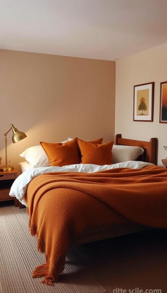
Embrace the comforting embrace of warm hues that create an intimate atmosphere. These inviting tones wrap your space in a cozy cocoon, making it feel safe and welcoming.
Warm colors have a scientific basis for promoting relaxation. They can actually help reduce stress levels by creating a sense of security. This makes them perfect for your personal sanctuary.
Warm Taupe for Serene, Luxe Hotel Vibes
Designer Alison Giese chose warm taupe to create what she calls “serene space with luxe hotel vibes.” This sophisticated shade balances masculine and feminine elements beautifully.
She explains their approach: “We chose warm colors and a balance of masculine and feminine patterns.” This creates a harmonious environment that feels both elegant and comfortable.
Consider Farrow & Ball’s Elephant’s Breath or Benjamin Moore’s Revere Pewter. These rich taupe options work well with natural wood tones and soft textiles.
Mustard Yellow to Exude Pure Joy
Amber Guyton selected mustard yellow because “yellow exudes joy” and pairs wonderfully with the whole rainbow. This vibrant choice brings energy and happiness to any room.
This cheerful tone works beautifully with both warm and cool accent colors. Try Benjamin Moore’s Hawthorne Yellow or Sherwin-Williams’ Mustard Seed.
Balance this bold option with neutral furniture and natural materials. This prevents the space from feeling overwhelming while maintaining its joyful character.
Mauvey Beige for a Calming, Versatile Backdrop
Kristen Peña chose a mauvey beige that “reads slightly pink when the sunlight hits it.” This creates a calming bedroom environment that changes throughout the day.
This versatile backdrop works with various design styles from modern to traditional. It provides warmth without being too assertive.
Look at Farrow & Ball’s Setting Plaster or Benjamin Moore’s Ballet White. These shades offer that perfect mauve-beige balance that adapts to changing light conditions.
Butter Yellow to Emphasize Beautiful Natural Light
Adam Ben Wagner used custom buttery-yellow plaster to “emphasize the beauty of the natural light” in a California home. This approach maximizes the room’s connection to outdoors.
This soft yellow tone amplifies sunlight beautifully without being too bright. It creates a gentle glow that enhances the room’s natural assets.
For similar effects, consider Benjamin Moore’s Weston Flax or Sherwin-Williams’ Creamy. These colors work particularly well in sun-filled spaces.
Warm White for a Soft, Earthy Neutral
Minnette Jackson used warm white (Pointing by Farrow & Ball) in a guest room that gets the best light. She created “a neutral palette with earthy elements” that feels both clean and cozy.
This white shade provides flexibility while maintaining warmth. It serves as an excellent foundation for layered textures and natural materials.
Other great options include Benjamin Moore’s White Dove or Sherwin-Williams’ Alabaster. These warm whites prevent that sterile feeling some brighter whites can create.
When working with warm tones, balance them with cooler elements. Add crisp white linens, silver accents, or blue-gray accessories. This creates visual interest without losing that cozy feeling.
Your warm color selection should complement your existing furniture and personal style. Test samples in your actual space before making a final decision.
Cool and Soothing Hues for a Restful Ambiance
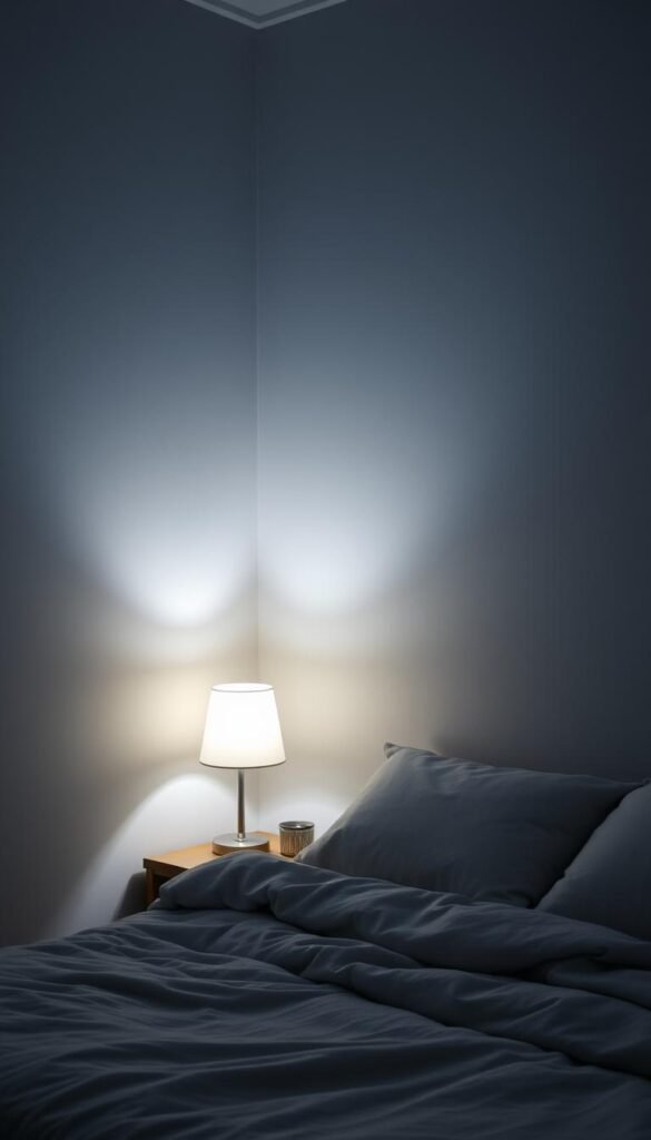
Transform your personal sanctuary with cool, soothing colors that promote deep relaxation. These tones create a peaceful environment perfect for unwinding after long days.
Cool shades naturally lower heart rates and reduce stress levels. They help you achieve more restful sleep patterns throughout the night. Your space becomes a true retreat from daily pressures.
Steely Gray for a Unified, Color-Drenched Look
Allison Willson selected Piedmont Gray by Benjamin Moore for sophisticated color-drenching. This approach creates visual harmony in spaces with complex architectural details.
The steely gray tone prevents the room from feeling “too busy with all the different depths.” It provides a cohesive backdrop that simplifies your overall design.
This shade works beautifully for monochromatic schemes. Pair it with lighter and darker gray accents throughout your space.
Soft Blue for a Calming and Refreshing Vibe
Amy Knerr chose Summer Shower by Benjamin Moore for its refreshing qualities. She describes it as a “soft, refreshing shade” that matures gracefully.
This blue option remains timeless and sophisticated through changing trends. It creates a calming vibe that supports relaxation and mental clarity.
The soft blue works particularly well in morning light. It helps create a gentle awakening experience each day.
Muted Green with Blue Undertones for a Serene Feel
Minnette Jackson used Sea Salt by Sherwin-Williams to achieve serene feelings. She wanted walls that felt like a “private little treehouse” escape.
This muted green with blue undertones creates watery, organic sensations. It brings nature’s calming influence into your personal room.
The color palette of watery blues and greens promotes mental tranquility. It feels both refreshing and grounding simultaneously.
“Green is known to calm the mind and provide a restful backdrop while calming blue is another color that will create a soothing bedroom vibe.”
Sea Salt Green for a Watery, Treehouse Escape
Sea Salt green specifically creates organic, natural feelings throughout your space. Its watery quality evokes coastal retreats and forest escapes.
This choice works exceptionally well in sun-drenched rooms needing cooling effects. It maintains its serene character under both natural and artificial light.
Consider Benjamin Moore’s Quiet Moments or Sherwin-Williams’ Rain for similar effects. These colors offer that perfect blue-green balance.
Balance cool colors with warm elements to prevent clinical feelings. Add natural wood tones, cream textiles, or brass accents throughout your interior.
Test these colors on your actual walls at different times. Observe how they transform throughout the day with changing light conditions.
Cool tones create depth through subtle variations rather than contrast. Layer similar shades for a sophisticated, monochromatic scheme that feels both cohesive and interesting.
Bold and Statement-Making Colors for Maximum Impact
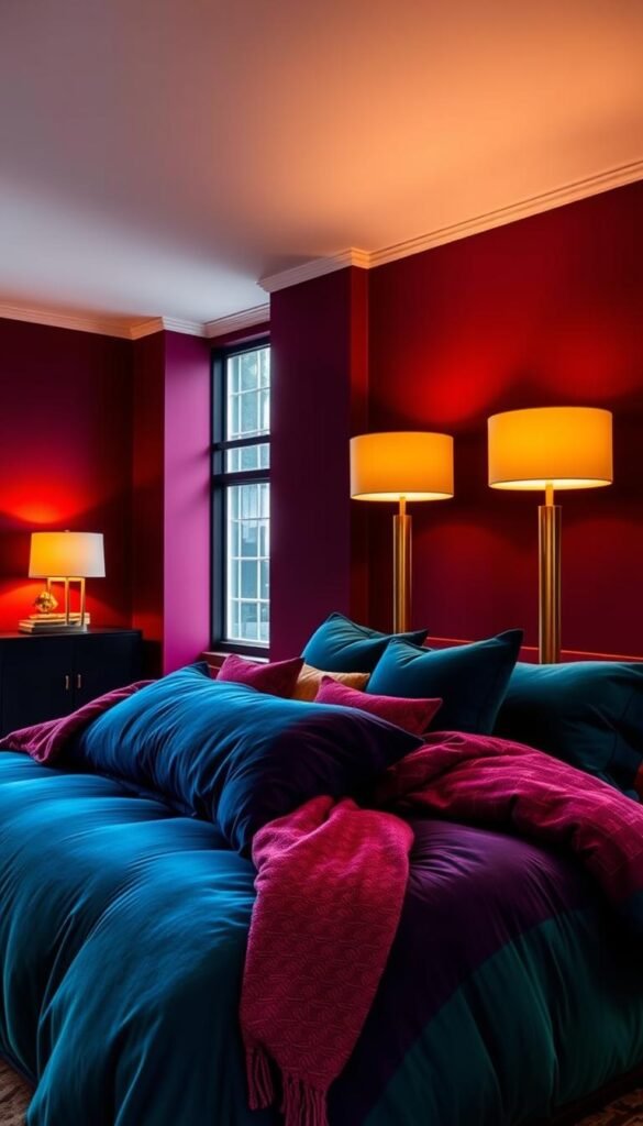
Step beyond safe neutrals and embrace hues that create unforgettable visual impact in your personal space. These daring shades transform ordinary rooms into extraordinary expressions of individuality.
Statement colors work particularly well in spaces with architectural character. They highlight unique features and create focal points that draw the eye.
Hot Pink for a Vibrant and Unforgettable Statement
Jenna Gross selected Pink Starburst by Benjamin Moore for what she calls a “vibrant interior.” This hot pink choice makes a bold personality statement that energizes the entire room.
Balance this intense shade with neutral furniture and clean-lined decor. This prevents the space from feeling overwhelming while maintaining its vibrant character.
Foggy Red for a Soft and Unexpected Drama
Krysta Gibbons chose Cedar Ridge by Benjamin Moore for “soft and unexpected drama.” She enhanced the effect with Hickory Stick in the bed niche for added depth.
This foggy red option creates sophisticated warmth without traditional red’s intensity. It works beautifully with both modern and traditional design elements.
Blue-Black for a Depth That Goes Beyond Navy
Breegan Jane selected blue-black for her son’s bedroom, going “deeper than navy.” She balanced the depth with graffiti-style art that adds personal flair.
This rich tone creates incredible depth and sophistication. It feels both dramatic and restful when paired with adequate lighting.
“When using intense colors, remember they affect the room’s perceived size. Darker shades absorb light and make spaces feel more intimate, while brighter tones expand the visual space.”
Chartreuse for a Lively Balance of Yellow and Green
French & French used chartreuse to strike “a balance between the brightness of yellow and natural tones of green.” They softened the effect with blue and white wallpaper.
This lively color brings energy and freshness to any space. It works particularly well in rooms with abundant natural light.
Mahogany for a Serene Yet Rich Brownish-Red
Lindsay Rhodes used Mahogany by Farrow & Ball for serene richness. She added playful cabana stripes in green and yellow for contrasting energy.
This brownish-red shade creates warmth and sophistication simultaneously. It feels both grounded and luxurious in execution.
When working with statement colors, consider using them on accent walls rather than all four surfaces. This creates impact without overwhelming the senses.
Balance intense hues with neutral elements throughout your interior. White trim, natural wood tones, and simple textiles help ground bold paint color ideas.
Test these tones in your actual room before committing. Observe how they transform throughout the day with changing light conditions.
Remember that bold doesn’t have to mean bright. Deep, saturated shades often create more sophistication than neon-bright options.
Nature-Inspired Greens for a Grounding Atmosphere
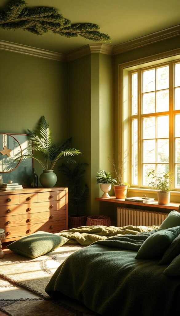
Bring the calming essence of nature indoors with earthy green tones that create a peaceful sanctuary. These organic shades connect your personal space to the natural world, promoting relaxation and reducing stress.
Green hues have proven psychological benefits for sleep environments. They lower heart rates and create feelings of balance and harmony. Your space becomes a true retreat from daily pressures.
Different green shades work beautifully in various lighting conditions. North-facing rooms benefit from warmer greens with yellow undertones. South-facing spaces can handle cooler, blue-based greens.
Lively Green for a Visual Transition with Impact
Kelly Hurliman selected Herb Garden by Benjamin Moore for dramatic effect. This lively shade creates “visual transition from the white walls to the yellow wallcovering.”
This approach adds significant impact between different wall elements. It creates visual interest without overwhelming the senses. The vibrant green works as a beautiful bridge color.
Consider this option for rooms with architectural features or accent walls. It provides enough contrast to highlight special elements while maintaining cohesion.
Mossy Green for an Enchanting Forest Retreat
Liz Carroll transformed a bunkroom using Great Barrington Green by Benjamin Moore. She created an “enchanting, forest-like retreat” with this rich mossy tone.
This deep green shade pairs beautifully with natural browns and neutral textiles. It evokes the feeling of being nestled among trees. The color creates instant coziness and connection to nature.
Use this choice in rooms with adequate natural or artificial light. It works particularly well in spaces where you want to create intimacy and warmth.
Yellow-Green for an Invigorating and Offbeat Choice
Churlish Green by Farrow & Ball offers an unexpected color solution. This yellow-green option “invigorates a tired sleep space” with fresh energy.
It pairs wonderfully with bold jewel tones for impactful yet calming palettes. This unconventional choice brings personality without sacrificing relaxation.
The Decorilla team notes that olive greens with gray undertones offer exceptional versatility. They “pair well with many other colors too – especially nature-inspired ones.”
Create layered green schemes using multiple shades and textures. Combine lighter and darker greens for depth and dimension. Add natural materials like wood, stone, and linen to enhance the organic feel.
Green works equally well in traditional and contemporary design schemes. It brings life to minimalist spaces and complements ornate traditional decor.
Test your green paint color ideas at different times of day. Observe how natural light transforms each shade throughout daylight hours.
Your bedroom color selection should reflect your personal connection to nature. Choose greens that make you feel grounded, peaceful, and restored.
Unexpected and Playful Color Combinations
Break free from traditional color rules and explore combinations that express your unique personality. These creative pairings add energy and character to your personal retreat.
Mixing unexpected hues creates visual interest and depth. It transforms ordinary spaces into extraordinary expressions of style. Your room becomes a true reflection of your creative spirit.
Designer Kim-Joy Hewlett demonstrates this approach beautifully. She used contrasting stripes in pink and chocolate brown to accent the bed area. This playful treatment creates a focal point without overwhelming the space.
She softened the bold pattern with neutral drapery and warm lighting. This balance keeps the room feeling adult-appropriate while maintaining its whimsical charm. The combination feels both sophisticated and fun.
Pink and Brown Stripes for a Playful Accent
This stripe pattern works particularly well behind headboards or on feature walls. It adds vertical interest that can make ceilings appear higher. The contrast between warm brown and vibrant pink creates dynamic energy.
Consider using this technique in rooms with simple furniture and clean lines. The pattern becomes the star while other elements provide calm balance. Test your stripe width and color intensity before committing fully.
Peachy Pink for a Universally Flattering Calm
French & French selected an orangey-pink that offers universal flattery. This shade creates calming effects while maintaining sophistication. It develops richer character when paired with vibrant, darker hues.
They enhanced the look with a mural band at the ceiling crease. This drawing technique highlights architectural features beautifully. The peachy tone works across various lighting conditions and room sizes.
“Layering colors together and allowing one color to meet another just beyond the corner of the room has an amazing effect on a space. It makes a room feel less like a box and more like a gallery for the things in your life that you really care about.”
Color layering creates depth and movement throughout your space. It guides the eye around the room in intentional ways. This approach works particularly well in creative personalities’ spaces.
Test combinations using digital tools or large physical samples. Observe how colors interact at different times of day. Some pairs might surprise you with their harmonious relationship.
Scale bold combinations appropriately for your room’s proportions. Larger spaces can handle more intense applications. Smaller rooms benefit from subtle touches of unexpected pairings.
Remember that playful doesn’t mean childish. These combinations bring joy and personality to adult spaces. They create environments that feel both sophisticated and personally expressive.
Creative Paint Techniques Beyond a Single Wall Color
Elevate your personal space with innovative painting methods that add depth and character. These approaches transform ordinary walls into artistic statements without overwhelming your room.
Creative techniques solve common design challenges beautifully. They add visual interest while maintaining harmony. Your space gains personality through thoughtful application.
Painting an Accent Wall Behind Your Bed
Create a stunning focal point by painting the wall behind your sleeping area. This technique draws attention to your bed as the room’s centerpiece.
Choose a bold color that complements your overall scheme. The accent wall adds drama without dominating the entire space. It creates depth and dimension in your interior.
Consider warmer tones for coziness or cooler shades for serenity. This option works particularly well in rooms with neutral surrounding walls.
Trying the Color Drenching Trend on Walls and Ceiling
Embrace the unified look of color drenching throughout your entire room. This approach creates seamless visual flow from walls to ceiling.
Allison Willson used Piedmont Gray by Benjamin Moore for sophisticated results. She found it “didn’t feel too busy with all the different depths and details.”
This technique works beautifully with complex architectural features. It simplifies visual clutter while adding rich depth. Your choice of hue becomes the defining element.
Painting Half Your Wall for a Balanced Look
Create visual balance with two-tone walls that ground your space. Little Greene suggests this approach for both paneled and plain walls.
They recommend “a warm, earthy terracotta or red” on the lower section. Pair it with “a neutral tone on the top section of wall.”
This design technique creates stability through darker colors at the bottom. It adds interest while maintaining airiness above.
Using Paint to Create a Faux Headboard
Transform your sleeping area with a painted headboard effect on the wall. This creative way adds definition without physical furniture.
Paint the wall area behind your bed in your chosen color. Create a block effect that frames your sleeping space beautifully.
Add wooden trim for contrast edging if desired. This style option offers flexibility for changing decor preferences.
Here’s a quick guide to choosing the right technique for your space:
| Room Feature | Recommended Technique | Visual Result |
|---|---|---|
| Large blank wall behind bed | Accent wall painting | Creates strong focal point |
| Complex architectural details | Color drenching | Unifies diverse elements |
| Standard height ceilings | Half-wall painting | Adds vertical interest |
| Minimalist bed frame | Faux headboard | Adds definition without clutter |
These techniques work for various bedroom layouts and design preferences. They offer creative solutions for rental properties too.
Always test your paint color ideas before committing. Observe how different techniques affect your room’s perception throughout the day.
Your creative choice should reflect your personal style while enhancing relaxation. These methods transform ordinary spaces into extraordinary retreats.
Don’t Forget About Your Furniture and Floors
Your transformation journey doesn’t end at the walls – consider how furniture and floors complete your space. These elements work together to create a harmonious environment that feels both fresh and cohesive.
Thoughtful updates to these surfaces can dramatically enhance your room’s overall appeal. They provide opportunities to introduce additional color and texture throughout your interior.
Giving Old Furniture a Bold New Life with Paint
Annie Sloan recommends chalk paint for furniture transformations. She notes it’s “self-levelling and self-sealing, so gives excellent coverage with minimal effort.”
This option works beautifully on various furniture pieces. Dressers, nightstands, and chairs become statement pieces with the right color choice.
Consider these durable product recommendations for daily use:
- Annie Sloan Chalk Paint for vintage charm
- Benjamin Moore Advance for hard-wearing surfaces
- Sherwin-Williams Emerald Urethane for high-traffic pieces
Preparation ensures long-lasting results. Clean surfaces thoroughly and lightly sand before application. This creates the perfect foundation for your new look.
Painting Woodwork and Alcoves for a Decadent Touch
Katie Lion suggests painting built-in cupboards in “inky teal for sophistication” while using “paler blue for the walls and ceiling.” This approach balances darker tones throughout your space.
Alcoves and architectural details deserve special attention. Painting these elements creates depth and visual interest. They become featured aspects of your room’s design.
Consider this approach for various woodwork elements:
- Window trim and baseboards for cohesive framing
- Built-in shelving units for integrated storage solutions
- Architectural niches for highlighting special items
Transforming Your Floor with a Checkerboard Pattern
Isabelle Lomas created a “fun checkerboard pattern on the floor – a fun element that is also hardwearing” while keeping walls plain. This technique adds personality underfoot.
Floor patterns offer durable decorative solutions. They withstand daily wear while providing visual excitement. This choice works particularly well in rental situations.
Marianne Shillingford suggests another creative approach: “paint up some canvases in colors you love and use them to add life to the walls. It can tie all your belongings together for a harmonious look.”
This rental-friendly option allows color experimentation without permanent commitment. You can change your artwork as your style evolves over time.
Here’s a comparison of different painting techniques for various surfaces:
| Surface Type | Recommended Paint Type | Preparation Needed | Best For |
|---|---|---|---|
| Wood Furniture | Chalk Paint | Light sanding, cleaning | Vintage pieces, dressers |
| Metal Furniture | Enamel Paint | Primer, degreasing | Bed frames, tables |
| Wood Floors | Floor Enamel | Sanding, priming | Checkerboard patterns |
| Built-in Cabinets | Alkyd Paint | Cleaning, deglossing | Alcoves, storage units |
Color selection for furniture should complement your walls rather than compete. Choose tones that harmonize with your overall scheme. This creates visual flow throughout your bedroom.
Consider pearlized treatments or stenciled designs for added elegance. These techniques transform ordinary pieces into extraordinary statements. They unify disparate furniture into cohesive collections.
Maintenance ensures your painted surfaces stay beautiful. Keep touch-up paint available for quick repairs. Clean surfaces gently to preserve your decorative work.
Your creative choices should reflect your personal style while enhancing relaxation. These methods complete your space transformation beautifully.
Pro Tips for a Perfect Paint Job Every Time
Achieving professional-looking results with your transformation requires attention to detail and proper technique. These expert insights help you avoid common mistakes while creating beautiful, lasting results.
Proper planning makes your project smoother from start to finish. You’ll save time and materials while achieving better outcomes. Thoughtful preparation ensures you love your final look.
Coordinating Your New Wall Color with Existing Decor
Your new color should harmonize with furniture and accessories already in your space. Decorilla recommends thoughtful coordination: “Will your wall color complement or contrast your existing elements? Intense colors set against bold furnishings create an eclectic look but could be too energizing for a bedroom.”
Balance intense hues with neutral features throughout your room. Justyna Korczynska advises: “Always incorporate neutral and pale features through furniture, accessories, or other paint colors that light up the space. If painting walls deep, make sure you paint the ceiling crisp white.”
Consider these coordination approaches for different styles:
- Monochromatic schemes using varying shades of one color
- Complementary pairs that create visual interest without conflict
- Neutral bases with colorful accents for flexibility
Choosing the Right Finish for Your Bedroom Walls
Finish selection affects both appearance and durability in your interior. Different sheens work better for various surfaces and conditions.
Matte finishes hide imperfections beautifully on walls. They create soft, non-reflective surfaces perfect for sleeping environments. This option works well in low-traffic areas.
Eggshell offers slight sheen with good durability. It withstands gentle cleaning while maintaining sophisticated appearance. Many designers recommend this for master bedrooms.
Semi-gloss works best on trim and doors. It provides easy cleaning and highlights architectural details. Use this choice for woodwork and accents.
Proper surface preparation ensures flawless application and longevity. Clean walls thoroughly to remove dust and grease. Repair any holes or cracks with spackling compound.
Light sanding creates better paint adhesion. Use 120-grit sandpaper for smooth surfaces. Wipe away dust with tack cloth before painting.
Quality tools make application easier and produce professional results. Invest in good brushes for cutting in edges neatly. Use rollers appropriate for your wall texture.
Painter’s tape creates sharp lines between colors. Remove it before paint fully dries to prevent peeling. This technique ensures clean transitions.
Calculate paint quantities accurately for your room size. Measure wall square footage excluding windows and doors. Most paints cover 350-400 square feet per gallon.
Buy slightly more than calculated for touch-ups later. Keep leftover paint properly sealed for future repairs. This way maintains color consistency.
Timing considerations affect your project’s success. Check weather conditions if ventilating the space. Ideal temperatures range between 50-85 degrees Fahrenheit.
Follow recommended drying times between coats. Most paints require 4-6 hours before recoating. Wait longer in humid conditions.
Cutting in techniques create neat edges without tape. Use a quality angled brush for precision work. Maintain wet edge to avoid lap marks.
Common application mistakes include overloading brushes and rolling too quickly. Work in manageable sections for consistent coverage. Maintain wet edge to blend sections seamlessly.
Troubleshoot common problems like drips and streaks immediately. Smooth drips with brush before they dry. Feather out streaks while paint remains wet.
Uneven coverage often requires additional coats. Ensure proper drying time between applications. This prevents underlying issues from showing through.
Maintain painted surfaces with proper cleaning techniques. Use soft cloths and mild cleaners for regular dusting. Avoid abrasive materials that might damage finish.
Keep touch-up paint for quick repairs of scratches or marks. Store in airtight containers away from temperature extremes. Label containers with color name and room location.
Consider professional help for complex situations. High ceilings, intricate details, or time constraints might warrant experts. DIY works well for standard rooms with good preparation.
Your final choice between professional and DIY depends on skill level and project complexity. Either option can achieve beautiful results with proper planning.
Your Journey to the Perfectly Painted Bedroom Starts Now
Your walls stand ready to become the canvas for your unique style and comfort. This exploration of color possibilities shows how transformative the right shades can be.
Remember that small steps lead to big changes. Start with sample testing or a single accent wall behind your bed. This approach builds confidence before full commitment.
Your personal sanctuary should reflect who you are while promoting restful sleep. Trust your instincts while considering how natural light affects your chosen tones.
This cost-effective update dramatically changes your space’s feeling. Professional results come with proper preparation and technique.
Your color choice can evolve as your tastes change over time. Embrace this creative opportunity to enhance your daily wellbeing through beautiful surroundings.