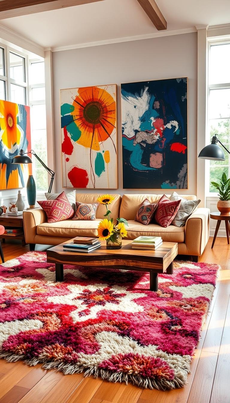
A room can feel happier with one colorful sofa, a few repeated accents, or an entire enveloping palette. If you want a brighter, more personal home, color can help your living space show more of your personality and create a warmer mood. The goal is not to fill every corner with a different hue. It is to choose colors that feel good to you and give them room to breathe.
These ideas offer expressive palettes and simple ways to bring color into your space, from a confident focal point to small, easy-to-change details. You can make a lively room feel inviting by repeating colors with care and balancing them with quieter surfaces. Your favorite color, used with intention, can make the space feel unmistakably yours.
What Makes Colorful Decor Feel Cheerful, Not Chaotic?
A cheerful palette feels intentional because a few colors recur instead of competing for equal attention. Repetition gives your living room a visual rhythm, while a clear dominant color helps the other hues find their place.
A practical palette uses 3-5 visible colors: one dominant color, one or two supporting colors, and a smaller accent. The dominant color carries the most visual weight. Supporting colors add variation, while an accent gives you a bright note without taking over.
Repeat a chosen accent in 2 or more places, such as a lamp and a framed print. The objects do not need to match exactly; a shared hue is enough to connect them. Color-wheel conventions can help you find combinations, but they are tools, not rules.
Give one color the leading role, let supporting colors build the scene, and use an accent sparingly.
Color can shape the room’s mood. Cool hues may feel calm, warm hues can add coziness, bright combinations often feel playful, and dark contrasts can feel dramatic. A sunny yellow accent, for instance, can lift a quiet palette without changing its whole character.
When colors share a clear relationship, colorful living feels more considered than crowded. Houzz’s advice on cohesive color flow also emphasizes how repeating hues can connect spaces and sightlines. Before choosing a color, decide whether you want the room to feel calm, warm, playful, or dramatic.
Choose a Color Story Before You Buy
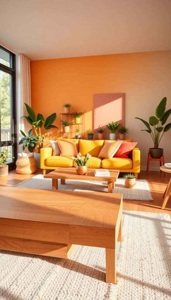
A palette becomes easier to shop for when you name its colors and decide where each one will appear. Start with a mood, then choose a few colors and a material that makes them feel at home together.
Write down the palette before buying paint or furnishings. A mood board, a saved photograph, or a few fabric swatches can help you see the combination as a whole. Your color palette does not need exact matches: related shades can repeat in paint, textiles, and wood.
| Style direction | Palette | Furniture or material anchor | Visual effect |
|---|---|---|---|
| Modern warm | Brown, cream, black, olive | Wood | Grounded |
| Soft cozy | Terracotta, ivory, sage, blush | Linen or wood | Gentle warmth |
| Bold eclectic | Cobalt, pink, yellow, emerald | Art or upholstery | Expressive contrast |
| Minimal colorful | White, walnut, one bold color | A single focal piece | Restrained energy |
Use the table to decide which color will appear most often and which belongs on a smaller surface. For example, a cream wall can leave room for olive upholstery and a black frame. A walnut table can connect either choice without needing to match every brown tone in the room.
For more palette planning, these mid-century living room ideas show how earthy accents can work with wood and simple shapes. Keep one or two colors dominant, then let smaller accents supply variety.
How to Make Living Room Designs Colorful With 15 Cheerful Palettes
A pastel trio of soft blue, mint, and blush creates a playful look that stays light when each piece has breathing room. One clear anchor makes a palette easier to adapt, whether you prefer a modern living room or a collected, eclectic space.
Choose supporting hues and a grounding material before deciding how much color to use. One room can feel joyful without using every color at full strength. Keep the brightest hue on one focal surface, then use a neutral or natural texture to steady the rest.
These combinations work as starting points, not shopping lists. Repeat a hue where it makes sense, and let the material or neutral provide a visual pause.
Pastels and light-filled pairings
- Pastel blue anchors mint and blush; pale wood or warm white keeps this trio airy.
- Peach leads, with cream and soft apricot nearby; linen and a woven texture add comfort.
- Fresh green anchors coral and ivory; natural wood balances the lively contrast.
- Turquoise leads, with yellow and leafy green; a white backdrop keeps the mix bright.
- Muted pink and soft green share attention; upholstered neutrals make the pairing gentle.
These lighter schemes suit a room where you want color without a heavy visual effect. Soft upholstery can also make brighter hues feel more relaxed, rather than sharp or overly polished.
Warm and earthy combinations
- Terracotta walls anchor cream and ochre; layered textiles add depth without crowding the color.
- A golden sofa leads against a neutral backdrop; wood and ivory keep the focal piece welcoming.
- Mustard anchors charcoal and cream; a light floor adds contrast beneath the deeper tones.
- A saturated sofa carries the main hue; a patterned rug adds support against quiet walls.
- A rich-hued rug leads with rust and blue; warm wood grounds the colors underfoot.
A rug-led palette lets you pull a few colors from one piece instead of inventing a scheme from scratch. For other modern chic living room ideas, combine clean-lined shapes with color that feels personal.
Jewel tones and confident contrast
- Deep blue anchors orange and textured neutrals; woven details soften the contrast.
- Emerald leads beside teal and red; a cream background gives the saturated hues room.
- Pink walls set off geometric art in black and yellow; white trim keeps the shapes crisp.
- A neutral sofa grounds colorful artwork in cobalt and coral; a dark frame adds definition.
- Bright accents lead over clean lines; walnut or another dark neutral gives the room structure.
Saturated colors can share a room when one remains the clear anchor. Choose the combination that fits both your favorite colors and the amount of visual energy you want at home.
Which 2026 Color Trends Can You Make Your Own?
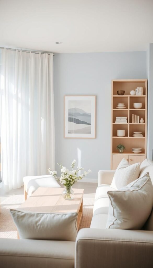
Pale blue, teal, and amber offer three different ways to bring a current color direction into a room. Use trends as inspiration, not a checklist, and choose a version that fits your home and the colors you already enjoy.
Frosty pale blue is a clear, crisp hue, distinct from saturated denim or Swedish blue. Desaturated sky blue has a softer effect and pairs well with neutral interiors and wood tones. Teal can feel rich beside warm neutrals or wood, while amber, also called burnt caramel, blends rust, mustard, and brown.
Amber can work as a warm neutral, especially when you pair it with cream. Sage green also sits comfortably beside warm beige. Benjamin Moore White Dove (OC-17) is a soft white option for keeping living areas bright, while Sherwin-Williams Evergreen Fog (SW 9130) is a muted green-gray suggested for built-in shelving.
Pale blues and blue-greens
WGSN named Transformative Teal its 2026 color of the year. You can use teal on a smaller feature or an upholstered piece, then balance its depth with warm wood or a sandy neutral. Zillow’s 2026 paint color research suggests pale blue living rooms may positively influence prospective buyers’ offers, but survey-based estimates do not guarantee a higher sale price.
A range of 2026 colors to watch also includes desaturated sky blue, pistachio-chartreuse, lemon-vanilla, and red. These hues can add freshness without forcing every surface into a strong shade. Choose a softer version if you want the color to sit quietly with existing finishes.
Earthy ambers and greens
Umber and ochre offer deeper earthy notes, while sage can soften a scheme built around warm beige. Sherwin-Williams Universal Khaki (SW 6150) is a sandy neutral and the 2026 Color of the Year for the HGTV Home by Sherwin-Williams collection.
The 2026 Honest Essentials collection includes Universal Khaki, Neutral Ground, Cordovan, Lemon Chiffon, Creamy, Griffin, Reddened Earth, Still Water, Hazel, and Secret Garden. That range gives you options from pale neutrals to richer colors, without suggesting that every room needs several trend hues.
Soft whites and sandy neutrals
Warm beige, sage green, and a soft white can form a flexible background for color. Let a sandy neutral cover a larger area, then add a pale blue or green on a smaller feature. Use a trend on a reversible piece or a smaller painted feature if you are unsure you will love it long term.
How Does Room Direction Change the Color You See?
A north-facing room often benefits from a warmer paint choice because it receives less daylight and can read cool. Warm undertones can make the room feel more comfortable, especially when the paint also has a higher LRV.
Daylight changes by room direction, so judge paint in the light your walls actually receive. A warm white or neutral can soften the cooler feel of a north-facing space. South-facing rooms usually have brighter daylight, which can make many colors appear more vivid.
| Room condition | Daylight quality | Paint approach | Named example |
|---|---|---|---|
| North | Least daylight; can read cool | Warm undertone, higher LRV | Antique White (SW 6119) |
| South | Brighter daylight | Choose for the room’s brightness | Repose Gray (SW 7015) |
| East | Warm morning, cooler evening | Judge the actual morning-to-evening shift | Rainwashed (SW 6211) |
| West | Cooler morning, warm evening | Judge the actual evening warmth | Upward (SW 6239) |
| Little or no natural light | Mostly artificial light | Choose bulb color for the room’s use | Greek Villa (SW 7551) |
For north-facing rooms, Worldly Gray (SW 7043) is another warm-toned option. South-facing spaces can also suit Rainwashed (SW 6211) or Upward (SW 6239), depending on the finish and the daylight in your room.
East-facing rooms receive warm morning light and cooler light toward evening. West-facing rooms experience the reverse, so a paint color may shift noticeably as the day passes. The room’s actual light matters more than a label alone.
A dim room changes again under artificial light. Warm bulbs can create a cozier feel, while white or cool bulbs suit common spaces where you need more light. Explore how changing light affects color when comparing samples at different times. Check a paint sample in both daylight and the room’s usual evening lighting before settling on a color.
How Can LRV Help in a Small or Dim Room?
LRV gives you a 0-100 measure of how much light a paint color can reflect. Higher numbers reflect more light, while lower numbers indicate a deeper color that reflects less.
Use LRV to compare paint lightness, not to predict exactly how a color will look in every room. Sherwin-Williams Pure White has an LRV of 84, and Benjamin Moore White Dove has an LRV of 83.16. Those figures place both paints in the white or very-light range.
| LRV range | Category | Example or visual effect |
|---|---|---|
| 2-10; 10-20 | Dark; medium-dark | Cyberspace (SW 7076), LRV 6, reflects very little light |
| 20-40 | Medium-depth | Redend Point (SW 9081), LRV 30, reflects about 30% of received light |
| 40-55; 55-72 | Light-medium; light | More reflective than medium-depth colors |
| 73-81 | Off-white | Distinct from white or very light |
| 82-94 | White or very light, higher-chroma colors | Pure White (SW 7005), LRV 84 |
The categories are approximate: dark is 2-10, medium-dark is 10-20, medium-depth is 20-40, light-medium is 40-55, and light is 55-72. Off-white is 73-81, while white or very light, higher-chroma colors are 82-94.
Higher LRV for brighter walls
A higher-LRV paint reflects more of the light it receives, which can help a small or dim room feel brighter. It does not create extra daylight, but it can make a pale wall look more reflective than a deeper one.
For a closer comparison, Sherwin-Williams’ LRV scale lists Pure White at 84 and Redend Point at 30. LRV is a comparison tool, not a guarantee of how paint looks under every bulb or beside every finish.
Lower LRV for depth and drama
Lower-LRV paint reflects less light and can give walls more visual depth. Cyberspace has an LRV of 6, so it reflects very little light. Compare LRV alongside undertone and a real sample, especially when the room gets little daylight.
Should You Paint the Walls, Ceiling, or Trim?
A lighter shade above a deeper wall color can make a large room feel more intimate without darkening every surface. Color placement changes how the fixed parts of a room relate, so pick the surfaces that support the feeling you want.
Light colors can make a small room feel larger, while rich dark colors can make its walls feel closer. You can also carry one color across walls and woodwork for a more continuous look. A smaller painted feature gives you less surface to commit to.
- Paint one wall as a feature when you want one focused area of color.
- Use lighter-over-deeper color-blocking to make a large room feel more intimate.
- Carry color across walls and woodwork for a continuous, enveloping look.
- Choose a colored ceiling or trim to add a distinct detail without painting every wall.
Wallpaper is another way to bring color and pattern to a fixed surface. A small-scale repeat can add interest without becoming the room’s loudest feature, while a larger design makes a stronger statement.
Paint-color regret often starts with choosing from a tiny chip without checking undertones and room lighting. A small sample can make it hard to judge how a color behaves across a full wall or beside nearby finishes.
Test the wall, ceiling, or trim choice in the room before committing to all of its fixed surfaces.
Can a Colorful Sofa Anchor the Whole Palette?
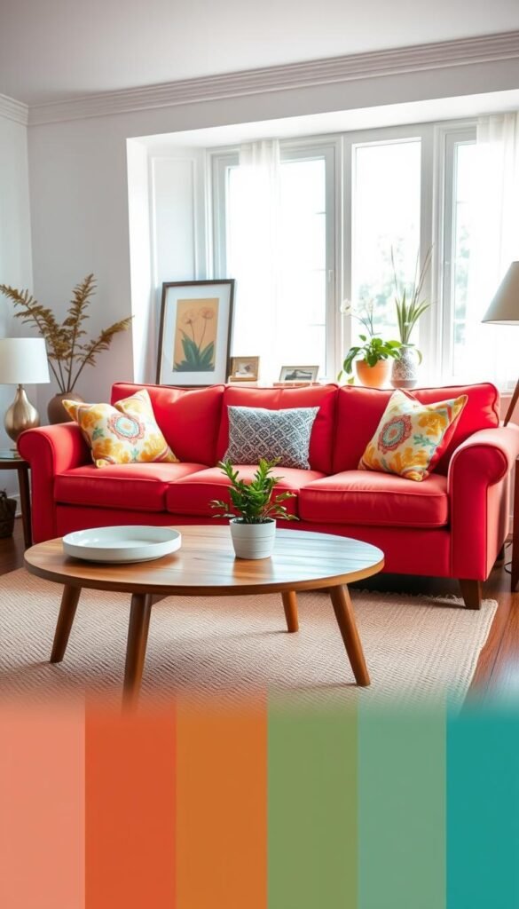
A sofa can either ground the palette in a quiet neutral or supply its most noticeable color. Choose its role first, then make sure the rest of the room gives that decision a clear place to land.
A brown or cream sofa offers a flexible base, while teal, blue, mustard, or green can make the sofa a focal color. A neutral piece works well with brighter accents, while a saturated sofa usually looks best with quieter walls and a calmer rug.
For a lower-commitment choice, keep the sofa neutral and bring color in through artwork or patterned pillows. If you choose a bold upholstery color, you can let the sofa carry most of the room’s visual weight instead of adding several equally strong surfaces.
The sofa color should relate to at least one other visible element, such as art, a rug, or an accent chair. The hues do not need to match exactly. A related shade, shared undertone, or similar level of brightness can make the connection feel natural.
Before choosing fabric, compare its color with the room’s permanent finishes and the materials you already own. A swatch beside flooring or a wood table can reveal whether the sofa feels connected or isolated.
If you are unsure about a bold sofa, choose a neutral base and test the hue on a chair or cushion first.
How Can Rugs, Pillows, and Throws Repeat Color?
A rug can introduce several colors at once, while pillows and throws repeat only the ones you want to emphasize. Use the rug as a color map, then choose a few tones to carry through the seating area.
Repeat only a handful of rug colors in smaller textiles. Pillows can pick up one hue, while a throw brings in another. This keeps the layers connected without making every fabric look like part of a matching set.
The 3-5-7 decorating rule is a flexible way to group objects by scale. It offers a composition guide, not a required count for every shelf, table, or room.
- 3 large foundational pieces help set the composition.
- 5 medium supporting pieces add another visual layer.
- 7 small decorative details provide finishing touches.
In a seating area, the foundational pieces might be the rug, sofa, and coffee table. Medium objects and small details can vary by room, so do not add decor simply to meet a number. The balance of sizes matters more than a rigid count.
A rug with a busy pattern may need simpler pillows, while a quiet rug can leave room for more texture. The 3-5-7 decorating rule works best as a loose guide, not a shopping target. Step back from the seating area and remove one textile if the layers compete for attention.
Can Art or Pattern Set the Color Scheme?
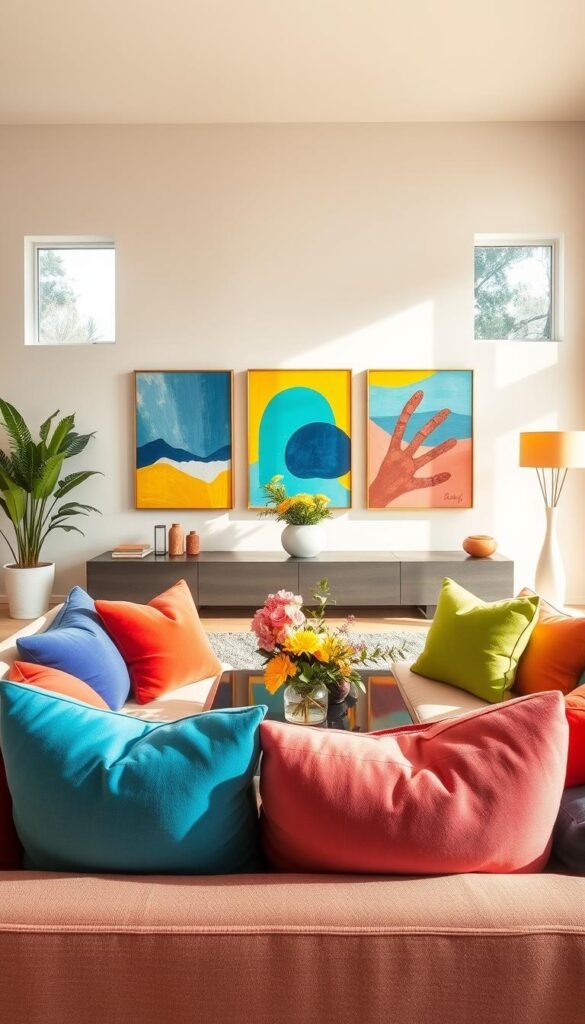
A favorite artwork can supply a ready-made palette for walls, textiles, and smaller accents. Start with something you love, then choose two or three colors from it for the rest of the room.
Repeat selected colors in smaller amounts instead of copying every hue across every surface. A striking print can set the tone, while a quieter color from the image gives the scheme a less obvious link.
- One artwork can offer both a main hue and a quieter supporting color.
- A patterned rug can bring several useful tones into the room at once.
- Wallpaper can supply a repeating design across a wall or a smaller feature.
- A fabric pattern can guide choices for nearby surfaces and details.
Choose two or three colors from your starting point, then use them in smaller amounts elsewhere. A rug with a green detail might lead you to a green frame or a muted textile, rather than another large green surface.
A mural or large-scale design creates a stronger statement and can become the room’s main focal point. A small-scale repeat is easier to layer with other fabrics because its pattern tends to read as texture from farther away.
For more ways to build a scheme from a focal piece, explore modern living room color palettes. Repeat one less-obvious color from the pattern to make the scheme feel collected rather than overly matched.
How to Decorate a Living Room With Simple Things
A few well-placed pillows, a throw, and a vase can change the room’s mood without a paintbrush. Small edits can make a difference when you repeat a color that already appears in your space.
Simple colorful living room designs can begin with 3-5 small changes. Try a pillow, a throw, a vase, framed art, or a lampshade. These pieces are easy to move or replace, so you can see how a color feels before making a larger change.
- Pillows in a color already present in your room
- A throw that picks up one tone from the rug
- A vase in a new accent color
- A framed print that adds a small color note
- A lampshade that changes the look of one corner
To figure out how to decorate a living room with simple things, start by editing what you already own. Group books, candles, ceramics, or small decor in a few chosen colors before buying anything new.
Plants can contribute natural green, while a small ceramic piece can add a stronger hue. Repeating one or two colors from existing art or a rug keeps these easy changes connected. Moving just a few pieces may be enough to refresh the room.
Try the new accents together in one seating area before spreading them across the whole room.
How Do Brown, Beige, and Green Keep Color Warm?
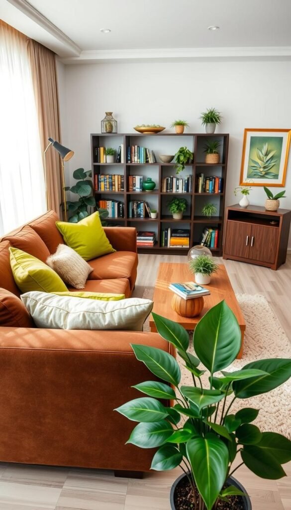
Brown, beige, and green can make a colorful scheme feel rooted in natural materials. Wood and warm neutrals give brighter colors a steady base, while muted greens add a softer connection to nature.
Pair brown with cream, olive, dusty blue, rust, blush, or black. Warm brown with soft yellow, olive green, and white creates an earthy combination. Use the table as a starting point, then adjust the materials to suit your room.
| Base color | Supporting color | Material or accent |
|---|---|---|
| Brown | Cream | Wood |
| Brown | Olive | Greenery |
| Brown | Dusty blue | Ivory |
| Brown | Rust | Brass |
| Brown | Blush | Cream |
Sherwin-Williams Accessible Beige (SW 7036) is a warm neutral that complements wood flooring. Alabaster (SW 7008) is a popular cool white, so it can create a cooler contrast against the same warm materials.
Sherwin-Williams Sea Salt is a soft, muted blue-green that can create a serene, nature-inspired interior. It offers a quieter alternative to a bright green, especially when paired with wood or cream.
Layering different natural materials can keep an earthy palette from looking too uniform. Add more than one wood or brown tone when a single earthy shade starts to look flat.
How Can Bold Contrast Stay Inviting?
Strong contrast makes a room feel more dramatic, while related tones create a quieter effect. Choose the level of contrast that suits the room, then soften strong colors with materials that add texture.
A black-and-white base creates a sharper statement than a palette built from nearby tones. You can warm a high-contrast scheme with cognac, wood, or one saturated accent. A lower-contrast room can still feel colorful when its shades differ in depth or texture.
Sherwin-Williams Tricorn Black (SW 6258) is a deep, saturated near-black. Use it on an accent wall for a focused statement or across an entire room for a more dramatic effect. The surface area changes the feeling, even when the color stays the same.
Velvet can soften the look of a saturated hue by giving it a rich, light-catching texture. A patterned rug can connect multiple colors, while textured neutrals keep the eye from meeting a hard edge everywhere.
Keep the number of competing focal points low. If a patterned rug or strong wall color already leads the room, let nearby surfaces and furniture shapes stay visually simpler.
Keep one large surface visually calm when a bold pattern or saturated color already commands attention.
How Can a Small Room Stay Colorful and Open?
A compact room can feel colorful and open when its largest surfaces stay light and one focal point carries the strongest hue. Concentrate the color rather than spreading several bold accents across every wall and seat.
Choose one focal point, then keep clear walking paths around the seating. A light, neutral wall can help the space feel larger, while a colorful rug, artwork, chair, or sofa brings in personality.
A colorful sofa can work in a compact room when the remaining large surfaces stay quiet. If the sofa is neutral, a single vivid artwork or rug can take the leading role instead.
Leave open space around the main seating rather than filling every corner with another table or chair. A round coffee table can make it easier to move around the room, while a low-profile design keeps sightlines more open.
Choose furniture that fits the room’s actual footprint, not just its wall dimensions. A clear focal point helps your eye settle, and an open path keeps the room practical to use.
For more compact-room approaches, see cozy living room ideas for small spaces. Before adding another accent, check whether it competes with the room’s single visual anchor.
Which Color Mistakes Make a Palette Feel Unfinished?
A colorful room often feels unfinished when each object introduces a new hue without connecting to anything already there. Look for the disconnect between colors, materials, and focal points before adding another accent.
A clear palette gives one dominant color the most weight, one or two supporting colors a smaller role, and an accent the least. Repeating a chosen color through 2 or more room elements can help the scheme feel connected.
When every hue carries equal visual weight, no color leads and the room loses a clear point of focus.
One common mistake is choosing colors without checking their undertones together. A warm beige and a cool gray may each look appealing alone, yet feel uneasy side by side. Cream, muted green, or wood can bridge warmer and cooler tones.
A second mistake is giving every color equal attention. If the sofa, wall, rug, and artwork all compete to be the main feature, the room can feel busy even when the individual colors look good.
A third mistake is adding new accents without repeating the colors already in the room. Mismatched undertones, too many focal points, or decor that feels unrelated can make the design feel less considered, regardless of the items’ price.
Check the palette as a whole before buying another piece. Remove or relocate the least-connected accent, then see whether the room reads more clearly.
Pick One Color Move to Make This Week
You do not need to change every surface to make your home feel more colorful. Start with a color you already enjoy, then repeat it intentionally instead of trying several unrelated hues at once.
Choose an easy-to-change accent before committing to paint or a large piece of furniture. Find one object you already love, such as a print, a book, or a ceramic bowl, and place a matching accent beside it.
Notice whether the two colors feel right together in your everyday space. Choose one object you love today and use its color to guide your next small decorating change.