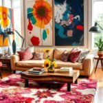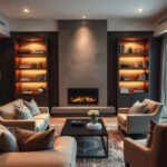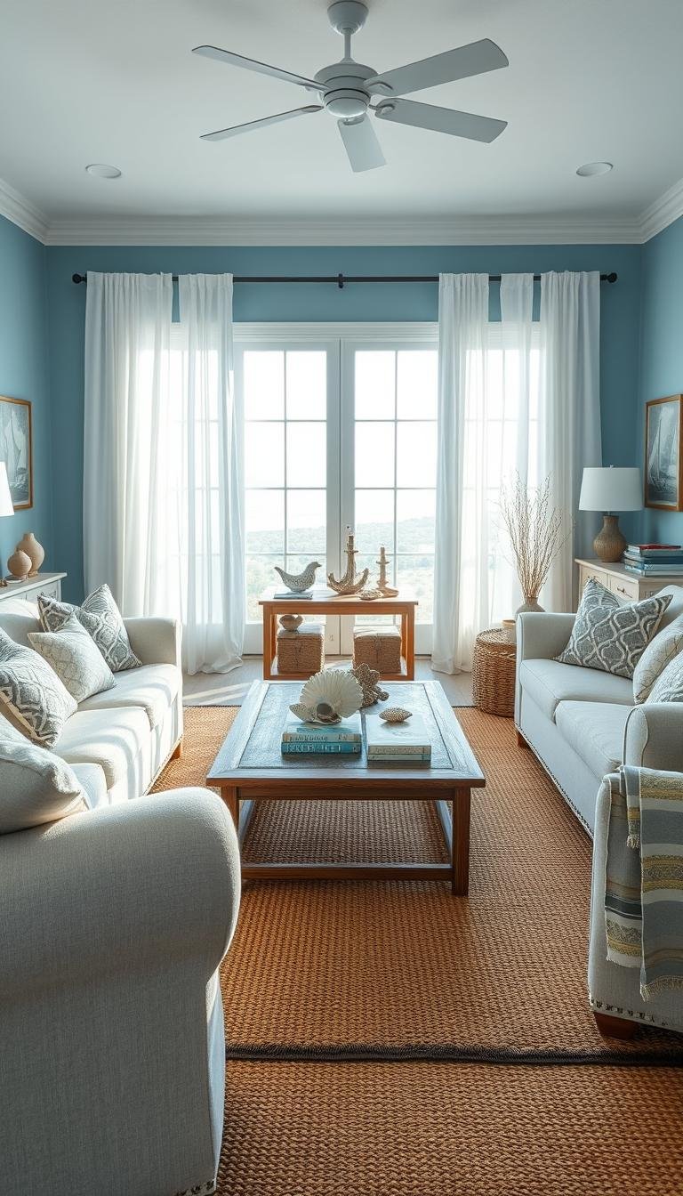
Blue can make your room feel like a breezy retreat or a rich, intimate gathering space, depending on the shade and the way you layer it. In your home, the color can seem calm, airy, cozy, or dramatic, shaped by its undertone, the light, and how much you use. An undertone is the subtle color beneath a paint shade that can make it read warmer, cooler, greener, or grayer.
Whether you want a relaxed place to unwind or a more striking setting for company, the right blue can support your style without taking over. You can bring it in through walls, furniture, or smaller accents, then use texture and contrast to make the room feel considered. A few carefully chosen blue elements can create a cohesive look without requiring every surface to change.
Living Room Designs Blue: Start With the Shade
A pale blue is the easiest starting point for an airy mood, while a deep blue makes a stronger, more dramatic statement. Your shade choice can turn a living room into a tranquil retreat, an energetic hub, or a room with a more intimate feel.
White, beige, gray, blue, and green are five useful living room colors because they work across a range of styles. Pale shades such as Dew Drop SW 9641 and Sky High SW 6504 feel uplifting; deeper Salty Dog SW 9177 and Anchors Aweigh SW 9179 bring drama. Compare the shades in this table:
| Shade | Family | Mood | Suitable role |
|---|---|---|---|
| Dew Drop SW 9641 | Light | Uplifting | Main color |
| Sky High SW 6504 | Light | Uplifting | Accent |
| Salty Dog SW 9177 | Dark | Dramatic | Main color |
| Anchors Aweigh SW 9179 | Dark | Dramatic | Accent |
Match the blue to the mood
Pale shades blue the room gently and can feel fresh, while deep shades give walls or furniture more visual weight. Decide whether the space should feel open and easygoing or more enveloping before choosing a paint chip.
Check undertones in changing light
An undertone is the subtle color beneath a paint shade’s surface appearance, and it can make the blue read warmer, cooler, greener, or grayer. View a paint sample at different times of day, since daylight and evening lamps can change its appearance.
Balance the palette with the 60/30/10 rule
Use 60% for the main color, 30% for a secondary color, and 10% for an accent. This Rule of Three is a flexible guide, not a strict formula. The 60/30/10 rule can help you spread color across walls, a rug, furniture, and small accessories without making every piece compete.
Use 60% main color, 30% secondary color, and 10% accent color as a flexible starting balance.
Treat 60/30/10 as a starting balance, then adjust the accent share if the room feels too busy.
Soft Blue Walls With Crisp White Trim
Soft blue walls paired with crisp white trim give you a fresh backdrop without making the room feel stark. The contrast defines the edges of the room, while the pale color keeps the walls from feeling heavy.
Niebla Azul SW 9137 is a serene dusty blue, while Powder Blue SW 2863 is a historic shade for both interior and exterior use. Mantra can read as light blue, robin’s-egg blue, or gray as the light changes. Eventide offers a soothing powder-blue look without seeming babyish.
White trim, crown molding, or a white sofa can keep a pale blue from feeling too sweet. A large stretch of pale blue may look washed out when the room has little contrast, so give the eye a few clear edges or light elements.
Living room designs with blue walls can use the color across the whole room or in a smaller dose. Try one of these approaches:
- Paint all the walls a soft blue.
- Paint one wall to make a restrained focal point.
- Add crisp white trim or crown molding.
- Repeat white in the upholstery for a larger block of contrast.
For more ways to shape living room wall designs, consider how paint and trim relate to the room’s architecture. A white sofa can soften the overall effect, while a white rug brings the contrast closer to the floor.
Check how the blue looks beside the wood floor and any large pieces that will stay. A color that appears delicate on a small sample can take on more presence across several walls.
Repeat the white in one larger element, such as a sofa or rug, so the trim feels intentional.
Navy Walls, Warm Wood, and Gold Accents
Navy walls gain warmth when you set them against wood furniture and a few gold or brass details. That contrast gives deep blue a grounded feel without making the room read as cold or overly formal.
Naval SW 6244, Favorite Jeans SW 9147, Moscow Midnight SW 9142, and Slate Tile SW 7624 are useful blues to compare. Some deep blues have green undertones that can look teal in stronger light. In a room with little natural light, dark blue can read nearly black.
Choose warm materials that bring out the room’s comfortable side: a walnut coffee table, a cognac leather chair, or a wood-framed cabinet. Keep metallic details restrained, perhaps a brass lamp or a few gold frames, instead of covering every surface in shine.
Use an inky blue-black finish where natural light is plentiful, not as an automatic choice for a dim space. The darkest blues can make an already shadowed room feel more enclosed, and their color may be difficult to distinguish from black.
A navy and gold scheme can feel polished through a mix of lighting, textiles, and decor. For more navy-blue-and-gold living room ideas, consider how a lamp, tray, or frame can echo the metal finish without repeating it everywhere.
Wood grain also matters. A warm finish can soften the wall color, while a cool, pale finish gives the room a sharper, more contemporary edge. Leather and woven textures add another layer without introducing another strong color.
Check the darkest corner before committing, because that is where a deep blue is most likely to lose its visible color.
Blue-Gray Paint for a Modern Living Room
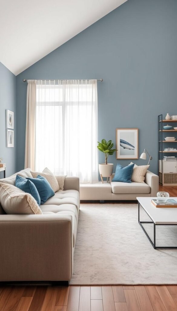
A blue-gray shade gives a modern room color without the intensity of saturated blue. Its muted quality can sit comfortably beside simple furniture, clean lines, and a palette built around gray or white.
Rainstorm SW 6230 is a deep blue with a slate-gray undertone. Van Courtland Blue is a midtone blue with subtle green and gray undertones, so it can work with neutral furnishings without feeling dark or moody. Compare their character and possible roles below.
| Paint | Undertone or character | Suggested room effect | Pairing note |
|---|---|---|---|
| Rainstorm SW 6230 | Deep blue, slate-gray undertone | Grounded and modern | White upholstery |
| Van Courtland Blue | Midtone, subtle green and gray | Muted, not moody | Neutral furnishings |
| Rising Tide | Soft blue-gray, may lean gray | Quiet and adaptable | Blue accents bring out blue |
| Rain Cloud | Deep navy softened with gray | Rich but softened | Textured neutral rug |
Rising Tide is a soft blue-gray that can lean gray in some lighting; blue accents can bring out its blue appearance. Rain Cloud is a deep navy softened with gray. Those differences can matter when you want a subdued wall rather than a strong blue statement.
Blue-gray can feel contemporary without turning cold when you balance it with white upholstery, soft textures, or a warm metallic finish. Try a cream throw, a nubby rug, or a brass table lamp to add warmth without changing the wall color.
Modern living room designs in blue can start with one muted blue-gray wall, a simple white or gray sofa, a textured rug, and one warm accent. A strong blue wall can also work beside a white sofa, gray rug, gold lamp, and small orange details.
Test the shade beside your largest neutral furnishing, since that is the color it will have to live with every day.
Bring Blue and Green Together
Blue and green make a room feel connected to nature, especially when wood and soft neutrals join the palette. A restrained mix of blue-green walls, leafy accents, and warm wood brings the colors together without turning the room into a display.
Calico appears bluer in direct light and greener in darker settings. East- and west-facing rooms can show shifting wall colors as daylight changes, so a blue-green may look different from morning to afternoon.
Waterloo is a rich blue-green that can work with stained trim, where its color contrasts subtly with warm wood. Sea Salt is a softer, muted blue-green for a more serene, natural feel. Still Water, Hazel, and Secret Garden offer other 2026 color directions to compare.
| Palette | Blue or blue-green element | Green element | Neutral or warm counterpoint |
|---|---|---|---|
| Sea Salt with foliage | Sea Salt | Leafy plants | Warm wood |
| Waterloo with stained trim | Waterloo | Green accents | Stained wood trim |
| Still Water with Hazel | Still Water | Hazel | Creamy |
Keep one shade dominant and use the other in smaller touches, such as plant leaves, a cushion, or a painted cabinet. Creamy can soften the Still Water and Hazel combination, while natural wood gives Waterloo a warmer frame.
Living room designs in blue and green can use blue-green walls, leafy green accents, and warm wood as the central mix. Add only a few green details if the wall color already carries both blue and green; the room will feel settled rather than crowded.
The light can shift the balance between the two colors, particularly in a room with east- or west-facing windows. Check a large sample on more than one wall to see how the color behaves as the sun moves.
Check blue-green paint on more than one wall if the room gets very different light across the day.
Make a Blue Sofa the Focal Point
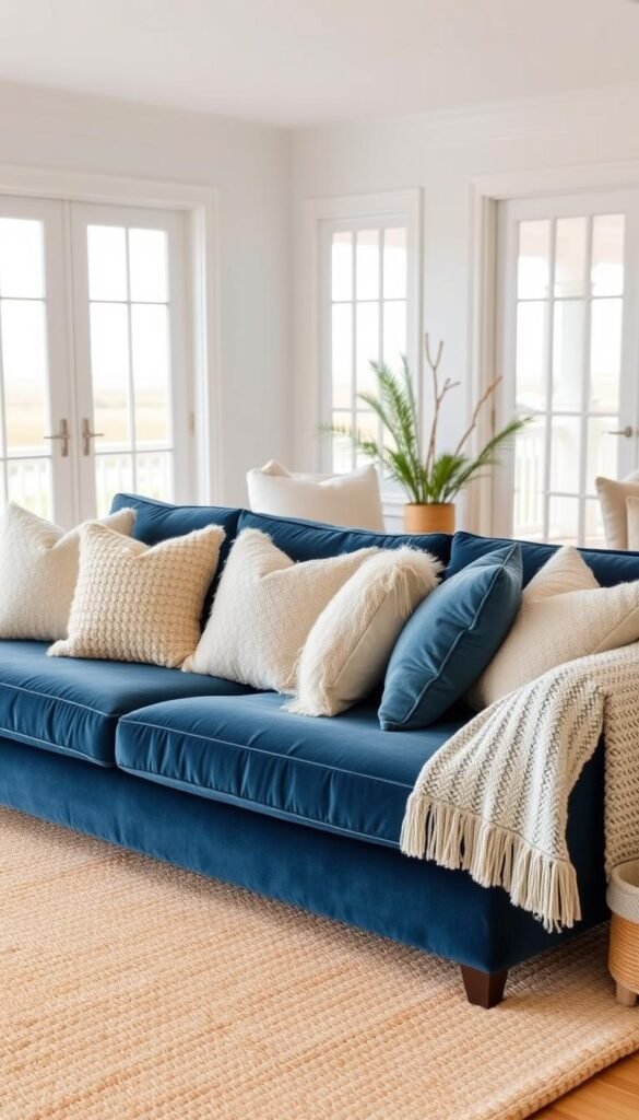
A blue sofa can be the room’s main color without requiring blue on every wall. Let the upholstery lead, then choose the surrounding colors and textures to support its particular shade.
White walls and a neutral rug can give a vibrant sofa breathing room. If you prefer more color, repeat one sofa shade in a few small cushions or in artwork rather than adding another large blue surface.
Cobalt with lively contrast
Cobalt works with olive or moss green, golden yellow, dusty blue, and white or cream. A small amount of deep burgundy adds depth without competing with the sofa. Rattan or burlwood brings in natural texture and keeps the mix from feeling too sleek.
For a quieter balance, use a pale wall and a cream rug, then bring green or yellow into one cushion or lamp. A white side table can create a clean break beside the sofa’s saturated color.
Navy with nature-inspired warmth
A navy sofa suits nature-inspired greens, deep mustard, cognac brown, soft blush, or a small red accent. Warm sand, beige, and crisp white create a more coastal alternative, especially with woven textures and an uncluttered floor.
Keep the rug neutral or repeat one blue sofa color in smaller cushions or artwork to balance the strong upholstery. The first move calms the whole seating area; the second makes the sofa feel connected to the rest of the room.
Blue-on-blue with texture
A navy velvet sofa can sit against dusty-blue walls when the two blues differ in tone and texture. Velvet absorbs and reflects light differently from painted walls, while cushions in linen or cotton add another surface. Those contrasts prevent a flat, single-color effect.
If the sofa is the brightest item, keep nearby accessories simple. A glass coffee table, pale wood side table, or plain throw lets the upholstery stay noticeable without filling the room with competing shapes.
If the sofa is already saturated, keep at least one large surrounding surface light or neutral.
Layer Blue and White for a Coastal Feel
Blue and white feel coastal when the room also has natural materials and a little breathing room. The easy balance comes from pairing crisp upholstery with blue paint or patterned fabric, then letting the materials carry the seaside mood.
One example uses Farrow & Ball Serge on walls and matching shutters, with Regency Tulip fabric on a sofa. The repeated color gives the room a clear framework, while the print adds movement without covering every surface.
Choose a few details to suggest the coast rather than building a literal theme:
- Woven wood furniture for texture and a natural finish.
- Shutters that frame the windows and echo the wall color.
- Plants that add a fresh green note.
- A small yellow or ochre accent for warmth.
Stone or terrazzo flooring can provide another Mediterranean detail, especially alongside plants and a simple blue-and-white palette. Let the floor remain a supporting element instead of layering several busy patterns over it.
Too many obvious seaside motifs can make the room feel kitschy, so keep references subtle. A woven chair and shutters may be enough; there is no need for every accessory to repeat an ocean image or shell shape.
White upholstery keeps the scheme crisp, while natural materials soften the clean contrast. A pale wood coffee table or woven basket can bring warmth without adding a new dominant color.
Keep enough open surface around patterned pieces to let them read clearly. A relaxed coastal style depends as much on what you leave out as on the details you add.
Choose one or two seaside references rather than repeating an ocean motif on every surface.
Add Blue Through Rugs, Curtains, and Artwork
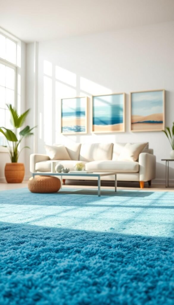
A rug, curtains, or one large canvas can bring blue into a neutral room without changing its walls. These movable accents let you adjust the color in small steps, whether you want a quiet hint or a stronger focal point.
A blue rug can sit under white or leather seating, while long light curtains or patterned Roman shades bring color near the windows. Artwork that echoes the room’s blue can connect those areas without matching them exactly.
Try one of these accents as a starting point:
- A patterned rug with gray-toned blue.
- Blue curtains or patterned Roman shades.
- A large canvas that includes the room’s blue.
- Blue cushions that echo the rug or curtains.
The Brintons V&A Calisia Talwin rug uses gray-toned blue in a floral pattern. That quieter blue can temper the formality of a floral design, especially when the rest of the room has simple shapes and a limited palette.
Repeat a blue accent across at least two different areas to make the room feel connected. A Taylor Howes room, for example, repeats blue in a canvas, cushions, a rug, and upholstery details, tying separate parts of the space together.
A gallery wall can vary artwork size and mount thickness, while pale wood frames work well alongside deep blues. Leave some clear wall around the group so the frames do not compete with a nearby curtain pattern.
Start with the largest textile or artwork, then choose one smaller item that picks up its blue. This creates a visible relationship without requiring the same shade on every object.
Repeat the chosen blue in at least one smaller accent so a single rug or artwork does not feel disconnected.
Paint Architectural Details Instead of Every Wall
You can make blue part of the room’s architecture without painting every wall. A focused band of color on built-in features can frame the room while white walls keep the overall look open.
Doors, architraves, window frames, built-in storage, and crown molding can all take blue. Mylands Walpole No.42 is one example of a shade used to frame architectural features rather than cover every wall.
Look for a connected group of features that already shapes the room. Blue window frames and a nearby built-in may read as one deliberate choice, while unrelated bits of trim in different corners can look scattered.
Consider these features for a restrained color statement:
- Window frames that define a view.
- Doors that sit within a visible wall.
- Built-in storage that forms a clear block.
- Crown molding that outlines the ceiling.
This approach has less impact when the room has no architectural detail to highlight. A painted panel or a furniture accent may give a plain room a clearer focal point than blue trim alone.
Keep the surrounding walls simple so the painted details remain easy to read. A consistent finish across the chosen group can make the treatment feel purposeful, even when the blue itself is bold.
For other ways to shape a room’s walls, consider how paint and built-in features can work together. The architectural details should feel attached to the room, not like separate decorative marks.
Pick one connected group of features to paint, rather than scattering blue across unrelated trim.
Use Wallpaper or a Gallery Wall for Pattern
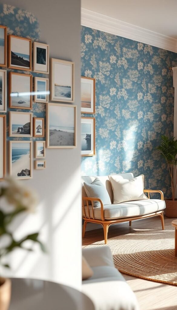
A single patterned panel or a curated gallery wall can add movement without making every surface compete. Limit the pattern to one clear area when the design is large or busy, so the room keeps a place for the eye to rest.
A wallpaper panel gives you a concentrated dose of blue pattern, while a gallery wall builds interest through separate images. Floral motifs inspired by the V&A archives can bring a vintage note without requiring a full room of print.
A large, busy wallpaper pattern is easier to live with on one feature wall or panel. Choose a wall that is visible from the main seating area, then leave nearby surfaces quieter so the print remains distinct.
A large pattern across every wall may overpower a compact or already busy room. In that setting, one panel can give you the same visual interest with less competition from furniture, windows, and other decor.
A blue gallery wall can feel cohesive without making every frame identical. Vary image sizes and mount thicknesses to avoid a rigid grid, and mix the spacing carefully enough that the group still reads as one arrangement.
Artwork can include prints, photographs, or other images that share a blue note. A range of frame sizes adds rhythm, while consistent spacing helps the wall feel composed rather than crowded.
For more options, compare wallpaper scale and wall treatments with the furniture around them. Pattern can look quieter from across the room than it does up close, so judge it from your usual seat.
Look at the pattern from the main seat before choosing its final position.
Make Blue Work in a Small Living Room
In a small room, use the deepest blue on one limited area and keep the largest surrounding surfaces lighter. That shift in scale lets you enjoy a strong shade without making the whole space feel closed in.
A light or softened main palette, one lower-wall dark-blue treatment or restrained focal point, and visible contrast from pale furniture can work well together. Choose how much blue to use based on the room’s natural light and the size of its largest furnishings.
Keep the strongest blue low
Farrow & Ball Stiffkey Blue can remain visibly blue in both well-lit and darker rooms. In a small space, use it on the lower portion of the walls, leaving the upper area lighter so the deeper color stays closer to the floor.
This arrangement gives the room a defined base without covering its full height in a dark shade. A pale upper wall can also make the boundary between wall and ceiling feel less heavy.
Choose pale or gray-softened shades
Light blue can help a room feel more open, while a softened navy offers more depth. Sherwin-Williams Blue Note can appear nearly black, so it is a stronger choice when the room has some natural light, but not too much.
Keep a softened navy to one restrained area if you want the room to retain a lighter feel. Farrow & Ball Inchyra Blue, Stiffkey Blue, and Hague Blue are other blue options to compare with your room’s finishes.
Use contrast to preserve openness
When the walls are deep, keep the floor, rug, or largest seating piece lighter. A pale rug beneath a dark wall can break up the color close to the floor, while light upholstery gives the room a visible point of contrast.
In small living room designs in blue, decide what should draw the eye first, then keep the rest of the large surfaces calm. Avoid filling each open area with another strong pattern or dark color.
Check the room from its entrance as well as from the sofa, since a dark first impression can make the space feel smaller.
Try an Ombre or Color-Blocked Feature Wall
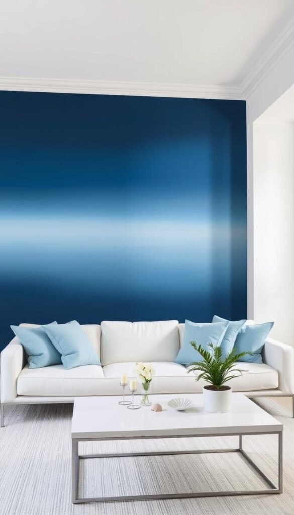
A feature wall lets you make a stronger blue choice while keeping the rest of the room quieter. The effect can be blended, with shades shifting across the wall, or graphic, with one clean-edged block of color.
An ombre wall can move from deep ocean blue through turquoise to pale blue-white. A color block gives you a crisp boundary instead, making the painted area feel more like a bold design choice.
Before painting, make three decisions:
- Choose the wall that is visible from your main seat.
- Limit the palette to a few related blue shades.
- Test the transition from the room’s usual viewing distance.
A blended ombre is difficult to execute evenly and may be better left to an experienced painter. The transitions need to look smooth from across the room, not just while you stand close to the wall.
A solid color can make a strong statement with less blending work. Greg Natale used a bold blue wall as a defining feature, showing how one graphic surface can set the tone without requiring a gradient.
Think about where the color should stop near corners, doors, and trim. A transition that ends in an awkward spot can distract from the wall’s shape, even when the blue shades work well together.
Decide where the color effect ends before you buy paint, especially near corners and trim.
Warm Blue With Red, Gold, or Earthy Accents
Warm accents give blue a livelier edge, while quieter blue undertones offer a more restrained alternative to saturated color. The balance can come from a little brass, burgundy, ochre, warm red, orange, or yellow against a blue wall or sofa.
For a bolder mix, try petrol blue with burnt orange and apple green. Gold or brass adds brightness, while warm wood brings a quieter contrast that feels grounded rather than flashy.
In 2026, designers are moving from saturated, poppy blues toward quieter shades with gray, mineral, or earthy green undertones. Those neutralized blues offer color without the same sharp intensity.
Icy blue and Transformative Teal are distinct 2026 directions. Icy blue is pale, crisp, and frosty, and can add color to a warm-neutral room. WGSN named Transformative Teal its color of the year for 2026.
| Color direction | Character | Companion color | Role |
|---|---|---|---|
| Icy blue | Pale, clear, frosty | Burgundy or cherry red | Cool accent |
| Transformative Teal | Distinct teal direction | Warm neutrals | Color statement |
| Muted mineral blue | Gray or earthy-green undertone | Warm wood | Quiet main color |
For a blue room that feels polished, use rich texture and a limited number of materials. A velvet cushion, a warm wood table, or a brass lamp can add depth without crowding the color scheme.
For more elegant living room ideas, focus on comfort as well as a refined finish. A considered mix of materials can make the room feel finished without relying on more accessories.
Repeat a strong accent color in two small places rather than spreading it evenly across every surface.
Use that repetition to make the accent feel deliberate, then let the rest of the room remain quieter.
Choose the Blue Details You’ll Enjoy Living With
A calm blue room comes from choosing the right role for the color, not from covering every surface in it. A deliberate shade, a few supporting tones, and a balance of texture can make the room feel cohesive and comfortable.
Start with one choice that suits how you use the space, then let the rest of the palette support it. A blue wall, sofa, or smaller detail can each carry the color successfully when it has room to stand out.
Before committing, place two blue samples beside your largest furnishing and compare them in both morning and evening light.