Your home should feel like a peaceful retreat. Choosing the right paint and decor can transform any space into a calm and stylish environment. A thoughtful palette brings harmony and balance to your interior.
Great design starts with smart choices. The right hues create a cohesive look that works in any light. Whether your space is large or small, these ideas ensure versatility.
You can achieve a serene vibe with carefully selected tones. Designers often use neutrals and crisp whites to open up rooms. Adding wood or accents provides warmth and depth.
This guide will walk you through various palettes and principles. Discover how color influences mood and comfort in your living area. Get ready to find inspiration for your next project!
Why Your Living Room Color Palette is More Important Than You Think
Colors do more than just decorate your space. They shape how you feel every day. Imagine walking into a bright red room versus a soft blue one. Your mood shifts instantly.
The Psychological Impact of Color in Your Home
Different hues affect your emotions in powerful ways. Blue often brings calm and relaxation. It’s perfect for creating a peaceful vibe.
Red can boost energy and excitement. But it might feel overwhelming in a space meant for unwinding. Think about how you want to feel in your home.
Designers use this knowledge to craft interiors that support well-being. Your choices influence daily comfort and mental state. Select tones that match your desired atmosphere.
Creating a Cohesive Flow from Room to Room
A unified palette makes your entire home feel connected. It guides the eye smoothly from one area to the next. This avoids jarring transitions between spaces.
Start with your central area and extend similar shades elsewhere. Use accents like throw pillows or art to tie everything together. This approach works well in open layouts or smaller homes.
Testing paint samples in your actual space is crucial. See how colors look with your natural light and furnishings. This ensures harmony throughout your interior.
Your home’s personality shines through a thoughtful scheme. It creates balance and makes rooms feel larger. Every choice contributes to a cohesive, inviting environment.
The Core Principles of Modern Minimal Color Design

Mastering a few key design principles can transform your space into a harmonious sanctuary. These foundational ideas help create balance and intentionality in your decor choices.
Emphasis on Neutrals and Texture
Neutral tones form the perfect foundation for any interior. Whites, grays, and beiges create a clean, timeless base that works beautifully.
Texture adds warmth and prevents your space from feeling flat. Materials like wool, linen, and natural wood bring depth to simple palettes.
These elements work together to create a sophisticated yet comfortable environment. They provide visual interest without overwhelming your senses.
Strategic Use of Accents for Depth
Accent colors inject personality into your design scheme. Bold blacks or muted jewel tones add striking contrast.
Use these pops of color thoughtfully through furniture, art, or decor pieces. They should complement rather than dominate your room.
This approach maintains the clean aesthetic while adding character. Every accent serves a purpose in your overall design vision.
Letting Natural Light Define the Mood
Natural light dramatically affects how colors appear in your home. North-facing rooms benefit from warmer hues that enhance brightness.
Sun-drenched spaces work well with cooler tones to soften glare. Test your paint choices at different times of day to see how they transform.
Designers often recommend balancing light and color intentionally. Cool tones counter strong sunlight, while warm hues cozy up dimmer rooms.
Your lighting conditions should guide your final color decisions. This ensures your palette works beautifully throughout the day.
1. The Crisp Classic: White and Charcoal
This classic combination delivers sophistication through simplicity and contrast. It creates a clean backdrop that feels both fresh and intentional in your home.
The scheme works beautifully in various spaces from compact apartments to spacious houses. You achieve a polished look that never feels dated or overwhelming.
Choosing the Right White for Your Light
Not all whites work the same in every room. Your natural light conditions dramatically affect how paint appears on walls.
North-facing rooms often benefit from warmer whites like Benjamin Moore’s White Dove. This versatile shade maintains its warmth even in limited light.
Test samples at different times before committing. Observe how the hue changes from morning to evening in your actual space.
Grounding the Space with Dark Gray Accents
Charcoal elements provide necessary contrast against light walls. They anchor the room visually without creating heaviness.
Consider dark gray throw pillows or a sleek sofa in deeper tones. These pieces add depth while maintaining airiness.
Designers recommend using dark accents strategically rather than everywhere. This preserves the open, minimal feel you want.
Adding Warmth Through Wood and Leather
Natural materials prevent the scheme from feeling too sterile. Wood tones bring organic warmth to balance cool whites and grays.
A leather sofa or wooden coffee table introduces rich texture. These elements make the space feel lived-in and comfortable.
Mix materials thoughtfully throughout your design. The combination creates visual interest while maintaining cohesion.
This palette promotes calmness and clarity in your living area. It provides a serene backdrop for daily life and entertaining.
Remember to test your chosen shades in the actual room. Light changes everything about how colors ultimately feel.
The white and charcoal scheme adapts to various styles seamlessly. It works whether your furnishings are contemporary or traditional.
2. Warm Minimalist: Layered Beiges and Ivories

This approach creates a cozy yet clean aesthetic in your interior. It blends soft neutrals for a welcoming vibe that feels both calm and collected.
You can achieve this look with careful layering of similar hues. The result is a space that promotes relaxation while maintaining visual interest.
Mixing Undertones for a Rich, Monochromatic Look
Combine warm ivories with cooler taupes for depth. This prevents your palette from feeling flat or boring.
Designers often use this technique to add sophistication. It creates subtle variation while keeping the overall scheme cohesive.
Test paint samples on your walls to see how they interact. Natural light will reveal the beautiful complexity of these shades.
Introducing Depth with Cognac and Natural Textiles
Leather accents in cognac or tan bring warmth to your space. A chair or ottoman in this hue adds character without clutter.
Natural textiles like linen and jute provide wonderful texture. Woven baskets or throw pillows enhance the organic feel.
These elements work together to create a harmonious environment. They make your room feel inviting and lived-in.
Metallic touches in brass or copper offer elegant contrast. Use them in lighting fixtures or small decor pieces.
This approach maintains the simplicity of your design. It adds just enough sparkle to keep things interesting.
| Element | Purpose | Examples |
|---|---|---|
| Beige/Ivory Walls | Create neutral foundation | Warm white, cream, taupe |
| Textile Accents | Add texture and comfort | Linen throws, jute rugs |
| Leather Pieces | Introduce rich warmth | Cognac chair, tan ottoman |
| Metallic Details | Provide subtle contrast | Brass lamps, copper vases |
This color scheme works well in various room sizes. It adapts beautifully to changing light throughout the day.
Your space will feel both serene and sophisticated. The layered neutrals create a timeless backdrop for daily life.
3. Desert Modern: Earthy Hues and Clean Whites
Imagine bringing the warmth of the desert into your home. This style blends earthy tones with crisp whites for a cozy yet clean look. It creates a grounded atmosphere that feels both inviting and intentional.
You can achieve this vibe with a thoughtful mix of colors and textures. The combination works beautifully in various spaces. It brings natural warmth without sacrificing simplicity.
Incorporating Shades of Sienna and Terracotta
Start by adding warm earth tones through decor and accents. Think terracotta pots or sienna-colored throw pillows. These pieces add character without overwhelming your space.
An accent wall in a rich clay hue creates instant depth. It draws the eye while maintaining an airy feel. Designers often use this technique to add visual interest.
Textiles in these shades bring softness and warmth. Consider a woven rug or linen curtains in earthy colors. They enhance the organic vibe of your interior.
Balancing Warmth with a Crisp White Backdrop
White walls provide the perfect foundation for earthy accents. They prevent the room from feeling too dark or heavy. This balance is key to the desert modern aesthetic.
Choose a white with warm undertones for harmony. It complements terracotta and sienna shades beautifully. Test your paint in natural light to see how it changes.
Furniture in light neutrals keeps the space feeling open. A white sofa or cream chairs work well here. They allow your earthy accents to shine.
Natural materials like wood and clay enhance the desert feel. A wooden coffee table or clay vase adds texture. These elements bring authenticity to your design.
This palette creates a welcoming environment that connects with nature. It works in various home styles and climates. Your space will feel both serene and inspired.
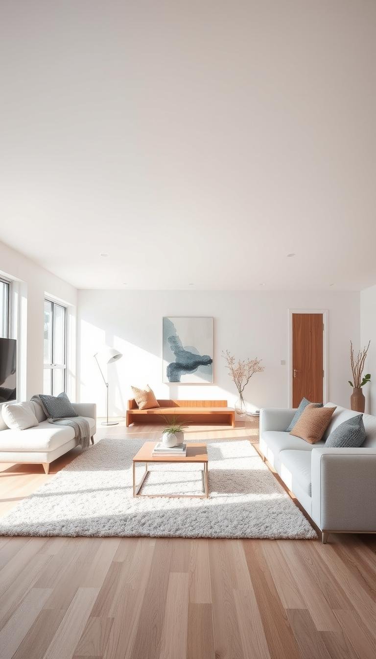
4. Coastal Neutrals: Serene Blues and Grays

Picture yourself relaxing in a space that feels like a gentle ocean breeze. This palette combines soft blues and grays with crisp whites for a tranquil atmosphere. It brings the calm of the coast right into your home.
You can create this soothing vibe with careful color choices. The scheme works in any space, whether you live by the water or just love the feeling. It promotes relaxation and reduces stress through its calming hues.
Evoking Calm with Soft Blue-Gray Tones
Start by selecting paint with subtle blue-gray undertones. Benjamin Moore’s Gossamer Blue is a popular choice among designers. This shade creates a serene backdrop that feels both fresh and peaceful.
Consider using this hue on your walls or through larger furniture pieces. A soft blue-gray sofa anchors the room while maintaining an airy feel. It provides just enough color without overwhelming your space.
Natural light enhances these cool tones beautifully. Sheer curtains allow sunlight to filter through, making the colors shift throughout the day. This creates a dynamic yet consistently calm environment.
Using Textured Accents for Visual Interest
Texture plays a key role in this coastal-inspired scheme. Nubby blankets and woven rugs add depth without introducing bold colors. They provide visual interest while keeping the palette light and airy.
Throw pillows in similar blue-gray shades create a layered look. Mix different fabrics like linen and cotton for variety. This approach maintains the minimal aesthetic while adding comfort.
Natural elements like driftwood or sea grass baskets enhance the theme. They bring organic texture that complements the color scheme. These pieces make the space feel collected rather than decorated.
“The best coastal designs feel effortless, like they’ve evolved naturally over time. It’s about creating a space that breathes.”
Mirrors strategically placed to reflect light enhance the breezy feel. They make rooms appear larger and brighter. This simple trick amplifies the serene atmosphere.
Remember to keep patterns minimal and cohesive. Too many competing prints can disrupt the calm vibe. Stick to subtle textures rather than bold designs.
This versatile scheme works in various home styles and locations. It creates a peaceful retreat that feels both stylish and comfortable. Your space will become a true sanctuary for relaxation.
5. Moody Modern: Dark Greens and Deep Blacks
Transform your home into a sophisticated retreat with dramatic dark tones. This bold approach creates an intimate atmosphere that feels both luxurious and intentional.
Deep greens and rich blacks work together to establish a powerful foundation. They bring depth and character to your interior without overwhelming the space.
Making a Statement with a Bold Accent Wall
Create instant drama with a single feature wall in a deep shade. Benjamin Moore’s Dark Olive makes an excellent choice for this purpose.
This rich green hue adds sophistication while maintaining a natural feel. It serves as the perfect backdrop for artwork or shelving.
Consider painting built-in bookshelves or cabinetry in the same shade. This creates cohesion while maximizing the impact of your bold choice.
Preventing a Dark Palette from Feeling Cramped
Balance deep walls with lighter furniture pieces to maintain openness. A cream sofa or light wood table prevents the room from feeling too heavy.
Strategic lighting plays a crucial role in this scheme. Layer ambient, task, and accent lighting to create dimension.
Mirrors reflect both natural and artificial light throughout the space. They make rooms appear larger while enhancing the moody atmosphere.
Metallic accents in brass or chrome provide reflective surfaces. These elements catch the light and add visual interest.
Designers often recommend matte finishes for dark paint colors. This reduces glare and enhances the richness of the shade.
Test your chosen colors at different times of day. Observe how natural light transforms the mood throughout daylight hours.
Add warmth through leather accents and wooden elements. A cognac leather chair or oak side table softens the dramatic vibe.
Textured throw pillows and blankets introduce comfort and coziness. They make the space feel inviting rather than intimidating.
“Dark colors create intimacy and luxury in equal measure. They turn ordinary spaces into extraordinary experiences.”
This scheme works beautifully in various room sizes when executed thoughtfully. High ceilings allow the colors to breathe, while smaller spaces benefit from strategic lighting.
Remember that moody design is about bold choices with careful restraint. Every element should contribute to the overall harmony.
Your living area will feel both dramatic and completely livable. It becomes a personal sanctuary that reflects sophisticated taste.
6. Subtle Jewel Tones: Muted Sapphire and Ruby

Introduce sophisticated elegance with muted jewel tones in your interior design. These rich hues add warmth and personality while maintaining a clean aesthetic. The approach brings luxurious touches without overwhelming your space.
Barely-there ruby and subdued sapphire bring depth to neutral foundations. They create visual interest through strategic placement rather than full coverage. This method keeps your overall look balanced and intentional.
How to Use Saturated Hues as Subtle Accents
Start with small decor pieces to test the waters. A single sapphire vase or ruby throw blanket makes a statement. These touches introduce color without commitment.
Artwork provides another excellent entry point. Choose pieces with muted gem tones that complement your walls. This adds personality while keeping the scheme cohesive.
Textiles offer flexibility in your design approach. Swap out pillow covers or area rugs seasonally. This lets you experiment with different saturation levels.
“Jewel tones work best when they feel discovered rather than designed. Let them emerge naturally through layers.”
Pairing Jewel Tones with Neutral Furnishings
Neutral backdrops make jewel accents shine beautifully. Crisp white walls allow sapphire elements to pop. Beige furnishings provide warm contrast to ruby touches.
Your largest pieces should remain in neutral territory. A white sofa or light wood table creates balance. Then add jewel tones through smaller, movable items.
Consider the psychological impact of your choices. Ruby brings energy and passion to a space. Sapphire promotes calm and tranquility.
| Element | Jewel Tone Application | Neutral Pairing |
|---|---|---|
| Walls | Accent wall in muted sapphire | Crisp white main walls |
| Furniture | Ruby accent chair | Beige main seating |
| Textiles | Sapphire throw pillows | Neutral linen sofa |
| Decor | Ruby ceramic vase | Light wood shelves |
Metallic accents enhance jewel tones beautifully. Brass or gold details complement both ruby and sapphire. They add refinement without competing for attention.
Experiment with placement in well-lit areas. Natural light makes these hues glow beautifully. Morning sun particularly enhances ruby tones.
This approach maintains minimal principles while adding personality. Your space feels both curated and comfortable. The jewel accents provide just enough visual interest.
Remember that muted versions work best for this style. Choose shades with gray undertones for sophistication. They blend seamlessly with neutral palettes.
Your interior gains depth and character through these touches. The scheme feels luxurious yet completely livable. It’s perfect for expressing personal style.
7. Cozy Cottage: Dusty Blues and Soft Pinks
Step into a world of gentle charm with dusty blues and soft pinks. This palette brings warmth and nostalgia to your interior. It creates a welcoming environment that feels both personal and serene.
You can achieve this sweet aesthetic with thoughtful choices. The combination works in various homes from small spaces to larger areas. It offers a comforting vibe that invites relaxation.
Designers often use these hues to evoke feelings of comfort. They promote a sense of peace and belonging in your home. The scheme feels both timeless and current.
Leaning into Florals and Patterns Gently
Introduce subtle patterns through textiles and decor. Floral throw pillows add charm without overwhelming your space. Choose designs with soft colors for harmony.
A patterned rug in muted tones anchors the room beautifully. It provides visual interest while maintaining simplicity. This approach keeps your design feeling light and airy.
Consider wallpaper with delicate patterns for an accent wall. This adds depth without making the room feel busy. Test samples in your actual light before deciding.
Creating a Sweet, Inviting Atmosphere
Soft lighting enhances the cozy feel of this palette. Table lamps with warm bulbs create a gentle glow. They make your space feel inviting during evening hours.
Plush furnishings add comfort and warmth to your room. A comfortable sofa in neutral fabric works well here. Then add colorful accents through smaller pieces.
Natural materials like wood and cotton complement the scheme. They bring organic texture that feels authentic and warm. These elements make your home feel lived-in.
| Element | Color Application | Purpose |
|---|---|---|
| Walls | Pale blue or soft pink | Create gentle backdrop |
| Textiles | Dusty blue pillows | Add subtle color accents |
| Decor | Pink ceramic vases | Introduce sweet touches |
| Lighting | Warm white bulbs | Enhance cozy atmosphere |
Personal touches make the space truly yours. Family photos in simple frames add heart. Handmade items bring character and uniqueness.
This scheme works beautifully in various room sizes. It creates a harmonious environment that feels both stylish and comfortable. Your home becomes a true sanctuary.
Remember to test your paint choices in natural light. See how the colors change throughout the day. This ensures your palette works perfectly.
8. Sleek & Stylish: The Black and White Statement

Black and white combinations offer timeless elegance that works in any decade. This high-contrast approach creates a striking visual impact in your interior. It delivers sophistication through simplicity and bold contrast.
You can achieve a dramatic yet balanced look with this palette. The scheme works beautifully in various spaces from compact apartments to spacious houses. It provides a polished aesthetic that feels both intentional and refined.
Achieving Balance in a High-Contrast Scheme
Create visual harmony by distributing dark and light elements equally. Too much black can feel overwhelming, while too much white might seem sterile. The key lies in strategic placement throughout your space.
Consider a black accent wall paired with white furnishings. This creates instant drama while maintaining airiness. Alternatively, use white walls with black furniture pieces for grounded elegance.
Designers often recommend the 60-30-10 rule for this scheme. Sixty percent dominant color, thirty percent secondary, and ten percent for accents. This formula ensures cohesion without visual chaos.
Choosing Between Matte and Glossy Finishes
Your finish selection dramatically affects the final look. Matte surfaces absorb light and create a soft, sophisticated appearance. They work particularly well in rooms with strong natural light.
Glossy finishes reflect light and add depth to darker spaces. They can make small rooms feel more expansive through reflection. Consider your existing light conditions before deciding.
“We suggest a matte finish to ease the reflections in a room with strong natural light.”
Test samples at different times of day before committing. Observe how each finish interacts with your specific lighting conditions. This ensures your choice enhances rather than fights your space.
Incorporate textures through materials like black leather or white marble. These elements add visual interest without introducing additional colors. They enhance the sleek vibe while maintaining minimal principles.
Throw pillows in various fabrics provide subtle texture variation. Mix matte and glossy finishes within accessories for dimensional interest. This approach keeps the scheme dynamic yet cohesive.
The psychological impact of this palette creates focused energy. Black adds drama and sophistication, while white promotes clarity and openness. Together they establish a balanced, intentional atmosphere.
If a full-room approach feels too intense, start with accessories. Black and white artwork makes a powerful statement without commitment. You can gradually introduce more elements as you become comfortable.
Remember that this scheme works with any decor style. It provides a versatile foundation that allows for easy updates. You can always add pops of color through seasonal accessories.
Your space will feel both dramatic and completely livable. The black and white combination offers clarity and elegance through contrast. It remains one of the most enduring choices in interior design.
How to Test and Choose Your Perfect Palette
Finding the right colors for your home requires careful testing and consideration. The perfect palette should reflect your personality while creating harmony throughout your space. Taking time to evaluate options ensures you’ll love the final result.
Sampling Paint Colors in Your Actual Space
Always test paint samples in your actual room before committing. Colors look completely different in your home versus the store. Lighting, furniture, and other elements affect how shades appear.
Benjamin Moore offers peel-and-stick samples that make testing easy. Apply them to different walls and observe throughout the day. Notice how morning, afternoon, and evening light change each hue.
Take notes on how colors make you feel at different times. Some shades might energize you in morning light but feel overwhelming at night. This helps you choose tones that work for your lifestyle.
Considering Your Room’s Natural Light
Natural light dramatically influences how colors appear in your home. North-facing rooms often need warmer tones to feel brighter. South-facing spaces can handle cooler shades to balance strong sunlight.
Observe how light moves through your room during the day. Notice which areas get direct sunlight and which stay shaded. Choose colors that enhance rather than fight your natural light conditions.
Dim rooms benefit from lighter, warmer shades that reflect light. Sunny spaces work well with slightly deeper tones that won’t feel washed out. Always test samples in your specific lighting situation.
Matching Your Color Scheme to Your Furniture
Your existing furniture should guide your color choices. Look at your largest pieces like sofas and cabinets first. Choose wall colors that complement rather than clash with these elements.
Pick up undertones from your furniture in your wall color. If your sofa has warm brown undertones, consider similar warm shades for walls. This creates a cohesive look throughout the space.
Use accent pieces like throw pillows to tie everything together. They can bridge colors between walls and larger furniture items. This approach creates harmony without everything matching perfectly.
“The right color should feel like it belongs in your space, not like it was forced to fit.”
Consider your room’s function when choosing colors. Calm shades work well in relaxation areas, while energizing tones suit active spaces. Your palette should support how you use each room.
Involve family members in the decision process when possible. Everyone should feel comfortable with the final choices. This ensures your home reflects all who live there.
Don’t hesitate to consult with paint professionals at local stores. They can offer valuable advice based on your specific situation. Their expertise might save you from costly mistakes.
Testing multiple options gives you confidence in your final decision. You’ll know exactly how each color will look in your space. This peace of mind makes the investment worthwhile.
Bringing Your Modern Minimal Vision to Life
You now have a strong foundation to create a serene and stylish space. The palettes shared offer versatile starting points for your personal transformation.
Remember that achieving your ideal look takes patience. Test paint samples in your actual space before committing fully. Local experts can provide valuable guidance if you need help.
Your chosen scheme should reflect your personality while promoting daily comfort. A thoughtful palette creates lasting appeal that adapts to changing trends.
Share your results with trusted sources for feedback. Your effort will reward you with a harmonious environment that enhances everyday life.