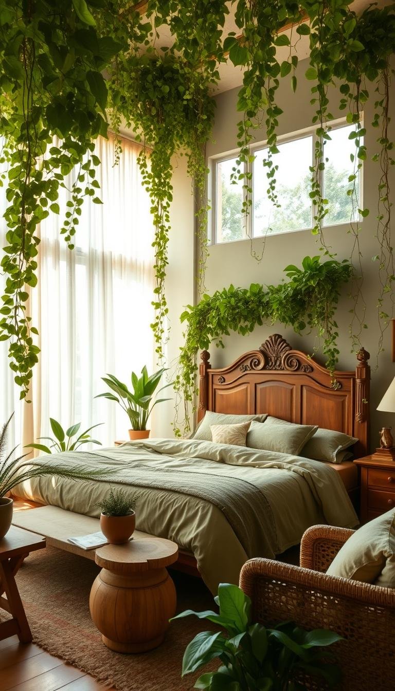
Imagine stepping into a personal sanctuary that breathes with natural energy. Your sleeping space becomes a peaceful retreat that connects you to the outdoors.
This vibrant color represents growth and renewal. It brings a sense of tranquility perfect for creating a restful environment in your home.
From soft seafoam to deep forest tones, green offers countless possibilities. Each shade creates a unique atmosphere in your room.
This versatile hue pairs beautifully with neutral tones and bright accents. You can design a space that truly reflects your personality.
We’ll guide you through selecting the perfect nature-inspired palette. Discover how even small touches can transform your bedroom into a fresh, inviting oasis.
Why Your Bedroom Craves an Earthy Green Palette
There’s something magical about a space that captures the serene essence of the natural world around you. Your personal retreat deserves a palette that promotes true relaxation and restorative sleep.
Psychologically, these nature-connected hues work wonders for reducing stress. They create a calming environment perfect for unwinding after long days. This connection to the outdoors brings peace right into your sleeping area.
Different tones create distinct moods in your sanctuary. Warm variations offer cozy comfort that welcomes you in. Cooler shades provide refreshing serenity that helps clear your mind.
The versatility of this approach works with countless interior styles. From modern minimalist to rustic charm, these colors integrate seamlessly. You can maintain your preferred aesthetic while adding natural tranquility.
This isn’t just a passing trend—it’s a timeless choice for any space. Your room will maintain its stylish appeal for years to come. You’re investing in lasting beauty rather than temporary fashion.
Incorporating these elements can be done through various methods. Paint, bedding, or decorative accents all offer opportunities. Even small touches can create dynamic energy without overwhelming the senses.
These hues pair beautifully with organic materials like wood and linen. This combination enhances the overall natural atmosphere. It creates a cohesive look that feels both intentional and effortless.
If you have limited square footage, this approach offers special benefits. It can make compact areas feel more spacious and connected to outdoors. Windows with natural views become enhanced focal points.
Choosing this direction represents a commitment to your well-being. You’re creating a personal sanctuary that supports mental and physical health. It’s an investment in quality rest and daily renewal.
“The best rooms have something to say about the people who live in them.”
This nature-inspired color scheme represents a smart choice for refreshing your space. It delivers a calming, organic vibe that transforms your daily experience. You’ll wonder how you ever slept without this peaceful environment.
How to Choose the Perfect Green Shade for Your Space
Selecting the right color for your walls sets the tone for your entire room. The perfect hue creates harmony between all elements in your space.
Different shades interact uniquely with your existing furniture and lighting conditions. Taking your time during selection ensures you’ll love the results for years.
Understanding Warm vs. Cool Green Undertones
Green colors contain hidden undertones that dramatically affect their appearance. Warm variations contain yellow, brown, or red bases that create cozy atmospheres.
Cool shades feature blue undertones that deliver calming, serene vibes. Identifying these subtle differences helps you achieve your desired mood.
Compare paint samples against neutral colors to spot undertones easily. Place swatches near your wood finishes and metal accents for accurate comparisons.
Testing Paint Swatches in Your Room’s Light
Natural and artificial light significantly alters how colors appear throughout the day. Test samples directly on your walls to observe these changes.
North-facing rooms receive cool light that benefits from warm green shades. These hues add welcoming warmth to spaces that might feel chilly.
South-facing rooms with abundant light work beautifully with cool greens. These shades prevent the space from feeling overly warm during sunny hours.
Paint large swatches or small wall sections to see the true color impact. Observe how the shade complements your furniture at different times.
| Room Direction | Recommended Green Type | Lighting Effect |
|---|---|---|
| North-Facing | Warm Undertones | Adds warmth to cool light |
| South-Facing | Cool Undertones | Balances abundant sunlight |
| East-Facing | Medium Warmth | Complements morning light |
| West-Facing | Balanced Undertones | Works with evening glow |
Testing multiple shades helps avoid costly repainting mistakes. Ensure your chosen color works harmoniously with all room elements.
The perfect shade becomes the foundation for your entire color scheme. This careful selection process guarantees a space you’ll truly enjoy.
Sage Green: The Soothing, Neutral Choice
Discover the gentle embrace of sage green, a hue that whispers tranquility into your personal space. This versatile shade acts like a neutral while bringing sophisticated calm to your room.
It creates harmony without overwhelming your senses. You’ll find this color easy to live with daily.
Pairing Sage with Natural Wood and Crisp White
Combine sage walls with natural wood furniture for organic warmth. An oak bed frame or maple nightstands complement this soft green perfectly.
Crisp white bedding brightens the space beautifully. It highlights the subtle elegance of your color palette.
White trim frames the walls with clean definition. This combination creates airy freshness throughout your room.
Adding Texture with Linen and Rattan Accents
Introduce depth through thoughtful textures in your decor. Linen curtains add soft movement and natural appeal.
Rattan baskets and woven rugs bring earthy charm. These elements enhance your style without competing.
Light or medium wood finishes maintain inviting atmosphere. They let the sage green’s subtlety shine through.
This flexible color works in both modern and traditional spaces. You can adapt it to your preferred design approach.
Metallic accents in brass or copper add elegant touches. They elevate the space while keeping the calm vibe.
Sage green creates a serene and stylish retreat when paired with natural elements. It’s perfect if you’re new to using color in your room.
This harmonious palette supports relaxation and renewal. You’ll love waking up in this peaceful environment.
Deep Emerald Green for a Luxurious Retreat

Step into a world of sophisticated elegance with deep emerald tones. This rich color choice transforms your sleeping area into a lavish sanctuary. It creates an atmosphere of refined comfort and dramatic beauty.
Emerald hues bring a sense of royal grandeur to your personal space. They work beautifully in master suites or any room where you seek opulence. This bold shade makes a powerful style statement.
Proper lighting ensures your space feels inviting rather than dark. Ample natural or artificial light maintains the color’s vibrant character. You’ll enjoy the depth without sacrificing brightness.
Creating Opulence with Velvet and Gold Finishes
Velvet bedding or an upholstered headboard adds wonderful texture. This fabric catches light beautifully, enhancing the rich look. It brings tactile luxury to your sleeping environment.
Gold or brass accents provide elegant contrast against deep green. Consider mirror frames, light fixtures, or decorative pieces. These metallic touches add shimmer and sophistication.
Botanical prints or patterned wallpaper make artistic statements. They introduce visual interest without overwhelming the space. Choose designs that complement rather than compete.
Balancing Richness with Dark Wood Furniture
Dark wood pieces anchor the room with natural warmth. Mahogany or walnut furniture offers beautiful depth. These materials balance the intensity of emerald shades.
White or cream elements provide refreshing contrast. They prevent the space from feeling too heavy. This combination maintains airy elegance.
Your retreat becomes a cozy, intimate environment perfect for relaxation. Emerald green creates a sanctuary that feels both luxurious and welcoming. You’ll love spending time in this thoughtfully designed space.
Olive Green: Warm, Earthy, and Inviting
Welcome the comforting embrace of olive green into your personal space. This rich, muted shade brings warmth and sophistication to your room.
It creates an atmosphere that feels both refined and relaxed. You’ll love how this color transforms your sleeping area.
This versatile hue works beautifully in various lighting conditions. It adds cozy warmth without making the space feel dark.
Your room becomes a welcoming retreat that encourages relaxation. This color choice supports peaceful rest and daily renewal.
Complementing Olive with Brushed Bronze and Matte Black
Introduce modern elegance through thoughtful metallic accents. Brushed bronze light fixtures add warm sophistication to your space.
Matte black hardware provides striking contrast against olive walls. These finishes create visual interest without overwhelming the natural vibe.
Consider these elements for your lighting and decorative pieces:
| Accent Type | Recommended Finish | Placement Ideas |
|---|---|---|
| Light Fixtures | Brushed Bronze | Ceiling lights, table lamps |
| Hardware | Matte Black | Cabinet pulls, switch plates |
| Decorative Items | Mixed Metals | Vases, picture frames |
| Furniture Details | Bronze Highlights | Bed frame accents |
These touches elevate your room’s design while maintaining harmony. They work beautifully with the organic character of olive green.
Layering with Plush Rugs and Sumptuous Bedding
Enhance comfort through luxurious textiles and soft surfaces. A plush area rug adds warmth underfoot and visual texture.
Choose sumptuous linen or cotton bedding for ultimate comfort. These natural fabrics complement the earthy tone perfectly.
Layer different textures to create depth and interest. Combine woven throws with smooth cotton sheets for variety.
Your bed becomes the cozy centerpiece of the room. These elements make your space feel inviting and comfortable.
Warm wood furniture completes the harmonious look. Cherry or teak finishes bring natural warmth that complements olive walls.
This combination creates a cohesive, organic feel throughout your space. The wood tones enhance the earthy character beautifully.
Consider using olive on walls or large furniture pieces. This creates a serene backdrop for your entire room design.
This shade pairs wonderfully with other nature-inspired colors. Terra-cotta or mustard accents add rich, layered interest.
Botanical elements reinforce the natural theme beautifully. Potted plants or floral arrangements enhance the inviting atmosphere.
Olive green works in both contemporary and rustic designs. It creates a space that feels elegant yet comfortably lived-in.
Your room becomes a personal sanctuary that welcomes you daily. This color choice transforms your space into a true retreat.
Mint Green for a Fresh and Vibrant Energy

Awaken your space with mint green’s refreshing energy that revitalizes your morning routine. This crisp shade brings playful energy into your personal retreat.
It creates an atmosphere that feels both modern and cheerful. You’ll love how this color brightens your entire space.
Modernizing the Space with Sleek White Finishes
White furniture creates clean contrast against mint walls. This combination keeps the look fresh and contemporary.
Choose minimalist white nightstands or a simple dresser. These pieces prevent the space from feeling dated.
White trim frames the walls with crisp definition. It enhances the modern vibe throughout your room.
Incorporating Playful Accents with Brass and Geometric Patterns
Brass lamps or drawer pulls add warm sophistication. These metallic touches elevate your decor beautifully.
Geometric patterns in bedding or wallpaper create visual interest. They complement mint green’s dynamic character perfectly.
Consider these accent ideas for your space:
- Brass bedside lamps with clean lines
- Geometric throw pillows in complementary colors
- Patterned area rugs with modern designs
- Metallic picture frames for artwork display
This shade works wonderfully in compact rooms. It creates airy brightness without overwhelming small spaces.
Pair mint with natural wood tones for balanced warmth. Light oak or birch furniture complements this cool hue.
Use mint as an accent wall if you prefer subtle color. Decor items like vases or artwork offer another approach.
Your morning routine becomes more inspiring in this rejuvenating environment. The color promotes optimism and creativity.
Mint pairs beautifully with pastels for soft harmony. Bold colors create striking contrast for personalized style.
This lively shade brings optimistic energy to any space. It transforms your room into a vibrant retreat.
Forest Green: Embrace Drama and Elegance
Create a bold statement in your room with forest green’s luxurious depth and natural grandeur. This rich shade brings sophisticated character to your personal space.
It works beautifully as an accent wall or on large furniture pieces. This approach creates focus without making the room feel enclosed.
Good lighting highlights the richness of this deep hue. It prevents the space from feeling gloomy while maintaining its luxurious appeal.
Making a Statement with Botanical Prints and Velvet
Botanical print wallpaper or artwork enhances the natural feel of forest green. These elements add visual interest without overwhelming the space.
Velvet curtains or bedding introduce wonderful texture and opulence. This fabric creates a cozy yet sophisticated atmosphere in your room.
The combination creates a luxurious retreat full of style and comfort. You’ll love spending time in this thoughtfully designed environment.
Using Polished Brass Hardware for a Luxe Feel
Polished brass hardware on furniture or light fixtures adds elegant contrast. This metallic touch complements the dark green beautifully.
Consider these accents for drawer pulls, switch plates, or lamp bases. They introduce warmth and sophistication to your space.
Dark wood furniture with ebony or espresso finishes adds depth. These pieces anchor the room with natural warmth and grandeur.
Forest green pairs wonderfully with blush pink or cream for soft contrast. This combination maintains elegance while adding visual interest.
This dramatic shade transforms your space into a refined sanctuary. It brings a sense of luxury and natural beauty to your daily life.
The Best Earthy Green Bedroom Palettes That Feel Alive

Ready to transform your sleeping area with inspiring color combinations? These carefully curated schemes bring natural harmony into your personal retreat.
Each palette balances different tones for visual interest. They create rooms that welcome you with organic warmth.
You can adapt these ideas to match your existing furniture. They work in various room sizes and design styles.
Sage Green, Warm Wood Tones, and Cream
This combination creates a serene atmosphere perfect for relaxation. Sage walls provide a soft, neutral backdrop that feels calming.
Warm wood furniture adds natural texture and organic appeal. An oak bed frame or nightstands complement the muted green beautifully.
Cream bedding and accents brighten the space with gentle contrast. This keeps the room feeling airy and inviting.
Consider these elements for a cohesive look:
- Sage green on walls or large furniture pieces
- Light oak or maple wood finishes
- Cream-colored textiles and decorative items
- Natural fiber rugs for added texture
This palette works wonderfully in rooms with abundant natural light. It creates a peaceful environment that promotes restful sleep.
Olive Green, Terra-Cotta, and Mustard Yellow
Embrace rich, earthy warmth with this vibrant combination. Olive green serves as a sophisticated base color.
Terra-cotta accents bring Mediterranean charm to your space. Throw pillows or ceramic pieces add beautiful warmth.
Mustard yellow artwork or decor provides cheerful contrast. These sunny touches prevent the room from feeling too dark.
This palette creates a cozy, inviting atmosphere perfect for cooler months. It feels both refined and comfortably lived-in.
“Color is a power which directly influences the soul.”
Layer different textures to enhance the organic feel. Woven blankets and pottery pieces complete the look.
Forest Green, Blush Pink, and Black
Create dramatic elegance with this striking color combination. Forest green makes a bold statement on walls or large pieces.
Blush pink curtains or bedding provide soft contrast. This unexpected pairing feels both modern and romantic.
Black metal frames or hardware add sophisticated definition. These accents ground the space with contemporary flair.
This palette works beautifully in master suites or larger rooms. It creates a luxurious retreat full of character.
You can adjust the intensity based on your preferences. Lighter pink shades keep the look soft and approachable.
These nature-inspired combinations offer wonderful starting points. Mix and match elements to create your perfect personal sanctuary.
Each palette brings balanced energy into your sleeping area. They transform your room into a harmonious retreat.
Remember to test colors in your actual lighting conditions. This ensures you’ll love the results for years to come.
Incorporating Wood Elements for Natural Warmth
Wood brings organic texture and cozy comfort to your space. It creates a grounded feeling that complements nature-inspired colors beautifully.
These natural elements add visual interest and tactile appeal. They transform your room into a welcoming retreat.
Choosing the right materials enhances your overall design. They work together to create harmonious balance.
Choosing the Right Wood Finish for Your Green Hue
Light wood finishes like oak or maple work with soft greens. They maintain an airy, fresh look throughout your space.
Dark woods like walnut complement deeper green shades. They add richness and sophistication to your design.
Consider these pairings for your room:
- Sage walls with light oak furniture
- Emerald accents with mahogany nightstands
- Mint green with birch shelving units
- Forest green with espresso finished pieces
Matching undertones creates cohesive harmony. Warm greens pair best with warm wood tones.
Cooler greens work beautifully with ash or pine. These combinations feel intentional and balanced.
Using Wood Beams and Furniture as Anchor Pieces
Wood beams on the ceiling create dramatic focal points. They draw the eye upward while adding architectural interest.
A statement bed frame becomes the room’s centerpiece. It establishes the overall style and mood.
These anchor pieces provide strong foundation for your design. They give other elements something to build upon.
Wooden nightstands and dressers integrate functionality with style. They offer storage while contributing to the natural theme.
Open shelving displays decorative items beautifully. It keeps the space feeling light and accessible.
Reclaimed wood adds character and history to your room. Polished finishes offer more refined elegance.
Small accents like picture frames introduce warmth in subtle ways. They complete the look without overwhelming.
Your space gains depth and dimension through thoughtful wood integration. It feels connected to the outdoors.
This approach creates a sanctuary that welcomes you every time you enter. The natural materials promote relaxation and peace.
Using an Accent Wall to Make a Statement

Transform your room with a single feature that captures attention. An accent wall creates instant visual interest without overwhelming your entire space.
This approach adds personality and style to your personal retreat. It’s a simple way to refresh your room’s overall look.
You can experiment with bold colors or textures safely. The remaining walls stay neutral for balanced harmony.
This technique works beautifully in various room sizes and layouts. It draws the eye toward your chosen focal point.
Selecting the Right Wall for Maximum Impact
Choose the wall behind your bed for natural emphasis. This position creates a beautiful backdrop for your sleeping area.
Walls receiving abundant natural light showcase colors best. Sunlight enhances the depth and richness of your chosen shade.
Consider architectural features when making your selection. Walls with interesting angles or built-ins make excellent choices.
Avoid walls with multiple doors or windows. These interruptions can break up your visual statement.
Exploring Textured Wallpaper vs. Bold Paint
Both options create dramatic effects in different ways. Your choice depends on desired look and practical considerations.
Textured wallpaper adds dimension through patterns and materials. Grasscloth or botanical prints bring organic character to your space.
Bold paint offers solid color with dramatic simplicity. It creates a clean, modern backdrop for your furniture and decor.
Consider these differences when making your decision:
| Feature | Textured Wallpaper | Bold Paint |
|---|---|---|
| Visual Depth | Adds pattern and texture | Creates solid color block |
| Installation | Requires professional help | DIY-friendly application |
| Cost Factor | Generally more expensive | Budget-friendly option |
| Flexibility | Harder to change later | Easy to update colors |
| Maintenance | Can be challenging to clean | Simple touch-ups available |
Wallpaper offers unique patterns like geometric designs or metallic flecks. These details add extra visual interest to your space.
Paint provides unlimited color options for customization. You can match any shade perfectly to your existing decor.
This approach lets you try deeper shades safely. Emerald or forest tones work beautifully as accent colors.
Pair your statement wall with neutral surrounding surfaces. This balance keeps the room feeling open and spacious.
Small rooms benefit from this design technique. It creates the illusion of depth without closing in the space.
Renters appreciate this temporary transformation method. It makes big impact without permanent changes.
An accent wall delivers powerful personality to your room. It’s the perfect solution for adding character safely.
Selecting Bedding and Textiles to Complement Your Palette
Your fabric choices bring warmth and personality to your space. They complete the visual story while adding daily comfort.
Textiles work with your wall colors to create harmony. They introduce patterns and tactile elements that enrich your environment.
These elements make your room feel inviting and complete. They transform basic furniture into a personalized retreat.
Mixing Patterns While Staying Within Your Color Scheme
Combine different designs within your chosen color family. Stripes, florals, and geometrics can work together beautifully.
Keep patterns in similar tone ranges for cohesion. Vary scale rather than color intensity for visual interest.
Solid pieces provide resting points for the eye. They balance busier patterns throughout your space.
Choosing the Right Fabric Textures for Comfort
Linen offers breathable comfort for warmer climates. Its natural wrinkles add casual charm to your look.
Velvet brings luxurious softness and rich appearance. It catches light beautifully for added dimension.
Cotton provides versatile, easy-care options. It works for everything from crisp percale to soft flannel.
Consider these textures for different elements:
- Linen duvet covers for airy comfort
- Velvet throw pillows for tactile luxury
- Cotton sheets for practical daily use
- Wool blankets for cozy warmth
Your bedding sets the overall tone for relaxation. Choose fabrics that match your desired atmosphere.
Layer different materials for depth and interest. A smooth cotton sheet under a nubby linen coverlet feels wonderful.
Pillows in various fabrics add visual and tactile variety. Mix shimmery satin with matte cotton for contrast.
A plush rug anchors your sleeping area comfortably. It provides softness underfoot while complementing your palette.
Window treatments introduce additional texture opportunities. Sheer curtains filter light while heavier drapes add warmth.
These ideas help create a space that feels complete. Your decor becomes both beautiful and functional.
Easy-care fabrics ensure your sanctuary stays fresh. Machine-washable options make maintenance simple.
Thoughtful textile selection ties your entire design together. It creates a space that welcomes you with comfort and style.
The Power of Lighting in Your Green Sanctuary

Lighting transforms your nature-inspired retreat in surprising ways throughout the day. The right illumination can dramatically change how your walls appear and feel.
Different times create unique moods in your personal space. Morning light brings freshness while evening glow offers cozy comfort.
Layering Ambient, Task, and Accent Lighting
Create depth through thoughtful lighting layers in your room. Each type serves a specific purpose while enhancing your overall design.
Overhead fixtures provide general ambiance for your entire space. They establish the foundation for your lighting scheme.
Bedside lamps offer focused light for reading and relaxation. They create intimate pools of illumination where you need them most.
Accent lights highlight special features like artwork or textures. Wall sconces or picture lights draw attention to beautiful details.
Choosing Warm vs. Cool Light Bulbs for Your Green Walls
Bulb temperature significantly affects how your color appears. The right choice enhances your desired atmosphere perfectly.
Warm bulbs (2700K-3000K) complement warmer green undertones beautifully. They create cozy, inviting environments for relaxation.
Cool bulbs (3500K-5000K) work with cooler green shades effectively. They provide fresh, alert energy for morning routines.
Consider these options for different times and moods:
| Bulb Temperature | Best For Green Types | Created Atmosphere |
|---|---|---|
| 2700K-3000K (Warm) | Warm undertones | Cozy, intimate vibe |
| 3500K-4100K (Cool White) | Balanced greens | Fresh, natural look |
| 5000K+ (Daylight) | Cool undertones | Energetic, alert space |
Dimmable options offer flexibility throughout your day. Softer light works for evenings while brighter settings help mornings.
Natural light showcases your true color best possible way. Sheer curtains maximize sunlight while maintaining privacy.
Metallic fixtures in brass or black serve as decorative accents. They complement your palette while providing functional illumination.
Placement should avoid casting shadows on colored surfaces. This prevents unwanted color changes throughout your room.
LED bulbs provide energy-efficient, long-lasting solutions. They maintain consistent quality while reducing energy costs.
“Light can make or break a room’s atmosphere—it’s the invisible decor that shapes how we experience space.”
Strategic lighting enhances your sanctuary’s relaxing quality. It creates functional beauty that supports daily renewal.
Your illumination choices complete your personal retreat perfectly. They make your color scheme shine with inviting warmth.
Adding Pops of Contrast with Decorative Accents
Small details make big impacts in your personal retreat. Thoughtful decorative elements transform your space from basic to beautifully personalized.
These finishing touches introduce visual interest and character. They create a curated look that feels both intentional and inviting.
Your accents should reflect your unique personality. Choose pieces that speak to your individual style and preferences.
Using Throw Pillows and Blankets for a Cozy Contrast
Soft textiles offer wonderful opportunities for color play. Coral, mustard, or blush tones create vibrant contrast against nature-inspired walls.
Layer different sizes and textures for depth. Mix velvet pillows with knitted throws for tactile variety.
Group items in odd numbers for balanced arrangement. Three pillows often works better than two or four.
Seasonal changes keep your space feeling fresh. Swap summer linens for winter wools while maintaining your base palette.
Incorporating Artwork and Decor in Complementary Colors
Wall art anchors your design with personal expression. Choose pieces featuring complementary hues or nature themes.
Metallic finishes add sophisticated sparkle. Brass frames or copper sculptures catch light beautifully.
Consider these decor ideas for your space:
- Botanical prints with terra-cotta accents
- Ceramic vases in contrasting colors
- Stacked books with colorful spines
- Sculptural objects on nightstands
Each piece should serve a purpose beyond decoration. Select items that enhance your overall design concept.
Contrasting elements prevent visual monotony. They add layers of interest throughout your room.
Experiment with trends through small accessories. You can update your look without major commitment.
Well-chosen accents make your sanctuary feel complete. They transform your space into a true reflection of you.
Mistakes to Avoid When Designing Your Green Bedroom
Creating your perfect nature-inspired space requires thoughtful planning. Some common errors can disrupt the harmony you’re trying to achieve.
Knowing these potential pitfalls helps you create a balanced, inviting environment. Your room will feel cohesive and truly relaxing.
Overwhelming the Space with Too Much of One Shade
Using a single color everywhere creates visual fatigue. Your room might feel heavy instead of refreshing.
Balance bold walls with neutral bedding and lighter furniture. This approach gives your eyes places to rest.
Vary your shades within the same color family for depth. Try sage walls with emerald accents in pillows or art.
Natural materials like wood and linen break up solid color blocks. They add texture while maintaining your theme.
Test your ideas with small samples before committing. See how different elements work together in your actual space.
Ignoring the Undertones in Your Paint and Furniture
Clashing undertones create visual discord in your room. Warm and cool hues fight rather than harmonize.
Match your green’s base tone with your wood finishes and other pieces. This creates a cohesive look throughout.
Test paint samples near your existing furniture and flooring. Observe how they interact in both natural and artificial light.
Don’t rush your design decisions. Taking time prevents costly mistakes and ensures you’ll love the results.
Your room becomes a true sanctuary when all elements work together. Avoiding these common errors guarantees a space that feels both beautiful and balanced.
Bringing Your Earthy Green Bedroom Vision to Life
You now have all the tools to create your perfect nature-inspired retreat. These earthy palettes bring natural calm into your personal space.
Start small if you feel unsure. Add green through bedding or an accent wall before full commitment.
Remember to consider undertones and lighting. This ensures a harmonious look throughout your room.
Draw inspiration from our tips but personalize choices. Your sanctuary should reflect your unique style.
Creating this space is a journey. Take time to experiment until everything feels just right.
Prioritize comfort and personal connection above all. Your bedroom should feel restorative and alive.
These nature-infused rooms promote well-being beautifully. The effort delivers lasting rewards for your daily life.
Share your results or seek professional advice if needed. Thoughtful planning creates a stunning space that’s uniquely yours.
Embrace these ideas and transform your room into a peaceful haven. You deserve a personal retreat that truly reflects you.