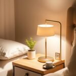
Welcome to your complete guide for creating a restful sanctuary through thoughtful design. The right approach to your room’s appearance can completely change how you experience your space.
Discover how specific shades can transform the atmosphere of your personal retreat. We’ll show you why your selection matters more than you might realize for creating that perfect environment.
Different hues and tones work together to make any area feel more inviting. Whether you’re working with a large master suite or compact guest space, these concepts will work beautifully.
This comprehensive guide takes you from basic principles to practical application methods. You’ll gain all the knowledge needed to choose the perfect shades for your walls.
Get ready to explore specific recommendations from top brands and design professionals. By the end, you’ll feel confident creating the peaceful environment you deserve.
Why Your Bedroom Color Choice Matters for Coziness
Choosing the perfect paint for your personal retreat goes far beyond simple aesthetics. The shades you select create an environment that either supports or disrupts your peace. This decision impacts your daily life in ways you might not expect.
Color expert Ashley McCollum from Glidden perfectly captures this importance:
“Your bedroom is where you go to rest or retreat from life’s chaos”
Your wall colors directly influence both your mood and sleep quality. Different hues can stimulate or soothe your nervous system. This affects how quickly you fall asleep and the rest you receive.
Warm, muted tones create a wonderful cocooning effect. They make your space feel safe and secure. These colors also enhance that intimate, personal feeling you want in your retreat.
Interestingly, color choices affect perceived temperature too. Warmer tones can actually make a room feel physically warmer. This adds to the overall comfort of your environment.
Always consider your room’s natural light patterns and architectural features. The right shade complements these elements beautifully. Your paint selection sets the foundation for all other design aspects.
From bedding to artwork, everything works together with your wall color. Investing time in choosing the perfect shade pays off daily. You’ll enjoy greater comfort and relaxation benefits every time you enter your space.
Understanding Warm vs. Cool Tones for a Snug Atmosphere

The temperature of your color selection creates a powerful emotional response. Warm and cool tones affect how you perceive your personal space in surprising ways.
Farrow & Ball experts explain this subtle yet significant difference:
“Even if it seems like a subtle detail, the color you paint a room can have an enormous overall impact on the ambiance of your space. For instance, one shade of gray can read stark and cold while other variations can lend the perfect amount of welcoming warmth”
Warm tones like reds, oranges, and yellows appear to advance toward you. They create an intimate, enveloping feeling that makes areas feel smaller but more secure.
Cool tones including blues and greens tend to recede visually. They can make a room feel more spacious but sometimes less personal without proper balance.
Understanding undertones becomes absolutely essential. Many colors contain both warm and cool elements that change their overall character.
- Warm grays with brown undertones (greiges) generate comforting feelings
- Cool grays with blue undertones often appear more stark and modern
- The same color family can have warm and cool variations that transform a room
Always consider your existing furniture and flooring when selecting between these tones. Your personal preference also matters significantly.
Some people find certain cool tones incredibly relaxing. Others naturally gravitate toward warm hues for their comforting qualities.
Testing samples in your actual space remains non-negotiable. Lighting conditions dramatically shift how warm or cool any color appears throughout the day.
This understanding helps you create the perfect emotional environment. Your choices will support the peaceful retreat you’re trying to achieve.
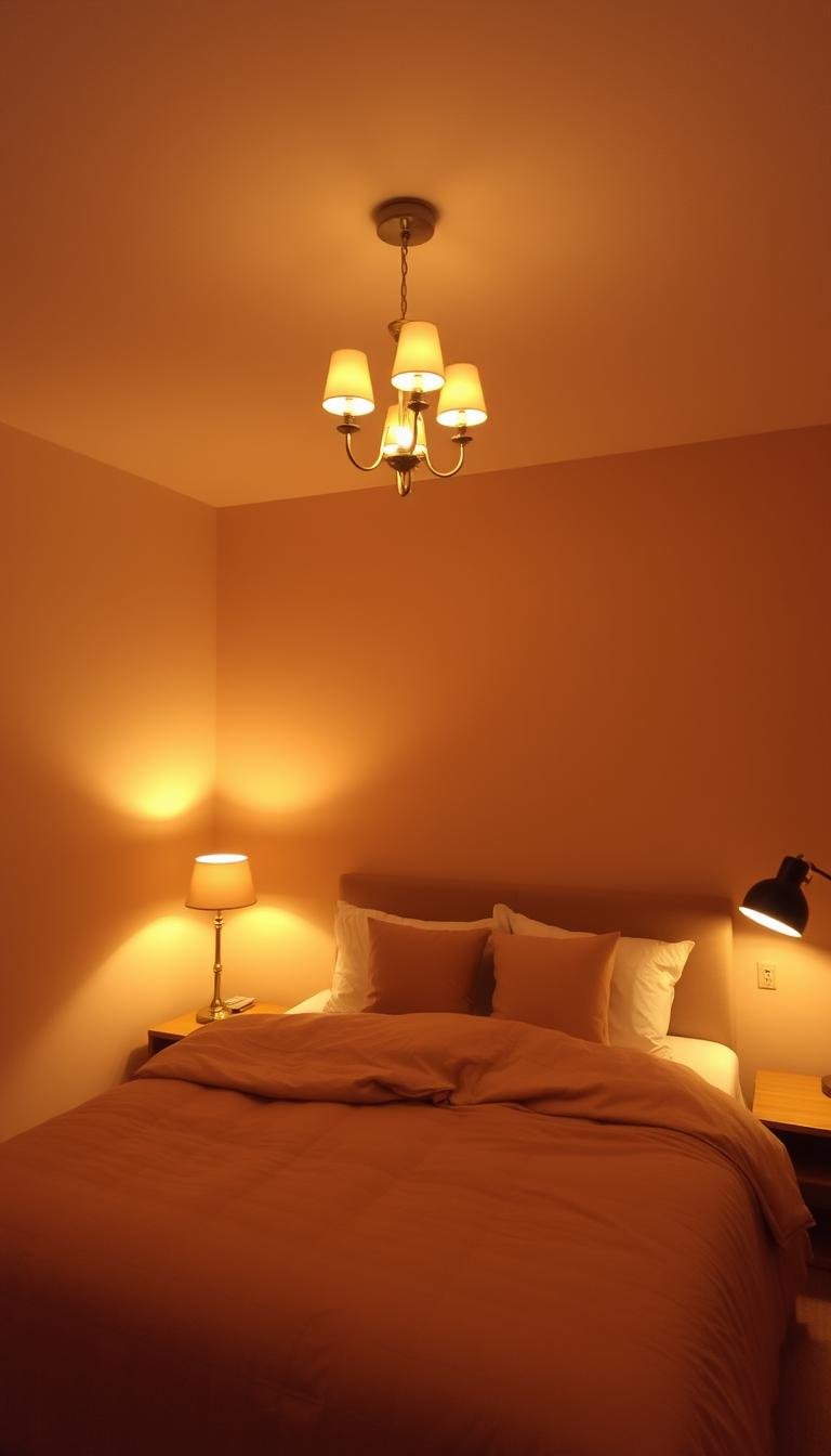
How Lighting Transforms Your Paint Color and Ambiance
Lighting conditions dramatically influence how your chosen shades appear throughout the day. The same color can look completely different under various light sources. This transformation affects the entire feeling of your personal retreat.
“Lighting plays a huge role in both impacting the appearance of paint colors around your home and in creating a cozy ambiance. Try warm layers of lighting to make your home feel inviting and cozy”
The Role of Natural and Artificial Light
Natural illumination changes constantly from morning to evening. This causes your wall color to shift in appearance significantly. North-facing spaces receive cool, blue-toned light that can mute warm tones.
South-facing areas get warm, yellow light that intensifies warm colors. It also makes cool shades appear brighter than expected.
Artificial lighting temperature is measured in Kelvin. Warmer bulbs (2700-3000K) enhance comforting tones beautifully. Cooler bulbs can make the same color feel completely different.
Layered Lighting for Ultimate Warmth
Creating dimensional warmth involves combining different light sources. Use overhead lighting for general illumination throughout the space. Add task lighting for specific activities like reading.
Accent lighting highlights architectural features or artwork beautifully. This layered approach creates depth and visual interest in your room.
Dimmer switches offer excellent control over light intensity. They let you create different moods throughout the day and evening. Consider how your fixtures cast light – directional vs. ambient lighting affects color perception differently.
Always test paint samples under both natural and artificial light. Check them at different times before making your final decision. This ensures you’ll love your color choice in all conditions.
The combination of well-chosen wall color and strategic lighting creates the ultimate comforting atmosphere. They work together to make your space feel perfectly inviting in every way.
Expert Tips for Choosing Your Perfect Cozy Shade

Finding that ideal color for your personal space requires careful consideration. Professional insights can guide you toward selections that truly transform your environment.
Kaitlin Madden from The Finish shares valuable perspective:
“To me, paints that aren’t too dark or too light feel the coziest. Very light colors tend to create spaces that feel vibrant and energetic, while very deep shades can be very dramatic”
Considering Your Room’s Size and Light
Your space’s dimensions and illumination dramatically affect color perception. Larger areas can handle deeper tones without feeling overwhelming.
Smaller rooms often benefit from lighter shades that create airiness. Always evaluate how natural and artificial light interacts with your chosen color.
North-facing spaces receive cooler light that affects warm tones. South-facing rooms get warmer light that intensifies colors differently.
Testing Undertones Before You Commit
Hidden color characteristics significantly impact your final result. These subtle elements emerge under different lighting conditions.
Compare potential shades against pure white to reveal their true nature. This simple test shows whether warm or cool undertones dominate.
Paint substantial sample areas (at least 2×2 feet) on your actual walls. Observe these patches at various times throughout the day.
Key considerations for your perfect shade selection:
- Mid-range tones often create the most balanced and inviting atmosphere
- Darker colors can make spacious areas feel more intimate and personal
- Lighter shades help compact spaces appear more open and airy
- Test samples directly on your surfaces rather than relying on color chips
- Evaluate how colors make you feel emotionally in your specific environment
- Consider the room’s primary function when selecting your final shade
- Remember that colors appear more intense on large wall surfaces
- Trust your personal instincts while considering professional guidance
Your emotional response to a color matters more than technical specifications. The right shade should make you feel relaxed and comfortable immediately.
Professional designers recommend testing multiple options side by side. This comparison helps you identify which undertones work best in your space.
Your perfect color choice creates that welcoming retreat you deserve. It transforms your personal area into a true sanctuary.
Cozy Bedroom Wall Painting Ideas That Add Depth and Warmth
Selecting the right color family transforms your personal space into a true sanctuary. These timeless choices work beautifully across various design styles and room sizes.
According to design experts, “Choose warm earth tones like browns and greens for a cozy and inviting home atmosphere. Mid-toned hues create a subtle yet stylish ambiance perfect for accent walls and any room’s overall feel.”
Earth Tones: Browns, Beiges, and Greiges
Natural-inspired colors ground your space and create serenity. These shades connect your room to the outdoors for ultimate relaxation.
Browns offer wonderful warmth and sophistication. They range from light taupe to rich chocolate tones. Each provides different levels of comfort and elegance.
Modern beiges have evolved beyond basic choices. Many contain subtle pink, green, or gray undertones. These hidden elements add beautiful depth to your paint color.
Greiges combine gray and beige characteristics perfectly. They balance warm and cool elements for contemporary comfort. This hybrid approach works well in various lighting conditions.
Soothing Greens: From Sage to Forest
Green hues bring nature’s calming effect indoors. They create refreshing yet peaceful environments for rest.
Lighter greens like sage provide airy freshness. Deeper forest greens offer cocooning comfort. Both options work beautifully for different effects.
These natural tones complement various furniture styles. They pair wonderfully with wood finishes and natural textiles. Your space feels both organized and organic.
Serene Blues: Soft Skies to Deep Oceans
Blue tones create retreat-like atmospheres reminiscent of peaceful waters. They bring calm energy to your personal environment.
Softer sky blues maintain airiness and light. Deeper ocean shades provide dramatic comfort. Both options work well for different room sizes.
These cool tones balance beautifully with warm accents. They create visual interest through thoughtful contrast. Your space feels both refreshing and restful.
Consider combining these color families through accent features or full coverage. This approach creates dimensional interest throughout your space.
| Color Family | Light Tone Effect | Dark Tone Effect | Best For Rooms With |
|---|---|---|---|
| Earth Tones | Airy warmth | Intimate sophistication | Limited natural light |
| Greens | Refreshing calm | Nature-inspired cocooning | South-facing windows |
| Blues | Sky-like openness | Ocean-depth serenity | Warm artificial lighting |
Test samples in your actual space before deciding. Observe how different hues transform throughout the day. Your perfect choice should make you feel immediately comfortable.
Warm and Welcoming White & Off-White Paint Colors

Many people overlook the incredible potential of white and off-white shades for creating inviting spaces. These versatile colors offer brightness while maintaining comforting undertones that prevent sterile feelings.
The right white paint color can transform your environment into a peaceful retreat. These selections work beautifully in various lighting conditions throughout the day.
Sherwin-Williams White Sand
This beautiful option brings subtle sophistication to any space. Linda Smith from BLDC Design perfectly describes its appeal:
“White Sand has just enough undertones to create a clean, pure softness in any space. It’s a perfect choice for a modern interior design”
The barely-there beige undertones prevent clinical coldness. You get airy brightness with comforting warmth that feels both fresh and inviting.
Benjamin Moore Simply White
This popular choice maintains crisp cleanliness without appearing sterile. Kat Jamieson shares her personal experience:
“This is the creamiest, most beautiful white paint color for your home. We have this on both the interior and exterior of our Connecticut farmhouse”
It provides a clean backdrop that won’t yellow in different lighting. The balanced hue works beautifully with both warm and cool accent colors.
PPG Weathered Wood
For those seeking more pronounced warmth, this option delivers beautiful results. Kimberly Greenwell from My Southern Home explains:
“This color will wrap you in all the seasonal feels all year long. This color is perfect for the living area of a home or a lower level”
The mid-toned neutral brown sugar beige sits comfortably on the warmer side. It creates enveloping comfort without overwhelming your space.
These whites work wonderfully as main colors or for trim and ceilings. They create cohesive environments that feel both bright and comforting.
Pair these warm whites with natural wood tones and textured fabrics. This combination enhances the inviting atmosphere beautifully.
Always test multiple white options in your actual space. Lighting conditions dramatically affect how each shade appears throughout the day.
Consider existing elements like flooring and furniture. These factors influence how your chosen white paint color will ultimately look.
White walls provide perfect backdrops for layering personal artwork and textiles. They create versatile foundations for evolving your decor over time.
Inviting Green Paint Colors for a Nature-Inspired Retreat
Green shades bring the outdoors inside for a calming atmosphere. These nature-connected hues create peaceful environments perfect for relaxation.
Different green intensities serve various purposes beautifully. Lighter greens provide airy freshness while deeper tones offer enveloping comfort.
Consider your room’s light exposure when selecting your perfect green. North-facing spaces might need warmer greens while south-facing rooms handle cooler tones.
Green walls pair wonderfully with natural materials. Wood furniture, rattan accents, and linen textiles enhance the organic feel.
Benjamin Moore Louisburg Green
This mid-toned green creates balanced comfort without overwhelming your space. Kaitlin Madden from The Finish explains its appeal:
“If you’re looking to use this trend in your home in a way that feels cozy, go for a mid-toned shade like Louisburg Green. To me, paints that aren’t too dark or too light feel the coziest”
The sophisticated hue works beautifully in various lighting conditions. It provides enough depth for interest while maintaining approachable warmth.
Benjamin Moore Black Forest Green
This deep, historical green adds sophistication and richness to your environment. Jaclyn James highlights its timeless quality:
“It’s a color that will stand the test of time, but also put you right in the middle of the current green trend. Black Forest Green is a great color to add warmth to your home office”
The luxurious tone creates wonderful cocooning effects. It makes larger spaces feel more intimate and personal.
BEHR Fern Canopy
This vibrant, botanical green brings energy while maintaining natural calm. The refreshing quality mimics nature’s revitalizing effect:
“This fun, lively hue boosts your mood as it mimics the refreshing qualities of nature. Enhance the organic feel by adding furniture and accessories made from natural materials like wood, linen, and rattan”
The cheerful paint color works well with various accent shades. It pairs beautifully with warm terracotta or cool blue accents.
Green hues create inherent relaxation through their natural connection. They transform your personal space into a true sanctuary.
Live plants complement green walls perfectly for biophilic design. This approach brings additional life and freshness to your environment.
Test samples in your actual space before making final decisions. Observe how different greens transform throughout the day.
Your perfect green choice should make you feel immediately peaceful and connected to nature.
Calming Blue Paint Colors for a Serene Escape
Blue tones create peaceful environments that transport you to tranquil spaces. These shades range from soft sky-inspired hues to deeper ocean tones. Each offers different levels of calm for your personal retreat.
Lighter blues feel airy and refreshing while darker blues feel protective. The psychological effects make them ideal for creating relaxing spaces. Blue works well in rooms with ample natural light.
These shades prevent your space from feeling too cool or stark. They pair beautifully with white trim and natural materials. You achieve a fresh, coastal-inspired look that feels both current and timeless.
Sherwin-Williams Rain Cloud
This sophisticated gray-blue elegantly bridges classic and contemporary styles. Emily Kantz from Sherwin-Williams describes its appeal:
“Rain Cloud is a deep gray-blue that elegantly bridges classic and contemporary styles. Although this shade is dramatic, its calming depth adds timeless sophistication to your bedroom”
The versatile hue works in both traditional and modern spaces. It creates an atmosphere of refined tranquility.
Sherwin-Williams Underseas
This muted blue-green creates spa-like serenity reminiscent of ocean depths. The gorgeous, calming tone is perfect for inducing relaxation.
“Muted blue-green shades can create a serene, spa-like atmosphere inside of any bedroom, reminiscent of the sea and sky. This gorgeous, calming tone is perfect for inducing relaxation”
The soothing paint color transforms your space into a peaceful sanctuary. It brings the calming essence of water into your environment.
Dutch Boy Mapped Blue
This versatile medium blue offers a reliable foundation for evolving styles. Lisbeth Parada from Dutch Boy Paints explains its significance:
“Mapped Blue by Dutch Boy Paints, the 2025 Color of the Year, is an excellent choice for adding more personality to your bedroom. This versatile medium blue offers a reliable foundation for homeowners’ evolving styles”
The shade features subtle yellow undertones that adapt beautifully. It provides excellent backdrops for layered textiles in complementary colors.
| Blue Shade | Color Family | Light Effect | Room Compatibility | Pairing Suggestions |
|---|---|---|---|---|
| Rain Cloud | Gray-Blue | Sophisticated depth | Traditional & modern spaces | Warm wood tones, crisp white |
| Underseas | Blue-Green | Spa-like serenity | Rooms with natural light | Natural materials, soft textiles |
| Mapped Blue | Medium Blue | Versatile foundation | Various style preferences | Complementary accent colors |
Test these blue samples in your actual space before deciding. Observe how they transform throughout the day under different lighting conditions. Your perfect blue choice should make you feel immediately peaceful and relaxed.
Consider the psychological effects when selecting your shade. Lighter blues create airy openness while deeper tones offer cocooning comfort. Both options work beautifully for different emotional needs.
Blue walls provide excellent foundations for personal artwork and decor. They create versatile backgrounds that evolve with your changing style preferences. Your space becomes a true sanctuary of peace and tranquility.
Rich, Deep Hues for a Dramatic and Cocooning Effect
Embrace the power of dramatic shades to transform your space into a personal sanctuary. Deep colors create an enveloping atmosphere that feels both protective and intimate. These rich tones work beautifully to establish a comforting environment.
Dark hues visually recede, making them perfect for smaller rooms. They minimize focus on walls while creating depth. This effect makes spaces feel more personal and secure.
Sherwin-Williams Clove
This unique brown-black hybrid offers sophisticated elegance. Linda Smith from BLDC Design describes its special qualities:
“It adds a comfortable coziness to any room. The richness of the color plays as a neutral with almost any palette. Use this paint color in smaller spaces to create a strong, dramatic statement”
The shade provides warmth without appearing too dark. It serves as a versatile neutral that complements various design styles beautifully.
Sherwin-Williams Black Magic
This rich black features neutral undertones with surprising softness. Jaclyn James highlights its transformative power:
“It’s a rich color with neutral undertones, but there’s also a softness to this color. This color gives you that wow factor while at the same time creating a blanket of coziness. Don’t be afraid to paint the ceiling with this color too”
The paint color creates dramatic impact while maintaining comfort. Consider using it on ceilings for a fully immersive experience.
Benjamin Moore Hale Navy
This historical blue-black balances warm and cool elements perfectly. Interior designer Andi Morse explains:
“This is a great color to bring warmth to your home. It’s part of the brand’s historical collection and effortlessly blends both cool and warm. You can even paint all the walls and ceiling in it to create a cocoon feeling for a room”
The versatile hue works across various lighting conditions. It creates a protective, nest-like atmosphere.
Key considerations for using deep colors:
- Ensure adequate artificial lighting to prevent spaces from feeling too dark
- Use tinted primers and multiple coats for even, rich coverage
- These tones provide excellent backdrops for artwork and metallic accents
- Consider color drenching techniques for maximum impact
- Test samples under your actual lighting conditions before committing
Deep hues create intimate environments that feel both dramatic and comforting. They transform ordinary spaces into extraordinary personal retreats.
Soothing Neutral Paint Colors Beyond Basic Gray

Beyond basic gray lies a world of sophisticated neutral options. These complex hues offer subtle undertones that create depth and character. Modern neutrals provide beautiful foundations for any design style.
Today’s neutral palette includes warm greiges and moody grays with personality. These shades work particularly well in sleeping spaces. They create calm, unified environments without visual competition.
Neutral walls allow your furniture and artwork to take center stage. They maintain cohesion while providing timeless foundations. These colors adapt beautifully to changing decor styles.
Benjamin Moore Finnie Gray
This versatile neutral shifts between sage green and greige depending on lighting. Kaitlin Madden from The Finish explains its appeal:
“Warm neutrals are a great alternative to white because they’re just as easy to use but tend to make a space feel extra cozy. Finnie Gray is a beautiful, accessible neutral that can look either like a sage green or a greige depending on the light”
The paint color offers beautiful flexibility throughout the day. It provides just enough warmth without overwhelming your space.
Farrow & Ball Down Pipe
This moody deep gray adds drama without feeling overwhelming. Carissa Byrne Hebert from CBH Interiors describes its qualities:
“The color has beautiful depth to it and adds drama to a space without being too overwhelming. This moody deep gray is the perfect dark accent for any space, big or small”
The rich tone works beautifully as an accent or full coverage. It creates sophisticated depth that feels both modern and timeless.
Glidden Silent Smoke
This light gray sepia greige reflects natural light beautifully. Ashley McCollum from Glidden shares its benefits:
“An ethereal neutral that works beautifully on all walls. When paired with creamy whites, it creates a spacious and bright feel. A light gray, sepia greige that reflects natural light, making rooms appear larger”
The paint color maintains warmth while creating airy brightness. It works particularly well in spaces with limited natural light.
Consider existing furniture and flooring undertones when selecting neutrals. These elements influence how your chosen color will ultimately appear. Testing samples in your actual space remains essential.
These sophisticated neutrals provide excellent backdrops for layered textiles. They allow personal collections and artwork to shine. Your space achieves both character and calm simultaneously.
Unexpected Cozy Colors: Purples, Pinks, and Mauves
Some of the most inviting environments come from color choices that might initially surprise you. Purple, pink, and mauve tones offer sophisticated alternatives to traditional neutrals.
These hues create distinctive atmospheres that feel both personal and comforting. When selected carefully, they transform ordinary spaces into extraordinary retreats.
Farrow & Ball Pelt
This deep, moody purple creates a regal yet comfortable atmosphere. Carissa Byrne Hebert from CBH Interiors describes its captivating appeal:
“Pelt is unexpectedly sexy. You don’t know why you didn’t see it before, but now that you’ve seen it, you just want it. I recommend going all in on this color. Paint all four walls of a room this deep moody purple, you won’t regret it”
The rich purple paint color offers cocooning comfort without feeling overwhelming. It works beautifully in spaces with warm artificial lighting.
Benjamin Moore First Light
This soft, airy pink evokes the calm of a peaceful morning. Hannah Yeo from Benjamin Moore captures its gentle quality:
“Both delicate and soft, this rosy hue exudes a sense of calm, refreshment, and warmth—evoking the bliss of a lazy weekend morning spent enjoying breakfast in bed”
The light pink hue creates an atmosphere of gentle refreshment. It makes any space feel airy yet comfortably warm.
BEHR Mystere
This elegant blend of plum and clay-brown offers sophisticated warmth. Cara Newhart from BEHR shares her personal experience:
“I’ve been loving purples lately and actually just painted my bedroom in Mystere. This muted mid-tone paint color makes for a gorgeous all-over wall color. I love the way this shade looks alongside brass finishes and with dimmed warm lights at night”
The mauve-toned color creates rich depth that feels both modern and timeless. It pairs beautifully with metallic accents.
These unexpected colors work particularly well with warm lighting that enhances their cozy qualities. They make your space feel uniquely personal.
Always test these colors extensively in your actual room. Lighting conditions dramatically affect how they appear throughout the day.
Your chosen color should make you feel immediately comfortable and relaxed. Trust your emotional response when making final decisions.
Metallic accents like brass and copper complement these hues beautifully. They enhance the warmth and sophistication of your space.
Incorporating Accent Walls for Depth and Focus

Creating a focal point in your space adds dimension without overwhelming the entire area. Accent walls provide that perfect balance of visual interest and harmony.
Design experts confirm this approach works beautifully:
“Mid-toned hues create a subtle yet stylish ambiance perfect for accent walls and any room’s overall feel”
These special surfaces draw attention to your room’s best features. They create natural focal points that guide the eye beautifully.
Select the wall that naturally commands attention first. Often this is the surface behind your bed or one with architectural details. This placement ensures your accent enhances rather than competes with your room’s flow.
Consider using a darker version of your main color for a tonal effect. This creates subtle sophistication while maintaining cohesion. Your space feels intentionally designed rather than randomly decorated.
Accent surfaces aren’t limited to paint alone. Wallpaper, textured finishes, or architectural elements work wonderfully. These options add tactile interest beyond color variation.
Strategic placement considerations for your accent surface:
- Highlight artwork or architectural features that deserve special attention
- Choose colors that complement rather than compete with your main palette
- Darker tones recede visually, making rooms feel longer and more spacious
- Lighter shades advance, creating intimacy in larger areas
- These features work particularly well in sleeping spaces seeking visual interest
- Proper planning ensures your accent enhances overall room harmony
Your chosen color should relate to your main scheme through undertones or intensity. This connection creates a cohesive look that feels intentional and polished.
Consider the psychological effect you want to achieve. Darker accents create cocooning comfort while lighter ones add airy brightness.
| Accent Type | Visual Effect | Best For | Room Impact |
|---|---|---|---|
| Tonal Variation | Subtle sophistication | Cohesive environments | Enhanced depth |
| Complementary Color | Dynamic contrast | Modern spaces | Energy boost |
| Textured Finish | Tactile interest | Traditional settings | Rich character |
| Architectural Focus | Highlight features | Unique room elements | Personalized style |
Test your accent color beside your main shade before committing. Observe how they interact under different lighting conditions throughout the day.
Your finished result should feel balanced and intentionally designed. The accent should enhance your space without dominating it completely.
This approach lets you experiment with stronger colors safely. You can incorporate bold shades without overwhelming your entire environment.
Remember that less can often be more with accent features. A well-placed focal point creates far more impact than multiple competing elements.
Color Drenching: Painting Walls, Ceiling, and Trim
Transform your entire space with a unified color approach that wraps you in comfort. This technique creates a fully immersive experience that feels both intentional and inviting.
Design expert Jaclyn James encourages bold thinking:
“Don’t be afraid to paint the ceiling with this color too. It’s becoming more popular to add warmth and drama all the way to the tippy top”
When you paint all surfaces the same shade, you eliminate visual breaks. This creates a seamless, cocoon-like environment that feels incredibly personal.
Farrow & Ball’s experts recommend this approach for serene spaces:
“Studholme recommends color drenching a bedroom with this serene hue. With its underlying warmth, it will create a totally calm space to sleep in, especially when taken up and over the ceiling and even used on the trim as well for the most tranquil of bedroom”
This method works particularly well with deeper colors. They create intimate, protective environments that feel both dramatic and comforting.
Consider your room’s height before beginning. Color drenching can make high ceilings feel more intimate. It can also make low ceilings seem to disappear.
Use eggshell or satin finishes on your walls. Choose semi-gloss for trim to create subtle variation. This maintains color continuity while adding slight dimension.
This technique requires careful cutting-in and attention to detail. Any imperfections become more noticeable when everything shares the same shade.
The monochromatic effect allows your furniture and artwork to stand out beautifully. Your personal items become the stars against a unified background.
Proper lighting becomes especially important with this approach. You want to prevent the space from feeling too dark or overwhelming.
This method works beautifully in sleeping spaces where you want retreat-like atmosphere. It creates that peaceful sanctuary you deserve.
Coordinating Your Paint Color with Bedroom Furniture and Textiles
Your wall color should work in harmony with your existing furnishings and fabrics. This coordination creates a unified look that feels both intentional and inviting.
Consider the advice from BEHR about their Wild Truffle shade:
“Pair this shade with white trim and blue accents to create a peaceful bedroom retreat”
Glidden’s Silent Smoke also offers excellent versatility:
“This versatile neutral complements many different types of decor styles and color schemes”
Your wall color should complement rather than match your existing pieces. This approach creates visual interest while maintaining harmony.
Consider the undertones in your wood furniture. Warm woods like oak or cherry pair beautifully with warm wall colors. Cool woods work best with cooler wall shades.
Create contrast between your walls and furniture. Light walls with dark pieces create striking visual impact. Dark walls with light furniture achieve the same balanced effect.
Your wall color should work with bedding, curtains, and rugs. These elements together tell a cohesive color story throughout your space.
Consider developing a palette that includes your main wall color. Add two or three accent colors for textiles and accessories. This creates a layered, professional look.
Always sample your paint colors alongside fabric swatches. Include wood samples too. This testing ensures everything works together harmoniously.
Remember that large pieces affect how your wall color appears. Their size and color influence the overall perception of your space.
Your wall color should enhance your furnishings rather than compete. It provides the perfect backdrop for your favorite pieces to shine.
Consider the overall style you want to achieve. Traditional spaces might use different colors than modern or coastal designs. Your choices should reflect your personal aesthetic.
This coordination creates a space that feels both personal and polished. Everything works together to create your perfect retreat.
Final Checks Before You Start Painting Your Bedroom
Before you dip that brush, a few essential steps ensure your project goes smoothly. Proper preparation makes all the difference between professional results and frustrating do-overs.
Always test your final color selection in the actual space. View samples at different times under both natural and artificial lighting. Colors transform dramatically throughout the day.
Calculate your paint needs accurately. Measure your walls and add 10-15% extra for touch-ups. Running out mid-project causes color matching headaches.
Surface preparation creates the perfect canvas for your new hue. Clean walls thoroughly to remove dust and grease. Fill any holes or cracks with spackling compound.
Sand rough areas until surfaces feel smooth to the touch. Apply appropriate primers for better adhesion and coverage. This foundation work ensures your finish lasts.
Protect everything you don’t want painted. Use drop cloths for flooring and furniture. Apply painter’s tape precisely along edges and trim.
Check your tools before beginning. Quality brushes and rollers make application easier. Extension poles help reach high areas comfortably.
Consider ventilation throughout your project. Open windows or use fans for proper airflow. Follow manufacturer guidelines for drying times between coats.
Plan your sequence strategically. Typically start with ceilings, then walls, then trim last. This method minimizes drips on finished surfaces.
Allow adequate drying time before moving furniture back. Rushing this step risks damaging your fresh finish. Patience rewards you with perfect results.
These final checks transform your vision into reality. Your beautiful new space awaits just beyond these preparations.
Bringing Your Cozy Bedroom Vision to Life
Your personal space should mirror what comfort means to you. Whether you prefer serene cool tones or rich dramatic hues, your choice creates the atmosphere you desire.
Remember that paint offers flexibility. If your initial selection doesn’t create the right feeling, you can always make changes later. This freedom lets you experiment with confidence.
The perfect shade combined with soft lighting and comfortable fabrics transforms your area. These elements work together to build your ultimate retreat.
Notice how your chosen color affects your mood morning and evening. Your space should help you relax and feel truly at home.
Even minor adjustments can significantly improve your daily relaxation. Trust your instincts while considering professional guidance too.
Enjoy creating an environment that supports your wellbeing through thoughtful choices. Your refreshed space will become your favorite sanctuary for years ahead.