Your personal space should be a true retreat from daily chaos. According to Ashley McCollum, a color expert for Glidden, this room is where you go to rest and recharge.
Thoughtful design choices can transform this functional area into your personal sanctuary. The right atmosphere promotes peace and quality rest.
Color psychology reveals that certain hues significantly impact mood and sleep quality. Neutral tones, soft blues, and pale greens are particularly effective for creating calm.
This guide features inspiring shades recommended by industry experts. These versatile options work with various design styles throughout your home.
You can use these beautiful colors for full walls or accent features. The perfect choice creates a space you’ll love starting and ending each day in.
Why Your Choice of Cozy Bedroom Paint Colors Matters So Much
The visual environment you create in your personal space influences both your waking and sleeping hours. Your selection of wall color directly affects your mood and energy levels throughout the day.
Research shows that certain hues can either energize or calm your nervous system. Soft blues and pale greens are particularly effective for promoting restful sleep. These shades create a peaceful atmosphere that helps you unwind.
Your sleeping area should feel like a personal retreat where you can completely relax. The right color scheme makes this space feel larger, more intimate, or more refined. It’s about creating the exact vibe you want to experience daily.
Color psychology reveals that warm neutrals evoke feelings of comfort and security. Cooler tones promote serenity and mental clarity. Your ideal choice should align with how you want to feel in your sanctuary.
The perfect wall color complements your existing furniture and decor elements. It works harmoniously with natural materials like wood and linen. This creates a cohesive look that feels intentionally designed.
Remember that color selection goes beyond personal preference. It’s about crafting an environment that supports your well-being. Investing time in this decision pays off through daily comfort and better relaxation.
Different families of hues evoke distinct emotional responses. From calm serenity to warm comfort, your color choice sets the emotional tone. This makes your space truly feel like home.
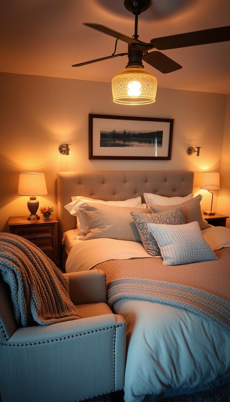
How Lighting Transforms Your Bedroom Paint Color

The magic of your room’s atmosphere often comes down to how light interacts with your walls. Different light sources can make the same shade appear completely different throughout the day.
Understanding this relationship helps you create the perfect environment. Your lighting plan should work with your color scheme rather than against it.
The Effect of Natural Light Throughout the Day
Morning light tends to be soft and warm. It brings out yellow and pink undertones in your walls.
Midday sunlight is bright and neutral. This shows colors in their truest form without much alteration.
Evening light becomes golden and warm again. It emphasizes warmer tones while muting cooler ones.
Room orientation dramatically affects color appearance. South-facing rooms receive warm, bright light all day.
North-facing spaces get cooler, softer light. This can make colors appear slightly more muted.
East-facing rooms enjoy bright morning light. West-facing spaces get warmer afternoon sunlight.
Choosing Colors for Rooms with Artificial Light
Artificial lighting comes in various temperature ranges. Warm bulbs (2700K-3000K) add yellow tones to your walls.
Cool white bulbs (3500K-4100K) provide neutral light. Daylight bulbs (5000K-6500K) offer blue-toned illumination.
Test your color samples under all light conditions. View them during different times of day and with your lamps on.
Rooms with limited natural light need careful consideration. Lighter shades work best as they reflect available light.
Warm artificial light can make bold colors feel more comfortable. It softens intense shades for a more relaxing atmosphere.
Consider your lighting plan before finalizing colors. The right combination creates harmony throughout your space.
| Light Type | Color Effect | Best For These Shades |
|---|---|---|
| Morning Natural Light | Enhances warm undertones | Creams, soft yellows, warm neutrals |
| Midday Natural Light | Shows true color | All shades, especially cool tones |
| Evening Natural Light | Adds golden warmth | Earth tones, warm hues |
| Warm Artificial Light | Adds yellow tones | Reds, oranges, warm neutrals |
| Cool Artificial Light | Adds blue tones | Blues, greens, grays |
Your ideal choice depends on your specific lighting conditions. Test samples in your actual space before making final decisions.
Different light sources can highlight or minimize color undertones. This knowledge helps you select shades that work beautifully in your environment.
Soothing Blues for a Serene, Coastal Vibe
Blue tones create the perfect atmosphere for relaxation and tranquility. These calming hues naturally slow your heart rate and lower blood pressure.
They mimic peaceful natural elements like sky and water. This connection to nature brings a refreshing sense of calm to your personal space.
“Rain Cloud is a deep gray-blue that elegantly bridges classic and contemporary styles,” says Emily Kantz, color marketing manager at Sherwin-Williams.
These versatile shades work with various design aesthetics. From modern minimalism to traditional elegance, blue adapts beautifully.
Rain Cloud by Sherwin-Williams: Deep Gray-Blue Sophistication
Rain Cloud SW 7065 offers dramatic depth with calming sophistication. Its gray undertones provide timeless elegance for your room.
This shade creates a cocoon-like effect that promotes restful sleep. Despite its depth, it maintains a soothing quality.
Pair it with bright white trim for beautiful contrast. Add natural materials like wood and rattan for warmth and texture.
The sophisticated gray-blue works in both light and dark lighting conditions. It maintains its calming presence throughout the day.
Underseas by Sherwin-Williams: A Muted Blue-Green Escape
Underseas SW 6214 creates a spa-like retreat in your home. This muted blue-green shade evokes feelings of ocean tranquility.
It captures the essence of sea and sky for perfect relaxation. The soft green undertones add natural harmony.
Complement with neutral tones in your bedding and linens. Layer different blue-green shades for a coastal-inspired vibe.
This versatile color works with various design styles. It brings a fresh, airy feeling to any interior space.
For more inspiration on blue paint colors, explore these blue bedroom paint ideas.
| Color Name | Color Code | Best Paired With | Room Vibe |
|---|---|---|---|
| Rain Cloud | SW 7065 | White trim, natural wood | Sophisticated calm |
| Underseas | SW 6214 | Neutral linens, layered blues | Coastal serenity |
| Light Gray Blues | Various | Warm neutrals, metallic accents | Airy relaxation |
| Deep Navy | Various | Crisp white, gold accents | Dramatic peace |
Both paint colors offer unique paths to tranquility. Your ideal choice depends on your desired atmosphere and existing decor.
Test samples on your bedroom walls before committing. Observe how they change with natural light throughout the day.
These blue hues create a peaceful retreat for quality sleep. They transform your space into a personal sanctuary.
Warm Neutrals for a Grounded and Inviting Feel

Neutral tones create a foundation of comfort in your personal retreat. These versatile hues establish a peaceful atmosphere that welcomes relaxation.
Warm neutrals bring earthy elements into your interior space. They create a sense of stability that promotes restful sleep.
These shades work with any design style from modern to traditional. Their flexibility makes them an ideal choice for creating harmony.
Neutral paint colors provide the perfect backdrop for your bedding and decor. They allow you to change accessories while maintaining a cohesive look.
Roman Column by Sherwin-Williams: A Cozy Warm White
Roman Column SW 7562 offers a soft, welcoming atmosphere. This warm white creates a calm and spacious space feel.
It works beautifully on both walls and trim throughout your room. The subtle warmth makes your home feel instantly inviting.
Pair this shade with beige and black accents for sophistication. The combination creates depth while maintaining airy lightness.
This versatile color adapts to different lighting conditions throughout the day. It always maintains its comforting presence.
Wild Truffle by BEHR: A Welcoming Brown-Gray Hue
Wild Truffle delivers a grounded, restful vibe perfect for relaxation. This mid-tone gray with brown undertones feels both modern and timeless.
“This mid-tone gray with brown undertones feels welcoming,” says Cara Newhart, interior designer and BEHR ambassador.
The earthy tones create a connection to nature within your bedroom. This enhances the peaceful atmosphere for better sleep.
Combine this wall color with white trim and blue accents. The contrast creates a serene retreat that feels both fresh and comfortable.
Both paint colors work with various bedroom colors and textures. Layer different neutral tones for added depth and interest.
Test samples on your actual bedroom walls before making your final choice. Observe how they change with natural and artificial light.
These warm neutrals create the perfect foundation for your personal sanctuary. They provide flexibility while maintaining a comforting atmosphere.
Earthy Greens to Bring the Calm of Nature Indoors
Green hues create an instant connection to the natural world within your personal retreat. These organic tones bring the restorative power of nature directly into your living space.
Psychological studies show green promotes balance and harmony. This color family reduces stress while encouraging mental clarity.
The right green shade transforms your room into a serene sanctuary. It creates a peaceful atmosphere perfect for unwinding after long days.
Fern Canopy by BEHR: A Vibrant, Botanical Green
Fern Canopy M380-6 delivers a lively, botanical energy to any interior. This vibrant green mimics fresh foliage and brings outdoor freshness inside.
The cheerful hue naturally boosts mood and energy levels. It creates an uplifting atmosphere that still promotes relaxation.
“This fun, lively hue captures the refreshing qualities of nature while creating a therapeutic escape,” says BEHR color experts.
Pair this statement color with natural materials for enhanced organic feel. Wood accents, linen textiles, and rattan details complement beautifully.
This shade works particularly well in spaces with ample natural light. Morning sunlight emphasizes its vibrant character while evening light softens its intensity.
Secret Moss: A Dusky, Therapeutic Moss Green
Secret Moss offers a deeper, more grounded alternative for creating calm. This dusky green with subtle gray undertones feels both sophisticated and soothing.
The therapeutic qualities make it perfect for spaces dedicated to restful sleep. It creates a cocoon-like effect that encourages complete relaxation.
This versatile paint color works beautifully with minimalist decor schemes. Clean lines and simple furnishings allow the rich shade to make its statement.
Combine with soft neutral tones in your bedding and accessories. Creamy whites and warm beiges create beautiful contrast while maintaining serenity.
| Green Shade | Color Code | Lighting Performance | Recommended Pairings |
|---|---|---|---|
| Fern Canopy | M380-6 | Best in bright natural light | Natural wood, white accents |
| Secret Moss | Various brands | Works in all lighting conditions | Soft neutrals, minimalist decor |
| Botanical Greens | Various | Enhances with morning light | Rattan, linen textures |
| Mossy Greens | Various | Softens in evening light | Warm grays, natural fibers |
Your ideal choice depends on your existing color scheme and lighting conditions. Test samples on your actual bedroom walls to see how they transform throughout the day.
Balance vibrant greens with calming elements for optimal relaxation. Layer textures and incorporate soft lighting to create your perfect nature-inspired retreat.
These green paint colors bring the outdoors inside beautifully. They create a fresh, organic vibe that supports both energy and tranquility.
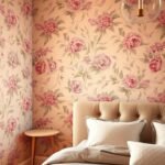
Soft, Airy Pinks and Blushes for a Gentle Embrace

Delicate pink tones create a nurturing atmosphere in your personal retreat. These gentle hues offer a comforting embrace that promotes feelings of safety and tranquility.
Psychological research shows soft pinks reduce stress and anxiety levels. They create a protective environment that supports emotional well-being.
These versatile shades work across various design aesthetics. From modern minimalism to classic elegance, they adapt beautifully to your space.
Setting Plaster by Farrow & Ball: A Delicate Blush Hue
Setting Plaster offers timeless elegance with its subtle blush character. This gorgeous shade brings historic charm to contemporary interiors.
“It’s a magical color for bedrooms, as its soft tones feel like they are embracing you and keeping you safe,” says Joa Studholme, color curator at Farrow & Ball.
The gentle warmth creates a protective atmosphere for quality sleep. It works equally well in adult spaces and children’s rooms.
Pair this shade with crisp white trim for beautiful contrast. Add natural wood elements and textured linens for depth.
First Light by Benjamin Moore: A Soft, Airy Pink
First Light provides a refreshing alternative to standard neutrals. This airy pink brings delicate softness to your walls.
“Both delicate and soft, this rosy hue exudes a sense of calm, refreshment, and warmth—evoking the bliss of a lazy weekend morning spent enjoying breakfast in bed,” says Hannah Yeo, senior manager of color marketing at Benjamin Moore.
The subtle rosy undertones create morning-fresh energy throughout the day. It maintains its calming presence in various lighting conditions.
This versatile choice works with both cool and warm color schemes. It brings gentle sophistication without overwhelming your space.
Style these pink tones with complementary decor for balanced elegance. Consider these pairing suggestions for your ideal look:
| Pink Shade | Best Paired With | Design Style | Atmosphere Created |
|---|---|---|---|
| Setting Plaster | White trim, natural wood | Traditional to modern | Historic charm |
| First Light | Gray accents, metallic details | Contemporary | Airy freshness |
| Blush Tones | Green elements, linen textiles | Organic modern | Natural harmony |
| Dusty Pinks | Black accents, geometric patterns | Modern eclectic | Sophisticated contrast |
Create a balanced scheme by combining pink walls with neutral bedding. Layer different textures to add depth without feminine overload.
Incorporate natural materials and clean-lined furniture for modern appeal. This approach keeps the space feeling sophisticated rather than childish.
Test your chosen shade on actual walls before final commitment. Observe how it transforms under both natural and artificial light throughout the day.
These gentle pink tones create a truly embracing environment. They offer both visual comfort and psychological warmth for your perfect retreat.
Deep, Moody Hues for a Dramatic and Cocoon-like Space
Dark color choices create an intimate sanctuary that wraps you in comfort. These deep shades transform your personal space into a dramatic retreat.
Psychological research shows dark hues promote feelings of security and tranquility. They create a cocoon-like environment perfect for restful sleep.
These rich tones work beautifully in various interior design styles. From modern minimalism to traditional elegance, they add depth and character.
Caviar by Sherwin-Williams: A Comforting Inky Black
Caviar SW 6990 offers sophisticated darkness with comforting warmth. This inky black paint color mimics the peaceful night sky.
The deep shade creates the perfect setting for quality sleep. Despite its intensity, it maintains a soothing presence.
Consider using Caviar as an accent wall if full coverage feels overwhelming. This approach adds drama while maintaining balance.
The elegant black works with both natural and artificial lighting. It creates different moods throughout the day and evening.
Grounded by Sherwin-Williams: An Elegant Deep Brown
Grounded SW 6118 brings earthy sophistication to your home. This deep brown shade replaces cooler gray tones with natural warmth.
“Grounded is a deep brown that’s both elegant and calming, making it ideal for a cozy bedroom,” says Emily Kantz, color marketing manager at Sherwin-Williams.
The rich brown hues create connection to nature within your room. This enhances the peaceful atmosphere for better relaxation.
Complement this stunning color with a tonal palette of brown, tan, and beige. The combination creates luxurious depth throughout your space.
This trending shade works particularly well in smaller bedrooms. Dark colors can make walls recede, creating a larger sense of space.
Balance dark wall colors with strategic lighting and textural elements. Layer different neutral tones in your bedding and accessories.
Test these deep paint colors on your actual bedroom walls before finalizing your choice. Observe how they transform under different light conditions.
These moody hues create a truly embracing environment. They offer both visual drama and psychological comfort for your perfect retreat.
The Can’t-Go-Wrong Versatility of Light Grays and Greiges

Neutral shades offer incredible flexibility for your personal retreat. These versatile hues create a perfect foundation that adapts to changing tastes and styles.
Light grays and greiges provide a balanced backdrop for any decor scheme. They work beautifully with both traditional and contemporary interior designs.
These neutral tones allow your furniture and accessories to take center stage. You can easily update your look without repainting the entire room.
Greiges blend warm and cool undertones for universal appeal. This balance creates a comfortable atmosphere that supports restful sleep.
Silent Smoke by Glidden: A Light, Reflective Greige
Silent Smoke offers an ethereal quality that transforms any space. This light gray with sepia influence reflects natural light beautifully.
Ashley McCollum describes it as a sophisticated choice that makes rooms appear larger. The reflective quality enhances brightness throughout your home.
Pair this shade with creamy whites for a spacious, airy feel. The combination creates a serene environment perfect for relaxation.
This versatile paint color works on all walls without overwhelming the space. It maintains its calming presence under various lighting conditions.
Accessible Beige by Sherwin-Williams: A Warm, Versatile Greige
Accessible Beige delivers warmth without appearing dated or too golden. Its gray undertones keep the color fresh and modern.
This warm greige creates a relaxed, neutral backdrop for any style. It works particularly well with patterned bedding and various textiles.
The versatile hue complements a wide range of natural materials. Wood accents, stone features, and organic textiles all harmonize beautifully.
This paint color establishes a grounded sense of tranquility in your sanctuary. It provides the perfect foundation for creating your ideal retreat.
Both shades offer excellent flexibility for evolving decor preferences. They work with various color schemes and design elements.
Test these neutral tones on your actual walls before making your final choice. Observe how they transform throughout the day and evening.
These versatile paint colors create a timeless foundation for your personal sanctuary. They provide both visual harmony and psychological comfort.
Testing Paint Samples: The Most Important Step Before You Commit
Never skip testing your favorite shades on actual surfaces. Colors transform dramatically between store displays and your personal environment.
Lighting, existing decor, and wall textures all influence final appearance. Your perfect choice depends on seeing it in context.
This crucial step prevents costly mistakes and disappointment. It ensures your selected shade delivers the desired atmosphere.
How to View Samples in Your Actual Space
Paint large swatches directly onto multiple walls. Test both north and south-facing surfaces for different light effects.
Observe how each shade interacts with your furniture and bedding. Notice how colors change beside wood tones and metallic elements.
Create sample boards if painting directly isn’t possible. Use foam core or large poster boards for movable testing.
Place samples near windows and in darker corners. This shows how light distribution affects color perception.
Observing Color Changes from Day to Night
Check your samples during morning, noon, and evening hours. Natural light reveals different undertones throughout the day.
Morning light typically enhances warm undertones in shades. Cool tones might appear softer during early hours.
Evening artificial lighting dramatically alters color perception. Warm bulbs emphasize yellow and red undertones.
Cool white bulbs make blues and greens appear more vibrant. Test under all lighting conditions you typically use.
Live with samples for at least three full days. This gives you time to experience all lighting scenarios.
Notice how colors make you feel during different times. Your ideal choice should promote restful sleep and daytime comfort.
| Testing Time | What to Observe | Key Considerations |
|---|---|---|
| Morning | Warm undertones, natural light effects | How east-facing walls respond to sunrise |
| Midday | True color representation, brightness | South-facing wall performance |
| Evening | Artificial lighting effects, mood changes | Lamp and overhead lighting interactions |
| Night | Darkness impact, cozy atmosphere | How shade performs in low light conditions |
Evaluate how each sample works with your color scheme. Ensure it complements rather than clashes with existing elements.
Look for undertones that might emerge under specific lighting. Some grays might reveal unexpected green or purple hints.
Notice intensity changes throughout daylight hours. Some shades become more vibrant while others soften considerably.
This comprehensive testing ensures your final decision creates the perfect environment. It transforms your space into a true sanctuary.
Selecting the Perfect Paint Sheen for Your Bedroom Walls

The finish you choose for your walls makes a significant difference in your final result. Sheen affects both the appearance and functionality of your painted surfaces.
Different sheen levels interact with light in unique ways. They can either highlight or minimize wall imperfections throughout your space.
Flat finishes provide the most matte appearance with zero shine. They offer excellent hide and coverage for uneven surfaces.
Eggshell provides a subtle, soft glow that resembles actual eggshells. This popular choice balances beauty with practical performance.
Satin finishes offer a pearl-like luster that’s easy to maintain. They provide more durability than flatter options.
Semi-gloss creates noticeable shine and reflects light beautifully. This option works best on trim and detailed elements.
Your personal preference matters most in low-traffic areas like sleeping quarters. Since these spaces experience minimal wear, durability becomes less critical.
Eggshell remains the traditional recommendation for bedroom applications. It offers great coverage that makes painting easier.
This versatile finish minimizes visible brush strokes and roller marks. It creates a uniform appearance across all your surfaces.
Different sheens can alter how you perceive your chosen color. Higher gloss levels tend to make shades appear slightly brighter.
Flatter finishes absorb more light, making colors appear deeper. This effect can influence your final color selection.
Test sheen options alongside your color samples during daylight hours. View them under both natural and artificial lighting conditions.
Notice how each finish interacts with your existing decor elements. Consider how they complement your furniture and bedding choices.
Higher sheen levels tend to highlight surface imperfections. Lower sheens do better at hiding minor flaws and irregularities.
Cleanability varies significantly between different finish options. Higher gloss levels withstand cleaning better than flat alternatives.
For rooms with children or pets, consider slightly more durable options. Satin provides good cleanability while maintaining subtle elegance.
North-facing rooms with limited natural light benefit from lighter sheens. These finishes help reflect available light throughout your space.
South-facing rooms with abundant sunlight can handle flatter finishes. The natural brightness compensates for the light-absorbing quality.
Your ideal choice depends on your specific conditions and preferences. Take time to evaluate samples in your actual environment.
The right sheen completes your color scheme beautifully. It enhances your chosen shades while providing the practical performance you need.
This finishing touch transforms your walls into a cohesive background. It supports both your aesthetic vision and functional requirements.
Pairing Your Wall Color with Decor and Bedding for a Cohesive Look
Your personal sanctuary achieves harmony when every element works together. The right combinations create visual flow and emotional balance throughout your space.
Start by looking at your existing textiles and furnishings. Your bedding, curtains, and favorite pillows offer excellent inspiration for your palette.
Find a wall shade that complements these key elements. This approach ensures everything feels intentionally designed rather than random.
For balanced interiors, choose a wall color lighter than your floor tone. This creates natural visual hierarchy that feels grounded and spacious.
Neutral walls provide incredible flexibility for changing decor seasons. They allow you to experiment with different accent colors through accessories.
Consider your furniture’s wood tones and metal finishes. Warm woods pair beautifully with earthy greens and soft neutrals.
Cool gray metals work well with blue tones and crisp whites. These connections create subtle harmony throughout your room.
Create focal points through strategic color placement. An accent wall behind your headboard draws attention beautifully.
Use colorful bedding against neutral walls for vibrant contrast. This lets you change the vibe easily without repainting.
Patterns add wonderful visual interest to solid walls. Striped curtains or floral pillows bring energy to calm backgrounds.
Different room sizes benefit from specific color strategies. Light shades make small spaces feel more open and airy.
Darker tones create intimacy in larger rooms. They make expansive areas feel more welcoming and personal.
Your ceiling color contributes to the overall atmosphere. Light ceilings enhance brightness while dark ones add coziness.
Remember that textures work alongside colors beautifully. Layered linens, woven rugs, and soft throws add depth.
Test your final selections together before committing. View samples beside your actual bedding and furniture pieces.
The perfect combination creates a space that feels completely yours. It supports both beautiful aesthetics and restful relaxation.
Your Peaceful Bedroom Retreat Awaits: Final Thoughts on Color Selection
Your perfect personal retreat starts with the right color that reflects your desired atmosphere. It’s about how you want your space to feel, not just look.
Always test shades on your actual walls under different lighting conditions. This ensures your choice promotes restful sleep and daytime comfort.
Trust your instincts while considering expert advice. Your bedroom should mirror your personal style and needs perfectly.
Start with versatile neutral tones as a foundation. Add personality through accent elements and textured bedding.
Remember that paint is easy to change if your first selection isn’t ideal. Your sanctuary should evolve with you over time.
Create a home environment that truly supports your well-being. Your peaceful retreat awaits your personal touch.