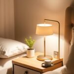
Your personal sanctuary deserves careful thought. The right hues transform your space into a retreat that promotes relaxation and well-being.
Colors powerfully affect your emotions. They can create feelings of happiness, comfort, and warmth in your room.
This guide helps you navigate your choices. We cover everything from understanding color psychology to practical application tips.
Your scheme impacts more than just looks. It enhances sleep quality and shapes your daily mood.
Whether you love vibrant shades or calming neutrals, we offer expert advice. You’ll discover how to match tones with furniture and lighting.
Think of your interior as a balanced sanctuary. Our upcoming sections include science-backed tips and thirty inspired schemes to spark ideas.
Make informed decisions to create your perfect retreat. Gain confidence in selecting hues that harmonize with your decor and personal style.
Why Your Bedroom Color Palette Matters for Sleep and Well-being

Your eyes do more than just see. They communicate directly with your brain about your environment. Special cells called ganglion cells respond to different hues.
This biological connection means your room’s scheme affects your vital rhythms. It influences how you perform all day long.
Research from the Edinburgh Sleep Centre shows this clearly. Director Chris Idzikowski’s team found that blue tones promote calmness. They help lower heart rate and blood pressure.
In contrast, energetic shades like bright purple can disrupt sleep patterns. They stimulate brain activity when you need rest most.
Your choices create more than just visual appeal. They build a serene environment that reduces stress and anxiety. This supports better mental health every day.
Lighter tones can make your space feel larger and more open. This perception adds to your overall comfort and relaxation.
Think of your sanctuary as a tool for rejuvenation. The right shades transform it into a functional retreat for true rest.
Understanding this science empowers you. You can make choices that enhance both your sleep quality and daily life.
Your well-being deserves this thoughtful approach. The connection between hues and health is real and powerful.
Understanding Color Psychology: How Hues Affect Your Mood

Have you ever walked into a room and felt an instant shift in your energy? That’s the power of tones working on your subconscious. Different shades trigger unique emotional responses that shape your daily experience.
This fascinating field examines how visual stimuli influence human behavior and feelings. By understanding these connections, you can intentionally craft spaces that support your desired vibe.
Your choices create more than visual appeal—they build environments that either energize or calm you. This knowledge becomes particularly valuable when designing spaces for specific purposes.
For deeper insights into this subject, explore this comprehensive guide on color psychology for home environments.
The Calming Effect of Cool Tones: Blue and Green
Cool shades like blue and green naturally evoke tranquility and peace. They remind us of serene natural elements—endless skies and lush forests.
Blue possesses scientifically proven restful qualities. Studies show it can lower heart rate and blood pressure, encouraging peaceful sleep.
Green brings a sense of rejuvenation and balance to your space. It mimics nature’s restorative qualities, creating harmony in your environment.
The Cozy Embrace of Warm Tones: From Neutrals to Reds
Warm shades generate energy and excitement in your personal space. Reds, yellows, and oranges create feelings of coziness and intimacy.
Use these stimulating hues carefully though. Overuse might create too much energy when you need relaxation.
Neutrals like beige or taupe offer grounding effects without overwhelming your senses. They provide sophistication while maintaining comfort.
| Temperature | Common Hues | Primary Effect | Best Application |
|---|---|---|---|
| Cool | Blues, Greens | Calmness, Serenity | Walls, Large surfaces |
| Warm | Reds, Oranges | Energy, Excitement | Accents, Decor items |
| Neutral | Beiges, Grays | Balance, Grounding | Base tones, Furniture |
Consider combining different temperatures for optimal results. A primarily cool scheme with warm accents creates both serenity and visual interest.
Your personal preference matters most when selecting shades. Choose combinations that resonate with your desired feeling and purpose.
Understanding these psychological effects helps you make informed decisions. You’ll create spaces that truly support your mood and activities.
The Science of Sleep: Choosing Colors for Optimal Rest

Ever wonder why some rooms instantly make you feel drowsy while others keep you alert? The answer lies in how your brain processes visual information. Special cells in your eyes called ganglion cells respond directly to different hues.
These cells send signals to your brain’s sleep centers. They help regulate your circadian rhythms and melatonin production. This biological connection means your room’s visual environment directly impacts your rest quality.
Research consistently shows blue tones work best for sleep environments. A University of Sussex study found blue light lowers heart rate and blood pressure. It creates calmness that prepares your body for deep rest.
Green hues also promote relaxation by mimicking natural environments. They evoke feelings of peace and balance. Both these cool tones encourage melatonin production for faster sleep onset.
“Blue light has been shown to lower heart rate and blood pressure, creating ideal conditions for sleep preparation.”
In contrast, vibrant shades like purple or bright red stimulate brain activity. They increase energy when you need relaxation most. These tones can disrupt your sleep patterns and reduce rest quality.
Consider these science-backed tips for your sleep space:
- Choose pastel versions of calming hues to avoid overstimulation
- Test samples at different times to see how light affects them
- Remember personal sensitivity varies – trust what feels right for you
Combine your hue choices with other sleep-enhancing elements. Soft lighting and comfortable bedding work with your scheme. Together they create the perfect atmosphere for restorative rest.
Your informed choices transform your space into a true sanctuary. They support rather than disrupt your natural sleep patterns. This science-backed approach leads to better health and daily energy.
Exploring Core Color Families for Your Bedroom

Your perfect retreat begins with choosing the right family of shades. Each group creates a distinct atmosphere and supports your desired mood.
These core families offer versatile options for your personal space. They range from calming cool tones to warm, inviting hues.
Understanding their unique qualities helps you make confident choices. Let’s explore how each family can transform your sanctuary.
Serene and Soothing Blues
Blue remains a top choice for creating peaceful environments. Its calming effect is backed by scientific research on rest and relaxation.
Soft pastel versions work best for sleep areas. They create a gentle backdrop that lowers heart rate and blood pressure.
From sky blue to deeper navy, these shades offer versatility. Lighter tones make spaces feel more open and airy.
Pair blue with crisp whites for a fresh, clean look. This combination enhances the tranquil atmosphere you want.
Fresh and Rejuvenating Greens
Green brings nature’s renewal into your personal space. It fosters growth and balance through its connection to the natural world.
Sage and seafoam are particularly popular choices. These specific shades create a fresh, inviting look that complements various styles.
Green works beautifully with both modern and traditional decor. It adds life to your scheme without overwhelming the senses.
This family promotes harmony and rejuvenation daily. It’s perfect for those seeking a natural, balanced environment.
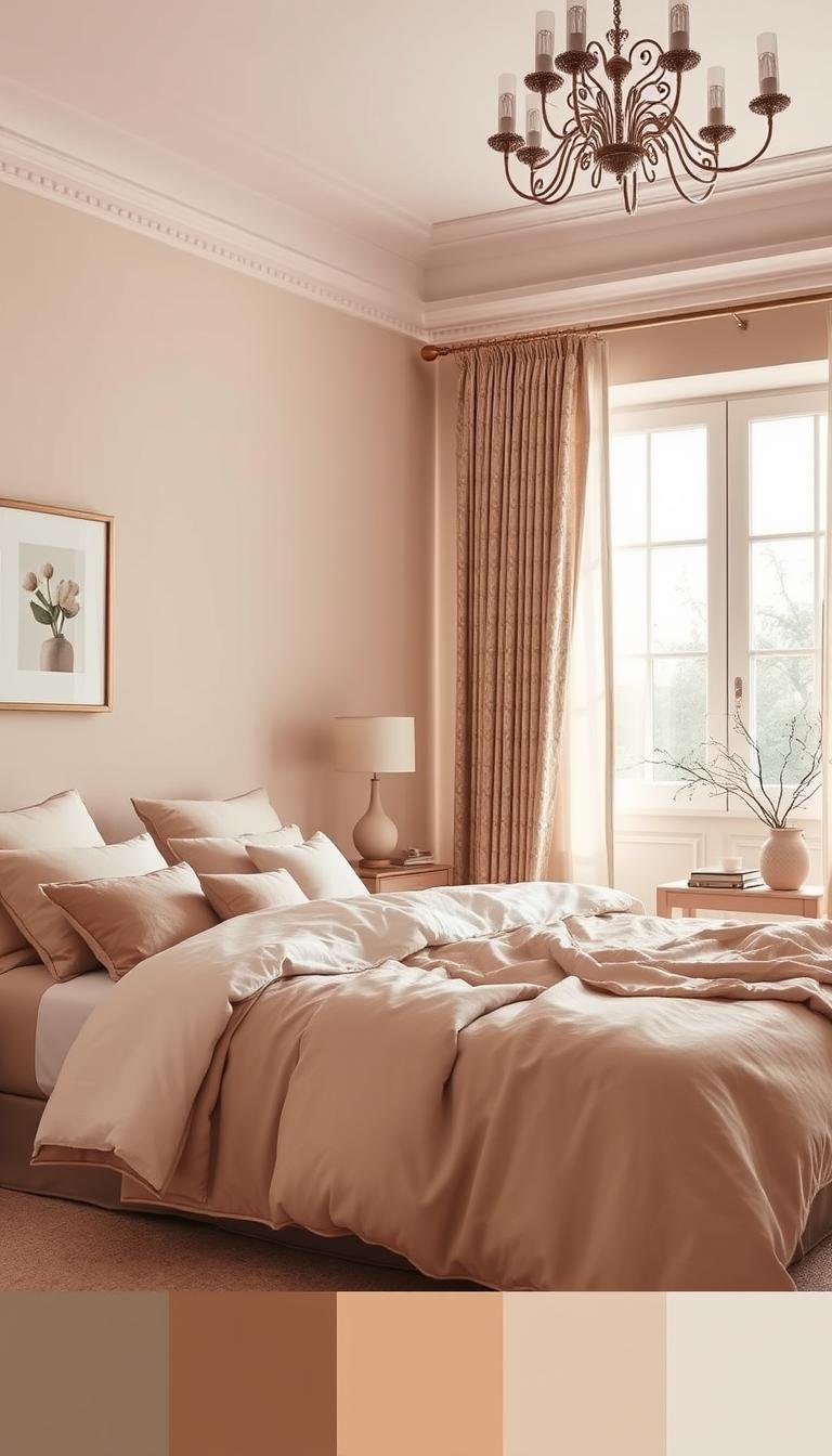
Warm and Inviting Neutrals
Neutrals provide a sophisticated foundation for any space. Beige, taupe, and ivory offer incredible versatility and elegance.
These tones pair beautifully with other colors and textures. They create a timeless appeal that’s easy to update over time.
You can refresh your look simply by changing accents. This flexibility makes neutrals a practical long-term choice.
Warm neutrals ground your space with comforting energy. They provide coziness without sacrificing sophistication.
Soft and Romantic Pinks
Pink adds romance and warmth to your personal retreat. Soft versions create comfort without being overwhelming.
These shades work particularly well in morning light. They create a gentle, uplifting atmosphere to start your day.
Pair pink with neutrals for a balanced, sophisticated look. This combination maintains serenity while adding visual interest.
Choose muted tones for the most restful effect. They provide just enough warmth for a cozy, inviting space.
Each family offers unique benefits for your environment. Consider your personal style and lighting conditions when choosing.
Experiment with samples to see how tones transform your space. This testing ensures you’ll love your final selection.
Your choices should reflect what makes you feel most at peace. Trust your instincts about what creates your perfect retreat.
30 Inspired Bedroom Color Schemes and Palettes

Ready to transform your personal space with stunning visual combinations? We’ve curated thirty beautiful schemes to spark your creativity. These examples show how different tones work together to create unique atmospheres.
Each combination offers a distinct personality for your retreat. You’ll find options for every style preference and room size.
Remember that lighting and room size affect how shades appear. Always test samples in your actual space before committing.
Black, White, and Blush Pink for a Balanced Retreat
This classic trio creates sophisticated contrast with soft warmth. The strong black-and-white base gets a gentle touch from blush pink accents.
This combination feels both elegant and approachable. It works particularly well in rooms with plenty of natural light.
Add pink through throw pillows, artwork, or a small accent wall. This keeps the scheme grounded and inviting.
Squash Yellow, Creamy White, and Emerald Green for Dynamic Energy
Mix warm and cool tones for vibrant yet balanced energy. Squash yellow brings sunshine, while emerald green adds natural richness.
Creamy white prevents the scheme from feeling overwhelming. It creates a clean backdrop that lets the other shades shine.
Modern touches like mirrored nightstands enhance this lively look. The result is a space full of personality and style.
Antiqued Blue and Soft Red for a Welcoming Country Feel
Create cozy vintage charm with these muted, friendly tones. Antiqued blue provides a relaxed foundation with historical character.
Soft red accents add just enough warmth without overwhelming. Use traditional patterns and warm whites to complete the atmosphere.
This combination feels both timeless and personally inviting. It’s perfect for creating a comfortable, lived-in vibe.
Poppy Red and Orange with Black for a Global-Inspired Look
Embrace bold, adventurous energy with this vibrant combination. Rich poppy red and orange create excitement and warmth.
Black accents provide definition and ground the energetic shades. White elements keep the overall look crisp and balanced.
This scheme works beautifully for bohemian or global-inspired decor. It brings joyful energy to your personal space.
Pearly Whites and Rich Wood for Pastoral Ease
Achieve relaxed sophistication with this natural combination. Soft pearly whites create an airy, light-filled atmosphere.
Rich wood tones add warmth and organic texture. Consider shiplap walls or wood ceiling beams for added dimension.
Charcoal accents provide subtle contrast without disrupting the calm vibe. This scheme feels both fresh and comfortably established.
Burnt Orange and Dusty Pink for a Sunset Vibe
Capture the beautiful warmth of evening skies with this pairing. Burnt orange brings deep, earthy energy to your space.
Dusty pink softens the intensity with romantic warmth. White walls make these rich tones truly stand out.
Dark fixtures or furniture pieces anchor the scheme beautifully. You’ll create a cozy, enveloping atmosphere perfect for relaxation.
Seafoam Green and Mustard Yellow for a Nature-Inspired Retreat
Bring the outdoors inside with this refreshing combination. Seafoam green evokes calm waters and peaceful moments.
Mustard yellow adds sunny warmth and cheerful energy. Together they create a balanced, organic feeling.
Enhance the natural theme with tactile textures like woven headboards. This scheme feels both rejuvenating and comfortably cozy.
Blue, White, and Fuchsia for a Bold Floral Statement
Make a dramatic style statement with this vibrant trio. Teal walls provide rich saturation as a beautiful background.
Fuchsia accents bring playful energy and modern flair. Often inspired by patterned bedding or artwork.
White elements prevent the scheme from feeling too intense. This combination creates memorable visual interest.
Use these thirty schemes as starting points for your own creativity. Adapt them to your space with personal accents and adjustments.
Consider your room’s lighting conditions and size when choosing. The right combination should reflect your personal style while creating your perfect retreat.
How to Match Your Bedroom Color Palette with Existing Furniture
Your furniture pieces anchor your room’s design. Coordinating wall tones with your existing pieces creates harmony throughout your space.
This approach ensures everything works together beautifully. You’ll achieve a cohesive look that feels intentional and well-designed.
Whether you have dark or light wood pieces, smart choices enhance their beauty. The right background makes your furnishings stand out.
Let’s explore how to create perfect pairings for both scenarios.
Best Wall Colors for Dark Wood Bedroom Furniture
Dark wood pieces bring richness and depth to your interior. Light walls prevent the space from feeling too heavy or closed-in.
Choose neutrals like beige or dove gray for your background. These shades reflect light and make the room feel brighter.
Your dark furniture will stand out elegantly against these light tones. The contrast creates visual interest without overwhelming the senses.
Add warmth through decor items or artwork for extra coziness. This touch enhances the overall atmosphere beautifully.
Best Wall Colors for Light Wood Bedroom Furniture
Light wood furniture offers wonderful flexibility for your walls. You can choose brighter tones for a fresh, modern aesthetic.
Soft blues or greens create a lively yet relaxing vibe. These tones complement the natural warmth of light wood beautifully.
For classic styles, consider sand, ivory, or gray walls. These neutrals enhance the furniture’s simplicity and warmth.
Always match undertones for harmony throughout your space. Warm furniture pairs best with warm wall shades.
| Furniture Type | Recommended Walls | Visual Effect | Style Match |
|---|---|---|---|
| Dark Wood | Beige, Dove Gray | Brightness, Contrast | Traditional, Modern |
| Light Wood | Soft Blue, Sage Green | Fresh, Modern | Contemporary, Nature-Inspired |
| Light Wood | Sand, Ivory, Gray | Classic, Warm | Traditional, Transitional |
Consider these real-world examples for inspiration. Sage green walls with light oak create a nature-inspired look.
Gray walls with dark cherry wood offer sophisticated contrast. These combinations work well in various lighting conditions.
Always test paint samples on your actual walls. Observe how they interact with your furniture throughout the day.
Light changes affect how tones appear in your space. Natural and artificial lighting both influence the final look.
Your goal is balanced harmony between walls and furniture. This approach creates a cohesive, inviting environment.
Every element should work together to support your desired mood. Your choices transform the space into your perfect retreat.
Working with Light: Choosing Colors for Your Room’s Exposure
Light plays a crucial role in how your interior feels and functions. The right tones can enhance your space’s natural brightness or add warmth where needed.
Your room’s exposure determines which hues work best. Understanding this helps you create a comfortable atmosphere all day.
Rooms with abundant sunlight handle darker or brighter shades well. These spaces won’t feel dim even with rich, deep tones.
Low-light areas benefit from lighter hues. Soft whites, pastels, and neutrals enhance brightness and create airiness.
North-facing rooms receive cool, indirect light. Warm tones like beige or soft yellow add needed warmth to these spaces.
South-facing rooms get warm, direct sunlight. Cooler shades like blue or green balance this bright, intense light perfectly.
Artificial lighting also affects your scheme. Bulb temperature changes how walls appear during evening hours.
Warm bulbs make cool tones feel cozier. Cool bulbs keep warm shades from looking too intense at night.
Matte finishes work well in low-light rooms. They reduce glare and create a softer, more diffused look on your walls.
Always test paint samples at different times. Observe how they change from morning to evening light.
This ensures your chosen shades remain pleasing throughout the day. You’ll maintain the desired effect consistently.
Use light to highlight architectural features or color accents. This technique adds dimension and visual interest.
Tailoring your palette to light exposure creates comfort. Your space feels inviting regardless of the time or season.
Beyond the Walls: Incorporating Color Through Textiles and Decor
Your walls set the stage, but textiles and decor bring your space to life. These elements add personality and style without permanent changes.
They offer flexibility to refresh your look whenever you want. You can easily swap items to match your mood or the season.
Start with your foundational scheme from walls or furniture. Echo these tones through accessories for a cohesive look.
This approach creates harmony throughout your interior. Everything feels intentional and well-designed.
Bedding makes a powerful style statement. Choose duvets or comforters that reflect your desired vibe.
Throw pillows add quick pops of energy. Mix patterns and shades for visual interest.
Curtains frame your windows while adding softness. They can introduce new tones or reinforce existing ones.
Artwork serves as excellent inspiration. Let its patterns and hues guide your other decor choices.
A vibrant painting might suggest accent shades for pillows. This creates a coordinated yet dynamic effect.
Mix textures like velvet, linen, or wool. These materials add depth while maintaining harmony.
Different fabrics catch light in unique ways. They create dimension without overwhelming your space.
Rugs play a crucial role in defining areas. They introduce pattern and ground your scheme.
In neutral rooms, rugs become focal points. Choose designs that complement your overall look.
Decorative objects offer subtle touches. Vases, lamps, or trays provide opportunities for color pops.
These items allow experimentation without commitment. You can change them easily as your tastes evolve.
Balance bold and neutral elements carefully. Vibrant accents against subdued backgrounds create visual interest.
For example, use bright pillows on a neutral sofa. This approach adds energy without overwhelming.
Layer your chosen tones through multiple items. Repeat a shade in at least three places for seamless flow.
Pillows, art, and a rug might share the same hue. This repetition creates cohesion throughout your space.
| Element | Primary Function | Style Impact | Flexibility Level |
|---|---|---|---|
| Bedding | Foundation layer | High visual impact | Medium (seasonal changes) |
| Throw Pillows | Accent colors | Quick updates | High (easy to swap) |
| Artwork | Inspiration source | Sets tone direction | Low (semi-permanent) |
| Rugs | Space definition | Adds patterns | Medium (investment piece) |
| Decorative Objects | Color pops | Subtle touches | High (easily changed) |
Textiles and decor allow for easy updates over time. You can refresh your look without repainting or remodeling.
This flexibility makes designing fun and accessible. Enjoy creating a space that truly reflects your personal style.
Colors to Avoid for a Truly Serene Bedroom Sanctuary
Creating your perfect retreat means knowing which hues to skip. Some shades work against relaxation and peaceful sleep.
Bright, energetic tones like red and orange can disrupt your calm. They boost heart rate and excitement when you need to unwind.
Dark purple might feel oppressive in your personal space. It stimulates brain activity instead of promoting rest.
Overly dark shades like brown or black create a heavy feeling. They can make your room seem smaller and less inviting.
These intense tones work better as accents than main choices. Use them in small decor items you can change easily.
If you love vibrant hues, try muted versions instead. Dusty pink offers warmth without the intensity of bright red.
“The bedroom should be a sanctuary for rest, not stimulation. Choose colors that support relaxation rather than energize.”
Test samples in your actual space before committing. Personal reactions vary, but science supports calm, restful tones.
Your perfect retreat deserves thoughtful color choices. Avoid these disruptive shades to maintain true serenity.
Your Final Checklist for Choosing the Perfect Bedroom Colors
Follow this simple guide to create your ideal personal retreat. Start by evaluating your room’s lighting and exposure.
Test paint samples on walls. Observe how they change throughout the day. This ensures your chosen shades always look their best.
Stick to a cohesive palette that harmonizes with existing furniture. Use a primary hue as your foundation for consistency.
Balance bold accents with neutral bases. This adds visual interest without overwhelming your space.
Consider psychological effects and scientific findings. Choose restful tones that promote relaxation and better sleep.
Incorporate hues through textiles and accessories for flexibility. This allows easy updates as your tastes evolve.
Avoid disruptive shades that might stimulate instead of calm. Opt for muted, serene tones that enhance tranquility.
Trust your personal taste while staying within restful guidelines. Experiment with combinations that feel right for you.
Seek professional advice for complex spaces or unsure choices. Interior designers offer customized solutions.
Following these steps creates a beautiful, functional sanctuary. Your perfect retreat supports both relaxation and daily well-being.