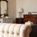
Welcome to your ultimate guide for transforming your home’s central gathering area with cheerful color schemes. Imagine bringing sunshine indoors year-round with warm, energizing tones that create an inviting atmosphere.
This vibrant hue has gone in and out of style several times in interior design trends. While not the most common choice, it’s definitely under-utilized for creating memorable spaces.
Discover how this versatile color can completely transform your area from dull to delightful. Different shades create various moods, from cozy intimacy to expansive brightness.
Get ready to explore psychological benefits and practical applications across design styles. You’ll learn why this hue offers both timeless appeal and contemporary freshness.
1. Why Yellow is the Perfect Choice for Your Living Room
Choosing the right color for your home’s main gathering area can completely transform its atmosphere. This vibrant hue brings a unique energy that few other colors can match.
The Psychology of Yellow in Interior Spaces
Colors directly impact how we feel in our homes. This particular shade stimulates mental activity and sparks creativity.
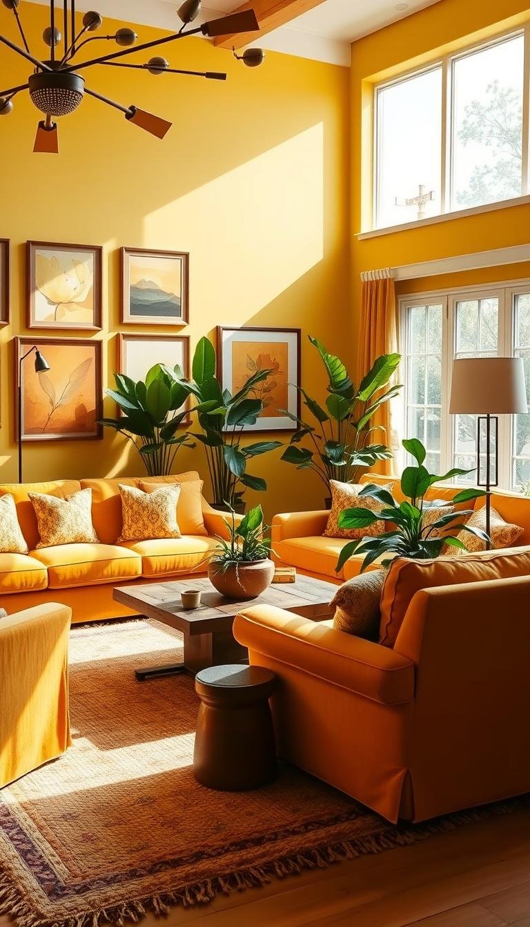
Different tones create distinct moods. Bright lemon shades energize, while muted mustard tones offer calmness.
This hue represents optimism throughout history. It transforms areas into positive environments that uplift everyone who enters.
How Yellow Creates Warmth and Happiness
This color generates visual coziness that makes areas more inviting. It’s especially welcoming during colder months.
The shade reflects light differently than other colors. It creates brighter spaces that feel more open and airy.
Smaller areas appear larger through clever light reflection. The warmth makes compact spaces feel more expansive.
| Yellow Shade | Mood Created | Best For |
|---|---|---|
| Bright Lemon | Energetic & Creative | Active Spaces |
| Muted Mustard | Calm & Cozy | Relaxation Areas |
| Soft Butter | Warm & Inviting | Social Spaces |
| Golden Ochre | Rich & Luxurious | Statement Walls |
Pantone’s 2021 Color of the Year “Illuminating” was chosen for its brightness. It represents finding light in everyday life.
This hue brings warmth, welcome, and space enhancement all together. It’s a versatile choice for any design style.
2. Starting with Soft Yellow Wall Paint

Your walls set the stage for your entire space. A gentle yellow hue can transform the atmosphere instantly. It creates a warm backdrop that welcomes both daylight and evening comfort.
Choosing the Right Yellow Tone for Your Space
Light conditions greatly affect how paint appears. North-facing rooms need warmer tones to fight cool light. South-facing spaces can handle cooler shades without feeling harsh.
Look at your existing furniture and decor. Your new wall color should complement these elements. Instagram user @beachhousegrove mastered this with a mid-tone selection.
Test samples directly on your walls. Observe them at different times of day. Yellow shifts dramatically under artificial versus natural lighting.
“The right yellow makes a room feel like a hug—welcoming by day, cocooning by night.”
Mid-Yellow Shades for Balanced Brightness
Medium tones offer the perfect compromise. They provide cheerfulness without overwhelming your senses. These shades work well in both large and compact areas.
Notice the difference between warm and cool undertones. Warm versions contain subtle red or orange notes. Cooler options lean toward green or gray bases.
Finish changes everything with this vibrant color. Matte surfaces absorb light for a softer effect. Semi-gloss reflects light and adds depth.
Professional painters recommend two coats for full coverage. Proper preparation ensures your investment lasts years. The result becomes a foundation for your entire design scheme.
3. Making a Statement with Yellow Furniture
Beyond wall colors, your sofa and chairs offer powerful opportunities for color expression. These larger pieces become the foundation of your design scheme and set the tone for the entire space.
Velvet Couches in Ochre and Mustard Tones
Velvet upholstery continues to dominate interior design trends for good reason. This luxurious fabric adds depth and texture that transforms ordinary furniture into statement pieces.
The rich texture of velvet perfectly complements warm golden tones. It catches light beautifully, creating dimension that flat fabrics cannot achieve.
Fashion editor Hannah Krutman champions earthy, boho-inspired color schemes. Her approach shows how ochre and mustard shades work in modern spaces.
Maintaining velvet requires special attention. Regular gentle brushing keeps the nap looking fresh. Immediate spot cleaning prevents permanent stains on these vibrant pieces.
Yellow Accent Chairs as Focal Points
Accent chairs offer a more approachable way to use yellow in your decor. A single bold chair can become an instant focal point without overwhelming the space.
Consider the existing color palette when selecting your statement piece. Warm golden hues pair beautifully with neutrals like gray, white, or natural wood tones.
Mix materials for visual interest. Try a velvet chair against a leather sofa or woven textiles. This creates balance while letting your yellow piece shine.
Instagram designers showcase stunning examples of successful implementations. They demonstrate how one bright chair can energize an entire living room setup.
Whether you choose modern minimalist lines or traditional ornate designs, yellow furniture makes a memorable impact. It brings warmth and personality to any gathering space.
4. Yellow Living Room Decor Ideas for Bright, Happy Spaces Through Accessories

Accessories provide the perfect gateway to introduce cheerful color without permanent changes. They let you experiment with different shades and styles before making bigger commitments.
This approach works beautifully in any home. You can start small and build your color story over time.
Instagram user @yellow.jungle demonstrates how bright accents add warmth and personality. Their space shows how playful touches create energy without overwhelming the room.
Throw Pillows and Blankets in Sunshine Hues
Textiles offer the easiest entry point into colorful decor. Pillows and throws bring instant cheer to any seating area.
Mix different shades for a sophisticated look. Combine lemon with mustard or golden tones for depth.
Seasonal rotation keeps your space feeling fresh. Lightweight linen pillows work for summer, while chunky knit blankets add winter coziness.
Decorative Vases and Artwork Pops
Art pieces and vessels create fantastic focal points. A single vibrant vase can transform a neutral shelf arrangement.
Artwork with golden tones brings sunshine indoors year-round. It’s a great way to add personality without painting walls.
Budget-friendly options abound at thrift stores and DIY markets. You can find unique pieces that make your decor truly personal.
Strategic placement makes all the difference. Group accessories in odd numbers for visual appeal. Create small clusters throughout your space for balanced energy.
For more inspiration on implementing these ideas, explore these yellow living room ideas that showcase various accessory approaches.
Remember that accessories should complement your existing decor. They’re meant to enhance, not overwhelm, your current design scheme.
5. Creating Feature Walls with Yellow Paint
Feature walls transform ordinary spaces into extraordinary environments. They create focal points that draw attention and add personality.
This technique remains popular because it delivers maximum impact with minimal effort. You can completely change a room’s character with just one accent surface.
Instagram user Barbara Halewood demonstrates this beautifully. She chose a vintage-inspired mustard tone that complements her home’s period aesthetic perfectly.
Half-Wall Painting Techniques
Painting just the lower portion creates visual interest without overwhelming your space. This approach maintains an open, airy feeling while adding color.
Measure carefully before starting. Most designers recommend painting from floor to chair rail height or 36-42 inches up.
Use painter’s tape for clean, sharp lines. Apply it precisely along your measured line for professional results.
Consider adding a chair rail or molding at the division line. This creates a finished look that appears intentional rather than incomplete.
Color Blocking with Yellow and Complementary Colors
Interior designer Natasha Landers shows how playful color blocks can transform a room. She combines golden tones with complementary shades for dramatic effect.
Color blocking creates modern, geometric interest on your surfaces. It works particularly well with this cheerful hue.
Choose complementary colors that enhance rather than compete. Navy blue, soft gray, and crisp white all pair beautifully with sunny tones.
| Wall Treatment | Best For | Skill Level | Time Required |
|---|---|---|---|
| Half-Wall Paint | Traditional Spaces | Beginner | 1-2 Days |
| Geometric Blocks | Modern Interiors | Intermediate | 2-3 Days |
| Artistic Patterns | Creative Spaces | Advanced | 3-5 Days |
| Textured Finishes | All Design Styles | Intermediate | 2-4 Days |
Prepare your surface properly before starting any painting project. Clean walls thoroughly and repair any imperfections.
Choose the right wall for your feature treatment. Consider lighting, furniture placement, and room flow when making your selection.
North-facing walls benefit from warmer golden tones. South-facing walls can handle cooler lemon shades without feeling overwhelming.
Test your color choices in different lighting conditions. Paint large swatches and observe them throughout the day.
“A well-executed feature wall becomes the heart of a room—it tells a story and creates emotional connection.”
Many homeowners see incredible transformations with this approach. Before-and-after examples show how golden accent walls can elevate entire spaces.
Remember that preparation determines your final result. Take time with measuring, taping, and surface preparation for professional-looking finishes.
6. Incorporating Yellow Through Textiles and Rugs

Soft fabrics and floor coverings provide wonderful opportunities to add cheerful color to your space. Textiles let you experiment with different shades and patterns easily.
They offer flexibility that permanent fixtures cannot match. You can change your entire room’s mood with just a few strategic additions.
Many designers consider textiles among the most versatile design elements. They bring both color and texture into your home environment.
Statement Rugs in Vibrant Yellows
A beautiful area rug can completely transform your flooring. It becomes the foundation for your entire design scheme.
Choose the right size for your space. Measure your seating area and leave at least 18 inches of bare floor around the edges.
Consider pile height based on your lifestyle. Low-pile options work well in high-traffic areas. They’re easier to clean and maintain.
Pattern selection matters greatly. Geometric designs create modern energy. Floral patterns bring traditional charm.
Maintenance requirements vary by material. Natural fibers like wool offer durability. Synthetic materials provide easy cleaning.
Layering Textures with Yellow Elements
Combining different fabrics creates depth and visual interest. Mix smooth velvets with nubby linens for contrast.
Curtains offer another excellent opportunity. Sheer golden drapes filter light beautifully. They create soft morning glow effects.
Upholstery fabrics bring lasting color to furniture. Performance fabrics resist stains while maintaining vibrant hues.
Decorative pillows complete your textile story. Mix patterns carefully for balanced results.
| Textile Type | Best Use | Maintenance Level | Design Style |
|---|---|---|---|
| Wool Rugs | High Traffic Areas | Medium | Traditional |
| Cotton Curtains | Light Filtering | Easy | Casual |
| Velvet Pillows | Accent Seating | Delicate | Luxury |
| Performance Fabric | Family Furniture | Simple | Modern |
Pattern mixing requires some basic guidelines. Combine large-scale patterns with smaller designs. Use solid colors to balance busy prints.
Stripes work well with florals when they share color tones. Geometric patterns complement organic designs through contrast.
Always step back to view your combinations from across the room. This helps ensure your patterns work together harmoniously.
“Textiles are the poetry of a home—they add rhythm, texture, and emotional resonance to every space.”
Many beautiful examples show successful implementations. Design professionals often use golden tones to create warmth and energy.
Remember that textiles should enhance your existing decor. They bring comfort and personality to any gathering area.
7. Pairing Yellow with Gray for Modern Elegance
Some combinations just feel right from the moment you see them. Gray and golden tones create instant sophistication that works in any home.
This pairing brings together warmth and coolness in perfect balance. It creates spaces that feel both inviting and refined.
Balancing Warm and Cool Tones
Getting the temperature right makes all the difference. Warm golden hues need cooler gray shades to create harmony.
Think about the mood you want to create. Do you prefer cozy intimacy or bright openness? Your color palette choices determine the final feel.
Light grays work beautifully with lemon tones. They keep spaces feeling airy and fresh. Dark charcoal grays pair perfectly with rich mustard shades.
2021 Color of the Year Combination
Pantone made a brilliant choice by selecting both these colors together. This combination represents hope and practicality in perfect balance.
The pairing remains incredibly relevant today. It offers timeless appeal with contemporary freshness.
Many designers continue to use this scheme in their projects. It creates living rooms that feel both current and classic.
Consider different distribution approaches for your space. You might prefer a gray-dominated room with golden accents. Or try a balanced fifty-fifty split for dramatic impact.
Metallic elements naturally complement this combination. Silver, chrome, and stainless steel add shine that enhances both tones.
Additional accent colors can deepen your scheme. Navy blue brings nautical elegance. Soft white adds crisp contrast.
“This combination delivers both emotional warmth and visual sophistication—a rare and valuable pairing in design.”
Real-life examples show stunning results. Design professionals demonstrate how this pairing creates elegant yet welcoming spaces.
Your living room ideas can incorporate this timeless combination. It brings sophistication and warmth to your home.
8. Earthy Yellow Ochre for Natural Aesthetics

Sometimes the most inviting spaces come from nature’s own palette. Earthy tones create warmth that feels both grounded and inspiring.
Yellow ochre brings a special kind of energy to your home. It mixes golden warmth with earthy depth for a truly unique feel.
This shade differs from brighter versions in its subtle sophistication. It offers coziness without overwhelming your senses.
Combining with Raw Wood and Natural Materials
Natural textures make ochre tones sing. Raw wood grains complement this earthy shade beautifully.
Think about mixing light and dark woods together. This creates visual interest while maintaining organic harmony.
Stone surfaces add cool contrast to warm walls. Rattan and woven elements bring tactile texture.
Linen fabrics soften the overall look. They add movement and casual elegance.
“Natural materials speak the same language as earthy colors—they tell stories of authenticity and comfort.”
Your space gains character through these combinations. Each element supports the others in creating harmony.
Creating Bohemian-Inspired Spaces
Boho style celebrates free-spirited individuality. Yellow ochre fits perfectly into this eclectic aesthetic.
Mix patterns and textures fearlessly. Layer rugs, pillows, and wall hangings for depth.
Incorporate global influences through handicrafts and art. These pieces add personal meaning to your decor.
Plants play a crucial role in boho design. They bring life and freshness to earthy color schemes.
Choose greenery that complements ochre tones. Olive trees, monstera, and succulents work beautifully.
| Element | Best Pairing | Effect Created |
|---|---|---|
| Terracotta | Warm Earth Tones | Mediterranean Warmth |
| Sage Green | Natural Textures | Organic Balance |
| Rattan Furniture | Ochre Walls | Textural Interest |
| Macrame Details | Earthy Backgrounds | Handcrafted Charm |
Remember that boho style values comfort above perfection. Your space should feel lived-in and loved.
Many design influencers showcase beautiful ochre spaces. They demonstrate how earthy tones create welcoming environments.
Your home becomes a sanctuary with these natural elements. They bring peace and personality to everyday living.
9. Yellow and Blue: A Classic Complementary Scheme
Some color combinations feel instantly right and scientifically harmonious. The pairing of golden and blue tones creates visual energy that feels both fresh and timeless.
This classic scheme works across various design styles. It brings together warmth and coolness in perfect balance.
Coastal and Nautical Themes
Beach-inspired designs naturally embrace this vibrant pairing. Think sunshine and ocean waves coming together in your space.
Light blue walls create an airy backdrop. Golden accents add warmth and energy to the cool foundation.
Natural materials enhance the coastal feel. Woven seagrass rugs and driftwood finishes complete the look.
White acts as a crucial balancing element. It prevents the scheme from becoming overwhelming.
Nautical touches add authentic charm. Rope details and sail-inspired textiles reinforce the theme.
Mood-Boosting Color Combinations
Different blue shades create distinct atmospheres. Navy brings sophistication and drama to golden accents.
Softer powder blue creates calm serenity. It pairs beautifully with gentle butter tones.
Your color palette determines the room’s emotional impact. Bright combinations feel energetic and playful.
Deeper tones create cozy intimacy. They work well in spaces meant for relaxation.
Pattern mixing adds visual interest. Try combining stripes with floral prints in coordinating tones.
“Complementary colors create visual vibration that energizes a space while maintaining perfect balance.”
White plays a vital role in this scheme. It provides breathing room between vibrant tones.
Consider your existing furniture when planning. Neutral pieces allow the color story to shine.
This combination works in various room sizes. It can make compact areas feel more expansive.
Many beautiful examples showcase successful implementations. They demonstrate the scheme’s versatility across different styles.
10. Patterned Wallpaper with Yellow Elements

Wallpaper brings a special dimension to your home’s atmosphere through pattern and texture. It offers an exciting alternative to traditional wall treatments.
Designers like Kit Kemp for Andrew Martin demonstrate how effective this approach can be. They pair golden tones with black or white for stunning visual impact.
SPRUCE Interiors used playful prints to introduce cheerful color in client projects. Their work shows how pattern can transform ordinary surfaces.
Subtle Yellow Patterns for Impact
Tone-on-tone designs create interest without overwhelming your senses. These patterns add depth while maintaining a calm atmosphere.
Scale considerations matter greatly for your space. Smaller patterns work well in compact areas. Larger designs make big rooms feel cozier.
Consider your ceiling height when selecting patterns. Vertical designs can make rooms appear taller. Horizontal patterns create width.
Placement options extend beyond standard walls. Try papering built-in bookshelves or ceiling surfaces. These unexpected applications create delightful surprises.
Bold Maximalist Wallpaper Statements
Graphic patterns make powerful style declarations. They become instant focal points that define your entire space.
Balance bold papers with solid colors elsewhere. Neutral furniture and simple window treatments let the pattern shine.
Current trends embrace joyful maximalism. Designers mix large-scale patterns with confidence. The key lies in careful color coordination.
Professional installers recommend ordering extra paper for pattern matching. This ensures your design flows seamlessly across walls.
“Patterned wallpaper adds personality that paint alone cannot achieve—it tells stories through design.”
Many homeowners find success with this approach. Before-and-after examples show dramatic transformations.
Your space gains unique character through thoughtful pattern selection. The right paper creates lasting impressions.
11. Painting Trim and Molding in Yellow
Architectural details deserve as much attention as your main surfaces. Painting trim and molding offers a bold approach to color integration that creates cohesive harmony throughout your space.
This technique transforms ordinary features into intentional design elements. It makes your entire environment feel thoughtfully planned and executed.
Instagram creator Francesca Johnson demonstrates this beautifully. She painted her bookcases a rich, warm tone to create a joyful atmosphere.
Creating Height and Space Illusion
Strategic color placement can alter how you perceive dimensions. Painting crown molding the same tone as your walls draws the eye upward.
This visual trick makes ceilings appear higher than they actually are. It creates an expansive feeling even in compact areas.
Baseboards painted to match your walls eliminate visual breaks. This makes floors seem longer and rooms feel more spacious.
Doors and window frames become seamless extensions of your walls. The continuous color flow enhances the sense of openness.
Harmonious Monochromatic Schemes
Using varying shades of one color creates sophisticated depth. Try slightly different tones on walls, trim, and ceilings.
This approach maintains color harmony while adding subtle interest. The variations create richness without visual competition.
Consider the natural light in your space when selecting shades. North-facing rooms might need warmer undertones.
South-facing spaces can handle cooler variations without feeling overwhelming.
“Colored trim isn’t a new idea—Victorian homes used it extensively to highlight architectural details and create visual drama.”
Different molding styles work better with certain approaches. Simple trim profiles suit contemporary spaces best.
Ornate moldings pair beautifully with traditional interior designs. Their details become more pronounced with color treatment.
| Trim Type | Best Yellow Tone | Room Style | Visual Effect |
|---|---|---|---|
| Crown Molding | Lemon Yellow | Modern | Height Enhancement |
| Baseboards | Mustard | Traditional | Grounding Effect |
| Window Casings | Buttercream | Transitional | Frame Emphasis |
| Door Frames | Golden Ochre | Eclectic | Architectural Focus |
Proper preparation ensures professional results. Clean all surfaces thoroughly before starting your project.
Use painter’s tape for crisp, clean lines between surfaces. Quality brushes make application smoother and more precise.
Consider the sheen difference between wall and trim paint. Semi-gloss on molding creates beautiful light reflection.
Matte walls provide a soft contrast that enhances both surfaces.
Many historical homes feature colored trim in their original designs. These traditional techniques adapt beautifully to contemporary spaces.
Modern renovations show how this approach creates unique character. Your home gains personality through thoughtful color application.
12. Yellow Ceilings for Unexpected Drama
Your ceiling presents an often-overlooked canvas for dramatic color transformation. This approach creates instant visual impact that changes how you experience your entire space.
More homeowners are embracing this bold technique to add cheerful energy. It represents one of this year’s most exciting interior design trends.
Drawing the Eye Upward
Colored overhead surfaces naturally attract attention upward. This creates the illusion of higher ceilings in compact areas.
Different golden hues produce distinct effects. Bright lemon tones make spaces feel more expansive and airy.
Deeper mustard shades create cozy intimacy perfect for relaxation. Your choice depends on the atmosphere you want to create.
Creating Cozy Overhead Warmth
Overhead color treatments generate remarkable atmospheric warmth. The hue reflects light downward, bathing your space in gentle radiance.
This technique works beautifully in north-facing rooms that receive less natural light. It compensates for cooler lighting conditions.
Evening artificial lighting interacts wonderfully with golden ceilings. It creates a welcoming glow that enhances relaxation.
Consider these popular techniques for implementation:
- Solid color application for maximum dramatic effect
- Contrasting tones that complement wall colors
- Matching trim and molding for cohesive harmony
- Decorative treatments like subtle patterns or textures
Lighting considerations significantly impact your results. Natural daylight enhances brighter tones, while artificial light deepens richer shades.
Test your chosen color under both lighting conditions before committing. Observe how it changes throughout the day.
“Colored ceilings have historical precedent in many design movements, from Victorian elegance to mid-century modern boldness.”
Practical painting tips ensure professional results:
- Proper surface preparation prevents uneven coverage
- Extension poles and angled brushes simplify overhead work
- Multiple thin coats achieve better results than one thick application
- Safety equipment protects against drips and strain
Many adventurous designers showcase stunning implementations. Their work demonstrates how golden overhead treatments transform ordinary rooms into extraordinary spaces.
This approach adds personality and warmth to any living area. It creates memorable environments that delight everyone who experiences them.
13. Combining Yellow with White for Airy Spaces
Few combinations create such instant freshness as pairing sunny tones with crisp whites. This classic duo brings lightness and cheer to any area in your home.
The blend offers timeless appeal that works across design styles. It creates environments that feel both uplifting and calming simultaneously.
Maintaining Light and Bright Feelings
Your space benefits from this pairing’s natural luminosity. White surfaces reflect light while golden accents add warmth.
Consider your room’s orientation when selecting shades. North-facing areas need warmer cream tones to combat cool light.
South-facing spaces handle cooler lemon hues beautifully. They maintain brightness without feeling overwhelming.
Artificial lighting changes how colors appear after dark. Test your selections under both natural and electric light.
“White provides the perfect canvas for yellow’s sunshine—it creates clarity while allowing warmth to shine through.”
Pastel Yellows with Crisp Whites
Softer hues create gentle, inviting atmospheres. They offer cheerfulness without intense visual stimulation.
Buttercream walls paired with bright white trim create classic elegance. This approach works in both traditional and modern homes.
Textural variation adds depth to monochromatic schemes. Mix smooth paints with nubby textiles for visual interest.
Natural materials enhance this light-filled scheme. Light wood tones and woven elements complement the airy feeling.
| White Type | Best Yellow Pairing | Room Atmosphere | Lighting Consideration |
|---|---|---|---|
| Cool White | Lemon Yellow | Fresh & Energizing | South-Facing Rooms |
| Warm White | Butter Yellow | Cozy & Inviting | North-Facing Rooms |
| Bright White | Pastel Yellow | Crisp & Clean | Well-Lit Spaces |
| Off-White | Muted Yellow | Soft & Serene | Low-Light Areas |
Balance your distribution for harmonious results. White-dominated spaces with golden accents feel spacious and calm.
Equal distribution creates vibrant energy perfect for social areas. Your choice depends on the mood you want to create.
Maintenance keeps your scheme looking fresh. Regular cleaning prevents white elements from yellowing over time.
Choose washable paints and fabrics for high-traffic areas. This preserves your light, bright atmosphere for years.
Coastal homes often showcase this combination beautifully. They demonstrate how airy colors create relaxed, welcoming environments.
Modern apartments use the scheme for spacious elegance. Country houses achieve cozy charm through softer variations.
Your space gains character through this timeless pairing. It brings sunshine and clarity to everyday living.
14. Victorian Elegance with Muted Yellow Tones
Step back in time to an era of ornate beauty and rich detail. Victorian design embraces warmth and sophistication through carefully chosen color palettes.
Muted golden tones create authentic period charm. They offer historical accuracy with timeless appeal.
Period-Appropriate Yellow Shades
Victorian homes used specific hues throughout different eras. Early designs favored mustard tones with earthy undertones.
Late Victorian periods embraced richer gold shades. These colors reflected growing prosperity and ornate tastes.
Instagram creator Barbara Halewood demonstrates perfect shade selection. Her vintage-inspired mustard hue honors her home’s original character.
Consider these authentic Victorian color combinations:
- Mustard walls with deep burgundy accents
- Gold tones paired with forest green trim
- Muted buttercream with rich brown woodwork
- Ochre shades complemented by navy blue details
Always test colors in your actual space. Victorian homes often have unique lighting conditions.
Pairing with Gold Accents and Dark Wood
Ornate gold frames and mirrors enhance period authenticity. They catch light beautifully against muted walls.
Dark wood furniture provides grounding contrast. Mahogany and walnut pieces work particularly well.
Upholstered furniture should feature rich fabrics. Velvet and brocade add texture and luxury.
Your fireplace becomes a natural focal point. Consider painting the surround or adding gold leaf details.
“Victorian design celebrates abundance and craftsmanship—every detail tells a story of careful consideration.”
Modern adaptations blend historical authenticity with contemporary comfort. You can maintain period charm while ensuring your space meets today’s living needs.
Many historical homes offer inspiration for your project. They demonstrate how golden tones create warmth and sophistication.
Your space gains character through these thoughtful combinations. They bring elegance and history to everyday living.
15. Mid-Century Modern Yellow Statements
Mid-century design brings a special kind of energy to contemporary homes. This style combines retro charm with modern functionality in perfect balance.
Golden tones played a key role in original mid-century interiors. Designers used them to add warmth and optimism to clean, minimalist spaces.
Retro Color Palettes
Authentic mid-century colors range from mustard to bright lemon. These shades created the period’s distinctive look.
Designers often paired golden tones with teal, orange, and brown. These combinations feel both retro and refreshingly modern today.
White acted as a balancing element in most schemes. It prevented brighter yellows from overwhelming the space.
Your room ideas can incorporate these authentic palettes. They bring historical accuracy with timeless appeal.
Clean Lines with Bold Yellow Accents
Mid-century modern emphasizes simple forms and organic shapes. Bold golden accents complement this aesthetic beautifully.
Feature walls offer a great way to introduce color minimally. They create contrast without compromising the clean-lined look.
Iconic furniture pieces work wonderfully with this scheme. Eames chairs and Noguchi tables become even more striking against golden backgrounds.
This design choice adds visual warmth to minimalist spaces. It creates inviting environments that feel both curated and comfortable.
Geometric patterns reinforce the atomic age influence. They add playful energy while maintaining structural clarity.
Your room gains character through these thoughtful combinations. They honor mid-century principles while feeling completely current.
16. Begin Your Yellow Living Room Transformation Today
Ready to bring sunshine into your home? This vibrant hue offers mood-boosting benefits that work beautifully in any space.
Start small with golden accessories if you’re new to bold colors. Throw pillows or artwork provide cheerful pops without commitment.
Test paint samples on your walls before deciding. Observe how light changes the tones throughout the day.
Remember that this warm color scheme creates inviting atmospheres. It makes your area feel more open and energetic.
Follow interior design experts on Instagram for fresh ideas. Their projects show how to use this hue successfully.
Embrace the happiness this sunny palette brings. Your home deserves that bright, welcoming feel!