Transform your personal sanctuary into a calming retreat with the perfect color choice. Blue creates a peaceful atmosphere that helps you unwind after long days.
This versatile hue works wonders in any sleeping space. You can create bold statements or add subtle touches throughout your room.
The psychological benefits are remarkable. Blue tones reduce stress and promote tranquility for better rest.
You’ll discover practical suggestions for your personal space ahead. We cover everything from wall colors to accessories that enhance your vibe.
These suggestions work for various styles and preferences. You don’t need a complete renovation to achieve this refreshing feel.
Continue reading for inspiration tailored to different room sizes and types. Create a space that feels both stylish and wonderfully comfortable.
Why Blue is the Perfect Color for Your Bedroom Sanctuary
Have you ever noticed how calm you feel near the ocean or under a clear sky? This serene vibe comes from nature’s favorite color. It naturally lowers your heart rate and reduces anxiety.
That makes it ideal for your sleeping space. You want a place that helps you unwind and recharge.
This hue is incredibly versatile. Light shades can make a small room feel airy and more open. Darker tones create a cozy, intimate atmosphere.
You can choose from many options. Soft powder blue gives a classic look. Deep navy adds drama without feeling overwhelming.
Designers often call it a restful neutral. It pairs beautifully with almost any other color. That gives you lots of flexibility with your decor.
Think about the mood you want. Airy and coastal? Or moody and cocooning? Your shade choice sets the tone.
This color works for everyone. It suits master suites, kids’ rooms, and guest spaces. All ages and genders find it appealing.
It also creates a timeless look. Your space won’t feel dated in a few years. That makes it a smart long-term choice.
Ready to bring this peaceful feel into your home? The next sections will show you how.
16 Blue Bedroom Decor Ideas That Soothe Your Senses
Ready to transform your sleeping space? We’ve gathered sixteen creative approaches to bring this calming color into your personal retreat. Each suggestion focuses on creating a peaceful environment that promotes rest.
From Sky Blue to Midnight Navy: A Shade for Every Mood
Different tones create distinct atmospheres. Light options like sky or powder blue feel airy and open. They mimic clear daylight and create a spacious feel.
Deeper options like navy or midnight blue offer drama and sophistication. These rich tones make your space feel cozy and intimate. They work well in larger rooms or those with ample natural light.
Teal and aqua provide vibrant yet calming touches. They bridge the gap between light and dark spectrums beautifully.
“The right color doesn’t just decorate your space—it transforms how you feel in it.”
Matching Your Blue to Your Desired Ambiance
Consider your room’s size and lighting before choosing. North-facing rooms with less light benefit from lighter tones. South-facing spaces can handle deeper, moodier shades.
Test paint samples on your walls. View them at different times of day. Natural and artificial light changes how color appears.
Think about your existing furniture and decor. Your new shade should complement what you already own. This creates a cohesive look without starting from scratch.
| Shade | Best For | Creates This Vibe |
|---|---|---|
| Sky Blue | Small rooms, low light | Airy, coastal freshness |
| Powder Blue | Traditional spaces | Soft, classic elegance |
| Navy | Large, well-lit areas | Dramatic, sophisticated |
| Teal | Modern interiors | Vibrant yet calming |
Mixing multiple shades adds depth and interest. Try a navy accent wall with lighter accessories. This approach creates visual appeal without overwhelming your space.
Your chosen tone should match your desired atmosphere. Coastal themes pair beautifully with light options. Moody, intimate spaces shine with deeper selections.
Upcoming sections explore specific applications for these tones. You’ll see how they work on walls, bedding, and accessories. Each idea helps create your perfect peaceful retreat.
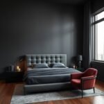
1. Make a Bold Statement with a Blue Bed

Your sleeping area’s centerpiece offers the perfect opportunity to introduce calming tones. A carefully chosen bed becomes the room’s anchor, setting a peaceful mood throughout your personal retreat.
This approach lets you create impact without permanent changes. You can experiment with different looks as your preferences evolve.
Choosing a Blue Bed Frame or Headboard
Selecting the right shade for your frame depends on your room’s size and style. Darker options like navy create drama in spacious areas. Lighter tones make compact spaces feel more open.
Upholstered headboards in velvet offer luxurious texture. Painted wooden frames provide rustic charm. Both options bring character to your sleeping space.
Consider materials that match your desired atmosphere. Plush velvet feels opulent and inviting. Breathable linen creates casual comfort.
Styling Your Bed with Blue Bedding and Throws
Layer different textures for depth and visual interest. Start with crisp white sheets as your foundation. Add a quilted coverlet in your favorite shade.
Mix patterns and materials for added dimension. A chunky knit throw at the foot provides both style and warmth. This approach creates a welcoming look that invites relaxation.
As noted by Southern Living, monogrammed shams in bright blue add personal interest. A quality throw delivers saturated color while maintaining balance.
This method offers affordable flexibility. You can update your look with seasonal trends without major investment. Your space transforms instantly into a calming sanctuary.
2. Paint Your Walls for a Serene Backdrop
Your wall color choice creates the foundation for your entire room’s atmosphere. This versatile hue offers incredible flexibility, from bright and airy to deep and cozy options.
You can transform your space with just a few coats. The right selection makes your personal retreat feel both inviting and perfectly tailored to your taste.
Opt for a Light Blue to Brighten and Expand the Space
Light shades like sky blue or pale aqua make small rooms feel larger. They bounce natural light around your space, creating an open and cheerful atmosphere.
These tones function similarly to white walls but add gentle color. They promote relaxation and positivity throughout your day.
Consider Benjamin Moore’s Sweet Bluette for a soft, airy feel. Sherwin Williams’ Sea Salt offers a subtle green-blue blend that feels fresh and calming.
Test samples on your wall to see how light changes their appearance. Morning sun versus evening lamps creates different effects worth considering.
Embrace a Dark, Moody Blue for a Cocooning Effect
Deeper tones like navy or charcoal create an intimate, secure feeling. They work wonderfully in well-lit rooms where you want cozy sophistication.
Benjamin Moore’s Wythe Blue delivers rich depth without feeling heavy. Their Stratton Blue offers a slightly lighter option with similar enveloping qualities.
Balance dark walls with lighter furniture or bedding. This maintains airiness while enjoying the moody atmosphere you love.
Consider painting trim or doors in coordinating shades for subtle interest. Blue-gray options provide sophisticated tones that feel both modern and timeless.
Artwork and textiles complement your wall color beautifully. Cream accents against navy create striking contrast that enhances your desired mood.
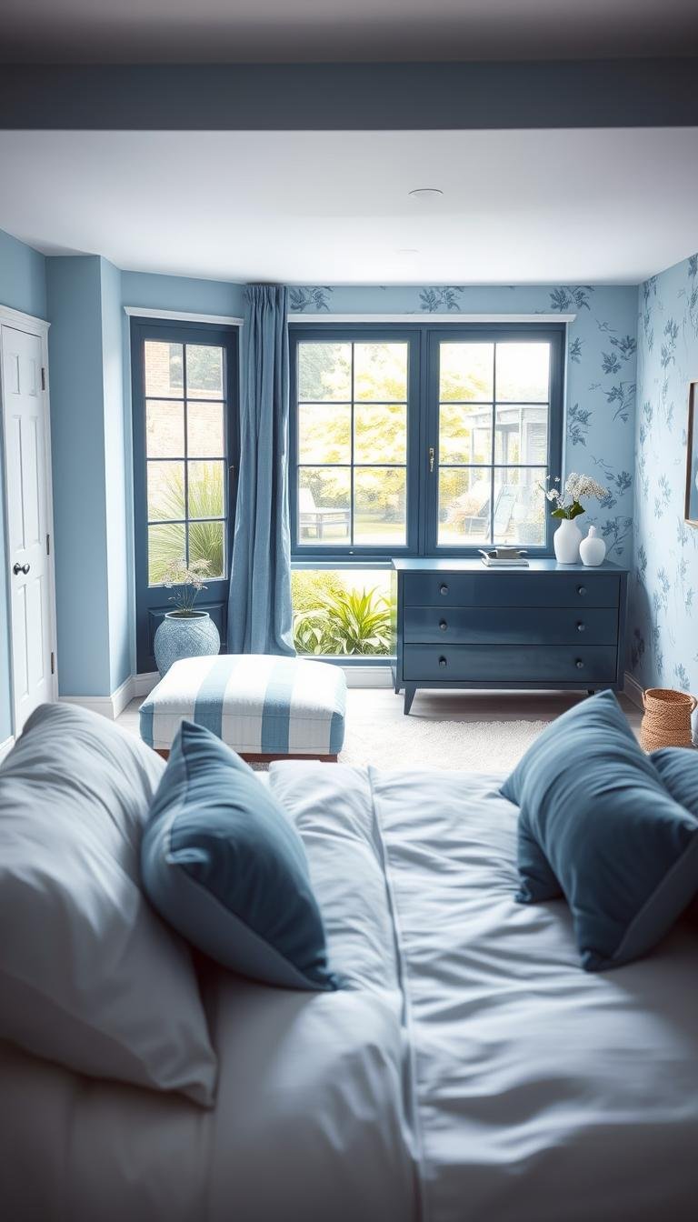
3. Add Softness and Style with Blue Window Treatments
Your windows offer a fantastic opportunity to enhance your personal retreat. The right treatments bring color, texture, and function together beautifully.
They soften the look of your space while managing light perfectly. This creates a cohesive flow between your walls, bedding, and other decor elements.
Choose lighter shades for a breezy, open feel. These tones let more daylight filter through your room. They create an airy vibe that feels fresh and uplifting.
Deeper options make a bold statement with warmth. Navy or charcoal tones add drama and sophistication. They work well in spaces that crave a cozy atmosphere.
Fabric choices impact both look and function. Linen offers a casual, relaxed texture. Velvet provides luxury and extra warmth for cooler months.
Consider your light control needs carefully. Blackout versions in darker shades promote better sleep. Sheer panels in lighter tones diffuse light gently.
“Window treatments frame your view of the world while defining your interior space.”
Patterns add visual interest without overwhelming. Stripes create length for rooms with off-center windows. Florals bring a touch of nature-inspired charm.
Pair your selections with neutral walls for contrast. This makes the color pop as a focal point. Matching them with bedding creates a coordinated, polished look.
Hardware choices complete your window style. Brushed nickel rods offer modern elegance. Wooden poles provide rustic warmth that complements various fabrics.
This update transforms your space quickly and affordably. You’ll notice improved comfort and aesthetic appeal immediately.
| Treatment Type | Best Shade | Light Control | Room Vibe |
|---|---|---|---|
| Sheer Curtains | Sky Blue | Soft Diffusion | Airy & Open |
| Blackout Drapes | Navy | Total Darkness | Cozy & Intimate |
| Roman Shades | Teal | Adjustable | Modern & Clean |
| Wood Blinds | Slate Blue | Precise | Structured & Warm |
Your window solutions should reflect your personal style. They tie the whole room together while serving practical needs. Enjoy both beauty and function in your peaceful retreat.
4. Layer Textures for a Rich, Cozy Feel

Transform your personal space into a tactile paradise through thoughtful layering. This approach adds visual depth and physical comfort simultaneously.
You create an inviting atmosphere that welcomes relaxation. Each layer contributes to both style and function in your retreat.
Incorporating Rugs, Pillows, and Quilts
Start with a quality rug to anchor your sleeping area. This foundation piece defines the space while adding warmth underfoot.
A wool option provides excellent insulation during colder months. Cotton or jute versions offer breathability for warmer seasons.
Consider a striped navy design for preppy elegance. Natural fiber rugs with subtle hints provide earthy charm.
Pillows introduce wonderful opportunities for pattern play. Mix geometric prints with solid colors for dynamic interest.
Vary sizes from standard to euro shams for professional styling. Different shades create ombre effects that feel both intentional and relaxed.
Quilts serve as both functional and decorative elements. They add warmth while contributing to your color story.
Faded denim options create rustic appeal. Bright selections make cheerful statements against neutral backgrounds.
“Texture is the secret ingredient that turns a beautiful room into an irresistible one.”
Coordinate your layers for harmonious results. Match your rug tone with curtain or bedding elements. This creates cohesion throughout your personal oasis.
Try layering a smaller accent rug over a larger neutral base. This technique defines your sleeping zone while adding color interest.
| Texture Type | Material Options | Seasonal Benefit | Visual Impact |
|---|---|---|---|
| Area Rug | Wool, Jute, Cotton | Year-round comfort | Anchors space |
| Throw Pillows | Silk, Linen, Velvet | Easy seasonal swap | Adds pattern |
| Bed Quilt | Cotton, Denim, Blend | Lightweight warmth | Color layer |
| Accent Throw | Knit, Woven, Faux Fur | Extra coziness | Texture contrast |
Mix contrasting textures for maximum effect. Pair chunky knit throws with smooth silk pillows. This combination creates rich tactile experiences.
Your finished space should feel collected over time. This layered approach makes your retreat genuinely inviting and wonderfully comfortable.
5. Incorporate Blue Through Artwork and Wall Decor
Artwork offers one of the simplest ways to infuse your personal retreat with calming color accents. You can add personality without permanent changes like painting entire walls.
This approach provides wonderful flexibility for your space. A single large piece above your sleeping area creates instant impact. Smaller prints scattered throughout add subtle touches of color.
Consider various art styles that incorporate soothing tones. Ocean landscapes create serene coastal vibes. Abstract paintings offer modern interpretations of calming hues.
Vintage posters bring character and history to your room. Textile art with blue elements adds texture and warmth. Each option contributes to your desired atmosphere.
Framing choices significantly affect your artwork’s feel. White frames create crisp, clean contrast against darker walls. Gold frames add luxurious warmth and sophistication.
“Art speaks where words are unable to explain.”
Your selections can echo other elements in the room. Match artwork tones with your bedding or curtain shades. This creates visual harmony throughout your space.
Thematic approaches enhance your overall ambiance. Coastal scenes establish breezy, relaxed decor. Modern abstracts support contemporary minimalist styles.
Create gallery walls with mixed shades and styles. Combine different blue tones for depth and interest. Vary frame sizes and artwork types for dynamic appeal.
This method offers easy seasonal updates. Swap pieces as your preferences evolve. Refresh your room’s look without major effort or expense.
Consider placement for optimal viewing. Hang pieces at eye level when standing or lying down. Ensure art enhances rather than overwhelms your space.
Wall decor provides accessible personalization. It reinforces your calming color theme beautifully. Your sanctuary becomes truly yours through thoughtful art choices.
6. Use Blue Accent Furniture for a Cohesive Look
Strategic furniture choices can unify your entire design scheme beautifully. A well-placed piece adds both function and visual harmony to your personal retreat.
These items serve as practical decor that ties everything together. They provide storage while contributing to your calming color story.
Selecting the Perfect Blue Side Tables or Dresser
Choose pieces that complement your overall color scheme. A navy chest creates striking contrast against light walls. Soft powder options offer subtle elegance.
Consider materials that match your desired atmosphere. Painted wood provides a custom, handcrafted feel. Metal with blue finishes adds industrial edge.
Vintage finds bring wonderful character and depth. A thrifted dresser tells a story while adding unique charm. These pieces often cost less than new furniture.
Modern designs deliver sleek sophistication. Clean lines and simple forms create contemporary appeal. They work well in minimalist spaces.
Proper sizing ensures proportional balance. Measure your area before selecting any piece. Leave enough walking space around each item.
Strategic placement enhances both aesthetics and function. Position nightstands within easy reach of your bed. Place dressers against walls with clear access.
Maintenance keeps your furniture looking fresh. Choose easy-to-clean surfaces for frequently used items. Wipe down surfaces regularly to maintain their beauty.
Pair blue pieces with natural wood for warm balance. This combination feels both intentional and inviting. It prevents your space from feeling too cold.
Blue accent furniture strategically incorporates color. It enhances your room’s usability while elevating style. Your sanctuary becomes both beautiful and functional.
7. Create a Focal Point with a Blue Accent Wall

An accent wall transforms your room’s personality without total commitment. It draws attention to specific areas while keeping the overall space balanced.
This technique adds depth and character instantly. You create visual interest that feels both intentional and inviting.
Choose the wall behind your bed for natural emphasis. This placement creates a stunning backdrop for your sleeping area. It makes your room feel professionally designed.
Opposite the entrance also works beautifully. Guests see this feature immediately upon entering. It sets the tone for your entire personal retreat.
Select shades based on your room’s light and size. Deep navy offers dramatic sophistication in well-lit spaces. Soft powder options provide serene calm in smaller areas.
Test paint samples directly on your chosen surface. Natural and artificial light changes how colors appear throughout the day. This ensures perfect shade selection.
“An accent wall is like jewelry for your room—it highlights without overwhelming.”
Consider patterned wallpaper for added texture. Floral motifs bring organic charm to your space. Geometric designs offer modern crispness.
Balance your bold wall with lighter elements. White bedding maintains airiness against dark backgrounds. Light wood furniture adds warm contrast.
Coordinate accessories for harmonious enhancement. Artwork in similar tones reinforces your color story. Floating shelves display decorative items beautifully.
This approach suits renters seeking temporary updates. It requires less effort than full-room painting. You achieve major impact with minimal investment.
| Wall Position | Recommended Shade | Lighting Consideration | Complementary Colors |
|---|---|---|---|
| Behind Bed | Navy | Needs adequate light | Cream, White |
| Opposite Entrance | Blue-Gray | Works in various conditions | Light Wood, Gold |
| Longest Wall | Powder Blue | Brightens naturally dark areas | Soft Gray, Beige |
| Window Wall | Teal | Consider curtain coordination | White Trim, Natural Textiles |
Your accent wall becomes the room’s hero feature. It demonstrates personal style while maintaining peaceful atmosphere. Enjoy transformed space with this simple technique.
8. Mix and Match Different Shades of Blue
Combining various tones creates a sophisticated and layered atmosphere in your personal space. This technique adds visual interest while maintaining the calming qualities you love.
You can achieve a curated look without everything matching perfectly. Multiple hues work together to create depth and personality throughout your area.
Start with two or three complementary tones for best results. Repeating these colors across different elements creates harmony and cohesion.
Your space feels both dynamic and intentionally designed. This approach allows for personal expression while keeping the peaceful vibe intact.
How to Combine Shades for a Harmonious Look
Choose one dominant color as your foundation. This primary shade should cover about 60% of your visible surfaces.
Select a secondary tone for 30% of your decor. Use this for medium-sized items like bedding or curtains.
Add an accent color for the remaining 10%. This pop of contrast works well in small accessories and artwork.
Analogous colors create smooth transitions between tones. Try pairing sky blue with aqua and navy for a seamless flow.
Contrasting shades add vibrancy and energy. Combine light powder blue with deep navy for striking visual impact.
Repeat colors throughout your space for cohesion. Echo your navy throw pillow in artwork or decorative objects.
Balance cool blue tones with warm elements. Natural wood furniture or gold accents prevent your room from feeling too cold.
“The most beautiful rooms have something to say about the people who live in them.”
Use tools to visualize combinations before committing. Color wheel apps help you see how different shades work together.
Test paint samples and fabric swatches in your actual space. Lighting conditions dramatically affect how colors appear throughout the day.
| Primary Shade (60%) | Secondary Shade (30%) | Accent Shade (10%) | Overall Vibe |
|---|---|---|---|
| Soft Sky Blue Walls | Navy Bedding | Periwinkle Pillows | Cozy & Lively |
| Dusty Blue Furniture | Denim Curtains | Teal Artwork | Curated & Relaxed |
| Powder Blue Rug | Slate Blue Headboard | Royal Blue Throw | Sophisticated & Calm |
| Aqua Accent Wall | Light Blue Sheets | Navy Decorative Bowl | Fresh & Balanced |
Mixing multiple shades allows for creative expression. You maintain the serene atmosphere while adding personal style touches.
Your space becomes uniquely yours through thoughtful color combinations. Enjoy both visual interest and peaceful relaxation in your perfected retreat.
9. Pair Blue with Crisp White for a Classic Feel
Discover the magic of combining two timeless colors in your personal retreat. This pairing creates a fresh and inviting atmosphere that never goes out of style.
White acts as a perfect neutral backdrop that makes blue elements stand out beautifully. Whether you choose light or dark shades, the contrast remains striking and elegant.
This combination evokes a sense of coastal freshness and simplicity. It brings a breezy, nautical ambiance that feels both relaxed and sophisticated.
“Blue and white together create a harmony that feels both fresh and forever classic.”
Start with crisp white walls as your foundation. This bright base makes your space feel open and airy. Then layer in soft blue tones through accessories and textiles.
Consider navy stripes against white bedding for a preppy look. Sky blue accents on white linens create an airy, cloud-like effect. Both approaches maintain that clean, classic feel.
The versatility of this pairing works across various styles. Traditional spaces benefit from formal patterns. Modern rooms shine with solid color blocks and clean lines.
Natural light enhances this combination wonderfully. Sunlight makes white surfaces glow and blue tones pop. Your room feels brighter and more inviting throughout the day.
Add texture for depth and visual interest. White linen curtains paired with a blue throw create dimension. A natural jute rug with blue pillows adds earthy warmth.
Balance is key to perfecting this look. Too much white can feel sterile, while excessive blue might overwhelm. Aim for a 70/30 ratio for optimal visual appeal.
This low-risk scheme appeals to almost everyone. It’s perfect for color newcomers or those wanting timeless elegance. You can easily adapt it as your tastes evolve.
Your finished space becomes a clean, calming retreat. This classic combination proves both beautiful and effortlessly achievable.
10. Introduce Warmth with Natural Wood Tones

Bring cozy balance to your space with the perfect pairing of cool tones and warm wood elements. This combination creates a harmonious atmosphere that feels both fresh and inviting.
Natural materials add organic texture that prevents your room from feeling too stark. The warmth of timber beautifully complements cooler shades for visual comfort.
Light woods like oak or ash create an airy Scandinavian feel. They work wonderfully with pale shades to maintain brightness throughout your space.
Darker options like walnut or mahogany add rich sophistication. These deeper tones pair elegantly with navy or charcoal for a more dramatic effect.
“Wood brings nature’s warmth indoors, creating spaces that feel both grounded and graceful.”
Consider a wooden bed frame as your foundation piece. An oak frame with navy bedding creates striking yet balanced contrast. This combination feels both modern and timeless.
Teak dressers against light walls offer beautiful visual interest. The warm grain patterns add movement and character to your decor.
You can incorporate wood through various elements:
- Floating shelves for display and storage
- A wooden bench at the foot of your bed
- Picture frames with natural finishes
- Ceiling beams for architectural interest
Mixing wood tones adds eclectic charm to your space. Combine light and dark finishes for personalized character. Just maintain some consistency for cohesive results.
Natural materials offer sustainable style benefits. They enhance your room’s eco-friendly appeal while delivering lasting beauty.
Wood ages gracefully, developing richer character over time. This patina pairs beautifully with timeless shades for enduring style.
Choose sealed wood finishes for durability in your sleeping area. Proper maintenance ensures your pieces remain beautiful for years.
| Wood Type | Best Paired With | Room Vibe | Maintenance Level |
|---|---|---|---|
| Light Oak | Sky Blue, Powder Blue | Airy & Scandinavian | Low |
| Rich Walnut | Navy, Charcoal | Sophisticated & Cozy | Medium |
| Reclaimed Wood | All Shades | Rustic & Characterful | Medium-High |
| Teak | Teal, Aqua | Modern & Warm | Low |
This natural element makes your space feel more lived-in and comfortable. The organic texture creates tactile interest that enhances relaxation.
Your room becomes a truly welcoming retreat through this balanced approach. Enjoy both visual appeal and comforting warmth in your perfected sanctuary.
11. Add a Pop of Contrast with Complementary Colors
Elevate your personal retreat with strategic color pairings that create visual excitement. Complementary colors sit opposite each other on the color wheel, offering dynamic contrast that energizes your space while maintaining harmony.
This approach prevents your room from feeling one-dimensional. It adds personality and depth through thoughtful color relationships.
Color theory explains why these combinations work so well. Opposites attract visually, creating balance through tension and release. Your eyes enjoy the relationship between warm and cool tones.
Follow the 80-20 rule for best results. Keep your main shade dominant across most surfaces. Use accent colors for the remaining percentage through accessories and decor.
This method lets you experiment safely. You can always remove or change accent pieces if the look doesn’t suit your taste.
Using Orange, Pink, or Mustard for a Vibrant Touch
Orange brings warmth and energy to cooler tones. This pairing creates a bold yet balanced atmosphere that feels both lively and relaxing.
Try navy walls with coral throw pillows for sophisticated contrast. A bright orange blanket adds cheerful energy against serene backdrops.
Pink offers softness and romantic charm. This combination feels sweet and inviting, especially with lighter shades.
Sky blue bedding with magenta artwork creates playful elegance. Blush accents against powder walls maintain gentle sophistication.
Mustard delivers retro flair and earthy warmth. This vintage-inspired pairing adds character and nostalgia to your space.
Dusty blue furniture with mustard curtains creates cozy appeal. This combination works beautifully in eclectic or bohemian settings.
“Complementary colors create visual vibration that makes both shades appear more vibrant and alive.”
Start small when introducing contrasting elements. A single throw pillow or piece of art makes a statement without overwhelming.
Consider your existing shade when choosing accents. Bright orange pops dramatically against deep navy. Soft pink complements powder blue beautifully.
These pairings work especially well in guest rooms or children’s spaces. They add playful energy while maintaining the calming foundation you love.
| Blue Shade | Best Complementary Accent | Resulting Vibe | Ideal Placement |
|---|---|---|---|
| Navy | Bright Orange | Bold & Energetic | Throw Pillows, Art |
| Powder Blue | Soft Pink | Sweet & Gentle | Bedding, Curtains |
| Teal | Mustard Yellow | Retro & Cozy | Rugs, Lamps |
| Sky Blue | Coral | Fresh & Playful | Accessories, Art |
Complementary colors highlight your main shade’s calming qualities. The dynamic counterpoint makes your space feel more intentional and designed.
Your room becomes a balanced sanctuary with just the right touch of energy. This lively addition enhances your overall aesthetic appeal beautifully.
12. Elevate the Space with Blue Lighting Fixtures
Illuminate your personal retreat with lighting that adds both function and style. These elements create atmosphere while serving practical needs.
A well-chosen lamp brings color and illumination together beautifully. It becomes a decorative piece that enhances your overall design.
Different types offer various benefits for your space. Table versions with ceramic bases provide focused task lighting. Pendant options hang gracefully above key areas.
Wall sconces deliver ambient glow without taking up surface space. Each style contributes to your room’s unique character.
Consider a navy pendant above your sleeping area. This creates a dramatic focal point that draws the eye upward.
A powder blue ceramic lamp on your nightstand offers soft illumination. It provides perfect reading light while adding color.
“Lighting is the jewelry of the home; it shouldn’t just light, it should delight.”
The right lighting creates specific moods throughout your day. Soft blue hues promote relaxation during evening hours. Brighter options add modern energy when needed.
Pair colored fixtures with warm white bulbs. This prevents any cold feel while maintaining cozy atmosphere.
Dimmable options offer wonderful flexibility. You can adjust brightness to match different activities and times.
Strategic placement maximizes both function and style. Use task lighting near reading chairs or workspaces. Ambient fixtures provide overall glow throughout the room.
This approach works perfectly for renters or those avoiding permanent changes. You can swap fixtures easily as your tastes evolve.
Coordinate your lighting with other elements in the space. Match lamp shades with curtain tones for harmony. Echo base colors in artwork or decorative objects.
| Fixture Type | Best Placement | Lighting Purpose | Recommended Bulb |
|---|---|---|---|
| Table Lamp | Nightstand, Desk | Task Lighting | Warm White LED |
| Pendant Light | Above Bed | Ambient Glow | Dimmable LED |
| Wall Sconce | Reading Nook | Accent Lighting | Soft White |
| Floor Lamp | Room Corner | General Illumination | Warm Dimmable |
Your lighting choices should enhance both beauty and function. They complete your design while supporting daily activities.
This final touch makes your space feel intentionally designed. It brings everything together for a cohesive and inviting retreat.
13. Choose a Blue Carpet for Comfort and Color

Your floor provides the perfect canvas for adding both comfort and visual appeal. A carefully chosen carpet creates a soft foundation that ties your entire design together beautifully.
This approach adds color without painting walls. It anchors your space while providing practical benefits you’ll appreciate daily.
Different shades create distinct atmospheres. Deep navy or slate options offer sophisticated elegance for adult spaces. Brighter tones work wonderfully in children’s areas for playful energy.
The functional advantages are impressive. Quality padding provides warmth during cooler months. It also reduces noise between floors for peaceful living.
“A great carpet is like a good friend—it supports you quietly while adding beauty to your life.”
Material choices affect both feel and durability. Wool offers natural luxury and resilience. Synthetic fibers provide excellent stain resistance for busy households.
Your carpet defines the room’s character. It creates visual impact especially against neutral walls or furniture. This foundation piece sets the tone for your entire decor.
Consider these practical examples:
- Navy carpet balances pale walls in master suites
- Teal options add fun to kids’ spaces
- Powder blue creates airy openness in smaller rooms
You can layer area rugs for added dimension. Choose complementary colors or patterns for interest. Avoid overcrowding to let your main carpet shine.
This investment requires thoughtful selection. Timeless shades ensure longevity as your tastes evolve. They adapt beautifully to future decor changes.
Maintenance considerations are important. Stain-resistant options work best in high-traffic areas. Darker shades hide everyday wear more effectively.
| Shade | Best For | Material Recommendation | Maintenance Level |
|---|---|---|---|
| Navy | Adult spaces, formal feel | Wool blend | Medium |
| Slate Blue | Modern decor, neutral backdrop | Polyester | Low |
| Sky Blue | Kids’ rooms, airy spaces | Nylon | High (stain-resistant) |
| Teal | Eclectic spaces, personality | Olefin | Medium |
This bold choice completes your sanctuary beautifully. It adds both physical comfort and stylish visual appeal. Your space feels truly finished with this foundational element.
14. Design a Playful yet Peaceful Kids’ Blue Room
Designing a kid’s room requires balancing energy for play and calm for restful sleep. This versatile color creates the perfect foundation for both activities throughout the day.
Light shades like sky blue establish a serene base for your child’s personal space. They maintain brightness while allowing colorful accents to shine. Deeper tones add energy when paired with vibrant touches.
Consider a turquoise scheme with animal themes for younger children. Navy with striped bedding offers a timeless look that grows well. Raspberry accents against powder walls create cheerful contrast.
Functionality remains crucial in any children’s room. Choose durable furniture that withstands active use. Washable textiles make cleanup simple after playtime.
“The best children’s spaces adapt to their changing needs while maintaining a sense of security and comfort.”
Thematic elements add personality to your child’s environment. Nautical decor with blue and white creates coastal charm. Space themes with dark walls and star accents spark imagination.
Storage solutions in coordinating shades keep the space organized. Blue bins or bookshelves add color while containing toys and books. This approach maintains visual harmony throughout the room.
Growth adaptability ensures your design remains relevant for years. Neutral blue shades transition beautifully from toddler to teen years. You can update accessories rather than repainting entire walls.
Color psychology supports blue’s benefits for children. It promotes relaxation and focus during quiet times. The calming effect helps with winding down before bedtime.
Safety considerations protect your little ones during play. Secure area rugs to prevent slipping accidents. Avoid small decorative pieces that might pose choking hazards.
Your child’s personal space becomes both fun and restful with thoughtful design. It supports their development while providing a comfortable retreat they’ll love spending time in.
15. Style a Welcoming and Sophisticated Guest Room
Create an unforgettable experience for visitors with a thoughtfully designed retreat. Your guest space becomes a sanctuary that combines comfort with elegant style.
This versatile color creates an inviting atmosphere that welcomes everyone. It provides a peaceful environment where guests can truly relax.
Choose soft shades for walls to establish a serene backdrop. Pale options make the room feel open and airy without any chill.
Deeper tones add polished sophistication when used strategically. Navy accent walls create drama while maintaining restful qualities.
“A well-designed guest room speaks volumes about your hospitality before you utter a single word.”
Layer crisp white linens with subtle blue patterns for classic appeal. Graphic black accents against lighter walls create striking modern contrast.
Quality bedding ensures your visitors sleep soundly through the night. Plush throws add both color and extra warmth when needed.
Neutral companions like beige or gray create sophisticated harmony. These pairings appeal to diverse tastes while enhancing your chosen shade.
Functional pieces serve dual purposes beautifully. A colored luggage rack offers convenience while adding decorative touch.
Storage ottomans provide hidden organization with stylish surfaces. These practical elements make the space more usable for visitors.
Personalized decor makes stays more memorable for your guests. Local artwork or books about area attractions add thoughtful touch.
This room allows for creative experimentation with bolder choices. Since it’s used less frequently, you can embrace dramatic patterns.
Lighting enhances the cozy atmosphere significantly. Soft illumination through colored lampshades creates warm, inviting glow.
Your finished space combines beautiful design with genuine hospitality. It leaves a lasting impression that guests will appreciate and remember.
Your Blue Bedroom Oasis Awaits
Creating your perfect retreat is about personal expression. The journey begins with a single step toward your ideal space.
Start small if you prefer. A new throw pillow or painted accent wall can shift the entire vibe. Build gradually from there.
This versatile tone adapts to your existing furniture and style. It works with what you already own or inspires fresh starts.
Prioritize comfort alongside visual appeal. Invest in quality bedding that supports restful nights and peaceful mornings.
Trust your instincts when selecting shades. Choose colors that genuinely resonate with your personal taste and needs.
Even minor updates create significant impact. A few thoughtful accents transform the atmosphere effortlessly.
Experiment freely with mixing textures and complementary colors. Find the balance that feels uniquely yours.
This timeless approach ensures lasting satisfaction. Your sanctuary will remain stylish and soothing for years.
Share your creations and continue exploring inspiration. Your peaceful haven is ready to welcome you home.