Welcome to your ultimate guide for creating a stunning personal retreat! This vibrant hue combines the calm of blue with the energy of green.
You’ll discover how this versatile color works in any space. It pairs beautifully with neutrals or jewel tones for a custom look.
Our comprehensive design advice covers everything from color psychology to practical tips. Expert insights help you create a room that’s both lively and peaceful.
We’ll explore shade selection, accent walls, textiles and complementary colors. Find the perfect inspiration for your project!
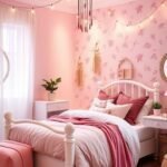
Why Teal is the Perfect Color for a Girl’s Bedroom
Choosing the right wall color can transform a room from ordinary to extraordinary, and this particular shade excels. It blends the best qualities of blue and green into one harmonious hue.
The Psychology of Blue and Green
Blue creates a calming atmosphere perfect for relaxation. It lowers heart rate and reduces anxiety. This makes it ideal for spaces where you unwind.
Green brings nature’s balance indoors. It promotes feelings of renewal and harmony. This earthy tone connects us to the natural world.
When combined, these colors create something special. The blend offers both serenity and vitality. It’s like having the ocean and forest in one room.
Creating a Space That’s Both Lively and Peaceful
This unique blue-green shade energizes without overwhelming. It provides visual interest while maintaining tranquility. Your space feels both inviting and restorative.
Lighting affects how the color appears throughout the day. North-facing rooms work well with greener tones. South-facing spaces benefit from bluer variations.
“This versatile hue adapts to any room’s personality. It creates positive moods while supporting restful sleep.”
The color makes rooms feel cozy and comfortable. It enhances relaxation after busy days. Your personal retreat becomes a true sanctuary.
Unlike fleeting trends, this choice remains timeless. It offers emotional benefits beyond mere aesthetics. The hue supports both playtime and downtime.
| Color Quality | Psychological Benefit | Room Application |
|---|---|---|
| Blue Undertones | Promotes calmness and relaxation | Ideal for sleep areas |
| Green Elements | Brings nature and balance | Creates connection to outdoors |
| Combined Effect | Both energizing and tranquil | Perfect for multipurpose spaces |
| Light Adaptation | Maintains mood throughout day | Works in various room orientations |
Consider this sophisticated choice for its emotional impact. It creates a personal haven that grows with your child. The result is a space that feels both special and soothing.
Finding Your Shade: From Soft Aqua to Deep Cyan
The journey to finding your ideal teal begins with understanding light dynamics. This spectacular hue ranges from gentle aqua to rich cyan tones.
Each variation creates a distinct atmosphere. Your perfect teal color depends on several factors we’ll explore.
Choosing a Hue for Your Room’s Light
Natural illumination dramatically affects how paint appears. First, identify your window direction.
South-facing spaces receive warm, golden light throughout the day. These rooms benefit from bluer teal shades.
The cooler undertones maintain vibrancy without becoming overwhelming. They keep the space feeling fresh and clear.
North-facing rooms have cooler, softer light. Greener teal hues work beautifully here.
They add warmth and depth to counteract the cooler natural light. The result feels rich and inviting rather than cold.
East-facing rooms get bright morning light. Softer aqua tones create restful quality here.
West-facing spaces receive intense afternoon sun. Consider medium-depth shades that won’t fade visually.
Always test samples on your actual walls. Paint large swatches and observe them at different times.
Notice how morning, noon, and evening light change the appearance. This prevents surprises after full application.
Popular Teal Paint Colors to Consider
Professional designers favor several outstanding options. These brands offer consistent quality and beautiful formulations.
Farrow & Ball’s Pigeon presents a sophisticated gray-green teal. It works wonderfully in north-facing spaces.
Benjamin Moore’s Caribbean Teal offers vibrant blue-green energy. This shade excels in rooms with ample natural light.
Sherwin-Williams’ Rainwashed provides a soft, soothing aqua. It creates airy freshness in smaller spaces.
Behr’s Teal Tide delivers rich depth with blue undertones. This dramatic choice makes beautiful accent walls.
Consider your existing furniture and decor when selecting. Your new wall shade should complement rather than clash.
Bring fabric samples and photos to the paint store. Coordinating elements creates harmonious results.
“Test three similar shades side-by-side on your wall. Live with them for two full days before deciding.”
Lighter teal hues create open, airy feelings. They work well in smaller rooms or spaces with lower ceilings.
Deeper shades produce cozy, cocooning effects. These rich tones make large rooms feel more intimate.
Remember that lighting affects mood throughout the day. Your perfect shade should please you morning and night.
Now you can confidently use teal in your space. The right choice transforms ordinary rooms into extraordinary personal retreats.
Idea 1: Make a Statement with a Teal Accent Wall

Discover how one painted surface can completely redefine your personal space’s character. An accent wall creates instant drama without overwhelming your entire room.
This approach adds depth and visual interest beautifully. You get maximum impact without committing to a full paint job.
Place your feature wall behind the bed for the best effect. This draws attention to your sleeping area. It creates a cozy backdrop that enhances relaxation.
The rich jewel-like quality of this blue-green hue makes it perfect. It offers sophistication and warmth simultaneously. Your space feels both inviting and special.
Choose the right wall carefully. Consider your room’s layout and natural light patterns. The wall facing your main entrance often works well.
Complement your bold choice with neutral tones on other surfaces. Soft grays, warm whites, or creamy beiges make the color pop beautifully.
Accessorize your feature wall to enhance its impact:
- Hang contrasting artwork in gold or white frames
- Add floating shelves with decorative items
- Install sconce lighting for evening ambiance
- Place a dramatic mirror to reflect light
This design approach works in various room sizes. Smaller spaces benefit from the focal point. Larger rooms gain definition and character.
“A single accent wall can transform a room’s entire personality. It’s the most effective update per square foot of effort.”
Use high-quality paint for a smooth, professional finish. Proper preparation ensures your results last for years. Clean walls thoroughly before starting.
This is a budget-friendly way to refresh your space quickly. You’ll achieve dramatic results with minimal investment. The transformation happens in just a weekend.
Embrace this bold yet manageable idea with confidence. Your personalized retreat awaits with this simple change. Start planning your stunning feature today!
Idea 2: Go Bold with an All-Over Teal Paint Job
Embrace the drama of full-coverage painting for a space that feels both regal and restful. This approach creates an immersive luxury that transforms ordinary rooms into extraordinary personal sanctuaries.
Complete wall coverage offers a cocooning effect perfect for sleeping areas. The rich hue wraps your space in sophisticated comfort from every angle.
Choose your shade carefully based on room dimensions and natural light. Darker variations absorb illumination for intimate coziness. Lighter tones maintain airy openness while delivering vibrant energy.
North-facing spaces benefit from warmer, greener undertones. These add welcoming depth to cooler natural light. South-facing rooms shine with bluer shades that stay crisp and clear.
Always test samples on multiple walls at different times. Observe how morning, noon, and evening light affect the appearance. This ensures consistent beautiful results throughout the day.
“Full-room color creates intentional design with emotional impact. It turns basic spaces into personalized retreats that feel both special and soothing.”
Balance the boldness with light-colored furniture and accessories. Cream upholstery, white bedding, and natural wood tones prevent visual overwhelm. Metallic accents in gold or silver add sparkling contrast.
Coordinate textiles that complement rather than compete. Patterned curtains with hints of coral or blush pink create beautiful harmony. Layered textures in rugs and throw pillows add dimensional interest.
Select washable paint formulations for lasting beauty and easy maintenance. Quality finishes withstand daily living while maintaining their rich depth. Your stunning space remains practical for years of enjoyment.
This approach is perfect for color lovers wanting standout personality. It creates a designed look that feels both luxurious and livable. Your home gains a truly unique character.
Confidently embrace comprehensive color coverage. The result is a breathtaking space that serves as your personal retreat. Every moment spent there feels special and serene.
Idea 3: Incorporate Teal Through Your Bedding and Textiles
Transform your space with soft fabrics that bring comfort and style. This approach lets you refresh your room without permanent changes.
You can easily switch out pieces for different seasons or moods. Textiles offer flexibility while creating a cohesive design.
Choosing the Right Fabric: Velvet, Linen, and More
Select materials that match your desired atmosphere. Each fabric creates a distinct feeling in your personal space.
Velvet offers luxurious richness with its deep texture. It catches light beautifully for added dimension.
Linen provides relaxed elegance with natural wrinkles. This breathable choice works well in warmer climates.
Cotton remains practical for everyday use. It’s easy to clean and maintain over time.
Mix patterns and textures for visual interest. Combine solids with subtle prints for balanced appeal.
Layer different shades of your chosen hue. This creates depth without overwhelming the space.
“Textiles provide the easiest way to experiment with bold colors. You can completely change a room’s personality with new bedding and throws.”
Coordinate your fabrics with existing elements. Match or complement your wall color and furniture finishes.
Consider seasonal changes for optimal comfort. Lightweight cotton works well in summer months.
Heavier velvet or wool blends add warmth during winter. This practical approach keeps your space comfortable year-round.
For a chic, preppy vibe, consider combining coral and teal striped bedding with patterned throw pillows. This combination creates visual interest while maintaining harmony.
Proper care ensures your textiles last longer. Follow manufacturer instructions for cleaning and maintenance.
This method works perfectly for renters or those avoiding permanent changes. You achieve dramatic results without commitment.
| Fabric Type | Best For | Maintenance Level |
|---|---|---|
| Velvet | Luxurious, formal spaces | Medium – requires careful cleaning |
| Linen | Relaxed, casual atmospheres | Low – becomes softer with washing |
| Cotton | Everyday practicality | Easy – machine washable |
| Blends | Durability and texture | Varies by composition |
Add metallic accents for extra sophistication. Gold or silver threads enhance the luxurious feel.
Your space becomes both comfortable and visually appealing. The right textiles create a welcoming retreat.
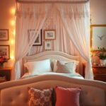
Idea 4: Add a Pop of Teal with a Statement Headboard
Create instant visual impact with a beautifully crafted centerpiece behind your bed. This approach adds sophisticated color without overwhelming your entire space.
A teal headboard serves as a stunning focal point that anchors your room’s design. It brings art-deco elegance while maintaining comfortable softness.
Choose luxurious velvet upholstery for rich texture and depth. The fabric catches light beautifully throughout the day.
Painted wood offers another excellent option for custom appeal. This method lets you match existing furniture finishes perfectly.
Ensure proper sizing for balanced proportions with your bed frame. The headboard should complement rather than dominate your space.
“A well-chosen headboard defines the sleeping area as a cozy retreat. It creates architectural interest while adding personal style.”
Pair your striking centerpiece with complementary bedding selections. Neutral patterns or solid tones enhance the blue-green hue beautifully.
Consider do-it-yourself options for budget-friendly customization. Paint an existing headboard or build one from scratch for unique character.
Coordinate with other teal elements throughout your room for cohesive design. This creates harmony without matching everything perfectly.
This update adds personality and glamour with relatively little effort. You achieve dramatic transformation without major renovation work.
View your headboard as a key style element that expresses your taste. It becomes the foundation for your entire room’s aesthetic story.
Idea 5: Create a Focal Point with Teal Wallpaper
Transform your walls into stunning works of art with patterned wallpaper. This approach delivers instant personality and depth to your personal space.
You get both color and pattern in one beautiful application. The result creates a dramatic effect that paint alone cannot achieve.
Wallcoverings offer incredible versatility for your design vision. They can transform ordinary rooms into extraordinary retreats.
Many options now feature easy installation and removal. This makes experimenting with bold patterns less commitment.
Patterns That Work: Florals, Nature Motifs, and Geometrics
Nature-inspired designs bring organic beauty indoors. Floral patterns and leaf motifs enhance the calming quality of your hue.
These designs create a serene, restful atmosphere. They connect your space to the natural world beautifully.
Geometric patterns offer structured elegance with modern appeal. Clean lines and repeating shapes create visual interest.
This style feels both contemporary and inviting. It adds sophistication without sacrificing comfort.
“Wallpaper provides texture and dimension that flat paint cannot match. It turns basic walls into design features that tell your unique story.”
Consider your room’s proportions when selecting patterns. Larger spaces handle big, bold designs well.
Smaller rooms benefit from smaller-scale patterns. This prevents visual overwhelm while still making an impact.
Accent walls work beautifully with dramatic wallcoverings. They create focal points without dominating the entire space.
Full coverage makes a powerful statement in rooms with good proportions. Both approaches deliver stunning results.
Wallcoverings can conceal minor imperfections in your surfaces. They add texture that makes rooms feel more finished.
Many options feature washable surfaces for easy maintenance. This practical benefit keeps your space looking fresh.
Coordinate your wall treatment with other elements in the room. Select bedding or accessories that complement rather than match exactly.
This creates a layered, collected look that feels intentional. Your space develops cohesion without being too matchy.
Removable options offer fantastic flexibility for temporary applications. They allow bold experimentation without permanent commitment.
This approach works perfectly for renters or those who enjoy frequent refreshes. You achieve high impact with relatively low effort.
| Pattern Type | Best For | Room Size Recommendation |
|---|---|---|
| Floral Designs | Creating serene, nature-inspired spaces | Medium to large rooms |
| Nature Motifs | Enhancing calming qualities | Any size with proper scale |
| Geometric Patterns | Modern, structured appeal | All room sizes |
| Small-Scale Prints | Intimate spaces | Smaller rooms |
Explore the wonderful world of pattern possibilities. Your walls can become the most exciting feature in your room.
This design method offers endless creative opportunities. Embrace the transformative power of beautiful wallcoverings today!
Idea 6: Use Teal in Your Window Treatments
Your windows offer a fantastic opportunity to introduce vibrant color into your personal space. This approach adds style while solving practical needs for light control and privacy.
These treatments frame your view beautifully while creating a cohesive design element. They bring your color scheme together in a visually pleasing way.
Choose blinds for a clean, modern appearance that feels crisp and organized. They provide excellent light control with simple operation.
Curtains deliver softness and drama with their flowing fabric. They add movement and texture to your room’s decor.
Select fabrics that match your room’s overall style perfectly. Sheer materials maintain brightness while offering slight privacy.
Heavier fabrics provide complete privacy and better insulation. They help regulate temperature throughout the year.
“Window treatments serve both aesthetic and functional purposes beautifully. They’re one of the most versatile elements in room design.”
Pair your treatments with metallic hardware for extra sophistication. Gold rods or silver finials enhance the luxurious feel.
Consider layering different treatments for maximum flexibility. Combine blinds with curtains for both functionality and style.
This color choice can make windows a focal point in challenging spaces. It draws attention away from awkward room shapes effectively.
Proper measuring ensures a perfect fit and professional appearance. Follow manufacturer guidelines for best results.
These treatments control sunlight and add insulation for improved comfort. They help maintain consistent room temperature.
This method lets you experiment with color without permanent changes. You can easily update your look whenever desired.
| Treatment Type | Best Features | Room Compatibility |
|---|---|---|
| Blinds | Precise light control, modern look | Contemporary spaces |
| Curtains | Softness, drama, insulation | Traditional rooms |
| Sheer Fabrics | Light diffusion, airy feel | Bright spaces |
| Layered Approach | Maximum functionality and style | All room types |
Enjoy this affordable way to refresh your home’s appearance. Your space gains personality and practical benefits simultaneously.
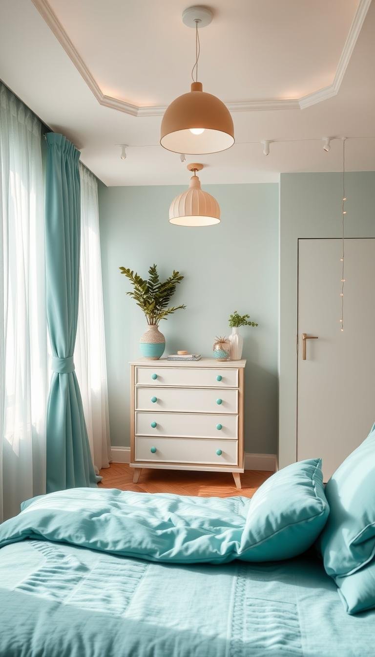
Idea 7: Introduce Teal Through Furniture Pieces

Furniture provides a fantastic way to infuse your room with personality and function. Key pieces become both practical and decorative elements in your space.
These items anchor your decor while serving everyday needs. They create visual interest without overwhelming your entire room.
Desks, Dressers, and Nightstands
Select a dresser for storage and style in one beautiful piece. This versatile item holds clothing while making a color statement.
A desk creates a dedicated creative corner for projects and homework. It offers functionality with fashionable appeal.
Nightstands provide convenient surface space beside your bed. They complete your sleeping area with coordinated charm.
“Furniture delivers both color and utility in your design scheme. It transforms ordinary rooms into extraordinary living spaces.”
Choose finishes that match your desired atmosphere perfectly. Painted wood offers crisp, clean lines with durable beauty.
Upholstered velvet provides luxurious texture and rich depth. This soft option adds comfort and sophistication.
Pair these items with neutral walls for maximum impact. Light backgrounds let your furniture stand out beautifully.
Mix and match with complementary colors for balanced appeal. Warm wood tones or metallic accents create harmonious contrast.
Consider do-it-yourself painting projects for budget-friendly updates. Refresh existing pieces with a fresh coat of paint.
This approach offers flexibility as you can rearrange items easily. Pieces move with you if you change homes or redecorate.
Select quality construction for lasting enjoyment and value. Well-made furniture maintains its appeal through years of use.
Your room gains both character and practical benefits simultaneously. These pieces become the foundation of your personalized decor.
Idea 8: Design a Coordinated Look with a Teal Closet
Your closet offers a fantastic opportunity to extend your design scheme into functional spaces. This approach turns storage into a stylish feature that enhances your entire room.
Painting your closet creates visual harmony throughout your personal area. It transforms ordinary storage into an intentional design element.
Match your closet color to the walls for a seamless, integrated appearance. This creates flow and makes your space feel larger.
Choose a contrasting shade for emphasis if you prefer bold statements. This makes your storage area stand out as a focal point.
“A coordinated closet elevates ordinary storage to design feature status. It shows thoughtful attention to detail throughout the space.”
Proper preparation ensures professional-looking results that last. Clean surfaces thoroughly and use painter’s tape for clean edges.
Select durable paint formulations that withstand daily use. Semi-gloss or satin finishes clean easily and resist scuff marks.
Add decorative hardware for extra personality and function. Choose knobs or pulls that complement your room’s overall style.
Organize the interior for both beauty and practicality. Use matching bins or baskets to maintain visual consistency.
This idea works beautifully with both built-in and freestanding units. Each type benefits from coordinated color treatment.
Renters can achieve similar results with temporary solutions. Contact paper or removable wallpaper offers flexibility.
Always seek permission from landlords before making permanent changes. Many appreciate improvements that enhance property value.
Your coordinated storage solution makes daily routines more enjoyable. Everything feels part of a designed environment.
This practical use of color adds personality to functional elements. Your space gains cohesion and intentional style.
| Closet Type | Best Paint Approach | Recommended Finish |
|---|---|---|
| Built-in | Match wall color for seamless integration | Satin for easy cleaning |
| Freestanding | Contrasting color for statement piece | Semi-gloss for durability |
| Rental Unit | Removable coverings or landlord approval | Any non-permanent solution |
| Children’s Space | Washable, scuff-resistant formulas | High-gloss for easy maintenance |
Enjoy this smart way to incorporate color throughout your home. Your personalized look becomes both beautiful and functional.
Idea 9: Accessorize with Teal Lamps, Rugs, and Art
Complete your design with carefully chosen decorative elements. These final touches bring everything together beautifully.
Accessories offer the perfect way to experiment with bold color. You can add personality without permanent commitment.
Select pieces that complement your room’s scale and existing palette. This creates harmony throughout your personal space.
Lamps provide both function and style in one elegant package. They cast warm light while making a color statement.
Rugs add softness underfoot and visual warmth above. They define areas while introducing texture and pattern.
Art expresses your unique taste and creative spirit. It personalizes your environment with meaningful imagery.
“Strategic accessories complete a room’s story. They’re the jewelry of interior design – small details that make everything shine.”
Mix textures for added dimensional interest throughout your room. Combine plush rugs with metallic lamp bases.
Layer different materials for rich visual appeal. This approach feels collected rather than matchy.
Create DIY art projects for truly custom expression. Paint simple canvases or frame special prints.
Swap items seasonally for fresh looks throughout the year. This keeps your decor feeling current and inspired.
Place accessories thoughtfully to enhance without cluttering. Each piece should have purpose and presence.
This budget-friendly approach lets you play with color confidently. You can change your mind easily later.
Choose items that reflect your personal story and taste. Meaningful decor creates emotional connection.
| Accessory Type | Primary Function | Style Impact |
|---|---|---|
| Table Lamps | Task lighting and ambiance | Adds vertical interest and color |
| Area Rugs | Defines spaces and adds comfort | Introduces pattern and texture |
| Wall Art | Personal expression and focal points | Completes color story and theme |
| Decorative Objects | Adds personality and layers | Provides finishing touches |
Small touches create big impact in your overall look. They transform basic spaces into designed homes.
Enjoy this creative process of selecting perfect pieces. Your room becomes a true reflection of your style.
Colors That Make Teal Pop: Your complementary Palette

Creating the perfect color combination transforms your room from nice to spectacular. The right pairings enhance this beautiful blue-green shade beautifully.
Understanding basic color theory helps you make confident choices. Complementary colors sit opposite each other on the color wheel.
These combinations create vibrant contrast that makes both shades stand out. Your space gains energy and visual interest.
Pairing with Metallics: Gold, Silver, and Brass
Metallic accents add instant glamour and sophistication to your decor. They catch light beautifully throughout the day.
Gold creates warm, luxurious contrast against cool blue-green tones. It feels both elegant and inviting.
Silver offers modern crispness with its cool shimmer. This pairing works well in contemporary spaces.
Brass provides vintage charm with its muted golden quality. It adds character without overwhelming.
Use metallic touches in lighting fixtures, hardware, or decorative objects. These elements sparkle against rich walls.
Pairing with Warm Tones: Coral, Peach, and Burnt Orange
Warm colors create cheerful energy that complements your cool base hue. They bring balance and vitality.
Coral offers vibrant contrast that feels both playful and sophisticated. This combination works beautifully in youth spaces.
Peach provides softer warmth with its gentle orange-pink tone. It creates cozy, inviting atmospheres.
Burnt orange delivers rich depth with earthy sophistication. This pairing feels both grounded and exciting.
These warm accents work well in textiles, artwork, or accessories. They prevent your space from feeling too cool.
Pairing with Neutrals: Grey, White, and Cream
Neutral tones create balanced, timeless looks that never overwhelm. They let your main color shine beautifully.
Grey offers sophisticated contrast with its cool undertones. This pairing feels modern and elegant.
White provides crisp freshness that keeps spaces feeling bright and airy. It works well in smaller rooms.
Cream adds warm softness that feels cozy and inviting. This combination creates comfortable elegance.
Use neutrals for larger elements like furniture or bedding. They create calm backgrounds for vibrant walls.
Pairing with Other Shades: Pink, Mustard, and Burgundy
Bold color combinations create dramatic, personalized statements. They show confidence and creative flair.
Pink offers playful contrast that feels both modern and romantic. This pairing works well in eclectic spaces.
Mustard provides rich warmth with its golden yellow tone. It adds vintage charm and depth.
Burgundy creates luxurious contrast with its deep red-purple quality. This combination feels sophisticated and cozy.
Use these bold accents in moderation for best results. They should complement rather than compete.
“Test color combinations with large swatches before committing. Observe how natural and artificial light affect the relationship between shades.”
Remember proportion when mixing multiple hues. Your main color should dominate while accents provide support.
Digital tools help visualize combinations before painting. Many paint brands offer online room visualizers.
These pairings adapt to various design styles from minimalist to maximalist. Your personal taste guides final choices.
Confidently experiment with different combinations. The right palette makes your space uniquely yours.
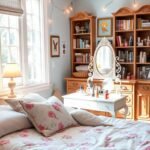
Idea 10: Bring in Natural Elements for a Biophilic Feel
Connect your room to the calming power of nature with organic materials. This approach creates a peaceful atmosphere that feels both fresh and relaxing.
Natural elements enhance the beautiful green undertones in your color scheme. They make your space feel grounded and connected to the outdoors.
Plants, Rattan, and Wooden Accents
Plants bring life and vibrancy into your personal area. They improve air quality while adding visual interest.
Choose low-maintenance varieties like succulents or snake plants. Hanging plants add vertical dimension without taking up surface space.
Rattan furniture introduces texture and bohemian charm. This natural material feels both lightweight and durable.
Consider a rattan headboard or accent chair for organic style. The woven pattern complements solid surfaces beautifully.
Wooden accents add warmth and balance to cool tones. Floating shelves or picture frames create natural contrast.
Choose light woods for airy feelings or dark woods for richness. Either option enhances your overall look.
“Biophilic design reduces stress and improves well-being. It creates spaces that feel both restorative and inspiring.”
Create a cohesive natural theme with earthy companion colors. Soft browns, warm tans, and muted greens work wonderfully.
These tones reinforce the organic feeling throughout your room. They make your space feel like a true retreat.
Mix live and faux plants for easy maintenance. High-quality artificial plants look realistic without requiring care.
Dust plants regularly to keep them looking fresh and vibrant. Wipe wooden surfaces with appropriate cleaners.
This idea transforms your room into a peaceful sanctuary. You’ll enjoy the calming benefits every day.
| Natural Element | Benefits | Placement Ideas |
|---|---|---|
| Live Plants | Air purification, vibrant energy | Windowsills, shelves, hanging planters |
| Rattan Pieces | Texture, bohemian style | Chairs, headboards, storage baskets |
| Wood Accents | Warmth, natural balance | Shelves, frames, nightstands |
| Mixed Materials | Layered interest, organic feel | Throughout the room for cohesion |
Enjoy creating your nature-inspired personal haven. This approach brings tranquility and beauty into your home.
Idea 11: Play with Texture Using Chalk Paint and Fabrics
Transform your surfaces with dimensional charm that invites touch and admiration. This approach adds depth and personality through creative material combinations.
Texture creates visual interest that flat colors cannot achieve alone. It makes your room feel more engaging and comfortable.
Chalk paint offers a matte finish with subtle variation. It provides vintage character with easy application.
This special formula requires minimal surface preparation. It adheres beautifully to various materials without priming.
“Layered textures create rooms that feel collected over time. They add soul and character that new spaces often lack.”
Combine painted surfaces with complementary fabrics for rich contrast. Velvet brings luxurious softness against matte walls.
Linen offers casual elegance with natural texture. Knit materials provide cozy warmth for chilly evenings.
Experiment with application techniques for custom effects. Brushing creates subtle streaks for rustic appeal.
Sponging adds mottled variation for artistic interest. Both methods deliver unique results every time.
Refresh furniture pieces with creative paint projects. A dresser gains new life with distressed charm.
Create textile art pieces for personalized decor. Framed fabric swatches make meaningful wall displays.
These contrasts make your space more dynamic and inviting. They prevent flat, one-dimensional appearances.
Maintain textured surfaces with proper cleaning methods. Dust painted furniture with soft cloths regularly.
Spot clean fabrics according to manufacturer instructions. This preserves your beautiful results for years.
This hands-on approach encourages creative expression. You develop a truly unique environment.
Mix different materials to discover perfect combinations. Your personal taste guides final selections.
Enjoy this tactile way to enhance your home’s character. Your space becomes both visually and physically engaging.
Idea 12: Add Depth with an Ombre or Color-Blocked Wall

Transform your room into a work of art with creative paint techniques that add incredible dimension. These approaches create visual drama while maintaining a cohesive design.
An ombre effect transitions from light to dark in a beautiful gradient. This soft technique adds artistic flair without overwhelming your space.
Color blocking uses bold geometric shapes with contrasting shades. This modern method creates graphic impact with clean lines.
Both techniques offer unique ways to personalize your environment. They turn basic walls into stunning focal points.
Choose the ombre method for a soft, dreamy atmosphere. The gradual shift creates calming movement across your surface.
Select color blocking for energetic, contemporary vibes. Sharp contrasts make both colors pop beautifully.
“These paint techniques transform walls into artistic statements. They add custom character that reflects personal style beautifully.”
Plan your design carefully before starting any project. Sketch your idea on paper to visualize the final look.
Use painter’s tape for crisp, clean lines in color block designs. Remove tape before paint fully dries for best results.
Test your color combinations in different lighting conditions. Observe how natural and artificial light affect the relationship.
Place your feature wall behind the bed for maximum impact. This creates a dramatic backdrop for your sleeping area.
Coordinate other elements to complement rather than compete. Neutral furniture and bedding let your artistic wall shine.
These techniques can alter how your room feels spatially. Vertical ombre makes ceilings appear higher.
Horizontal color blocks can make rooms feel wider. Choose the approach that enhances your space best.
DIY execution requires proper tools and preparation. Use quality brushes and rollers for smooth application.
Work in sections for ombre effects, blending while wet. This creates seamless transitions between shades.
This idea is perfect for artistic souls wanting unique expression. Your room becomes a true reflection of personal style.
Always test samples before full application. Live with them for a day to ensure you love the effect.
| Technique | Best For | Room Effect |
|---|---|---|
| Ombre Gradient | Soft, artistic atmosphere | Creates movement and depth |
| Color Blocking | Modern, graphic statements | Adds energy and contrast |
| Vertical Application | Height enhancement | Makes ceilings appear higher |
| Horizontal Design | Space widening | Creates broader feeling |
Enjoy this creative approach to wall design. Your personalized space gains incredible character and charm.
Idea 13: Don’t Forget the Fifth Wall: The Ceiling
Look up and discover an often-overlooked canvas for dramatic transformation. Your ceiling offers incredible potential to elevate your entire room’s atmosphere.
Painting overhead creates an enveloping, cocoon-like effect that feels both intimate and luxurious. This bold approach draws eyes upward while making your space feel more designed.
This technique works beautifully in rooms with generous height. It brings lofty ceilings down to a more human scale for cozy comfort.
Choose your shade carefully based on light reflection and room dimensions. Lighter tones maintain brightness while adding color interest.
Deeper variations create more dramatic, intimate moods. They absorb light beautifully for evening relaxation.
“A colored overhead surface completes the design story beautifully. It turns basic boxes into thoughtfully crafted environments that feel both intentional and inviting.”
Pair your bold overhead choice with lighter walls for balanced appeal. This prevents the space from feeling too closed in or intense.
White or pale neutral walls create beautiful contrast. They keep the room feeling fresh and open despite the dramatic ceiling.
Coordinate lighting fixtures to enhance your feature. A statement chandelier becomes even more spectacular against colored backdrop.
Consider these practical tips for successful execution:
- Use extension poles for comfortable roller application
- Work in small sections for even coverage
- Protect floors and furniture with drop cloths
- Apply two coats for rich, consistent color
Test your selected shade at different times before committing. Observe how morning, noon, and evening light affect the appearance.
This unexpected approach adds serious wow factor to any room. It shows design confidence and creative thinking beyond ordinary solutions.
Your home gains unique character that standard decor cannot achieve. The result feels both daring and delightful every time you enter.
Embrace this creative opportunity to think beyond vertical surfaces. Your fifth wall awaits its transformation into something spectacular!
Idea 14: Layer Your Lighting to Enhance the Teal Hue
Mastering illumination transforms how your favorite blue-green shade appears throughout the day. Strategic lighting reveals hidden depths and subtle variations in your chosen color.
Natural daylight emphasizes green undertones for fresh, vibrant energy. Evening illumination brings out cooler blue notes for calming serenity.
Create a balanced scheme with three lighting types working together. Ambient lighting provides overall brightness for general activities.
Task lighting focuses on specific areas like reading nooks or desks. Accent lighting highlights architectural features or artwork beautifully.
“Warm bulbs between 2700-3000 Kelvin enhance blue undertones perfectly. They create cozy ambiance while making your color scheme shine.”
Choose LED options for energy efficiency and long-lasting performance. Dimmable controls let you adjust mood from bright to intimate instantly.
Position lamps to graze accent walls or featured furniture pieces. This technique adds dimension and makes surfaces appear richer.
Table lamps with fabric shades offer soft, diffused illumination. They reduce harsh shadows while adding decorative charm.
Wall sconces save surface space while providing directed light. They work wonderfully beside beds or above nightstands.
Overhead fixtures should provide even coverage without dark corners. Consider multiple light sources instead of one bright center point.
Your layered approach supports various activities throughout the day. Bright settings help with homework or dressing routines.
Softer lighting creates relaxation perfect for evening reading. Adjustable systems accommodate changing needs effortlessly.
Experiment with different bulb types and placements regularly. Small changes can dramatically improve your overall look.
Good lighting enhances both beauty and functionality in your home. It makes your space more versatile and comfortable daily.
This practical touch completes your design while serving real needs. You’ll enjoy the perfect balance of form and function.
Idea 15: Creative and Personal DIY Teal Decor Projects

Unleash your creativity with personalized projects that transform your room into a unique sanctuary. DIY crafts add that special personal touch money cannot buy.
Experts love this approach for creating budget-friendly spaces. You get custom results without the high cost of store-bought items.
Start with simple painted picture frames for instant charm. Choose non-toxic paint for safe crafting throughout your home.
Create custom wall art that reflects your personality. Incorporate photos or memorabilia for meaningful displays.
Upcycle furniture pieces with fresh color applications. An old dresser becomes a stunning focal point with creative painting.
“Handmade elements infuse spaces with soul and character. They transform generic rooms into personal retreats that tell your unique story.”
Involve children in age-appropriate projects for family fun. Their creations make the room feel truly theirs.
This approach allows continuous updates as tastes evolve. You can refresh your look whenever inspiration strikes.
Share your creations online for community inspiration. Social media platforms offer wonderful idea exchanges.
Source materials affordably from various locations. Thrift stores and online retailers offer great finds.
| Project Type | Skill Level | Time Investment | Budget Range |
|---|---|---|---|
| Painted Frames | Beginner | 1-2 hours | $10-20 |
| Custom Wall Art | Intermediate | 2-4 hours | $15-30 |
| Furniture Upcycling | Advanced | 4-8 hours | $20-50 |
| Textile Projects | Intermediate | 3-5 hours | $25-40 |
Enjoy the process of making your space uniquely yours. Each handmade piece adds character and warmth.
Your creative journey brings new life to your personal area. The results will fill you with pride every day.
Bringing It All Together: Your Teal Bedroom Oasis Awaits
Your vibrant sanctuary is ready to come to life. This dynamic hue blends calm and energy perfectly.
Start with one simple change. Add an accent wall or refresh textiles. Build your look gradually.
Remember lighting and room size. They guide your shade and element choices. Your space should feel both joyful and restful.
This versatile color grows with your child. It adapts to changing tastes over time. Regular updates keep it fresh.
Share your results with design communities. Seek inspiration and celebrate your unique style.
Your personalized retreat combines beauty and function. It supports peaceful sleep and lively days.
Thank you for exploring these creative possibilities. Your dream space awaits—happy designing!