Welcome to your ultimate guide for creating a dream space your daughter will absolutely adore. Transforming her personal sanctuary doesn’t require magic – just the right vision and a few clever techniques.
Discover how the perfect color choices and creative design can completely change your child’s room. You’ll learn that professional-looking results don’t demand advanced skills.
The right paint serves as the foundation for a personalized space that reflects your girl’s unique personality. These ideas can grow with your child, saving you from frequent updates.
Get excited about this creative journey! Even simple changes to your walls can make a dramatic impact on the entire bedroom‘s atmosphere.
Introduction: Creating a Dream Room for Your Girl
Creating the perfect environment for your girl means balancing her current passions with designs that will grow alongside her. This approach ensures her personal space remains relevant through different stages of childhood.
A well-designed room serves as more than just a sleeping area. It becomes a sanctuary where your daughter feels comfortable, inspired, and truly herself. This personal space should reflect her unique personality while supporting her development.
The right design choices can significantly impact your child’s daily mood and creativity. Thoughtful color selection and layout contribute to her overall wellbeing. These elements work together to create an environment that nurtures her growth.
Choosing timeless elements saves you time and money as your daughter matures. Instead of frequent updates, select pieces that can adapt to changing tastes. This practical approach ensures longevity in your design investments.
Involving your child in the process creates ownership and excitement. Let her express preferences while you guide toward choices that will remain appealing. This collaboration makes the space truly hers while maintaining practical considerations.
Good design doesn’t require a massive budget. Many transformative ideas can be achieved with reasonable spending. Creative solutions often make the biggest impact without breaking the bank.
Color psychology plays a crucial role in creating the right atmosphere. Different hues can create calming, energizing, or creatively stimulating environments. Understanding these effects helps you design a space that supports your daughter’s needs.
Balancing current preferences with lasting appeal is key to successful room design. Choose elements that honor your daughter’s present interests while maintaining flexibility for future changes. This approach creates a space that grows with your child.
| Color Type | Psychological Effect | Best For |
|---|---|---|
| Soft Pastels | Creates calming atmosphere | Bedrooms, reading nooks |
| Bright Hues | Boosts energy and creativity | Play areas, activity spaces |
| Neutral Tones | Provides versatile foundation | Long-term design schemes |
| Warm Colors | Promotes comfort and security | Relaxation spaces |
| Cool Shades | Enhances focus and tranquility | Study areas, quiet zones |
Remember that your daughter’s room should evolve as she does. The best designs incorporate flexibility while creating a special place she’ll love for years. This thoughtful approach makes the space truly magical.
Choosing the Right Color Palette for Her Personality

Your daughter’s personality shines brightest in her personal space. The perfect color scheme reflects who she is while creating an environment she loves.
Today’s options go far beyond basic primary colors. You’ll find light, bright, moody, and neutral shades that work beautifully for children’s spaces.
Finding the right palette means understanding her energy and preferences. A calm child might prefer soothing tones while an energetic one needs vibrant hues.
This choice affects more than just appearance. Different colors influence mood, creativity, and even sleep quality.
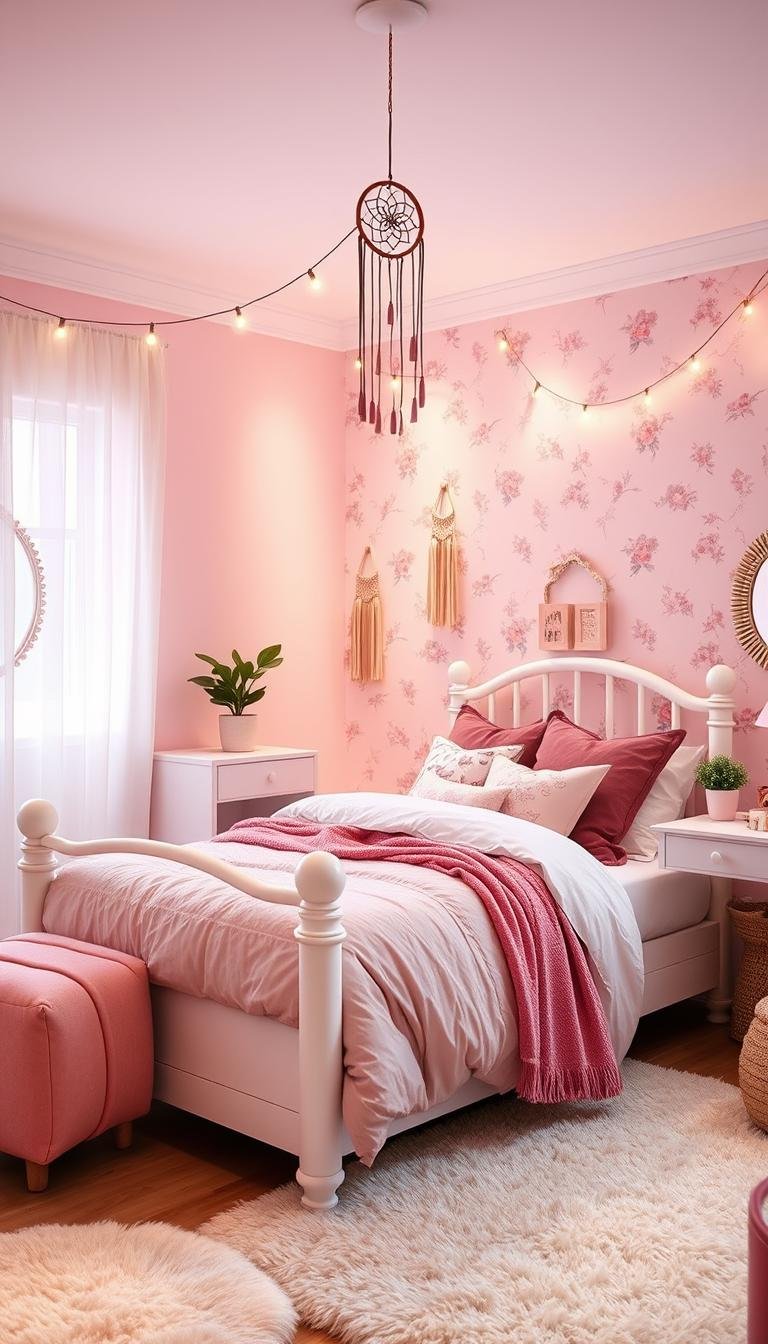
Soft Pastels for a Calming Atmosphere
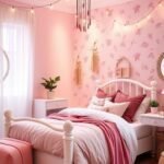
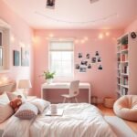
Soft pastels create peaceful environments perfect for relaxation. Think blush pink, mint green, or powder blue for serene spaces.
These gentle hues work well in bedrooms and reading nooks. They promote calmness and help with winding down at bedtime.
Pastel paint creates a dreamy, soft background for decor. It pairs beautifully with white furniture and natural light.
Bold and Bright Hues for Energetic Spaces
Vibrant colors energize rooms and stimulate creativity. Coral, sunshine yellow, and emerald green make spaces feel alive.
These bold choices work best in play areas and activity zones. They encourage movement, imagination, and joyful expression.
Balance bright walls with neutral furnishings. This prevents overwhelming the space while maintaining energy.
Neutral Bases with Pops of Color
Neutral walls provide versatile foundations that grow with your child. Whites, grays, and beiges create timeless backgrounds.
Add personality through strategic accents and decor elements. This way you can easily update the look without repainting.
Colorful bedding, artwork, and accessories bring life to neutral bases. This approach offers maximum flexibility for changing tastes.
Consider how light affects your paint selection. Natural and artificial lighting change how colors appear throughout the day.
Test samples on walls before committing. Observe them at different times to see how they work in your interior.
Finish selection matters too. Matte hides imperfections while semi-gloss adds durability and shine.
| Age Group | Recommended Palette | Design Considerations |
|---|---|---|
| Nursery (0-2) | Soft pastels, muted tones | Soothing environment for sleep |
| Young Child (3-6) | Bright accents, playful colors | Stimulates imagination and play |
| School Age (7-12) | Balanced tones, personal favorites | Supports both play and study |
| Teen (13+) | Sophisticated hues, personal style | Reflects growing independence |
Remember that your daughter’s preferences will evolve. Choose a flexible approach that allows for easy updates as she grows.
Wall Paint and Decor Ideas for Girls Bedrooms: Creative Techniques
Ready to move beyond solid colors? These creative approaches turn plain surfaces into magical features. They add personality without overwhelming the entire space.
Each technique offers unique character while remaining surprisingly achievable. You’ll discover methods that work with various skill levels and time commitments.
DIY Striped Walls: Colorful and Playful
Stripes create dynamic energy while maintaining clean lines. They work beautifully in both large and compact areas.
Start with a level tool and quality painter’s tape for crisp edges. Measure carefully to ensure consistent spacing between each stripe.
Choose colors that complement your existing decor scheme. Contrasting hues make bold statements while similar tones create subtle texture.
The Sugar & Cloth project demonstrates how vibrant stripes transform children’s spaces. Their approach shows professional results through careful preparation.
Whimsical Wavy Wall Designs
Curved patterns bring soft, organic movement to your surfaces. They create dreamy atmospheres perfect for imaginative play.
Peel and stick tile trim simplifies curved designs tremendously. This flexible material bends smoothly without the frustration of traditional tape.
Practice your wave pattern on paper before committing to the surface. This ensures pleasing proportions and consistent curves throughout the design.
Consider scale when planning your wavy elements. Larger rooms can handle bigger curves while smaller spaces benefit from delicate ripples.
Scalloped Edges for Vintage Charm
Scalloped borders add delightful character with nostalgic appeal. They create focal points that feel both playful and sophisticated.
The Loving Littles tutorial shows how achievable this look can be. Their method uses simple tools to create professional-looking results.
Consider placing scallops along chair rails or ceiling edges. This framing technique highlights architectural features beautifully.
Color combinations significantly impact the final appearance. Contrasting colors make bold statements while tonal variations create subtle elegance.
These techniques offer incredible flexibility for personalization. Mix and match approaches to create something truly unique for your space.
Remember that preparation determines your final results. Proper tools and careful measurement ensure professional-looking finishes every time.
Accent Walls That Make a Statement

Transform any space with one powerful focal point. An accent feature creates visual interest without overwhelming the entire area.
This design choice adds personality while defining specific zones. It’s perfect for creating dedicated sleeping or study areas within larger rooms.
The wall opposite the entrance often works best for this treatment. It naturally draws attention while complementing room layout and light patterns.
Choose colors that harmonize with your existing scheme. The right selection creates cohesion rather than competition with other surfaces.
Two-Tone Color Blocking
Create dramatic visual interest with contrasting color sections. This approach allows for creative combinations that feel fresh and modern.
The Lily Pad Cottage demonstrates how two tones can transform a space. Their project shows how horizontal or vertical divisions create different effects.
Use painter’s tape for clean, sharp lines between colors. This technique works beautifully for creating geometric interest on a single surface.
“Color blocking adds architectural interest where none exists, creating dimension through paint alone.”
Consider how natural light affects each color throughout the day. Test samples to ensure both shades work well in your specific environment.
Painted Arches for Modern Elegance
Soft curved shapes bring sophisticated charm to any interior. They add architectural detail without structural changes.
Josie Michelle Davis showcases beautiful color block arches in her designs. This technique creates a soft, welcoming focal point behind beds or seating areas.
Create perfect curves using a flexible ruler or string compass. This method ensures symmetrical, professional-looking results every time.
Arches work particularly well in rooms with higher ceilings. They draw the eye upward while maintaining a cozy, intimate feeling.
Geometric Patterns for Contemporary Style
From simple triangles to complex hexagons, shapes make bold statements. These patterns create rhythm and movement on your surface.
Discover numerous geometric design approaches that suit various skill levels. Many projects use tape to create crisp, clean patterns.
Start with simpler shapes if you’re new to pattern work. Triangles and diamonds offer striking results with straightforward execution.
Consider scale when planning your geometric design. Larger patterns make strong statements in big rooms while smaller repeats work well in compact spaces.
| Accent Technique | Best For Room Types | Skill Level Required |
|---|---|---|
| Two-Tone Blocking | All room sizes, defines zones | Beginner |
| Painted Arches | Medium to large rooms, behind beds | Intermediate |
| Geometric Patterns | Any size, creates movement | Beginner to Advanced |
| Color Washes | Creates soft, blended effects | Intermediate |
| Textured Effects | Adds depth and dimension | Advanced |
Remember that your accent should enhance rather than dominate. The right balance creates a space that feels both intentional and inviting.
These techniques adapt beautifully to various ceiling heights and room configurations. Even small spaces can handle bold statements when executed properly.
Your finished look will reflect personal style while adding architectural interest. This approach creates a truly custom environment your child will love.
Murals and Hand-Painted Artwork
Transform plain surfaces into magical storytelling canvases with custom artwork. Hand-painted murals create unforgettable spaces that reflect your child’s unique spirit.
These personal touches turn ordinary rooms into extraordinary environments. They become cherished backgrounds for childhood memories and imaginative play.
DIY Rainbow and Sunburst Murals
Rainbow designs bring instant joy and energy to any space. Creative Wife & Joyful Worker demonstrates how vibrant arches create stunning focal points.
Start with careful measuring and light pencil marks. Use painter’s tape for clean color transitions between each band.
Sunburst patterns radiate happiness from a central point. They work beautifully behind beds or in reading nooks.
Choose colors that complement your existing scheme. This ensures your mural enhances rather than overwhelms the space.
Floral and Nature-Inspired Designs
Nature themes bring organic beauty and tranquility to your child’s sanctuary. Amidst the Chaos shows how floral patterns create soft, romantic atmospheres.
Customize with your daughter’s favorite flowers and natural elements. This personal touch makes the space truly hers.
Consider scale when planning your botanical elements. Larger blooms make bold statements while smaller flowers create delicate textures.
These designs grow beautifully with your child. They transition effortlessly from playful childhood to sophisticated teen years.
Watercolor Effects for Serene Spaces
Soft, blended colors create dreamy, ethereal environments perfect for relaxation. Mr. Kate’s technique uses simple tools for professional-looking results.
Wet-on-wet blending creates beautiful color transitions. This method works with both bold and subtle color combinations.
Watercolor effects establish calming backgrounds for busy rooms. They provide visual interest without overwhelming other elements.
These techniques work well in spaces dedicated to rest and quiet activities. They promote tranquility and peaceful energy.
Essential tools make mural creation easier:
- Various brush sizes for different details
- Sponges for soft blending effects
- Projector for scaling designs accurately
- Painter’s tape for crisp edges
Scale your design to fit specific dimensions. Use grid methods or projectors to maintain proper proportions on large surfaces.
Incorporate personal elements like favorite animals or themes. These special touches create deeper emotional connections to the space.
Protect your artwork with clear matte sealant. This preserves colors while making surfaces easy to clean.
“A hand-painted mural transforms a room into a personalized sanctuary that grows with your child.”
These creative techniques offer endless possibilities for customization. They turn blank canvases into cherished personal statements.
Your finished mural will become a beloved feature of your home. It creates a space where imagination and reality beautifully intersect.
Fun Patterns and Textures

Ready to add some playful personality to your space? Patterns and textures bring energy and character to any room. They create visual interest without overwhelming the entire area.
These techniques work beautifully for adding custom touches. You’ll find options for every skill level and design preference.
Checkerboard and Polka Dot Patterns
Checkerboard designs bring retro charm and graphic appeal. Boho Frisco Home demonstrates how this classic pattern adds timeless character.
Start with careful measuring for perfect squares. Use quality painter’s tape to ensure crisp, clean lines between colors.
Polka dots add playful movement and whimsical energy. The “On the Dot” approach shows both uniform and random cluster techniques.
Create perfect circles using stencils or round objects. Vary sizes for added visual interest and dynamic appeal.
Terrazzo Confetti and Honeycomb Designs
Terrazzo confetti brings modern, speckled texture to surfaces. A Kailo Chic Life’s technique creates stylish, colorful effects.
Use natural sea sponges or speckling tools for authentic texture. This method adds depth and dimension to plain walls.
Honeycomb patterns create geometric interest with natural inspiration. Vintage Revivals shows customizable hexagon designs.
These interconnected shapes work beautifully as accents or full features. They create rhythm and movement throughout the space.
Stenciled Walls for Easy Customization
Stenciling offers wallpaper-like effects without permanent commitment. This technique provides endless customization possibilities.
Choose from countless pre-made designs or create your own. Stencils work with both paint and glaze techniques.
Secure stencils firmly to prevent bleeding and smudging. Use minimal paint on brushes or rollers for clean results.
This approach allows for pattern mixing without visual overload. You can create cohesive looks with multiple complementary designs.
“Patterns add rhythm and personality to a space, turning plain surfaces into engaging visual experiences that spark imagination.”
Essential tools ensure professional-looking results:
- Quality painter’s tape for sharp edges
- Various brush sizes for different pattern details
- Level and measuring tools for precise placement
- Sealant to protect finished designs
| Pattern Type | Skill Level | Best Application |
|---|---|---|
| Checkerboard | Intermediate | Feature walls, floors |
| Polka Dots | Beginner | Accent areas, ceilings |
| Terrazzo | Advanced | Modern spaces, bathrooms |
| Honeycomb | Intermediate | Geometric feature walls |
| Stenciled | Beginner to Advanced | Custom designs, borders |
Remember that preparation determines your final outcome. Proper tools and careful planning ensure beautiful, lasting results.
These techniques transform ordinary surfaces into extraordinary features. They create spaces that feel both personal and professionally designed.
Paint Ideas for Little Girls’ Nurseries
Creating a beautiful nursery brings special joy to parents expecting a baby girl. This personal space should feel both magical and safe for your newest family member.
The right design choices create environments that support early development. They provide visual stimulation while maintaining peaceful energy for rest.
Your baby’s first room deserves thoughtful planning and creative touches. These approaches balance aesthetic appeal with practical considerations for infant spaces.
Soothing Ombre Walls
Ombre techniques create gentle color transitions that feel both modern and timeless. Kasie Barton demonstrates how soft gradients establish calming atmospheres.
This approach works beautifully with pastel palettes and neutral tones. The gradual shift from light to dark adds depth without overwhelming the space.
Start with careful planning of your color transition points. Use a large brush or roller to blend edges while the paint remains wet.
These walls create dreamy backgrounds that grow with your child. They transition beautifully from nursery to toddler room without requiring updates.
Whimsical Character Themes
Incorporate beloved storybook characters through subtle artistic touches. These elements spark imagination while maintaining sophisticated design.
Choose themes that can evolve as your child’s interests develop. Simple silhouettes or pattern accents offer flexibility for future changes.
Consider placement that captures attention without overstimulation. Feature walls behind the crib or changing area work particularly well.
These personal touches make the space uniquely hers from the beginning. They create connections to stories and characters she’ll grow to love.
Celestial and Starry Night Ceilings
Transform overhead surfaces into magical night skies that inspire wonder. The “Shoot for the Stars” approach creates dreamy environments perfect for sleep.
Use glow-in-the-dark paint for subtle nighttime magic. These special finishes create gentle illumination that comforts without disrupting sleep.
Consider scale when placing celestial elements. Larger feature pieces make bold statements while smaller clusters create delicate textures.
This technique turns ordinary ceilings into extraordinary focal points. It creates lasting magic that your child will appreciate for years.
Essential considerations for nursery environments:
- Choose low-VOC paint options for healthier air quality
- Select washable finishes for easy cleaning of surfaces
- Test colors in natural and artificial light before deciding
- Coordinate with furniture and textiles for cohesive design
“A well-designed nursery balances visual interest with peaceful energy, creating spaces where both babies and parents feel comfortable.”
These techniques create special environments for your little one’s first years. They establish foundations for spaces that will grow alongside your child.
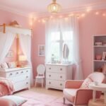
Big Girl Room Paint Colors (Ages 5-12)
Your school-age daughter’s personal space needs to balance fun with function. This special time calls for colors that spark creativity while supporting her growing independence.
The right choices create environments where she can play, study, and relax. These years bring rapid changes in interests and activities.
Smart selections now save you from frequent updates later. Look for options that adapt as her tastes evolve.
Benjamin Moore Favorites for Growing Girls
Benjamin Moore offers wonderful choices for this age group. Their colors provide beautiful coverage and lasting durability.
Consider “First Light” for a soft, cheerful pink that feels both playful and sophisticated. This versatile shade works with various decor styles.
“Beach Glass” creates a calming aqua backdrop perfect for ocean themes. It pairs beautifully with both bright and neutral accents.
“Silver Half Dollar” offers a sophisticated gray that grows with your child. This neutral base allows for easy decor changes over time.
These quality products withstand active lifestyles while maintaining beautiful finishes. They clean easily and resist scuffs and marks.
Themed Walls: Jungle, Ocean, or Fantasy
Themed surfaces spark imagination and create magical environments. They transform ordinary rooms into extraordinary adventures.
Jungle themes bring vibrant energy with lush greens and animal prints. Add palm fronds or monkey silhouettes for playful touches.
Ocean scenes create calming blue backgrounds with underwater elements. Consider coral patterns or swimming fish motifs.
Fantasy designs might feature castle outlines or magical creature silhouettes. These elements encourage creative storytelling and play.
Incorporate educational elements like maps or alphabet designs. These features support learning while adding visual interest.
Interactive Dry Erase Paint Walls
Turn any surface into a creative canvas with special finishes. Benjamin Moore’s dry erase options transform spaces into interactive zones.
These innovative products create surfaces perfect for drawing and learning. Your daughter can express herself freely without worry.
Designate specific areas for this treatment to maintain organization. A lower section allows easy access while keeping upper areas decorative.
Combine with magnetic primer for even more functionality. This creates spaces for both drawing and displaying artwork.
These surfaces withstand frequent use while maintaining easy clean-up. They’re perfect for homework help, creative expression, and fun.
| Paint Type | Best Application | Age Range Suitability |
|---|---|---|
| Benjamin Moore Regal | All surfaces, high durability | 5-12 years |
| Dry Erase Finish | Activity walls, creative spaces | 6-12 years |
| Themed Accents | Feature areas, play zones | 5-10 years |
| Washable Finishes | High-traffic areas, near furniture | All ages |
Remember that your choices should reflect your child’s current passions while allowing for future changes. This approach creates spaces that remain relevant through these important years.
Teen Girl Bedroom Paint Ideas
Your teenager’s personal space should reflect her growing independence and unique style. This exciting phase calls for designs that feel both mature and authentically hers.
The right choices create environments where she can study, relax, and express herself. These years bring new interests and changing preferences.
Smart selections now create spaces that remain relevant through high school. Look for options that adapt as her tastes continue evolving.
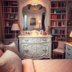
Moody and Sophisticated Dark Hues
Deep tones create intimate, stylish environments perfect for teenage retreats. Navy blue, charcoal gray, and forest green establish mature atmospheres.
These rich colors work beautifully for creating cozy study nooks. They provide dramatic backdrops for artwork and personal collections.
Balance dark walls with plenty of lighting and reflective surfaces. Mirrors and metallic accents prevent spaces from feeling too heavy.
Consider an accent wall approach with these bold choices. This maintains brightness while adding sophisticated depth.
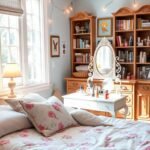
Boho Chic with Dusty Roses and Neutrals
Mikyla Creates demonstrates beautiful boho techniques using warm, earthy tones. Dusty roses, terracotta, and neutral shades create inviting environments.
These colors feel both current and timeless for teenage spaces. They provide perfect backgrounds for layered textiles and natural elements.
Incorporate macrame, plants, and woven textures for complete boho vibes. This style encourages self-expression through collected pieces.
The approach works beautifully for creating comfortable social spaces. It establishes warm, welcoming atmospheres for friends and relaxation.
Skater and Vintage Vibes with Checkerboard
Checkerboard patterns bring retro energy and graphic appeal to modern spaces. This classic design adds playful character while feeling current.
Use contrasting colors for bold statements or similar tones for subtle texture. The pattern works on floors, accent wall features, or furniture pieces.
Combine with vintage posters and skate decor for authentic vibes. This style celebrates personal interests and alternative aesthetics.
Consider removable options for commitment-free pattern experimentation. Peel-and-stick tiles offer easy installation and future changes.
Create dedicated zones within the room paint color scheme. Study areas benefit from focused lighting and organized storage.
Social spaces need comfortable seating and charging stations. Built-in solutions keep technology integrated yet discreet.
Relaxation zones deserve soft lighting and cozy textiles. These areas provide peaceful retreats from busy teenage lives.
“Teen spaces should balance self-expression with functionality, creating rooms that support both independence and practical needs.”
Incorporate technology-friendly elements throughout the design. Hidden charging stations and cable management maintain clean aesthetics.
Consider resale value when making permanent color choices. Neutral bases with removable accents offer flexibility for future homeowners.
| Style | Color Palette | Best Features |
|---|---|---|
| Moody Sophisticated | Navy, charcoal, forest green | Study nooks, dramatic backdrops |
| Boho Chic | Dusty rose, terracotta, neutrals | Layered textures, plant integration |
| Skater Vintage | Checkerboard, retro brights | Graphic patterns, personal displays |
Your teenager’s space should celebrate her unique personality while supporting daily activities. These paint color ideas create environments that feel both personal and practical.
The right choices establish foundations for spaces she’ll love through high school. They create rooms that truly feel like home.
Ceiling and Trim Paint Ideas

Often overlooked, ceilings and trim offer incredible opportunities to elevate your design. These finishing touches can transform ordinary spaces into extraordinary environments with thoughtful execution.
The right approach creates cohesive stories from floor to overhead surfaces. You’ll discover how these elements work together to establish complete, polished looks.
Your ceiling serves as the fifth wall in any space. Treating it with intention adds dimension and completes your overall aesthetic vision.
Trim work frames your surfaces and defines architectural features. Thoughtful color choices here enhance your entire design scheme beautifully.
Colorful Ceilings for Added Dimension
Painting overhead surfaces something other than white creates unexpected depth. This technique draws the eye upward and adds personality throughout the space.
The “Gray Glam” approach demonstrates sophisticated elegance with gray overhead. This creates a cozy, intimate atmosphere perfect for relaxation zones.
Consider your room’s natural light when selecting overhead hues. North-facing spaces benefit from warmer tones while south-facing rooms handle cooler shades.
Bold ceiling choices make dramatic statements in rooms with higher elevations. They create focal points that feel both intentional and inviting.
Matching Trim to Wall Colors
Modern design often features trim painted the same color as surrounding surfaces. This creates seamless, streamlined appearances that feel current and clean.
This approach works particularly well with deeper or more saturated wall colors. It eliminates visual breaks and creates cohesive backdrops for decor.
Consider semi-gloss or satin finishes for trim even when matching colors. These sheens provide durability while adding subtle textural variation.
This technique simplifies color decisions while creating sophisticated results. It’s perfect for achieving polished looks with minimal complexity.
Accent Ceilings with Murals or Patterns
Transform overhead surfaces into stunning focal points with artistic treatments. The “Shoot for the Stars” technique creates magical celestial environments.
These special effects turn ordinary ceilings into extraordinary features. They add wonder and personality without overwhelming the entire space.
Consider scale when planning overhead designs. Larger patterns make bold statements while smaller repeats create delicate textures.
Glow-in-the-dark elements add nighttime magic for younger children. These special finishes create gentle illumination that comforts during sleep.
Essential considerations for overhead and trim surfaces:
- Use flat or matte finishes overhead to minimize light reflection
- Choose semi-gloss for trim to withstand cleaning and wear
- Test colors in both natural and artificial lighting conditions
- Consider room proportions when selecting overhead colors
“The ceiling is the most neglected surface in most rooms, yet it offers tremendous potential for adding character and completing your design story.”
| Surface Type | Recommended Finish | Design Impact |
|---|---|---|
| Ceiling | Flat/Matte | Minimizes light reflection, hides imperfections |
| Trim & Moldings | Semi-Gloss | Adds durability, creates subtle contrast |
| Accent Ceiling | Eggshell/Satin | Provides washability while reducing glare |
| Doors & Windows | Semi-Gloss | Withstands frequent use and cleaning |
Remember that overhead color choices affect perceived room height. Lighter tones generally create airy feelings while darker colors establish intimacy.
Your trim and ceiling decisions should complement your overall design scheme. These elements work together to create spaces that feel both complete and carefully considered.
Incorporating Wallpaper with Paint
Mixing wallpaper and paint opens exciting possibilities for your daughter’s personal space. This combination allows you to create unique designs that balance pattern and color beautifully.
You can achieve professional-looking results with some basic techniques. These approaches let you customize the room while keeping options flexible for future changes.
Painting Over Existing Wallpaper
Sometimes removing old wallpaper isn’t practical or necessary. Fynes Designs shows how proper preparation creates successful painted-over surfaces.
First, ensure the existing material is firmly attached and smooth. Repair any loose edges or bubbles before starting your project.
Use oil-based primer to seal the pattern and prevent bleed-through. This crucial step ensures your new color appears vibrant and consistent.
Choose thicker, non-woven types for best painting results. These varieties handle paint well without texture issues.
Avoid painting over vinyl or foil-backed materials. These often require removal for proper adhesion and finish.
Combining Wallpaper Accents with Painted Walls
Strategic placement creates focal points without overwhelming the space. Use patterned sections on one surface while keeping others painted.
This balanced approach adds visual interest while maintaining flexibility. You can change painted areas easily as tastes evolve.
Consider the room’s natural light when positioning patterned sections. Areas with good illumination showcase detailed designs best.
Coordinate colors between patterned and painted areas for cohesion. Pull accent hues from the wallpaper into your solid color choices.
DIY Wallpaper Effects with Paint and Stencils
Create custom patterns without permanent commitment using simple techniques. Stencils and paint offer endless possibilities for temporary designs.
This approach works beautifully for renters or those who enjoy frequent updates. You can change patterns as easily as repainting a surface.
Use quality stencils and minimal paint for crisp results. Practice on cardboard first to perfect your technique.
Consider scale when selecting stencil patterns. Larger repeats make bold statements in big rooms while smaller designs work well in compact spaces.
Essential tools ensure professional results:
- High-quality primer for proper surface preparation
- Various brush sizes for different pattern details
- Painter’s tape for clean edges between materials
- Sealant to protect finished surfaces
“Combining materials creates depth and personality in a space, allowing for custom designs that reflect individual style while maintaining flexibility for future changes.”
| Wallpaper Type | Paint Compatibility | Best Application |
|---|---|---|
| Non-woven | Excellent – seals completely | All-over coverage, accent walls |
| Vinyl | Poor – requires removal | Not recommended for painting |
| Grasscloth | Fair – may require special primer | Accent areas with careful preparation |
| Peel-and-stick | Good – removable option | Temporary designs, rental properties |
Remember that preparation determines your final outcome. Proper tools and careful planning ensure beautiful, lasting results that your daughter will love.
These techniques offer creative freedom while maintaining practical flexibility. They create spaces that feel both personal and professionally designed.
DIY Tips and Tricks for Painting Success

Getting professional results with your painting project doesn’t require magic. It comes down to proper preparation and smart techniques. These insider secrets help you achieve beautiful finishes that last.
Great outcomes start long before the first brushstroke. Understanding the process ensures your efforts yield stunning transformations. You’ll save time and avoid common mistakes.
Prepping Walls for Paint
Surface preparation makes all the difference in your final outcome. Start with thorough cleaning using mild detergent and warm water. Remove any dust, grease, or residues that could affect adhesion.
Repair imperfections before applying any primer or color. Fill holes with spackling compound and sand smooth once dry. Address any cracks or damaged areas for flawless surfaces.
Priming creates the perfect foundation for your chosen hues. It ensures even coverage and true color representation. Quality primer also helps your finish last longer.
Using Painter’s Tape and Guides
Achieve crisp, clean edges with proper tape application techniques. Press firmly along all edges to prevent bleeding underneath. Remove tape while the final coat is still slightly wet for perfect lines.
Use level tools and measuring guides for straight patterns. Laser levels provide accuracy for complex designs. These tools ensure professional-looking geometric elements.
Consider frog tape for extra sharp edges on delicate surfaces. Its special formulation reacts with latex paint to create seals. This prevents seepage and messy edges.
Mixing Custom Colors and Samples
Create your perfect shade by mixing small batches first. Keep detailed notes of proportions for consistent results. Custom colors make your space truly unique.
Test samples on large boards before committing to entire surfaces. Observe them at different times of day under various lighting conditions. Natural and artificial light change how hues appear.
Consider sheen when selecting your final mixture. Matte finishes hide imperfections while satin offers easy cleaning. Choose based on your room’s specific needs.
| Tool Type | Best Use | Professional Tip |
|---|---|---|
| Angled Brushes | Cutting in edges, corners | Use 2-3 inch sizes for most trim work |
| Roller Covers | Large flat surfaces | Choose nap length based on texture |
| Paint Trays | Loading rollers evenly | Line with plastic for easy cleanup |
| Extension Poles | Ceilings, high walls | Prevent ladder movement for safety |
| Putty Knives | Surface repairs | Keep blades clean for smooth application |
Calculate quantities accurately to avoid waste or shortage. Measure square footage and consult coverage rates on cans. Remember that multiple coats require additional material.
Clean tools immediately after use for longest lifespan. Proper maintenance ensures consistent results on future projects. Store brushes properly to maintain their shape.
These techniques transform any diy project into professional-quality work. Your finished room will reflect careful planning and execution. The right way makes all the difference.
Budget-Friendly Decor Ideas to Complement Paint
Transform your space with smart decor choices that enhance your beautiful paint work. These clever ideas create cohesive designs without breaking your budget.
You can achieve magazine-worthy results with simple updates. The right accessories and textiles make your color scheme shine.
Strategic touches bring harmony to your entire design. They create visual interest while maintaining balance.
DIY Furniture Painting to Match Walls
Refresh existing pieces with custom colors that coordinate with your walls. This approach creates unified looks that feel professionally designed.
Start with proper surface preparation for best results. Clean thoroughly and use quality primer before applying your chosen hue.
Consider chalk paint for easy application and distressed finishes. It requires minimal prep work and offers beautiful matte results.
Test colors on small areas first to ensure perfect matching. Natural light affects how shades appear on different surfaces.
Accent Pieces and Textiles that Pop
Throw pillows and blankets add instant personality without permanent changes. Choose patterns and textures that complement your wall colors.
Area rugs define spaces while adding warmth and comfort. They anchor furniture arrangements beautifully.
Window treatments frame your views and control light levels. They complete your design while providing practical function.
Artwork and wall hangings personalize your space with meaningful touches. Mix frames and sizes for curated gallery effects.
Lighting Choices to Enhance Color Schemes
Different bulbs create varying color temperatures throughout your room. Warm white enhances cozy tones while daylight shows true colors.
Layer lighting sources for flexible ambiance. Combine overhead fixtures with table lamps and accent lighting.
Dimmer switches allow mood adjustments for any occasion. They provide perfect illumination from bright play to soft relaxation.
Consider LED options for energy efficiency and long lifespan. They offer excellent color rendering for your beautiful palette.
| Decor Element | Budget-Friendly Tip | Design Impact |
|---|---|---|
| Throw Pillows | Mix patterns and textures | Adds instant color and comfort |
| Area Rugs | Choose washable options | Defines spaces and adds warmth |
| Window Treatments | DIY simple curtain panels | Controls light and adds softness |
| Artwork | Create personal pieces | Adds personality and meaning |
| Lighting | Use dimmer switches | Creates flexible moods |
Shop secondhand stores for unique finds with character. Many pieces need only minor updates to become perfect additions.
Refresh existing items with new hardware or fresh paint. Sometimes simple changes make the biggest impact.
Rotate accessories seasonally for refreshed looks without new purchases. This keeps your space feeling current and interesting.
Your thoughtful choices create spaces that feel both personal and polished. They celebrate your color scheme while expressing unique style.
Bringing It All Together: Your Project Starts Now
You’ve gathered wonderful inspiration to create a magical personal space. This journey blends creativity with practical steps for lasting results.
Break your project into manageable phases. Start with color selection, then move to accent features. This approach keeps the process enjoyable.
Involve your child in age-appropriate decisions. Let her choose between pre-approved options. This creates ownership while maintaining design cohesion.
Regular maintenance keeps surfaces looking fresh. Gentle cleaning preserves your beautiful work. Simple touch-ups address everyday wear.
Seasonal decor swaps keep the room feeling current. Rotate accessories as interests evolve. This approach celebrates growth without major overhauls.
You now possess all the tools for success. Trust your vision and enjoy creating something special together. The result will be a space filled with joy and personality.