Creating a special place for your daughter is exciting. The right shades can turn a simple room into her own cozy retreat.
Staying current with new palettes helps build a modern and uplifting environment. It makes the area feel fresh and full of inspiration.
We will explore a variety of hues, from soft neutrals to vibrant choices. Expert tips back each suggestion to guide your decisions.
Your selection affects the room’s vibe, use, and how long it stays stylish. It’s a big part of designing a space she will love for years.
Keep reading to discover our full list of tones and creative methods. Find the perfect match for your home and make her ideas come alive.
Why 2025 Paint Colors Will Transform Your Daughter’s Bedroom
The hues you select for your child’s personal space do more than just decorate walls. They create an environment that shapes emotions and daily experiences.
Thoughtful color selection can turn an ordinary room into a sanctuary that supports both play and rest. It becomes a place where your daughter feels truly at home.
The emotional impact of color choices
Colors speak directly to our feelings without saying a word. Warm tones like yellow bring energy and happiness to a space.
Designer Amber Guyton believes in yellow’s power to spark joy.
“Yellow creates an instant mood lift—it’s sunshine in a can,”
she notes.
Cooler shades promote relaxation and peace. Blues and greens work well in areas meant for quiet time or sleep.
Your selection affects more than just aesthetics. It influences your child’s mood and overall well-being every day.
| Color Family | Emotional Effect | Best For |
|---|---|---|
| Warm Tones | Energy & Happiness | Play Areas |
| Cool Tones | Calm & Relaxation | Sleep Spaces |
| Nature-Inspired | Balance & Connection | Whole Room |
How trends evolve from 2024 to 2025
Palettes shift toward more personalized and emotionally resonant choices each year. The upcoming season brings deeper connection to nature and bold self-expression.
Last year’s safe neutrals make room for more adventurous selections. Designers now encourage colors that reflect personality rather than follow strict rules.
The evolution shows a clear move toward hues that support multiple activities. Spaces now need to work for learning, playing, and resting equally well.
Staying current means creating a room that feels fresh now but won’t feel dated next year. The best choices balance current style with lasting appeal.
Looking ahead helps you make decisions that will keep the space relevant. Your daughter’s room should grow with her through the years.
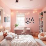
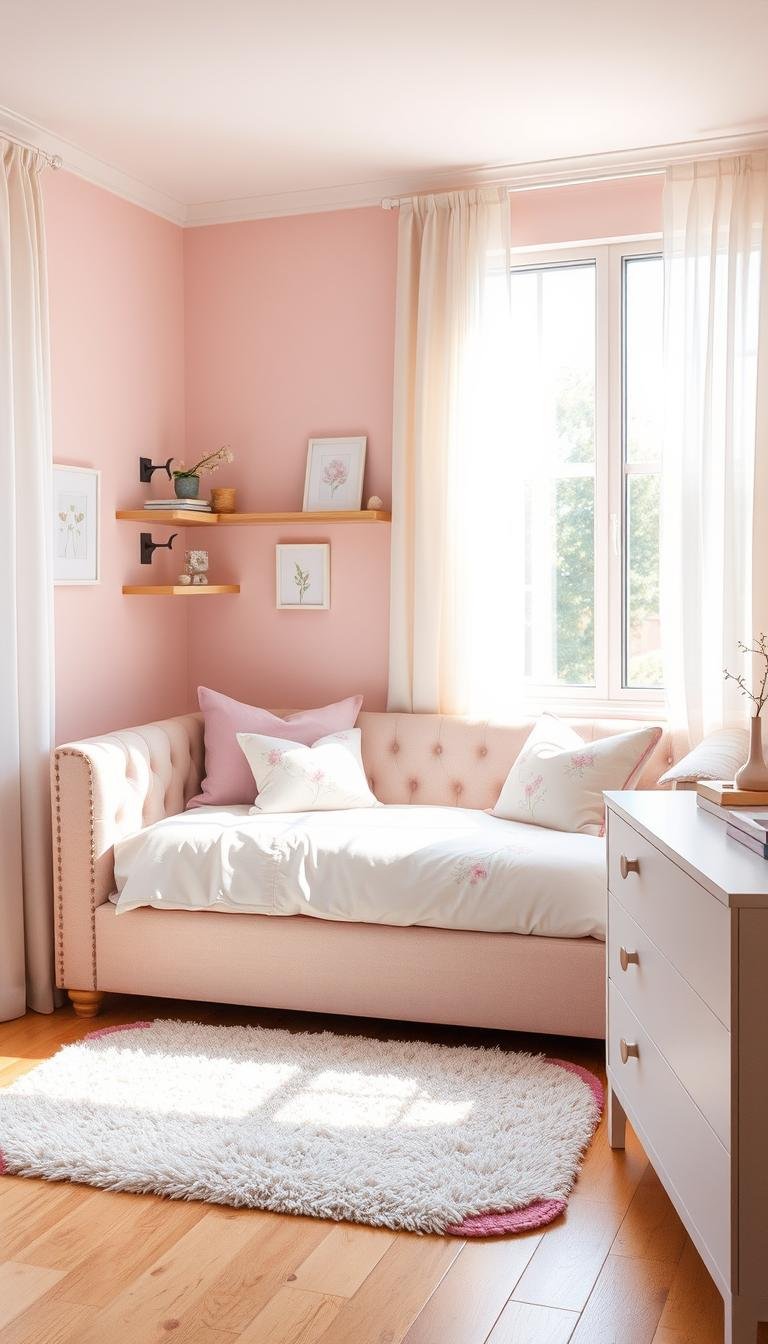
Soothing Neutrals That Create a Calming Sanctuary
Neutral tones build a peaceful retreat for rest and rejuvenation. These gentle shades form the perfect foundation for a personal haven.
They work beautifully in spaces meant for quiet time and relaxation. Your selection creates an atmosphere that feels both cozy and refined.
Designers often turn to these hues for their versatility and timeless appeal. Each shade brings its own unique character while maintaining a serene vibe.
Warm Taupe: Alison Giese’s Serene Choice
Interior designer Alison Giese selected warm taupe for a primary bedroom project. This rich neutral creates a luxurious hotel-like atmosphere.
The shade balances masculine and feminine elements beautifully. It serves as a harmonious backdrop for mixed patterns and textures.
Giese’s approach demonstrates how taupe can feel both sophisticated and welcoming. It’s an excellent choice for creating a refined yet comfortable environment.
Mauvey Beige: Kristen Peña’s Versatile Backdrop
Designer Kristen Peña chose mauvey beige for a calming space design. This unique shade offers subtle warmth with a hint of pink undertone.
Natural sunlight reveals its delicate rosy character throughout the day. The color adapts beautifully to changing light conditions.
Peña’s selection works as a versatile foundation for various decor styles. It provides just enough color interest while maintaining neutral flexibility.
Warm White: Minnette Jackson’s Light-Enhancing Neutral
Minnette Jackson used Farrow & Ball’s Pointing warm white in a guest room. This particular shade maximizes natural light reflection.
The soft white creates a bright yet cozy atmosphere throughout the space. It pairs exceptionally well with natural materials and earthy elements.
Jackson’s choice demonstrates how white can be warm and inviting rather than stark. It forms the perfect neutral base for layered textures and accents.
These expert selections show how neutrals create sanctuary-like environments. Each brings its own special quality to the overall design.
| Neutral Shade | Designer | Key Characteristic | Best Paired With |
|---|---|---|---|
| Warm Taupe | Alison Giese | Luxe hotel serenity | Mixed patterns |
| Mauvey Beige | Kristen Peña | Sunlight-responsive pink undertones | Natural textures |
| Warm White | Minnette Jackson | Light-enhancing quality | Earthy elements |
Incorporate these neutrals with varied textures to maintain visual interest. Consider adding:
- Soft woven blankets for tactile comfort
- Natural wood accents for organic warmth
- Metallic details for subtle shine
- Layered textiles for depth and dimension
These elements work together to create a space that feels complete without overwhelming the senses. The result is a personal sanctuary that promotes relaxation and peace.
Bold Statement Colors for the Confident Girl
Expressing personality through vibrant shades makes a room truly special. These strong hues show off your daughter’s unique spirit and creativity.
Bold selections create spaces full of energy and character. They turn an ordinary area into a personal statement.
Using daring tones requires thoughtful planning. The right balance keeps the space fun without feeling overwhelming.
Hot Pink: Jenna Gross’s Vibrant Statement
Designer Jenna Gross chose Benjamin Moore’s Pink Starburst for a guest room. This intense shade brings incredible energy and excitement.
The hot pink creates an instant focal point in the space. It makes a powerful design statement that reflects confidence.
Gross’s approach shows how vibrant hues can transform a room. This particular choice works beautifully for spaces meant for play and creativity.
Mustard Yellow: Amber Guyton’s Joyful Exclamation
Amber Guyton selected mustard yellow for its cheerful qualities. This warm tone brings sunshine and happiness into any space.
Guyton believes in yellow’s ability to spark instant joy. The shade pairs wonderfully with various other tones and textures.
This choice creates an environment that encourages creativity and positivity. It’s perfect for areas where your daughter spends time playing and imagining.
Chartreuse: French & French’s Lively Balance
French & French used chartreuse to create a harmonious space. This unique shade balances yellow’s brightness with green’s natural feel.
They softened the bold tone with soft blue and white wallpaper. The combination creates visual interest without overwhelming the senses.
This approach demonstrates how to use strong colors thoughtfully. The result is a lively yet balanced environment.
When working with statement shades, consider these balancing techniques:
- Pair bold walls with neutral furniture and textiles
- Use complementary accents to create visual harmony
- Incorporate natural materials to ground vibrant tones
- Consider an accent wall rather than painting all four surfaces
| Bold Color | Designer | Key Characteristic | Balancing Technique |
|---|---|---|---|
| Hot Pink | Jenna Gross | Energetic vibrancy | Neutral furnishings |
| Mustard Yellow | Amber Guyton | Joyful brightness | Natural wood elements |
| Chartreuse | French & French | Nature-meets-energy balance | Soft pattern pairing |
These expert approaches show how strong colors can create amazing spaces. The right combination makes the room feel both exciting and comfortable.
Your color choice should reflect your daughter’s personality while maintaining functionality. The result will be a space she loves spending time in.
Benjamin Moore’s Top Picks for Girls Bedroom Paint Colors Trending in 2025

Selecting the perfect shade for your daughter’s personal space becomes easier with trusted recommendations. Benjamin Moore offers exceptional options that blend current style with lasting appeal.
These selections work beautifully for creating environments that support both play and relaxation. Each hue brings its own unique character while maintaining versatility.
Designers frequently turn to this brand for its consistent quality and beautiful tones. The right choice can transform an ordinary area into a special retreat.
Pink Starburst for vibrant energy
Jenna Gross selected Pink Starburst for its incredible energy and excitement. This intense shade creates an instant focal point in any space.
The vibrant tone works wonderfully for areas meant for creativity and play. It brings a sense of joy and confidence to the environment.
Gross’s approach shows how strong hues can make a powerful design statement. This particular selection reflects personality while maintaining functionality.
Herb Garden for natural transition
Kelly Hurliman used Herb Garden to create harmony with wallcoverings. This unique shade features forest green with subtle yellow undertones.
The color brings a natural, grounded feeling to the space. It works beautifully with various textures and patterns.
Hurliman’s choice demonstrates how green can feel both fresh and calming. It creates a seamless transition between indoor and outdoor elements.
Summer Shower for growing sophistication
Amy Knerr chose Summer Shower for its timeless quality and soft blue tone. This gentle shade offers sophistication that matures with your child.
The color maintains its appeal through different stages and decor changes. It provides a peaceful backdrop for both play and rest.
Knerr’s selection works as a versatile foundation for evolving tastes. It creates a space that feels both current and enduring.
When using these Benjamin Moore selections, consider these pairing ideas:
- Combine vibrant tones with neutral furnishings for balance
- Use natural materials to ground bold color choices
- Layer textures to add depth and visual interest
- Consider accent walls for strong hues rather than full coverage
These expert approaches show how quality paint can create amazing spaces. The right combination makes the area feel both special and comfortable.
Your selection should reflect personality while supporting daily activities. The result will be a space your daughter loves spending time in.
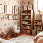
Earthy Greens That Bring Nature Indoors
Earth-inspired tones transform any area into a peaceful retreat connected to nature. These organic shades create harmony between indoor comfort and outdoor freshness.
Green hues offer a wonderful way to make your space feel more serene and balanced. They bring a sense of tranquility that works beautifully for personal sanctuaries.
Designers often choose these colors for their calming qualities and natural appeal. Each shade brings its own unique character while maintaining a grounded feeling.
Mossy Green: Liz Carroll’s Enchanting Retreat
Liz Carroll selected Benjamin Moore’s Great Barrington Green for a bunkroom project. This rich mossy tone creates a forest-like atmosphere that feels both magical and cozy.
The deep green works beautifully with brown and neutral accents throughout the space. It transforms the area into an enchanting retreat that connects with nature.
Carroll’s approach shows how earthy tones can create a special sanctuary. The result feels both adventurous and perfectly peaceful.
Lively Green: Kelly Hurliman’s Impactful Choice
Kelly Hurliman chose Herb Garden for its unique green with yellow undertones. This lively shade creates visual transition and impact in any room.
The color brings energy while maintaining a natural, organic feeling. It works wonderfully with various textures and patterns.
Hurliman’s selection demonstrates how green can feel both fresh and calming. It makes a strong statement without overwhelming the senses.
Muted Green: Minnette Jackson’s Serene Treehouse Vibe
Minnette Jackson used Sherwin-Williams’ Sea Salt for its soft blue-green quality. This muted tone creates a serene treehouse-like atmosphere.
The color offers peaceful sophistication that matures beautifully over time. It works as a versatile foundation for evolving decor styles.
Jackson’s choice shows how muted greens can feel both current and enduring. The result is a space that promotes relaxation and connection.
When working with these earthy greens, consider these natural pairings:
- Natural wood elements for organic warmth
- Woven textiles for tactile comfort
- Stone or ceramic accents for earthy texture
- Botanical prints for nature-inspired patterns
These combinations enhance the organic feel of your space beautifully. They create a harmonious environment that feels both fresh and comforting.
Your color selection should reflect the natural world while supporting daily relaxation. The right green tone makes your area feel like a personal sanctuary.
Sophisticated Blues for Peaceful Dreams

Cool blue and gray tones create a calming environment perfect for rest. These shades transform any area into a serene sanctuary.
They promote relaxation and peaceful sleep through their soothing qualities. Your selection can turn a busy space into a tranquil retreat.
Designers often choose these hues for their timeless appeal and versatility. Each brings unique character while maintaining a restful atmosphere.
Steely Gray: Allison Willson’s Unified Approach
Allison Willson selected Benjamin Moore’s Piedmont Gray for a bunk room project. This steely shade creates a unified, non-busy look throughout the space.
She used color drenching techniques on walls, trim, and ceilings. The approach makes the room feel cohesive and surprisingly spacious.
Willson’s design comfortably sleeps eight while maintaining visual harmony. It demonstrates how a single tone can create sophisticated simplicity.
Mid-tone Gray: Krysta Gibbons’ Textured Coolness
Krysta Gibbons chose Adagio by Benjamin Moore for a primary bedroom. This mid-tone gray features subtle blue undertones that create cool sophistication.
She warmed up the space with rust-colored accents and varied textures. The combination balances cool tones with organic warmth beautifully.
Gibbons’ approach shows how to maintain elegance while adding comfort. The result feels both refined and perfectly inviting.
Soft Blue: Amy Knerr’s Timeless Selection
Amy Knerr used Summer Shower by Benjamin Moore in a bunkroom design. This soft blue shade balances excitement with calmness perfectly.
The color offers timeless appeal that matures gracefully with children. It creates a foundation that supports both play and rest.
Knerr’s selection demonstrates how blue can feel both current and enduring. The space remains relevant through different stages and decor changes.
Consider these complementary elements to enhance your blue palette:
- Warm metallic accents for subtle shine
- Natural wood tones for organic balance
- Soft white textiles for contrast and comfort
- Textured rugs for added dimension
| Designer | Color Selection | Key Characteristic | Complementary Elements |
|---|---|---|---|
| Allison Willson | Piedmont Gray | Unified color drenching | Minimal pattern, clean lines |
| Krysta Gibbons | Adagio | Blue-gray sophistication | Rust accents, varied textures |
| Amy Knerr | Summer Shower | Timeless soft blue | Natural materials, warm whites |
These expert approaches show how blue and gray tones create peaceful environments. The right combination makes your space feel both serene and stylish.
Your color choice should promote rest while maintaining visual interest. The result will be a personal retreat that supports peaceful dreams.
Unexpected Color Combinations That Work
Thinking outside the box with your wall treatments opens up exciting possibilities. Creative pairings can transform ordinary spaces into extraordinary personal retreats.
These innovative approaches add character and personality to any room. They create visual interest while maintaining a cohesive feel.
Pink and Brown: Kim-Joy Hewlett’s Playful Stripes
Kim-Joy Hewlett created a charming guest space with alternating pink and brown stripes. This creative treatment replaced a traditional headboard entirely.
She softened the bold pattern with neutral drapery and gentle lighting. The result feels both playful and perfectly balanced.
This approach shows how unexpected combinations can work beautifully. It creates visual excitement without overwhelming the space.
Blue-Black: Breegan Jane’s Artistic Darkness
Breegan Jane used deep blue-black in a young boy’s personal space. This dramatic choice created a cool, artistic atmosphere.
She brightened the mood with graffiti-style blue artwork on the walls. The combination feels dynamic and full of personality.
This demonstrates how dark tones can work in children’s areas. Proper lighting and accents keep the space feeling vibrant.
Yellow-Green: Farrow & Ball’s Invigorating Choice
Farrow & Ball’s Churlish Green brings energy to any kids’ area. This yellow-green shade feels both fresh and invigorating.
Designers often pair it with jewel tones for added impact and coziness. The combination creates a space that feels special and welcoming.
This choice shows how nature-inspired hues can transform a room. It brings the outdoors inside in a sophisticated way.
When working with bold combinations, consider these balancing techniques:
- Use neutral furniture to ground vibrant wall treatments
- Incorporate natural materials for organic warmth
- Add soft textiles for comfort and texture
- Consider lighting that enhances without overwhelming
These unexpected pairings can make your space truly unique. They reflect personality while creating a harmonious environment.
How to Choose Colors That Grow With Your Child

Selecting wall tones for your kid’s space requires thoughtful planning. The right choice can last through many stages without needing updates.
Versatile shades create a foundation that evolves with changing preferences. This approach saves time and resources over the years.
Smart selections balance current style with lasting appeal. They support your child’s development while maintaining a beautiful environment.
Considering longevity in color selection
Benjamin Moore recommends adaptable off-whites like Paper Mache. These neutral bases work with various decor styles through different phases.
Designer Amy Knerr demonstrates this with her Summer Shower blue selection. The soft tone maintains its sophistication as children mature.
Current trends emphasize transition-friendly hues. Colors should move seamlessly from infant years to big kid stages.
Adaptable palettes for changing tastes
Versatile palettes serve as neutral backdrops for evolving decor. They allow for personality expression through accessories and artwork.
Soft blues and gentle greens offer excellent flexibility. These tones pair well with both bright and muted accent pieces.
Involving your child in the process ensures personal connection. Their input helps create a space that reflects their spirit while remaining practical.
“The best colors grow alongside your child, creating a consistent sanctuary through all life stages.”
Consider these elements for long-lasting design success:
- Neutral walls with colorful, changeable accessories
- Quality paint that withstands cleaning and touch-ups
- Timeless tones that complement various furniture styles
- Personal touches that can evolve with age
This approach creates a space that feels both current and enduring. Your child’s room becomes a comfortable haven that adapts through the years.
Accent Walls and Creative Paint Techniques
Creative wall treatments offer wonderful ways to add personality without overwhelming your space. These techniques create focal points that draw attention to special areas.
They provide visual interest while maintaining overall harmony. Your choices can transform ordinary surfaces into artistic statements.
Designers use various methods to achieve depth and dimension. Each approach brings unique character to the room’s design.
Foggy Red: Krysta Gibbons’ Layered Approach
Krysta Gibbons chose Cedar Ridge by Benjamin Moore for her daughter’s personal space. This foggy red tone creates warmth and sophistication.
She applied a deeper shade within the bed niche for added dimension. The layered effect produces softness and visual interest.
This technique demonstrates how color variation can enhance architectural features. It makes the sleeping area feel cozy and special.
Peachy Pink: French & French’s Sophisticated Air
French & French used a delicate peachy pink in their design project. They created a mural band along the ceiling crease for elegance.
This treatment pairs beautifully with darker surrounding hues. The combination achieves a refined and artistic atmosphere.
Their approach shows how ceiling details can elevate the entire room. It adds sophistication without overwhelming the space.
Mahogany: Lindsay Rhodes’ Serene Nook
Lindsay Rhodes selected Mahogany by Farrow & Ball for a quiet corner. This rich tone establishes a peaceful retreat within the room.
She accented the area with playful green and yellow stripes. The contrast adds fun while maintaining serenity.
This design creates a special place for reading or quiet time. It demonstrates how bold colors can work in small doses.
Consider these practical techniques for your own project:
- Color blocking to define different functional areas
- Vertical or horizontal stripes for visual movement
- Textured finishes using specialized tools or techniques
- Geometric patterns for modern artistic appeal
These methods allow you to experiment with bold choices safely. They create impact while keeping the overall decor balanced.
Your creative treatments should enhance rather than dominate the space. The right approach makes the room feel both personal and harmonious.
Complementary Color Schemes for Balanced Rooms

Pairing opposite hues creates dynamic energy in any personal space. These combinations bring excitement while maintaining perfect harmony.
Understanding color relationships helps you design a vibrant yet balanced environment. The right pairings can transform an ordinary area into something special.
Understanding color wheel relationships
The color wheel shows how different tones relate to each other. Opposite colors create the most visual impact when used together.
These pairs are called complementary schemes. They balance each other perfectly while adding energy to your design.
This knowledge helps you create a space that feels both exciting and harmonious. It’s a smart way to approach your decor planning.
Purple and yellow combinations
Purple and yellow sit directly opposite on the color wheel. This pairing creates wonderful whimsy and creative energy.
Benjamin Moore suggests using these tones for lively, fun spaces. They stimulate imagination while maintaining visual balance.
Consider softer shades for a more subtle effect. Light lavender with pale yellow creates excitement without overwhelming the room.
Blue and orange partnerships
Blue and orange form another powerful complementary pair. These tones offer vibrant contrast with natural harmony.
Benjamin Moore’s Orange Parrot and Sapphireberry demonstrate this beautifully. The combination feels both energetic and perfectly balanced.
Darker or lighter versions create different moods. You can adjust the intensity to match your desired atmosphere.
When testing these combinations, consider these practical tips:
- View paint samples at different times of day
- See how colors look with your existing furniture
- Test small sections before committing fully
- Consider how artificial lighting affects the tones
| Color Pair | Energy Level | Best For | Benjamin Moore Examples |
|---|---|---|---|
| Purple & Yellow | High energy, whimsical | Creative play areas | Lavender haze, Pale sunshine |
| Blue & Orange | Balanced vibrancy | Active yet calm spaces | Orange Parrot, Sapphireberry |
| Red & Green | Natural harmony | Nature-inspired decor | Christmas red, Forest green |
These complementary schemes offer exciting possibilities for your design. They create spaces that feel both dynamic and perfectly harmonious.
Your color choices should reflect personality while maintaining visual balance. The right combination makes the room feel special and welcoming.
Ceiling Treatments That Elevate the Space
Looking up reveals a new opportunity to enhance your design. The fifth wall offers creative potential often overlooked in room planning.
Thoughtful overhead treatments add depth and character to any area. They create visual interest that draws the eye upward.
Designers use various techniques to maximize this vertical dimension. Each method brings unique charm and personality.
Painted ceilings for added dimension
Benjamin Moore suggests painted ceilings for whimsical charm. A contrasting or complementary hue creates cohesive visual appeal.
This technique draws attention upward and expands the perceived space. It adds playful character without overwhelming the decor.
Consider softer versions of your wall tone for subtle harmony. Bold choices make dramatic statements in more adventurous designs.
Wallpaper accents overhead
Patterned paper on the ceiling creates immersive experiences. This approach adds dramatic effect and artistic flair.
Designers incorporate murals or delicate prints for full visual impact. The treatment transforms ordinary ceilings into focal points.
This method works beautifully in spaces seeking extra personality. It provides artistic interest while maintaining overall balance.
Color drenching techniques
Allison Willson demonstrates unified elegance through color drenching. Walls, trim, and ceilings receive the same sophisticated shade.
This technique creates serene, cohesive environments that feel spacious. It eliminates visual breaks for seamless sophistication.
Krysta Gibbons used this approach for harmonious simplicity. The result feels both refined and perfectly balanced.
Consider these practical tips for your overhead treatments:
- Test samples under different lighting conditions
- Consider room height when selecting patterns or colors
- Balance bold overhead choices with simpler wall treatments
- Ensure proper preparation for lasting results
| Treatment Type | Designer Example | Key Benefit | Best For |
|---|---|---|---|
| Painted Ceiling | Benjamin Moore | Whimsical dimension | Cohesive color schemes |
| Wallpaper Accent | Various designers | Dramatic immersion | Artistic statements |
| Color Drenching | Allison Willson | Unified serenity | Simplified elegance |
Your ceiling choice should complement the overall theme beautifully. The right treatment creates a finished, polished look.
These ideas help you maximize every surface in your design. They turn ordinary spaces into extraordinary personal retreats.
Paint Finishes and Their Impact on Mood

The final layer on your walls does more than protect surfaces. It changes how light interacts with your space and influences the overall feeling.
Different sheens create unique visual effects and practical benefits. Your choice affects both the look and functionality of the area.
Understanding finish options helps you create the perfect atmosphere. Each type brings its own character to your design.
Matte vs. gloss considerations
Matte finishes offer a soft, non-reflective surface that hides imperfections beautifully. They create a velvety look that feels cozy and sophisticated.
This sheen works wonderfully in spaces meant for relaxation and calm. It provides a gentle backdrop that doesn’t compete with other elements.
Glossy options reflect light and create vibrant energy in your space. They offer excellent durability and easy cleaning for busy areas.
Higher sheen levels stand up well to frequent touching and cleaning. This makes them practical for active spaces that see lots of use.
How finish affects color perception
The same hue looks different depending on its surface treatment. Glossier finishes make tones appear richer and more intense.
Light reflection enhances color depth and vibrancy. This can make bold choices feel even more dramatic and exciting.
Matte surfaces absorb light and create softer, more muted effects. They provide elegant subtlety that feels peaceful and refined.
Your finish selection changes how people experience your color choice. It’s an important part of creating the right mood.
Consider these recommendations for different surfaces:
- Satin or semi-gloss for walls in active spaces
- Matte or eggshell for ceilings and low-traffic areas
- High-gloss for trim and doors that need frequent cleaning
- Specialty finishes for unique conditions or effects
| Finish Type | Light Reflection | Durability | Best Use |
|---|---|---|---|
| Matte/Flat | Low (0-5%) | Moderate | Ceilings, adult spaces |
| Eggshell | Low-medium (10-25%) | Good | Living areas, bedrooms |
| Satin | Medium (25-35%) | Excellent | High-traffic zones, kids’ rooms |
| Semi-Gloss | High (35-70%) | Superior | Trim, doors, bathrooms |
| High-Gloss | Very high (70-85%) | Maximum | Accent features, furniture |
Benjamin Moore’s Aura Bath & Spa finish offers special humidity resistance. This specialized option works beautifully in spaces with moisture concerns.
It provides lasting protection while maintaining beautiful color integrity. The finish stands up to challenging conditions without compromising style.
Your finish selection should balance aesthetic goals with practical needs. The right choice creates a space that looks great and works well for daily life.
Test samples in your actual space before making final decisions. See how different sheens perform under your specific lighting conditions.
Incorporating Trends While Maintaining Timelessness
Creating a space that feels fresh yet lasting requires thoughtful balance. You want to blend current styles with elements that will remain appealing for years.
This approach ensures your design stays relevant through changing preferences. It creates a foundation that supports evolving tastes beautifully.
Designers achieve this harmony through strategic color selection and placement. Their methods help spaces feel both contemporary and enduring.
Balancing trendy colors with classic elements
Minnette Jackson demonstrates this balance with her use of Sea Salt. This serene green-blue shade offers sophistication that matures gracefully.
She pairs timeless tones with current accents for flexible style. This allows for trend incorporation without full commitment.
Benjamin Moore suggests adaptable palettes as smart foundations. Neutral bases work with various decor styles through different phases.
Consider these strategies for harmonious blending:
- Use classic neutrals on main surfaces for lasting appeal
- Introduce trend tones through changeable accessories and art
- Select versatile shades that complement both current and future styles
- Layer textures to add depth without dating the space
When to take risks with color
Some areas offer perfect opportunities for adventurous choices. These spaces allow for personal expression without long-term commitment.
Accent walls create dramatic impact while maintaining overall harmony. They provide a canvas for bold statements that can easily change.
Furniture pieces offer another excellent option for experimentation. A vibrant dresser or chair adds personality without overwhelming the room.
Small nooks and reading corners work well for daring hues. These intimate spaces can handle stronger colors beautifully.
| Design Area | Risk Level | Longevity | Designer Example |
|---|---|---|---|
| Accent Wall | Medium | 2-5 years | Krysta Gibbons’ Cedar Ridge niche |
| Furniture | High | Until replacement | Painted vintage dresser |
| Ceiling Treatment | Low-Medium | 5+ years | French & French’s mural band |
| Small Nook | High | 3-7 years | Lindsay Rhodes’ Mahogany corner |
Your personal style should guide these adventurous choices. Select tones that resonate with your family’s personality and preferences.
Test samples in your actual space before making final decisions. See how colors perform under your specific lighting conditions.
This approach creates a space that feels both current and personally meaningful. It balances excitement with enduring comfort beautifully.
Practical Considerations for Painting Kids’ Rooms
Choosing the right products for your child’s space involves more than just color selection. You need materials that stand up to daily life while keeping the environment healthy.
Durability and safety become top priorities when designing areas for young ones. Smart choices ensure the space remains beautiful and functional for years.
Durability and washability factors
Active spaces demand finishes that handle everyday wear and tear. Satin and semi-gloss sheens offer excellent scrubbability for busy areas.
Benjamin Moore’s Aura line provides exceptional stain resistance. These formulas withstand frequent cleaning without losing their vibrant appearance.
Proper surface preparation ensures lasting results. Primer creates a uniform base that helps paint adhere better and last longer.
Consider these features for high-traffic zones:
- Scrubbable finishes that resist marks and stains
- Durable formulations designed for active spaces
- Easy-touch-up capabilities for quick fixes
- Moisture resistance for humid environments
Low-VOC options for health concerns
Indoor air quality matters greatly in your child’s personal environment. Low-VOC and zero-VOC options minimize harmful emissions.
Benjamin Moore’s Natura line offers zero-VOC formulations. These products provide beautiful color without compromising air quality.
Health-friendly choices create safer spaces for growing children. They reduce exposure to potentially irritating chemicals.
Proper ventilation during application further protects your family. Open windows and use fans to ensure good airflow.
| Product Type | Key Feature | Best For | Benjamin Moore Example |
|---|---|---|---|
| Satin Finish | Excellent washability | Walls in active spaces | Regal Select Interior |
| Semi-Gloss | Superior durability | Trim and doors | Advance Interior |
| Zero-VOC | No harmful emissions | Children’s spaces | Natura Interior |
| Bath Formula | Moisture resistance | Humid environments | Aura Bath & Spa |
Your selection should balance practical needs with aesthetic goals. The right products create spaces that work beautifully for daily life.
Test samples in your actual environment before final decisions. See how finishes perform under your specific conditions.
These considerations help you build a space that’s both stylish and functional. Your child’s area becomes a practical haven for years of enjoyment.
Working With Your Daughter’s Color Preferences
Collaborating with your child on her personal space creates a special bonding experience. It transforms the design process into a shared adventure that reflects her unique spirit.
Her input ensures the final result feels truly personal and meaningful. This approach builds excitement and ownership over her environment.
Finding the right balance between her wishes and practical design creates a space everyone loves. The room becomes a reflection of her personality with smart style.
Involving children in the decision process
Benjamin Moore encourages including kids in color selection from the beginning. This participation builds enthusiasm and ensures she feels heard.
Designers recommend showing your daughter several pre-approved options. This method guides her toward choices that work well for the space.
Paint sampling becomes a fun activity you can enjoy together. Seeing colors on the wall helps her understand how they transform the room.
This collaborative approach creates lasting memories beyond the finished project. She’ll treasure the experience of creating her special place.
Balancing their wants with design principles
Sometimes your child’s favorite shade might seem too bold for the entire room. Smart designers incorporate these vibrant choices as accents instead.
An energetic pink might work beautifully as a feature wall rather than on all surfaces. This maintains her preferred color while keeping the space balanced.
Another strategy uses her favorite tone in accessories and bedding. These elements can change over time as her preferences evolve.
Designers often suggest adaptable neutral bases for main walls. These backgrounds allow for colorful accents that reflect her current passions.
Consider these successful approaches from design professionals:
- Mural accents that incorporate your daughter’s favorite themes or characters
- Color-blocking techniques that use bold shades in controlled amounts
- Changeable elements like removable wallpaper or colorful textiles
- Personalized artwork displays that showcase her creations
| Design Strategy | Child’s Preference | Design Solution | Longevity |
|---|---|---|---|
| Accent Wall | Bright purple | Single feature wall with neutral others | 3-5 years |
| Colorful Accessories | Rainbow themes | Neutral walls with vibrant bedding and art | 1-3 years |
| Adaptable Base | Changing favorites | Versatile neutral with changeable accents | 5+ years |
| Personalized Art | Self-expression | Display system for her artwork | Ongoing |
These methods honor your daughter’s input while maintaining design integrity. The result is a space that feels both personally meaningful and visually harmonious.
Your guidance helps her understand how colors work together in a room. This learning experience becomes part of the creative journey.
The final space should reflect her personality while supporting relaxation and play. With smart strategies, you can achieve both goals beautifully.
Creating Your Dream 2025 Girls Bedroom Color Palette
Now you have all the tools to build a beautiful personal retreat. Combine designer wisdom with your child’s unique spirit.
Start with a versatile neutral base. Add personality through accent walls or colorful accessories.
Remember the emotional impact of your choices. Balance energetic tones with calming shades.
Test samples in your actual space. See how light changes colors throughout the day.
Your final palette should reflect joy and comfort. It will create a special haven for years of memories.
Trust your instincts and have fun with the process. The perfect combination awaits your creative touch.