Welcome to your complete guide for transforming your home’s central gathering area. Choosing the right wall treatment can completely change how your space feels and functions.
The perfect palette can turn an ordinary area into something truly special. It creates that sophisticated atmosphere you’ve been dreaming about while reflecting your unique personality.
Your main gathering space deserves careful consideration when selecting hues. The right choice sets the tone for your entire home’s design aesthetic.
We’ll explore everything from bold accent shades to calming neutral tones. These selections work beautifully in today’s upscale interior schemes.
Natural lighting and dimensions play crucial roles in your final decision. Understanding these factors helps you make the perfect choice for your specific situation.
Get ready to discover professional tips and actionable ideas. You’ll gain the confidence to create a space that feels both elevated and authentically yours.
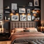
What Defines a Modern Luxury Living Room?
What truly sets apart an elevated social area in today’s homes is the careful balance of design elements and personal expression. This approach creates spaces that feel both special and completely yours.
Several key characteristics define these exceptional gathering spaces:
- Clean lines and quality materials work together to create a sense of elevated comfort
- A neutral foundation allows for strategic pops of color and texture that add visual interest
- Thoughtful lighting schemes enhance both functionality and atmosphere
- Statement furniture pieces serve as focal points while maintaining comfort
- Artful decor elements feel curated rather than cluttered
The overall feeling is sophisticated yet completely welcoming. Every choice promotes both relaxation and inspiration for you and your guests.
These spaces prioritize excellent flow and practical functionality. Your area should work beautifully for daily life and special occasions alike.
Color schemes in these environments tend to be refined but never dull. They often feature rich, saturated tones or nuanced neutrals with depth.
Ultimately, your gathering space should reflect your unique personality. It embraces current trends while maintaining a timeless quality that will feel fresh for years.
Why Your Paint Color Choice is Everything

Your wall treatment acts as the foundation for your entire design scheme. It establishes the atmosphere before you add a single piece of furniture or decor.
The perfect hue transforms how you experience your home daily. It creates that special feeling you want when relaxing or entertaining guests.
Light plays a crucial role in how your chosen shade appears throughout the day. Morning sun brings out different tones than evening artificial lighting.
Lighter tones can make a compact area appear more spacious and airy. Darker shades add cozy intimacy and sophisticated depth to larger spaces.
Your wall treatment affects everything else in the area. It can make your furniture and artwork stand out beautifully or compete for attention.
Consider how your gathering area connects to other parts of your home. The right choice creates harmonious flow throughout your entire living space.
A well-selected shade increases your enjoyment every single day. It can even add perceived value to your property when chosen thoughtfully.
Your decision impacts both function and feeling in your home. Take time to choose something that truly reflects your personality and lifestyle.
Embrace Earthy Elegance with Olive and Sage Greens
Nature-inspired hues bring a sense of calm and sophistication to your gathering space. These organic tones create a welcoming atmosphere that feels both current and timeless.
Earthy greens work beautifully in various design schemes. They pair wonderfully with natural materials and metallic accents.
Designer Kristen Peña selected one particular shade for creating depth. Her choice demonstrates how green can transform an area.
Trailing Vines by Benjamin Moore: A Moody Olive
This rich olive shade features subtle charcoal gray undertones. It creates dramatic depth without overwhelming your space.
Natural light reveals the complex character of this sophisticated hue. Its appearance changes beautifully throughout the day.
This particular option works especially well in well-lit areas. The shifting tones add constant visual interest to your walls.
October Mist by Benjamin Moore: A Soothing Sage
This versatile green earned recognition as a former Color of the Year. Its gray undertones provide a soothing, natural feeling.
The sage option brings organic elements indoors beautifully. It creates a peaceful backdrop for your furniture and artwork.
This hue complements warm wood finishes and natural textiles perfectly. Metallic accents shine against this gentle green background.
| Color Name | Undertones | Best Use | Lighting Considerations |
|---|---|---|---|
| Trailing Vines | Charcoal gray | Accent walls or full coverage | Works best with ample natural light |
| October Mist | Soft gray | Full room coverage | Adapts well to various lighting conditions |
Both options serve as excellent main wall treatments or accent shades. Your choice depends on the atmosphere you want to create.
These greens establish a calming foundation for your entire design scheme. They allow your decorative elements to stand out beautifully.
Test samples in your space before making a final decision. Observe how each shade changes with different lighting throughout the day.
Make a Bold Statement with Deep Teals and Blues

Dramatic teal and blue paint colors create instant impact in your gathering area. These rich hues transform ordinary walls into something truly special.
Interior designer Cecilia Casagrande found exactly what she wanted. She described her ideal shade as “lush but livable” for everyday enjoyment.
These deep shades work beautifully in various settings. They add sophistication while creating an enveloping atmosphere.
Hague Blue by Farrow & Ball: Lush and Livable
This rich teal offers both drama and practicality. It feels elegant without being overwhelming in your daily life.
The sophisticated color works particularly well in traditional homes. It brings character to any space when used thoughtfully.
Natural light reveals the depth of this beautiful shade. It changes throughout the day, adding constant visual interest.
Admiral Blue by Benjamin Moore: An Electric Anchor
Designer Heather French used this saturated blue in her living room. The deep tone looks almost electric against patterns and textures.
This powerful color anchors the entire room beautifully. It creates a focal point that draws attention immediately.
These bold colors work wonderfully with metallic accents. Brass and gold create luxurious contrast against the deep background.
Consider using these paint options on an accent wall. Rooms with plenty of natural light prevent them from feeling too dark.
Large areas feel more intimate with these deep tones. Smaller spaces gain depth when used strategically.
For more inspiration on coordinating these rich hues, explore colors that complement teal in your design scheme.
Create Warmth and Intimacy with Rich Browns and Ochres
Some paint choices wrap your space in instant comfort. These earthy tones transform any area into a welcoming retreat.
Designer Sarah Stacey found the perfect solution for her project. She needed a specific atmosphere for a special gathering space.
Rich browns and golden yellows create immediate coziness. They encourage relaxation and meaningful conversation in your home.
These colors work beautifully in spaces where you spend quality time. They make your area feel grounded and comfortable.
A Cozy Gray-Brown for a Speakeasy Vibe
Sarah selected a sophisticated gray-brown blend for her project. This particular color creates a cocooning, intimate feel.
The shade offers a speakeasy vibe that feels both current and timeless. It works with various design styles from contemporary to classic.
This versatile neutral pairs beautifully with leather and wood elements. Metallic accents add subtle sparkle against this rich background.
Designer Byron Risdon shares his approach to these warm hues:
These earthy tones create instant connection and comfort. They make any space feel like a true sanctuary.
Ochre: An Enveloping and Inviting Yellow
Byron chose ochre to complement tonal soft furnishings. This deep, rich yellow features beautiful brown undertones.
The enveloping color creates a sunny atmosphere even on gray days. It works particularly well in north-facing spaces needing warmth.
This welcoming option avoids being too pale or too vibrant. Instead, it offers a golden hue that feels both inviting and sophisticated.
Both these warm tones complement various furniture styles. They work well with both cool and warm accent colors throughout your space.
| Color Type | Best For | Lighting Needs | Pairing Suggestions |
|---|---|---|---|
| Gray-Brown | Intimate gathering spaces | Adapts to various conditions | Leather, dark wood, brass accents |
| Ochre | North-facing rooms | Needs some natural light | Neutral textiles, warm metals, earthy tones |
These paint choices create a grounded, comfortable feeling. They make your living area feel like a true retreat.
Test samples in your room before making final decisions. Observe how each shade changes with different lighting throughout the day.
Consider pairing these rich colors with a warm white for trim work. This creates beautiful contrast and definition.
Your space becomes a cozy haven with these thoughtful paint selections. They transform ordinary walls into something truly special.
Add a Touch of the Unexpected with Purples and Pinks

Step beyond traditional neutrals with sophisticated purples and pinks that transform your space. These unconventional choices create memorable environments that reflect your unique personality.
Designer Ali Budd selected Patchwork Plum for a specific project. She needed a hue that connected spaces while adding intimate character.
Patchwork Plum by Sherwin-Williams: A Saturated Mauve
This rich mauve offers depth and sophistication without overwhelming your area. It works beautifully with both warm and cool accent shades throughout your design.
The saturated color creates an intimate vibe that feels both current and timeless. It complements marble surfaces and curved furniture perfectly.
Natural light reveals the complex character of this sophisticated paint choice. Its appearance changes beautifully throughout the day.
Tailor Tack by Farrow & Ball: A Delicate Pink
Designer Samantha Stathis Lynch found inspiration in nature for her selection. She chose a soft pink reminiscent of cherry blossoms.
This delicate hue feels uplifting yet thoroughly sophisticated. It avoids any childish connotations while bringing natural beauty indoors.
The subtle pink creates a luxurious, curated feel in your gathering area. It works particularly well with neutral furniture and artwork.
Both these colors perform best in spaces with good natural light. Their complex undertones shift beautifully throughout the day.
These unexpected hues allow your walls to become the focal point. They create dramatic impact without overwhelming your entire room.
Test samples in your actual space before committing. Observe how each color interacts with your lighting throughout the day.
Your living area gains unique character with these thoughtful paint selections. They transform ordinary walls into something truly special.
Elevate Your Space with Sophisticated Neutrals
Your space deserves a foundation that adapts to your evolving style. These versatile neutral paint colors create harmony throughout your home while letting your decor shine.
They provide the perfect backdrop for artwork and furniture. Your choices can change over time without requiring new wall treatments.
White Dove OC-17 by Benjamin Moore: A Classic Warm White
This beloved white avoids any sterile feeling in your living area. It creates a soft, inviting atmosphere that works in any light condition.
The warm undertones make your space feel welcoming day and night. It serves as the perfect background for bold artwork and colorful accents.
Designers often choose this paint for its incredible versatility. It makes your entire room feel brighter and more spacious.
Revere Pewter HC-172 by Benjamin Moore: A Balanced Greige
This popular color beautifully blends gray and beige tones. It adapts to its surroundings, appearing warmer or cooler as needed.
The sophisticated neutral paint creates flow between connected spaces. It works particularly well in open-concept homes.
Your furniture and decor stand out against this nuanced background. The shade changes beautifully throughout the day with natural light.
Both these Benjamin Moore options offer long-term flexibility. You can update your style without repainting your walls.
They create a timeless foundation that always feels current. Your space maintains its elegance through changing trends.
Test samples in your actual living area before deciding. Observe how each color interacts with your specific lighting.
These sophisticated neutrals transform your room into a harmonious backdrop for life’s moments. They provide the perfect foundation for your personal style evolution.
Incorporate Energetic Hues for a Playful Vibe

Sometimes your space needs a burst of joyful energy that still feels polished and intentional. These vibrant colors create an atmosphere that’s both lively and sophisticated.
Author Holly Peterson made a bold choice in her Hamptons home. She selected a powerful palette that completely transformed her gathering area.
These energetic hues bring personality without overwhelming your design. They work beautifully when balanced with thoughtful elements throughout your space.
Lime Green and Magenta: A Powerful Pairing
This unexpected combination creates instant visual interest in your home. The pairing feels vibrant yet completely polished when executed properly.
These bold paint choices work particularly well in spaces with high ceilings. Ample natural light allows the colors to truly shine throughout the day.
Consider using these energetic accents on feature walls rather than full coverage. This approach creates impact without overwhelming your entire area.
Paradise Green by Benjamin Moore: A Slice of Lime
This vibrant green offers a fresh take on traditional wall treatments. It brings life to any space while maintaining a sophisticated feel.
The lively color makes a strong style statement in your gathering area. It pairs beautifully with neutral furniture and natural wood elements.
Designer Holly Peterson used this specific shade to create a unique vibe. Her space feels both curated and personally expressive.
| Color Combination | Best Application | Lighting Requirements | Balancing Elements |
|---|---|---|---|
| Lime Green & Magenta | Accent walls or architectural features | Abundant natural light | Neutral furnishings, white space |
| Paradise Green | Full walls or statement areas | Moderate to bright light | Natural materials, wood tones |
These energetic choices work best when balanced with plenty of negative space. White trim and neutral flooring help ground the vibrant colors.
Natural materials like wood and stone provide beautiful contrast. They prevent the space from feeling too overwhelming or artificial.
Test samples in your actual living area before making final decisions. Observe how the colors change throughout the day with different lighting.
Your space gains unique character with these thoughtful paint selections. They transform ordinary walls into something truly special and personal.
Look Up: Don’t Neglect Your Fifth Wall
Many homeowners forget about the surface right above their heads. Your ceiling represents incredible potential for adding depth and luxury.
This often-overlooked area can transform your entire atmosphere. Designer Suzanne Kasler understood this power perfectly.
She made a brilliant choice that differentiated her area beautifully. Her approach shows how ceilings deserve thoughtful consideration.
Providence Blue by Benjamin Moore: A Glossy Slate Ceiling
Suzanne selected a sophisticated slate blue for overhead drama. Providence Blue creates instant visual interest above your head.
The glossy finish reflects light throughout your day beautifully. It adds brightness and movement to your entire area.
This approach works wonderfully with both neutral and colorful walls. It creates sophisticated contrast that feels intentional.
Misty Blue by Benjamin Moore: A Disappearing Act
Designer Ashley Lavonne Walker used a clever technique with light blue. Misty Blue creates an illusion that makes your area float upward.
This method works especially well in compact spaces. It gives the feeling of more height and openness overhead.
The soft blue hue complements various wall treatments beautifully. It adds dimension without competing for attention.
Both these approaches demonstrate creative ceiling solutions. Your overhead surface becomes an integral part of your design.
Test samples on your ceiling before making final decisions. Observe how the colors change with different lighting conditions.
Your fifth wall offers amazing opportunities for personal expression. Embrace this often-forgotten canvas in your home.
Our Top Picks for Modern Luxury Living Room Paint Colors to Try Now

We’ve gathered the most impressive wall treatments that professionals actually use in real homes. These selections balance current trends with timeless appeal that works beautifully year after year.
Both options have been tested by designers in actual spaces rather than just looking good on sample chips. They represent opposite ends of the spectrum from serene versatility to bold statement-making.
Serene and Versatile: Raindance by Benjamin Moore
Designer Serena Dugan selected this serene hue for her personal space. Raindance offers a chameleon-like gray-green that adapts beautifully to its surroundings.
This flexible color appears warmer or cooler depending on your furniture and decor choices. It provides excellent adaptability for those who enjoy changing accessories seasonally.
The versatile nature maintains a cohesive base throughout your design evolution. You can refresh your look without repainting your entire area.
Bold and Cozy: Rectory Red by Farrow & Ball
The lounge area of a maximalist home features this rich red treatment. Rectory Red creates an utterly enchanting and cozy atmosphere that feels both dramatic and inviting.
This bold choice works particularly well in spaces with plenty of natural light. It can make large areas feel more intimate and welcoming rather than overwhelming.
The rich depth adds character while maintaining a comfortable feel. It transforms ordinary walls into something truly special and personal.
Both these top picks demonstrate the incredible range available in quality paint colors. Whether you prefer serene adaptability or bold statement-making, there’s a perfect option for your home.
Test samples in your actual space before making final decisions. Observe how each color interacts with your specific lighting throughout the day.
Your gathering area gains unique character with these thoughtful selections. They create spaces that feel both elevated and authentically yours.
Pro Tips for Applying Your Luxury Paint Color
Your wall treatment application makes all the difference between good and exceptional results. Proper techniques elevate your space from simply painted to professionally finished.
Attention to detail during application ensures your chosen shade looks its absolute best. These methods create that polished, high-end appearance you desire.
Considering an Accent Wall
An accent wall adds dramatic interest without overwhelming your entire area. This technique works beautifully with bold shades or special patterned finishes.
The right feature surface highlights architectural details or creates focal points. It adds depth and dimension to otherwise neutral spaces throughout your home.
Choose the wall that naturally draws attention when entering your area. This might be behind your sofa or where your fireplace sits.
Selecting the Perfect Finish
Your finish choice dramatically affects both appearance and durability. Matte options hide imperfections beautifully while glossier selections reflect light.
Consider your lighting conditions when making finish decisions. Matte works well in brightly lit spaces while eggshell offers better durability.
Designer Timothy Corrington emphasizes finish importance:
The right sheen level transforms how color interacts with light throughout the day. It’s the final touch that makes ordinary walls extraordinary.
| Finish Type | Best For | Lighting Considerations | Durability Level |
|---|---|---|---|
| Matte | Low-traffic areas, hiding imperfections | Works in all lighting conditions | Moderate |
| Eggshell | High-traffic spaces, family areas | Reflects some light | High |
| Satin | Trim work, detailed surfaces | Creates subtle shine | Very High |
| Semi-Gloss | Doors, cabinets, accent features | Reflects significant light | Excellent |
Always invest in quality application tools for the smoothest results. Professional-grade brushes and rollers make noticeable differences in final appearance.
Proper surface preparation ensures your treatment lasts longer and looks better. This includes cleaning, repairing imperfections, and using appropriate primer.
Your efforts during application pay off every time you enjoy your beautifully transformed space. These techniques create that truly luxurious finish you deserve.
How to Choose the Right Color for Your Space
Selecting the perfect shade involves more than just picking what you like. You need to consider several important factors to get the best results for your home.
Your choice affects how your area looks and feels every single day. It’s worth taking time to make the right decision.
See the Light in Your Room
Natural illumination changes how your shade appears throughout the day. North-facing areas often benefit from warmer tones to balance cooler light.
South-facing spaces can handle cooler shades since they get plenty of warm sunlight. The amount of illumination really impacts your final selection.
Saturated shades work beautifully in sun-filled areas. Pale options might look washed out without enough natural brightness.
Set the Mood You Want to Create
Different shades create various emotional responses in your home. Blues often feel calm and peaceful, while greens bring balance and harmony.
Yellows typically add energy and cheerfulness to your environment. Consider how you want your space to feel when choosing your palette.
Your area’s purpose should guide your final decision. Entertainment spaces can handle more energetic shades, while relaxation zones benefit from calming hues.
Always Sample Your Colors First
Testing large swatches on multiple walls is absolutely essential. Observe them at different times of day before making your final commitment.
Benjamin Moore provides excellent sampling options for homeowners. They offer 8 oz. color samples, large swatches, and reusable peel-and-stick samples.
Live with your samples for several days to see how they work. Notice how they interact with your furniture, flooring, and changing illumination conditions.
This testing process ensures you’ll love your choice for years to come. It’s the best way to avoid expensive and time-consuming repainting later.
Transform Your Living Room with Confidence
You now possess all the knowledge needed to create a stunning gathering area. Your design journey begins with confidence and excitement.
Remember that wall treatments offer incredible flexibility. Don’t hesitate to experiment with bold shades that reflect your personality.
Always test samples in your actual environment first. Observe how different lighting affects your chosen shades throughout the day.
Consider consulting experts at your local paint store for personalized advice. Their guidance can help you achieve the perfect look for your home.
The most successful areas blend current style with timeless appeal. Your transformed space should feel authentically yours while welcoming everyone comfortably.
Enjoy creating an environment that functions beautifully for daily life. Your carefully chosen palette will make every moment more special.