Welcome to the wonderful world of mid-century modern design! This timeless style from the mid-20th century is making a huge comeback in homes today.
It’s all about creating spaces that feel both retro and fresh. The right color choices can transform your living area into something special.
This design approach began after World War II. People wanted bright, happy colors that brought optimism into their homes. That joyful spirit still shines through in contemporary interpretations.
You’ll discover how versatile this style can be for your space. We’ll explore everything from neutral foundations to bold accent hues.
Get ready to find the perfect palette that reflects your personal taste while honoring classic design principles. Let’s make your living room a beautiful, inviting space you’ll love!
Why Mid-Century Modern Color Palettes Remain Timeless

Ever wonder why these hues feel so fresh yet familiar? They capture a special moment in history while offering endless flexibility for your home.
The Historical Significance of Mid-Century Color Choices
After World War II, people craved joy and optimism. Designers responded with vibrant, expressive interiors.
Colors like orange, yellow, and teal broke away from austerity. They reflected a new era full of hope and creativity.
This joyful spirit still resonates today. Many contemporary designers draw inspiration from these classic hues.
How These Colors Create Both Warmth and Sophistication
Earthy tones and bold accents work together beautifully. They make any space feel both inviting and refined.
Warm shades like mustard yellow evoke coziness. Cool tones such as teal add depth and calm.
These palettes enhance natural materials like wood and leather. They bring out the best in your furniture and decor.
You can add pops of color through artwork or pillows. This creates balance without overwhelming the room.
The result is a perfect blend of historical charm and contemporary sophistication. Your home will feel uniquely yours yet timelessly elegant.
Essential Neutral Foundations for Your Color Scheme

Think of neutrals as the quiet heroes of your home’s design. They create a calm background that lets your bold colors truly shine.
These foundational shades bring balance and harmony to your space. They ensure your room feels cohesive rather than chaotic.
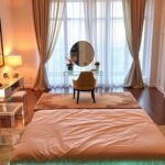
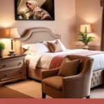
Beige: The Perfect Base for Future-Proof Design
Beige offers incredible versatility for your interior. It serves as a blank canvas that adapts to changing trends.
Consider a light beige sofa as your anchor piece. This approach lets you experiment with colorful pillows and artwork.
You can refresh your entire look simply by switching accessories. This makes your design both timeless and easily updateable.
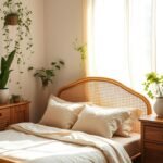
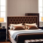
Rich Browns: Bringing Natural Materials to Life
Brown tones celebrate the organic materials central to this style. Leather and wood gain extra depth against these rich backgrounds.
Designer Nicole Franzen masterfully uses dark brown paneling. She pairs it with leather accents to create cozy, intimate spaces.
These earthy hues add both visual warmth and practical durability. They work beautifully with geometric furniture shapes.
Taupe: The Modern Mid-Century Evolution
Taupe represents the contemporary evolution of classic neutrals. This sophisticated shade blends gray and brown undertones perfectly.
Use taupe on walls for a dramatic yet soothing effect. It creates wonderful contrast with both warm and cool accent colors.
Incorporate this versatile color through velvet pillows or textured rugs. It adds sophistication while maintaining an earthy feel.
These neutral foundations ensure your bold choices never feel overwhelming. They provide the structural support that makes your palette truly sing.
Your living rooms will achieve that perfect blend of retro charm and modern sensibility. These elements create spaces that feel both current and timeless.
Warm Colors That Create Inviting Spaces

There’s magic in colors that make every day feel brighter. These hues bring instant cheer to your interior while maintaining that classic aesthetic appeal.
They work wonderfully with natural materials like wood and leather. Your space gains both visual warmth and emotional comfort.
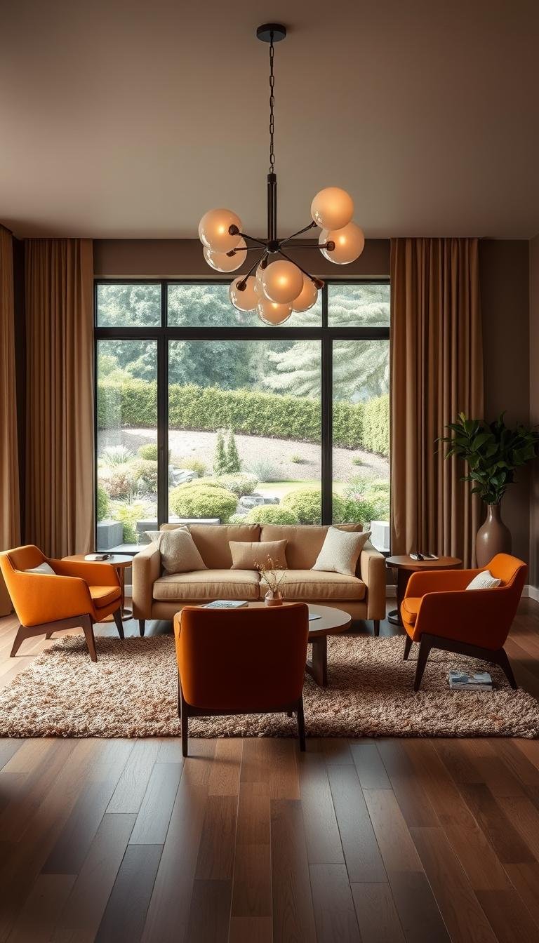
Orange Tones: Injecting Joy and Optimism
Orange brings pure energy into your home. It captures that post-war optimism perfectly.
Consider a bronze-toned sofa as your centerpiece. Add complementary accents through pillows and artwork.
This approach creates a super inviting atmosphere. Your guests will feel immediately welcomed.
Mustard Yellow: Embracing 1970s Retro Vibes
Mustard yellow delivers serious retro charm. It’s ideal for velvet upholstery or dramatic walls.
This rich shade adds depth without overwhelming your design. Pair it with neutral elements for balance.
You’ll love how it enhances natural light. The result feels both nostalgic and fresh.
Terracotta and Burgundy Reds: For Cozy Atmosphere
Red hues transform any room into a cozy retreat. They work especially well in cooler climates.
Experiment with terracotta tiles or burgundy textiles. These pieces add tactile beauty to your scheme.
Even fire-engine red lamps make fantastic statements. They create focal points that draw the eye beautifully.
Remember to balance warm tones with cooler accents. This prevents your space from feeling overwhelming.
Texture plays a crucial role too. Velvet and chenille add luxury while enhancing color depth.
Your living rooms will achieve that perfect blend of retro charm and modern sensibility. These warm palettes create spaces that feel both current and timeless.
Cool Colors for Balanced Mid-Century Modern Living Room Color Schemes to Try in 2025

Balance creates harmony in your home’s aesthetic. Cool tones provide the perfect counterpoint to warm shades, adding depth and visual interest.
These refreshing hues bring calm sophistication to any interior. They work beautifully with natural materials and geometric shapes.
Greens: From Calming Sage to Dramatic Moss
Green offers incredible versatility for your space. It ranges from soothing sage to deep moss tones.
This hue creates serene yet interesting environments. It complements wood elements beautifully.
Consider a Model 10 sofa in Vine green. This piece becomes an instant focal point in retro-inspired living rooms.
Green works well in various rooms and styles. It brings nature indoors while maintaining sophistication.
Teal Blues: The Signature Cool Tone of the Era
Teal stands as the definitive cool tone of this design era. Its rich depth captures the period’s essence perfectly.
This shade makes a striking choice for upholstery or walls. It particularly enhances south-facing rooms with wonderful light effects.
Teal creates dynamic contrast with warm accents. It brings both retro charm and contemporary elegance to your palette.
| Color Type | Best Uses | Room Recommendations |
|---|---|---|
| Sage Green | Walls, accent chairs | Bedrooms, reading nooks |
| Moss Green | Upholstery, decorative pieces | Living areas, studies |
| Teal Blue | Statement furniture, wall color | South-facing rooms, dining spaces |
| Sky Blue | Accent pillows, artwork | Any room needing light enhancement |
Incorporate these cool tones through various elements. Use them in upholstery, wall colors, or decorative accents.
They create wonderful balance with warm hues and neutrals. Your space will feel both inviting and refined.
Experiment with different shades to find your perfect mix. These colors will make your 2025 scheme feel complete and harmonious.
Earthy Color Palettes That Feel Approachable

Some design styles can feel too perfect for everyday life. Earthy color choices make your space feel welcoming instead of museum-like.
These natural hues create instant comfort in your home. They work beautifully with the sculptural elements of this style.
Mixing Organic Hues for Natural Harmony
Think about combining warm earth tones. Beige, orange, ochre yellow, and brown create wonderful harmony.
Blair Moore of Moore House Design uses this approach beautifully. She creates custom furniture in client-chosen palettes.
This mix brings both warmth and visual interest. Your living rooms gain character without feeling overwhelming.
Add playful accents like teal or moss green. These colors provide delightful contrast while maintaining cohesion.
How Earth Tones Complement Wood Elements
Earth shades enhance natural materials perfectly. They make wood grain patterns truly stand out.
Use these hues on walls or larger pieces. They create a grounded foundation for your entire room.
Leather accents gain extra depth against earthy backgrounds. Geometric patterns become more pronounced too.
Natural light interacts beautifully with these palettes. Your space feels connected to the outdoors.
| Earth Tone | Best Application | Complementary Accent |
|---|---|---|
| Beige | Wall color, large furniture | Teal blue |
| Ochre Yellow | Textiles, accent chairs | Burgundy red |
| Warm Brown | Wood elements, leather | Mustard yellow |
| Terracotta | Decorative pieces, tiles | Moss green |
These approaches make your interior design both authentic and livable. You achieve retro charm without sacrificing comfort.
Your home becomes a true reflection of your personality. Earthy palettes offer endless possibilities for creative expression.
Bold Accent Colors and How to Use Them
Your design deserves that extra spark of personality. Strategic pops of bold color can transform your space from nice to unforgettable.
These vibrant accents create focal points that draw the eye. They add drama while honoring the authentic spirit of your chosen style.
Let’s explore three signature hues that defined the era. You’ll discover how to use them in fresh, contemporary ways.
Mustard Yellow: Making Statement Pieces Pop
This rich yellow shade brings instant energy to any room. It works beautifully on velvet upholstery or as artwork accents.
Consider a mustard yellow armchair as your focal point. It creates wonderful contrast against neutral backgrounds.
This approach adds visual interest without overwhelming your palette. Your space gains both retro charm and modern flair.
Avocado Green: The Classic Mid-Century Hue
This light green color captures the era’s organic spirit perfectly. Designer Ashley Maddox demonstrates its power on walls.
When paired with period-appropriate furniture, it creates incredible cohesion. The entire room feels thoughtfully designed.
Use this green shade to unify your various elements. It brings a peaceful, natural atmosphere to your home.
Cobalt Blue: Adding Glamour to Period Pieces
This intense blue shade adds sophisticated drama. Tina Ramchandani uses high-gloss finishes to enhance authentic pieces.
Imagine Kangaroo chairs treated with this luxurious color. The result feels both historically accurate and strikingly contemporary.
This approach works beautifully on statement furniture or light fixtures. It creates depth and visual beauty in your interior design.
Balance these bold accents with neutral foundations. This prevents your space from feeling overwhelming.
Focus on one or two statement pieces per room. Let them shine against simpler backgrounds.
Your living rooms will achieve that perfect blend of retro charm and modern sensibility. These vibrant palettes create spaces that feel both current and timeless.
Creating Depth with Color Combinations
Masterful color pairing transforms good design into extraordinary interior design. The right combinations add visual depth and sophistication to your space.
Strategic mixing creates dynamic yet harmonious environments. Your home gains both personality and timeless appeal.
Pairing Warm and Cool Tones Effectively
Balance creates the most engaging atmosphere. Warm and cool tones complement each other beautifully.
Serena Dugan demonstrates this perfectly in her Shelter Island home. She combines warm textures like leather and rattan with cool sage green.
This approach creates wonderful visual interest. The space feels both cozy and refreshing.
Consider pairing mustard yellow with teal blue accents. These complementary hues enhance each other’s beauty.
Using Black as an Anchoring Sophisticated Element
Black brings grounding elegance to any palette. It anchors playful colors while adding sophistication.
Use black velvet fabrics for luxurious accents. This nods to authentic mid-century modern design.
Add black through statement pieces like lamps or side tables. These elements create focal points without overwhelming.
Remember to use this rich shade sparingly. It should enhance rather than dominate your look.
Geometric Patterns in Complementary Colors
Geometric shapes define this iconic style. They add structural depth and visual rhythm.
Choose patterns in complementary colors for maximum impact. High-pile rugs with geometric designs update spaces beautifully.
Curved details paired with crisp lines capture the era’s essence. This approach feels authentic yet contemporary.
Experiment with patterned pillows or artwork. These accents reinforce mid-century modern themes throughout your room.
Thoughtful combinations elevate your entire design scheme. They create living rooms that feel both cohesive and engaging.
For more inspiration on timeless elegance, explore these mid-century modern colour ideas.
Your home will achieve that perfect balance of retro charm and modern sensibility. These techniques ensure your palette remains both current and timeless.
Incorporating Color Through Materials and Textures
Your chosen materials do more than just fill your space. They bring color and character to life in ways paint alone cannot achieve.
Natural elements add organic warmth and tactile beauty. They create depth that makes your interior design feel authentic.
Leather Accents in Rich Brown Tones
Brown leather works beautifully in mid-century modern design. It offers both practical durability and aesthetic sophistication.
Choose rich brown tones for chairs or ottomans. These pieces add instant warmth to your room.
Leather develops a wonderful patina over time. This natural aging process enhances its visual interest.
Velvet Upholstery for Luxurious Color Depth
Velvet brings incredible depth to bold colors. Mustard yellow or teal blue become especially vibrant.
This fabric catches light in fascinating ways. It makes your furniture appear richer and more dimensional.
Consider a velvet sofa as your statement piece. It creates a focal point that draws attention beautifully.
Wood Paneling and Its Natural Color Contribution
Wood paneling adds natural color and texture to walls. Designer Nicole Franzen uses it to create cozy, moody spaces.
Pair dark wood with leather accents and curved furniture. This combination feels both retro and contemporary.
The natural grain patterns provide visual interest. Your home gains organic beauty that synthetic materials cannot match.
Mix different materials for intriguing combinations. Try acrylic and leather for a blend of retro and modern elements.
Textures amplify your color palette‘s impact. Velvet adds richness while wood provides organic warmth.
Choose materials that complement your overall scheme. Ensure harmony between furniture, walls, and decorative accents.
These design choices create an authentic, inviting atmosphere. Your living rooms will feel both stylish and comfortable.
Lighting’s Role in Enhancing Your Color Scheme
Light transforms how you experience every shade in your home. It brings your chosen palette to life in dynamic ways.
The right illumination makes colors appear richer and more vibrant. It adds dimension to your entire design scheme.
How Natural Light Affects Color Perception
Sunlight changes how colors appear throughout the day. Morning light makes warm tones glow beautifully.
Afternoon sun enhances cooler shades like teal and sage. North-facing rooms benefit from these refreshing hues.
South-facing spaces amplify earthy colors and wood grains. Natural illumination highlights texture and depth in materials.
Large windows maximize this beautiful effect. They create seamless transitions between indoor and outdoor aesthetics.
Statement Light Fixtures as Color Accents
Lighting pieces become dramatic focal points in any room. Elaine Santos uses a bronzed pendant light against neutral tones.
This approach lets the fixture shine as artistic decor. The sculptural shape adds retro flair to modern design.
Nina Garbiras selects geometric fixtures for industrial lofts. These pieces draw attention to architectural elements.
Choose fixtures with sleek, modern shapes that complement your style. They serve as both functional and decorative accents.
Creating Atmosphere with Strategic Lighting
Layer different light sources for perfect ambiance. Mix ambient ceiling lights with targeted accent lighting.
This combination highlights key furniture pieces and artwork. It creates warmth while maintaining sophistication.
Use dimmers to adjust mood throughout the day. Evening lighting should feel cozy and inviting.
Mirrors amplify natural light for brighter spaces. This technique aligns with mid-century modern principles.
Consider lighting early in your design process. Ensure it enhances your 2025 color palette perfectly.
Lighting adds functionality and transforms your interior. It brings depth and beauty to living rooms.
Bringing Your 2025 Mid-Century Color Vision to Life
You now have all the tools to craft your perfect space. Remember to begin with neutral foundations. Then layer warm and cool tones for balance.
Earthy palettes and bold accents add personality. Materials and lighting complete your look.
This style offers timeless beauty. Your home will feel both fresh and classic.
Ready to begin? Explore more modern living room design ideas for inspiration. Embrace your creativity and enjoy the process!