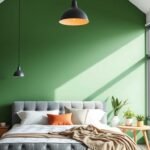
Imagine stepping into a room that feels both elegant and inviting. That’s the magic of pairing warm earth tones. This classic combination brings instant sophistication to any home.
Top designers like Amber Lewis and Chris Loves Julia showcase how these colors create depth. Brown adds a rich warmth that gray simply can’t match. It transforms a space into something intimate and romantic.
Our guide walks you through everything from paint choices to textiles. You’ll discover how to build a harmonious palette that reflects your personal style. We’ll share practical ideas to avoid common mistakes.
Get ready to craft a beautiful living area you’ll love spending time in. Let’s begin this exciting design journey together!
Why Beige and Brown Are the Perfect Living Room Combo
When these two colors come together, they form a foundation that’s both timeless and adaptable. Their complementary nature creates a sophisticated look that works across various aesthetics.
Beige offers a soft, calming base for your space. Brown adds depth and stability to the overall design. This combination makes any room feel inviting and grounded.
Neutral tones like these never go out of style. They serve as a classic foundation that can evolve with your taste over time.
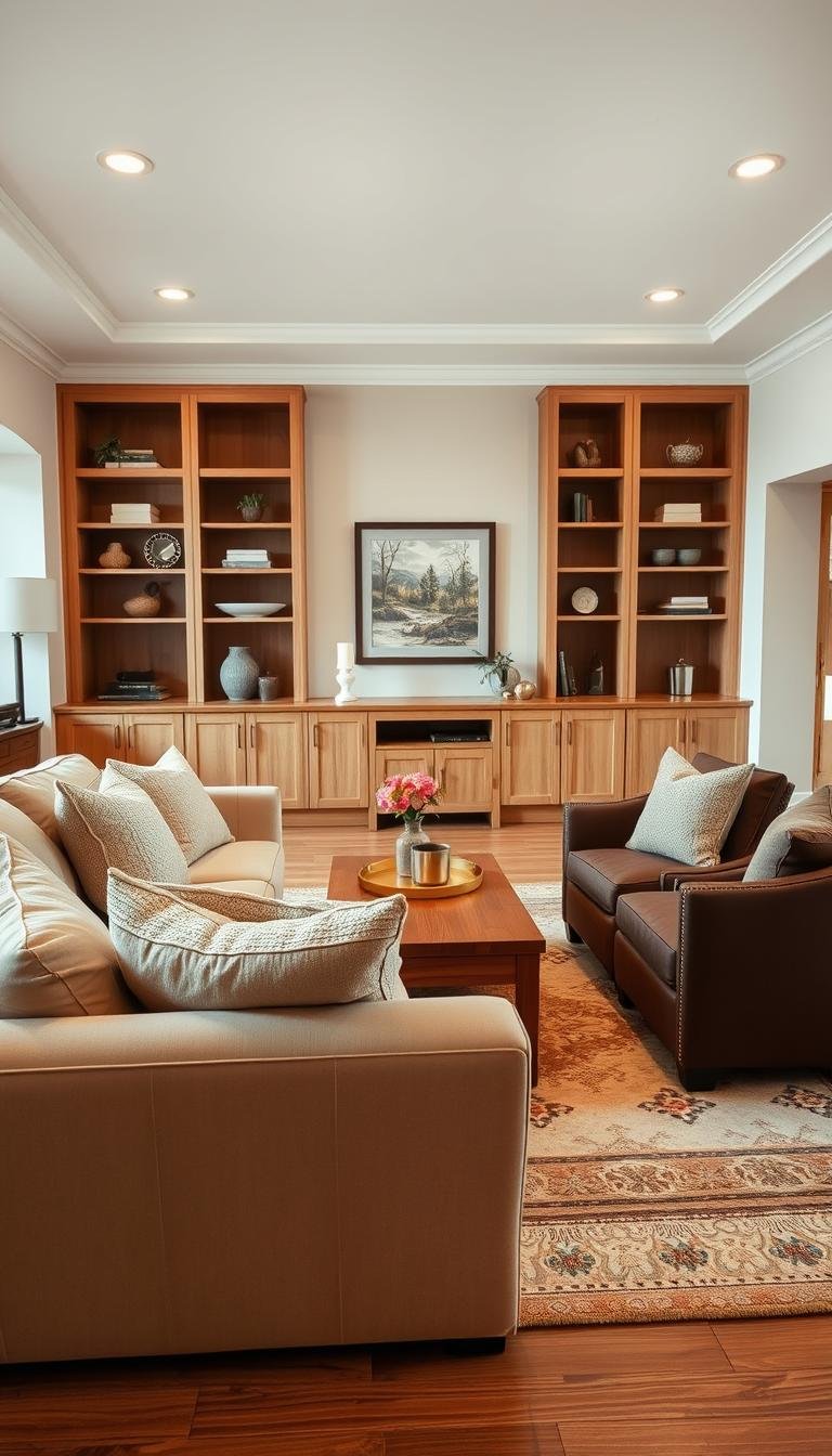
Consider espresso furniture against beige walls. This creates a bold yet harmonious contrast that many designers love. The dark brown pieces stand out beautifully against the lighter background.
These colors adapt wonderfully to different light conditions. Beige reflects light to brighten your living room. Brown absorbs light for added coziness in the evenings.
Top designers continue to champion warm neutrals. They show how this palette can feel fresh and modern. The combination works particularly well in open-concept spaces.
Beige and brown evoke natural elements and earthiness. They create a comforting retreat within your home. This emotional connection explains brown’s recent resurgence in interior design.
There are practical benefits too. These colors hide wear and tear better than brighter shades. They’re ideal for high-traffic areas where durability matters.
You’ll appreciate how this balanced palette offers endless possibilities. Accent pieces can easily refresh the look without major changes. The warmth and versatility make it a smart choice for any room.
Understanding the Warmth and Versatility of Neutral Tones

Neutral tones create the perfect foundation for any room. They lack strong chromatic content, making them incredibly adaptable. You can mix them easily with other hues for a cohesive look.
Beige and brown derive their comforting warmth from yellow and red undertones. This creates a cozy atmosphere that cooler neutrals like gray simply can’t match. As designer Chris Loves Julia noted, brown brings a depth and romantic intimacy that transforms spaces.
These earthy shades offer remarkable versatility. Beige ranges from cool greige to warm cream. Brown spans from light taupe to rich espresso. This allows for endless combinations in your palette.
Modern trends favor “mushroom” and sun-kissed taupe shades. These evolved from traditional Tuscan styles to contemporary elegance. They create a sophisticated backdrop that lets your personal style shine through.
According to color expert Maria Killam, understanding undertones is crucial. Brown can shift greenish or reddish based on natural light. Always test your color choices in different lighting conditions.
Psychologically, these tones promote relaxation and tranquility. They’re ideal for living areas where comfort matters most. Your home becomes a peaceful retreat from the outside world.
Neutrals serve as the perfect canvas. They allow accent colors to pop without overwhelming the space. This flexibility makes them a designer favorite for creating harmonious environments.
Mastering these concepts helps you make informed design choices. You’ll create a living area that feels both intentional and inviting. The result is a space that truly reflects your taste and lifestyle.
How to Mix Beige and Brown in Living Room Decor: Core Principles
Creating visual harmony with warm neutrals requires thoughtful application of key concepts. These foundation ideas help you build a cohesive and inviting environment. They work across various aesthetics from modern to traditional styles.
Understanding these principles prevents common mistakes. You’ll achieve professional-looking results that feel intentional. Let’s explore the essential guidelines for success.
Balancing Light and Dark Shades
Contrast creates visual interest in your space. Pair lighter beige walls with darker brown furniture for dramatic effect. This approach prevents a flat or monotonous look.
Medium tones offer a more blended appearance. They create subtle sophistication without strong contrast. This works well in smaller rooms or spaces with limited natural light.
Always test your chosen shades in different lighting conditions. Natural light can significantly alter how colors appear throughout the day. Evening artificial lighting creates another layer of complexity.
| Light Element | Dark Element | Visual Effect | Best For |
|---|---|---|---|
| Beige walls | Espresso furniture | Bold contrast | Large, well-lit spaces |
| Cream upholstery | Dark wood tables | Elegant definition | Traditional settings |
| Light area rug | Brown leather chairs | Grounding effect | Open concept areas |
| Soft beige curtains | Chocolate accents | Subtle sophistication | Cozy, intimate spaces |
The 60-30-10 Rule for a Harmonious Palette
This classic design principle ensures visual balance. Allocate 60% to your dominant color, typically beige on walls or large furniture. Use 30% for your secondary color, often brown pieces.
The remaining 10% serves as accent colors. These pops of contrast add personality and depth. They prevent the palette from feeling too uniform.
Your dominant shade establishes the room’s overall mood. Secondary tones provide richness and dimension. Accents offer opportunities for personal expression.
Playing with Texture to Add Depth
Texture prevents brown from feeling one-dimensional. Mix materials like velvet, linen, and wood for tactile interest. Each surface interacts differently with light.
Velvet adds luxury and depth to seating pieces. Linen offers casual elegance for curtains and pillows. Wood brings natural warmth through furniture and accessories.
Layer these elements gradually to avoid overwhelming your space. Start with larger pieces like sofas and area rugs. Add smaller textural elements through pillows and decor.
Jute rugs introduce organic texture against smooth surfaces. Metallic accents provide reflective contrast to matte finishes. These combinations create a dynamic, engaging environment.
Begin with a mood board to visualize your concept. Sample paints on your actual walls before committing. Build your layers systematically for best results.
These core principles apply to all design preferences. They create a balanced, inviting atmosphere you’ll enjoy for years. Mastering them transforms your space into a true reflection of your style.
Choosing Your Paint: Walls, Trim, and Accent Walls

Your wall color sets the stage for your entire room. It creates the foundation that everything else builds upon. Getting this right makes all other design decisions easier.
Professional designers spend considerable time selecting the perfect paint. They understand how different shades interact with light and furnishings. Your choices here will define your space’s character.
Selecting the Right Beige for Your Walls
Beige comes in countless variations with different undertones. Some lean pinkish while others have yellow or gray bases. These subtle differences dramatically affect your room’s feel.
North-facing rooms often benefit from warmer tones. They counteract the cool natural light that can make spaces feel chilly. South-facing rooms can handle cooler beiges without issue.
Always test samples directly on your walls. Observe them at different times of day under various lighting conditions. The color that looks perfect at the store might surprise you at home.
Benjamin Moore’s French Press offers a rich, warm neutral. Farrow & Ball’s London Clay provides earthy sophistication. Both work beautifully with brown furniture and accents.
Using Dark Brown to Create a Focal Point
An accent wall in deep brown creates instant drama. It draws attention to a specific area while adding depth. This technique works particularly well behind sofas or fireplaces.
Consider Sherwin-Williams’ Dark Clove or Behr’s Dark Truffle. These rich hues create intimacy without overwhelming your space. They pair beautifully with lighter beige furnishings.
Well-lit rooms handle dark colors best. The natural light prevents the look from feeling too heavy or closed in. This approach creates a sophisticated, modern atmosphere.
Coordinating Trim and Ceiling Colors
Trim color frames your walls like a picture frame. Typically, choose a shade lighter than your wall color. Crisp white or lighter beige both work well.
Ceilings usually look best in a similar tone to your walls. This creates cohesion and makes the room feel taller. Avoid stark contrasts between ceilings and walls.
Sheen matters as much as color. Use eggshell or satin finishes for walls—they’re durable and washable. Semi-gloss works perfectly for trim as it highlights details.
Flat paint minimizes imperfections on ceilings. It doesn’t reflect light, hiding flaws beautifully. This combination creates a professional finish throughout your home.
Thoughtful paint selection establishes harmony from the start. It enhances every other element in your room. Your careful choices will pay off for years to come.
Selecting Your Furniture for a Cohesive Foundation
Your furniture choices create the visual anchor for your entire room. These pieces establish the color story and set the mood. Thoughtful selection ensures everything works together beautifully.
Consider both style and function when choosing your main items. The right pieces create harmony between your walls and decor. They transform your vision into a lived-in reality.
Anchor Pieces: Sofas and Sectionals
Your sofa serves as the centerpiece of your seating area. Light beige upholstery creates an airy, open feeling. Rich brown velvet adds depth and luxurious texture.
Material selection impacts both look and feel. Linen offers casual elegance for everyday living. Velvet provides sophistication for more formal spaces.
Consider these popular options:
- Beige sectional with clean lines for modern appeal
- Brown leather sofa for timeless durability
- Two-tone designs combining both colors
Measure your room before making final decisions. Ensure proper traffic flow around each piece. Leave adequate space for other furniture and movement.
Accent Chairs and Tables
Accent chairs provide secondary seating and style points. Choose complementary tones that enhance your main pieces. Brown leather chairs beautifully offset beige sofas.
Side tables and coffee tables complete your arrangement. They offer both function and visual weight to your space. Mix materials for added interest and texture.
Metal legs add contemporary flair to traditional designs. Wooden bases maintain warmth and organic appeal. Choose based on your overall style direction.
Wood Tones: Matching and Intentional Contrast
Wood furniture brings natural warmth to your room. Matching tones creates a streamlined, cohesive look. Intentional contrast adds visual drama and depth.
Focus on undertones rather than exact matches. Red and mahogany tones feel modern and rich. Yellow undertones can appear dated if not balanced properly.
Reclaimed wood offers character and rustic charm. Sleek walnut provides contemporary sophistication. Choose based on your desired aesthetic.
Designer Amber Lewis advises:
“Don’t match wood tones perfectly—allow variations to create depth and interest. The slight differences tell a richer story.”
Your furniture forms the foundation of your beautiful room. Selecting harmonious pieces creates an inviting space you’ll love for years. These choices make your design vision come alive.
Layering Textiles: Rugs, Curtains, and Throws

Textiles provide the final layer that transforms a room from basic to beautiful. These soft elements add warmth, texture, and personality to your neutral foundation. They complete the look while enhancing comfort throughout your space.
Strategic textile choices create visual depth and tactile interest. They work together to establish a cohesive design story. Your selections should complement your existing furniture and wall colors.
Choosing an Area Rug to Ground the Space
Your area rug anchors the entire room visually. It defines seating areas while adding comfort underfoot. Select a size that fits under all furniture legs for a unified appearance.
Patterned rug options add interest without overwhelming the space. Consider geometric designs or subtle textures in warm tones. Jute or sisal rugs offer natural texture that pairs beautifully with both colors.
Practical considerations matter for high-traffic areas. Choose stain-resistant materials for easy maintenance. This ensures your beautiful foundation remains pristine for years.
Window Treatments for Light and Style
Window treatments serve both functional and aesthetic purposes. They control light levels while adding softness to your home. Beige curtains create a soft, light-diffusing effect throughout the day.
For dramatic impact, consider rich brown drapes. They add depth and sophistication to any space. Linen offers casual elegance while silk provides luxurious appeal.
Blackout options work well for media rooms or sleeping areas. They ensure complete light control when needed. Always measure carefully before making final selections.
Adding Coziness with Knits and Velvets
Throws and pillows introduce the final layer of comfort. A chunky knit throw invites relaxation on cooler evenings. Velvet pillows add luxurious texture against smoother surfaces.
Mix materials for maximum visual interest. Try these combinations:
- Brown leather sofa with beige velvet pillows
- Beige sectional with a woven throw blanket
- Patterned accents in complementary earth tones
These elements prevent your palette from feeling flat. They add dimension through varied textures and weights. Choose machine-washable options for practical daily use.
Your layered textiles complete the inviting atmosphere. They make the room feel lived-in and loved. This final touch transforms your space into a true sanctuary.
Incorporating Accents and Decor
The final layer of your room tells your personal story. Thoughtful accents transform a beautiful foundation into your unique sanctuary. These finishing touches add character while reinforcing your chosen palette.
Well-chosen decorative pieces create visual interest throughout your space. They prevent a flat appearance while maintaining cohesion. Your selections should feel intentional rather than random.
Throw Pillows for Pops of Pattern
Pillows offer the easiest way to refresh your look. Mix solid beige and brown pillows with patterned options. Geometric or tribal designs add energy without overwhelming your space.
Vary textures for additional depth. Try velvet brown pillows against linen beige upholstery. This combination feels luxurious yet comfortable for daily living.
Consider these popular arrangements:
- Three standard pillows in alternating colors
- One lumbar pillow with bold pattern
- Various sizes for visual hierarchy
Rotate seasonal patterns to keep your space feeling fresh. This simple change makes a big impact with minimal effort.
Artwork and Wall Decor
Your walls provide prime real estate for personal expression. Choose pieces that complement your color story while adding visual interest. Abstract art in warm tones reinforces your palette beautifully.
Natural themes work particularly well with this scheme. Consider landscape photography or botanical prints. Wood-textured art adds organic warmth to any room.
Create impact with gallery walls grouping multiple pieces. Vary frame styles while maintaining color consistency. This approach feels curated rather than matchy-matchy.
Mirrors with brown frames serve dual purposes. They reflect light while adding decorative appeal. Place them strategically to brighten darker corners.
Lighting Fixtures and Metallic Finishes
Lighting choices dramatically affect your room’s atmosphere. They provide both function and decorative appeal. Select fixtures that enhance your overall design direction.
Metallic finishes add sophistication to neutral spaces. Bronze and gold tones complement warm colors beautifully. Black metals offer contemporary contrast against lighter backgrounds.
Consider these popular options:
| Fixture Type | Finish | Style Effect | Best Placement |
|---|---|---|---|
| Chandelier | Bronze | Luxurious elegance | Dining area |
| Floor lamp | Black metal | Modern edge | Reading corner |
| Table lamps | Brass | Warm glow | Side tables |
| Sconces | Mixed metals | Layered sophistication | Hallway or bathroom |
Art Deco styles with geometric patterns make bold statements. They add architectural interest while providing necessary illumination. Always consider both ambient and task lighting needs.
Natural materials enhance the earthy feel of your palette. Wood sculptures and ceramic vases add organic texture. These elements feel both current and timeless.
Your decorative choices complete the transformation. They personalize the space while maintaining visual harmony. The result feels intentionally designed yet completely yours.
Exploring Different Design Styles with Beige and Brown

Your warm neutral palette serves as the perfect canvas for various aesthetics. These earthy tones adapt beautifully to different design preferences. They create a versatile foundation that reflects your personal taste.
Whether you prefer clean lines or organic textures, this combination works. It brings cohesion to any space while allowing creative expression. Let’s discover how these colors transform across popular styles.
Modern Minimalist Haven
Clean lines and simplicity define this approach. A monochromatic palette creates serene sophistication. Functionality takes priority over decorative elements.
Choose a sleek beige sectional as your foundation. Add a dark brown coffee table for contrast. Keep accessories minimal and purposeful.
Amber Lewis often showcases California modern elegance. She blends warm neutrals with streamlined furniture. The result feels both current and timeless.
Scandinavian influences emphasize light and space. They incorporate natural materials with simple forms. This creates an airy yet grounded atmosphere.
Rustic Elegance Retreat
This style embraces natural textures and organic warmth. Distressed wood and stone elements add character. The combination feels both refined and comfortable.
Pair a beige linen sofa with brown leather chairs. Add wooden beams or a stone fireplace for charm. These elements create depth and history.
Designer Chris Loves Julia often incorporates rustic touches. They balance roughness with softness beautifully. The result feels inviting and authentic.
Earth tones beyond brown enhance the natural feel. Think olive green or terracotta accents. These additions complement without overwhelming.
Coastal and Boho Influences
Light, airy feelings define these relaxed approaches. They incorporate organic shapes and natural fibers. The vibe feels effortless and breezy.
Start with light beige walls as your backdrop. Add driftwood brown furniture pieces. Woven textures like jute rugs complete the look.
Boho elements bring playful personality to your room. Macramé wall hangings and patterned pillows add interest. They prevent the space from feeling too serious.
Coastal ideas might introduce soft blue or green accents. These mimic ocean hues and natural surroundings. They create a fresh, vacation-inspired feeling.
| Design Style | Key Elements | Color Palette | Texture Focus |
|---|---|---|---|
| Modern Minimalist | Clean lines, functional pieces | Tight beige-brown range | Smooth surfaces, metallic accents |
| Rustic Elegance | Natural materials, distressed finishes | Earth tones with warm neutrals | Wood, stone, leather textures |
| Coastal/Boho | Organic shapes, light fabrics | Beige-brown with blue/green accents | Woven fibers, natural textiles |
Feel free to blend elements from different aesthetics. Add boho accents to a modern base for personality. The warm neutral foundation ensures everything harmonizes.
Choose a style that truly reflects how you live. These colors provide the perfect backdrop for any design direction. Your home becomes a true expression of you.
Mixing in Other Neutrals and Colors
Your warm foundation becomes even more dynamic with thoughtful additions. Introducing new hues creates personality while maintaining harmony. This approach keeps your space feeling fresh and personal.
Additional colors should enhance rather than compete with your base. They add depth and character to the overall design. The key lies in careful selection and proportion.
Adding Black and Gray for a Contemporary Edge
Charcoal gray walls create sophisticated contrast against beige furnishings. They add modern elegance without losing warmth. This combination feels both current and timeless.
Black accents provide striking definition throughout your room. Try metallic lighting fixtures or picture frames for subtle impact. These elements ground the space with visual weight.
Gray throw pillows on a beige sofa offer instant refreshment. They bridge the gap between light and dark elements. This creates a cohesive look that feels intentionally designed.
Designers often recommend these cool neutrals for updating traditional spaces. They add sophistication without overwhelming the existing palette. The result feels both familiar and fresh.
| Base Element | Accent Addition | Visual Effect | Best Application |
|---|---|---|---|
| Beige walls | Charcoal gray sofa | Modern contrast | Contemporary spaces |
| Brown leather chair | Black metal floor lamp | Industrial edge | Urban lofts |
| Cream upholstery | Gray patterned pillows | Subtle sophistication | Transitional rooms |
| Warm brown flooring | Dark gray area rug | Layered depth | Open concept areas |
Introducing Earth Tones and Pops of Color
Terracotta and moss green enhance the natural feel of your palette. They complement rather than clash with your foundation. These earthy tones create organic harmony.
Orange accents add spicy warmth to neutral backgrounds. A single vibrant pillow transforms a beige sofa. This approach maintains balance while adding personality.
Green plants bring natural freshness to any space. They introduce life and movement to static arrangements. This creates a vibrant, welcoming atmosphere.
Seventies-inspired palettes pair brown with rich earth tones. Think mustard yellow or rusty red for retro flair. These combinations feel both nostalgic and current.
Bold choices like fuchsia create modern vibrancy. Use them sparingly as unexpected pops of color. This keeps your foundation dominant while adding excitement.
Follow the 60-30-10 rule for best results. Keep additional colors to 10-20% of your overall scheme. This maintains visual hierarchy and prevents overwhelm.
Start small with decorative pillows or artwork. Gradually introduce larger elements if desired. Always test combinations in your actual lighting conditions.
Your personalized touches make the space uniquely yours. They add character while respecting the timeless foundation. The result feels both intentional and inviting.
Working with the Light in Your Space

Light transforms your room throughout the day. It changes how colors appear and shapes the overall mood. Understanding this helps you create a balanced environment.
Natural and artificial sources both play crucial roles. They work together to enhance your chosen palette. Your space becomes more dynamic and inviting.
Start by assessing your room’s natural light direction. North-facing windows receive cool, indirect sunlight. Warm beige shades prevent the space from feeling chilly.
South-facing rooms enjoy abundant warm light throughout the day. They handle cooler beiges or richer browns beautifully. These spaces feel bright and energizing.
East and west exposures offer varying light conditions. Morning light feels soft while afternoon light intensifies. Test your colors at different times for accuracy.
Deep brown shades work best in well-lit areas. They create intimate atmospheres without feeling oppressive. Poorly lit spaces might need lighter alternatives.
Artificial lighting requires careful consideration too. Warm white bulbs enhance the warmth of your palette. They make beige and brown feel cozier during evenings.
Layer different lighting types for optimal results. Ambient lighting provides overall illumination. Task lighting focuses on specific activities like reading.
Accent lighting highlights architectural features or artwork. This combination ensures both functionality and mood enhancement.
Low-light rooms benefit from strategic solutions. Lighter beige walls reflect available light more effectively. They make the space feel brighter and more open.
Mirrors amplify natural light by bouncing it around. Place them opposite windows for maximum impact. Glossy furniture finishes add subtle shine too.
Window treatments offer light control options. Sheer beige curtains maintain privacy while maximizing daylight. Brown blackout curtains create cozy evening environments.
Always test materials under real conditions. Paint samples look different throughout the day. Fabric choices change under various lighting too.
Observe your samples morning, noon, and night. Note how artificial light affects them after sunset. This prevents unexpected color shifts later.
Statement lighting fixtures serve dual purposes. They provide necessary illumination while adding style. Bronze finishes complement warm tones beautifully.
Black metal options offer contemporary contrast. They create visual interest against lighter backgrounds. Choose fixtures that match your overall design direction.
| Light Condition | Wall Color Recommendation | Furniture Finish | Lighting Solution |
|---|---|---|---|
| North-facing room | Warm beige with yellow undertones | Medium brown wood | Warm white LED bulbs |
| South-facing room | Cool beige or rich brown | Dark espresso finishes | Layered lighting scheme |
| Low natural light | Light reflective beige | Glossy surface treatments | Multiple light sources |
| Evening emphasis | Medium taupe shades | Matte textured surfaces | Dimmable warm lighting |
Zen-inspired spaces demonstrate effective light use. Soft illumination complements neutral tones perfectly. It creates calming environments for relaxation.
Art Deco sophistication incorporates dramatic lighting. Geometric fixtures make bold statements against neutral backgrounds. They provide both function and artistic flair.
Your attention to light ensures consistent appeal. The room feels inviting during daylight hours. It remains cozy and balanced after dark.
Seasonal changes affect natural light quality too. Summer brings brighter, longer days. Winter offers softer, more limited illumination.
Your adaptable palette handles these variations gracefully. The result is a space that always feels right. It becomes your favorite place regardless of time or season.
Avoiding Common Decorating Mistakes
Even the most beautiful color combinations can fall flat with simple missteps. Recognizing potential pitfalls helps you create a truly stunning environment. Let’s explore how to sidestep these common challenges.
Your goal is a space that feels both cohesive and dynamic. Small adjustments make a huge difference in the final result. Thoughtful planning prevents disappointment down the road.
Preventing a Flat or Monotonous Look
Using similar shades without variation creates a boring appearance. Your room might feel one-dimensional and lacking energy. This common mistake is easily avoidable.
Vary your palette from light to dark for visual interest. Light beige walls pair beautifully with espresso furniture. Medium tones work well for transitional pieces.
Patterns break up solid blocks of color effectively. Try geometric rugs or textured pillows for movement. These elements add life without overwhelming your space.
Natural materials bring organic texture to your design. Wood grains and woven fibers create depth. They prevent synthetic-looking flatness.
Designer Amber Lewis demonstrates this perfectly. She layers varying beige and brown tones throughout her projects. The result feels rich and dimensional rather than flat.
Metallic finishes provide reflective contrast against matte surfaces. Bronze lamps or gold frames catch the light beautifully. They add sophistication to neutral backgrounds.
An accent wall creates instant focal points. Deep brown behind your sofa adds drama. This technique prevents walls from blending together.
Ensuring Your Pieces Complement Rather Than Clash
Undertone conflicts create visual discord in your room. Yellow-beige with red-brown can feel unsettling. Choosing cohesive tones maintains harmony.
Create a mood board before making purchases. Arrange fabric swatches and paint samples together. This reveals potential clashes before commitment.
Natural light affects how colors interact throughout the day. Test combinations in your actual space at different times. Evening lighting might change everything.
Scale matters as much as color harmony. Too many small pieces create visual clutter. Oversized furniture can overwhelm your room.
Aim for balanced proportions throughout your space. Mix larger anchor pieces with medium accents. This creates comfortable visual flow.
Consider this practical approach to harmony:
| Element | Common Mistake | Better Solution | Design Impact |
|---|---|---|---|
| Wall color | Matching furniture exactly | Lighter walls, darker furniture | Creates depth and dimension |
| Textiles | All solid colors | Patterned pillows and throws | Adds movement and interest |
| Wood tones | Perfect matching | Intentional variation | Creates rich, layered look |
| Lighting | Single source | Layered ambient and task lighting | Enhances mood and functionality |
Gray and black accents work well when chosen carefully. Ensure they share similar undertones with your base colors. This prevents discord in your palette.
Natural materials avoid “bad browns” from synthetic pieces. Real wood and leather develop beautiful patinas over time. They add character that faux materials cannot match.
Your careful attention to these details pays off beautifully. The result is a dynamic, harmonious living environment. You’ll enjoy your space for years to come.
Pro Tips from Interior Designers
Top professionals share their secrets for creating stunning neutral spaces. Their expert advice helps you avoid common pitfalls. You’ll achieve a polished, magazine-worthy result.
Michelle Salz-Smith often uses gray walls behind tan sofas. This creates sophisticated contrast without overwhelming the space. Martha O’Hara Interiors balances gray and beige furniture mixes beautifully.
Chris Loves Julia celebrates brown’s romantic depth in interiors. Amber Lewis masters warm neutrals for calm, inviting environments. Both designers emphasize personal connection over trends.
Start with a neutral base and layer accents gradually. Test paint samples in your actual lighting conditions. Quality materials like linen or walnut ensure longevity.
Choose pieces that truly speak to you. Don’t follow trends blindly. Your home should reflect your unique personality and lifestyle.
Area rugs help define different zones in open spaces. Mix vintage and modern pieces for character. Statement lighting creates dramatic focal points.
Earth tones complement brown beautifully for added warmth. Pops of color bring vibrancy when used sparingly. Repeat colors throughout for visual cohesion.
Select durable fabrics for high-traffic furniture pieces. Washable throws make maintenance effortless. These practical choices keep your space looking fresh.
“Professional guidance transforms good spaces into great ones. Discovery chats help create personalized solutions that work for your life.”
Apply these pro tips throughout your design journey. You’ll create a beautiful, functional space that feels uniquely yours. The result will be both stylish and comfortable.
Maintaining Your Beautiful Neutral Living Room
Your elegant space deserves care to stay fresh and inviting. Simple routines preserve that sophisticated look you worked hard to create. Proper maintenance keeps your home feeling welcoming for years.
Regular cleaning prevents dirt buildup on light surfaces. Vacuum area rugs weekly to keep them looking new. Spot-clean beige fabrics immediately to avoid permanent stains.
Dust wood furniture with appropriate products weekly. This maintains the beautiful finish on your brown pieces. Quality materials age gracefully with proper care.
Preventive measures protect your investment. Use coasters on wood tables to avoid water rings. Rotate cushions regularly for even wear on seating.
Sun protection prevents fading on delicate fabrics. UV-blocking curtains shield your space from harsh rays. This is especially important in sunny rooms.
Seasonal refreshes update your decor easily. Swap throw pillows or blankets for instant change. This approach keeps your design feeling current.
Address minor damage promptly. Repair scratches on wood with touch-up kits. Reupholster worn pieces instead of replacing them.
Natural materials develop character over time. Linen and wool acquire a lovely patina. This adds depth to your neutral palette.
Declutter surfaces regularly for clean lines. This maintains either minimalist or cozy vibes. Your room stays functional and beautiful.
These practices ensure lasting elegance. Your careful attention pays off every day. You’ll enjoy your sophisticated space for years.
Your Journey to a Warm and Inviting Living Space
You’ve explored the wonderful world of warm neutrals. Now it’s time to create your perfect sanctuary. Remember those core principles for a harmonious palette.
Start with a mood board. Sample paints in your actual space. Build your layers gradually, focusing on balance and texture.
Your investment in timeless neutrals will remain stylish for years. Trends come and go, but these classics endure. They provide a foundation you can refresh with simple accents.
Enjoy every step of this creative process. Soon you’ll have a cozy retreat that truly feels like home. A space filled with warmth and personal style.
For more inspiration on color harmony, explore our guide on mixing warm and cool tones. This complements your neutral foundation beautifully.
Congratulations on beginning this exciting transformation. Embrace the elegance of your new living area. You’ll love spending time in your inviting personal retreat.