Welcome to your guide for creating a dreamy personal retreat. Imagine a space that feels both cozy and sophisticated. This is your chance to transform your sleeping area into something truly special.
Soft hues can work wonders in your home. They create a calming atmosphere that promotes relaxation. These gentle shades help you unwind after a long day.
Design experts show how to use these colors in grown-up ways. You’ll discover options beyond traditional nursery shades. Think sophisticated variations with earthy undertones.
Prepare to rethink everything about this beautiful color palette. Embrace these shades in new and intentional ways. Your peaceful sanctuary awaits!
Why a Pastel Bedroom is Your Perfect Peaceful Escape

Your sleeping area should be a sanctuary where stress melts away. Soft colors create this calming environment effortlessly. These gentle tones transform your room into a personal retreat.
Design experts have rediscovered these beautiful shades. They now use them in sophisticated adult spaces. Forget old associations with children’s decor.
Patrick O’Donnell of Farrow & Ball shares valuable advice.
Ignore pre-existing associations with pastel colors. Treat them as neutrals rather than limiting “pretty” colors.
Moving Beyond the Nursery: Pastels for Grown-Ups
These colors have evolved dramatically in interior design. The millennial pink trend showed their true potential. Designers now create stunning adult spaces with these hues.
You’ll find incredible examples from top designers. They break free from saccharine stereotypes completely. Their work proves these shades belong in elegant homes.
These colors work beautifully in different lighting conditions. They create varying moods throughout your day. Morning light brings soft freshness to your space.
The Psychology of Soft Hues for Better Sleep
Science supports using gentle colors in sleeping areas. Light blues and soft greens promote relaxation effectively. They help reduce stress and improve sleep quality.
These shades make your room feel more spacious. They create an airy, tranquil atmosphere naturally. Your mind and body will thank you daily.
| Color Family | Psychological Effect | Best For |
|---|---|---|
| Soft Blues | Calming, reduces anxiety | Creating serene environments |
| Gentle Pinks | Comforting, promotes warmth | Adding soft sophistication |
| Muted Greens | Balancing, connects to nature | Earth-inspired retreats |
| Lavender Tones | Soothing, encourages rest | Dreamy relaxation spaces |
The right shades transform your personal space completely. They turn it into a true escape from daily pressures. You deserve this peaceful haven.
Choosing Your Dreamy Pastel Color Palette

Selecting the perfect color palette transforms your space into a personal sanctuary. The right shades create harmony and balance throughout your room. Consider how different hues interact with your natural light throughout the day.
Test paint samples on your walls before making final decisions. Observe how they change from morning to evening. This ensures you love your chosen colors in all lighting conditions.
Embrace Soothing Pastel Blue
Pastel blue creates a serene atmosphere reminiscent of peaceful skies. These calming blues work beautifully for blue walls in any relaxation space.
Designer Jessica Nelson used Farrow & Ball’s Blue Gray throughout a bathroom. She applied it on walls, ceiling, and trim for a cohesive spa-like feeling. This approach creates a truly tranquil environment.
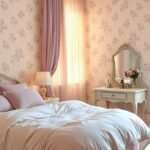
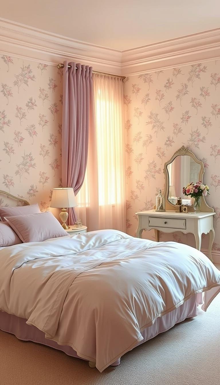
Try a Warm Pastel Pink
Pastel pink options offer sophistication rather than sweetness. These fleshy tones work as friendly neutrals for pink walls. They create warmth without overwhelming your space.
These colors pair beautifully with natural materials and textures. They bring a soft glow to your room color scheme throughout the day.
Opt for Calming Pastel Green
Pastel green brings nature indoors while maintaining restful ambiance. These green shades create connection to the outdoors through your green walls.
They work particularly well in spaces with plenty of natural light. The organic feeling promotes relaxation and mental clarity.
Consider Sophisticated Lavender and Lilac
Lavender and lilac options add elegance without overwhelming your space. These purple tones create dreamy relaxation environments.
A Manhattan townhouse beautifully used varied purple pastel tones. The result was a rich, luxurious feel throughout the space.
For more inspiration on combining these beautiful pastel tones, explore this guide on creating your dream color scheme.
Think Like a Designer: Treat Pastels as Neutrals

Professional designers approach these soft hues differently than most people. They see them as versatile foundation shades rather than just decorative colors. This mindset shift opens up exciting possibilities for your space.
Patrick O’Donnell of Farrow & Ball shares this professional perspective. He encourages thinking beyond traditional associations.
Try and ignore the fact that you are using pastel colors altogether. It has such a connotation of pretty which is subliminally limiting. If you’re after something more modern, think of them as neutrals – a foil to add more dynamic elements.
Forget Preconceived Notions of “Pretty”
Many people associate these shades with childhood spaces or overly sweet decor. Top designers have completely moved past these outdated ideas. They now use these colors in sophisticated, adult-appropriate ways.
Your interior can feel both soft and strong simultaneously. These shades work beautifully when treated as background elements. They create harmony without demanding attention.
Create a Dynamic Base for Accents
These gentle tones serve as perfect backdrops for bold statement pieces. They allow other elements to shine while maintaining overall cohesion. Your decor becomes more interesting and layered.
Strong colors work beautifully against these soft shades. They create either subtle tonality or moodier contrasts. This approach gives you freedom to experiment.
| Pastel Base Color | Recommended Accent | Visual Effect Created |
|---|---|---|
| Soft Blue | Deep Navy | Sophisticated contrast |
| Muted Pink | Rich Terracotta | Warm, earthy balance |
| Pale Green | Forest Green | Natural depth |
| Lavender | Charcoal Gray | Modern elegance |
Artwork becomes more striking against these gentle backgrounds. Textiles and statement furniture gain prominence. Your overall look feels intentionally designed rather than overly decorated.
This designer approach transforms how you use these beautiful shades. Your space gains depth and sophistication. The result feels both calming and visually interesting.
Select “Dirty Pastels” for a Grounded, Earthy Feel

Ready to elevate your space with sophisticated color choices? The secret lies in selecting shades with earthy undertones. These grounded hues create warmth and depth while avoiding overly sweet appearances.
Design professionals call these “dirty pastels” for good reason. They feature subtle brown or gray bases that feel naturally sophisticated. This approach transforms your space into an elegant retreat.
Look for Shades with Brown or Gray Undertones
Seek out colors that resemble natural materials. Think setting plaster, aged clay, or weathered stone surfaces. These tones bring organic beauty into your home.
Kate Cox of HÁM Interiors explains their appeal beautifully.
When selecting pastel shades, we appreciate their resemblance to setting plaster. The yellow and brown undertones create a flattering backdrop for antique furniture.
These earthy hues work particularly well with natural materials. They complement wood grains and stone textures perfectly. Your space gains authentic character and warmth.
Avoid Overly Saccharine or Sweet Colors
Steer clear of candy-like shades that feel too youthful. Instead, choose colors with fleshy, warm undertones. These create friendly neutrals rather than childish accents.
Patrick O’Donnell recommends this thoughtful approach. Gentle earthy pinks work as sophisticated background shades. They provide flattering light throughout your room.
Notice how these colors transform throughout the day. Morning light brings soft warmth to your space. Evening light creates cozy, intimate atmospheres.
- Choose colors resembling natural materials like plaster or clay
- Look for subtle brown or gray bases in paint samples
- Test how shades change in different lighting conditions
- Pair with antique furniture for rich visual harmony
- Create sophisticated environments suitable for adults
This design approach ensures your space feels both current and timeless. You achieve elegance without sacrificing comfort. Your room becomes a truly grown-up retreat.
Build Depth by Layering Different Pastel Shades
Creating visual interest in your space involves thoughtful color layering. This technique adds dimension while maintaining a calming atmosphere. You can achieve this through strategic combinations of similar and complementary hues.
Designers use this approach to make rooms feel more dynamic. Layering different intensities creates sophisticated depth. Your space gains character without losing its peaceful vibe.
Brooke Copp Barton demonstrates this beautifully in a dining area. She used paneling to define the space while softening hard edges.
The paneling zones the dining space and softens some of the hard edges of the kitchen – and the pastel pink gives the space a restorative and calming vibe.
She balanced pale pink with bolder pink seating and teal accents. This combination creates both harmony and visual interest.
Combine Lighter and Darker Tones of the Same Color
Working within one color family creates a sophisticated monochromatic look. Choose your starting shade then explore variations in saturation. This approach adds depth while maintaining cohesion.
Marie Flanigan recommends playing with color intensity levels.
Choose your starting pastel color and then work to add in that color through varied saturation levels.
This technique prevents your space from feeling too matchy-matchy. It creates natural visual flow throughout the room. You maintain the calming effect while adding dimension.
Try these combinations for beautiful results:
- Soft blue walls with navy blue textiles
- Pale green accents with deeper emerald touches
- Light lavender base with rich purple accessories
Mix Complementary Pastels for a Playful Look
Combining different color families creates playful yet intentional aesthetics. These combinations feel fresh while maintaining softness. They add personality without overwhelming your space.
Brooke Copp Barton’s use of pink with teal shows this perfectly. The contrast feels both unexpected and harmonious. This approach works well for defining different zones.
Consider these complementary pairings:
| Primary Color | Complementary Accent | Overall Effect |
|---|---|---|
| Soft Pink | Mint Green | Fresh and inviting |
| Light Blue | Pale Yellow | Sunny and cheerful |
| Lavender | Soft Peach | Warm and romantic |
| Muted Green | Dusty Rose | Earthy and soothing |
These combinations help soften architectural edges throughout your room. They create visual interest while maintaining overall tranquility. Your space feels both designed and effortlessly comfortable.
Incorporate Pastels Through Textiles and Bedding

Discover how fabric selections can introduce calming tones while adding comfort to your retreat. These elements offer flexible ways to bring soft hues into your space. You can easily change them with seasons or moods.
High-quality textiles create sophistication rather than childishness. They add both visual appeal and physical comfort. Your personal haven becomes a true luxury escape.
Choose Luxurious Pastel Linens and Throws
Select premium fabrics like washed cotton, natural linen, or Tencel. These materials offer durability and breathability. They feel wonderful against your skin.
Soft pink, powder blue, and lavender work beautifully for bedding. These shades create a serene environment. They pair well with various furniture styles.
Mix different textures within the same color family. This approach adds visual interest and depth. Your sleeping area gains sophistication through thoughtful layering.
Add Softness with a Pastel Area Rug
A gentle-hued rug anchors your space while adding comfort underfoot. It defines the area and absorbs sound. Your room feels more intimate and cozy.
Choose shades that complement your overall scheme. Mint green or peach options work well. They bring warmth without overwhelming the space.
Textured rugs add dimension to your design. They create visual interest while maintaining tranquility. This element completes your comfortable retreat.
Install Dreamy Canopy Curtains for Drama
Create dramatic elegance with flowing canopy treatments. They add vertical interest and softness. Your space feels more luxurious and complete.
The Manhattan townhouse featured exquisite silk curtains by Dedar. These were embroidered by Penn & Fletcher and lined with Stark fabric. The custom cast-metal bed completed this elegant look.
Designer Anthi Grapsa used pastel blue zellige tiles in a bathroom. This created a playful yet fresh modern vibe. Similar principles apply to textile choices.
For more inspiration on combining these beautiful elements, explore this guide on incorporating soft colors through textiles.
Anchor Your Scheme with Bold Accents and Contrasts
Balance your soft color palette with striking elements that add depth and character. These bold touches prevent your space from feeling too delicate or one-dimensional. They create visual interest while maintaining overall harmony.
Designers often use contrast to ground lighter schemes effectively. This approach adds sophistication and prevents overly sweet appearances. Your room gains personality through thoughtful juxtaposition.
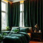
Introduce Dark Wood or Wrought Iron Furniture
Rich wood tones bring warmth and earthiness to your gentle color scheme. They create beautiful contrast against softer backgrounds. These pieces add timeless elegance to your space.
Marie Flanigan recommends mixing these materials with lighter hues. This combination adds masculine energy to balance the aesthetic. Your room feels more grounded and complete.
Wrought iron elements offer another excellent option. Their dark metallic finishes provide striking visual weight. They work beautifully against pale walls and textiles.
Consider these furniture options for your space:
- Dark walnut nightstands against soft blue walls
- Wrought iron bed frame with gentle pink bedding
- Mahogany dresser complementing lavender accents
Use Moody Artwork and Decorative Objects
Dramatic art pieces create focal points against gentle backgrounds. They add personality and depth to your overall design. Your space becomes more engaging and visually rich.
The Italian attic apartment showcased this approach beautifully. Vintage prints created contrast against blue walls. A red velvet runner added luxurious texture.
Ritika Bhasin’s New York City project demonstrated bold color pairing. Purple walls and seating created dramatic impact. This shows how strong elements enhance softer schemes.
Choose artwork with deeper tones or interesting subjects. These pieces become conversation starters. They prevent your room from feeling too uniform.
Select Metallic Finishes in Brass or Black
Metal accents add sophistication and refinement to your space. They provide subtle shine against matte surfaces. These finishes elevate your overall design.
Brass elements bring warm golden tones to your room. They complement various pastel shades beautifully. These details feel both current and timeless.
Black metallic finishes offer striking contrast. They create modern edge against softer backgrounds. Your space gains contemporary appeal.
Consider these metallic applications:
| Metal Type | Best Pairings | Visual Effect |
|---|---|---|
| Brass | Soft pink, light blue | Warm elegance |
| Black Iron | Mint green, lavender | Modern contrast |
| Copper | Peach, pale yellow | Earthly richness |
| Chrome | All pastel shades | Clean modernity |
Incorporate these metals through lighting fixtures and hardware. They add consistency throughout your space. Your design feels intentionally curated and complete.
Explore the Power of a Pastel Accent Wall
Transform your room with a single statement wall. This design trick adds personality without overwhelming your entire space. An accent wall creates instant focus and visual interest.
You can experiment with soft shades without a full room commitment. This approach works beautifully in any home. It lets you test a pastel color before going all-in.
Choose the right wall based on your room’s architecture. Consider natural light patterns and existing furniture placement. The best wall often faces your entry point or holds your bed.
Highlight a Wall with Custom-Color Wallpaper
Custom wallpaper creates unique texture and pattern. It adds depth while maintaining a soft aesthetic. Your space gains sophistication through intentional design choices.
The Manhattan townhouse featured exquisite purple wallpaper by Gracie. This created a luxurious focal point in the room. Custom patterns offer exclusive design possibilities.
Designer Anthi Grapsa used pastel blue zellige tile insets in a bathroom. Brass taps and light fittings complemented this elegant look. Similar principles apply to wallpaper selections.
Paint a Feature Wall Behind the Bed
Create a dramatic backdrop for your sleeping area. A painted feature wall anchors your bed beautifully. It transforms your space into a curated retreat.
The Parisian-inspired room used Farrow & Ball’s Calamine No. 230. This soft pink wall created a warm, inviting atmosphere. The Victorian cottage kitchen featured Light Blue walls for a fresh feel.
Your accent wall can make small rooms feel larger. It balances awkward architectural features effectively. This technique adds dimension while keeping the overall look serene.
Integrate Pastel Colors on Furniture and Built-Ins
Your furniture choices offer wonderful opportunities to introduce soft hues into your space. These pieces become focal points that carry your color scheme beautifully. They add personality without overwhelming your entire room.
Built-in elements provide another excellent way to incorporate gentle colors. Shelving units, window seats, and cabinetry can all feature these lovely shades. They create cohesive design while serving practical purposes.
Consider a Painted Pastel Dresser or Armoire
Transform ordinary storage pieces into extraordinary statement makers. A painted dresser or armoire adds personalized charm to your space. Choose pieces with good proportions and interesting details.
Select the right furniture for painting projects. Look for solid wood construction with minimal damage. Pieces with carved details or turned legs work particularly well.
Professional painting techniques ensure smooth, durable finishes. Proper surface preparation is essential for long-lasting results. Use high-quality primer before applying your chosen color.
Real examples show how effective this approach can be. The Beverly Hills breakfast room used coordinated pastels beautifully. Pratt & Lambert Accolade in Solitary adorned walls while Farrow & Ball Estate Emulsion in Clunch covered trim.
Explore the Idea of Pastel Bed Frames
A colored bed frame creates a bold anchor for your entire scheme. This choice makes your sleeping area the undeniable focal point. It works particularly well in rooms with neutral walls.
Kitchen examples demonstrate how cabinetry can inspire bedroom ideas. Mary McDonald’s space featured pastel blue cabinetry with custom diagonal-striped marble flooring. Bill Wackermann’s kitchen had gorgeous robin’s egg blue cabinets that elevated the entire space.
These principles translate beautifully to bedroom furniture. A soft green bed frame could reference nature-inspired themes. Pale blue options create serene sleeping environments.
Your painted pieces should work harmoniously with other elements. Consider how they complement wall colors, textiles, and accessories. This creates a cohesive yet interesting space that feels intentionally designed.
Bring Your Dreamy Pastel Bedroom Vision to Life
Now it’s time to create your personal retreat. Remember to treat soft shades as versatile neutrals. Build your scheme around them for a balanced look.
Start with textiles or an accent wall if you’re unsure. Add depth with darker accents and natural materials. Layer different tones within your chosen color family.
Let your personal style guide the process. Take inspiration from designers but make it yours. Create a space that feels authentically you.
Your peaceful sanctuary awaits. Begin with one element and build from there. You deserve this beautiful escape.