Welcome to your guide to the most stylish and popular palettes for your personal sanctuary. Discover how fresh hues can completely change the feel of your space.
Learn about the latest approaches top designers use to create stunning, magazine-worthy rooms. These ideas go far beyond traditional paint choices.
Different combinations can dramatically affect the mood and atmosphere. The right selection can make your area feel more spacious, cozy, or luxurious.
Staying current helps you create a fresh and contemporary design. Get ready to be inspired and reflect your unique style.
Why Your Bedroom Color Choice Matters So Much
Interior design experts recognize that wall tones shape more than just visual appeal. The palette you choose creates an environment that influences your daily experience in profound ways.
Your selection affects multiple aspects of your life. From the moment you wake up to when you unwind at night, the atmosphere plays a crucial role.
Consider these significant impacts of your pigment decisions:
- Daily wellbeing – The right tones can improve your rest and emotional state
- Room perception – Lighter shades create airiness while darker ones add cozy intimacy
- Design foundation – Your wall treatment sets the stage for furniture and accessories
- Personal expression – Colors reflect your unique style and make the space truly yours
Color psychology demonstrates how different hues affect emotional states. Cool blues might promote calmness, while warm neutrals often create comfort.
Investing time in selecting your perfect scheme pays dividends. You’ll create a personal sanctuary that supports relaxation and rejuvenation.
The environment you craft becomes your daily retreat. Thoughtful color choices transform a simple room into a harmonious space that nurtures your senses.
Understanding Color Psychology for Bedroom Design
The colors surrounding you in your personal space do more than just look pretty. They create an emotional atmosphere that can influence how you feel and rest. This connection between shades and psychology is fascinating.
Smart bedroom design considers how different pigments affect your daily experience. The right selection can transform your room into a true sanctuary.
How Colors Affect Your Mood and Sleep
Different hues create distinct emotional responses. Blues and greens typically promote calmness and relaxation. These cooler shades help lower heart rates and reduce anxiety.
Your sleeping environment benefits from thoughtful color choices. The right palette can significantly improve sleep quality. It creates a peaceful atmosphere that encourages rest.
Research shows that certain tones affect melatonin production. Softer, muted colors tend to support better sleep patterns. They help your mind and body prepare for rest.
The Difference Between Warm and Cool Tones
Warm tones include reds, oranges, and yellows. These colors typically create energy and excitement. They might work better as accents rather than main wall colors.
Cool tones like blues and greens promote serenity. They create a calming sense of peace. These shades are ideal for creating a restful space.
The temperature of colors also affects room perception. Cool tones can make a space feel more spacious. Warm tones often create coziness and intimacy.
Understanding these differences helps you make informed decisions. You can create a personalized space that supports your needs. The right balance enhances both your mood and daily experience.
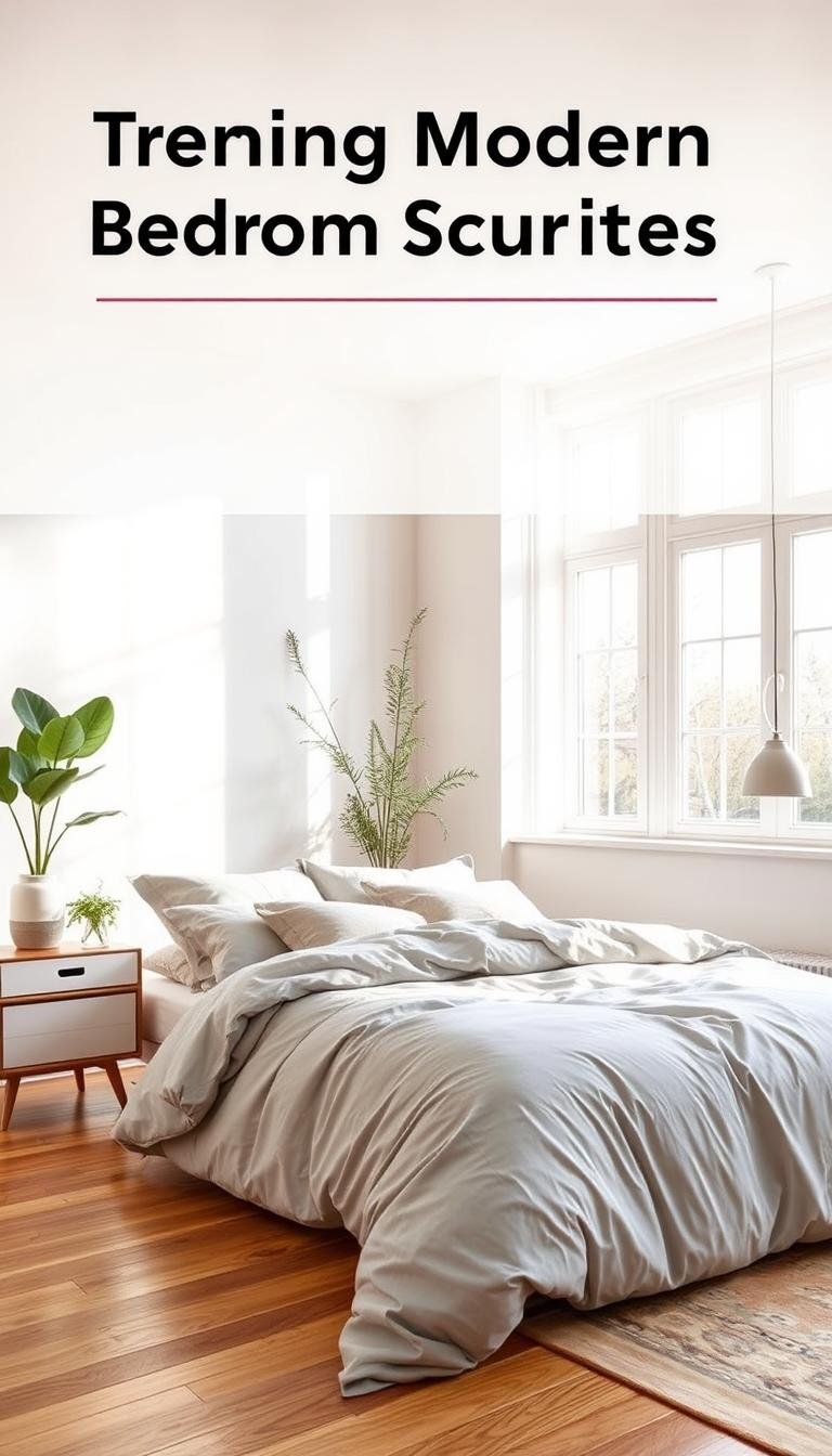
Trending Modern Bedroom Color Schemes You’ll Love
The latest interior design movements showcase creative combinations that redefine traditional decorating. These fresh approaches transform ordinary spaces into extraordinary personal retreats.
Top designers currently favor palettes that blend contemporary flair with timeless elegance. This creates spaces that feel both current and enduring.
Today’s most sought-after schemes offer something for every taste. From bold statement hues to subtle neutrals, there’s a perfect match for your style.
Many current favorites feature unexpected pairings that create visual interest. These combinations add personality and depth to your space.
Sophisticated looks often incorporate both warm and cool tones. This balance creates harmonious environments that feel complete.
Current design thinking emphasizes creating personal sanctuaries. Colors that promote relaxation and comfort are particularly popular.
These versatile schemes work with various design approaches. They complement everything from minimalist to maximalist styles beautifully.
Exploring these fresh ideas can inspire your own creative vision. You’ll discover exciting possibilities for your personal space.
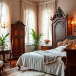
Serene Warm Taupe for Luxe Hotel Vibes
Imagine stepping into a five-star retreat every evening. That luxurious experience begins with your wall treatment selection. Warm taupe delivers this premium atmosphere beautifully.
This sophisticated neutral creates instant calm. It evokes high-end hospitality spaces where every detail promotes relaxation. Your personal sanctuary deserves this elegant touch.
Designer Alison Giese specifically selected this shade for a primary suite project. She aimed to craft a peaceful environment with balanced energy. Her approach combined warmth with sophisticated patterns.
“We chose warm colors and a balance of masculine and feminine patterns,”
The warmth of taupe makes your room feel inviting. It creates coziness without overwhelming darkness. This versatile neutral serves as an excellent foundation.
Your space feel transforms with this elegant choice. Taupe provides a sophisticated backdrop for various design elements. It pairs wonderfully with both cool and warm accents.
Consider these advantages when selecting this palette:
- Creates timeless elegance that won’t date quickly
- Allows easy updates through bedding and accessories
- Offers flexibility for changing decor preferences
- Works with diverse furniture styles and materials
The neutral quality means you can refresh looks without repainting. Simply change textiles and decorative pieces. This practical benefit saves time and money.
Different lighting conditions affect how taupe appears. Natural daylight reveals subtle undertones. Evening illumination enhances its cozy character.
| Taupe Characteristics | Design Benefits | Room Impact |
|---|---|---|
| Warm neutral base | Works with various styles | Creates cozy atmosphere |
| Subtle undertones | Pairs with multiple colors | Adds visual depth |
| Medium saturation | Balances light and dark | Enhances perceived space |
| Timeless appeal | Long-lasting relevance | Maintains elegance |
This color choice supports both relaxation and visual harmony. It creates a sanctuary that feels both luxurious and personal. Your bedroom becomes a true retreat from daily life.
The balanced tones work beautifully for creating serene environments. They provide enough warmth for comfort without excessive energy. This makes taupe ideal for sleeping spaces.
Many designer professionals recommend taupe for its versatility. It serves as an excellent foundation for personal expression. You can layer personality through art and accessories.
Embrace this sophisticated choice for your personal haven. It delivers hotel-inspired luxury with everyday comfort. Your bedroom transforms into a premium retreat.
Bold Hot Pink for Making a Statement
Break free from conventional neutrals with a bold pink hue that energizes your space. This daring choice transforms ordinary rooms into extraordinary personal statements.
Jenna Gross of Colordrunk Designs demonstrates this approach beautifully. She selected Benjamin Moore’s Pink Starburst for a guest bedroom project.
This vibrant designer choice creates an energetic vibe that feels both playful and sophisticated. The intense pink hues make a confident statement about personal style.
Strategic use of hot pink can actually make space feel more expansive and lively. The color reflects light beautifully, creating an airy atmosphere.
Consider these advantages of embracing bold pink:
- Creates dramatic visual impact that showcases personality
- Works perfectly in spaces meant for excitement and entertainment
- Balances beautifully with neutral furniture and accessories
- Maintains sophistication while delivering playful energy
- Ideal for those who want their space to reflect confidence
This color choice works particularly well in guest rooms or spaces where you want to create memorable impressions. It tells visitors something special about your approach to design.
The key to success lies in balance. Pair vibrant walls with calming neutrals in bedding and furnishings. This prevents the space from feeling overwhelming while maintaining that exciting energy.
Hot pink brings joyful modernity to any sleeping area. It proves that bold choices can create both excitement and elegance simultaneously.
Joyful Mustard Yellow Paired With Rainbow Accents

Imagine waking up to a room that radiates happiness and positive energy. Amber Guyton of Blessed Little Bungalow brings this vision to life with her inspiring design choices.
She selected a warm gold tone for a special project, explaining her thoughtful approach. This shade creates an atmosphere filled with cheer and optimism.
This particular designer choice transforms ordinary spaces into extraordinary environments. The mustard shade brings instant warmth and uplifting feelings.
Your personal area gains character and personality with this selection. It works beautifully as either a main wall treatment or strategic accent.
Consider these wonderful benefits of mustard yellow:
- Creates an instantly cheerful and welcoming atmosphere
- Pairs wonderfully with virtually any color from the rainbow spectrum
- Enhances rooms that receive abundant natural daylight
- Adds warmth without feeling overwhelming or too intense
- Provides an excellent background for artwork and decorative pieces
- Works for both complete walls and smaller accent applications
The versatility of this palette allows for creative expression. You can combine it with various complementary hues.
Different rainbow accents create unique personalities within your space. Deeper shades add sophistication while brighter ones increase energy.
This color choice particularly suits spaces where you begin and end your day. The joyful atmosphere supports positive mornings and peaceful evenings.
Natural light interaction enhances the sunny character of mustard yellow. Morning sun makes the color glow with warm radiance.
Evening artificial lighting creates cozy, intimate moments. The shade maintains its cheerful quality under various light conditions.
Mustard yellow serves as a fantastic foundation for personal style expression. It supports both minimalist and maximalist design approaches beautifully.
Your space becomes a true reflection of personality and taste. This color choice encourages creativity and individual expression.
Sophisticated Steely Gray for Color Drenching
Discover how a single sophisticated shade can transform your entire room into a cohesive sanctuary. Steely gray creates a unified look that feels both contemporary and calming.
Designer Allison Willson demonstrates this technique beautifully. She selected Benjamin Moore’s Piedmont Gray for a special project.
“We painted everything in the same tone so it didn’t feel too busy with all the different depths and details,”
This approach works particularly well in sleeping areas with architectural features. The uniform treatment creates visual harmony throughout the space.
Color drenching offers several wonderful advantages:
- Creates a streamlined, uncluttered appearance that feels modern
- Highlights room architecture without visual competition
- Provides a neutral backdrop that makes furnishings stand out
- Establishes a serene environment perfect for relaxation
- Works equally well in primary suites and guest accommodations
The steely gray tones offer sophistication without coldness. This particular color choice creates depth while maintaining neutrality.
Your sleeping space gains a cohesive personality with this treatment. The monochromatic scheme feels intentional and well-designed.
This talented designer approach proves that sometimes less creates more impact. A single hue can deliver remarkable visual harmony.
| Color Drenching Feature | Practical Benefit | Room Atmosphere |
|---|---|---|
| Uniform wall treatment | Simplifies decorating decisions | Creates seamless visual flow |
| Single tone application | Reduces visual clutter | Enhances feeling of calm |
| Neutral gray base | Works with various textiles | Maintains sophistication |
| Architectural highlighting | Emphasizes room features | Adds design interest |
This technique works beautifully for rooms serving multiple sleepers. The cohesive look prevents visual chaos while maintaining style.
Steely gray provides the perfect foundation for personal expression. You can layer personality through bedding, art, and accessories.
The result is a space that feels both designed and deeply personal. Your room becomes a true retreat that supports rest and relaxation.
Moody Foggy Red With Depth and Softness
Transform your personal retreat into a cozy haven with foggy red tones. This rich palette creates an intimate environment that feels both dramatic and comforting.
Kipling House designer Krysta Gibbons selected this approach for her daughter’s room. She used Benjamin Moore’s Cedar Ridge for most walls.
The inside of the bed niche received Hickory Stick, a deeper shade. This thoughtful layering adds wonderful softness and dimension.
Foggy red establishes a moody atmosphere perfect for relaxation. The color creates a cocoon-like feeling that encourages restful sleep.
This talented designer approach demonstrates how tonal variation creates interest. The cohesive look maintains harmony while adding visual depth.
Consider these advantages of foggy red in your space:
- Creates intimate environments that feel both dramatic and comforting
- Works beautifully with architectural features like niches and alcoves
- Provides a rich background that makes light furnishings stand out
- Offers sophistication that feels both contemporary and enduring
- Delivers warmth without overwhelming the senses
The moody quality makes your room feel like a personal sanctuary. It transforms ordinary spaces into extraordinary retreats.
Different lighting conditions affect how these hues appear. Natural light reveals subtle undertones in the foggy red.
Evening illumination enhances the cozy, intimate atmosphere. The color maintains its rich character throughout the day.
This palette works particularly well with white bedding and light furniture. The contrast creates striking visual appeal.
| Foggy Red Feature | Design Advantage | Room Impact |
|---|---|---|
| Muted red base | Creates drama without intensity | Establishes cozy atmosphere |
| Tonal variation | Adds visual interest | Enhances perceived depth |
| Warm undertones | Works with various materials | Provides comforting environment |
| Sophisticated character | Maintains timeless appeal | Adds design elegance |
This color choice supports both relaxation and visual harmony. It creates a sanctuary that feels both luxurious and personal.
The balanced tones work beautifully for creating serene environments. They provide enough warmth for comfort without excessive energy.
Many design professionals recommend foggy red for its versatility. It serves as an excellent foundation for personal expression.
Embrace this sophisticated choice for your personal haven. It delivers dramatic comfort with everyday elegance.
Balanced Mid-Tone Gray With Rust Accents

Designer Krysta Gibbons demonstrates how cool grays transform with warm rust elements. Her primary suite showcases this elegant approach using Benjamin Moore’s Adagio throughout.
This talented professional created a fully immersive experience. She applied the same blue-gray color to walls, ceilings, and even the curtain behind the bed.
The cool tones receive beautiful warmth from rust accents. This combination creates perfect balance between contemporary and cozy elements.
Your space feel becomes both sophisticated and inviting. Mid-tone gray serves as an ideal neutral foundation that’s neither too light nor too dark.
Consider these wonderful benefits of this approach:
- Creates harmonious coexistence of cool and warm elements
- Provides excellent backdrop for artwork and personal collections
- Layered textures add depth to what could be simple
- Establishes refined adult environment that feels cozy
- Works beautifully in primary suites and guest rooms alike
“The complete room wrap in Adagio creates seamless visual flow, while rust elements add just enough warmth for perfect balance”
This designer technique proves that neutral foundations can still make strong statements. The gray serves as a calm canvas for personal expression.
| Gray Characteristics | Rust Benefits | Room Impact |
|---|---|---|
| Medium saturation | Adds warmth to cool tones | Creates balanced atmosphere |
| Blue undertones | Provides earthy contrast | Adds visual interest |
| Neutral foundation | Introduces organic elements | Enhances sophistication |
| Versatile base | Complements various textures | Maintains refined feel |
Natural light interaction reveals the subtle complexity of Adagio. Morning sunlight enhances its blue undertones while evening light softens the appearance.
Rust accents work beautifully in bedding, artwork, or decorative pieces. They provide just enough warmth without overwhelming the space.
This combination creates a sanctuary that feels both designed and deeply personal. Your room becomes a true retreat that supports relaxation.
Rich Mahogany With Playful Stripes
Create a personal retreat that balances deep sophistication with cheerful energy. Lindsay Rhodes achieves this perfect blend in her sleeping nook design.
She selected Farrow & Ball’s Mahogany for its warm, brownish-red character. This rich foundation establishes a serene and luxurious atmosphere.
The designer incorporated bold cabana stripes in green and yellow. This playful touch adds vibrant contrast against the deep background.
Your space gains both elegance and personality with this approach. The combination proves that traditional hues can feel fresh and contemporary.
Consider these wonderful benefits of this design strategy:
- Mahogany creates a cocoon-like effect that feels both protective and cozy
- Bold stripe patterns introduce energy without overwhelming the space
- The rich base color works beautifully in rooms with ample natural light
- This approach demonstrates how sophistication and fun can coexist perfectly
- Traditional colors gain modern relevance through creative pattern applications
This talented designer approach shows thoughtful consideration of balance. The deep mahogany provides grounding while stripes add movement.
Your personal style shines through this creative combination. It allows for both dramatic depth and playful expression.
Natural light enhances the richness of mahogany throughout the day. Morning sun reveals its warm undertones beautifully.
Evening lighting creates intimate, cozy moments in your space. The color maintains its luxurious character under various conditions.
This design strategy works particularly well for creating personal sanctuaries. It transforms sleeping areas into truly special retreats.
Calming Mauvey Beige That Changes With Light
Discover how a subtle neutral transforms throughout the day with shifting illumination. This remarkable shade adapts beautifully to changing conditions in your personal space.
Kristen Peña selected this warm neutral specifically for its calming properties. The talented designer recognized its unique versatility and soothing qualities.
Mauvey beige offers a chameleon-like quality that shifts subtly. As sunlight moves across your room, the color reveals different characteristics.
The warm neutral appears slightly pink when sunlight hits it directly. This adds unexpected dimension to what might seem like a simple palette.
Consider these wonderful advantages for your space:
- Creates a serene environment that feels both warm and sophisticated
- Provides enough warmth to feel cozy without being too heavy
- Works beautifully with various lighting conditions throughout the day
- Complements virtually any style of furniture and accessory choices
- Offers flexibility for changing decor preferences over time
Different times of day reveal the color’s complex personality. Morning light might emphasize its pink undertones beautifully.
Evening illumination creates a softer, more muted appearance. The shade maintains its calming quality under artificial lighting.
This versatile backdrop supports both relaxation and visual harmony. It creates a sanctuary that feels both luxurious and personal.
The balanced tones work beautifully for creating peaceful environments. They provide just enough warmth for comfort without overwhelming energy.
Natural light interaction enhances the color’s unique character. Your room gains depth and interest as illumination changes.
This choice works particularly well for spaces serving multiple purposes. The adaptable neutral supports various activities and moods.
Embrace this sophisticated option for your personal retreat. It delivers everyday elegance with remarkable versatility.
Butter Yellow That Emphasizes Natural Light

California designer Adam Ben Wagner created a special retreat using custom buttery-yellow plaster. This approach maximizes the beautiful sunshine streaming into the space.
The warm yellow color enhances every ray of sunlight. It makes the room feel bright and cheerful throughout the day.
This talented designer balanced the vibrant walls with neutral cream and brown tones. The combination creates a peaceful sanctuary away from busy ranch life.
Consider these wonderful benefits of buttery yellow:
- Beautifully amplifies natural light, creating sunny spaces even on overcast days
- Creates a welcoming atmosphere that feels both cheerful and relaxing
- Works exceptionally well in rooms with generous window space
- Provides warmth without feeling overwhelming or too intense
- Offers a fresh alternative to conventional neutral choices
The plaster finish adds subtle texture and depth to the walls. It creates a soft, luminous quality that paint alone cannot achieve.
Your space gains a special sense of joy and comfort with this approach. The color feels like constant sunshine even when skies are gray.
Natural materials and neutral accents complement the yellow beautifully. They ground the space while letting the walls shine.
This color choice brings consistent warmth to your personal retreat. It transforms ordinary rooms into extraordinary sunny sanctuaries.
Playful Pink and Brown Stripes Instead of a Headboard
Kim-Joy Hewlett brings fresh energy to guest room design with an inventive approach. She replaces the traditional headboard with vibrant pink and chocolate brown stripes.
This creative choice makes a strong visual statement. The alternating patterns create a dynamic focal point behind the bed.
The talented designer achieves balance through neutral drapery and soft lighting. These elements prevent the bold stripes from overwhelming the space.
This solution offers wonderful flexibility for various living situations. It works particularly well in rental properties or temporary spaces.
Consider these advantages of this innovative approach:
- Adds personality and visual interest without permanent changes
- Creates a playful vibe that feels both modern and timeless
- Allows for color experimentation without painting entire walls
- Works with diverse furniture styles and existing decor
- Provides an excellent solution for those avoiding structural changes
The stripes introduce movement and energy into the sleeping area. They create rhythm that guides the eye across the space beautifully.
Neutral elements like curtains and lamps soften the bold pattern. This balance maintains a restful atmosphere despite the vibrant colors.
This approach demonstrates how creative thinking transforms ordinary spaces. It proves that traditional elements like headboards can be reimagined wonderfully.
Your guest room gains memorable character with this treatment. Visitors appreciate the thoughtful and inventive design touch.
The combination feels both cheerful and sophisticated simultaneously. It creates a welcoming environment that guests remember fondly.
Deep Blue-Black Brightened With Art
Designer Breegan Jane demonstrates how the deepest blues create sophisticated spaces. She selected a dramatic blue-black hue for her son’s bedroom, proving dark tones work beautifully in any space.
This bold color choice creates a cocoon-like effect that feels both modern and intimate. The deep walls establish a moody atmosphere perfect for relaxation and quality sleep.
The talented designer brightened the dark walls with graffiti-style art in varying blue shades. This creative solution adds light and movement throughout the space.
Strategic artwork prevents the dark walls from feeling heavy or overwhelming. It creates visual interest while maintaining the sophisticated mood.
“Dark colors can transform ordinary rooms into extraordinary sanctuaries when balanced properly with light elements and personal touches”
This approach offers several advantages for your personal retreat:
- Creates dramatic focal points that make other elements stand out beautifully
- Works particularly well with thoughtful artificial lighting schemes
- Provides a sophisticated backdrop for personal expression through decor
- Establishes a cozy environment that encourages restful sleep
- Offers a fresh alternative to conventional lighter color choices
| Blue-Black Feature | Design Advantage | Room Impact |
|---|---|---|
| Deep saturation | Creates dramatic contrast | Adds sophistication |
| Cool undertones | Promotes relaxation | Enhances calm atmosphere |
| Dark base color | Makes accents stand out | Adds visual depth |
| Versatile background | Works with various art styles | Maintains modern feel |
Natural and artificial lighting interact beautifully with this deep tone. Evening illumination enhances its rich character while maintaining cozy intimacy.
This color strategy works wonderfully for creating personal sanctuaries. It transforms sleeping areas into truly special retreats that balance drama with comfort.
Lively Green for Visual Transitions

Kelly Hurliman shows how strategic color placement creates beautiful flow between different surfaces. Her approach uses green as a transitional element that connects contrasting wall treatments.
This talented designer selected Benjamin Moore’s Herb Garden for picture frame molding. The deep forest green contains subtle yellow undertones that create perfect harmony.
The green molding bridges white walls and yellow wallcovering beautifully. It creates a natural progression that feels intentional and well-designed.
This method adds significant impact without full-wall commitment. You achieve dramatic results through thoughtful color placement rather than complete coverage.
Green creates a natural, calming effect perfect for relaxation spaces. The color brings organic warmth while maintaining sophisticated appeal.
Consider these advantages of this design approach:
- Serves as excellent transitional element between different surfaces
- Creates visual flow that guides the eye through the space
- Adds depth and dimension to otherwise simple schemes
- Demonstrates how color can be used intentionally to create movement
- Offers bold impact without overwhelming the space
“Strategic color placement creates harmony between contrasting elements while adding sophisticated depth to the overall design”
This technique works particularly well in rooms with architectural details. The color highlights features while creating cohesive visual interest.
Natural light enhances the green’s warm undertones throughout the day. The color maintains its rich character under various lighting conditions.
| Green Characteristic | Design Benefit | Spatial Impact |
|---|---|---|
| Yellow undertones | Creates warmth and harmony | Bridges contrasting elements |
| Medium depth | Adds impact without darkness | Creates visual interest |
| Natural association | Promotes calm atmosphere | Enhances relaxation |
| Transitional quality | Guides eye movement | Improves flow between areas |
This approach demonstrates innovative thinking about color application. It proves that sometimes less creates more dramatic impact.
Your space gains sophistication through this thoughtful technique. The green molding adds character while maintaining overall harmony.
This method offers flexibility for various design preferences. You can adapt the concept to suit your personal style and space requirements.
Embrace this creative approach for your personal retreat. It delivers beautiful results through strategic color placement rather than complete coverage.
Balancing Chartreuse With Soft Blue Wallpaper
French & French demonstrates how bold chartreuse transforms spaces when paired with soft blue patterns. This innovative approach creates vibrant energy while maintaining peaceful harmony.
The design firm applied this lively hue to millwork and ceilings throughout the space. Their strategic use maximizes impact without overwhelming the room.
Soft blue and tonal white wallpaper provides the perfect counterpoint. This combination creates visual interest while establishing calm.
Chartreuse offers an energetic option that brings movement and life. It works particularly well in spaces needing personality injection.
Consider these advantages of this creative approach:
- Creates dynamic visual interest while maintaining restful atmosphere
- Allows for bold color choices without overwhelming the space
- Works beautifully in rooms that benefit from energy enhancement
- Combines modern appeal with timeless design sensibility
- Demonstrates successful layering of multiple strong elements
The color combination feels both contemporary and enduring. It appeals to various design preferences while making a strong statement.
“Strategic pairing of vibrant and soothing elements creates spaces that are both exciting and restful”
This talented designer approach shows thoughtful consideration of balance. The bold chartreuse provides energy while blue wallpaper establishes calm.
Your space gains both personality and sophistication with this treatment. It transforms ordinary areas into extraordinary environments.
Natural light enhances the chartreuse’s vibrant character throughout the day. The color maintains its energetic quality under various conditions.
This color palette offers wonderful flexibility for personal expression. You can layer additional elements through textiles and accessories.
The result is a space that feels both designed and deeply personal. Your room becomes a true retreat that balances energy with relaxation.
Universally Flattering Peachy Pink
Discover a shade that brings warmth and sophistication to your personal space. This orangey-pink hue offers a fresh take on traditional pink tones.
French & French design firm showcases this color’s versatility beautifully. They added a mural band along the ceiling crease to enhance its visual impact.
This particular palette creates a calming environment that feels both inviting and refined. The warm tones work wonderfully in various lighting conditions.
Consider these advantages for your space:
- Creates a welcoming atmosphere that feels both soft and sophisticated
- Works with diverse design styles from contemporary to traditional
- Pairs beautifully with darker accents for added depth and interest
- Offers flexibility for different room types and personal preferences
- Maintains a romantic feel without being overly sweet or feminine
The orange undertones give this pink its distinctive character. It feels warmer than pinks with blue undertones, creating coziness.
Your space gains a special vibe with this selection. It establishes harmony while allowing for personal expression through accessories.
“Strategic use of peachy pink creates spaces that feel both contemporary and comforting, offering a fresh alternative to conventional neutrals”
This talented designer approach demonstrates thoughtful color application. The ceiling mural adds dimension without overwhelming the space.
Different hues complement this base color wonderfully. Deeper shades create contrast while lighter ones maintain airiness.
| Peachy Pink Feature | Design Advantage | Room Atmosphere |
|---|---|---|
| Warm orange undertones | Creates cozy environment | Adds welcoming warmth |
| Medium saturation | Works with various accents | Maintains visual balance |
| Universal appeal | Suits diverse preferences | Creates harmonious feel |
| Versatile application | Allows creative expression | Supports personal style |
Natural light enhances the color’s warm character throughout the day. Morning sunlight reveals its peachy quality beautifully.
Evening illumination creates soft, intimate moments in your space. The color maintains its inviting quality under artificial lighting.
This selection works particularly well for creating personal sanctuaries. It transforms sleeping areas into truly special retreats.
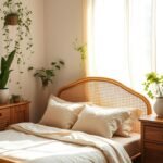
Muted Green With Blue Undertones for Serenity

Some wall treatments surprise with their color-shifting personality. This special selection might appear more blue than green at first glance. Its unique character comes from strong blue undertones that create visual interest.
Designer Minnette Jackson selected this approach for a primary sleeping area. She wanted to establish a peaceful and calming atmosphere. Her choice reflects thoughtful consideration of color psychology.
Jackson explains her inspiration for the space. She describes the room’s unique architectural features beautifully.
“Our bedroom has windows on three sides, so it feels a bit like you are perched up in your own private little treehouse”
The selected hues create a watery, serene effect perfect for relaxation. Sherwin-Williams’ Sea Salt delivers this beautiful ambiguous quality. It transitions between green and blue depending on light conditions.
This particular environment benefits from abundant natural illumination. Multiple windows enhance the color’s fluid character. The space feels connected to nature while maintaining comfort.
Consider these advantages for your personal retreat:
- Creates a calming atmosphere that promotes restful sleep
- Works beautifully with natural materials like wood and linen
- Adds visual depth through its color-shifting quality
- Feels both contemporary and timeless in appeal
- Enhances rooms with generous natural light exposure
The muted green tones establish harmony throughout the space. They provide enough color interest without overwhelming the senses. This balance creates ideal conditions for relaxation.
Your sleeping area gains a special treehouse-like feeling. The color enhances this connection to nature beautifully. It transforms ordinary spaces into extraordinary personal sanctuaries.
This designer approach demonstrates thoughtful color selection. It proves that subtle choices can create significant impact. Your space becomes a true retreat for rest and rejuvenation.
Versatile Warm White for the Best Light
Discover how the perfect neutral shade transforms spaces bathed in beautiful illumination. This approach creates harmony between light and color in remarkable ways.
Designer Minnette Jackson selected Farrow & Ball’s Pointing for a guest room with excellent light exposure. She wanted a neutral palette with earthy elements throughout the space.
This warm white provides the ideal neutral backdrop that enhances natural light beautifully. It works with virtually any style or decor preference you might choose.
The soft tone creates a clean, bright environment that feels both welcoming and relaxing. Your space gains a wonderful sense of calm and sophistication.
“The guest room gets the best light, so I wanted a neutral palette that connects with the rest of our home through earthy elements”
This versatile color allows other design elements and artwork to take center stage. It provides flexibility for changing decor styles over time without repainting.
Warm white makes sleeping areas feel spacious, airy, and filled with light. The color works beautifully with natural materials for a cohesive look.
Consider these advantages for your personal space:
- Creates the perfect foundation for any design style or color scheme
- Enhances natural light exposure throughout different times of day
- Provides warmth without overwhelming the space with color intensity
- Works harmoniously with wood tones and other natural elements
- Offers timeless appeal that remains relevant through changing trends
This talented designer approach demonstrates thoughtful consideration of light and space. The warm white establishes harmony while allowing personal expression.
Your room gains both brightness and comfort with this selection. It transforms ordinary spaces into extraordinary personal retreats filled with light.
Practical Tips for Choosing Your Perfect Bedroom Colors
Selecting the right hues for your personal space requires thoughtful planning. These practical suggestions help ensure your choices create the desired atmosphere and harmony.
Testing samples in your actual room provides the most accurate representation. Colors transform under different lighting conditions throughout the day.
Creating a cohesive look involves considering all elements in your space. Your selections should work together to establish a unified feeling.
Testing Colors in Your Actual Space
Always sample potential selections directly on your walls. Paint large swatches in multiple locations to observe variations.
View these test areas at different times throughout the day. Morning, afternoon, and evening light dramatically change appearance.
Observe how artificial lighting affects your chosen tones at night. This complete picture prevents unexpected surprises after full application.
Considering Your Room’s Lighting Conditions
Evaluate both natural and artificial illumination in your space. Rooms with abundant sunlight handle deeper tones beautifully.
Spaces with limited natural light often benefit from lighter selections. These choices create airiness and enhance perceived spaciousness.
Consider how your artificial lighting fixtures affect color perception. Warm bulbs intensify warm undertones while cool bulbs emphasize cooler notes.
Creating a Cohesive Color Palette
Develop a harmonious scheme that flows throughout your personal area. Your selections should complement existing furniture and flooring.
Create sample boards featuring paint chips, fabric swatches, and material samples. This visual approach helps ensure all elements work together.
Consider the emotional atmosphere you wish to establish. Different tones support various moods from serene calm to energetic vibrancy.
Thoughtful planning creates spaces that feel both intentional and personal. Your choices should reflect your unique style while maintaining visual harmony.
| Selection Factor | Practical Consideration | Resulting Benefit |
|---|---|---|
| Light testing | Observe colors at different times | Prevents unexpected results |
| Room lighting | Assess natural and artificial sources | Ensures proper tone selection |
| Sample boards | Combine materials visually | Creates cohesive appearance |
| Mood consideration | Align colors with desired atmosphere | Supports emotional goals |
| Existing elements | Coordinate with furniture and flooring | Maintains design harmony |
These practical approaches help transform your vision into reality. Thoughtful testing and planning ensure your space becomes a true personal sanctuary.
Beyond Paint: Incorporating Color Through Design Elements
Your sleeping space gains personality through thoughtful layering of various components. These additions bring life and character without permanent wall changes.
Smart design considers how different elements work together harmoniously. They create visual interest while maintaining overall balance.
These components allow for creative expression and easy updates. You can refresh your space seasonally or as your preferences evolve.
Using Bedding and Textiles for Color Accents
Your bedding serves as a fantastic canvas for introducing vibrant tones. These textiles offer flexibility without long-term commitment.
Consider mixing patterns and solids within your chosen palette. This approach adds depth while maintaining cohesion throughout your space.
Throw pillows and blankets provide wonderful opportunities for seasonal changes. They allow quick updates that transform your room’s atmosphere.
Area rugs introduce both pattern and color while defining spaces. They anchor your room visually while adding comfort underfoot.
Artwork and Decor That Complement Your Scheme
Wall art serves dual purposes in your personal sanctuary. It expresses your style while reinforcing your color story.
Select pieces that echo your main palette or introduce complementary tones. This creates visual harmony throughout your sleeping area.
Decorative objects offer chances for subtle color accents. Vases, sculptures, and books bring personality to shelves and surfaces.
Window treatments provide another surface for color introduction. They frame your space beautifully while controlling light and privacy.
Functional items like lamps and storage solutions contribute to your scheme. Their finishes and materials add to the overall color feel.
Layering different textures in similar colors creates depth and interest. This technique adds sophistication to your bedroom design.
Material finishes including metals and woods influence the color atmosphere. Their natural tones complement your chosen palette beautifully.
| Design Element | Color Contribution | Flexibility Advantage |
|---|---|---|
| Bedding Collections | Primary color foundation | Easy seasonal changes |
| Decorative Pillows | Accent color introduction | Quick style updates |
| Wall Art Pieces | Scheme reinforcement | Personal expression |
| Area Rugs | Pattern and color blending | Defines space areas |
| Window Treatments | Framing and light control | Complete look integration |
These approaches allow you to experiment with different looks. You can change your room’s atmosphere without repainting walls.
Your space becomes a true reflection of personal style. It maintains harmony while allowing creative expression through various elements.
Colors to Approach With Caution in Bedrooms
Some shades might work against creating the peaceful retreat you desire. Certain bold choices can disrupt the tranquil environment you want for your personal space.
Bright red brings intense energy that might interfere with relaxation. This vibrant hue creates excitement rather than calmness.
Dark purple can feel heavy and overwhelming in sleeping areas. Extensive use might create an oppressive atmosphere.
Pure black requires careful consideration for bedroom applications. Without sufficient light sources, it can create a cave-like feeling.
Vibrant orange brings too much energy for spaces designed for rest. This stimulating color might keep you awake rather than help you unwind.
Consider these factors when selecting your palette:
- Neon or extremely bright tones can cause visual fatigue over time
- Personal associations with certain shades might affect your ability to relax
- Very dark colors can make small spaces feel more confined
- Some hues might not complement natural skin tones in mirror reflections
- Future home value considerations if resale is important to you
Your bedroom’s mood depends greatly on color choices. The right selection supports restful sleep and daily rejuvenation.
These considerations help maintain a harmonious sense of peace. Thoughtful planning ensures your space becomes a true sanctuary.
Remember that personal preferences always matter most. What works for one person might not work for another.
Testing samples in your actual space provides the best guidance. Observe how colors transform under different lighting conditions.
Bringing Your Dream Color Scheme to Life
Harnessing color psychology helps craft restful retreats that promote relaxation. It transforms sleeping areas into peaceful sanctuaries. If you’re ready to create a custom sleep haven, contact Everything Home design-build studio. Their team understands your unique needs.
They guide you through selecting perfect colors and elements. This process turns your personal area into a tranquil escape. Start with inspiration images and mood boards. Visualizing your dream palette makes decisions easier.
Working with a professional avoids costly mistakes. Paint is relatively easy to change, so experiment freely. Consider how choices fit your lifestyle and routines. Think about the emotional impact you desire.
Practical factors like maintenance matter too. Your space should reflect personal style and bring joy. Take time with decisions—this is your sanctuary. Enjoy creating a retreat that feels uniquely yours.