Your personal sanctuary deserves special attention. More homeowners are turning to nature-inspired hues to create peaceful retreats.
These natural shades bring comfort and tranquility to your space. Soft greens, warm browns, and muted terracottas connect you to the outdoors.
This trend has roots in 1970s design but feels completely modern today. Earth tones offer a timeless quality that never goes out of style.
Color experts agree: natural pigments have enduring appeal throughout history. They provide a direct antidote to today’s digital chaos.
This guide will help you select and implement these soothing shades. Transform your sleeping space into a calming oasis you’ll cherish.
Why Earthy Paint Colors Are Your Bedroom’s Best Friend
There’s scientific reasoning behind why these natural shades create such comforting environments. Earth tones contain brown pigment that produces their muted appearance.
This creates a cocooning effect in your space. Havenly lead designer Toussaint Derby explains how this works psychologically.
Earth tones are inherently comforting and connect us to the natural world. They provide stability and peace as a direct antidote to modern chaos.
After years of stress and digital noise, homes have become sanctuaries. These pigments create environments that feel safe and grounded.
The connection to nature remains strong even in urban settings. This psychological benefit makes these hues perfect for relaxation spaces.
Humans have naturally gravitated toward earth-derived colors throughout history. There’s deep-rooted comfort in these organic pigments.
In contemporary home design, these tones serve as excellent foundations. They allow flexibility in decorating choices while maintaining cohesion.
Botanical and earth tone paints are taking center stage in modern interiors. They create sanctuary-like environments that counterbalance today’s fast-paced world.
Your sleeping space benefits tremendously from this calming approach. The right color selection transforms it into a true retreat.
Understanding the Earth Tone Palette: More Than Just Brown and Green
Many people think earth tones mean just brown and green. But the spectrum is much richer. This palette includes nature’s entire color story.
Think warm terracotta from clay soil. Soft sand from desert dunes. Rich ochre from mineral deposits. These shades create depth in any space.
The Psychology of Earthy Hues: Comfort and Connection
Different earth tones affect your mood in unique ways. Warm shades like terracotta and clay create cozy feelings. They make spaces feel intimate and secure.
Cooler hues like sage and slate blue bring serenity. These tones lower stress and promote relaxation. Perfect for your personal retreat.
Science shows why these colors feel comforting. Our brains recognize them from natural environments. This triggers feelings of safety and peace.
Natural pigments connect us to evolutionary memories of safe habitats. They signal resources, shelter, and community.
From Cave Walls to Modern Sanctuaries: A Brief History
Humanity’s relationship with earth tones goes back millennia. Early humans used ochre and charcoal for cave paintings. These were among the first artistic expressions.
Ancient civilizations developed sophisticated pigment techniques. Egyptians used malachite for green. Romans favored earth pigments for frescoes.
The Renaissance saw masters like da Vinci using natural pigments. These colors remained popular through every design movement.
Even when synthetic dyes emerged, earth tones never disappeared. Their timeless appeal transcends temporary trends.
Today’s interior design continues this ancient tradition. Modern technology gives us more consistent shades. But the connection to nature remains unchanged.
Earth tones work well together because they share natural undertones. This creates harmony in your color palette. They also complement other color families beautifully.
- Terracotta – Warm and energizing, reminiscent of sunset
- Clay – Soft and nurturing, like riverbed sediment
- Sand – Neutral and calming, evokes beach tranquility
- Ochre – Rich and earthy, connects to mineral deposits
- Taupe – Sophisticated neutral, balances warm and cool
Different cultures have cherished these pigments throughout history. Native American art uses natural earth pigments. African textiles feature beautiful mudcloth patterns.
This global appreciation shows their universal appeal. Earth tones speak a language everyone understands.
How to Choose the Perfect Earth Tone for Your Space
Finding your ideal natural hue requires thoughtful consideration of several factors. The right selection transforms your room into a harmonious retreat.
Light exposure dramatically affects how pigments appear throughout the day. Your room’s orientation determines how much natural illumination it receives.
Considering Your Room’s Natural and Artificial Lighting
North-facing rooms receive cool, indirect light. These spaces benefit from warmer earth shades like terracotta or clay.
South-facing rooms enjoy warm, direct sunlight. Cooler tones like sage green or slate blue work beautifully here.
East-facing rooms get morning light. West-facing spaces receive afternoon sun. Both can handle medium-toned options.
Artificial lighting also changes color perception. Warm bulbs enhance reddish undertones. Cool bulbs emphasize blue and green notes.
Test your selected shades at different times. Observe how they change from morning to evening. This ensures you love the color around the clock.
Matching Colors to Your Existing Furniture and Decor
Your current furnishings guide your color selection. Look at wood tones, fabrics, and flooring materials.
Identify undertones in your existing pieces. Warm woods pair well with terracotta and ochre. Cool grays complement sage and slate hues.
Create visual flow between connected areas. Choose shades that transition smoothly from room to room.
Consider your room’s size and ceiling height. Lighter tones make small spaces feel larger. Darker shades create intimacy in spacious rooms.
Select one or two main colors as focal points. Use supporting neutrals for balance. This creates a layered, sophisticated look.
Your personal style should shine through. Whether minimalist or maximalist, earth tones adapt beautifully. They provide the perfect natural foundation.
The Non-Negotiable Step: Testing Your Paint Colors

Skipping the sample testing phase is the most common mistake homeowners make with natural wall colors. What appears perfect in the store can transform completely in your unique space.
Natural pigments react dramatically to different lighting conditions. Your specific environment creates a color experience nobody can predict from a swatch.
Always test multiple large samples directly on your surfaces. Paint at least two-foot squares in several locations. View them on different walls with varying light exposure.
Observe these samples throughout the entire day. Morning light reveals different qualities than afternoon sun. Evening artificial lighting creates another completely different effect.
Common testing mistakes include using too-small samples or painting on incorrect surfaces. Always test on your actual walls rather than poster board. The existing wall color affects how new shades appear.
Compare your top contenders side-by-side. This direct comparison highlights subtle differences in undertones and intensity. You’ll notice which options harmonize best with your flooring and furnishings.
Pay attention to how colors interact with your textiles and wood tones. Notice if shades pull too gray, green, or pink in your specific light. These subtle shifts dramatically affect the overall mood.
Live with your test samples for at least three full days. Observe them in different weather conditions too. Cloudy days reveal color qualities that sunshine hides.
This crucial step ensures your final choice creates the peaceful sanctuary you envision. Proper testing eliminates disappointing surprises after committing to a full room.
Our Top Picks for Paint Colors for Earthy Bedroom Walls You’ll Love
After extensive research and designer consultations, we’ve curated standout options from leading brands. These selections offer exceptional quality and proven results in real homes.
Each hue brings unique character to your personal retreat. They transform spaces into nature-inspired sanctuaries.
1. Benjamin Moore’s Rich, Warming Tan
Benjamin Moore 984 (Rich Tan) creates instant coziness. This shade resembles sun-baked earth and dried grasses.
It works beautifully in north-facing rooms needing warmth. Pair it with cream textiles and dark wood accents.
Interior designer Maria Rodriguez notes its versatility.
This tan behaves like a neutral while adding warmth. It makes spaces feel instantly lived-in and welcoming.
2. Benjamin Moore’s Soothing Botanical Green
Benjamin Moore 1495 (Botanical Green) offers serene organic energy. This muted green suggests forest shadows and mossy stones.
It excels in sun-drenched south-facing spaces. The green paint balances bright light beautifully.
Combine it with natural linen and light oak furniture. This creates a fresh, airy atmosphere perfect for relaxation.
3. Benjamin Moore’s Deep Soil Brown
Benjamin Moore 2106-20 (Deep Soil Brown) makes a dramatic statement. This rich, dark shade embodies fertile earth.
It works best in large rooms with high ceilings. Ample lighting prevents it from feeling too heavy.
This sophisticated hue appeared as a color year favorite on design platforms. It pairs wonderfully with metallic accents and textured wool.
4. Sherwin-Williams’ Accessible Beige: The Perfect Warm Neutral
Sherwin-Williams SW 7036 (Accessible Beige) serves as an ideal foundation. This warm greige adapts to any lighting condition.
It complements both cool and warm-toned furnishings. The versatile shade works with traditional or modern decor.
Designers appreciate its chameleon-like quality. It never fights with other elements, creating harmonious backdrops.
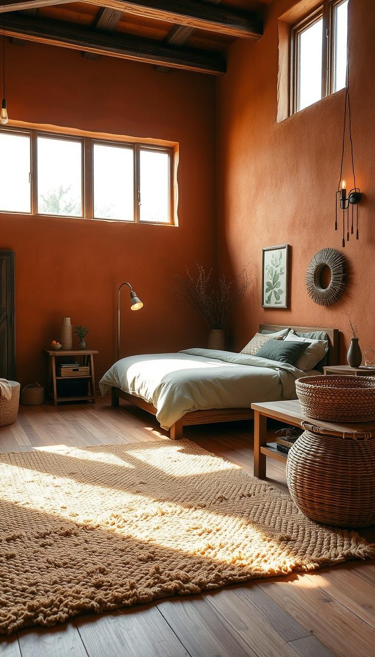
5. Sherwin-Williams’ Cavern Clay: A Warm Terracotta
Sherwin-Williams SW 7701 (Cavern Clay) brings desert warmth indoors. This terracotta hue evokes canyon walls and pottery.
It creates intimate, cocooning effects in smaller spaces. The shade works particularly well in evening lighting.
Pair it with navy blues or sage greens for contrast. These combinations highlight its earthy warmth beautifully.
6. Sherwin-Williams’ Calming Sage Green
Sherwin-Williams SW 2860 (Sage Green Light) offers muted organic tranquility. This soft green suggests distant meadows and herbal gardens.
It creates peaceful environments for rest and rejuvenation. The hue works well in east-facing rooms receiving morning light.
Combine it with white trim and natural jute rugs. This enhances its fresh, organic character throughout your space.
These carefully selected options provide excellent starting points. They deliver proven results in various bedroom configurations.
Remember to test samples in your specific environment. Lighting and existing furnishings dramatically affect final appearances.
Creating a Cohesive Earthy Color Palette in Your Bedroom

Building a harmonious natural scheme transforms your personal retreat. Experts suggest selecting one or two focal colors. Let supporting neutrals enhance these main choices.
Creamy off-whites and soft greiges create lasting appeal. These versatile bases allow your featured tones to shine brightly. They provide flexibility for any style preference.
The 60-30-10 rule guides balanced distribution. Use your dominant shade for 60% of the space. This typically covers walls and large furniture pieces.
Secondary colors fill 30% of your room. These might appear in bedding, curtains, or area rugs. Accent hues complete the remaining 10% through decor items.
Choose colors sharing similar undertones for harmony. Warm terracotta pairs beautifully with clay and sand. Cool sage complements slate blue and misty gray.
Successful schemes use varying saturations within the same family. Light walls with medium-toned textiles and dark accents create depth without monotony.
Consider these professional combinations:
- Warm Harmony: Terracotta walls, sand-colored bedding, ochre throw pillows
- Cool Serenity: Sage green walls, slate blue curtains, mist gray rug
- Neutral Foundation: Greige walls, clay accent chair, taupe textiles
Create flow between architectural elements. Paint trim in a lighter version of your wall color. Ceilings often work best in pure white or pale neutral.
Test your complete palette together before committing. View samples in both natural and artificial light. Ensure all elements work harmoniously throughout the day.
Your finished space will feel both intentional and effortlessly natural. This approach creates a sanctuary that truly reflects your personal style.
Incorporating Natural Materials for an Authentic Earthy Feel
Nothing enhances the grounded feeling of nature-derived shades like genuine, tactile materials. These organic elements create harmony with your wall tones. They bring texture and warmth that synthetic options cannot match.
Your space gains authenticity when materials feel real and natural. This approach transforms a simple room into a true sanctuary. The connection to the outdoors becomes seamless and intentional.
The Beauty of Wood Furniture and Accents
Wood pieces create the foundation for your natural sanctuary. They work beautifully with various earth-inspired shades. The right selection enhances your overall aesthetic.
Consider your wall color when choosing wood tones. Warm terracotta walls pair well with medium oak finishes. Cool sage greens complement lighter ash or pine options.
Dark walnut furniture makes a striking statement against lighter neutral walls. This contrast adds depth without overwhelming the space. Mix different wood types for a collected, rustic appearance.
Start with essential pieces like your bed frame and nightstands. Add wooden benches or dressers for additional storage. These elements create cohesion throughout your personal retreat.
Quality matters when selecting wooden items. Solid wood pieces develop character over time. They tell a story that mass-produced items cannot replicate.
For budget-friendly options, consider wooden accents instead of large furniture. Woven baskets, picture frames, or small shelves add natural warmth. These touches create the desired look without major investment.
Textiles: Linen, Wool, and Rattan
Natural fabrics complete your earthy sanctuary with comfort and texture. They soften the space while maintaining organic authenticity. These materials work in harmony with your wall colors.
Linen bedding offers breathable comfort and casual elegance. Its natural texture complements both warm and cool tones. Choose neutral shades that enhance rather than compete with your walls.
Wool throws add warmth and cozy texture during cooler months. Drape them over chairs or at the foot of your bed. Their natural insulation properties provide practical comfort.
Rattan elements bring organic pattern and visual interest. Headboards, light fixtures, or accent chairs work beautifully. These pieces add dimension without overwhelming your space.
Cotton textiles offer versatile options for window treatments and accessories. Their natural fibers align perfectly with your overall aesthetic. Choose organic varieties for enhanced authenticity.
Mix these materials thoughtfully to avoid clutter. Start with larger items like bedding and curtains. Add smaller accents through pillows and decorative objects.
Remember that natural materials age gracefully. Their imperfections contribute to the authentic character of your space. This evolving beauty reflects the natural world itself.
Using Texture to Add Depth and Warmth

Texture plays a crucial role in making your space feel complete. It adds visual interest and tactile comfort to your sanctuary. This approach creates a rich, layered environment.
Natural materials work beautifully with grounded tones. They enhance the organic feel of your retreat. The right combination makes your room inviting.
Varied surfaces catch light in different ways. This adds dimension to your color scheme. Your space gains depth without needing extra colors.
Expert designers emphasize texture’s importance. It transforms simple schemes into sophisticated environments. This technique works in any size room.
Layered Bedding and Chunky Throws
Start with your bed as the focal point. Layer different textiles for maximum comfort. This creates a cozy, inviting look.
Begin with crisp cotton sheets. Add a soft linen duvet cover. Top with a chunky knit blanket.
Mix patterns and weaves carefully. Too much variety can feel chaotic. Stick to two or three complementary textures.
Throw pillows add final touches. Use different sizes and materials. Faux fur and woven options work well.
Consider this simple layering guide:
| Layer | Material | Purpose |
|---|---|---|
| Base | Cotton sheets | Comfort and breathability |
| Middle | Linen duvet | Texture and weight |
| Top | Wool throw | Warmth and visual interest |
This approach works for any style. It adds dimension to monochromatic schemes. Your space feels curated and intentional.
Faux Fur and Woven Elements
Faux fur brings luxury and softness. It mimics natural textures beautifully. Use it in moderation for best results.
Accent rugs in faux fur add warmth underfoot. They feel wonderful when you step out of bed. Choose neutral colors that blend seamlessly.
Woven baskets offer storage and texture. They hold blankets or magazines neatly. Natural materials like rattan or jute work best.
Wall hangings add vertical interest. Macrame or textile art brings softness. These elements break up large wall spaces.
Light interacts differently with each surface. Matte textures absorb light for coziness. Shiny surfaces reflect light for brightness.
Budget-friendly options make big impact. Swap out pillow covers seasonally. Add a textured throw over existing furniture.
Your sanctuary becomes more inviting with varied touches. These elements provide psychological comfort through tactile variety.
Bringing the Outdoors In with Plants and Greenery
Nothing completes a nature-inspired space like living greenery. Plants breathe life into your personal retreat. They create a vibrant connection to the natural world.
Live specimens improve air quality while adding beauty. Their presence makes any room feel fresher and more alive. This touch of green enhances your overall design.
Choose low-maintenance varieties for easy care. Snake plants and pothos thrive in various light conditions. They tolerate occasional forgetfulness with watering.
Peace lilies and ZZ plants also adapt well. These options work beautifully in sleeping spaces. They require minimal attention while providing maximum impact.
Incorporate greenery through different methods. Potted plants sit on floors or surfaces. Hanging planters add vertical interest without consuming space.
Wall gardens create stunning living art installations. They transform blank walls into lush, green showcases. This approach works for both large and small areas.
Plants introduce natural color variation effortlessly. Their leaves offer different shades and patterns. This visual diversity complements earthy schemes perfectly.
Psychological benefits make plants valuable additions. Studies show they reduce stress and improve mood. Their presence promotes better sleep and relaxation.
Strategic placement enhances room aesthetics. Group plants in corners for lush focal points. Use taller specimens to fill empty vertical spaces.
Smaller plants work well on nightstands and shelves. They add life without overwhelming the area. Ensure they don’t interfere with daily functionality.
Limited light doesn’t mean no plants. Many varieties tolerate lower light conditions. Consider grow lights for more demanding species.
Faux options provide realistic alternatives today. High-quality artificial plants look surprisingly authentic. They offer permanent greenery without any maintenance.
Coordinate plant selections with your color scheme. Deep green leaves complement warm earth tones. Lighter foliage pairs well with cooler shades.
Fresh flowers bring seasonal beauty indoors. Small bouquets on bedside tables add special touches. They provide changing natural accents throughout the year.
Your space becomes truly complete with living elements. They transform it from merely decorated to authentically natural. This final layer creates your perfect sanctuary.
Selecting the Right Lighting to Complement Your Earthy Walls

Proper illumination transforms your nature-inspired space from ordinary to extraordinary. The right approach enhances your chosen shades while creating perfect ambiance.
Light quality dramatically affects how pigments appear throughout the day. Warm tones become richer under golden illumination. Cool hues maintain their serenity with softer lighting.
Your lighting strategy should include multiple layers for best results. Ambient lighting provides overall illumination. Task lighting focuses on specific activities. Accent lighting highlights special features.
Warm Bulbs and Soft Dimmers
Bulb selection makes a significant difference in your space’s mood. Warm white bulbs (2700K-3000K) complement earth tones beautifully. They enhance reddish and yellowish undertones in your walls.
LED options offer energy efficiency with excellent color rendering. Incandescent bulbs provide classic warm glow but use more energy. Halogen lights deliver bright, crisp illumination that works well too.
Dimmer systems give you complete control over ambiance. They allow adjustment from bright morning light to soft evening glow. This flexibility supports different activities throughout the day.
Install dimmers on overhead fixtures and bedside lamps. This creates a cozy atmosphere perfect for relaxation. You can easily transition from reading light to sleep preparation.
Natural Material Lampshades: Rattan and Fabric
Fixture materials contribute to your overall natural aesthetic. Rattan and woven shades add organic texture to your lighting. They create beautiful light patterns that enhance wall colors.
Fabric shades in linen or cotton provide soft, diffused illumination. They reduce glare while maintaining warm light quality. Natural materials align perfectly with your earth-inspired design.
Consider pendant lights with rattan shades above nightstands. Table lamps with fabric shades offer soft bedside lighting. Wall sconces with natural materials provide space-saving solutions.
These elements work together to create harmonious illumination. They enhance rather than compete with your wall colors. The result is a perfectly balanced sanctuary.
Window treatments play a crucial role in natural light management. Sheer curtains allow soft daylight while maintaining privacy. They help distribute natural illumination evenly throughout your space.
Use lighting to highlight architectural features and textural elements. Directional spots can emphasize a beautiful headboard or artwork. This technique adds depth and visual interest.
Budget-friendly options make significant impact too. Swap existing shades for rattan alternatives. Add plug-in wall sconces without electrical work. These small changes refresh your space affordably.
The right approach transforms your personal retreat completely. It enhances your chosen colors while creating perfect mood lighting. Your sanctuary becomes both functional and beautifully illuminated.
Earth-Toned Bedding and Textile Choices
Your sleeping space deserves textiles that enhance its natural vibe. The right bedding can transform your room into a true sanctuary. Choose hues that complement your wall shade for perfect harmony.
Start with a foundation of neutral sheets and duvet covers. These pieces should match your main wall tone. Add layers with different textures and patterns for visual interest.
Mix solids and patterns within the same color family. A striped pillow pairs beautifully with a solid throw. Botanical prints add playful energy without overwhelming the space.
Consider material quality for both comfort and durability. Natural fibers like linen and cotton offer breathable comfort. These materials age gracefully and feel wonderful against your skin.
Introduce accent colors through smaller textile items. Mustard yellow pillows brighten a clay-colored bed. Olive green throws deepen a sand-toned scheme beautifully.
Seasonal changes keep your space feeling fresh year-round. Lightweight cotton works perfectly for summer months. Switch to wool or flannel during colder seasons.
Window treatments should coordinate with your bedding. Match curtain colors to your throw pillows or accent pieces. This creates a cohesive look throughout the room.
Refresh your textiles without complete replacement. New pillow covers or a throw blanket make big impact. These budget-friendly updates transform your space easily.
Quality textiles contribute significantly to your bedroom experience. They provide tactile comfort and visual warmth. Earth-toned palettes create balanced, harmonious environments that feel both stylish and serene.
Remember that layered bedding adds depth and coziness. A chunky knit throw over a woven coverlet creates wonderful texture. These elements make your bed inviting and comfortable.
Your final result should feel intentionally curated yet effortlessly natural. The right textile choices complete your peaceful retreat perfectly.
Accent Walls and Architectural Features

A single statement surface can transform your entire space. It adds visual interest without overwhelming your natural color scheme. This approach creates depth and character in your personal retreat.
Focus on the wall that naturally draws attention. This is often the one behind your headboard. Sometimes it’s a wall with unique architectural details.
Consider your room’s layout before deciding. The accent should enhance, not compete with, your furniture arrangement. Proper placement creates balance and harmony.
Various techniques achieve different effects. Paint creates subtle definition. Wallpaper adds pattern and texture. Wood introduces natural warmth.
These features solve design challenges beautifully. They can make awkward rooms feel intentional. Sloped ceilings or odd angles become design assets.
Wood Slat and Paneled Accent Walls
Wood surfaces bring organic texture to your space. They complement nature-inspired color schemes perfectly. The material adds warmth and tactile interest.
Slat walls create rhythm and movement. The linear pattern guides the eye gracefully. This technique works with both modern and traditional decor.
Paneling offers classic elegance. Shiplap or board-and-batten styles add character. These options provide depth without heavy visual weight.
Finish choices affect the final look. Natural wood grain showcases beautiful variations. Stained options enhance the material’s inherent warmth.
Painted paneling blends seamlessly with your scheme. Choose a shade slightly darker than your other surfaces. This creates subtle contrast and dimension.
Installation doesn’t require professional skills. Many DIY options are available today. Peel-and-stick wood panels make updating easy.
Consider this comparison for your project:
| Feature | Wood Slats | Wood Paneling |
|---|---|---|
| Visual Effect | Modern, linear | Traditional, textured |
| Installation | Moderate difficulty | Beginner-friendly |
| Cost Range | $$-$$$ | $-$$ |
| Maintenance | Easy cleaning | Dust-prone |
Coordinate with other elements in your room. Match wood tones to furniture finishes. Ensure harmony with flooring materials.
Your accent becomes a beautiful backdrop. It enhances rather than dominates your space. The result feels both intentional and effortless.
The Power of a Bold Botanical Wallpaper
Nature-inspired patterns create instant focal points. They transform plain surfaces into artistic statements. This approach brings the outdoors inside beautifully.
Botanical designs range from subtle to dramatic. Fern prints suggest forest tranquility. Tropical leaves add vibrant energy.
Color selection matters greatly. Neutral-toned patterns blend softly with earth schemes. Dark florals make bold statements against lighter walls.
Scale affects the overall impact. Large patterns work best on big walls. Smaller repeats suit compact spaces better.
Professional designer Emma Fletcher explains the appeal:
Botanical wallpaper creates depth and movement that paint alone cannot achieve. It tells a story and connects us to nature in the most direct way possible.
Placement requires thoughtful consideration. Feature walls behind beds work beautifully. Alcoves or reading nooks become special destinations.
Modern options include peel-and-stick varieties. These allow easy experimentation. They’re perfect for rental homes or frequent updates.
Coordinate with your existing textiles. Pull colors from patterns for throw pillows. This creates a cohesive, designed look.
Your space gains personality and charm. The wallpaper becomes a conversation starter. It reflects your personal connection to nature.
Balance bold patterns with simple elements. Solid-colored furniture prevents visual overload. Minimal decor keeps the focus on your beautiful wall.
This approach transforms ordinary rooms into extraordinary retreats. It adds artistry and natural beauty to your daily environment.
Accessorizing Your Earthy Bedroom
The final layer of your nature-inspired retreat comes through thoughtful accessories. These elements add personality while maintaining your serene atmosphere. They complete the transformation into your perfect sanctuary.
Choose pieces that enhance rather than compete with your scheme. The right selections create harmony throughout your space. They should feel intentional yet effortless.
Artwork: Botanical Prints and Natural Scenes
Nature-themed art complements your walls beautifully. Botanical prints bring organic patterns indoors. Landscape photography connects you to outdoor vistas.
Select artwork with similar tones to your walls. Look for pieces that share undertones with your color scheme. This creates visual cohesion throughout your space.
Frame selection matters for natural themes. Wood frames with simple profiles work best. They add warmth without distracting from the art itself.
Matting should complement both art and walls. Neutral mats in cream or soft gray create balance. They allow the artwork to shine beautifully.
Consider creating gallery walls with nature themes. Mix botanical prints with landscape photographs. Include pressed flowers or leaves for texture.
Professional designer Sarah Jenkins explains the approach:
Art should whisper rather than shout in natural schemes. Choose pieces that feel like extensions of your walls rather than competing elements.
Place artwork at eye level for best impact. Group smaller pieces together for greater presence. This creates focal points without clutter.
Decor: Ceramics, Baskets, and Dried Florals
Natural decor elements add wonderful texture to your space. Ceramic vases and stone sculptures bring earthy authenticity. Woven baskets offer both function and beauty.
Hand-thrown pottery works beautifully with natural schemes. The imperfect shapes feel organic and genuine. They complement your walls perfectly.
Stone pieces add mineral richness to your decor. Choose items with natural finishes and textures. They connect your space to geological elements.
Baskets provide storage while adding visual interest. Use them for blankets, magazines, or remote controls. Natural materials like rattan or seagrass work best.
Dried flowers offer year-round natural texture. They maintain their beauty without maintenance. Choose seasonally appropriate varieties for best results.
Macrame brings bohemian charm to your walls. Use it for plant hangers or decorative pieces. The woven texture complements other natural elements.
Create curated collections without overwhelming your space. Group three similar items together on a shelf. Leave breathing room between groupings.
Negative space allows your accessories to shine. Edit your decor until each piece feels intentional. This prevents visual clutter in your peaceful retreat.
DIY options add personal touches to your space. Create pressed flower art from garden finds. Make stone sculptures from collected river rocks.
Seasonal rotations keep your space feeling fresh. Switch dried florals with the changing seasons. Update decorative pillows for different times of year.
Your accessories should reflect your personal connection to nature. They complete your sanctuary with meaning and beauty. The final result feels both curated and authentically yours.
Your Journey to a Peaceful, Earthy Bedroom Sanctuary Starts Now
Creating a personal retreat begins with embracing nature-inspired shades. These tones bring comfort and tranquility to your space.
Remember to test your chosen hues in your unique environment. Lighting and existing decor affect how shades appear throughout the day.
Start small with accent pieces or a single wall. This approach makes the transformation manageable and budget-friendly.
Trust your instincts while applying these design principles. Your personal sanctuary should reflect your connection to the natural world.
Begin today by selecting samples that resonate with you. Your peaceful retreat awaits—transform your space into the calming oasis you deserve.