Welcome to your complete guide for creating an amazing personal space your son will adore. This journey transforms an ordinary room into a special place that shows off his unique personality.
Choosing the right shades for your child’s room is more important than you might think. The perfect selection can boost creativity, improve mood, and even help with better sleep at night.
We’ll explore everything from classic neutral tones to exciting bold accents. These options work wonderfully in any boy’s personal area and can adapt as he grows older.
Get ready to make this project fun for both you and your child. Our guide will help you create a space that makes everyone happy with the final result.
How to Choose a Paint Color Your Son (And You) Will Love
Finding the perfect shade for your child’s room requires teamwork. The right approach creates a space that reflects his personality while maintaining a cohesive look you both appreciate.
Collaboration is key when making design decisions. This process should be fun rather than stressful for everyone involved.
Narrow Down the Options Together
Start by asking your son to pick two favorite colors. This gives him input while keeping options manageable.
Visit a paint store yourself to select 3-4 parent-approved versions of those hues. Then let your child make the final choice from your pre-selected options.
This method maintains your oversight while giving your kid a voice in the decision. It’s a smart way to balance preferences.
“The best rooms allow children to express themselves while maintaining design integrity that grows with them.”
Using an Accent Wall for Bold Choices
When your son wants dramatic or dark shades, consider using just one wall. This technique contains bold colors without overwhelming the entire space.
Accent walls work particularly well behind beds or on feature walls. They create visual interest while keeping the overall scheme balanced.
This approach satisfies your child’s desire for vibrant colors while maintaining your preference for a more subdued palette.
Considering the Room’s Lighting and Exposure
Natural light dramatically affects how colors appear in a room. North-facing spaces often benefit from warmer tones that add coziness.
South-facing rooms typically work better with cooler shades that balance the abundant natural light. Always test samples on your walls before committing.
Observe how colors change throughout the day. This ensures you make an informed choice that works in all lighting conditions.
| Room Exposure | Recommended Color Temperature | Visual Effect |
|---|---|---|
| North-Facing | Warm Tones | Adds warmth and coziness |
| South-Facing | Cool Tones | Balances bright light |
| East-Facing | Medium Warmth | Complements morning light |
| West-Facing | Versatile Neutrals | Works with changing light |
The chair rail technique offers another excellent solution. Paint the top portion neutral and let your child choose the bottom color.
This design allows for easy updates as tastes change. Simply repaint the lower section when your son wants a new look.
These strategies help create a space that satisfies both generations. The result is a room that feels personal yet professionally designed.
Timeless Neutral Bases for Flexibility and Growth

Starting with a neutral foundation creates a room that grows with your child through different stages. These versatile backdrops adapt beautifully as interests change over the years.
Neutral walls provide the perfect canvas for personal expression. They allow colorful bedding, artwork, and accessories to take center stage without clashing.
Classic Warm Whites and Off-Whites
Warm white shades create a clean, inviting atmosphere that feels both fresh and cozy. Options like Benjamin Moore’s White Dove or Sherwin Williams’ Pure White offer subtle warmth without appearing sterile.
These light tones make spaces feel larger and more open. This is particularly valuable in smaller rooms where every inch counts.
Off-whites like Paper Mache AF-25 or White Down OC-131 have stood the test of time. They provide a versatile backdrop that works with any decor style your child might love.
Versatile Light Grays and Greiges
Light gray tones bring sophistication while maintaining a youthful feel. Greige options (gray-beige blends) offer the perfect balance of warm and cool undertones.
Distant Gray OC-68 represents an excellent choice in this category. It creates a calming environment that supports both play and study time.
These neutral bases work with sports themes, academic decor, or adventure motifs. You won’t need to repaint when your son’s interests evolve.
“Neutral walls are the secret weapon of smart children’s room design—they adapt as quickly as kids grow.”
The long-term benefits extend beyond just adaptability. Neutral palettes contribute to better resale value for your home when maintained properly.
Starting with these timeless options means easier updates down the road. Simply change accessories rather than undertaking major painting projects.
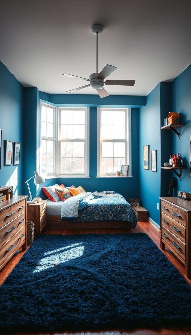
Blue Hues: The Go-To Choice for a Calming Retreat

Blue continues to be the top pick for creating peaceful personal spaces. This versatile shade offers both visual appeal and psychological benefits that make it ideal for any child’s sanctuary.
Different blue tones create distinct atmospheres in your son’s personal area. Lighter shades promote relaxation while deeper variations add character and depth.
Soothing Light Blues and Blue-Greens
Soft blue and blue-green blends create a serene environment perfect for unwinding. These airy tones make spaces feel larger and more open.
Light blue shades work beautifully in rooms where your child spends time relaxing or sleeping. They create a retreat-like atmosphere that encourages peaceful moments.
Blue-green combinations offer a subtle connection to nature. These hues bring a calming coastal vibe that works year-round.
Striking and Classic Navy Blues
Deep navy tones add sophistication without feeling too heavy. These rich shades create a grounded, masculine feel that grows well with your son.
Benjamin Moore Newburyport Blue represents an excellent navy option. It provides depth while maintaining enough brightness for comfortable living spaces.
Darker blues work wonderfully as accent walls or in well-lit rooms. They pair beautifully with crisp white trim for a classic combination.
“Blue bedrooms have been shown to promote restful sleep and reduce anxiety, making them perfect for children’s spaces.”
The psychological benefits of blue make it particularly valuable in sleeping areas. Studies show blue environments can lower heart rates and reduce stress levels.
Pair blue walls with complementary accents for a balanced look. White, gray, red, or orange accessories create vibrant contrast against blue backgrounds.
| Blue Shade Type | Mood Effect | Best Room Placement |
|---|---|---|
| Light Blue | Calming and peaceful | All walls in smaller rooms |
| Blue-Green | Serene and natural | North or east-facing walls |
| Medium Blue | Balanced and versatile | Accent walls or entire rooms |
| Navy Blue | Dramatic and sophisticated | Feature walls or large spaces |
Consider the existing furniture and lighting when selecting blue tones. Test samples at different times of day to ensure the color works in all conditions.
Blue remains a timeless choice that adapts to changing tastes and styles. It provides the perfect foundation for creating a personal space your son will love for years.
Energetic Greens for a Nature-Inspired Vibe

Bring the outdoors inside with nature-inspired shades that energize and calm simultaneously. These earthy tones create spaces that feel both adventurous and peaceful.
Green hues connect your son to the natural world while supporting creativity and focus. They work beautifully in study areas and play zones alike.
Serene Sea Salt and Sage Tones
Soft green-blue blends like Sherwin Williams Sea Salt create subtle sophistication. These chameleon colors shift with changing light throughout the day.
Sea Salt offers a versatile foundation that pairs beautifully with natural wood tones. It provides just enough color without overwhelming smaller spaces.
Sage greens bring earthy tranquility to any personal area. These muted tones work well in rooms facing north or east where natural light is softer.
Fun and Bold Teal Accents
Vibrant teal shades inject personality and modern energy into your design. These bold choices make excellent accent walls behind beds or desks.
Teal creates fantastic contrast against neutral furniture and white trim. It brings youthful energy while maintaining design sophistication.
Consider using these brighter tones on just one wall if you want to make a statement. This approach keeps the room feeling balanced and intentional.
“Green spaces have been shown to boost creativity and reduce stress—perfect benefits for any child’s personal retreat.”
Complementary colors enhance green’s natural beauty. Consider these pairings:
- Cream and white for crisp, clean contrast
- Warm wood tones for natural harmony
- Orange and yellow accents for energetic pops
- Primary red for nautical or sporty themes
If full walls feel like too much commitment, incorporate green through furniture or decor. A teal bookshelf or sage bedding can introduce color without permanent changes.
Remember that lighting dramatically affects how green tones appear. Test samples at different times before making your final selection.
These nature-inspired options create spaces that grow with your son through many years. They provide the perfect backdrop for both quiet moments and active play.
Unexpected Pops of Color: Red, Orange, and Beyond

Sometimes the most memorable spaces come from daring color decisions that break from tradition. These vibrant choices can transform an ordinary area into something truly special.
When used strategically, bold hues create focal points and energy. They work particularly well in spaces where your child plays and creates.
Cheery Red for a Nautical or Sporty Theme
Classic red makes an instant impact in any personal space. This vibrant choice works wonderfully for nautical themes or sports decor.
Consider using red on an accent wall behind the bed. Pair it with navy blue and white for a timeless maritime look.
You can incorporate this energetic hue through:
- Striped patterns with white or navy
- Anchor or sailboat motifs
- Sports team memorabilia displays
- Red bedding or storage solutions
This approach keeps the energy contained while making a strong style statement. The result feels intentional rather than overwhelming.
Vibrant Orange for a Modern Geometric Look
Orange brings contemporary energy to your design scheme. This warm tone creates excitement without feeling too aggressive.
Geometric patterns using orange make excellent focal points. Consider triangles, chevrons, or modern shapes on one wall.
Pair orange with:
- Cool gray tones for balance
- Crisp white for clean contrast
- Deep blue accents for sophistication
- Natural wood elements for warmth
These combinations create a youthful yet polished atmosphere. The space feels modern and inviting simultaneously.
“Warm colors like red and orange stimulate creativity and energy when used in appropriate doses—perfect for play areas and study zones.”
Remember to test your paint samples in the actual room. Natural light changes how these bright colors appear throughout the day.
This careful way of incorporating bold hues ensures your space feels balanced. You create excitement without visual overload.
Creative and Themed Paint Ideas for Boys Bedrooms

Transform your son’s personal space into an imaginative world that sparks creativity and adventure. These themed approaches turn ordinary walls into extraordinary experiences that reflect his unique personality.
Themed designs create immersive environments that stimulate young minds. They offer wonderful opportunities for personal expression while maintaining a cohesive look throughout the room.
Adventure-Themed Murals
Mountain murals create breathtaking landscapes using watercolor techniques. You can customize these designs with lighter and darker shades to achieve incredible depth.
Start with a base coat of soft gray or blue. Then layer different tones to create realistic mountain ranges that seem to disappear into the distance.
Space-themed walls transform ceilings and walls into galactic wonders. Use deep blue or black as your backdrop for painted planets, stars, and nebulae.
Consider these elements for your space theme:
- Glow-in-the-dark paint for stars that shine at night
- Metallic accents for planets and moons
- Comet trails using white and silver brush strokes
- Floating astronaut or rocket ship silhouettes
“Themed murals don’t just decorate walls—they create entire worlds where imagination can flourish and grow.”
Superhero and Gaming-Inspired Accents
Superhero skylines bring urban energy to your design. Create black graffiti-style skyscrapers against white walls with bright accent colors for heroic pops.
This approach works beautifully as a feature wall behind the bed. The dramatic contrast makes the space feel dynamic and exciting.
Gaming-inspired elements offer modern graphic appeal. Think pixel art, controller motifs, or character silhouettes in bold, vibrant hues.
Strategic color blocking creates visual interest without overwhelming the space. Use tape to create clean lines and geometric patterns.
Consider these implementation approaches:
- DIY stencils for consistent shapes and patterns
- Wall decals that can be removed as interests change
- Professional mural artists for complex designs
- Mix-and-match elements that can evolve over time
Balance themed elements with practical considerations. Keep most walls neutral to allow the theme to shine without dominating the entire room.
This smart approach ensures the space can grow with your child. You can easily update accents as his interests evolve through different stages.
Themed designs create personal spaces that truly reflect your child’s passions. They turn ordinary rooms into special places filled with imagination and joy.
Benjamin Moore Standouts: Tried-and-True Favorites
When it comes to creating a space that lasts through the years, certain paint colors stand out for their reliability and beauty. Benjamin Moore offers some exceptional options that have proven themselves time and again in real homes.
These shades provide excellent coverage and consistent results. They work beautifully in any child’s personal space, from a young child’s nursery to a teenager’s retreat.
Stonington Gray for a Versatile Light Backdrop
Stonington Gray delivers a sophisticated light gray with subtle undertones. This versatile shade adapts beautifully to changing decor styles over time.
It works particularly well in south-facing rooms or well-lit north-facing spaces. The color maintains its integrity under various lighting conditions throughout the day.
Consider these complementary pairings:
- Crisp white trim for clean contrast
- Vibrant blue accents for nautical themes
- Warm wood tones for natural balance
- Bold red elements for energetic pops
This gray provides the perfect neutral foundation. It allows colorful accessories and artwork to shine without competing for attention.
Newburyport Blue for a Perfect Navy
Newburyport Blue offers a stunning navy option that feels substantial without being too heavy. Compared to darker navies, this shade maintains brightness and energy.
It creates a classic, masculine feel that grows beautifully with your child. The color works wonderfully as an accent wall or for an entire room in spaces with good natural light.
“Quality paints like Benjamin Moore offer better coverage and durability, meaning your beautiful color choice will look great for years to come.”
Test your samples at different times of day. Observe how the color changes with natural and artificial lighting in your specific space.
These Benjamin Moore favorites provide excellent value through their performance and longevity. They create a wonderful foundation for a room your child will love through many stages.
Sherwin-Williams Winners: Top Picks for Boys’ Rooms
Some paint color options stand out for their ability to create amazing spaces that last. These sherwin williams selections have proven themselves in countless homes across the country.
They offer unique characteristics that work wonderfully in various settings. These shades adapt beautifully as your child grows and his tastes evolve.
Sea Salt for a Subtle Green-Blue Blend
Sea Salt creates a serene atmosphere with its beautiful blue-green blend. This chameleon shade changes subtly throughout the day with shifting light conditions.
It works particularly well in north-facing spaces where natural light is softer. The color maintains its sophisticated appeal while adding visual interest.
Consider these complementary approaches:
- Pair with crisp white trim for clean contrast
- Add natural wood elements for warmth
- Incorporate navy accents for coastal vibes
- Use textured fabrics to enhance the organic feel
This versatile option transitions beautifully from childhood to teenage years. It provides just enough color without overwhelming the space.
Cloudburst for a Burst of Fun Teal
Cloudburst delivers energetic personality without going too extreme. This vibrant teal works wonderfully for entire walls or strategic accents.
It creates a modern, youthful feel that grows exceptionally well with children. The shade maintains its appeal through different developmental stages.
“Teal shades like Cloudburst offer the perfect balance of energy and sophistication—they transition beautifully from playful childhood to cool teenage spaces.”
Test this color in your specific lighting conditions before committing. Observe how it changes from morning to evening in your son’s personal area.
Cloudburst pairs beautifully with:
- Warm gray tones for balance
- White furniture for crisp contrast
- Orange accents for energetic pops
- Natural textures for grounded appeal
This teal option works particularly well in well-lit spaces. It brings personality while maintaining design integrity.
Both these sherwin williams winners offer excellent coverage and durability. They create foundations for spaces that reflect your child’s personality while maintaining timeless appeal.
Remember to sample these colors on your actual walls before making final decisions. Lighting conditions dramatically affect how these complex tones appear throughout the day.
Designer Tricks: Using Accents and Ceilings
Elevate your son’s personal space with clever design strategies that go beyond standard wall treatments. These professional techniques add depth and personality while maintaining flexibility for future changes.
Creative approaches can transform ordinary rooms into extraordinary environments. The right touch makes all the difference in creating a cohesive yet exciting atmosphere.
Making a Statement with a Painted Ceiling
Your ceiling offers a fantastic canvas for adding unexpected visual interest. A painted ceiling draws attention upward and creates a memorable focal point.
Consider a whimsical circus tent design with bold red and white stripes. This playful approach pairs beautifully with teal green walls for a balanced yet exciting look.
Sky-themed ceilings create an illusion of expanded space. Use soft blue backgrounds with white cloud details for a serene atmosphere.
“The fifth wall—your ceiling—offers incredible potential for adding personality without overwhelming the entire room’s design.”
Complementary color schemes work wonderfully for overhead surfaces. Choose a shade that enhances your wall colors without matching them exactly.
These creative options allow you to incorporate bold choices in manageable doses. You get dramatic impact without committing to entire walls of intense color.
Incorporating Color Through Furniture and Decor
Strategic use of furnishings and accessories provides excellent color introduction opportunities. This approach offers maximum flexibility as your child’s preferences evolve.
Vibrant furniture pieces make fantastic statement makers. A brightly colored bookshelf or desk adds personality without permanent changes.
Bedding and textiles offer another wonderful way to introduce patterns and hues. These elements can be easily swapped when your son wants a new look.
Consider these decor elements for adding visual interest:
- Area rugs with geometric patterns or bold colors
- Artwork that incorporates your accent palette
- Throw pillows in complementary shades
- Window treatments that coordinate with your theme
The 60-30-10 rule helps maintain visual balance throughout the space. Use 60% dominant color, 30% secondary shade, and 10% accent tones.
| Design Element | Color Percentage | Implementation Examples |
|---|---|---|
| Main Color | 60% | Walls, large furniture, flooring |
| Secondary Color | 30% | Bedding, window treatments, medium furniture |
| Accent Color | 10% | Throw pillows, artwork, small accessories |
This balanced approach creates a harmonious environment that feels intentionally designed. You achieve visual interest without overwhelming the senses.
Remember that lighting affects how colors appear on different surfaces. Test your choices in the actual room before making final decisions.
These designer techniques offer wonderful flexibility for creating spaces that grow with your child. You can easily update elements as tastes change through different stages.
Your Action Plan for a Successful Bedroom Makeover
You now have all the tools to create a fantastic personal space for your son. Let’s put everything together into a simple action plan.
Start by preparing the room properly. Move furniture to the center and cover everything with drop cloths. Clean the walls thoroughly before you begin.
Choose durable, easy-to-clean paint finishes. Satin or semi-gloss options work beautifully for active spaces. They handle scrubbing and resist marks well.
Always select non-toxic, low-VOC paints for health and safety. These options are specifically designed for children’s environments.
Plan your timing carefully to minimize disruption. Consider doing the project over a weekend when your household routine is more flexible.
After painting, ensure proper ventilation while the room dries. Then enjoy styling the space with new decor that complements your color choice.
Maintain your beautiful walls by addressing scuffs promptly. Keep some touch-up paint for quick fixes over time.
You’re ready to transform that room into a special place your child will love for years. Trust your planning and enjoy the creative process!