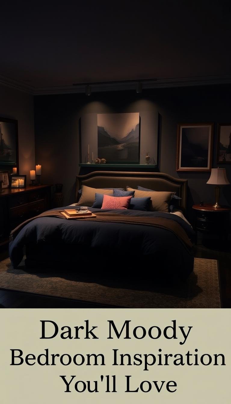
Welcome to your ultimate guide for creating a space that feels both cozy and sophisticated. This style captures personal flair while ensuring complete relaxation.
Discover how deep color palettes can transform your room into a personal sanctuary. You start and end each day feeling completely at ease.
Interior designers and homeowners alike embrace this look. It balances richness with warmth, creating an intimate rather than heavy vibe.
Explore various design ideas, from minimalistic modern to textured spaces with dramatic flair. The right mix of colors, textures, and lighting makes all the difference.
Your home deserves a style that reflects calm and comfort. Get ready to be inspired by practical approaches that work in any setting.
Why You Should Embrace a Dark Moody Bedroom
Your personal sanctuary deserves a design that truly reflects you. This style transforms your space into a cocoon-like retreat.
Deep tones create intimate environments perfect for relaxation. They help you unwind after long days and promote better sleep.
Many interior designers love this approach for its dramatic impact. It allows your personality to shine through in every detail.
Contrary to popular belief, these colors can make rooms feel larger. They create optical illusions that expand your perception of space.
The psychological benefits are significant. Reduced visual stimulation creates calming environments that soothe your mind.
These rich hues provide perfect backdrops for artwork and textiles. Your decorative elements stand out beautifully against deep walls.
The versatility might surprise you. This style ranges from modern minimalist to traditional romantic looks.
Lighting plays beautifully against these surfaces. It creates different moods throughout your day with simple adjustments.
When executed properly, these spaces feel incredibly cozy and welcoming. They become your favorite place to start and end each day.
Your home should represent comfort and personal style. This design approach achieves both in the most beautiful way.
1. Pair Black With Dark Gray for a Layered Look
Layering different shades creates incredible depth in your personal space. This approach adds sophistication without overwhelming your senses.
Meredith Owen Interiors mastered this technique beautifully. They combined charcoal walls with a jet black four-poster frame.
The contrast between these similar hues creates visual interest. Your eyes move around the room discovering new details.
Choosing Your Shades of Gray and Black
Selecting complementary tones requires careful consideration. Test paint samples in your actual space before committing.
Lighting dramatically affects how colors appear. Natural light reveals different undertones than artificial lighting.
Consider these factors when choosing your palette:
- Room orientation and natural light availability
- Existing furniture and wood finishes
- Desired mood and atmosphere
- Other accents and textures in the space
Gray shades range from cool blue undertones to warm taupe bases. Black can lean toward brown or blue depending on the formula.
The Impact of Mixed Bedding
Your bed becomes the focal point with strategic textile choices. Mixing light and dark bedding breaks up the color scheme beautifully.
This technique maintains the rich aesthetic while adding dimension. It prevents the space from feeling too uniform.
“The interplay between light and dark textiles creates movement and interest. It’s about balance rather than matching perfectly.”
Four-poster frames in black make dramatic statements against gray backgrounds. They anchor the room while allowing other elements to shine.
Your layered approach should feel intentional yet comfortable. The result is a space that feels both designed and livable.
2. Create a Monochromatic Moment with Black on Black
Transform your personal retreat into a sophisticated sanctuary with an all-black approach. This bold choice creates a cohesive and immersive experience that feels both edgy and elegant.
Designer Breeze Giannasio champions this technique for maximum impact. Her work demonstrates how monochromatic schemes can achieve incredible depth.
Painting everything from walls to window frames in deep hues creates visual harmony. You eliminate competing elements that might disrupt your peaceful atmosphere.
Using Glossy Finishes for Drama
Different paint sheens create subtle contrasts within your monochromatic scheme. Glossy trim against matte walls adds dimension without introducing other colors.
Light interacts uniquely with various finishes throughout the day. Glossy surfaces reflect light differently, creating dynamic visual interest.
Consider these finish combinations for your space:
| Surface | Recommended Finish | Visual Effect |
|---|---|---|
| Walls | Matte or Eggshell | Absorbs light, creates depth |
| Trim & Frames | Semi-Gloss or High-Gloss | Reflects light, adds dimension |
| Ceiling | Flat | Recedes visually, enhances height |
| Doors | Satin | Balances matte and glossy elements |
Textural elements prevent your space from feeling flat or one-dimensional. Layer bedding with varying fabrics to maintain visual richness.
“Glossy finishes on trim create subtle reflection points that guide the eye around the room. It’s about creating movement within a monochromatic palette.”
This approach works exceptionally well in sleeping quarters where intimacy matters most. The cohesive color scheme promotes relaxation and reduces visual stimulation.
Your finished space will feel both dramatic and perfectly balanced. It becomes a true reflection of sophisticated personal style.
3. Introduce Earthy Warmth with Deep Green Hues

Bring nature’s tranquility into your personal retreat with rich green tones. These colors create organic, inviting atmospheres that feel both grounded and sophisticated.
Deep greens transform any space into a peaceful sanctuary. They work beautifully in various lighting conditions and architectural styles.
Benjamin Moore’s Forest Floor
This particular shade offers incredible depth and versatility. Forest Floor creates a balanced, natural feeling that enhances relaxation.
The color shifts beautifully throughout the day. Morning light reveals different undertones than evening illumination.
Many designers love this hue for its adaptability. It works well even without expensive rugs or elaborate molding.
“Forest Floor creates such a rich, organic base for any room. It’s surprisingly versatile and always feels inviting.”
Pairing Green with Natural Wood Accents
Warm wood tones complement deep green walls perfectly. This combination creates harmonious, nature-inspired spaces.
Consider these natural material pairings:
- Reclaimed wood nightstands
- Rattan light fixtures
- Woven textile accents
- Live-edge wood furniture
Your green palette provides an excellent backdrop for both modern and traditional pieces. The color enhances rather than competes with your furniture.
Natural light plays beautifully against these rich hues. It creates dynamic shadows and highlights throughout your space.
This approach works particularly well in older homes with existing wood features. The green tones highlight architectural character beautifully.
Your finished room will feel both intentional and effortlessly comfortable. It becomes a true reflection of nature-inspired design.
4. Define Your Space with a Painted Accent Wall
Create instant focus in your sleeping area with one statement wall. This approach delivers dramatic impact without overwhelming your entire room.
Painting just one surface allows you to experiment with deep tones. You maintain brightness while adding sophisticated character.
Your accent wall becomes the natural focal point behind your bed. It draws attention to your most important furniture piece beautifully.
This technique works exceptionally well in various room sizes. Even smaller spaces gain dimension without feeling closed in.
Incorporating Architectural Shapes like Arches
Add architectural interest by painting shapes within your accent wall. Arches create soft, elegant transitions between color zones.
Lighter colors within these shapes provide beautiful contrast. They break up the deep tones while maintaining cohesion.
Consider these placement ideas for arched details:
- Centered behind your headboard for symmetrical balance
- Offset to one side for dynamic, asymmetrical interest
- Multiple smaller arches for rhythmic repetition
- Extending onto the ceiling for dramatic effect
These curved forms add organic softness to geometric spaces. They create visual movement that guides the eye around your room.
Adding Horizontal Slats for Texture
Wood slats introduce warmth and dimension to your painted surface. Horizontal placement creates the illusion of width in narrow rooms.
Black wood against deep walls adds subtle contrast. The natural grain provides texture that flat paint cannot achieve.
This table shows effective slat installation techniques:
| Slat Width | Spacing | Finish | Visual Effect |
|---|---|---|---|
| 2-3 inches | 1-2 inch gaps | Matte black | Subtle shadow lines |
| 4-6 inches | 3-4 inch gaps | Natural wood | Warm contrast |
| Varied widths | Random spacing | Mixed finishes | Organic texture |
Natural light plays across these textured surfaces beautifully. It creates changing patterns throughout the day.
“Horizontal elements create calming, expansive energy in sleeping spaces. They guide the eye gently across the room rather than upward.”
Your slatted wall becomes both artwork and architecture. It provides tactile interest that enhances your overall design.
This approach defines your sleeping area with clear visual boundaries. It creates intimacy without complete enclosure.
Experiment with these ideas to find your perfect balance. Your accent wall will transform your entire room’s atmosphere.
5. Add an Edgy Yet Calming Touch with Moody Purple

Transform your personal space with rich purple tones that offer both edge and elegance. This unconventional choice creates a truly unique atmosphere in your sleeping area.
Interior expert Mary Patton champions this bold approach. She shows how deep purple can feel both dramatic and deeply peaceful.
Purple combines blue’s stability with red’s energy. This creates a perfect balance for relaxation and personal expression.
Painting walls, ceiling, and trim in the same shade creates harmony. Your room becomes an immersive, cohesive experience.
This color works wonderfully when you want something different. It offers a fresh alternative to typical gray or blue schemes.
Balance your purple walls with complementary textiles. Cream or gray bedding creates beautiful contrast against deep hues.
“Deep purple adds warmth and personality while maintaining calm. It’s unexpectedly versatile for sleeping spaces.”
Accent pillows in metallic tones add subtle sparkle. They catch light beautifully against the rich background.
Your finished room will feel both personally tailored and professionally designed. This color choice makes your space truly one-of-a-kind.
Embrace purple’s psychological benefits for better rest. The combination of energy and calm promotes perfect relaxation.
6. Opt for the Cozy Comfort of Warm Brown Tones
Embrace the inviting embrace of earthy brown hues in your personal retreat. These rich tones create an atmosphere of grounded elegance and comfort.
Warm browns offer a sophisticated alternative to cooler color schemes. They bring natural warmth that feels both luxurious and welcoming.
Farrow & Ball’s London Clay
This exceptional shade delivers perfect warmth and coziness to any sleeping space. London Clay creates an elegant foundation that works with various design styles.
The color possesses subtle complexity that changes with lighting conditions. Morning light reveals different undertones than evening illumination.
Many designers appreciate this hue for its versatility. It creates beautiful backdrops for both traditional and contemporary furniture pieces.
“London Clay brings sophisticated earthiness that feels both refined and relaxing. It’s the perfect balance for creating cozy environments.”
Enhancing with Picture Molding and Accent Lighting
Picture molding adds architectural luxury without competing with your rich walls. These details create visual interest while maintaining color cohesion.
Strategic lighting highlights these features beautifully. It creates calming moods and emphasizes the room’s best elements.
Consider these enhancement techniques for your brown space:
| Element | Purpose | Recommended Approach |
|---|---|---|
| Picture Molding | Architectural interest | Matte finish against eggshell walls |
| Accent Lighting | Mood enhancement | Dimmable wall sconces or picture lights |
| Ceiling Medallions | Overhead detail | Painted same color for seamless look |
| Baseboards | Finished appearance | Extended height for dramatic effect |
Brown tones work exceptionally well in spaces where comfort matters most. They create environments that feel both sophisticated and deeply relaxing.
Your finished room will showcase beautiful balance between color and architecture. It becomes a true sanctuary for rest and rejuvenation.
7. Layer in Different Textures for Depth and Dimension

Transform your sleeping environment through masterful texture combinations that create visual and tactile richness. This approach prevents your space from feeling flat while maintaining that cozy atmosphere you love.
Designer Candace Shure demonstrates how flat finish paints like Sherwin-Williams’ Web Gray add incredible depth. These matte surfaces absorb light differently than glossy finishes, creating sophisticated backgrounds.
Flat Finish Paints vs. Contrasting White Trim
Flat paints create beautiful matte surfaces that make walls recede visually. This effect adds dimension without competing with other elements in your room.
White trim provides the perfect contrast against deeper wall colors. It frames your space beautifully while offering visual relief from the rich tones.
Consider these finish combinations for optimal results:
| Surface Type | Recommended Finish | Visual Impact | Light Interaction |
|---|---|---|---|
| Main Walls | Flat/Matte | Depth creation | Light absorption |
| Window Trim | Semi-Gloss White | Frame definition | Light reflection |
| Window Treatments | Roman Shades | Soft contrast | Light diffusion |
| Architectural Details | Eggshell | Subtle highlight | Balanced reflection |
“The combination of flat gray walls with crisp white trim creates beautiful balance. It maintains the moody aesthetic while preventing the space from feeling too heavy.”
Textural Elements: Bedding, Rugs, and Walls
Your bedding choices contribute significantly to the overall textural experience. Mix different fabrics like linen, cotton, and velvet for dimensional interest.
Area rugs anchor your space while adding another layer of texture. Choose patterns or piles that complement your wall colors and overall style.
Wall treatments beyond paint can enhance your textural story. Consider these elements for added dimension:
- Woven wall hangings for organic texture
- Wood slats or paneling for architectural interest
- Textured wallpaper accents for pattern variety
- Fabric headboards for soft visual appeal
Pillows in various materials create comfortable contrast against your bed. They add personality while contributing to the layered effect.
Remember that texture works through both sight and touch. The right combination makes your room feel inviting rather than stark.
Light interacts differently with each textural element throughout the day. This creates dynamic visual interest that keeps your space feeling fresh.
Your finished environment will feel richly dimensional and perfectly balanced. The textural variety ensures comfort while maintaining sophisticated style.
8. Experiment Boldly in a Kids’ Room
Children’s sleeping areas welcome adventurous color schemes and creative techniques. These spaces offer freedom to explore dramatic design ideas that might feel too bold elsewhere.
Young ones often appreciate immersive environments that spark imagination. Deep hues create cozy, cave-like atmospheres that children find comforting.
Choosing Playful, Bold Colors
Dunn-Edwards’ Aquatic provides an excellent starting point for ocean-themed spaces. This rich blue tone transforms walls into underwater wonderlands.
Bold colors stimulate creativity while creating intimate environments. They help children feel secure in their personal space.
Consider these factors when selecting vibrant hues:
- Your child’s favorite colors and interests
- Natural light availability throughout the day
- How colors might affect mood and sleep patterns
- Coordination with existing furniture and decor
Educational elements integrate beautifully with bold color choices. Maps, alphabet art, or nature themes complement deep tones wonderfully.
Using Textured Wall Techniques
Textured surfaces add tactile interest that children love exploring. These techniques maintain sophistication while adding playful elements.
Different wall treatments create various effects and moods. They transform flat surfaces into dimensional experiences.
This table shows effective textured wall options for children’s spaces:
| Technique | Materials Needed | Skill Level | Visual Effect | Child Appeal |
|---|---|---|---|---|
| Sponge Painting | Sea sponges, multiple paint colors | Beginner | Organic, cloud-like patterns | High – fun texture |
| Wood Slat Wall | Thin wood strips, adhesive | Intermediate | Modern, linear patterns | Medium – tactile interest |
| 3D Wall Panels | Pre-made panels, adhesive | Beginner | Geometric depth | High – interactive surface |
| Stenciled Patterns | Stencils, contrasting paint | Intermediate | Thematic designs | High – personalized themes |
Balance textured walls with adequate lighting throughout the room. Wall sconces or track lighting highlight these features beautifully.
Bright accent pieces prevent the space from feeling too heavy. Colorful bedding, artwork, and storage solutions provide cheerful contrast.
“Textured walls in children’s rooms create sensory experiences that support development while adding design sophistication. Kids love touching and exploring these surfaces.”
Your child’s room becomes a special environment that reflects their personality. Bold colors and textures make everyday spaces extraordinary.
These design ideas create rooms that grow with your child. They transition beautifully from playful childhood to sophisticated teen spaces.
9. Create Striking Contrast with White Furniture

Bright white furniture pieces create stunning visual impact against deep wall colors. This approach maintains your desired atmosphere while adding refreshing balance.
Behr’s Pastoral green makes an excellent backdrop for light wood or painted pieces. The contrast between surfaces creates dynamic energy in your personal area.
White bedroom sets help visually separate different zones within your space. They prevent the room from feeling too heavy or overwhelming.
Window treatments in matching light tones extend this design concept. Valances or curtains frame your view while reinforcing the contrast theme.
“The interplay between dark walls and light furniture creates modern graphic appeal. It feels both dramatic and perfectly balanced for daily living.”
This combination works wonderfully for renters seeking bold looks without painting. Light furniture against existing walls achieves similar impact.
Your space gains perceived airiness through strategic light elements. The room feels more open despite the rich background colors.
Balance remains key to successful implementation. Too much white diminishes the cozy atmosphere you want to maintain.
Choose furniture with clean lines for contemporary appeal. Alternatively, select pieces with traditional details for classic contrast.
Your finished room will showcase beautiful tension between light and dark. It becomes a thoughtfully designed retreat that balances drama with comfort.
10. Ground Your Space with Patterned Wallpaper
Wallpaper brings unique character to your personal area that paint alone cannot achieve. It offers a fresh way to create depth and visual interest without overwhelming the room.
Patterned designs combine light and dark elements beautifully. This balance grounds the space while maintaining an elegant atmosphere.
Many homeowners love wallpaper for its versatility and impact. It transforms plain walls into stunning focal points with personality.
Selecting Black-and-White Patterns
Black-and-white combinations create striking contrast that works wonderfully in sleeping areas. These patterns add graphic appeal while keeping the look balanced.
The right design depends on your room’s size and existing elements. Larger patterns make bold statements in spacious areas.
Smaller designs work better in compact rooms. They add detail without dominating the space.
Consider these popular pattern types for your walls:
| Pattern Style | Best For | Visual Effect | Room Size |
|---|---|---|---|
| Geometric | Modern spaces | Clean, structured look | Any size |
| Floral | Traditional areas | Soft, organic feel | Medium to large |
| Abstract | Contemporary design | Artistic expression | Small to medium |
| Striped | Various styles | Height or width illusion | Any size |
Wallpaper allows you to experiment with moody aesthetics without completely dark walls. The pattern breaks up solid colors while maintaining sophistication.
Simple furniture and bedding work best against patterned backgrounds. They prevent visual competition and keep the space feeling harmonious.
“Patterned wallpaper adds dimension that paint simply can’t replicate. It’s about creating movement and interest while maintaining cohesion throughout the space.”
Scale your pattern choice to match ceiling height and room proportions. Taller rooms handle larger patterns better than low-ceilinged spaces.
Wallpaper has regained popularity in interior design for good reason. It offers unique solutions for personalizing sleeping areas with style and creativity.
Your finished room will showcase beautiful balance between pattern and simplicity. It becomes a truly customized retreat that reflects your personal taste.
11. Brighten a Dark Room with Light and Airy Textiles

Discover how to balance deep wall colors with refreshing textiles that create perfect harmony. This approach maintains sophistication while adding brightness to your personal retreat.
Light-toned bedding works wonders against walls painted in Benjamin Moore’s Graphite. It provides visual relief while keeping the overall aesthetic cohesive and elegant.
Natural light becomes your best friend in these spaces. It interacts beautifully with both dark surfaces and light fabrics to create cozy environments.
The Role of Sheer Curtains and Neutral Bedding
Sheer curtains transform how light enters your room throughout the day. They filter sunlight gently, creating soft illumination that enhances your space.
These airy window treatments maintain privacy while maximizing brightness. They prevent the room from feeling closed off or cave-like.
Neutral bedding serves multiple important functions in your design scheme:
- Creates visual contrast against deep wall colors
- Adds textural interest without competing patterns
- Maintains sophisticated simplicity
- Allows other design elements to shine
Wicker Roman shades offer another excellent option for window treatments. Their natural texture adds organic warmth while controlling light beautifully.
This table shows effective textile combinations for balancing dark walls:
| Textile Type | Material Options | Light Effect | Visual Impact |
|---|---|---|---|
| Sheer Curtains | Linen, Voile, Cotton | Soft diffusion | Airy transparency |
| Roman Shades | Wicker, Bamboo, Light Fabric | Filtered light | Textural interest |
| Bedding | Cotton, Linen, Blend | Light reflection | Bright contrast |
| Throw Pillows | Various neutral fabrics | Subtle highlights | Dimensional layers |
Natural materials like wicker and bamboo add wonderful texture. They bring organic elements that complement both light and dark surfaces.
“The combination of light textiles against dark walls creates dynamic balance. It’s about achieving brightness without losing the sophisticated mood you love.”
Your choice of fabrics significantly affects how light behaves in the room. Lighter materials reflect light, while textures create interesting shadow patterns.
This approach makes your space feel inviting rather than overwhelming. It creates comfortable environments perfect for relaxation and rejuvenation.
Experiment with different textile combinations to find your perfect balance. The right mix will transform your room into a bright yet cozy sanctuary.
12. Install Grid Molding for Added Drama and Texture
Transform your sleeping area with architectural details that add depth and character. Grid molding creates visual interest behind your headboard without overwhelming the space.
This technique brings custom luxury to your personal retreat. The structured pattern adds dimension that flat surfaces simply cannot achieve.
Deep gray paints like Kilz’s Rebel enhance the molding’s dimensional quality. The rich color creates beautiful shadow lines that change throughout the day.
Natural light plays across these textured surfaces beautifully. It highlights the grid pattern while maintaining a cohesive look.
Grid patterns work particularly well in traditional and transitional designs. They add architectural interest that feels both classic and contemporary.
“Grid molding introduces architectural texture that makes any room feel more designed and intentional. It’s perfect for people who want depth without bold patterns.”
This approach works wonderfully for those avoiding wallpaper. You achieve texture through structural elements rather than printed designs.
The molding integrates seamlessly with your wall color. Painting everything the same shade creates unified sophistication.
Your bed becomes the focal point against this textured backdrop. The grid frame emphasizes your headboard without competing for attention.
Installation requires careful measurement and planning. Proper spacing ensures the pattern looks balanced and professional.
Consider these elements for successful grid molding:
- Consistent spacing between vertical and horizontal pieces
- Quality wood materials that resist warping
- Proper surface preparation before painting
- Strategic placement relative to your bed frame
This technique makes your sleeping area feel thoughtfully designed. The added texture creates visual richness that enhances relaxation.
Your finished space will showcase beautiful attention to detail. The grid molding becomes both artwork and architecture in your personal retreat.
13. Weave in Darkness Through Accent Pieces and Furniture
Create a sophisticated atmosphere without painting your entire room in deep tones. This approach offers flexibility while achieving that rich, intimate feel you desire.
Designer Reena Sotropa demonstrates this technique beautifully. Her work shows how strategic elements can transform your personal area.
Using Bedding and Built-In Cabinetry
Floor-to-ceiling black cabinetry creates dramatic impact as an accent feature. It provides both storage solutions and visual sophistication.
This method works wonderfully for those who cannot paint their walls. You achieve depth through furniture rather than wall color.
Dark bedding anchors your space with cozy elegance. It establishes the mood while allowing lighter walls to maintain brightness.
“Built-in cabinetry serves as both functional storage and artistic statement. It creates focal points that guide the eye through the space.”
Consider these elements for successful implementation:
- Matte black finishes for modern sophistication
- Textured wood grains for organic warmth
- Mixed metal hardware for subtle contrast
- Integrated lighting to highlight displays
Your cabinetry becomes more than just storage. It transforms into architectural art that defines your room’s character.
Balance dark furniture with lighter flooring and walls. This creates comfortable contrast that feels inviting rather than overwhelming.
Accent pieces allow for easy updates as your taste evolves. You can change the mood without major renovations.
This approach delivers both style and practicality. Your space remains fresh and adaptable to changing preferences.
The method creates depth through carefully chosen elements. Each piece contributes to the overall sophisticated atmosphere.
Your finished room will showcase thoughtful design choices. It becomes a personalized retreat that balances drama with comfort.
14. Master the Classic Black-and-White Color Combination
Experience how high-contrast design creates dramatic yet balanced environments in your personal space. This timeless approach delivers sophisticated impact that works across various design styles.
The black-and-white scheme remains popular for good reason. It offers graphic intensity while maintaining clean, organized aesthetics that feel both current and classic.
Bright white bedding provides the perfect counterpoint to deep wall colors. This contrast grounds the room while creating visual interest that guides the eye naturally.
Mixing light and dark artwork adds another layer of balance to your monochromatic scheme. The variation in tones creates movement without introducing competing colors.
This combination works beautifully in both modern and traditional settings. Clean lines enhance contemporary spaces while classic pieces feel right at home against this backdrop.
“The beauty of black-and-white lies in its ability to feel both dramatically bold and perfectly clean. It’s graphic design translated into living space.”
Pattern and texture play crucial roles within this limited palette. Geometric rugs or textured fabrics add dimension while maintaining color discipline.
People who appreciate graphic, high-contrast design find this approach particularly effective. It satisfies the desire for visual impact without overwhelming the senses.
When properly executed, these spaces feel both cozy and sophisticated. The contrast creates energy while the monochromatic base provides calming cohesion.
Your finished room will showcase beautiful tension between light and dark elements. It becomes a thoughtfully designed retreat that balances drama with comfort.
15. Don’t Forget the Fifth Wall: Paint Your Ceiling
Your ceiling presents a fantastic opportunity to complete your room’s transformation. Many designers call it the “fifth wall” for good reason.
This surface often gets overlooked in design plans. Giving it attention can dramatically change your space’s entire feel.
Daley Home shows us how extending color upward creates immersive environments. Their technique makes rooms feel cohesive and intentionally designed.
Creating the Illusion of Space
Painting your ceiling the same hue as your walls creates fascinating optical effects. It actually makes the room appear larger than it really is.
The technique eliminates visual stopping points at the ceiling line. Your eyes travel upward without interruption.
This approach works particularly well with interesting architectural details. Vaulted or tray ceilings become even more dramatic with color.
Matching walls and ceilings create cozy, cocoon-like environments perfect for sleeping. The effect feels intimate yet surprisingly spacious.
Light behaves differently when all surfaces share the same tones. It creates softer reflections and more uniform illumination.
Consider these benefits of painting your ceiling:
- Creates seamless visual flow throughout the room
- Makes standard ceilings appear higher
- Enhances architectural features beautifully
- Provides complete color immersion
This design choice impacts the overall mood significantly. It establishes a protected, intimate vibe perfect for relaxation.
The method works wonderfully in spaces where you want maximum impact. Your entire room becomes a coordinated work of art.
Try this approach to see dramatic results without major renovations. Your fifth wall might become your favorite design feature.
16. Bringing Your Dark and Moody Bedroom Vision to Life
Now you have all the pieces to create a space that truly feels like you. Combine deep wall colors with light bedding and airy curtains for perfect balance.
Add plants for life, simple art for personality, and plenty of texture through rugs and accents. This recipe works in any room size or layout.
Remember to test paint samples and trust your instincts. Your home should reflect your comfort and style above all trends.
This design approach creates a personal sanctuary where you love starting and ending each day. Embrace the process and make it uniquely yours.