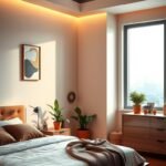
Imagine stepping into a room that instantly calms your senses while radiating sophistication. This magical transformation begins with a bold color choice that turns ordinary sleeping quarters into luxurious personal retreats.
While not the most common selection, this regal shade creates stunning visual impact when implemented thoughtfully. From deep plum tones to soft lilac whispers, the spectrum offers endless possibilities for your personal haven.
Our guide reveals 16 inspiring concepts to help you achieve professional-looking results. Discover how to incorporate this majestic color through both dramatic statements and subtle accents.
Whether you prefer moody elegance or airy serenity, these designer-approved approaches work for both adult spaces and children’s rooms. Get ready to create your dream sanctuary with confidence and style!
Why Purple is the Perfect Choice for Your Bedroom Sanctuary
The psychology of color plays a crucial role in creating the perfect sleep environment. Certain hues can significantly impact your mood and relaxation levels throughout the day.
The Calming Psychology of Purple Hues
This majestic shade creates a tranquil atmosphere that’s ideal for rest. Scientific studies show it can lower heart rate and blood pressure.
These physiological changes promote better sleep quality and deeper relaxation. The rarity of this color in nature adds to its magical appeal.
Different tones evoke various emotions from creativity to sophistication. Lighter variations feel airy and serene while deeper shades add mystery.
Blending Warmth and Coolness for Balanced Ambiance
This unique color combines both warm red and cool blue undertones. This creates balanced energy that’s neither too stimulating nor too sedating.
Interior designer Bynn Esmond explains its perfect balance:
“Think about how rare a purple sky is — when we see one, it’s magical. Its mysterious beauty naturally draws us in, inviting us to pause, take it in, relax and experience a sense of tranquility.”
The historical significance as a royal color translates to elegance in your space. It works beautifully with natural light, changing character from morning to evening.
This creates a sanctuary-like environment that feels both protective and inspiring. Your personal retreat becomes a place where you can truly recharge.
1. Embrace a Monochromatic Purple Dreamscape

Transform your personal retreat into a soothing sanctuary with a single-color approach. This method creates harmony through different tones of one majestic hue.
Stockholm designer Emma Vo Gårdh champions this concept for sleep spaces. Her studio Voghardh creates stunning environments using varying intensities.
“Someone once told me that purple symbolizes dreams,” she shares. “This felt like the perfect choice for a bedroom.”
Drenching Walls and Bedding for a Cocooning Effect
Cover surfaces with your chosen shade to create an enveloping feeling. This technique makes the room feel like a protective hug.
Start with your largest surfaces – walls and bedding. Then add smaller accessories in coordinating tones.
Use these elements to build your monochromatic scheme:
- Wall paint in your primary deep tone
- Bed linens in a slightly lighter variation
- Throw pillows and blankets in complementary shades
- Artwork and decor items with subtle tonal differences
This layered approach prevents the space from feeling flat. It adds depth while maintaining color harmony.
Selecting the Right Deep Shade for Light Absorption
Darker tones offer practical benefits beyond their visual appeal. They absorb evening light to create a softer atmosphere.
This light absorption reduces visual stimulation before sleep. It helps your mind and body prepare for rest.
Consider these factors when choosing your perfect shade:
| Light Condition | Recommended Shade | Visual Effect |
|---|---|---|
| North-facing rooms | Warmer plum tones | Adds warmth to cool light |
| South-facing rooms | Cooler aubergine shades | Balances bright sunlight |
| Small spaces | Medium-depth hues | Creates depth without shrinking |
| Large rooms | Deep majestic tones | Adds coziness to expansive areas |
Always test paint samples on your walls. View them at different times of day to see how light changes their appearance.
This careful selection process ensures your space feels restful day and night. You’ll create that dreamy, immersive experience perfect for relaxation.
2. Create Harmony With an Analogous Blue Scheme
Colors that sit next to each other on the color wheel create a peaceful and unified look. This approach brings balance to your personal space without jarring contrasts.
Designer Ana Engelhorn shows how well this method works. She explains, “The palette works because it’s tonal and harmonious.”
Using colors close to each other promotes relaxation. It makes your room feel calm and put together.
Pairing Aubergine Walls With Cool Blue Accents
Start with a rich foundation like Francesca’s Paints Piedmontese Aubergine. This deep shade adds sophistication to your walls.
Balance it with cooler blue tones in your bedding and upholstery. Even doorway trim in blue can ground the whole design.
This combination feels both luxurious and serene. It’s a smart way to use bold colors without overwhelming your space.
Using Tonal Colors from the Wheel for Flow and Calm
Analogous schemes use neighboring hues for smooth visual flow. They avoid strong contrasts that might disrupt relaxation.
Blue and purple together create a grounded, tranquil feeling. Both colors are known for their calming effects.
This harmony helps your mind unwind after a long day. Your room becomes a true sanctuary for rest.
Consider these blue shades that work beautifully with various purple tones:
| Purple Tone | Complementary Blue | Best Use |
|---|---|---|
| Deep Aubergine | Navy Blue | Bedding and upholstery |
| Royal Purple | Slate Blue | Accent walls and trim |
| Soft Lilac | Sky Blue | Curtains and accessories |
| Muted Plum | Steel Blue | Rugs and artwork |
For optimal balance, use about 70% purple and 30% blue in your room. This proportion keeps the scheme harmonious.
Always test your color combinations first. Paint large swatches on your wall and observe them at different times of day.
See how artificial lighting affects the shades in the evening. This ensures your chosen palette works around the clock.
This thoughtful approach guarantees a space that feels both stylish and supremely comfortable.
3. Achieve Serenity With Soft Lavender Walls

Discover the calming power of gentle lavender tones in your personal space. This approach creates a soothing atmosphere that feels both refreshing and restful.
Designer Bynn Esmond believes in involving family members in color decisions. She explains their collaborative process:
“When working with the homeowners on the interior design of the home, we wanted their children to have a say in how they wanted to feel in their own room.”
Choosing a Pale Hue Like Benjamin Moore Spring Iris
Selecting the right pale shade makes all the difference. Benjamin Moore Spring Iris offers a tranquil vibe that works beautifully in any space.
This specific hue creates a serene environment perfect for relaxation. It’s soft enough to maintain sophistication while feeling welcoming.
Consider your room’s orientation when choosing shades. North-facing spaces benefit from warmer lavender tones.
South-facing rooms can handle cooler variations. Always test samples on your wall to see how light changes their appearance throughout the day.
Balancing Color with Natural Wood Tones
Natural wood elements prevent lavender from feeling too sweet or juvenile. They add warmth and grounding to the space.
Incorporate wood through furniture pieces, flooring, or accent details. This combination creates a balanced look that feels both fresh and cozy.
The designers achieved artistic flair through asymmetrical headboard designs. This creative approach adds personality while maintaining elegance.
Lavender works for both youthful and mature room designs. Its versatility makes it an excellent choice for any personal retreat.
You can create a space that feels both playful and polished. The right balance of color and natural materials makes all the difference.
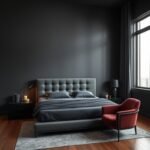
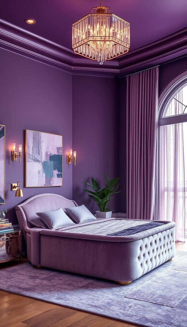
4. Infuse Luxury With Deep Purple and Velvet Textures
Dive into a world of opulence with sumptuous dark hues and plush fabrics. This approach transforms your sleeping area into a sophisticated retreat that feels both mysterious and inviting.
Designer Kimberly Peck explains why clients choose this dramatic direction:
“This color is Benjamin Moore Galaxy 2117-20. The clients selected this color as they were looking for a dark bedroom. They liked the mystery of the color, and practically the dark color is conducive to sleeping.”
Opting for a Rich, Moody Shade Like Benjamin Moore Galaxy
Deep, dramatic colors create an intimate atmosphere perfect for relaxation. Benjamin Moore Galaxy offers a majestic tone that feels both indulgent and magical.
This particular shade contains blue undertones that provide physiological benefits. Research shows these cooler tones can help lower heart rate and blood pressure.
Dark walls absorb light to create a cocoon-like effect. This reduces visual stimulation before sleep, helping your body prepare for rest.
Test your chosen paint color at different times of day. Observe how natural and artificial lighting changes its appearance throughout the evening.
Incorporating Velvet Pillows and Upholstery for Depth
Velvet textures add luxurious dimension to your color scheme. The fabric’s light-reflecting properties create visual interest and depth.
Start with smaller accents like throw pillows and blankets. Then consider larger pieces such as an upholstered bench or chair.
Balance dark walls with lighter elements to prevent overwhelming the space. Cream or metallic accents work beautifully against deep purple backgrounds.
Choose velvet in complementary shades for a cohesive look:
- Burgundy velvet for warm contrast
- Charcoal gray for monochromatic elegance
- Metallic gold for opulent highlights
- Cream velvet for softening effects
This combination creates a space that feels both dramatic and restful. You’ll achieve that perfect balance of luxury and comfort.
5. Make a Playful Statement With a Split-Complementary Scheme

Ready to try something truly unique in your personal space? This clever approach combines color theory with joyful energy for a room that feels both exciting and restful.
Emma Merry from Home Milk explains the thinking behind this combination:
“We went for purple and mint green, a great color combination. For a fairly bright color, it’s surprisingly calming. The carpet is also purple so you feel somewhat cocooned in the color.”
Pairing Purple with Unexpected Mint Green Accents
Split-complementary schemes use colors on either side of a direct complement. For purple, this means choosing mint green instead of standard yellow-green.
The result creates visual interest without overwhelming contrast. Valspar Magical Poetry purple with bright mint green creates balanced energy.
This unexpected pairing feels fresh and modern. It adds personality while maintaining harmony in your space.
Using Lighter Shades for an Uplifting Yet Calming Feel
Lighter tones keep the scheme feeling airy and bright. They create an uplifting atmosphere that still promotes relaxation.
The psychological effect combines creativity with calm. Your room becomes both inspiring and restful.
Follow these proportion guidelines for optimal results:
- Use 70% purple as your dominant color
- Add 25% mint green for accents
- Include 5% neutral tones for balance
Test your colors in both natural and artificial light. Observe how they change throughout the day.
Purple carpeting creates that cocooned feeling Merry mentioned. It grounds the space even with bright mint accents.
This approach proves that playful can still feel sophisticated. You get the best of both worlds in your personal retreat.
6. Introduce Personality With Decorative Purple Accents
Sometimes the most impactful approach involves strategic touches rather than full coverage. This method lets you infuse character while maintaining a clean, restful environment.
Plaid Fox designers mastered this technique beautifully. They created a space that feels both personal and peaceful through careful selection.
Layering Different Shades in Bedding and Rugs
Create visual depth by mixing various tones within your scheme. Start with foundational pieces like area rugs and comforters.
Choose items that coordinate without matching exactly. This creates a collected look that feels intentionally curated.
Consider these layering ideas for your space:
- Deep plum rug as your base layer
- Lilac throw pillows for mid-tone contrast
- Mauve bedding for subtle variation
- Violet artwork for finishing touches
Mix textures like velvet, linen, and wool. This adds tactile interest while keeping the color story cohesive.
Choosing a Hopeful, Optimistic Lavender Hue
Lavender brings a unique psychological quality to your personal retreat. It feels both calming and uplifting simultaneously.
Designer Ben explains this special characteristic:
“Purple, especially in its lavender form, has always felt inherently soothing to me. It’s a calming color that resonates on a deeper, almost subconscious level — perhaps because it’s a shade I associate with relaxation.”
Unlike cooler blue tones that can feel distant, lavender offers warmth. It invites you to settle in and truly unwind.
This optimistic hue works beautifully against neutral backgrounds. It adds just enough color without overwhelming your senses.
The approach offers wonderful flexibility over time. You can easily refresh your look by swapping out accent pieces as your style evolves.
7. Frame Your Bed With Purple Built-In Storage

Discover how smart storage solutions can transform your sleeping area into both a functional and beautiful retreat. Built-in units offer clever ways to maximize your square footage while adding serious style.
Painting a Recessed Niche a Striking Purple
Hannaford Design Studio shows how a pop of color creates magic in any room. They painted a recessed niche in a bold violet shade that instantly draws the eye.
This approach makes storage feel like an intentional design feature. The vibrant hue turns practical shelving into a stunning focal point.
Choose a shade that contrasts nicely with your main wall color. The studio paired their purple niche with pale green walls for perfect harmony.
Creating a Focal Point and Freeing Up Floor Space
Built-in units eliminate the need for bulky freestanding furniture. You gain valuable floor area while maintaining ample storage capacity.
Fitted storage around your sleeping area creates a framed, intentional look. It makes your bed feel like the centerpiece of the room.
This approach works especially well in compact spaces where every inch counts. You get organization and style in one smart solution.
The designers balanced playful quirkiness with rich textures and brass accents. Their approach shows how color can make practical elements feel special.
Consider these benefits of built-in storage with color accents:
- Maximizes vertical space instead of floor area
- Creates custom look that feels designed, not accidental
- Allows for bold color choices without overwhelming the room
- Combines organization with visual interest
Start by assessing your storage needs and available wall space. Work with a designer or use ready-made solutions that can be customized.
Remember that built-ins represent a permanent design choice. Choose colors and configurations that will serve you well for years to come.
8. Craft Contrast With Deep Purple and Exposed Brick
Discover how industrial elements can transform your personal space into a striking design statement. This approach combines raw materials with rich color for a look that feels both timeless and contemporary.
Balancing a Moody Statement Wall with Traditional Materials
Paul Archer Design demonstrates this powerful combination beautifully. They pair a deep violet accent surface with exposed brickwork for dramatic effect.
The natural variations in brick create visual interest against solid color. Each brick’s unique texture and tone adds depth to the overall design.
This combination works particularly well in spaces with architectural character. Loft apartments and rooms with original features benefit most from this approach.
Merging Modern Sophistication with Warming Tones
Brick’s warm undertones balance the coolness of deep violet shades. This creates a comfortable atmosphere that feels both edgy and inviting.
The contrast between old and new aesthetics adds personality to your space. You achieve a look that’s both stylish and deeply characterful.
Consider these factors when selecting your perfect shade:
| Brick Type | Recommended Purple Tone | Visual Effect |
|---|---|---|
| Red brick | Deep eggplant | Creates rich, dramatic contrast |
| Whitewashed brick | Muted plum | Offers subtle sophistication |
| Industrial brick | Dark violet | Enhances urban character |
| Reclaimed brick | Royal purple | Adds regal elegance |
Always test your color choice against the actual brick surface. Natural and artificial lighting will change how colors interact throughout the day.
This approach proves that contrast can create harmony rather than conflict. Your space becomes a perfect blend of historical charm and modern sensibility.
9. Command Attention With a Bold Contrasting Headboard

Want to make your space truly unforgettable? Consider making your headboard the star of the show with an unexpected color choice that creates instant drama.
Interior designer Rachel Chudley champions this approach for maximum impact. Her work demonstrates how deliberate color choices can transform ordinary rooms into extraordinary personal statements.
Choosing a Clashing Color Like Red for Dramatic Effect
Red against purple creates an electric visual tension that feels both daring and sophisticated. This jewel-tone combination delivers high contrast while maintaining color harmony.
Rachel explains her colorful philosophy:
“I like to lean into the darkness and explore the depths of color. Clashing colors makes my heart sing.”
Select shades with similar intensity levels for the best results. A deep crimson against rich plum creates balance despite their contrasting nature.
Test your color pairing in different lighting conditions. Observe how natural and artificial light affects their relationship throughout the day.
Embracing Jewel-Tones and Irregular Shapes
Jewel-toned colors bring richness and depth to your personal space. Their saturated quality creates a luxurious feeling that standard colors can’t match.
An irregularly shaped headboard adds artistic flair to the bold color choice. Asymmetrical designs or unique silhouettes make your bed feel like custom artwork.
This combination creates a space that feels distinctly personal and expressive. You’re not just decorating – you’re making an artistic statement.
Consider these elements when planning your dramatic headboard:
- Choose velvet or upholstered materials for added texture
- Select a shape that complements your room’s architecture
- Balance the bold headboard with simpler bedding
- Use metallic accents to bridge contrasting colors
The psychological impact of such a personal space is profound. Your room becomes a true reflection of your unique personality and taste.
This approach proves that sometimes the most harmonious rooms come from the most unexpected combinations. You create a space that’s truly and uniquely yours.
10. Transform Your Space With Color-Blocking Curtains
Ready for a clever twist on adding personality to your personal retreat? Fabric offers a wonderful alternative to permanent paint solutions.
This approach lets you experiment with bold hues without long-term commitment. You can create dramatic transformations that adapt to your mood and needs.
Installing Deep Violet Drapery for a Dynamic Wall of Color
Choose heavy, opaque fabrics in rich violet tones for maximum impact. These materials create a solid color surface when closed.
Amit Khanolkar from DIG Architects explains their dual purpose:
“Color blocking is present in the form of a violet curtain, serving both as a visual anchor and a reflection of the occupant’s personality.”
Select fabrics with good light-blocking properties for evening use. Velvet or heavy linen works beautifully for this application.
Consider these factors when choosing your curtain fabric:
| Fabric Type | Best For | Visual Impact |
|---|---|---|
| Velvet | Maximum color saturation | Rich, luxurious appearance |
| Heavy Linen | Textured sophistication | Organic, natural feel |
| Silk Blend | Light reflection | Subtle shimmer effect |
| Blackout Fabric | Complete light control | Solid color block |
Allowing for Light and Brightness When Open
The magic happens when you open your dramatic window treatments. Suddenly, the intense color vanishes from your visual field.
This transformation creates two distinct room personalities. You enjoy bold sophistication at night and airy brightness during daylight hours.
Install curtain rods wider than your window frame. This allows panels to stack completely clear of the glass area.
Choose hardware that complements your overall design scheme. Matte black or brass finishes work well with violet fabrics.
This flexible approach works particularly well for rental properties. You can make a strong style statement without altering permanent surfaces.
It’s also perfect for those who enjoy refreshing their look frequently. Changing curtain colors offers an easy way to update your entire space.
Coordinate your curtain color with existing elements for harmony. Pull shades from artwork, bedding, or accent pieces throughout the room.
This creates a cohesive look that feels intentionally designed. Your space will reflect your personal taste while maintaining visual balance.
11. Elevate the Space With Metallic Gold Accents
Add a touch of royal elegance to your personal space with metallic gold details. This classic combination creates instant sophistication and warmth throughout your room.
Gold accents bring a luxurious feel without overwhelming your design. They work beautifully against various shades from soft lavender to deep plum.
Incorporating Gold-Trimmed Details and Light Fixtures
Start with subtle golden touches that catch the light beautifully. Consider trim work on furniture edges or decorative moldings.
Light fixtures make excellent focal points with their shimmering presence. A sculptural lamp or celestial wall sculpture adds artistic flair.
These elements create visual interest while maintaining elegance. They draw the eye around the room in a pleasing rhythm.
Brass Moroccan lanterns offer old-world romance with their intricate patterns. Their warm glow enhances the luxurious atmosphere after dark.
Adding a Touch of Glamour and Opulence
Gold has historically symbolized wealth and prestige across cultures. Combined with rich hues, it creates a truly regal environment.
The metallic warmth balances cooler undertones in many shades. This creates a comfortable, inviting space that still feels special.
You can achieve this look through carefully chosen accessories:
- Gold-framed mirrors that reflect light around the room
- Metallic hardware on drawers and cabinets
- Gilded picture frames for artwork display
- Brass candle holders for evening ambiance
These elements work together to create cohesive luxury. They make your space feel thoughtfully designed and personally curated.
Consider how different gold finishes work with your existing elements:
| Gold Finish | Best Purple Pairing | Room Style |
|---|---|---|
| Polished Brass | Deep Eggplant | Traditional Luxury |
| Brushed Gold | Soft Lavender | Modern Elegance |
| Antique Brass | Muted Plum | Vintage Charm |
| Rose Gold | Berry Tones | Contemporary Glam |
Start with small metallic additions to test the effect. You can always build up to more dramatic statements over time.
This approach lets you create a space that feels both personal and profoundly luxurious. Your room becomes a true sanctuary of style and comfort.
12. Incorporate a Statement Purple Wallpaper
Wallpaper offers an incredible way to add personality and depth to your sleeping space. Unlike paint, patterns create visual interest that transforms ordinary surfaces into artistic statements.
This approach lets you express your unique style while maintaining sophistication. The right pattern can make your room feel both personal and polished.
Selecting a Geometric or Floral Pattern for Grown-Up Whimsy
Geometric designs bring modern elegance to your personal retreat. They create structured visual interest that feels both playful and refined.
Floral patterns offer romantic charm without feeling overly feminine. Choose larger-scale blooms for contemporary appeal rather than traditional cottage style.
Consider these pattern types for different effects:
- Geometric shapes for modern sophistication
- Botanical prints for organic elegance
- Abstract designs for artistic expression
- Textured patterns for subtle dimension
Scale matters when selecting your design. Larger patterns work best in spacious rooms, while smaller repeats suit compact areas.
Using Wallpaper on a Feature Wall or Ceiling
A single accent surface creates dramatic impact without overwhelming your space. This approach lets you make a bold statement while maintaining balance.
Feature walls behind your bed create an instant focal point. The pattern draws attention to your sleeping area as the room’s centerpiece.
Ceiling applications offer surprising sophistication. Looking up at a patterned surface adds dimension and unexpected delight.
This flexibility allows for creative expression without permanent commitment. Many modern wallpapers install easily and remove cleanly when you’re ready for change.
Coordinate your pattern with existing furnishings for cohesive results. Pull colors from your bedding or artwork to create harmonious connections throughout the space.
Patterned environments can stimulate creativity while maintaining calm. The visual interest engages your senses without creating visual clutter.
Your room becomes a true reflection of your personality through thoughtful pattern selection. The result feels both intentionally designed and personally meaningful.
13. Layer in Texture for a Rich and Tactile Experience
Texture transforms your space from visually appealing to physically inviting. It adds dimension that color alone cannot achieve.
Mixing different materials creates a sensory journey throughout your room. Each element contributes to an overall feeling of luxury and comfort.
Mixing Materials: Linen Bedding, Plush Rugs, and Boucle Throws
Start with your largest textile surfaces for maximum impact. Choose bedding in natural linen for breathable comfort against your skin.
Layer a plush area rug beside your bed for soft morning steps. Add boucle throw pillows for subtle visual interest and cozy appeal.
Consider these material combinations for your space:
- Linen duvet covers for crisp sophistication
- Velvet accent pillows for luxurious contrast
- Wool blend throws for warmth and texture
- Silk or satin pillowcases for subtle sheen
Each material interacts differently with light throughout the day. This creates changing visual interest as sunlight moves across your room.
Creating a Sense of Depth and Luxury Through Feel
Textured environments provide psychological comfort through physical sensation. The variety stimulates your senses without visual overload.
Different materials work together to build a layered, collected look. This approach feels intentionally designed rather than perfectly matched.
Follow this guide for selecting textures that complement your color scheme:
| Material Type | Best Purple Pairing | Sensory Experience |
|---|---|---|
| Matte Linen | Soft Lavender | Breathable, casual elegance |
| Plush Velvet | Deep Eggplant | Opulent, light-absorbing |
| Nubby Boucle | Muted Plum | Tactile, modern warmth |
| Silky Satin | Royal Shades | Luxurious, light-reflecting |
Build your texture layers gradually for coordinated results. Start with foundational pieces like bedding and rugs before adding smaller accents.
This thoughtful approach creates a space that feels rich through both sight and touch. Your room becomes a true sanctuary for relaxation.
14. Design a Lighting Scheme That Enhances the Purple Palette
Lighting transforms how you experience color in your personal space. The right illumination brings out the best in your chosen palette.
It affects mood, function, and visual appeal throughout daily cycles. Strategic lighting design makes your environment feel both magical and practical.
Using Warm, Soft Lighting to Enrich Deep Purples at Night
Warm light temperatures make deep tones feel richer and more intimate. Soft illumination creates cozy atmospheres perfect for evening relaxation.
Choose bulbs between 2700K-3000K for their golden glow. These temperatures enhance rather than fight against your color scheme.
Consider these lighting types for evening ambiance:
- Dimmable overhead fixtures for adjustable brightness
- Table lamps with fabric shades for softened glow
- Wall sconces for indirect, flattering illumination
- LED strip lighting for subtle accent effects
Layer your lighting sources for maximum flexibility. You can create different moods for various activities and times.
Selecting Sculptural Lamps and Crystal Chandeliers
Light fixtures serve dual purposes as both functional items and artistic statements. Choose pieces that complement your overall aesthetic.
Sculptural lamps become focal points even when not illuminated. Their interesting shapes add visual interest during daylight hours.
Crystal chandeliers bring glamour and light reflection. Their faceted surfaces create beautiful patterns throughout the room.
Designer Rachel Chudley emphasizes artistic lighting choices:
“Lighting should feel like jewelry for the room – both functional and beautiful. The right fixture becomes an integral part of the design story.”
Consider these fixture styles for different effects:
| Fixture Type | Best For | Style Impact |
|---|---|---|
| Articulated Task Lamps | Reading and detailed work | Modern, functional elegance |
| Crystal Pendants | Overhead ambient light | Traditional glamour |
| Ceramic Table Lamps | Soft accent lighting | Artisanal, textured appeal |
| Brass Floor Lamps | Corner illumination | Mid-century sophistication |
Mix fixture materials for collected appeal. Metallic finishes add warmth while crystal elements provide sparkle.
Your lighting choices should reflect your personal taste while enhancing functionality. The result creates a space that feels both beautiful and perfectly suited to your needs.
15. Curate a Collected Look with Art and Personal Touches
Your personal space becomes truly yours when you fill it with meaningful items. This final layer adds soul and character that no designer can replicate.
Thoughtful curation makes your room feel authentic rather than staged. It’s where design meets personal history and emotional connection.
Choosing Artwork that Complements or Contrasts the Hue
Select pieces that either harmonize with your color scheme or create exciting contrast. Both approaches add visual interest and personal expression.
Complementary artwork uses similar tones for a cohesive feel. Contrasting pieces make bold statements that highlight your wall color.
Consider these approaches for your walls:
- Abstract pieces with subtle hints of your main shade
- Black and white photography for dramatic contrast
- Botanical prints with coordinating green accents
- Metallic artwork that catches light beautifully
Gallery walls offer wonderful flexibility for mixing styles. You can combine different frames and art types for collected appeal.
Displaying Personal Items to Add Soul and Character
Meaningful objects transform your space from designed to lived-in. They tell your story and create emotional connections.
Display collections in intentional ways rather than random placement. Group similar items together for greater impact.
These personal touches add character:
- Travel souvenirs arranged on shelves
- Family photos in coordinated frames
- Favorite books stacked beside your bed
- Handmade items from loved ones
Your space evolves over time as you add new meaningful pieces. This natural growth maintains design integrity while reflecting your journey.
The balance between curation and spontaneity creates magic. Your room becomes a true reflection of who you are.
Begin Your Journey to an Elevated Purple Bedroom
Your dream sanctuary awaits with these creative approaches. From monochromatic elegance to bold contrasting statements, each idea offers unique personality.
This majestic hue creates spaces that feel both luxurious and deeply personal. You can achieve anything from moody retreats to airy sanctuaries.
Start small with accent pillows or test paint samples first. Remember that expert tips help you blend color psychology with beautiful design.
Your personal expression matters most in creating meaningful spaces. Embrace the transformative power of this versatile color in your home.
Now you’re ready to create a truly special environment that reflects your unique style and brings daily comfort.