Welcome to your complete guide to creating the perfect peaceful sleep space. Your bedroom should be your personal retreat from the busy world.
Discover how the right window treatment can transform your room into a tranquil oasis. The color you choose plays a huge role in setting the mood.
This guide will help you make smart choices about fabric, style, and hanging techniques. You’ll learn why soft, neutral tones work so well for relaxation.
We’ll explore how these window coverings complement various design styles. From modern minimalism to classic traditional looks, they create harmony.
Get ready to balance beauty with practical function in your home. Proper selection impacts both your sleep quality and your room’s overall feel.
Let’s begin your journey toward creating that dreamy, restful environment you deserve.
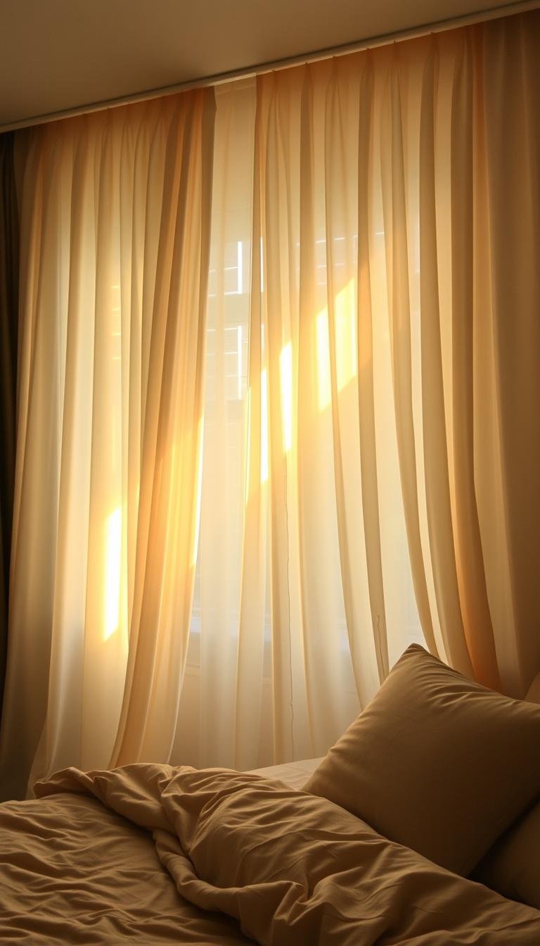
Why Off-White Curtains Create the Perfect Serene Bedroom Atmosphere

Achieve ultimate relaxation through carefully selected window coverings in muted tones. The right choice transforms your space into a personal retreat that promotes restful sleep.
These soft neutral window treatments work with your room’s natural light. They create an environment where your mind can truly unwind after a long day.
The Psychology of Off-White in Sleep Spaces
Soft white tones have a remarkable effect on your mental state. They reduce visual stimulation that can keep your brain active when you need to rest.
Research shows that warmer neutrals help lower anxiety levels. This creates the perfect conditions for drifting into deep, restorative sleep.
Historically, relaxation spaces have used these gentle hues. They provide a timeless solution for creating peaceful environments.
How Off-White Differs from Stark White for Relaxation
Pure white can feel clinical and overwhelming in a sleep space. Soft off-whites offer a much more inviting and comfortable feel.
The warm undertones in these hues create cozy intimacy without darkness. They strike the perfect balance between brightness and warmth.
Your bedroom becomes more welcoming with these subtle variations. They’re less intense than bright white but still maintain airy qualities.
Light Reflection Qualities That Enhance Calmness
These window treatments optimize natural light diffusion throughout your room. They soften harsh sunlight while maintaining beautiful illumination.
The science behind light reflection shows how these fabrics work. They distribute gentle, even light that enhances the room’s peaceful ambiance.
Different times of day affect how the color appears. Morning light creates one mood, while evening light offers another soothing effect.
This dynamic quality keeps your space feeling fresh yet consistently calm. It’s the perfect foundation for your personal sanctuary.
Understanding Different Fabric Types for Your Serene Space

Your material selection makes all the difference in creating that perfect peaceful environment. The right fabric transforms how light enters your room and affects the overall mood.
Different weights and weaves offer unique benefits for your sleep sanctuary. They control illumination levels while adding visual interest through various textures.
Linen Curtains for Natural Texture and Softness
Natural linen brings organic beauty to your sleeping area. Its slightly rough texture adds character without overwhelming your senses.
This fabric works beautifully in warmer months. It allows gentle airflow while filtering harsh sunlight.
According to sleep experts at Amerisleep, lighter fabrics like linen maintain a breezy, relaxed atmosphere. They’re perfect for creating that airy feeling you want in your personal retreat.
Sheer Curtains for Gentle Light Diffusion
Sheer curtains create magical morning light in your room. They soften harsh rays while maintaining brightness.
These translucent panels offer daytime privacy without darkness. You get protection while still enjoying natural illumination.
They’re ideal for rooms facing east where morning sun can be intense. The filtered light helps you wake up gently and naturally.
Velvet Options for Luxurious Warmth and Depth
For cooler months, velvet brings wonderful depth and luxury to your space. Its thick weave creates superior darkness and insulation.
This fabric adds rich texture that makes your room feel cozy and protected. It’s like wrapping your sleeping area in a warm embrace.
Velvet’s weight helps block outside noise too. You’ll enjoy quieter nights and better sleep quality with these luxurious panels.
Remember that heavier fabrics like velvet can reduce heat loss through windows significantly. They create that cocoon-like feeling perfect for winter months.
How to Choose the Right Off-White Shade for Your Bedroom

Selecting the perfect neutral tone involves more than matching paint swatches. You need to consider how light interacts with your space throughout the day. The right choice creates harmony between your walls and window treatments.
Different lighting conditions dramatically change how colors appear. Morning light reveals different qualities than evening illumination. Your selection should work beautifully across all these variations.
Testing samples in your actual room is essential for success. You’ll see how artificial and natural light affect each option. This prevents disappointing surprises after installation.
Warm vs. Cool Undertones in Off-White Palettes
Neutral shades contain subtle undertones that affect your room’s mood. Warm versions feature creamy or ivory bases that feel cozy and inviting. Cooler options like pearl or oyster create more airy, spacious feelings.
Warm hues work well in rooms with limited natural light. They add comforting energy without overwhelming brightness. Cool tones excel in sun-drenched spaces that need balancing.
Consider your existing furniture and flooring tones too. Warm wood finishes often pair better with warm undertones. Cool gray floors might prefer cooler neutral companions.
Matching Off-White Curtains to Your Wall Color
Coordinate your window treatments with wall colors for seamless design. You can match tones exactly or create intentional contrast. Both approaches work when executed thoughtfully.
Lighter curtains against slightly darker walls create beautiful depth. This layering effect adds visual interest while maintaining calmness. The reverse combination makes rooms feel more expansive.
Test your selections at different times before deciding. Morning and evening light change how colors interact. What looks perfect at noon might feel different at dusk.
Considering Natural Light Exposure Throughout the Day
Window direction dramatically affects how colors appear in your space. North-facing rooms receive cooler, bluer light throughout the day. South-facing windows enjoy warmer, brighter illumination.
Choose warmer neutrals for north-facing rooms to add comfort. Cooler tones work well in south-facing spaces to balance intensity. East-facing windows need treatments that handle morning glare.
Seasonal changes also impact your light quality. Summer sun behaves differently than winter light. Your selection should work across all seasons for year-round satisfaction.
| Room Characteristic | Recommended Shade | Lighting Effect |
|---|---|---|
| North-Facing Windows | Warm Ivory | Adds warmth to cool light |
| South-Facing Windows | Cool Pearl | Balances intense sunlight |
| Small Rooms | Light Oyster | Creates spacious feeling |
| Large Rooms | Soft Cream | Adds cozy intimacy |
| Low Ceilings | Bright Pearl | Enhances height perception |
Remember that artificial lighting changes everything after dark. Warm bulbs make cool tones appear warmer. Cool bulbs affect warm neutrals differently.
Test your final choices under both natural and artificial light. See how they transform from day to night. This ensures your selection works around the clock.
Your perfect neutral shade creates harmony throughout your space. It balances light, complements existing elements, and enhances relaxation. Take time to find your ideal match.
Light Control Features for Optimal Sleep Environment
Mastering your room’s illumination transforms how you rest and recharge each day. The right approach to managing sunlight creates the perfect conditions for deep, restorative sleep.
Professional designers like Brian Paquette often use dual-layered solutions in primary sleeping areas. This smart approach lets homeowners choose between different light levels for their ideal morning experience.
Blackout vs. Light-Filtering Options
Understanding these two main categories helps you make the best choice for your needs. Blackout panels create complete darkness, perfect for those sensitive to light or working night shifts.
Light-filtering options gently diffuse sunlight while maintaining brightness. They offer a soft glow that won’t disrupt your sleep patterns.
Innovative triple-weave fabrics and specialized linings now offer enhanced performance. These advanced materials provide better temperature control and energy efficiency too.
Layering Techniques for Customizable Light Levels
Combining different types of window coverings gives you ultimate flexibility. You can adjust your room’s atmosphere throughout the day with simple changes.
Many people pair sheer panels with heavier drapes on the same rod. This allows for beautiful light diffusion in daytime and total darkness at night.
Proper side panels and overlap ensure complete light blockage when needed. These details make a significant difference in creating that perfect dark environment.
Privacy Considerations Without Sacrificing Ambiance
Maintaining seclusion doesn’t mean losing your connection to natural light. Smart designs balance both needs beautifully.
Cafe styles offer excellent rental-friendly solutions for privacy concerns. They cover the lower portion of windows while allowing upper light flow.
The right window treatments create a serene atmosphere while protecting your personal space. This balanced approach supports healthier sleep routines and daily relaxation.
Measuring Your Windows for Perfect Off-White Curtains

Getting the measurements right transforms your window treatments from okay to outstanding. Proper sizing creates that polished, professional look you want in your personal space.
Take your time with this step. Rushed measurements lead to disappointing results that can ruin your room’s overall feel.
Follow these professional techniques to ensure your window coverings fit perfectly. You’ll avoid common mistakes that many homeowners make.
Standard Sizing vs. Custom Measurements
Ready-made panels work well for typical window dimensions. They’re affordable and readily available at most home stores.
Custom options become necessary for unusual window shapes or specific design needs. They ensure perfect proportions for your unique space.
Consider custom measurements when your windows are extra wide or tall. The investment pays off in flawless appearance and function.
Determining Optimal Curtain Length for Serene Proportions
Length dramatically affects how your room feels. Too short looks awkward, while too long appears messy.
The golden rule: panels should either just touch the floor or pool slightly. This creates elegant lines that enhance your room’s architecture.
Mounting height changes everything. Higher placement makes ceilings appear taller and windows look grander.
Calculating Fabric Width for Fullness and Elegance
Skimpy coverage looks cheap and unfinished. Luxurious fullness makes your space feel rich and complete.
Calculate width by measuring your window and multiplying by 2-2.5 times. This creates beautiful folds and proper coverage when closed.
Consider fabric type when determining fullness. Heavier materials may require less width than lighter sheers.
Your curtains offer both privacy and beauty when properly sized. They become functional art in your personal sanctuary.
Hardware and Installation for Peaceful Presentation

The right hardware completes your window treatment vision beautifully. Your choices here make the difference between ordinary and extraordinary results.
Thoughtful selection creates harmony throughout your sleeping space. Every element should work together to support relaxation.
Choosing Rods and Hardware That Complement Serene Design
Select hardware that enhances rather than dominates your window area. Simple, clean lines often work best for creating calm environments.
Consider finishes that match your room’s existing metal elements. Brushed nickel offers subtle sophistication without overwhelming attention.
Natural materials like wood bring warmth and organic texture. They add character while maintaining peaceful vibe.
Weight capacity matters for heavier fabric choices. Ensure your rods can handle layered treatments without sagging.
Installation Height Tips for Creating Space Illusion
Mounting higher than your window frame creates dramatic visual impact. This technique makes ceilings appear taller instantly.
Position rods 4-6 inches above the window molding for best results. This draws eyes upward and emphasizes vertical space.
Extend rods 3-6 inches beyond each side of the window frame. This allows panels to stack completely clear of glass areas.
Proper installation ensures smooth operation and longevity. Use appropriate anchors for your wall type to prevent future issues.
Header Styles That Enhance the Calm Aesthetic
Different heading styles create unique visual effects. Each option contributes differently to your room’s atmosphere.
Grommet tops offer modern simplicity with clean lines. They slide effortlessly and maintain orderly appearance.
Pinch pleat headers provide traditional elegance with structured folds. They add refined detail without overwhelming simplicity.
Rod pocket styles create soft, gathered looks that feel cozy. They work well for achieving that relaxed, comfortable feeling.
Hidden track systems deliver ultra-minimalist results. They disappear when not in use, maintaining clean sight lines.
Texture and Pattern Options for Visual Interest
Adding thoughtful details creates beautiful depth while keeping your space peaceful. The right elements bring personality without overwhelming your senses.
Textiles offer wonderful opportunities to introduce subtle character. Coordinating colors with your room’s palette maintains harmony throughout.
In busier spaces, solid drapery fabric can ground the entire design. It provides visual rest while still contributing to the overall atmosphere.
Sheer floral pleated panels filter soft light beautifully. Their tonal patterns complement warm, earthy shades perfectly.
Subtle Textures That Add Depth Without Distraction
Gentle textural variations create wonderful dimension in your room. They catch light differently throughout the day.
Woven textures like linen or boucle add organic interest. Their irregular surfaces create movement without pattern.
Different weaving techniques produce unique effects. Some fabrics feel smooth while others offer gentle roughness.
These tactile qualities affect your comfort level significantly. Softer textures feel more inviting and cozy.
Minimal Pattern Choices for Serene Environments
Simple patterns can enhance rather than overwhelm your peaceful space. The key lies in subtlety and scale.
Subtle stripes work beautifully in restful environments. They create visual contrast without agitation.
Gentle geometrics offer modern elegance. Their repetitive nature feels calming rather than busy.
Organic motifs like leaves or feathers bring natural beauty. They reference nature’s peaceful patterns.
Tonal patterning lets design exist without domination. Pattern and background share similar color values.
Mixing Textures While Maintaining Calm Cohesion
Layering different materials creates rich visual interest. The art lies in balancing variety with harmony.
Start with one dominant texture as your foundation. Add complementary variations for depth.
Consider how textures interact with light throughout your room. Some reflect while others absorb illumination.
Balance patterned window treatments with other elements. If your bedding has pattern, consider solid panels.
Texture can become the primary design element in neutral spaces. It replaces color as the main source of visual impact.
Your choices should work together to support relaxation. Every element contributes to your peaceful sanctuary.
Coordinating Off-White Curtains with Your Bedroom Palette
Creating a harmonious color scheme transforms your space into a true retreat. Your window treatments play a key role in tying everything together beautifully.
They connect wall colors, furniture tones, and accent pieces. This creates visual flow that feels both intentional and relaxing.
The right selection brings warmth and character to your room. It prevents that sterile feeling while maintaining peaceful vibes.
Complementing Wall Colors and Wood Tones
Your walls set the foundation for your entire color palette. White walls offer simplicity but need careful pairing.
Warmer off-white hues work well with bright white walls. They add subtle variation without overwhelming contrast.
Cooler neutrals complement gray-toned walls beautifully. They create a sophisticated, cohesive look.
Consider your wood furniture and flooring tones too. Warm woods like oak or cherry prefer creamy undertones.
Dark woods pair nicely with both warm and cool neutrals. They create beautiful contrast that feels balanced.
Accent Colors That Enhance the Serene Atmosphere
Thoughtful accent colors elevate your space without disrupting peace. Choose soft, muted versions of your favorite hues.
Dusty blues and soft greens work wonderfully with neutral window treatments. They bring nature’s calming influence indoors.
Gentle lavender or blush pink add romantic touches. Keep these accents small for subtle effect.
Metallic accents in gold or silver provide elegant highlights. They catch light beautifully throughout the day.
Creating Harmonious Color Flow Throughout the Space
Your window treatments can unify different elements in your room. They become the connecting thread between various colors.
Test your selections under both natural and artificial light. Colors change dramatically throughout the day.
Sample different combinations before making final decisions. Live with them for a few days to see how they feel.
Consider this professional approach to color coordination:
| Wall Color | Recommended Off-White Tone | Complementary Accent Colors |
|---|---|---|
| Bright White | Warm Ivory | Soft Blue, Pale Green |
| Warm Beige | Cream | Terracotta, Mustard |
| Cool Gray | Pearl | Lavender, Silver |
| Light Blue | Oyster | Navy, Gold |
| Soft Green | Natural Linen | Sage, Copper |
Remember that balance is key to creating serenity. Your window treatments should enhance rather than dominate.
They provide the perfect backdrop for your personal style expression. Enjoy creating a space that truly reflects your taste.
Seasonal Considerations for Year-Round Serenity
Your window treatments can adapt beautifully to changing seasons. This thoughtful approach keeps your space feeling perfect all year long.
Different materials work better in specific weather conditions. Light fabrics create breezy summer vibes while heavier options provide winter warmth.
Understanding seasonal changes helps you make smart choices. Your room maintains its peaceful feel through every weather shift.
Lightweight Options for Summer Breeziness
Summer calls for airy fabrics that let gentle breezes flow through. Sheer materials filter sunlight while maintaining bright, uplifting moods.
Linen and cotton blends work wonderfully during warmer months. They offer just enough privacy without trapping heat inside your room.
These lighter choices promote better air circulation too. You’ll enjoy fresh airflow while still getting protection from harsh sunlight.
Heavier Fabrics for Winter Warmth and Coziness
Colder months demand materials that provide insulation and comfort. Velvet and thermal-lined options create that cocoon-like feel you crave.
These thicker panels help reduce heat loss through your windows. They also block chilly drafts that can disrupt your sleep quality.
Heavier fabrics often feature special energy-efficient linings. This smart feature lowers heating costs while enhancing your comfort.
Transitional Styles That Work Across Seasons
Some materials perform beautifully throughout the entire year. These versatile options adapt to temperature changes effortlessly.
Medium-weight fabrics like certain cotton blends offer year-round performance. They provide balanced light control and insulation properties.
Layered systems give you ultimate flexibility between seasons. You can adjust your window coverings as weather conditions change.
Consider these seasonal fabric characteristics:
| Season | Recommended Fabric | Key Benefits |
|---|---|---|
| Summer | Linen | Breathability, light diffusion |
| Winter | Velvet | Insulation, darkness |
| Transitional | Cotton Blend | Versatility, ease of care |
Your seasonal choices should match your local climate patterns. Warmer regions might prioritize summer options year-round.
Colder areas will benefit from investing in proper winter panels. The right selection ensures comfort through every season.
Off-White Curtains for Calm, Serene Bedrooms: Style Implementation
Your personal retreat deserves window treatments that reflect your unique aesthetic vision. The right approach transforms your space into a true reflection of your taste while maintaining that peaceful atmosphere you love.
Different styles require specific considerations for optimal results. Each approach brings its own charm to your sleeping environment.
Modern Minimalist Approaches to Serene Design
Clean lines and simplicity define this contemporary look. Your window treatments should enhance the uncluttered feel of your space.
Choose panels with minimal texture and simple header styles. Grommet tops work beautifully for this aesthetic.
Keep hardware sleek and understated. Matte black rods create striking contrast against light panels.
The combination of black and white remains a timeless classic. It evokes that perfect minimalist vibe many homeowners love.
Traditional Elegance with Off-White Drapery
Classic design calls for more elaborate details and luxurious fullness. Your panels should feel rich and substantial.
Opt for pinch pleat headers and generous fabric width. This creates beautiful folds that enhance traditional elegance.
Choose rods with decorative finials that complement your room’s existing elements. Warm metallic finishes add traditional charm.
Length matters greatly in this style. Your panels should just kiss the floor or pool slightly for that elegant drape.
Coastal and Airy Styles Using Off-White Textiles
Beach-inspired spaces benefit from light, breezy fabrics that evoke ocean freshness. Your choices should create that airy, relaxed feeling.
Sheer materials work wonderfully for coastal design. They filter sunlight while maintaining bright, uplifting moods.
Blue accents provide calming touches that complement white walls perfectly. This combination creates ideal coastal serenity.
Natural textures like linen enhance the organic beach vibe. They bring subtle character without overwhelming simplicity.
Pastel pink options present charming ways to add warmth. They introduce subtle texture to white-walled interiors beautifully.
Your hardware choices should reflect your selected style too. Modern looks prefer simple rods while traditional styles enjoy decorative elements.
Consider how different architectural features affect your decisions. High ceilings allow for dramatic length while standard heights need proportional solutions.
Mixing elements requires careful balance to maintain cohesive atmosphere. Your personal style should shine through while keeping the peaceful qualities you value.
Creating Your Personal Sanctuary with Off-White Curtains
Your window treatments become the finishing touch that ties your peaceful room together. They create a harmonious space where light, color, and texture work in perfect balance.
Your home deserves that professional look you’ve always wanted. With proper care, these panels maintain their beauty for years while adapting to your changing style.
Notice how natural light transforms your space throughout the seasons. The soft glow creates a calming feel that enhances your daily mood and sleep quality.
Enjoy your new sanctuary every day. These window treatments offer lasting peace and comfort in your personal retreat.