Welcome to your complete guide for designing a peaceful living room using soothing, nature-inspired palettes. These hues bring the outdoors inside, creating a tranquil atmosphere.
According to Havenly lead designer Toussaint Derby, these muted shades create a cocooning effect. They make any space feel more intimate and comfortable.
These timeless color choices are enjoying a major comeback. Trends like organic modern and all-brown everything drive their popularity.
This guide will show you how to transform your space into a cozy retreat. You’ll learn everything from selecting perfect shades to final styling touches for your home.
Why Choose a Neutral Earth Tone Palette for Your Living Room
Imagine stepping into a sanctuary that wraps you in comfort after a long day. That’s the magic these nature-inspired colors create. They transform your main gathering area into a peaceful retreat.
These hues contain brown pigment that gives them their soft, muted quality. This creates a cocooning effect that makes any area feel more intimate. Your space becomes a warm embrace rather than just a room.
The versatility of this color scheme might surprise you. It works beautifully with minimalist aesthetics and maximalist expressions alike. Whether you prefer clean lines or rich layers, these shades adapt effortlessly.
One of the greatest advantages is their timeless appeal. Unlike trend-driven colors that quickly feel dated, these natural selections maintain their relevance. Your investment in this palette will continue to feel fresh for years.
There’s an inherent grounding quality to these organic shades. They connect your interior to the natural world outside your windows. This creates a harmonious flow between indoors and outdoors.
When working with this sophisticated scheme, texture becomes your best friend. Layering different materials adds depth and prevents monotony. Think nubby wool throws, smooth leather accents, and rough-hewn wood elements.
This approach to design creates more than just visual appeal. It crafts an experience that engages all your senses. You’ll find yourself relaxing deeper and enjoying your surroundings more fully.
The Foundation: Understanding Earth Tone Colors

Building your perfect space starts with mastering the basics of nature-inspired colors. These organic hues create harmony and balance throughout your environment.
Every successful design begins with understanding color relationships. You’ll discover how different tones work together to create a cohesive look.
Warm vs. Cool Earth Tones
Warm earth shades bring energy and coziness to your space. Think rich browns, warm tans, terracotta, and golden ochre.
These colors evoke feelings of comfort and warmth. They work beautifully with natural materials like leather and rattan.
Cool earth tones offer serenity and calm. Sage green, olive, slate gray, and charcoal create peaceful atmospheres.
These cooler hues bring a refreshing balance to warmer elements. They’re perfect for creating tranquil retreats.
Elements of a Cohesive Earth Tone Palette
Creating harmony means understanding color undertones. Similar undertones ensure your palettes work together seamlessly.
Brown pigment gives these colors their characteristic muted quality. This natural appearance connects your interior to the outdoors.
Layering different shades from the same family creates depth. A monochromatic approach can be surprisingly dynamic.
Balance warm and cool tones for a well-rounded scheme. This creates visual interest while maintaining overall harmony.
Texture plays a crucial role in your design. Materials like jute, shearling, and linen add tactile dimension.
Your final palette should feel both intentional and effortless. It’s about creating a space that feels naturally beautiful.
16 Designer-Approved Earth Tone Color Palettes for Your Space
Ready to find your perfect combination? These professional color schemes bring harmony and style to any area. Each palette offers unique character while maintaining that natural warmth you love.
Whether you prefer clean minimalism or layered elegance, there’s a combination here for you. These selections work beautifully in various lighting conditions and room sizes.
Camel, Brown & Ivory for a Minimalist Feel
This sophisticated trio creates a clean, contemporary look. The camel and brown shades provide warmth while ivory keeps things light and airy.
This combination works especially well in modern spaces with clean lines. It creates a neutral foundation that lets your furniture and artwork shine.
Add texture through woven baskets and natural wood elements. The effect is both calming and incredibly stylish.
Sage, Clay & Ivory for Organic Elegance
This beautiful palette brings soft, natural harmony to your environment. Sage green provides a refreshing botanical note that complements clay’s earthy warmth.
Ivory acts as the perfect balancing element between these two rich tones. This scheme has remained popular for over ten years for good reason.
Consider adding brass or gold accents to elevate this combination. Metallic touches complement these colors beautifully.
Shades of Greige for a Monochromatic Look
Greige—that perfect blend of gray and beige—creates a wonderfully calming atmosphere. Using varying shades of this versatile color creates depth without overwhelming.
This approach works beautifully in spaces where you want a cohesive, restful feeling. Layer different textures to keep the look interesting.
Add soft sage green or tan accents for subtle variation. The result is a sophisticated space that feels both current and timeless.
| Palette | Best For | Complementary Accents | Lighting Considerations |
|---|---|---|---|
| Camel, Brown & Ivory | Modern, minimalist spaces | Natural wood, black metal | Works well in both natural and artificial light |
| Sage, Clay & Ivory | Organic, elegant atmospheres | Brass, gold, soft blue | Best with plenty of natural light |
| Shades of Greige | Calming, monochromatic looks | Tan, soft green, white | Adapts well to any lighting condition |
Remember that your chosen color scheme should reflect your personal style. These professional combinations provide excellent starting points for creating your perfect space.
Don’t be afraid to experiment with different combinations. Sometimes the most beautiful spaces come from unexpected color partnerships.
Selecting Furniture That Complements Your Earth Tones

Your furniture choices make all the difference in creating a harmonious space. The right pieces bring your color scheme to life while adding functional beauty.
Think of your furniture as the foundation that supports your entire design vision. Each piece should work with your palette while adding its own character.
The Best Wood Tones for a Neutral Look
Natural wood elements add warmth and texture to your space. Different species create distinct moods and complement various color schemes.
Walnut and teak bring rich depth and complexity to your arrangement. Their darker hues work beautifully with lighter neutrals and muted colors.
Light oak creates an organic modern look when paired with sage green and ivory. This combination feels fresh yet timeless.
Warm wood flooring creates a beautiful foundation for your entire room. It pairs wonderfully with navy, charcoal gray, and pine green accents.
Choosing Upholstery Colors and Fabrics
Your upholstery choices complete your furniture’s personality. Select colors that enhance rather than compete with your palette.
Neutral beiges and soft grays provide versatile foundations. They allow other elements in your room to shine while maintaining cohesion.
Consider complementary muted colors for added interest. Soft blues, greens, and warm browns work within earth tone schemes.
Natural fabrics enhance the earthy feel of your space. Linen, cotton, and wool offer both comfort and aesthetic appeal.
Performance fabrics in natural tones provide practical elegance. They maintain your desired look while offering durability for daily living.
Remember that wood furniture with warm tones can balance cooler elements. This creates visual interest and harmonious contrast throughout your space.
The Power of Texture in Neutral Home Decor
Your design journey reaches new heights when you master texture. It transforms flat surfaces into engaging experiences that invite touch and admiration.
Texture creates contrast and dimension in your space. It prevents your beautiful color scheme from feeling one-dimensional or boring.
Interior designer Sarah Barnard explains this perfectly:
Texture adds soul to a room. It’s the difference between a space that looks good and one that feels truly lived-in and loved.
Natural materials bring authentic character to your environment. They work harmoniously with nature-inspired palettes to create cohesive beauty.
Materials to Layer for Depth and Interest
Start with foundational pieces that offer visual and tactile appeal. A nubby jute rug provides wonderful texture underfoot while anchoring your space.
Layer different materials to create rich depth. Combine smooth leather with chunky knit throws and sleek stone surfaces.
Consider these excellent materials for your layering strategy:
- Woven rattan for organic texture
- Soft shearling or faux fur for cozy comfort
- Breathable linen for casual elegance
- Rough-hewn wood for natural character
- Textured stone for earthy sophistication
Exposed wood beams add architectural interest from above. They create wonderful contrast with smoother wall surfaces.
These elements work beautifully with taupe and other muted shades. They enhance the natural qualities of your color scheme.
Try these creative ideas for incorporating texture. Place a woven basket beside a smooth leather chair. Drape a chunky knit blanket over a linen sofa.
Small accents make big impacts too. Consider textured pottery, carved wood objects, or hammered metal pieces.
Your space becomes a multi-sensory experience through thoughtful layering. It feels both visually interesting and incredibly inviting.
Designing Your Walls for a Grounded Atmosphere

Your walls create the perfect canvas for your nature-inspired design. They set the mood and tone for your entire space.
Choosing the right shades and treatments makes your room feel complete. It brings everything together beautifully.
Paint Color Ideas for a Calming Backdrop
Selecting paint colors creates your foundation. Warm beiges and soft taupes offer cozy comfort.
These muted shades provide a harmonious background. They let your furniture and decor take center stage.
Soft sage greens bring refreshing botanical notes. Greige combinations create wonderfully balanced atmospheres.
White walls with charcoal gray accents offer modern elegance. This mix feels both earthy and contemporary.
Remember that lighter colors make spaces feel larger. Darker tones create intimate, cocooning environments.
Incorporating Natural Elements and Wall Art
Natural materials add authentic character to your surfaces. Grass-cloth wallcoverings weave rich colors together beautifully.
These textured treatments create sophisticated backdrops. They add depth and visual interest to your room.
White woodwork keeps your look bright and balanced. It prevents darker tones from feeling too heavy.
Consider these wonderful options for your walls:
- Wood paneling for organic warmth
- Stone accents for earthy sophistication
- Living walls for fresh botanical beauty
- Textured pottery and carved objects
Your art selections should complement your palette. Choose pieces with natural themes and organic shapes.
Complementary colors create visual harmony. They enhance your overall design without competing.
These elements work together to create your desired atmosphere. They make your space feel both grounded and graceful.
| Wall Treatment | Best For | Lighting Effect | Maintenance Level |
|---|---|---|---|
| Warm Beige Paint | Cozy, traditional spaces | Enhances warm artificial light | Easy to clean and touch up |
| Sage Green Paint | Fresh, botanical atmospheres | Complements natural daylight | Requires occasional washing |
| Grass-cloth Wallcovering | Textured, sophisticated looks | Creates subtle shadow play | Professional cleaning recommended |
| White Woodwork | Bright, balanced environments | Reflects light throughout space | Regular dusting and occasional painting |
Your walls become more than just surfaces. They transform into integral parts of your beautiful design.
Anchor Your Space with the Perfect Area Rug
Your floor covering becomes the foundation that ties everything together beautifully. It creates visual harmony while adding comfort and definition to your arrangement.
A well-chosen rug anchors your seating group and defines the conversation zone. It also provides wonderful softness underfoot for daily enjoyment.
Natural fiber options bring organic texture to your scheme. Nubby jute rugs offer wonderful tactile appeal that complements nature-inspired palettes perfectly.
These earthy textures work with various styles from modern to rustic. They add depth without overwhelming your carefully curated look.
Patterned selections introduce rhythmic interest to serene environments. Bold chevrons or geometric motifs create upbeat visual movement.
These designs work particularly well in minimalist spaces. They add personality without competing with other elements.
Animal hides provide striking contrast against darker surfaces. Cowhide rugs warm floors while adding natural pattern variation.
Their organic shapes create visual interest in sophisticated ways. They feel both luxurious and completely natural.
Your color choices should enhance your overall palette. Natural neutrals create seamless harmony throughout your environment.
Muted patterns in complementary shades add subtle variation. Think soft blues, greens, or warm terracotta accents.
Proper sizing ensures your rug anchors the space effectively. All furniture legs should rest comfortably on the surface.
This creates a cohesive look that feels intentional and polished. Your arrangement will appear both balanced and inviting.
Placement defines your seating area clearly. It establishes boundaries while maintaining open flow throughout your room.
Your perfect rug completes the layered look you’ve created. It brings everything together into a harmonious whole.
Lighting Choices to Enhance Warmth and Ambiance

Light transforms your space from ordinary to extraordinary. It brings out the best in your color scheme and creates mood.
Ambient lighting makes your room feel cozy and welcoming. It highlights the beautiful warmth of your nature-inspired palette.
Think about how light changes throughout the day. Morning sun feels different from evening lamplight.
Gold or brass fixtures add elegance to your design. These metallic touches complement warm browns and soft beiges beautifully.
Sculptural lighting pieces serve dual purposes. They provide illumination while acting as stunning decor.
Warm lighting temperatures make colors look rich and inviting. They enhance the natural qualities of your scheme.
Layered lighting combines different types for perfect function. You get both practical task light and mood-setting ambient glow.
Your choices can evolve with your space over many years. Quality fixtures maintain their complementary effect through style changes.
| Lighting Type | Best Placement | Warmth Level | Style Impact |
|---|---|---|---|
| Ambient Lighting | Ceiling fixtures, floor lamps | High warmth | Creates overall mood |
| Task Lighting | Reading nooks, workspaces | Medium warmth | Functional focus |
| Accent Lighting | Art displays, architectural features | Variable warmth | Highlights specific areas |
| Gold/Brass Fixtures | Statement pieces, small accents | Warm metallic glow | Adds elegance |
Consider these lighting strategies for your space. Dimmer switches let you adjust brightness for different times.
Table lamps with fabric shades create soft, diffused light. They prevent harsh shadows and glare.
Wall sconces provide wonderful ambient illumination. They free up surface space while adding architectural interest.
Your lighting should work with your color scheme naturally. It enhances rather than competes with your beautiful palette.
Remember that good lighting makes everything look better. It shows off your design choices at their very best.
Styling Your Coffee Table with Natural Accents
Your coffee table becomes the heart of your seating area. It’s where style meets function in beautiful harmony.
This surface offers wonderful opportunities for creative expression. You can showcase your personality while maintaining that natural feel.
Start with a foundation that complements your overall scheme. Choose a table that reflects your preferred aesthetic.
Marble tops add elegant contrast to organic palettes. Their smooth surface creates beautiful drama against textured backgrounds.
Wood selections bring warm, natural character to your space. They provide wonderful textural contrast with other elements.
Think about proportions when selecting your centerpiece. Your table should balance comfortably with your seating arrangement.
Now let’s explore styling techniques that bring everything together. These ideas help you create visually appealing displays.
Layer different heights for dimensional interest. Combine tall objects with lower pieces for balanced composition.
Natural materials create authentic connections to your palette. They enhance the organic quality of your design.
Consider these wonderful elements for your arrangement:
- Stacked books with natural fiber covers
- Ceramic vessels in complementary shades
- Stone objects for earthy sophistication
- Organic decor items like dried botanicals
Woven baskets serve both decorative and practical purposes. They corral smaller items while adding textural appeal.
Natural fiber containers keep things organized beautifully. They maintain your desired look while providing storage.
Remember the rule of thirds when arranging your pieces. Group items in odd numbers for visual harmony.
Leave some breathing room between objects. Negative space prevents your display from feeling crowded.
Your arrangement should feel both intentional and effortless. It’s about creating beauty that feels naturally composed.
| Table Material | Style Impact | Best Paired With | Maintenance Level |
|---|---|---|---|
| Marble | Elegant contrast | Metallic accents, smooth ceramics | Regular sealing recommended |
| Wood | Warm natural character | Textured baskets, organic objects | Occasional polishing |
| Rattan | Organic texture | Natural fibers, ceramic pieces | Light dusting |
| Concrete | Modern earthy feel | Minimalist objects, metallic touches | Sealing prevents staining |
Rotate your displays with the seasons for fresh interest. This keeps your space feeling current and inspired.
Your coffee table becomes more than just furniture. It transforms into a curated expression of your beautiful style.
Incorporating Throw Pillows for a Cozy Feel
Small details often make the biggest impact in your design. Throw pillows offer one of the easiest ways to add comfort and personality to your space.
These soft accents transform ordinary seating into inviting retreats. They bring both visual appeal and physical comfort to your daily life.
Consider the emotional power of these simple additions. Interior designer Justina Blakeney perfectly captures their importance:
Pillows are the jewelry of a room. They can completely change the mood and feel of a space with just a few strategic placements.
Your selection process should balance aesthetics with practicality. Choose covers that feel wonderful against your skin while enhancing your palette.
Mixing Patterns and Shades
Combining different designs creates wonderful visual interest. Start with a foundation of solid colors that match your main scheme.
Add patterned pieces that incorporate complementary hues. Stripes, geometrics, or organic motifs work beautifully together.
Vary the scale of patterns for balanced composition. Large prints pair nicely with smaller, more intricate designs.
Consider these effective combinations:
- Ochre velvet pillows add warmth to minimalist arrangements
- Copper-blended patterns incorporate forest-inspired hues
- Textured weaves introduce subtle pattern without bold colors
- Muted florals bring soft botanical notes to neutral backgrounds
Layering different shades from the same family creates depth. Try combining light tan, medium brown, and deep chocolate pillows.
This monochromatic approach feels both cohesive and dynamic. It adds dimension without introducing competing colors.
Velvet throw pillows bring luxury and rich texture to your space. Their soft pile catches light beautifully, adding subtle shimmer.
These plush accents work wonderfully against leather or linen upholstery. They create pleasing contrast in both look and feel.
Placement matters as much as selection. Group pillows in odd numbers for visual harmony.
Vary sizes within your arrangements for organic composition. Standard squares work well with lumbar or bolster shapes.
Your final arrangement should feel inviting and comfortable. Too many pillows can make seating feel cramped and impractical.
Remember that these accents should enhance rather than overwhelm. They complete your look while maintaining functionality.
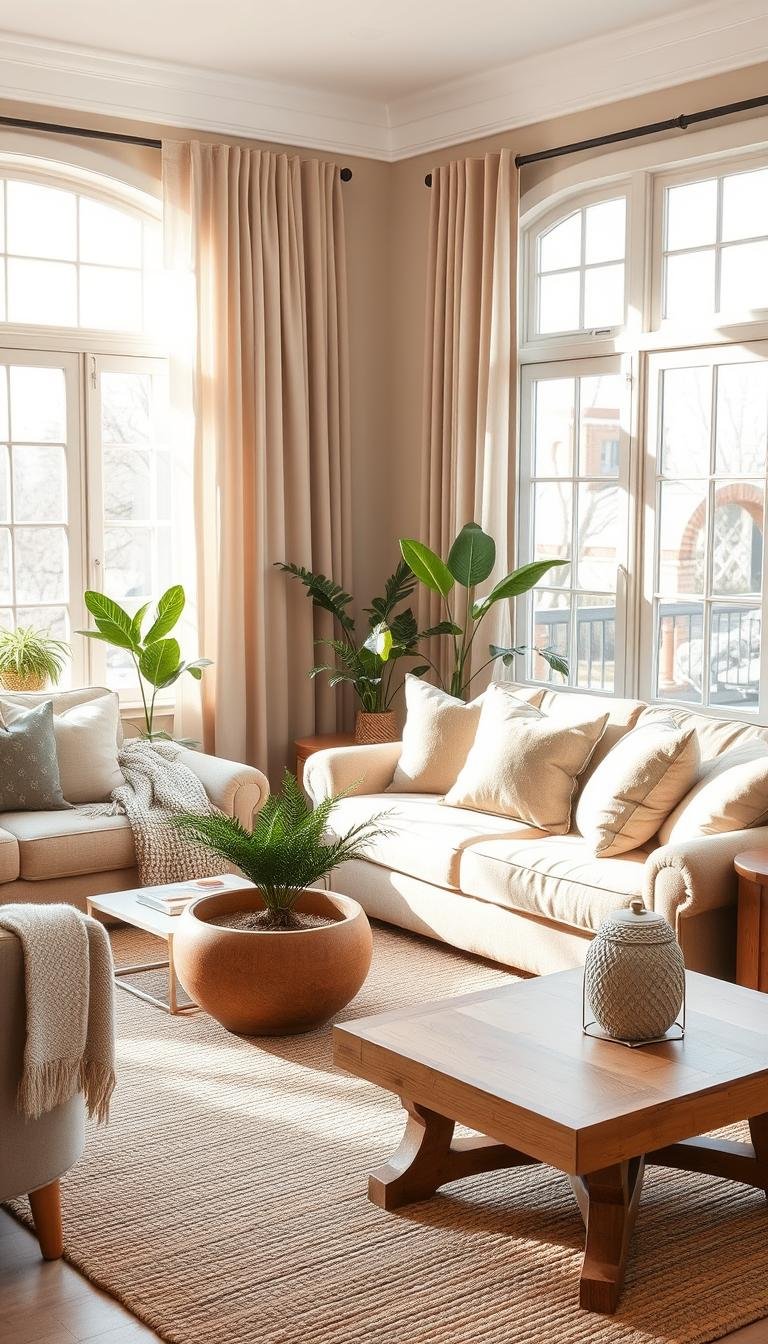
Bringing the Outside In with Plants and Greenery
Nothing completes your nature-inspired design like living plants. They add vibrant energy and organic beauty that artificial decor simply can’t match.
Fresh house plants create natural color pops throughout your arrangement. Their lively presence transforms any area into a thriving oasis.
Live selections provide cool green accents that balance warm tones beautifully. They add refreshing contrast to your sophisticated palette.
Greenery evokes springtime blooms and crisp leaves year-round. This connection to nature enhances your overall theme perfectly.
Plants with yellowish-green foliage give areas refreshing lifts. Their bright energy complements muted shades wonderfully.
Choose varieties that thrive in typical living conditions. Consider light levels and humidity when making your selections.
Large floor plants make dramatic statements in empty corners. They fill vertical space while adding lush texture.
Medium-sized options work beautifully on side tables and shelves. They create layered interest at different eye levels.
Small arrangements bring life to coffee tables and windowsills. These little touches make your entire design feel complete.
Proper care keeps your greenery looking its absolute best. Learn each plant’s specific needs for water and light.
Rotate pots occasionally for even growth patterns. This simple habit maintains beautiful, balanced shapes.
Your green companions become living elements in your design. They grow and change along with your personal style.
These natural additions make your space feel truly alive. They bring movement and freshness to your peaceful retreat.
Adding Metallic Accents for a Touch of Elegance

Metallic details transform your space from beautiful to breathtaking. They add that final layer of sophistication that completes your entire design.
These shimmering elements catch light beautifully throughout the day. They create dynamic interest that changes with natural and artificial lighting.
Brass accents particularly complement cool shades like sage green. Their warm golden tone creates perfect balance against cooler backgrounds.
Gold or brass details pair beautifully with warm ochre and terracotta. This combination feels both luxurious and completely natural.
Designer Jonathan Adler perfectly captures their transformative power:
Metallics are the jewelry of interior design. They add that final layer of polish that makes a room feel finished and fabulous.
Bronze furniture pieces blend wonderfully with forest-inspired hues. Their rich, earthy quality enhances natural textures and materials.
These metallic finishes maintain their appeal over many years. They complement evolving decor while maintaining timeless elegance.
Strategic placement creates balance without overwhelming your space. Small touches make big impacts when positioned thoughtfully.
Consider these placement techniques for maximum effect:
- Brass lamp bases on side tables
- Gold-framed mirrors above consoles
- Bronze cabinet hardware throughout
- Metallic vase arrangements on shelves
- Hammered metal trays on coffee tables
Your metallic choices should enhance rather than dominate. They complement your palette while adding subtle sparkle.
Mix different finishes for dimensional interest. Combine brushed brass with polished gold and matte bronze.
This layered approach creates visual depth throughout your space. It feels both curated and completely organic.
Remember that metallic accents work with various styles. They adapt to both modern minimalism and traditional elegance.
Your final look should feel harmonious and intentional. These finishing touches bring everything together beautifully.
| Metallic Type | Best Color Pairings | Recommended Items | Maintenance Level |
|---|---|---|---|
| Brass | Sage green, soft gray, navy | Lamp bases, picture frames, hardware | Occasional polishing |
| Gold | Ochre, terracotta, warm beige | Mirror frames, decorative objects, lighting | Light dusting |
| Bronze | Forest green, chocolate brown, charcoal | Side tables, planters, sculpture | Patina develops naturally |
| Mixed Metals | All earth tone palettes | Accent pieces, art frames, accessories | Varies by finish |
These elegant additions make your space feel truly special. They add that final layer of polish that completes your beautiful design.
Curating Art and Decor That Speaks to Nature
Your final layer of personality comes through thoughtful art and accessory choices. These elements tell your unique story while enhancing your nature-inspired palette.
Artwork becomes the soul of your space. It reflects your personal connection to the natural world.
Ocean pieces rendered in deep-sea hues create dramatic focal points. Their rich blues and greens add sophisticated contrast to warm backgrounds.
Graphic black and white selections create dynamic visual interest. They offer striking contrast that energizes serene environments.
Art with natural themes complements your overall aesthetic beautifully. Landscapes, botanical prints, and organic forms enhance the earthy feel.
Curated decor pieces reinforce your natural theme throughout the space. They add layers of interest while maintaining cohesive style.
Consider these wonderful ideas for your collection:
- Ceramic vessels in complementary muted shades
- Stone objects with interesting natural textures
- Wood carvings that showcase organic forms
- Woven fiber art that adds tactile dimension
- Pressed botanical specimens in simple frames
Gallery wall arrangements create stunning visual impact. They transform blank surfaces into curated displays.
Start with a cohesive color scheme for your arrangement. Choose frames that complement rather than compete with your art.
Vary sizes and orientations for dynamic composition. Mix larger statement pieces with smaller complementary works.
Leave consistent spacing between pieces for polished look. Two to three inches between frames creates harmony.
Your accents should feel both intentional and personal. Choose pieces that resonate with your connection to nature.
| Art Type | Color Impact | Best Placement | Style Effect |
|---|---|---|---|
| Ocean Artwork | Deep blue/green contrast | Focal walls, above mantels | Dramatic sophistication |
| Black & White Graphics | Striking monochromatic contrast | Gallery walls, entryways | Modern dynamic energy |
| Landscape Photography | Natural earth tone harmony | Above sofas, console tables | Organic serenity |
| Botanical Prints | Soft green accents | Grouped arrangements, shelves | Fresh natural beauty |
Rotate your displays seasonally for fresh perspectives. This keeps your space feeling current and inspired.
Your final decor choices complete the beautiful story you’ve created. They make your space truly yours.
Balancing Bold Jewel Tones with Earthy Neutrals
Discover how rich jewel tones can dance beautifully against serene neutral backdrops. This sophisticated approach creates spaces that feel both vibrant and deeply comforting.
Earthy foundations provide warmth and stability throughout your environment. They create that cocooning effect you love so much.
Jewel tones bring dynamic energy and incredible depth to your design. Think sapphire blue, emerald green, and amethyst purple shining against soft backgrounds.
This combination represents a major trend for 2025 design. It offers timeless appeal with contemporary freshness.
Interior designer Shea McGee perfectly captures this balance:
The magic happens when you ground vibrant colors with warm, soothing neutrals. This creates spaces that feel both exciting and completely restful.
Use jewel tones in moderation against your subdued foundation. They should accent rather than overwhelm your beautiful backdrop.
This approach works across various design styles beautifully. From modern minimalism to traditional elegance, the combination adapts wonderfully.
Consider these stunning jewel and neutral partnerships:
- Sapphire blue accents against warm beige foundations
- Emerald green touches with soft gray backgrounds
- Ruby red elements paired with creamy ivory surfaces
- Amethyst purple details complementing taupe environments
Your color selections should enhance your overall harmony. They create points of interest without disrupting the peaceful atmosphere.
Implementation techniques make all the difference in your success. Thoughtful placement ensures your jewel tones shine appropriately.
| Jewel Tone | Best Neutral Pairing | Recommended Applications | Visual Impact |
|---|---|---|---|
| Sapphire Blue | Warm Beige | Throw pillows, artwork, ceramic vases | Creates cool contrast against warm background |
| Emerald Green | Soft Gray | Velvet upholstery, planters, glass accessories | Adds botanical freshness to neutral space |
| Ruby Red | Creamy Ivory | Accent chairs, decorative objects, textiles | Provides vibrant energy against calm backdrop |
| Amethyst Purple | Warm Taupe | Lighting fixtures, artwork, decorative bowls | Offers regal sophistication with earthy warmth |
Start with small accents to test your comfort level. A single jewel-toned pillow can transform an entire seating area.
Gradually introduce more elements as you gain confidence. Remember that restraint often creates the most sophisticated results.
Your final look should feel both luxurious and completely natural. The jewel tones enhance rather than compete with your serene foundation.
This beautiful balance creates environments that truly sing. They offer visual excitement while maintaining that peaceful quality you cherish.
Avoiding Common Mistakes in Earth Tone Decor
Even the most beautiful color scheme can falter with simple missteps. Let’s explore how to sidestep common pitfalls and create a space that truly shines.
Using too many similar shades creates a flat, monotonous look. Your beautiful palette needs contrast and variation to feel dynamic.
Introduce lighter and darker values within your chosen family. This creates depth and visual interest throughout your arrangement.
Texture often gets overlooked in earth tone schemes. Neglecting different materials makes your decor feel one-dimensional.
Layer various textures to add richness and dimension. Combine smooth surfaces with nubby fabrics and rough natural elements.
Lighting conditions dramatically affect how colors appear. Choosing shades without considering natural light leads to disappointment.
Test paint samples at different times of day. Observe how colors change with morning sun and evening artificial light.
Balancing warm and cool tones prevents monotony. An all-warm scheme can feel heavy, while all-cool might lack coziness.
Mix warm browns with cool grays or soft greens. This creates harmonious contrast that feels both balanced and interesting.
Dark earth tones can sometimes feel too heavy. Strategic lightening elements keep your space feeling airy and open.
Incorporate ivory or cream accents throughout your design. Light-colored textiles and accessories provide refreshing contrast.
Mirrors and reflective surfaces bounce light around the room. They prevent darker schemes from feeling closed in.
Furniture choices can undermine your design goals. Pieces that compete rather than complement disrupt your harmonious feel.
Select furniture that enhances your color story. Avoid pieces that introduce competing color schemes or styles.
Accessory mistakes often involve scale or quantity. Too many small items create visual clutter rather than curated beauty.
Choose fewer, more substantial decorative pieces. They make stronger statements while maintaining your serene atmosphere.
Remember that successful design involves thoughtful balance. Your space should feel both cohesive and dynamically interesting.
Avoid these common errors for a truly polished result. Your efforts will create an environment that feels both beautiful and perfectly balanced.
Your Journey to a Serene and Stylish Living Room
You’ve transformed your space into a personal sanctuary. This thoughtful approach brings both comfort and elegance to your everyday life.
Nature-inspired palettes create timeless beauty. They offer a sophisticated foundation that evolves with your style over the years.
Your personalized retreat now reflects your unique taste. It balances peaceful energy with inspired details that spark joy.
Celebrate creating an environment that feels both grounded and graceful. This harmonious atmosphere welcomes relaxation and connection.
Trust your choices will continue to serve you well. Trends may shift, but your foundation remains beautifully relevant.