Your living room is the heart of your home. It’s where memories are made and your personal style shines through. Choosing the right paint for this space creates an atmosphere that welcomes everyone.
The perfect color scheme can transform your gathering area. It sets the mood from relaxed to polished. Benjamin Moore offers expert advice to help you find shades that work.
This guide provides practical tips and inspiring ideas. You’ll discover how to test colors in your specific space. We’ll explore everything from earthy neutrals to bold accent walls.
Consider both wall colors and complementary decor for a cohesive look. Our goal is to help you create an inviting space that truly reflects your lifestyle.
Why Your Living Room Color Choice Sets the Whole Mood
The tones you pick for this social hub create the foundational feeling that permeates the entire space. Colors work on both conscious and subconscious levels to shape your experience.
Cool shades like blue and green promote calmness and serenity. They’re perfect for creating peaceful retreats. Warm tones like red and yellow bring energy and vibrancy to your environment.
Natural illumination dramatically affects how pigments appear. Sun-filled spaces can handle richer, more saturated hues. Less bright areas often benefit from warmer tones that add coziness.
Consider your room’s orientation when selecting shades. North-facing spaces receive cooler light throughout the day. South-facing areas enjoy warmer, more direct sunlight.
Your personal style should guide your final decision. The right palette reflects who you are and how you want to feel in your home. It’s about creating an atmosphere that resonates with your lifestyle.
Accent walls offer creative opportunities to introduce bold statements. They can beautifully complement your textiles, area rugs, and decorative elements. This approach creates visual harmony throughout your space.
Always test samples at various times throughout the day. Morning light reveals different qualities than evening illumination. This ensures you achieve the desired atmosphere around the clock.
Design expert Timothy Corrigan emphasizes balancing three comfort aspects. Psychological comfort comes from colors that make you feel good. Physical comfort relates to how the space functions. Practical comfort considers maintenance and durability.
Think about how you primarily use your gathering area. Is it mostly for entertaining guests or quiet relaxation? Your answer should guide your color selection process.
The perfect palette transforms your space into an ideal gathering spot. It welcomes family and friends with just the right atmosphere. Your thoughtful choice makes every moment spent there more enjoyable.
| Color Temperature | Psychological Effect | Best For Rooms With |
|---|---|---|
| Cool Colors (Blues, Greens) | Calming, serene atmosphere | Abundant natural light |
| Warm Colors (Reds, Yellows) | Energetic, inviting feeling | Limited sunlight exposure |
| Neutral Tones | Balanced, flexible foundation | Any light conditions |
Embrace Earthy Neutrals for a Grounded and Welcoming Feel
Create an organic foundation for your interior with soothing earth-toned neutrals. These hues establish a comforting atmosphere that feels both fresh and familiar. They provide a versatile backdrop that works with various decor styles.
Earthy neutrals like beige, taupe, and soft greens create a welcoming environment. They bring a sense of calm and connection to nature into your space. This grounded feeling makes your area feel more inviting and restful.
Brandon Beige and White Dove: A Mossy, Subtle Green Combo
Brandon Beige 977 offers a beautiful mossy green undertone that evokes the outdoors. This subtle hint of nature works wonderfully in spaces seeking organic inspiration. It pairs perfectly with White Dove OC-17 for ceilings and trim.
This combination creates a cohesive look that feels both polished and peaceful. The creamy white trim brightens the space while complementing the earthy green tones. It’s a designer choice that brings nature-inspired elegance to your interior.
Other Soothing Neutral Picks to Consider
Benjamin Moore offers several other beautiful neutral options for your palette. Stardust 2108-40 provides a soft, earthy tone with gentle warmth. Wish AF-680 from the Affinity® Collection brings a sophisticated neutral option.
These colors work exceptionally well in rooms with natural light. The sunlight enhances their warmth and brings out their subtle undertones. They create a versatile foundation that accommodates various furniture and textile choices.
| Paint Color | Undertones | Best Paired With | Room Conditions |
|---|---|---|---|
| Brandon Beige 977 | Mossy green | White Dove OC-17 | Natural light rooms |
| Stardust 2108-40 | Earthy warmth | Creamy whites | Various light conditions |
| Wish AF-680 | Sophisticated neutral | Natural wood tones | Well-lit spaces |
Accent these neutral walls with natural materials like wood and stone. These elements enhance the organic feel and create visual harmony. They add texture and depth to your overall design scheme.
Always test sample pots at different times of day. Morning light reveals different qualities than evening illumination. This ensures you achieve the desired atmosphere around the clock.
Choose textiles and furniture in complementary earth tones. Soft linens, wool throws, and natural fiber rugs complete the look. They add layers of comfort while maintaining the cohesive color story.
Earthy neutrals remain a timeless choice for creating cozy spaces. They provide a restful backdrop that welcomes family and friends. Your thoughtful selection makes every moment spent there more enjoyable.
Create an Airy Oasis with Light Blue and White Hues
Discover how the gentle marriage of pale blue and bright white can create an expansive, calming environment in your home. This combination brings a refreshing quality that feels both open and intimate. It’s perfect for creating a space where you can truly unwind after a long day.
These colors work together to establish a serene atmosphere. They reflect natural light beautifully, making your area feel more spacious. The effect is both uplifting and peaceful.
Paint Pairings for a Clouds-in-the-Sky Vibe
Gossamer Blue 2123-40 offers an effortlessly cool and relaxing quality. This particular shade captures the essence of a clear summer sky. It creates an ethereal vibe that transforms any wall into a canvas of calm.
Pair this beautiful blue with crisp white trim and ceilings. The contrast enhances the airy feel throughout your space. White Dove OC-17 or Simply White OC-117 make excellent companions.
This combination creates what designers call a “clouds-in-the-sky” effect. It brings a sense of openness and tranquility to your interior. The look is perfect for those seeking peaceful inspiration.
Blue is scientifically proven to promote relaxation and rest. It lowers heart rate and reduces stress levels. This makes it ideal for spaces where you want to unwind and recharge.
These shades perform best in rooms with ample natural illumination. Sunlight enhances their airy quality and brings out their subtle tones. They work particularly well in south-facing spaces.
Complement this palette with soft, minimalist textiles. Think linen curtains, plush area rugs, and comfortable throw pillows. These elements enhance the overall serene feel.
Add subtle interest with accessories in metallic or natural materials. Brass accents, wooden elements, or stone pieces work beautifully. They provide contrast without overwhelming the peaceful atmosphere.
Always test your chosen blue in your specific space. Lighting conditions vary throughout the day and affect how hues appear. Sample pots allow you to see the true color in your environment.
This color scheme creates a modern yet timeless look. It offers a tranquil backdrop for daily life and special moments. Thanks to its calming nature, it remains a popular choice for peaceful interiors.
Incorporate Cozy Warmth with Sophisticated Greige Tones

Transform your space with greige, the versatile neutral that works beautifully in any lighting condition. This sophisticated blend of gray and beige creates a balanced foundation for your interior design.
Greige offers the perfect solution for those seeking both warmth and contemporary style. It brings cozy comfort while maintaining a polished, designer-approved look.
Our Top Balanced Greige Paint Colors
Wish AF-680 from the Affinity® Collection stands out as an exceptional choice. This popular hue features perfectly balanced undertones that adapt to your space’s unique characteristics.
These versatile colors complement both warm and cool decor elements beautifully. They create a neutral base that allows for seasonal accessory changes.
Greige paint performs well in various lighting conditions from bright to dim. It maintains its sophisticated appeal throughout the day.
Pair these elegant tones with natural wood finishes and plush textiles. This combination enhances comfort while adding visual interest.
Test sample pots to find the right greige with your desired warmth or coolness. Lighting affects how these hues appear in your actual space.
Consider accent colors like soft blue or muted pinks to enhance your greige backdrop. These pops of color add personality without overwhelming the serene palette.
This timeless choice creates an inviting atmosphere that feels both cozy and stylish. It offers endless ideas for creating a space where you can truly rest and relax.
The right greige paint gives your home a sophisticated feel that welcomes everyone. It’s a wonderful inspiration for creating a harmonious interior that reflects your personal style.
Add a Pop of Drama with Deep Teal Accents
Transform your gathering area with deep teal accents that create instant visual interest. These rich shades bring sophistication and personality to any interior. They work beautifully as focal points against neutral backgrounds.
Deep teal combines the calming qualities of blue with the earthy richness of green. This creates a balanced yet dramatic effect. Your space gains character while maintaining a welcoming atmosphere.
Gentleman’s Gray, Tucson Teal, and Pacific Rim
Gentleman’s Gray 2062-20 offers an elegant, luxurious tone that feels both classic and contemporary. This deep shade brings otherworldly sophistication to walls or furniture pieces. It creates a stunning contrast against lighter elements.
Tucson Teal 2056-10 and Pacific Rim 678 feature strong green undertones that connect to nature. These vibrant shades add energy and depth to your design. They make excellent choices for creating standout features.
Consider using these dramatic colors on an accent wall behind your sofa or entertainment center. This approach creates an instant focal point without overwhelming the entire space. You can also apply them to built-in shelving or a single piece of furniture.
Balance the intensity of teal with neutral companions like white or beige. These lighter tones prevent the space from feeling too dark or heavy. They allow the teal to shine while maintaining overall harmony.
These shades perform best in areas with good natural or artificial illumination. Proper lighting enhances their depth and reveals their complex undertones. They can transform even simple spaces into elegant retreats.
Incorporate metallic accents in gold or brass to complement teal’s luxurious feel. These finishes add warmth and sophistication to the overall look. They create beautiful visual interest against the deep blue-green background.
Teal evokes feelings of tranquility while adding bold personality to your interior. It connects to natural elements like ocean depths and forest shadows. This creates a space that feels both dramatic and restful.
Always test sample pots with your existing furnishings and lighting conditions. Colors appear differently throughout the day and under various light sources. This ensures your final choice works perfectly in your specific environment.
Deep teal accents offer a powerful way to add depth and character to your home. They create memorable spaces that reflect your unique style. Thanks to their versatility, they work with various design approaches.
| Paint Color | Undertones | Best Application | Lighting Needs |
|---|---|---|---|
| Gentleman’s Gray 2062-20 | Rich blue-green | Accent walls, furniture | Moderate to bright light |
| Tucson Teal 2056-10 | Vibrant green | Feature walls, built-ins | Good natural light |
| Pacific Rim 678 | Deep green-blue | Decor accents, trim | Various light conditions |
These dramatic shades create spaces that feel both inviting and impressive. They offer endless ideas for personalizing your home. Your bold choice will make every moment in the space more enjoyable.
Modern Warm Living Room Color Schemes Featuring Sage Green

Sage green brings nature’s peaceful energy directly into your home environment. This beautiful hue creates a Zen-inspired atmosphere that feels both fresh and calming. It’s perfect for creating a space where you can truly rest and recharge.
These soft green shades add dimension without overwhelming your design. They work beautifully in various lighting conditions throughout your home. The result is a sophisticated look that welcomes everyone.
October Mist and Other Zen-Inspired Greens
October Mist 1495 stands out as a former Color of the Year for good reason. This soft green shade brings the outdoors inside with its gentle, nature-derived hue. It adds visual interest while maintaining a serene atmosphere.
This particular color works wonderfully when paired with neutral tones. Beige or white trim creates a balanced look that feels both modern and timeless. The combination offers endless design ideas for your space.
Natural materials enhance sage green’s organic feel. Wood accents and linen textiles complement these shades perfectly. They create a cohesive design story throughout your room.
Consider these other Zen-inspired greens from Benjamin Moore’s collection:
| Paint Color | Undertones | Best Paired With |
|---|---|---|
| October Mist 1495 | Soft sage green | White Dove OC-17 |
| Silver Sage 2131-50 | Gray-green | Revere Pewter HC-172 |
| Sea Haze 2136-50 | Blue-green | Simply White OC-117 |
| Wythe Blue HC-143 | Soft blue-green | Manchester Tan HC-81 |
Use these greens on walls or as accent colors through furniture and textiles. Either approach creates a tranquil environment perfect for relaxation. Add plants and organic decor to enhance the natural vibe.
Always test your chosen shades in different light conditions. Morning and evening illumination affects how greens appear in your space. Sample pots help you see the true tone before committing.
Sage green remains an ideal choice for creating calming, nature-connected interiors. It offers both style and serenity in equal measure. Your space becomes a peaceful retreat that reflects beautiful inspiration.
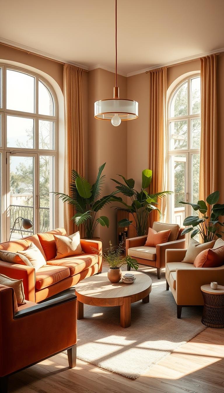
Design a Sunny and Inviting Space with Two-Toned Looks
Two-toned paint schemes create visual depth and energy in your home. These combinations add personality while keeping your space feeling open and airy. They offer a creative way to play with colors without overwhelming the room.
Using two different hues on walls creates instant architectural interest. This approach draws the eye upward and makes ceilings appear higher. It’s a smart design trick that transforms ordinary rooms.
White and Yellow Combinations for a Bright Lift
Pairing white with yellow creates an instantly cheerful atmosphere. The contrast between these shades brings energy and light into your environment. It feels like sunshine captured on your walls.
Consider using yellow on lower walls with white above. This placement grounds the space while keeping it feeling open. The white upper portion reflects natural light beautifully.
Choose softer yellow tones for a subtle effect. These colors provide warmth without being too intense. They create a welcoming feel that guests will love.
Balance yellow’s warmth with cooler accent colors. Soft purple or blue accessories work beautifully. They prevent the space from feeling too warm and create visual harmony.
Test several yellow paint samples before making your final choice. Natural light affects how these shades appear throughout the day. What looks soft in morning light might feel brighter at noon.
This approach lets you enjoy saturated color without full commitment. You can always repaint one section if you want a change. It’s a flexible design solution that grows with your style.
Two-toned looks work especially well in rooms with good natural illumination. The sunlight enhances both colors and creates a dynamic effect. Your space will feel brighter and more inviting.
Draw inspiration from nature’s own color combinations. Think of daffodils against a clear blue sky or sunflowers in a field. These natural pairings always feel balanced and beautiful.
Thanks to their versatility, these schemes adapt to various decor styles. From modern minimalist to cozy traditional, they work beautifully. Your room will gain personality while maintaining comfort.
This design approach creates an uplifting environment perfect for daily life. It brings energy and joy into your home. Your space becomes a place where you can truly rest and recharge.
Evoke Richness and Comfort with Elegant Brown Palettes

Deep brown hues bring a sense of luxury and coziness to your home. These rich shades create an intimate atmosphere that feels both sophisticated and welcoming. They offer a wonderful alternative to traditional neutral schemes.
Brown’s natural warmth makes any space feel more inviting. It works beautifully in areas where you want to encourage relaxation and conversation. This versatile choice adapts to various design styles with ease.
Deep Chocolate Browns Paired with Pink Accents
Benjamin Moore’s Chocolate Cherry 1250 offers a luxurious deep brown with subtle red undertones. This sophisticated shade creates an elegant backdrop for your interior design. It pairs beautifully with soft pink ceilings for a stunning contrast.
Light pink ceilings prevent the space from feeling too dark or heavy. They add an unexpected touch of romance and sophistication. This combination creates a balanced palette that feels both rich and airy.
Incorporate red-toned decor elements to enhance the luxurious vibe. Think burgundy throw pillows, rose gold accessories, or terracotta vases. These accents complement both brown walls and pink ceilings beautifully.
These colors work best in rooms with ample artificial lighting. Proper illumination ensures the deep brown doesn’t make the space feel too small. Layer different light sources to create warmth and dimension.
Add plush textiles like velvet curtains or wool area rugs. These elements enhance the cozy atmosphere while adding texture. Metallic accents in gold or brass provide elegant contrast against the rich brown background.
Consider these Benjamin Moore browns for your project:
- Chocolate Cherry 1250 – deep brown with red undertones
- Van Buren Brown HC-70 – rich, classic chocolate shade
- Chelsea Gray HC-168 – sophisticated gray-brown blend
Always balance dark browns with lighter elements throughout your space. Cream-colored furniture, white trim, or light wood finishes prevent the room from feeling too heavy. This approach maintains visual harmony.
Test brown shades in your actual space before making your final choice. Natural and artificial light significantly affects how these rich colors appear. Sample pots help you see the true tone throughout the day.
Brown and pink palettes create a unique, comforting environment with a touch of drama. They offer fresh ideas for those seeking something beyond typical neutral schemes. Thanks to their warmth, these colors make your home feel like a true retreat.
Get a Relaxed Modern Farmhouse Vibe with Soft Whites
Soft white paint creates a welcoming atmosphere in any home. This approach brings comfort and charm to your daily life. It’s perfect for those seeking a cozy yet stylish environment.
These colors work beautifully in various lighting conditions. They reflect natural light while maintaining warmth. Your space feels both bright and inviting.
The right white shades can transform ordinary rooms. They provide a clean backdrop for personal expression. This design choice offers endless ideas for customization.
Hallmark White Paints for Shiplap and Trim
Benjamin Moore’s Simply White OC-117 works beautifully on shiplap and trim. This warm white has minimal undertones for a clean appearance. It creates an authentic farmhouse look that feels timeless.
White Dove OC-17 offers another excellent choice for your projects. Its subtle warmth prevents a sterile feel. Both hues work well with natural wood elements.
These tones provide the perfect foundation for mix-and-match textiles. They allow your accessories to take center stage. The result is a layered, personal space that welcomes relaxation.
Test white paint samples at different times of the day. Morning and evening light affects how colors appear. This ensures you select the right warmth for your environment.
Pair white walls with textured fabrics and rustic decor. This combination enhances the cozy farmhouse vibe. It creates visual interest while maintaining simplicity.
Soft whites serve as a blank canvas for personal expression. They allow your furniture and accessories to shine. This approach makes your home feel uniquely yours.
For more farmhouse inspiration, explore cozy living room ideas that incorporate these principles. You’ll discover how white backgrounds create perfect settings for relaxed gatherings.
This style works particularly well in open, airy spaces. The white paint helps maintain brightness while adding warmth. Your home becomes a comfortable retreat for family and friends.
Thanks to their versatility, these shades accommodate various decor styles. From vintage finds to contemporary pieces, everything works together. Your space will reflect both character and comfort.
Make a Statement with a Painted Ceiling in a Saturated Neutral

Elevate your space by looking up and giving your ceiling a fresh coat of paint. This bold choice adds instant personality and depth to any room. Saturated neutrals create drama while keeping the overall feel balanced and inviting.
This approach draws the eye upward, making your room appear larger. It’s a designer trick that adds architectural interest without structural changes. Your interior gains character while maintaining harmony.
Rich Taupe and Gray Ceiling Ideas
Rich taupe and gray hues offer versatile yet bold options for overhead surfaces. These colors provide modern appeal without overwhelming your space. They work beautifully with various wall palettes and decor styles.
Benjamin Moore’s Dolphin AF-715 delivers a sophisticated gray with subtle warmth. This tone creates a cozy atmosphere that feels both contemporary and timeless. Chelsea Gray HC-168 offers a deeper, more dramatic option for those seeking greater contrast.
Pair these colored ceilings with off-white walls for perfect balance. The lighter walls keep the space feeling open and airy. The darker overhead color adds depth and visual interest.
These saturated neutrals work with any decor throughout the year. They complement natural wood finishes and various textile choices. You can easily change accessories without repainting.
Always test your ceiling paint before committing. Colors appear different when applied overhead versus on walls. View samples at different times to see how light affects the tones.
Consider using matte finishes for overhead surfaces. This reduces reflections and enhances color depth. It creates a sophisticated look that feels intentional and polished.
This technique offers accessible inspiration for transforming your space. It’s an innovative way to add personality without overwhelming changes. Your room gains character while remaining comfortable and welcoming.
A painted ceiling creates a cozy motif that invites relaxation. It’s a wonderful way to make your space feel uniquely yours. This approach offers fresh ideas for those seeking something beyond typical wall treatments.
Channel Nature’s Calm with a Woodland-Inspired Palette
Bring the peaceful essence of the forest right into your home with earthy, organic colors. This approach creates a sanctuary where you can truly unwind and recharge. The natural palette connects your interior to the calming power of the outdoors.
Woodland-inspired design uses deep greens, warm terracotta, and cozy beiges. These hues work together to create a harmonious, grounded atmosphere. Your space becomes a peaceful retreat that feels both fresh and familiar.
Mixing Deep Greens, Terracotta, and Cozy Beiges
Start with rich green shades on your main wall surfaces. Benjamin Moore’s Hunter Green 2041-10 offers a deep, forest-like tone that anchors your space. October Mist 1495 provides a softer sage alternative for those preferring lighter green options.
Add terracotta accents through decorative elements and smaller furniture pieces. This warm, earthy pop of color complements the green background beautifully. It brings warmth and energy to the overall look.
Use beige tones in your textiles and larger furniture items. This creates balance and prevents the scheme from feeling too dark. Natural linen curtains or a beige area rug complete the harmonious feel.
Consider these Benjamin Moore colors for your woodland palette:
- Hunter Green 2041-10 – deep forest green
- Burnt Sienna 1199 – rich terracotta tone
- Manchester Tan HC-81 – warm beige neutral
- October Mist 1495 – soft sage green
Natural materials enhance this organic design approach. Wood furniture, stone accessories, and woven baskets add texture. They create visual interest while maintaining the natural inspiration.
Incorporate live plants to complete the forest-like atmosphere. They add freshness and authenticity to your space. Choose varieties that thrive in your home’s light conditions.
Always test your choice of green in different light throughout the day. Morning and evening illumination affects how these nature-inspired shades appear. Sample pots help you see the true colors in your environment.
This palette creates the perfect environment for relaxation and quiet rest. It offers fresh ideas for those seeking a connection to the natural world. Thanks to its balanced approach, it works in various room sizes and light conditions.
Your woodland-inspired space becomes a peaceful retreat that welcomes both solitude and gathering. It’s a wonderful choice for creating a home that feels connected to the calming power of nature.
Balance Bold Color with the 60-30-10 Design Rule

Create harmony in your home with a proven approach to color distribution. The 60-30-10 rule guides you toward a balanced and polished aesthetic. This principle prevents visual chaos while allowing creative expression.
It divides your room into three proportional color areas. The largest portion establishes the foundation. The middle layer adds depth and interest. The smallest part provides exciting highlights.
How to Apply This Principle to Your Space
Start with your dominant shade covering 60% of the area. This typically includes walls, large rugs, or major furniture pieces. Neutral tones work beautifully here as they create a calm backdrop.
Your secondary color occupies 30% of the visual space. Use it for upholstery, curtains, or accent walls. This hue should complement your main shade while adding dimension.
The remaining 10% serves as your accent portion. Introduce vibrant pops through throw pillows, artwork, or decorative accessories. This is where you can experiment with bolder shades.
This approach works in any room size or style. It creates visual harmony without overwhelming the senses. Your space feels both cohesive and intentionally designed.
Consider these application examples:
- Walls in soft beige (60%), sofa in navy blue (30%), yellow throw pillows (10%)
- Light gray walls (60%), dark wood furniture (30%), red decorative items (10%)
- White walls (60%), green accent chair (30%), gold metallic accents (10%)
Always test your color proportions before finalizing. View them together in your actual lighting conditions. Natural and artificial light affects how hues interact throughout the day.
This rule simplifies your design process while ensuring beautiful results. It provides a framework that supports both bold choices and subtle elegance. Your room achieves that perfect balance between excitement and tranquility.
The 60-30-10 principle helps create spaces where you can truly rest and recharge. It offers endless ideas for personal expression within a structured approach. Thanks to its flexibility, it works with various color inspirations from nature to modern trends.
How to Test and Choose Your Perfect Paint Color
Finding your ideal shade involves more than picking a favorite from a fan deck. The right selection process ensures your final decision creates the atmosphere you desire. Testing helps you avoid costly mistakes and achieve true satisfaction.
Your room’s unique characteristics play a huge role in how pigments appear. Natural illumination varies throughout the day and affects color perception. Understanding these factors leads to better choices.
Considering Your Room’s Natural Light
Sunny, south-facing spaces handle saturated shades beautifully. The abundant light keeps colors from feeling too dark. These rooms work well with cooler tones.
North-facing areas receive softer, cooler light throughout the day. They often benefit from warmer hues that add coziness. These shades compensate for limited direct sunlight.
East-facing rooms get bright morning light that fades by afternoon. West-facing spaces enjoy warmer evening illumination. Both require testing at different times.
Sampling Colors at Different Times of Day
Observe your samples during morning, noon, and evening hours. Natural light changes dramatically throughout the day. Morning light reveals different qualities than evening illumination.
Test samples on multiple walls within your space. Light angles affect how colors appear on different surfaces. This ensures consistency throughout your room.
Benjamin Moore’s 8 oz. brush-on samples provide accurate visualization. Apply them directly to your walls for the truest representation. Peel-and-stick options offer easy testing alternatives.
Evaluate how artificial lighting affects your chosen shades at night. Different bulb temperatures alter color appearance. Test under all light sources you use regularly.
Look for undertones that might emerge in certain lighting conditions. Some grays might show blue or purple hints. Greens can reveal yellow or blue bases.
This thorough process prevents disappointment after full application. It ensures your final selection works perfectly in your specific environment. Your patience during testing pays off with beautiful results.
Selecting the Best Paint Finish for Your Living Room Walls
Your paint’s sheen level plays a crucial role in both appearance and durability. The right finish enhances your chosen colors while protecting surfaces from daily wear. It’s an essential consideration that affects your room’s overall feel.
Different sheen levels offer unique benefits for various situations. They impact light reflection, cleanability, and visual texture. Your selection should match both your aesthetic preferences and practical needs.
Matte vs. Eggshell: Picking the Right Sheen
Matte finish provides a non-reflective surface that minimizes glare in bright spaces. It’s perfect for rooms with strong natural light that might cause unwanted reflections. This sheen helps create a sophisticated, velvety appearance on your walls.
Benjamin Moore’s Aura® Interior in matte offers exceptional performance. It delivers rich color depth and superior hide in challenging lighting conditions. This premium choice ensures your colors look their absolute best.
Eggshell finish provides a soft, low-luster effect with slight reflectivity. It offers better durability and washability than flat finishes. This makes it ideal for spaces with moderate traffic where occasional cleaning might be needed.
Regal® Select in eggshell works wonderfully for active family areas. Its stain-release technology helps maintain beautiful walls despite everyday accidents. This reliable option balances beauty with practical performance.
Consider your room’s primary use when selecting sheen levels. Entertaining spaces might benefit from more washable finishes. Relaxation areas could prioritize non-reflective surfaces for calm atmospheres.
Higher sheens like semi-gloss work best on trim and doors. These surfaces need extra protection from frequent contact and cleaning. The increased reflectivity also highlights architectural details beautifully.
Finish selection affects how colors appear in your space. Glossier surfaces make pigments look brighter and more vibrant. Matte finishes provide truer color representation with minimal light interference.
Always test finish samples alongside your color choices. View them at different times under various lighting conditions. This ensures you achieve both the desired look and practical performance.
The perfect finish enhances your interior’s aesthetics and functionality. It protects your investment while creating the atmosphere you want. Your thoughtful choice ensures beautiful results that last for years.
Bringing Your Entire Color Scheme Together with Decor
Your carefully chosen wall colors deserve the perfect finishing touches. The right decor elements transform your space from painted walls to a complete, harmonious environment. They bring everything together into a cohesive design that feels intentional and personal.
Think of your decor as the final layer that makes your house feel like home. It’s where function meets beauty and comfort meets style. This thoughtful approach creates a space where you can truly rest and recharge.
Choosing Furniture and Textiles That Complement Your Walls
Start with a neutral foundation for your larger furniture pieces. Sofas and chairs in beige, gray, or cream provide versatile bases. They anchor your space without competing with your wall colors.
These neutral tones work with any palette you’ve chosen. They allow your wall shades to shine while providing comfortable seating. This approach creates balance throughout your room.
Add accent chairs that echo colors from your artwork or pillows. This creates visual connections throughout your space. It’s a clever way to reinforce your color story without overwhelming the eye.
Textiles introduce pattern and texture without permanent commitment. Throw pillows and area rugs offer opportunities for creative expression. You can change them seasonally or as your taste evolves.
Consider these decor pairing strategies:
| Wall Color | Neutral Furniture | Accent Textiles | Material Mix |
|---|---|---|---|
| Soft Blue | Light gray sofa | Navy pillows | Wood + linen |
| Sage Green | Beige sectional | Terracotta throws | Rattan + cotton |
| Warm Greige | Cream chairs | Mustard accents | Metal + velvet |
Apply the 60-30-10 rule to your decor distribution too. Let neutral furniture occupy 60% of visual space. Use secondary colors for 30% through curtains or larger textiles. Reserve 10% for bold accent pieces that provide that exciting pop.
Mix materials for depth and interest. Combine wood tones with metal finishes and various fabrics. This creates visual richness that feels collected over time rather than perfectly matched.
Always test fabric samples against your painted walls. Natural light affects how colors interact throughout the day. What looks perfect in morning light might feel different by evening.
Your decor should reflect your personal style while enhancing comfort. Choose pieces that make you happy and support how you use the space. This personal touch makes your home uniquely yours.
Well-chosen decor unifies your entire color scheme beautifully. It creates an inviting atmosphere that welcomes both relaxation and gathering. Thanks to this thoughtful approach, your space becomes a true reflection of your best ideas and inspiration.
Your Home Awaits Its Perfect Warm and Modern Transformation
Your perfect palette begins with the mood you want to create. Choose shades that reflect your style and enhance daily life.
Always test colors in your space. View them at different times of day. Consider how light and decor work together.
Trust your instincts. Your personal preferences matter most. Benjamin Moore experts offer great advice if you need help.
Start small with an accent wall if you feel unsure. Color transforms any area into a welcoming place for gatherings.
Explore more living room paint color ideas for extra inspiration. Your ideal look is within reach.