Your window treatments do more than just cover glass. They transform your entire space. The right fabric choices create harmony throughout your room.
Neutral tones work well together to create a welcoming atmosphere. These colors manage incoming light while providing privacy.
Coordinating your curtain color with your wall color creates a cohesive look. This approach makes your space feel complete and thoughtfully designed.
Discover how these versatile shades can dramatically change how your room functions. They work with different lighting conditions to create the perfect ambiance.
Why Grey and Beige Curtains Create Harmonious Spaces
Your choice of window treatments sets the tone for your entire room. When you select the right combination, you create a space that feels both peaceful and put-together. These neutral shades work together to establish a welcoming atmosphere.
The Psychology of Neutral Color Pairings
Colors influence your mood more than you might realize. Neutral tones like these create calming environments that help you unwind after a busy day. They transform chaotic energy into peaceful moments.
Lighter curtain colors can make small rooms appear larger and brighter. Darker hues create cozy nooks perfect for relaxation. The right combination plays visual tricks that enhance your space.
Grey walls offer a modern background that supports various curtain options. Beige’s neutral tone makes it compatible with many grey shades. This versatility allows for endless design possibilities.
How These Colors Work Together in Different Lighting
Natural light changes how these colors appear throughout the day. Morning sun brings out warm undertones in both shades. Evening light creates soft, muted tones that promote relaxation.
Artificial lighting affects your curtain color differently. Warm bulbs enhance beige’s creamy qualities. Cool LEDs emphasize grey’s modern sophistication.
Lighter curtains make rooms feel spacious and airy. They reflect light beautifully throughout your space. Darker options create intimate areas in larger rooms.
Testing colors in your actual room is crucial. The same shade looks different in various lighting conditions. Always view samples at different times before making your final decision.
Understanding Color Coordination Principles

Color coordination principles provide the framework for creating visually balanced spaces. These guidelines help you make intentional choices that transform your room’s atmosphere. When you understand these concepts, your design decisions become more confident and effective.
The right combination of elements creates harmony throughout your space. You achieve this through careful consideration of proportions, relationships, and textures. Each component works together to establish a cohesive look that feels both intentional and inviting.
The 60-30-10 Rule for Balanced Design
This classic design principle creates visual balance through proportional distribution. The rule suggests allocating 60% to your dominant color, typically walls. Thirty percent goes to secondary elements like window treatments. The remaining 10% adds accent colors through accessories.
For neutral schemes, this approach prevents monotony while maintaining harmony. Your wall color becomes the foundation that supports everything else. The right curtain choice occupies that crucial 30% space, making a significant visual impact.
Accessories in the final 10% provide that perfect finishing touch. They add personality without overwhelming the overall scheme. This balanced approach creates rooms that feel both complete and carefully considered.
Complementary vs Analogous Color Schemes
Different color relationships create distinct visual effects in your space. Complementary combinations use colors opposite each other on the color wheel. These pairings create dynamic contrast that adds energy and excitement.
Analogous schemes use colors that sit next to each other on the wheel. These combinations create gentle, flowing transitions between hues. They establish harmony through similarity rather than contrast.
Neutral tones typically work within analogous relationships. They create serene environments that promote relaxation and comfort. This approach works particularly well for creating peaceful bedroom or living areas.
| Scheme Type | Color Relationship | Visual Effect | Best For |
|---|---|---|---|
| Complementary | Opposites on color wheel | High contrast, energetic | Accent walls, bold statements |
| Analogous | Adjacent colors | Harmonious, flowing | Whole-room schemes, serenity |
| Monochromatic | Variations of one hue | Cohesive, sophisticated | Small spaces, elegant looks |
The Importance of Texture in Monochromatic Spaces
Texture becomes especially crucial when working with similar color shades. Different surfaces interact with light in unique ways, creating visual interest. Even identical colors appear distinct when rendered in different materials.
Matte wall finishes provide an excellent backdrop for textured window treatments. Luxurious fabrics like velvet or silk add depth through their light-reflecting qualities. Natural fibers like linen contribute organic texture that feels both casual and sophisticated.
Varying textures prevent neutral schemes from feeling flat or monotonous. They create subtle contrast through tactile differences rather than color variation. This approach maintains harmony while adding compelling visual depth.
Consider how different materials will interact with your room’s lighting conditions. Some fabrics absorb light while others reflect it beautifully. The right combination creates engaging visual interplay throughout your space.
For more guidance on selecting the perfect curtain colors for walls, explore our comprehensive resource that breaks down all the essential considerations for creating your ideal space.
Grey and Beige Curtain Ideas That Blend Perfectly

Finding the perfect window treatment combination can transform your space from ordinary to extraordinary. These neutral pairings create sophisticated yet inviting atmospheres that work in various room types.
The right selection balances color, texture, and pattern to achieve harmony. Your choices should complement existing elements while adding visual interest.
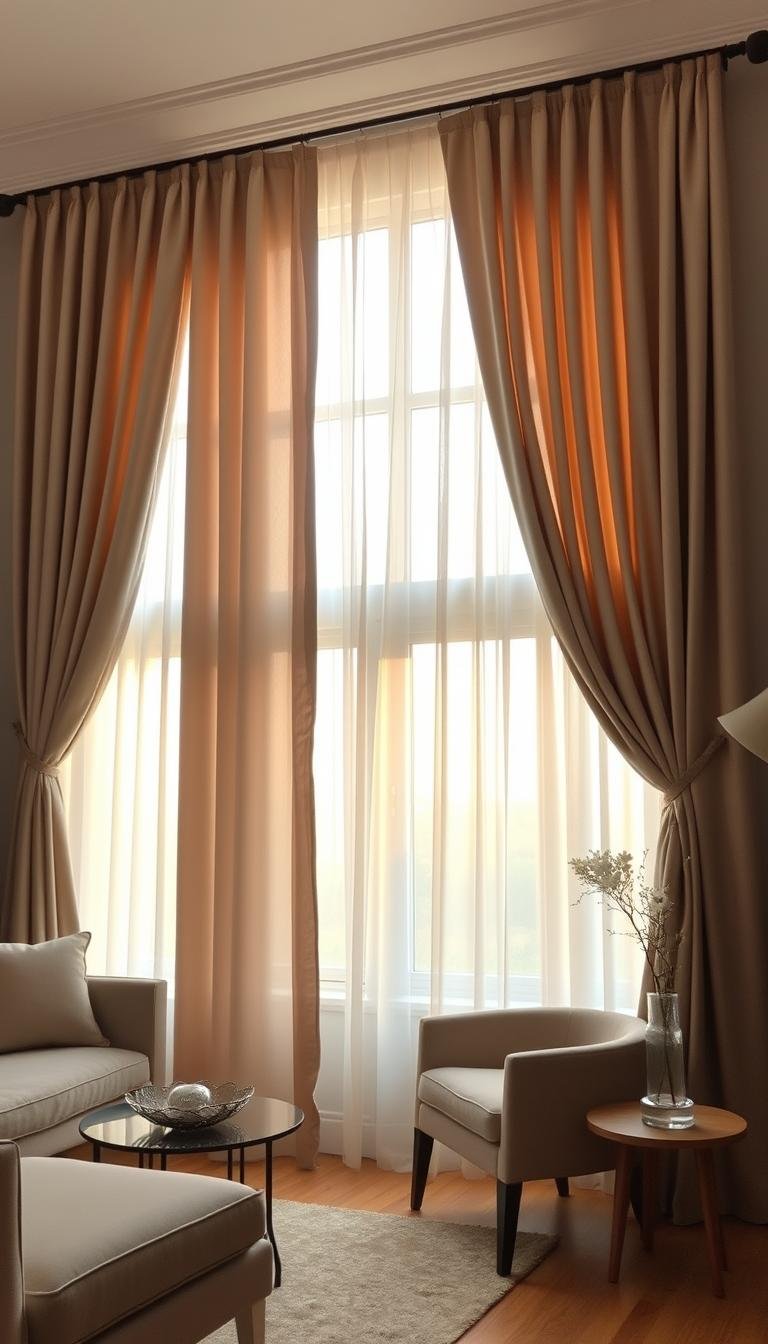
Light Grey Walls with Beige Curtain Combinations
Light grey walls provide an excellent backdrop for soft neutral window treatments. Beige curtains add warmth without overwhelming the space.
Opt for creamy tones that maintain that fresh, airy feeling. These shades reflect natural light beautifully throughout your room.
Consider lighter beige options for smaller spaces. They create the illusion of more square footage while maintaining coziness.
Deeper beige hues work well in rooms with abundant sunlight. They prevent the space from feeling too bright or sterile.
Dark Grey Walls with Cream and Taupe Options
Dark grey walls create dramatic backdrops that demand careful curtain selection. Cream window treatments soften the overall appearance beautifully.
These lighter options provide pleasing contrast against deeper wall colors. They prevent the room from feeling too dark or closed-in.
Taupe serves as an excellent bridge between grey and beige tones. This versatile shade creates seamless transitions between colors.
Rich cream curtains add sophistication to darker spaces. They create cozy, inviting atmospheres perfect for relaxation.
Mixing Patterns and Textures for Added Interest
Pattern mixing adds personality while maintaining color cohesion. Start with subtle designs that complement rather than compete.
Geometric patterns work beautifully with solid neutral backgrounds. They add visual interest without creating chaos.
Different fabric textures enhance your color scheme significantly. Velvet provides depth while linen offers casual sophistication.
Balance bold patterns with plenty of neutral space. This approach creates focal points without overwhelming your room.
Layering different textures creates compelling visual depth. The combination feels both intentional and effortlessly stylish.
Matching Curtains to Your Room’s Undertones

Understanding color undertones transforms your design process. This knowledge helps you create spaces that feel intentionally coordinated. Your window treatments will harmonize beautifully with your existing elements.
Different lighting conditions reveal hidden color characteristics. Natural and artificial light change how we perceive shades. Testing in your actual space ensures perfect coordination.
Identifying Cool vs Warm Grey Undertones
Grey walls contain subtle color influences that affect your choices. Cool varieties often show blue or green characteristics. Warm versions typically reveal beige or yellow notes.
Lighting dramatically changes how these undertones appear. Daylight might emphasize cool blue notes. Evening lamps could bring out warm yellow tones.
Try this simple white paper test for accurate identification. Hold white paper next to your wall surface. Observe whether the color appears more blue, green, or yellow.
This method reveals the true nature of your wall color. You’ll make better decisions about complementary shades. Your final look will achieve perfect balance.
Choosing Beige Shades That Complement Your Grey Walls
Selecting the right beige depends on your wall’s temperature. Cool grey walls pair beautifully with crisp, clean beiges. These combinations create fresh, modern atmospheres.
Warm grey walls work well with creamy, yellow-based beiges. These partnerships establish cozy, inviting environments. They make rooms feel comfortable and welcoming.
Consider these pairings for different undertones:
| Wall Undertone | Recommended Beige Type | Visual Effect | Room Atmosphere |
|---|---|---|---|
| Cool (blue/green) | Ash beige, taupe | Modern, crisp | Fresh and airy |
| Warm (yellow/beige) | Cream, camel | Cozy, inviting | Warm and comfortable |
| Neutral (balanced) | True beige, greige | Versatile, balanced | Timeless and adaptable |
Your curtain color should enhance without competing. The right choice creates visual harmony throughout your space.
Testing Colors in Your Actual Space
Always test potential options in your room before deciding. Colors change dramatically under different lighting conditions. Morning light reveals different qualities than evening illumination.
Obtain physical samples of your top curtain choices. Hang them next to windows and observe throughout the day. Notice how natural and artificial light affect their appearance.
Compare samples against your walls at various times. Daylight might make colors appear brighter and cooler. Evening light often creates warmer, softer appearances.
This testing process prevents disappointing surprises. You’ll confidently select options that work in all conditions. Your final decision will create the perfect atmosphere.
Remember that colors interact with your existing furnishings. Test samples near furniture and flooring materials. Ensure everything works together harmoniously.
Best Fabric Choices for Grey and Beige Curtains

Selecting the right textile for your window coverings can elevate your room’s design while serving practical needs. The material you choose affects how light enters your space and contributes to the overall atmosphere.
Different fabrics create distinct visual effects and functional benefits. Your selection should balance aesthetics with everyday usability.
Linen and Natural Fibers for Softness
Linen offers a relaxed elegance that complements neutral color schemes beautifully. This natural fiber creates soft, diffused light that enhances any space.
The organic texture of linen adds character to monochromatic arrangements. It brings depth through its unique weave patterns and natural variations.
Cotton works well for casual settings and maintains easily. This breathable option provides comfort while being simple to clean.
Natural fibers create an airy, inviting atmosphere in your room. They work particularly well with lighter wall colors.
Velvet and Heavy Fabrics for Depth
Velvet adds luxurious depth to your window treatments. This heavy fabric creates rich visual interest through its light-absorbing qualities.
Heavier materials provide excellent insulation and sound dampening. They transform your space into a cozy retreat perfect for relaxation.
Polyester offers practical elegance with its durability. This synthetic option resists wrinkles while mimicking more expensive textiles.
These fabrics create dramatic contrast against lighter walls. They establish a sophisticated vibe through their substantial presence.
Sheer Options for Light Control
Sheer curtains filter natural light beautifully throughout your space. They maintain privacy while allowing soft illumination to enter.
Semi-sheer options provide balanced light control for various needs. They offer some privacy while still welcoming sunlight.
Blackout fabrics block most light for optimal sleeping conditions. These are ideal for bedrooms where darkness enhances rest.
Different opacity levels affect your room’s atmosphere significantly. Lighter options create airy spaces, while darker choices establish intimate environments.
Mixing fabric textures adds compelling visual interest to your arrangements. Combine different materials to create layered looks with depth and character.
Room-Specific Applications and Ideas

Different spaces in your home serve unique purposes and deserve tailored window treatment solutions. The right selections enhance each area’s function while maintaining visual harmony throughout your living environment.
Living Room Elegance with Grey and Beige
Your gathering space deserves window treatments that balance sophistication with comfort. Soft white or cream curtains create a bright, airy feel against darker walls.
These light options reflect natural light beautifully throughout daytime hours. They maintain an open, welcoming atmosphere for entertaining guests.
Navy blue curtains paired with light grey walls create a striking look. This combination adds richness and elegance to your main living area.
Durable fabrics withstand high-traffic environments while maintaining style. Your choices should balance beauty with practical everyday use.
Bedroom Serenity Through Neutral Tones
Your personal retreat benefits from calming window treatments that promote rest. Dusty rose with grey results in a soothing color palette.
This romantic combination creates a cozy atmosphere perfect for relaxation. The right curtain options provide privacy while maintaining light control.
Blackout fabrics ensure optimal sleeping conditions when needed. Sheer layers allow soft morning light to filter through gently.
Your bedroom becomes a peaceful sanctuary with carefully chosen window coverings. They enhance relaxation and create the perfect retreat.
Kitchen and Dining Area Combinations
These functional spaces require practical yet attractive window solutions. Consider how curtains interact with existing elements like furniture and flooring.
Easy-to-clean fabrics withstand cooking environments while maintaining style. Your selections should balance functionality with aesthetic appeal.
Lighter hues create pleasant atmospheres for meals and gatherings. They make spaces feel more open and inviting during daytime use.
The right curtain colors complement your existing decor beautifully. They create cohesive looks that work well in these important areas.
Implementing Your Perfect Grey and Beige Curtain Plan
Ready to bring your vision to life? Proper planning ensures your window treatments enhance your space beautifully.
Start by measuring your windows accurately. Add a few extra inches to your curtain length for full coverage. This creates a polished, custom look.
Set a clear budget before shopping. Consider both ready-made and custom options. Each offers different benefits for your room.
Test curtain colors in your actual space first. Natural light changes how shades appear throughout the day. View samples at different times.
Choose fabrics that suit your lifestyle. Machine-washable options simplify maintenance. Stain-resistant materials keep your curtains looking fresh.
Coordinate hardware with your color scheme. Select rods and finials that complement your chosen hues. This attention to detail completes your room’s atmosphere.
Your careful implementation creates a harmonious space. Enjoy your new, beautifully dressed windows!