Your home is your sanctuary. The colors you choose can truly lift your mood and create a happy start to each day. Window treatments cover large visual spaces, often second only to wall paint in impact.
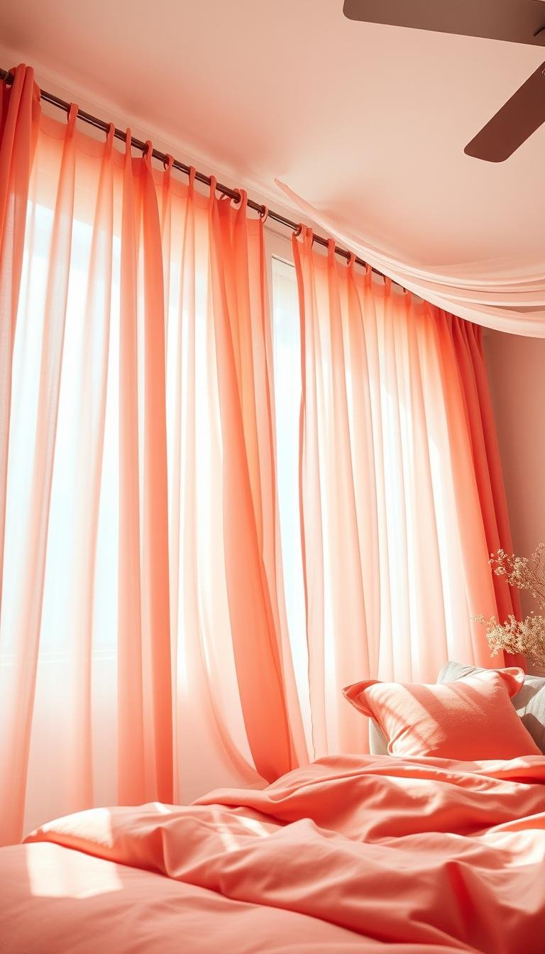
Selecting the perfect color and fabric is key for both happiness and longevity. The shade that sits between pink and orange brings a vibrant mood that’s impossible to ignore. It can be soft and sophisticated or punchy and playful.
This versatile hue pairs beautifully with various styles, from boho to modern. With minimal effort, you can transform your entire room, offering a quick and refreshing update.
We will explore 16 inspiring ideas to help you find the perfect look. This friendly guide aims to provide a solid foundation for the detailed advice ahead, making your space feel brand new.
Why Coral Curtains Are Your Bedroom’s Best Upgrade

Window treatments offer one of the most cost-effective ways to completely refresh your space. Unlike painting walls or buying new furniture, this single change delivers maximum impact with minimal investment.
Your draperies shape natural illumination and frame outdoor views beautifully. They control brightness levels throughout the day, creating perfect ambiance for relaxation or rejuvenation.
This vibrant hue works across countless interior styles. From minimalist modern to cozy traditional spaces, it brings sophisticated charm without overwhelming your existing design elements.
The psychological benefits are equally impressive. Warm coral tones naturally elevate mood, making your personal retreat feel more inviting and uplifting each morning.
Small rooms particularly benefit from this colorful approach. You gain visual interest without sacrificing precious floor area or creating clutter in compact living areas.
These window dressings harmonize wonderfully with your current bedding and decorative throws. They pull together various elements for a cohesive, polished appearance throughout the room.
Ultimately, coral introduces both warmth and vitality to your environment. This single upgrade can completely transform the atmosphere, making your space feel brand new.
Understanding the Psychology of Coral in Your Space

Color plays a powerful role in shaping how your personal area feels. It affects your emotions and daily mindset in subtle yet significant ways.
This unique hue combines the best qualities of two vibrant shades. It creates an atmosphere that feels both energizing and comforting.
Between Pink’s Charm and Orange’s Energy
This special shade brings together pink’s gentle warmth and orange’s lively spirit. The blend creates a friendly, contemporary feel that works in many settings.
You get the comforting embrace of pink tones mixed with orange’s invigorating touch. This combination makes your environment feel both cozy and awake.
It’s a versatile choice that adapts to various design styles. Whether your taste leans modern or traditional, this color adds character without overwhelming.
How Color Influences Mood and Atmosphere
The right hues can transform gray furniture into focal points of interest. In evening light, they emit a soft, welcoming glow that enhances relaxation.
Natural illumination changes how this color appears throughout the day. Morning sunlight reveals its vibrant energy, while dusk brings out its mellow warmth.
Pair it with metallic finishes like brass lamps for a harmonious look. These combinations create visual interest while maintaining balance in your decor.
Consider your existing color palette when introducing this vibrant tone. It complements neutral shades like cream and works well with contrasting textures.
This approach enhances your room’s energy without dominating the entire space. You achieve a balanced, inviting environment that feels both fresh and familiar.
Key Factors to Consider Before You Buy

Making the right choice involves more than just picking a favorite color. Several practical elements work together to create your perfect window treatment. Understanding these details ensures your selection enhances both function and style.
Fabric Choices: From Airy Sheers to Plush Velvet
Your fabric selection dramatically changes the room’s mood. Each material offers a unique feel and controls light differently.
Sheer fabrics spread a soft, diffused glow throughout your space. They maintain privacy while letting sunshine gently filter in.
Cotton brings a crisp, fresh look that works with many design styles. It’s easy to care for and offers medium light control.
Velvet provides a rich, luxurious texture that feels opulent. This heavier fabric blocks more light and adds warmth to your decor.
Linen creates a calm, relaxed atmosphere with its natural texture. It offers a casual elegance that pairs well with various color palettes.
Finding the Perfect Length and Fullness
Proper measurements are crucial for achieving a polished look. Getting the dimensions right makes all the difference.
Floor-length panels create a neat, tailored appearance. They should just kiss the floor or have a slight break for elegance.
Fullness refers to how much fabric you use relative to your window width. Aim for 1.5 to 2 times the window’s measurement for generous folds.
This extra fabric creates beautiful, soft folds when drawn closed. It also provides better light blocking and insulation for your space.
Always measure from the rod position down to your desired endpoint. Consider whether you want panels to pool slightly for a dramatic effect.
Pattern vs. Plain: Making the Right Statement
This decision impacts the entire room’s energy and visual balance. Your choice should complement your existing decor elements.
Plain panels offer a calm, tranquil feeling that soothes the space. They provide a solid background that lets other elements shine.
Patterns add motion and visual interest to your walls. They can introduce additional colors and textures to your design scheme.
If your room already has busy patterns in bedding or wall art, consider balancing with solid curtains. This approach maintains harmony without overwhelming the eye.
For a more dynamic look, patterned curtains can become the focal point. Just ensure they coordinate with your pillows, throws, and furniture finishes.
Remember that your window treatment should work with your overall design vision. The right choice creates cohesion between your walls, lighting, and accents.
How to Confidently Choose Your Coral Shade

Finding your ideal coral tone creates harmony between your window treatments and existing decor. This process ensures your selection enhances the entire room’s atmosphere.
Proper testing prevents disappointment with unexpected color shifts. You want your choice to work beautifully throughout the day.
Testing Swatches in Your Actual Light
Natural and artificial illumination dramatically changes how colors appear. Always test fabric samples in your specific environment.
Follow these steps for accurate color assessment:
- Place swatches near windows during bright daylight hours
- Check samples against walls during evening lighting
- Compare colors next to your sofa and floor surfaces
- Observe how tones change from morning to night
This comprehensive approach reveals the true character of each option. You avoid surprises when your curtains are finally installed.
Matching Coral Tones to Your Existing Decor
Your new window treatments should complement current design elements. Look for connections between coral tones and existing colors.
Neutral shades like cream or gray create perfect partnerships. They allow coral to shine without overwhelming the space.
Consider these coordinating elements:
- Fabric patterns on pillows and bedding
- Wall art colors and frames
- Wood tones in furniture pieces
- Metallic finishes on lamps and accessories
This thoughtful approach maintains visual balance throughout your room. Everything works together for a cohesive, polished look.
| Lighting Condition | What to Look For | Best Placement Areas |
|---|---|---|
| Morning Light | Warm undertones and brightness | East-facing windows |
| Afternoon Sun | Color intensity and vibrancy | South-facing windows |
| Evening Light | Softness and warmth | Near lamps and overhead lighting |
| Artificial Light | How colors appear at night | All room areas |
Take your time with these important decisions. Rushing can lead to mismatches that disrupt your room’s harmony.
The right coral shade brings warmth and energy to your space. It creates a welcoming atmosphere you’ll enjoy every day.
16 Coral Bedroom Curtains That Add Cheerful Energy

Discover creative ways to transform your room with vibrant window solutions. These ideas blend color, texture, and design for stunning results.
Each concept offers unique character and personality. Find the perfect match for your existing decor and personal style.
1. The Boho Retreat with Global Textiles
Create a cozy atmosphere with international fabrics and natural elements. Rattan accents bring earthy warmth to your space.
Layer patterns and textures for depth and comfort. This look feels collected over time and full of character.
2. The Warm Monochrome Escape
Embrace terracotta tones throughout your room for harmony. Botanical elements and macramé details complete the serene escape.
This palette creates a soothing, unified environment. It feels both modern and comfortably familiar.
3. The Mid-Century Statement with Sculpted Lines
Clean lines and retro lighting define this structured approach. The design emphasizes form and function beautifully.
Geometric patterns and tapered legs add retro charm. This style brings timeless appeal to contemporary spaces.
4. The Bright and Breezy Tangerine Look
Crisp white furniture creates airy contrast against vibrant tones. The combination feels fresh and invigorating.
Natural light plays beautifully with this cheerful palette. Your room will feel brighter and more spacious.
5. Modern Glam with Coral and Charcoal Contrast
Satin fabrics and dark charcoal create dramatic sophistication. This high-contrast approach makes a bold statement.
Metallic accents add shimmer and refinement. The result feels luxurious and intentionally designed.
6. Eclectic Style with Jewel-Tone Accents
Vintage art and rich jewel colors create creative energy. This approach celebrates individuality and personal expression.
Mix patterns and eras for unique character. Your space becomes a gallery of cherished pieces.
7. A Playful Kid’s Room
Patterns and smart storage solutions make fun, functional spaces. The design grows with your child’s changing interests.
Durable fabrics withstand everyday adventures. This room balances imagination with practical needs.
8. Soft Florals with a Hint of Elegance
Delicate patterns bring refined beauty to your space. The floral motifs feel romantic and gracefully subtle.
This approach works beautifully in traditional and modern settings. It adds sophistication without overwhelming.
9. Earthy Tones with Olive Accents
Olive green provides grounded contrast to warm hues. The combination feels natural and soothing.
Organic materials enhance the earthy palette. Your room connects with nature’s calming influence.
10. A Sunset-Inspired Whimsical Space
Murals and rattan elements create dreamy, imaginative environments. The design captures golden hour magic.
Soft lighting enhances the whimsical atmosphere. This space feels like permanent golden hour.
11. Cocooned Elegance in Deep Drapery
All-over upholstery creates enveloping comfort and luxury. The deep tones feel rich and protective.
This approach makes your room feel like a premium retreat. It’s perfect for creating intimate, cozy spaces.
12. Retro Pop with a Round Bed
Velvet textures and circular forms define this nostalgic look. The design recalls vintage glamour with modern comfort.
Bold shapes make strong visual statements. This style celebrates retro aesthetics with contemporary flair.
13. Eclectic Charm with Floral Wallpaper
Global textures mix with botanical patterns for unique character. The combination feels both curated and spontaneous.
This approach celebrates personal taste and individual style. Your space tells a story through varied elements.
14. Minimalist Accent Wall with Textural Contrast
Simplicity meets depth through thoughtful material choices. The design emphasizes quality over quantity.
Clean spaces feel both serene and intentionally designed. This approach creates calm, organized environments.
15. Textured Tropical with Sculptural Decor
Bold patterns and artistic pieces create dramatic impact. The design feels both lush and carefully composed.
Organic forms and vibrant colors celebrate tropical inspiration. This space feels like permanent vacation.
16. Playful Florals with a Whimsical Touch
Stripes and lighthearted patterns create cheerful energy. The design feels both fun and thoughtfully arranged.
This approach balances playfulness with refinement. Your space becomes both uplifting and gracefully composed.
| Design Style | Key Elements | Room Atmosphere |
|---|---|---|
| Boho Retreat | Global textiles, rattan accents | Cozy and collected |
| Warm Monochrome | Terracotta tones, botanical elements | Serene and unified |
| Mid-Century | Clean lines, retro lighting | Structured and timeless |
| Tangerine Look | White furniture, bright tones | Airy and invigorating |
| Modern Glam | Satin, charcoal contrast | Dramatic and luxurious |
| Eclectic Style | Jewel tones, vintage art | Creative and personal |
| Kid’s Room | Patterns, smart storage | Fun and functional |
| Soft Florals | Delicate patterns, elegance | Refined and romantic |
| Earthy Tones | Olive accents, organic materials | Grounded and natural |
| Sunset-Inspired | Murals, rattan elements | Whimsical and dreamy |
| Cocooned Elegance | Deep drapery, all-over upholstery | Luxurious and protective |
| Retro Pop | Round bed, velvet textures | Nostalgic and bold |
| Eclectic Charm | Floral wallpaper, global textures | Curated and spontaneous |
| Minimalist Accent | Textural contrast, simplicity | Serene and organized |
| Textured Tropical | Sculptural decor, bold patterns | Lush and dramatic |
| Playful Florals | Stripes, lighthearted patterns | Cheerful and graceful |
These ideas offer starting points for your design journey. Mix elements from different styles to create your perfect personal space.
Remember to consider your existing furniture and lighting conditions. The right choice will make your room feel both fresh and authentically yours.
Creating a Cohesive Coral Color Palette
Building a harmonious color scheme around your window treatments brings everything together beautifully. The right combinations make your space feel intentional and polished.
Start with your vibrant panels as the foundation. Then select complementary shades that enhance without competing.
This approach creates visual flow throughout your room. Everything works together for a balanced, inviting atmosphere.
Perfect Pairings: Neutrals and Accent Colors
Neutral backgrounds let your vibrant window treatments shine. They provide calm balance to energetic tones.
Consider these elegant neutral options:
- Crisp white creates fresh contrast and brightness
- Soft cream adds warmth while maintaining lightness
- Pale beige offers subtle earthy undertones
Accent colors should appear in smaller doses throughout your space. They add depth and interest without overwhelming.
Try navy blue throw pillows for sophisticated contrast. Gold lamp bases introduce metallic shimmer and elegance.
These touches create visual rhythm around your room. They guide the eye through your carefully curated design.
The Winning Combination: Gray and Coral
This pairing works beautifully for both mood and style. Gray provides serene stability while coral brings lively energy.
Light gray walls make an excellent backdrop for vibrant panels. They keep small rooms feeling open and airy.
Darker charcoal grays create dramatic sophistication. This contrast feels modern and intentionally designed.
Texture plays a crucial role in unifying these tones. Matte finishes on walls complement fabric textures.
Consider adding a plush area rug in coordinating gray. It anchors the space while enhancing comfort underfoot.
Limit your color selection to maintain harmony throughout. Too many competing hues create visual clutter.
Stick to three main colors for a cohesive look. Your vibrant panels, neutral base, and one accent shade work perfectly.
This disciplined approach creates a polished, professional result. Your room feels both energized and perfectly balanced.
Styling Tips to Make Your Curtains Shine
The right finishing touches transform your window treatments from functional to fabulous. These details create harmony between your panels and the entire room’s aesthetic.
Thoughtful hardware selections and accent pieces complete your vision. They add personality while maintaining practical functionality.
Choosing the Right Rods and Finials
Your curtain rod sets the stage for the entire window treatment. The finish dramatically changes the room’s mood and style.
Brass finishes bring warm, traditional elegance to your space. They pair beautifully with vintage-inspired decor and rich textures.
Black rods create striking modern contrast against light walls. This bold choice makes a strong design statement.
Chrome offers crisp, clean lines for contemporary spaces. It reflects light beautifully and feels fresh.
Finial shapes add the perfect finishing touch to your rods. Consider these popular options:
- Sphere finials provide classic, timeless appeal
- Flat caps deliver minimalist, streamlined elegance
- Crystal finials add sparkling refinement
- Wooden finials bring natural warmth
Match your hardware to existing metal finishes throughout the room. Consistency creates cohesive visual flow.
Incorporating Tiebacks and Hardware
Tiebacks serve both practical and decorative purposes. They control light while adding textural interest.
Rope tiebacks create casual, relaxed elegance. They work beautifully with boho and coastal styles.
Leather bands offer sophisticated contrast against fabric panels. This combination feels both refined and unexpected.
Woven materials add artisanal charm and handmade character. They bring unique personality to standard window treatments.
Consider these functional benefits when selecting tiebacks:
- Control natural illumination throughout the day
- Create beautiful drape and fold patterns
- Add visual interest at eye level
- Offer easy adjustment for privacy needs
Balance style with practicality for the best results. Your hardware should enhance both form and function.
Echoing the Color in Accents and Art
Repeating your curtain color throughout the space creates visual harmony. This technique makes your design feel intentional and polished.
Start with smaller decorative pieces that catch the eye. A vibrant throw pillow or ceramic vase introduces the hue subtly.
Wall art provides another excellent opportunity for color repetition. Choose pieces that feature your signature shade in their palette.
Consider these strategic placement ideas for coral accents:
- Bedding patterns with subtle tonal variations
- Area rugs that incorporate complementary colors
- Lamp bases with matte finishes in coordinating tones
- Decorative objects on shelves and surfaces
Layer different textures to add depth and interest. Matte ceramics, woven baskets, and soft fabrics create rich visual appeal.
Remember that balance is key to successful design. Too much of any color can overwhelm the space.
Use your vibrant hue as an accent rather than the main event. This approach creates energy without sacrificing elegance.
The right details make your window treatments feel integrated and intentional. They transform functional pieces into design statements.
Practical Considerations for Every Room
Every space has unique needs that go beyond just appearance. Your window treatments should work beautifully while meeting practical demands.
Functionality ensures your decor remains both lovely and livable. Smart choices create harmony between style and daily use.
Solutions for Low-Light and Small Spaces
Dim rooms benefit from bright, energizing tones. Vibrant fabrics reflect available illumination beautifully.
Lightweight materials like cotton or linen maintain airy feelings. They prevent heavy, closed-in sensations.
Mount rods close to the ceiling for height illusion. This trick makes compact areas feel more spacious.
Full-length panels draw the eye upward naturally. They create elegant vertical lines that enhance room proportions.
Selecting Kid-Friendly and Washable Fabrics
Family spaces demand durable, easy-care materials. Machine-washable options simplify maintenance dramatically.
Cotton and polyester blends withstand frequent cleaning. They maintain color vibrancy through many washes.
Secure mounting prevents accidental pulling down. Sturdy hardware ensures safety during active play.
Patterns help disguise minor stains between cleanings. They maintain fresh appearances longer than solid colors.
Ensuring Safety and Sun Protection
Cordless options eliminate potential hazards completely. They provide peace of mind in children’s areas.
Blackout lining creates perfect darkness for restful sleep. It also protects against fading from strong sunlight.
UV-protective coatings prevent fabric deterioration. They maintain beautiful colors for years longer.
Consider layered window treatments for flexibility. Sheers filter light while blackout panels provide total darkness.
Your practical choices ensure lasting satisfaction with your window decor. They blend beauty with functionality perfectly.
Your Step-by-Step Guide to Buying
Getting the right window treatments involves careful planning and smart choices. Proper preparation ensures your new panels fit perfectly and match your vision.
This guide walks you through measuring techniques and budget-friendly strategies. You will learn how to achieve a custom look without overspending.
How to Measure Your Windows Correctly
Accurate measurements are the foundation of beautiful window treatments. Follow these steps for perfect results every time.
First, decide where your rod will hang. Measure from the rod’s top position down to your floor.
For length, aim for panels that just touch the floor or have a slight break. This creates an elegant, tailored appearance.
Width measurement requires extra attention. Measure your window’s width from outer edge to outer edge.
Add extra width for fullness. Use 1.5 to 2 times your window’s measurement for luxurious folds.
This extra fabric creates beautiful drape and better light control. It makes your treatment look rich and custom-made.
Always measure twice to confirm your numbers. Write down each measurement clearly to avoid confusion.
Budget-Friendly Shopping Strategies
Beautiful window treatments don’t require a huge investment. Smart shopping helps you get quality results within your budget.
Start by comparing ready-made panels before considering custom orders. Many stores offer excellent options at lower prices.
Watch for seasonal sales during home decor events. Major holidays often bring significant discounts on window treatments.
Clip rings offer an easy solution for length adjustments. They let you modify panel height without sewing or hemming.
If funds are limited, focus on your main windows first. You can add treatments to other windows later as your budget allows.
Compare fabric quality and construction details across different price points. Sometimes mid-range options offer the best value.
| Measurement Type | How to Measure | Pro Tip |
|---|---|---|
| Length | Rod to floor | Add 1 inch for floor clearance |
| Width | Edge to edge | Multiply by 1.5 for fullness |
| Fullness | Total fabric width | 2x width for luxurious look |
| Rod Placement | Above window frame | 4-6 inches above for height |
These strategies help you create a beautiful space without breaking the bank. Thoughtful planning makes all the difference in your final result.
Remember that quality installation enhances your investment. Take time to hang your treatments properly for best appearance.
Caring for Your Curtains to Last for Years
Proper care extends the beauty of your window treatments for seasons to come. Regular maintenance preserves both their vibrant appearance and functional benefits. These simple practices keep your space looking fresh and inviting.
Simple Cleaning and Maintenance Tips
Always check fabric care labels before cleaning. Different materials require specific handling methods for best results.
Cotton and polyester blends often handle machine washing well. Use cold water and gentle cycle settings to protect colors.
Velvet and silk usually need professional dry cleaning. These delicate fabrics maintain their luxury feel with proper care.
Steamers gently remove wrinkles without heat damage. They refresh fabric between cleanings while maintaining texture.
Dust rods and finials during regular room cleaning. This prevents buildup that can transfer to your panels.
Preventing Fading and Keeping Them Fresh
Quality lining protects against sun damage significantly. It blocks harmful UV rays that cause color fading over time.
Rotate panels seasonally if possible. This distributes sun exposure evenly across the fabric.
Clean windows regularly to maximize natural illumination. Clear glass allows brighter light without extra fading risk.
Follow care instructions precisely for longevity. Manufacturers provide specific guidance for each fabric type.
Establish a simple monthly care routine. Quick checks and light dusting maintain fresh appearance between deep cleans.
Transform Your Bedroom with a Single Change
A fresh pair of vibrant panels can completely renew your personal space in just one afternoon. Start by testing a fabric swatch in your own lighting to ensure the perfect match.
Hang floor-length panels that gently touch the floor for a polished look. Echo the lively color in your pillows, art, or rug to create harmony throughout the room.
Add protective lining to shield against sun damage and choose sturdy hardware for lasting beauty. This simple update brings wonderful warmth and balance to your decor.
Enjoy your renewed space that now feels both bright and uniquely yours. Quality choices today mean years of cheerful mornings ahead.