Your home deserves a centerpiece that blends style with versatility. Many people overlook the incredible potential of neutral-toned furniture, but these pieces can transform your entire space.
These furnishings serve as the perfect foundation for any design vision. They create a cozy and inviting atmosphere while allowing your personality to shine through accessories and accents.
You’ll discover how one piece can become both a focal point and a adaptable backdrop. Simple changes like switching throw pillows or adding a textured blanket can completely refresh your look.
This approach offers endless possibilities for expressing your unique style. Whether you prefer bold colors or soft neutrals, your foundation piece provides the flexibility to evolve with your tastes over time.
1. Why a Light Gray Sofa is Your Best Design Decision
A light gray sectional offers unparalleled design flexibility that grows with your changing tastes. This choice serves as your home’s adaptable foundation for years to come.
You gain a neutral backdrop that enhances your existing furniture rather than competing with it. The elegant quality of this hue complements virtually any color scheme you imagine.
This versatile piece does more than improve your decor—it actually influences your room’s mood and energy. Many people find gray tones create a calming atmosphere that feels both sophisticated and welcoming.
Discover these key advantages:
- Experiment with different styles over time without replacing your main furniture
- Swap accessories seasonally for instant room refreshes
- Pair with bold colors or soft neutrals for completely different vibes
- Allow artwork and architectural details to become the true stars of your space
Whether you prefer eclectic mixes or soothing palettes, this foundation piece supports endless possibilities. Simply changing throw pillows or adding a textured blanket transforms your entire look.
You maintain design freedom while investing in a piece that will remain relevant through changing trends. That’s what makes this selection such a smart decision for your home.
2. Mastering the Art of Color Pairing

Choosing the right colors for your space starts with understanding your centerpiece’s undertones. This knowledge transforms your entire design approach.
You’ll create harmony instead of visual conflict. The right combinations make your furnishings sing together rather than compete.
First, identify whether your piece has warm or cool undertones. Warm grays have taupe or brown hints, while cool grays show blue or green notes.
Hold different colored fabrics against your upholstery in natural light. You’ll quickly see which tones complement and which clash.
Warm Undertones: Cozy and Inviting Pairings
Warm-toned pieces create instant comfort in your home. They pair beautifully with earthy, rich hues that enhance their cozy nature.
Mustard yellow adds vibrant energy without overwhelming. Blush pink brings soft elegance to the arrangement.
Coral introduces playful warmth perfect for gatherings. Gold accents provide luxurious shimmer throughout your space.
These combinations work wonderfully for creating intimate, welcoming environments. They make guests feel immediately at ease in your home.
Cool Undertones: Calm and Refreshing Combinations
Cool-toned furnishings establish serene, collected atmospheres. They work with refreshing hues that emphasize their tranquil qualities.
Teal adds depth while maintaining peaceful vibes. Navy blue creates sophisticated contrast without harshness.
Mint green brings airy freshness to your arrangement. Hunter green grounds the space with natural elegance.
These palettes produce calming retreats from busy days. They help transform your area into a true sanctuary.
Always test colors with fabric swatches before committing. Paint samples on your walls to see how light affects them throughout the day.
Layer multiple shades of your chosen palette for depth. This approach adds professional dimension to your design.
Seasonal changes become simple with your neutral foundation. Switch accent hues to refresh your look for different times of year.
Your choices should reflect both the undertones and your personal style. The right combinations will feel both harmonious and uniquely yours.
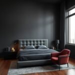
3. The Power of Contrast with Walls and Floors
Contrast transforms your neutral centerpiece into a stunning focal point. You can create drama or harmony depending on your wall and floor choices.
A slate gray couch makes a bold statement against crisp white walls. This combination instantly draws attention to your furniture as the room’s star.
For a softer approach, select a piece just slightly lighter or darker than your walls. This creates a gentle, cohesive flow throughout your space.
Complement this subtle contrast with delicate pastel accents. Soft pinks, blues, or greens add warmth without overwhelming your aesthetic.
Consider these professional techniques:
- Test paint samples at different times of day to see how light affects contrast levels
- Use large fabric swatches against walls to visualize final results before committing
- Remember that high contrast makes rooms feel more dynamic, while low contrast creates calm
- Consider how contrast affects perceived room size – darker walls can make spaces feel cozier
Gray floors represent the latest trend in minimalist design. They provide a sophisticated foundation that complements your neutral furnishings beautifully.
Whether you prefer dramatic statements or subtle harmony, contrast helps define your room’s character. Your choices should reflect both your style and how you use the space daily.
“The right contrast doesn’t just highlight your furniture – it defines the entire room’s personality.”
Always view samples in your actual space before making final decisions. Natural and artificial light dramatically change how colors interact throughout the day.
Your foundation piece offers incredible flexibility through contrast play. Experiment with different levels to discover what truly makes your heart sing.
4. Incorporating Texture for a Luxurious Feel

Texture transforms your space from flat to fabulous. It adds depth and dimension that makes your area feel complete.
You create visual interest through different materials and surfaces. This approach makes your design feel more inviting and thoughtfully crafted.
Mixing various elements prevents monotony in your arrangement. The right combinations make your furnishings feel cohesive yet dynamic.
Fabric Choices: Velvet, Tweed, and Linen
Your upholstery selection sets the tone for your entire room. Different fabrics create distinct moods and comfort levels.
Velvet offers rich luxury that feels soft to the touch. It catches light beautifully and adds sophistication to your space.
Tweed provides cozy warmth with its woven texture. This fabric brings modern comfort with timeless appeal.
Linen introduces breezy casualness perfect for relaxed spaces. Its natural texture adds organic charm to your design.
Textural Accents: Pillows, Blankets, and Rugs
Accessories provide opportunities to layer different textures. They let you experiment without major commitments.
Throw pillows in various fabrics create instant visual interest. Mix velvet with knit or faux fur for delightful contrast.
Cozy blankets add both comfort and textural appeal. Drape a chunky cable-knit throw over your piece for inviting warmth.
Area rugs anchor your space while adding another texture layer. Choose woven or shag options for enhanced comfort underfoot.
Professional texturing techniques:
- Combine at least three different textures for balanced visual interest
- Vary textures between large pieces and smaller accessories
- Consider how textures feel as well as how they look
- Rotate textiles seasonally to keep your space feeling fresh
| Material Type | Best For | Pairing Suggestions |
|---|---|---|
| Velvet | Formal spaces, luxury feel | Metallic accents, silk pillows |
| Tweed | Cozy family rooms | Wood elements, knit blankets |
| Linen | Casual, airy spaces | Cotton throws, natural fiber rugs |
| Leather | Modern contrast | Wool throws, metal tables |
| Chenille | Soft comfort | Velvet pillows, plush rugs |
Mix materials throughout your area for cohesive diversity. Pair your main piece with iron-framed chairs or a wooden coffee table.
Ceramic vases and decorative objects add subtle textural variation. These elements create a layered look that feels intentional.
Seasonal changes become simple with strategic texture swaps. Lightweight linens for summer transform into rich velvets for winter.
Your choices should reflect both aesthetic preferences and practical needs. The right texture balance makes your space truly special.
5. Choosing the Perfect Area Rug
Your area rug becomes the foundation that ties your entire seating arrangement together. It defines your conversation area while adding cozy softness underfoot.
The beauty of neutral furniture lies in its incredible versatility. You can pair it with virtually any rug design from subtle textures to bold patterns.
Textural, tone-on-tone options create understated elegance. They highlight your centerpiece’s beautiful hue while adding depth through weave variations.
For stronger statements, choose rugs with vibrant colors or compelling patterns. These make dramatic impacts beneath your neutral foundation piece.
In airy spaces, colored floor coverings ground the arrangement beautifully. They add much-needed dimension while maintaining visual balance.
Proper sizing ensures harmony between your furnishings. Follow these professional guidelines for ideal placement:
- Front legs of all seating should rest on the rug surface
- Allow 12-18 inches of bare floor around the rug’s edges
- Ensure proportional balance with your room’s dimensions
- Consider traffic patterns when determining placement
Different materials offer unique benefits for your home. Each brings distinct texture and durability qualities to your design.
| Material | Best Use | Maintenance Level | Texture Quality |
|---|---|---|---|
| Wool | High-traffic areas | Medium | Plush, durable |
| Cotton | Casual spaces | Easy | Soft, flat-weave |
| Synthetic | Budget-friendly | Simple | Varied options |
| Natural Fiber | Organic style | Delicate | Textural, rustic |
| Silk Blend | Luxury spaces | High | Shimmery, soft |
Seasonal changes become effortless with strategic rug rotations. Lightweight jute or seagrass works perfectly for summer months.
Switch to richer wool or shag options when cooler weather arrives. Your foundation piece remains constant while accessories refresh the look.
Always view rug samples in your actual space before purchasing. Natural light dramatically affects how colors and patterns appear throughout the day.
The right floor covering completes your design while adding comfort and style. It transforms your arrangement into a cohesive, inviting space.
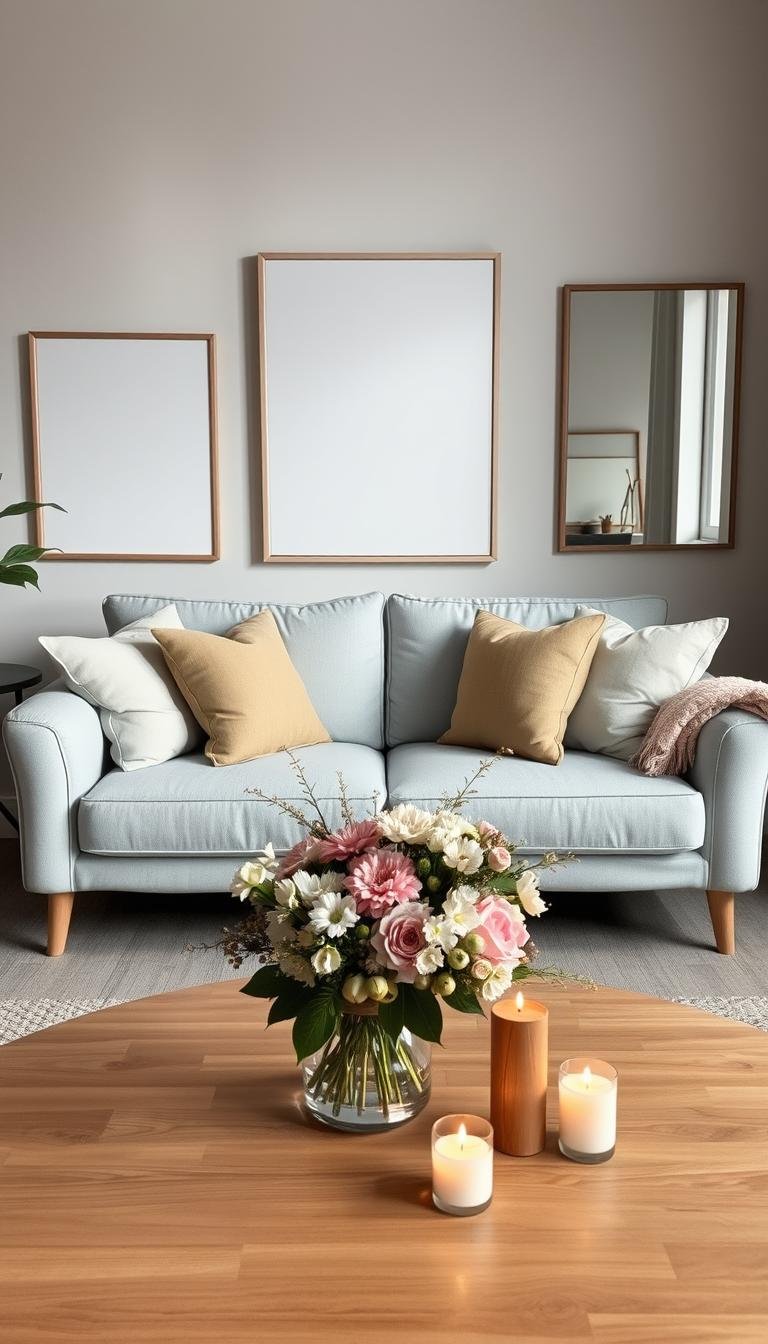
6. Styling Your Coffee Table and Surfaces
Surface styling transforms functional spaces into curated displays that reflect your unique aesthetic. Your coffee table becomes the perfect stage for expressing personal style while complementing your neutral foundation.
Discover how to create cohesive arrangements that enhance your entire room. Thoughtful surface decor brings personality and polish to your overall design.
Driftwood-and-glass combinations add unexpected texture and natural color. These unique pieces work beautifully with minimalistic furniture and decor.
The organic quality of driftwood introduces warmth to cool tones. Glass elements maintain visual lightness in your arrangement.
Consider these architectural enhancement techniques:
- Highlight existing features like exposed brick or wooden beams for natural texture
- Use limewashing on brick surfaces to maintain earthy quality without bright colors
- Balance saturated hues with your neutral foundation for polished sophistication
- Create visual interest through layered textures rather than competing colors
Your home’s inherent features become design assets when properly emphasized. They add character without overwhelming your carefully curated space.
Professional styling follows simple principles for maximum impact. Arrange items in groups of three for visual balance and interest.
Vary heights and textures within your arrangements. Include both functional and decorative elements for practical beauty.
Seasonal changes refresh your space throughout the year. Switch accessories to reflect different times and moods.
| Styling Approach | Best For | Key Elements | Seasonal Adaptation |
|---|---|---|---|
| Minimalist | Small spaces, modern aesthetics | Single sculptural piece, art book | Switch book themes seasonally |
| Layered Texture | Organic, cozy spaces | Wood tray, stone objects, textile | Change textile weight seasonally |
| Color Focused | Bold personal expression | Colorful ceramics, art objects | Rotate color palettes quarterly |
| Functional Beauty | Family spaces, daily use | Storage boxes, practical accessories | Adapt to changing family needs |
| Natural Elements | Biophilic design lovers | Fresh greenery, natural materials | Follow natural seasonal changes |
Choose decorative objects that complement your foundation’s color and style. Personal touches make the space uniquely yours while maintaining design cohesion.
Balance remains key to successful surface styling. Avoid clutter while ensuring enough interest to feel complete and intentional.
Your surfaces tell your design story through carefully chosen elements. They connect your main piece with the rest of your room beautifully.
7. Selecting Throw Pillows and Blankets for Impact
Accessories transform your foundation piece into a personalized statement. They add personality and warmth without permanent changes.
Your neutral centerpiece welcomes colorful accents beautifully. You can experiment with different moods and styles easily.
Discover how specific combinations create different atmospheres. Blue tones bring calm serenity to your arrangement.
Mustard yellow adds vibrant energy and warmth. Burgundy introduces rich sophistication and depth.
These earthy hues work together for cozy vibes. They complement rather than compete with your foundation.
“The right accessories don’t just decorate your space – they tell your story and create your desired mood.”
Texture plays a crucial role in luxury feel. Mix different materials for visual and tactile interest.
Velvet pillows add rich sophistication. Knit blankets provide cozy comfort for relaxation.
Faux fur accents create inviting warmth. These elements make your space feel extra special.
Professional arrangement techniques:
- Start with larger pillows at the back, smaller ones in front
- Mix patterns and solids for balanced interest
- Include different sizes and shapes for dynamic look
- Drape blankets casually for inviting appearance
Complement your textiles with other elements. A wooden table adds natural warmth to your scheme.
Patterned rugs introduce additional color and texture. They help tie everything together beautifully.
Plants on surfaces bring life and freshness. They add organic beauty to your curated space.
| Season | Pillow Fabrics | Blanket Types | Color Palette |
|---|---|---|---|
| Spring | Linen, cotton | Lightweight throws | Pastels, fresh greens |
| Summer | Cotton, canvas | Light woven blankets | Brights, ocean tones |
| Fall | Velvet, tweed | Medium-weight knits | Earthy tones, burgundy |
| Winter | Faux fur, wool | Chunky knits, plush | Rich hues, deep tones |
Seasonal changes keep your space feeling fresh. Rotate accessories to match the time of year.
Your choices should reflect both style and comfort. The right combinations make your home truly yours.
Experiment with different arrangements until you find what works. Your foundation piece supports endless possibilities.
8. Balancing with Other Furniture Pieces

Your neutral centerpiece becomes the perfect mediator between different furniture styles. It creates harmony where contrasting elements might otherwise clash.
This versatile foundation allows you to blend pieces from various eras and designs. You achieve a curated look that feels intentional rather than random.
Mixing Traditional and Modern Styles
Your piece serves as the ideal bridge between classic and contemporary elements. It connects different periods seamlessly in your space.
Pair midcentury modern chairs with a contemporary coffee table effortlessly. Your foundation creates visual continuity between these distinct styles.
Incorporate various shades throughout your arrangement for unity. This technique ties diverse shapes and designs together beautifully.
Classic architectural details like wainscoting work wonderfully. Their traditional charm complements modern simplicity perfectly.
Adding Accent Chairs for Personality
Accent chairs inject character into your design scheme. They become focal points that express your unique taste.
Choose patterned seats that complement rather than compete. Their vibrant designs pop against your neutral backdrop.
Consider scale and proportion when selecting additional pieces. Ensure they balance visually with your main furniture.
Strategic placement creates conversation areas that feel inviting. Arrange chairs to encourage interaction and flow.
Professional blending techniques:
- Repeat similar materials or colors throughout different pieces
- Maintain consistent leg styles or hardware finishes
- Use your foundation as the color constant among varied items
- Allow statement pieces to shine against simple backgrounds
Your choices should reflect both personal style and visual harmony. The right balance makes your space feel both collected and cohesive.
Experiment with different combinations until you find what works. Your adaptable foundation supports endless creative possibilities.
9. Creating a Focal Point with Art and Decor
Your neutral foundation piece becomes the perfect stage for showcasing bold artistic statements. It provides a sophisticated backdrop that lets your favorite pieces shine without competition.
Discover how this versatile choice enhances rather than overwhelms your design elements. You create visual harmony where artwork and decor become the true stars.
Your piece offers incredible flexibility for highlighting room features:
- Showcase striking artwork without color conflicts
- Emphasize architectural details like beautiful moldings
- Highlight colorful accent chairs as intentional statements
- Create gallery walls that pop against your neutral background
Position your foundation against an accent wall for maximum impact. This placement provides comfortable seating while letting the wall design take center stage.
Consider painting arches in different shades for visual interest. Fun wallpaper patterns create dynamic backgrounds that complement your arrangement.
“A neutral foundation doesn’t mean boring – it means everything else gets to be interesting.”
Ditch the myth that you must go dark with this hue. Light tones create airy, sophisticated spaces that feel both modern and timeless.
Professional arrangement follows simple principles for balanced composition. Scale and proportion ensure everything works together harmoniously.
| Element Type | Scale Guidelines | Placement Tips | Color Pairing |
|---|---|---|---|
| Large Artwork | 2/3 width of your piece | Eye level centered above | Bold colors, black frames |
| Gallery Wall | Group width matches piece | 6-8 inches above back | Mix frames, consistent mats |
| Sculptural Pieces | Vary heights 12-24 inches | Odd numbers, staggered | Natural materials, metals |
| Functional Decor | Proportional to surface | Group in triangles | Complementary tones |
| Textural Elements | Layered dimensions | Front and center | Neutral variations |
Choose pieces that reflect your personal style while enhancing your foundation. The right selections make your space uniquely yours.
Balance remains key to successful focal point creation. Allow enough negative space for elements to breathe and shine.
Your choices should create visual interest without overwhelming. The perfect arrangement feels both intentional and effortlessly beautiful.
10. Designing with Light and Airy Neutrals

Creating an open, spacious atmosphere around your centerpiece begins with strategic neutral choices. You can transform your entire area into a welcoming retreat that feels both modern and timeless.
Position your main furniture near windows to maximize natural illumination. This placement creates beautiful light patterns throughout the day.
Choose light wall colors to enhance the sense of space. Soft whites and pale grays make rooms appear larger and more open.
These hues work beautifully with your foundation piece. They create harmonious backgrounds that highlight rather than compete.
Discover these professional techniques for airy designs:
- Select creamy off-whites for warm, inviting backgrounds
- Use blush pink accents for soft, romantic touches
- Incorporate wood elements for natural warmth
- Layer varying neutral shades for depth without darkness
Your upholstery serves as the perfect foundation for neutral schemes. It harmonizes with numerous shades from crisp white to rich sepia.
Black accents provide sophisticated contrast when used sparingly. They ground the arrangement without overwhelming the light feel.
Natural materials like rattan and light wood maintain airiness. They add texture while keeping the overall look breezy and fresh.
| Neutral Element | Color Pairing | Room Effect | Best Applications |
|---|---|---|---|
| Walls | Soft white, light gray | Expands space visually | All room sizes, low ceilings |
| Ceiling | White, lighter than walls | Creates height illusion | Small spaces, low rooms |
| Flooring | Light wood, pale gray | Enhances brightness | North-facing rooms, limited light |
| Textiles | Cream, beige, blush | Adds soft warmth | Accent pillows, throws, curtains |
| Accessories | Wood tones, metallics | Provides subtle contrast | Decor items, table surfaces |
Monitor how light changes your colors throughout the day. Morning sun creates different effects than evening illumination.
Artificial lighting should complement your neutral scheme. Choose warm bulbs that enhance rather than distort your carefully selected hues.
Your choices create a sanctuary that feels both refreshing and comforting. The right neutral balance makes your home truly special.
11. Embracing a Coastal Vibe
Transform your home into a breezy retreat with coastal-inspired design. Your versatile foundation piece becomes the perfect anchor for beachy aesthetics.
Discover how to blend cool tones with natural warmth. You’ll create a space that feels both refreshing and inviting.
Classic coastal palettes feature creams, blues, and browns. These colors work beautifully with your neutral foundation.
They create relaxed, beach-inspired environments. Your space becomes a peaceful oasis for daily living.
Play up cool blue tones throughout your arrangement. Add ocean-inspired decor for cohesive coastal vibes.
Ceramic vases in sea glass hues bring subtle color. Nautical artwork introduces thematic elements without overwhelming.
Incorporate wicker chairs across from your main piece. Natural materials add texture and casual elegance.
Jute rugs provide earthy warmth underfoot. They complement your foundation while enhancing the beachy feel.
Brown remains a design staple for its warming qualities. It effortlessly balances cooler tones in your space.
Complement your foundation with brown leather chairs. They introduce rich texture and rustic charm.
“Coastal design isn’t about theme parks – it’s about creating light, airy spaces that feel connected to nature.”
Choose accessories that enhance your color scheme. Driftwood pieces and seashell collections add authentic touches.
Keep decorations minimal for uncluttered elegance. Let natural materials and colors tell the story.
Professional coastal design strategies:
- Layer varying shades of blue for ocean-inspired depth
- Mix natural textures like rattan, jute, and linen
- Use creamy whites for bright, airy backgrounds
- Incorporate reflective surfaces to mimic water’s shimmer
| Coastal Element | Design Purpose | Material Options | Color Pairings |
|---|---|---|---|
| Seating | Comfort and style | Wicker, light wood | Natural tones, white |
| Floor Coverings | Texture and warmth | Jute, sisal, seagrass | Natural beiges, light browns |
| Textiles | Softness and color | Cotton, linen | Blues, creams, whites |
| Accessories | Thematic accents | Driftwood, ceramic | Sea glass hues, corals |
| Lighting | Ambiance creation | Rattan, glass | Natural materials, metals |
Maintain balance between cool and warm elements. Your foundation provides the perfect neutral middle ground.
Experiment with different combinations until you achieve your ideal beach-inspired look. The possibilities are endless.
Your coastal oasis should reflect personal style while maintaining relaxed elegance. Create a space that feels both curated and comfortable.
12. Building a Sophisticated Monochromatic Scheme

Monochromatic design creates incredible elegance through subtle variations. You build a cohesive look that feels both intentional and sophisticated.
Your neutral foundation piece becomes the perfect starting point. It anchors your scheme while allowing depth through different shades.
Try pairing your piece with charcoal walls for dramatic effect. This combination creates striking contrast while staying within your palette.
The darker background makes your furniture stand out beautifully. It adds dimension without introducing competing colors.
Balance your arrangement with luxurious textures and soft accents:
- Add a plush fur throw for cozy warmth and tactile interest
- Incorporate cream pillows to lighten the overall feel
- Use varying gray tones throughout for visual depth
- Introduce natural materials like wood and stone for organic warmth
Additional seating in complementary shades enhances your scheme. Choose pieces that blend while adding textural variety.
Natural elements prevent your space from feeling cold or sterile. They bring life and warmth to your sophisticated palette.
“Monochromatic doesn’t mean monotone – it means mastering the art of variation within a single color family.”
Pattern becomes your secret weapon in single-color schemes. Geometric prints or subtle textures add interest without color competition.
Black and white accents provide crisp definition. They create focal points while maintaining your elegant aesthetic.
Metallic touches add subtle shimmer throughout your space. Brass or chrome elements catch light beautifully against gray tones.
| Element | Shade Variation | Texture Type | Design Purpose |
|---|---|---|---|
| Walls | Charcoal gray | Matte finish | Dramatic backdrop |
| Main Piece | Medium gray | Velvet or tweed | Focal point anchor |
| Textiles | Light gray to cream | Fur, knit, linen | Warmth and comfort |
| Accent Furniture | Dark gray or black | Wood, metal | Contrast and definition |
| Decor Elements | Various grays | Ceramic, glass | Visual interest points |
Lighting plays a crucial role in monochromatic schemes. Warm bulbs enhance gray tones and prevent coldness.
Layer different light sources throughout your space. Table lamps, floor lamps, and overhead lighting create dimension.
Your monochromatic scheme should feel inviting, not sterile. The right balance makes your home both elegant and comfortable.
Experiment with different shades until you find your perfect combination. Your foundation piece supports endless sophisticated possibilities.
13. Adding Pops of Fun with Patterns and Accents
Your neutral foundation invites playful personality through bold patterns and colorful accents. This approach brings vibrant energy to your space while maintaining sophisticated balance.
Patterned chairs create exciting visual contrast against solid upholstery. They become statement pieces that express your unique style.
Black-and-white striped designs offer striking sophistication. Their graphic quality adds modern flair without overwhelming your arrangement.
Knot pillows in darker hues provide excellent reference points. They introduce texture and visual interest through clever design elements.
Your foundation practically begs for creative expression:
- Mix patterns of different scales for dynamic contrast
- Choose accent colors that complement your overall palette
- Balance bold patterns with solid textures for harmony
- Rotate accessories seasonally for fresh perspectives
Vibrant throw pillows make strong style statements. They inject personality without permanent changes to your core furniture.
Textured blankets add both comfort and visual appeal. Their varied surfaces create depth and dimension throughout your space.
“Patterns should converse with your foundation, not shout over it. The best accents enhance rather than overwhelm.”
Consider pattern scale relative to your room’s proportions. Larger patterns work well in spacious areas, while smaller designs suit cozy spaces.
Your choices should reflect personal taste while maintaining visual harmony. The right balance creates excitement without chaos.
| Pattern Type | Best Room Size | Color Pairing | Style Effect |
|---|---|---|---|
| Geometric | Medium to large | Black/white, bold colors | Modern, structured |
| Floral | Small to medium | Soft pastels, greens | Romantic, organic |
| Striped | Any size | Contrasting tones | Graphic, energetic |
| Abstract | Medium to large | Artistic colors | Creative, unique |
| Textural | Small to medium | Neutral variations | Tactile, cozy |
Experiment with different combinations until you find your perfect mix. Your adaptable foundation supports endless creative possibilities.
Seasonal changes become effortless with strategic pattern rotations. Light, airy designs for summer transform into rich, cozy patterns for winter.
Your space should evolve with your personal style over time. The right accents make your home truly yours while maintaining design integrity.
14. Adapting Your Decor with the Seasons
Your versatile centerpiece becomes the perfect canvas for seasonal transformations. This adaptable foundation lets you refresh your area throughout the year with minimal effort.
Seasonal decorating brings new energy to your home every few months. You can completely change the mood without replacing your main furniture.
The classic neutral hue pairs beautifully with any color palette. You gain incredible freedom to experiment with different seasonal themes.
Current seasonal trends offer wonderful inspiration:
- Golden hues create warm, autumnal atmospheres
- Muted jewel tones bring rich sophistication for winter
- Blush tones add soft, romantic touches for spring
- Vibrant citrus colors provide fresh summer energy
Small changes make big impacts on your overall look. Switching throw pillows and blankets transforms the entire feel.
Seasonal accents keep your space feeling fresh and current. They prevent your design from becoming stagnant over time.
“The best seasonal decor feels both timely and timeless – it captures the moment while complementing your foundation.”
Choose colors that complement your piece’s specific undertones. Warm grays work beautifully with earthy autumn palettes.
Cool-toned pieces pair excellently with icy winter hues. This creates harmonious seasonal transitions.
Professional seasonal rotation techniques:
- Store off-season items in clearly labeled containers
- Rotate accessories every three months for maximum impact
- Mix permanent pieces with seasonal items for balance
- Photograph arrangements you love for easy recreation
| Season | Color Palette | Texture Focus | Key Accessories |
|---|---|---|---|
| Spring | Pastels, fresh greens | Lightweight fabrics | Floral pillows, fresh flowers |
| Summer | Brights, ocean tones | Natural fibers | Nautical accents, light throws |
| Fall | Earthy tones, burgundy | Cozy knits | Pumpkins, warm blankets |
| Winter | Rich hues, metallics | Plush materials | Evergreen branches, velvet pillows |
Storage solutions make seasonal changes effortless. Use vacuum bags for textile storage to save space.
Clear plastic containers let you see contents at a glance. Label each bin with its seasonal designation.
Your adaptable foundation supports endless creative possibilities. Enjoy refreshing your space with each season’s unique beauty.
15. Lighting and Layout Tips for Your Space
Great lighting makes your space feel inviting and shows off your furniture beautifully. Smart placement creates comfortable areas for relaxing and entertaining.
Natural illumination enhances colors and textures throughout your area. Artificial sources add warmth and function during evening hours.
Maximizing Natural Light
Position your main seating near windows to catch daytime brightness. This placement creates beautiful light patterns that change throughout the day.
Your neutral piece can appear warm or cool depending on sunlight. Morning light often brings out warmer tones, while afternoon sun emphasizes cooler notes.
Bright blue and green accents complement cool undertones beautifully. These colors create refreshing vibes that feel both modern and peaceful.
Painting shelves in coordinating hues adds cohesive style. Fun artwork introduces personality without overwhelming your scheme.
Houseplants bring life and natural texture to your arrangement. They purify air while adding organic beauty to your design.
Choosing the Right Artificial Lighting
Layer different light sources for balanced illumination throughout your space. Combine overhead fixtures with table and floor lamps for perfect coverage.
Warm bulbs enhance neutral tones and prevent coldness. They create cozy atmospheres perfect for relaxation and gatherings.
Consider these professional lighting strategies:
- Use dimmer switches to adjust brightness for different occasions
- Place reading lamps near seating for functional task lighting
- Choose fixtures that complement your overall design style
- Highlight architectural features with strategic spotlighting
Balanced saturated colors offer polished sophistication. They provide visual interest without overwhelming your foundation.
Your layout should encourage comfortable conversation and easy movement. Arrange pieces to create natural flow throughout the area.
Traffic patterns ensure practical functionality for daily use. Leave enough space between furniture for effortless navigation.
Experiment with different arrangements until you find your perfect setup. Your versatile foundation supports endless layout possibilities.
16. Your Journey to a Perfectly Styled Living Room
Your classic piece offers the perfect blend of timeless elegance and creative freedom. This versatile foundation lets you experiment with bold colors and patterns while maintaining a sophisticated backdrop.
Pair soft neutrals with dramatic teal walls for exciting contrast. Accent pillows and area rugs introduce additional personality to your scheme.
The world of neutral furnishings holds more excitement than many realize. This adaptable choice brings subtle sophistication while letting other elements shine.
Your design journey continues with endless possibilities for expression. Refresh your look seasonally with new textiles and art pieces.
This approach keeps your home feeling current and uniquely yours for years. Enjoy creating a space that truly reflects your personal style.