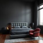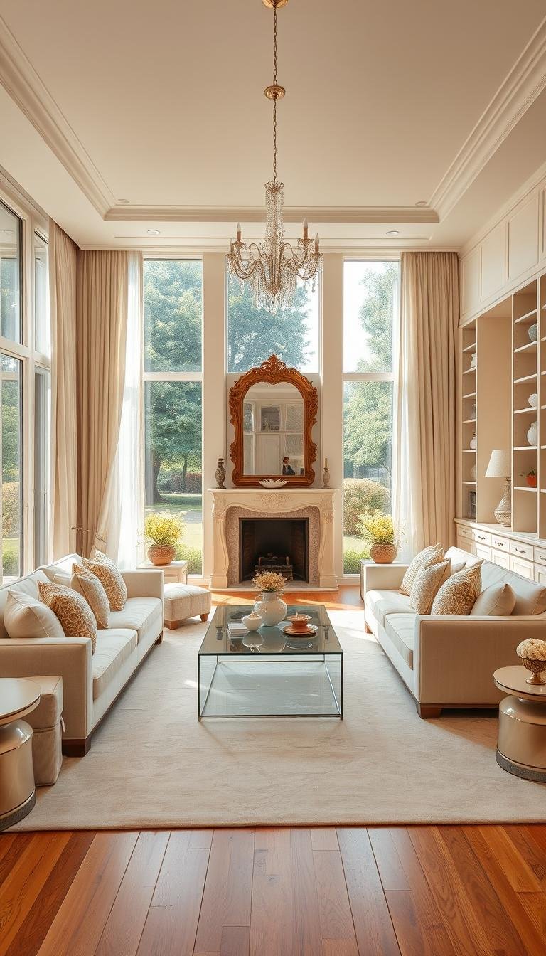
Imagine walking into a space that wraps you in warmth and elegance. Many designers love using this soft, neutral color for its cozy vibe. It creates a more welcoming atmosphere than stark white.
This timeless color scheme acts as a perfect canvas. It pairs beautifully with almost any other colors you love. Your home becomes a flexible foundation for your personal style.
Furniture, decor pieces, and lighting all play key roles. They work together to build a room that feels both stylish and serene. With the right touches, you can avoid a flat or boring look.
Ready to transform your space? Let’s explore how to achieve a design that balances luxury with a calm, comfortable feel.
1. Start with a Foundation: The Perfect Cream Sofa
Your journey to a sophisticated neutral space begins with one key furniture piece. The right sofa establishes both comfort and style throughout your area. This foundation piece sets the tone for everything that follows.
Selecting durable materials ensures your investment lasts for years. Performance fabrics resist stains and wear while maintaining their beautiful appearance. These smart choices keep your space looking fresh through daily life.
Choosing a Performance Fabric
Performance fabrics offer practical luxury for busy households. They combine elegance with functionality for real-life use. Your sofa becomes both beautiful and worry-free.
Consider these factors when selecting your material:
- Stain resistance for easy cleaning
- Durability against pet claws and active families
- Color retention to maintain that soft neutral tone
- Texture that adds visual interest without overwhelming
The right fabric choice balances practicality with aesthetic appeal. You get peace of mind without sacrificing style.
Layering with Art, Leather, and Wood
Your sofa serves as the perfect canvas for creative expression. Large-scale art pieces create immediate visual impact above your foundation piece. They draw the eye upward and establish personality.
Leather accents introduce sophistication through rich texture. A leather ottoman or chair complements soft fabrics beautifully. These elements add depth and character to your scheme.
Wood and brass details bring earthy glamour to your space. Side tables with warm wood tones ground the arrangement. Metallic touches provide subtle shine without overwhelming.
This layered approach creates dimension and interest throughout your area. Each element works together to build a cohesive, elevated look. The result feels both cozy and intentionally designed.
Your foundation piece becomes the starting point for personal expression. It supports your unique style while maintaining calm sophistication. This approach transforms ordinary spaces into extraordinary living experiences.
2. Master the Mix of Patterns and Textures
A neutral foundation becomes truly captivating when you add dimension. Strategic mixing prevents your area from appearing one-dimensional. This approach creates visual richness while maintaining serene elegance.
Texture isn’t just for throw pillows and cozy blankets. Look beyond traditional soft furnishings for creative opportunities. Every element contributes to your overall aesthetic experience.
Beyond Pillows and Blankets
Lighting fixtures offer excellent texture opportunities. Consider ceramic bases with organic imperfections or woven shades. These pieces add personality without overwhelming your scheme.
Wall treatments provide another texture layer. Grasscloth wallpaper introduces subtle pattern and tactile interest. It creates depth behind your furniture arrangements.
Window treatments complete the textural story. Roman shades with subtle linen weaves add softness. They filter light beautifully while contributing to your layered look.
Incorporating Textural Lamps and Flooring
Floor patterns make a significant impact in neutral spaces. Herringbone wood installation creates movement underfoot. This classic pattern adds sophistication to your foundation.
Area rugs provide another texture opportunity. Layering a jute rug over hard surfaces adds warmth. This technique defines seating areas while introducing natural elements.
Metallic accents bring subtle shine to your palette. Brass lamp bases catch light throughout the day. They create focal points that draw the eye around your room.
The key lies in balanced variation. Too much similarity creates monotony, while too much contrast feels chaotic. Aim for harmonious diversity within your neutral framework.
“Texture is what gives a room its soul. It’s the difference between a space that looks designed and one that feels lived-in.”
Remember that texture works visually and tactilely. Some elements you’ll see, while others you’ll feel. This dual approach creates truly immersive environments.
Your finished space should invite closer inspection. Interesting details reveal themselves as people spend time in the room. This discovery process enhances the overall experience.
3. Select the Right Warm Cream Paint Shade
Your walls provide the backdrop that ties all your design elements together beautifully. The perfect shade creates harmony throughout your space while establishing the desired atmosphere.
Warm cream tones offer a sophisticated alternative to stark white. They bring cozy warmth without overwhelming your design scheme. This approach creates an inviting environment that feels both elegant and comfortable.
Avoiding Yellow or Gray Undertones
Choosing paint with the right undertones makes all the difference. Some creams pull too yellow, creating an outdated look. Others lean gray, making spaces feel cold rather than cozy.
Test samples in your actual lighting conditions before committing. Paint looks different throughout the day as natural light changes. What appears perfect at the store might not work in your home.
Benjamin Moore’s Soft Chamois OC-13 offers excellent warmth without yellow tones. White Down OC-131 provides a cleaner, brighter option that still feels warm. Both avoid the clinical feel of pure white.
“The right cream paint should whisper warmth, not shout yellow. It’s about finding that perfect balance between cozy and clean.”
Best Cream Paints for North-Facing Rooms
North-facing spaces receive less direct sunlight throughout the day. These rooms need warmer tones to combat cool, gray light. The right cream shade adds necessary warmth without artificial-looking yellow.
Benjamin Moore’s recommendations work particularly well in low-light conditions. Their formulations lack gray pigments that can make spaces feel dull. This keeps your room feeling fresh and inviting even with limited natural light.
| Paint Name | Best For | Undertones | Lighting Conditions |
|---|---|---|---|
| Soft Chamois OC-13 | Creating warm atmosphere | Subtle warm undertones | All lighting, especially north-facing |
| White Down OC-131 | Bright, clean look | Minimal yellow undertones | Low light spaces |
| Other cream options | Various effects | Watch for gray/yellow | Test in your space |
These warm undertones work beautifully with soothing green accents. The combination creates a harmonious palette that feels both natural and elegant. Greens cooled with a splash of gray complement cream walls perfectly.
Remember that paint interacts with your other materials and textures. The same shade looks different against various surfaces. Consider how it will work with your flooring, furniture, and fabrics.
Your chosen color should make the space feel inviting and elevated. The right warm cream achieves this without feeling too yellow or artificial. It creates the perfect canvas for your personal style to shine.
4. Understand How Lighting Transforms Your Cream Palette

Light works like magic on your neutral walls. It changes how you see colors throughout the day. The same paint can look different in morning sun versus evening lamplight.
This transformation affects your entire design scheme. Your carefully chosen palette deserves proper lighting consideration. Understanding this relationship ensures your space always feels right.
Testing Paint in Natural and Artificial Light
Always test samples on your actual walls before final decisions. Paint small sections in different areas of your room. Observe these patches at various times throughout the day.
Morning light shows colors differently than afternoon sun. Evening artificial lighting creates another completely different effect. Each condition reveals unique aspects of your chosen shade.
Orange-toned bulbs can make warm neutrals appear overly yellow. This might not match your intended sophisticated look. Testing helps you avoid unexpected color shifts.
Overly white, stark lighting removes cozy ambiance from your space. It can make warm tones feel clinical and cold. Your living area should maintain its inviting atmosphere after dark.
Choosing Bulbs for a Cozy Ambiance
Select bulbs that complement rather than fight your color scheme. Warm white bulbs around 2700-3000 Kelvin work beautifully. They enhance creamy tones without adding unwanted yellow casts.
Consider these factors when selecting lighting for your room:
- Bulb color temperature measured in Kelvin
- Dimmable options for adjustable ambiance
- LED quality for consistent color rendering
- Fixture design for proper light distribution
Your bulb choice significantly impacts how people experience your space. The right lighting makes your design feel intentional and harmonious. It completes the sophisticated yet comfortable atmosphere you want.
| Lighting Type | Color Temperature | Best For | Effect on Cream Tones |
|---|---|---|---|
| Warm White | 2700-3000K | Evening ambiance | Enhances warmth naturally |
| Cool White | 3500-4100K | Task lighting | Can make cream appear gray |
| Daylight | 5000-6500K | Artwork highlighting | Shows true color but feels clinical |
| Smart Bulbs | Adjustable | Flexible mood setting | Allows customization throughout day |
Room size and desired mood guide your lighting choices. Larger spaces might need layered lighting approaches. Smaller rooms benefit from softer, more uniform illumination.
Warm neutral colors work as sophisticated backdrops when properly lit. They pair beautifully with other colors and textures in your design. The right lighting makes everything come together perfectly.
Always check undertones in your specific conditions. Your living area deserves lighting that enhances its best qualities. This attention to detail creates a space that feels both luxurious and genuinely welcoming.
5. Build a Cozy and Calming Atmosphere
Your home becomes a sanctuary when you master the art of atmosphere creation. This neutral palette provides the perfect foundation for both relaxation and elegance. The right approach transforms ordinary spaces into extraordinary experiences.
Exuding Comfort with Luxurious Materials
Quality materials make your space feel both inviting and refined. Plush velvet upholstery invites you to sink in and relax. Smooth leather accents add sophistication without sacrificing comfort.
Natural elements bring organic warmth to your design. Wood tones ground the scheme with earthy authenticity. Metallic details provide subtle sparkle that catches the light beautifully.
These material choices work together to create sensory richness. You experience visual beauty and tactile comfort simultaneously. Every element contributes to the overall feeling of luxury.
Mixing Cream, Beige, and White Shades
Monochromatic schemes gain depth through subtle variation. Combining different neutral tones creates visual interest. This approach prevents flatness while maintaining serenity.
Start with your lightest shade as the dominant color. Use medium tones for larger furniture pieces. Reserve darker accents for smaller decorative elements.
The transition between shades should feel natural and harmonious. Too much contrast creates disruption rather than flow. Aim for a graduated effect that feels both intentional and effortless.
“The most successful rooms use tone-on-tone layering to create depth and dimension without introducing competing colors.”
Lighting plays a crucial role in how these shades interact. Warm illumination enhances the cozy quality of neutral tones. Proper lighting ensures your palette always feels cohesive.
Texture variation becomes especially important in tonal schemes. Different materials reflect light in unique ways. This creates subtle visual movement throughout your space.
Your finished room should feel like a gentle gradient of warmth. Each element contributes to the overall harmonious atmosphere. The result is both calming and visually captivating.
6. Ground the Space with Dark Wood Flooring

Your flooring choice anchors the entire room’s aesthetic while providing practical durability. Dark wood creates a stunning foundation that complements your neutral palette beautifully. This grounding element adds depth without overwhelming your carefully curated scheme.
Rich, dark woods enhance the warmth of your surrounding tones. They create a cozy atmosphere that feels both elegant and inviting. The deep coloration provides visual interest while maintaining harmony.
Creating Beautiful Contrast
Dark flooring establishes striking contrast against lighter walls and furniture. This prevents your neutral scheme from appearing flat or monotonous. The variation adds dimension that guides the eye throughout the space.
Contrasting elements prove essential when working with neutral palettes. They create visual hierarchy and prevent a washed-out appearance. Your flooring serves as the perfect place to introduce this variation.
The deep tone grounds the room without introducing disruptive colors. It maintains your sophisticated aesthetic while adding necessary depth. This approach keeps your design feeling intentional and cohesive.
Selecting a Classic, Hardwearing Option
Choose wood species known for their durability and timeless appeal. These materials withstand daily wear while maintaining their beautiful appearance. Your investment should last for years while looking increasingly character-rich.
Consider these classic options for high-traffic areas:
- Dark oak: Offers strength and traditional elegance
- Walnut: Provides rich coloration and natural durability
- Mahogany: Delivers luxury appeal with exceptional hardness
- Engineered hardwood: Combines beauty with practical stability
Each option brings unique grain patterns and tonal variations. These natural characteristics add visual interest to your foundation. They complement rather than compete with your overall design.
| Wood Type | Durability Rating | Maintenance Level | Best For |
|---|---|---|---|
| Dark Oak | High | Moderate | Traditional interiors |
| Walnut | Medium-High | Low | Modern spaces |
| Mahogany | Very High | Moderate | Formal areas |
| Engineered Hardwood | High | Low | Active households |
Your flooring should balance beauty with practical considerations. Family-friendly options resist scratches and wear beautifully. They maintain their elegant appearance through years of enjoyment.
The timeless appeal of dark wood works with various interior styles. It provides a versatile foundation that adapts to your evolving taste. This flexibility makes it an excellent long-term investment for your home.
7. Decorate with the Right Undertones in Mind
Choosing your perfect neutral shade involves more than just picking a color you like. The subtle undertones in your paint dramatically affect how other elements work together. Getting this right makes your entire design feel cohesive and intentional.
Neutrals like creams offer incredible versatility for personal expression. They create a beautiful foundation that supports various accent colors and textures. Your space becomes a true reflection of your unique style.
Matching Cream to Your Accent Colors
Your cream shade should complement rather than clash with accent colors. Warm undertones pair beautifully with earthy greens and rich ambers. Cooler undertones work better with blues and grays.
Behr’s Whipped Cream offers a warm, inviting base that avoids yellow tones. Chanoyu provides a slightly deeper option with green undertones. Blank Canvas delivers a cleaner, brighter neutral that still feels warm.
Consider these popular accent combinations:
- Relaxed green creates serene, natural harmony
- Dark amber adds bold, sophisticated pops
- Inky black introduces dramatic contrast
- Soft pink brings gentle warmth
Always test your chosen cream with accent colors in your actual lighting. Colors interact differently throughout the day as light changes. This ensures your palette always feels harmonious.
Versatile Color Pairings for Cream
Cream’s neutrality makes it incredibly adaptable to various color schemes. You can create completely different moods using the same base shade. This flexibility lets you refresh your look without repainting.
Dark amber accents create warmth and sophistication against cream backgrounds. These rich tones add depth without overwhelming the space. They work particularly well in traditional or transitional designs.
Inky black provides striking contrast that feels modern and intentional. Use it sparingly for maximum impact on key pieces. This combination maintains elegance while adding visual interest.
Relaxed green brings natural serenity to your neutral foundation. Greens cooled with gray complement cream walls beautifully. They create a peaceful atmosphere that feels both fresh and calming.
| Behr Paint Shade | Best Accent Colors | Overall Effect | Room Atmosphere |
|---|---|---|---|
| Whipped Cream | Dark amber, soft pink | Warm and inviting | Cozy traditional |
| Chanoyu | Relaxed green, navy blue | Serene and natural | Peaceful retreat |
| Blank Canvas | Inky black, charcoal gray | Clean and modern | Sophisticated contemporary |
Your chosen combination should reflect your personal style and desired atmosphere. Consider how colors make you feel when spending time in the space. The right palette creates an environment you genuinely enjoy.
Remember that accent colors appear in various elements throughout your design. Throw pillows, artwork, and decorative objects all contribute to the overall effect. This layered approach creates depth and visual interest.
Your cream foundation provides the perfect backdrop for creative expression. It supports bold color choices while maintaining a calm, sophisticated base. This balance creates spaces that feel both personalized and harmoniously designed.
8. Create Visual Interest with Strategic Decor

Your neutral backdrop becomes a stage for personal expression through thoughtful decoration. The right pieces transform your area from simple to spectacular. They add character where color might otherwise do the heavy lifting.
Symmetry creates immediate visual harmony in any arrangement. It makes your space feel organized and intentionally designed. But perfect mirroring can sometimes feel too rigid or predictable.
Subtle variations in size and height introduce delightful intrigue. These small differences catch the eye without disrupting overall balance. They create moments of discovery throughout your room.
Using Large-Scale Art for Balance
Oversized artwork makes a powerful statement above your sofa or console. It anchors the wall and establishes a clear focal point. This approach prevents your neutral scheme from feeling underwhelming.
Choose pieces that complement rather than compete with your palette. Abstract works with soft tones add sophistication without overwhelming. Photographic prints in black and white create striking contrast.
Proper placement ensures your art enhances the entire room. Center pieces at eye level for optimal viewing. Allow adequate space around the frame for visual breathing room.
“A large piece of art doesn’t just fill wall space—it commands attention and sets the tone for the entire room.”
Adding Intrigue with Size and Height Variations
Vary the scale of your decorative objects throughout the space. Mix tall floor vases with lower profile table sculptures. This creates visual rhythm that guides the eye around the room.
Consider these approaches for adding dimensional interest:
- Stack books under smaller objects to create varying levels
- Use candlesticks of different heights on mantels or consoles
- Place taller items toward the back of surfaces, shorter in front
- Incorporate hanging elements that break the horizontal plane
These techniques work particularly well on shelves and tabletops. They transform flat surfaces into dynamic displays. Your decorations become part of the overall design story.
| Decor Element | Recommended Height | Placement Tip | Visual Effect |
|---|---|---|---|
| Large Artwork | Eye level (57-60 inches) | Center over furniture | Creates focal point |
| Floor Vase | 24-36 inches | Place in corners | Adds vertical interest |
| Table Lamps | 26-32 inches | Flank seating | Provides balanced light |
| Sculptural Objects | Varying heights | Group in odd numbers | Creates dynamic arrangement |
Empty walls offer opportunities for creative expression. Don’t feel you must fill every available surface. Strategic placement makes each piece feel more intentional and special.
Your decorative choices should reflect your personality and interests. They transform a beautiful space into your personal sanctuary. The result feels both designed and genuinely lived-in.
9. Add Warmth Through Layers of Natural Texture
Your design gains soul and character when you embrace the beauty of natural materials. These elements bring organic warmth that synthetic options simply cannot match. They create a sensory experience that makes your space feel genuinely lived-in and loved.
Natural fibers work particularly well in neutral schemes due to their earthy tones. They complement rather than compete with your overall palette. This harmony creates a cohesive look that feels both intentional and effortless.
Incorporating Jute, Cotton, and Linen
Jute rugs add wonderful texture underfoot while maintaining neutral warmth. Their natural golden tones work beautifully with lighter shades. These durable fibers stand up well to daily life while aging gracefully.
Cotton throws and pillows offer softness and breathability. They’re perfect for adding cozy layers to your seating areas. Choose organic cotton for its beautiful, natural texture and sustainable qualities.
Linen brings effortless elegance to any space. Its slightly wrinkled appearance adds casual sophistication. Use linen for curtains, slipcovers, or accent pillows to introduce subtle variation.
Consider these natural material combinations:
- Jute area rug with cotton throw blankets
- Linen curtains paired with woven baskets
- Cotton slipcovers on accent chairs
- Mixed material pillows for visual interest
Maintaining Consistency in Wood Tones
Wood elements throughout your space should feel harmonious. Consistency in tone creates visual flow from one area to another. This approach prevents your design from feeling disjointed or random.
Choose one dominant wood tone as your foundation. Use this consistently for larger furniture pieces. Then introduce subtle variations through smaller decorative elements.
Warm mid-tone woods work beautifully with neutral palettes. They add richness without overwhelming the space. These tones feel inviting and work with various design styles.
Remember that wood grain patterns also contribute to consistency. Similar grain directions create visual harmony. Contrasting grains can add interest when used intentionally.
Your wood choices should complement other natural materials. They work together to create a layered, textured look. This combination makes your space feel both curated and comfortable.
Texture plays a key role in adding dimension to neutral rooms. It creates visual interest without relying on bold colors. The right combinations make your space uniquely yours while maintaining calm sophistication.
10. Design a Sophisticated Tonal Scheme

Your neutral palette reaches its full potential when you master tonal layering. This approach creates richness without introducing competing colors. It transforms simple spaces into deeply engaging environments.
Monochromatic schemes gain dimension through careful shade selection. Different tones work together to build visual interest. Your room feels cohesive yet far from boring.
The key lies in balancing light, medium, and dark neutrals. Each shade plays a specific role in your overall composition. This creates natural movement that guides the eye throughout your space.
Layering Different Shades of Neutrals
Start with your lightest shade as the dominant background color. This establishes the calm, airy feeling you want to maintain. It serves as your foundation for building depth.
Introduce medium tones through larger furniture pieces. Your sofa might feature a slightly deeper version of your wall color. This creates subtle progression without stark contrast.
Use the darkest neutrals for accent pieces and decorative elements. These provide grounding and visual weight where needed. They prevent your scheme from feeling too light or floating.
Consider this progression for optimal results:
- Walls: Lightest cream or warm white
- Upholstery: Medium beige or taupe
- Accents: Dark brown or charcoal gray
- Metallics: Warm brass or bronze for sparkle
This graduated approach creates natural harmony throughout your area. Each element feels intentionally placed yet effortlessly connected. The result is both sophisticated and soothing.
Mixing Various Textures for Depth
Texture provides the secret ingredient that brings tonal schemes to life. Different materials reflect light in unique ways. This creates subtle variation that prevents flatness.
Natural materials offer particularly beautiful textural qualities. Wood grains, stone surfaces, and woven fibers add organic interest. They introduce pattern without competing colors.
Consider these texture combinations for your neutral palette:
- Smooth leather against nubby wool throws
- Polished marble alongside rough-hewn wood
- Silky velvet pillows on linen upholstery
- Metallic accents beside matte ceramic pieces
Each combination creates tactile and visual interest. Your space invites closer inspection and engagement. This layered approach makes your design feel curated and complete.
“Texture is the unsung hero of tonal schemes. It’s what transforms a beautiful color palette into a truly immersive experience.”
Lighting plays a crucial role in highlighting textural variation. Directional light emphasizes surface qualities and patterns. Soft ambient illumination creates gentle shadows that enhance depth.
| Neutral Shade | Best Texture Pairings | Visual Effect | Recommended Use |
|---|---|---|---|
| Light Cream | Smooth velvet, polished metals | Creates soft reflection | Walls, large upholstery |
| Medium Beige | Textured linen, woven fibers | Adds subtle pattern | Furniture, window treatments |
| Dark Taupe | Rough wood, natural stone | Provides grounding | Accent pieces, flooring |
| Warm Gray | Leather, brushed metals | Adds sophistication | Decorative objects, hardware |
Your finished space should feel like a gentle gradient of warmth and texture. Each element contributes to the overall harmonious atmosphere. The result is both calming and visually captivating.
Remember that tonal schemes work particularly well in smaller rooms. They create the illusion of more space through color continuity. This approach makes compact areas feel more expansive and intentional.
Your home becomes a testament to sophisticated simplicity. The layered neutrals and textures create lasting appeal. This timeless approach ensures your space always feels current and comfortable.
11. Achieve a Timeless Look with a Transitional Style
Transitional style offers the perfect bridge between timeless elegance and contemporary comfort. This approach creates spaces that feel both current and classic. Your room avoids looking dated while maintaining character and warmth.
This design philosophy balances clean modern lines with traditional craftsmanship. It allows you to mix pieces you love from different eras. The result feels collected rather than contrived.
Blending Contemporary and Vintage Pieces
Start with a foundation of clean-lined modern furniture. These pieces provide comfort and functionality for daily life. Then layer in vintage elements that add personality and history.
Consider these blending techniques for balanced appeal:
- Pair a sleek contemporary sofa with an antique wooden coffee table
- Use modern lighting fixtures above traditional seating arrangements
- Mix contemporary art with vintage frames and display methods
- Combine new textiles with heirloom-quality decorative objects
The key lies in proportional balance. Too much vintage can feel outdated. Too much modern might lack character. Aim for a harmonious mix that feels intentional.
“The best transitional spaces tell a story. They honor the past while embracing the present, creating rooms that feel both timeless and timely.”
Incorporating Items with Age and Character
Items with history contribute depth that new pieces cannot replicate. Their patina and craftsmanship add layers of visual interest. These elements make your space feel genuinely lived-in and loved.
Look for pieces with natural aging and unique characteristics. A vintage rug with subtle wear patterns adds warmth underfoot. Antique wooden furniture brings rich grain variations and craftsmanship details.
Family heirlooms become particularly meaningful in this context. They connect your space to personal history while adding aesthetic value. These pieces often become conversation starters and emotional anchors.
Consider these character-rich elements:
- Vintage textiles with unique patterns and textures
- Antique wooden pieces with beautiful patina
- Artisanal ceramics or glassware with slight imperfections
- Timeworn metals that have developed natural oxidation
Your cream color scheme provides the perfect backdrop for these character pieces. The neutral palette allows their unique qualities to shine without competition. This combination creates depth that feels both sophisticated and personal.
Transitional design works exceptionally well in neutral rooms. The palette creates cohesion between diverse elements. Your space feels unified despite incorporating pieces from different eras.
This approach ensures your room never feels overly trendy or dated. It evolves gracefully as your taste and collection grow. You create a space that reflects your unique story while maintaining timeless appeal.
12. Infuse Life with Pops of Green and Greenery

Nature’s favorite color brings fresh energy into your neutral sanctuary. Green accents create visual excitement while maintaining a peaceful atmosphere. This combination feels both revitalizing and deeply relaxing.
Plants and green decor pieces add organic beauty to your space. They introduce life and movement that static elements cannot provide. Your home becomes more vibrant and connected to the natural world.
The right green shades complement rather than compete with your palette. They enhance the warm, soothing qualities of your foundation. This partnership creates harmony between nature and nurture.
Choosing the Right Shade of Green Accents
Select green tones that work with your existing color scheme. Lighter greens maintain airiness and brightness in your space. Muted sage or olive tones offer sophistication without overwhelming.
Brighter emerald greens make bold statements when used sparingly. These vibrant pops work best on smaller accent pieces. They draw attention without dominating the entire room.
Consider these green options for different effects:
- Sage green for soft, natural harmony
- Olive tones for earthy sophistication
- Emerald for dramatic focal points
- Mint for fresh, light accents
Always test green samples against your walls and fabrics. Colors interact differently under various lighting conditions. This ensures your choices always feel cohesive.
Strategically Placing Plants Around the Room
Distribute greenery evenly throughout your space for balanced appeal. Large floor plants anchor corners and fill vertical space. Smaller tabletop varieties add life to surfaces and shelves.
Group plants in odd numbers for natural-looking arrangements. Vary heights and leaf textures for visual interest. This creates depth and movement throughout your area.
Consider these placement strategies for optimal impact:
- Tall plants behind seating areas for background greenery
- Medium plants on side tables for layered height
- Small succulents on shelves for subtle accents
- Hanging plants to utilize vertical space beautifully
Plants purify air while adding bursts of life to your environment. They contribute to a healthier, more vibrant home atmosphere. This natural element enhances both aesthetics and wellbeing.
| Plant Type | Light Requirements | Maintenance Level | Best Placement |
|---|---|---|---|
| Snake Plant | Low to bright indirect | Very low | Corners, behind furniture |
| Fiddle Leaf Fig | Bright indirect | Moderate | Statement corner piece |
| Pothos | Low to moderate | Low | Shelves, hanging baskets |
| ZZ Plant | Low to bright indirect | Very low | Anywhere, even low light |
Green textiles offer another way to incorporate nature’s palette. Velvet pillows in emerald add luxurious texture. Linen cushions in sage provide casual elegance.
Natural materials like jute and rattan complement green accents beautifully. They enhance the organic feel of your design scheme. This layered approach creates depth and authenticity.
Your space becomes a tranquil retreat that still feels alive and dynamic. The combination of neutral foundation and green accents works magic. It balances calm sophistication with natural vitality.
13. Set the Mood with Layered and Dimmable Lighting
Lighting transforms your neutral area from functional to fabulous. It creates atmosphere and highlights your design choices beautifully. The right approach makes your home feel both inviting and intentional.
Layered lighting combines different sources for optimal effect. This technique allows you to adjust ambiance throughout the day. Your space becomes more versatile and visually interesting.
Using Soft, Diffused Light Fixtures
Soft light creates a warm glow that enhances your palette. It makes tones appear richer and more inviting. This approach prevents harsh shadows and glaring brightness.
Choose fixtures that distribute light evenly throughout your space. Frosted glass shades work beautifully for this purpose. They soften the illumination while maintaining adequate brightness.
Consider these options for diffused lighting:
- Drum pendant lights with fabric shades
- Wall sconces with opaque glass covers
- Floor lamps with upward-facing shades
- Table lamps with linen or paper diffusers
Dimmable controls offer flexibility for different occasions. You can create bright light for daytime activities. Then soften the atmosphere for evening relaxation.
Highlighting Textures with Accent Lighting
Accent lighting draws attention to specific design elements. It creates focal points and adds visual drama. This technique makes your room feel more dynamic and engaging.
Use directional lights to emphasize textural surfaces. Picture lights showcase artwork with focused illumination. Track lighting highlights architectural features or collections.
Consider these accent lighting strategies:
- Wall washers to graze textured surfaces
- Spotlights to emphasize decorative objects
- Under-cabinet lighting to create glow effects
- LED strips for subtle highlighting
These focused lights work alongside your general illumination. They create depth and dimension throughout your area. The combination makes your design feel complete and professional.
| Lighting Type | Best Placement | Mood Created | Texture Enhancement |
|---|---|---|---|
| Diffused Overhead | Center of room | General warmth | Softens all surfaces |
| Directional Spots | Above artwork | Focused attention | Emphasizes details |
| Wall Washers | Along textured walls | Dramatic effect | Highlights patterns |
| Dimmable Lamps | Throughout space | Adjustable ambiance | Changes throughout day |
Your lighting scheme should include multiple control points. This allows you to create different scenes for various activities. You maintain both functionality and atmosphere.
Remember that lighting affects how colors appear in your home. Warm tones make neutrals feel cozier and more inviting. Cooler lights can make the same shades appear stark or clinical.
Test your lighting at different times before finalizing decisions. Observe how it interacts with your materials and colors. This ensures your space always feels right.
The perfect lighting scheme balances practicality with beauty. It supports daily activities while creating wonderful atmosphere. Your home becomes both functional and fabulous.
14. Your Luxurious and Calm Cream Living Room Awaits
Your personal oasis of tranquility and elegance is now within reach. These comprehensive ideas help you blend colors, textures, and personal touches harmoniously.
Your space should reflect your unique taste and definition of serenity. Designer-approved concepts serve as guidance while letting your individuality shine through.
The combination of all these elements creates a harmonious environment that soothes the soul. Your home becomes a personal sanctuary reflecting what peace means to you.
Use these secrets as a foundation while making the area uniquely yours. The perfect balance of luxury and calmness awaits your personal touch.