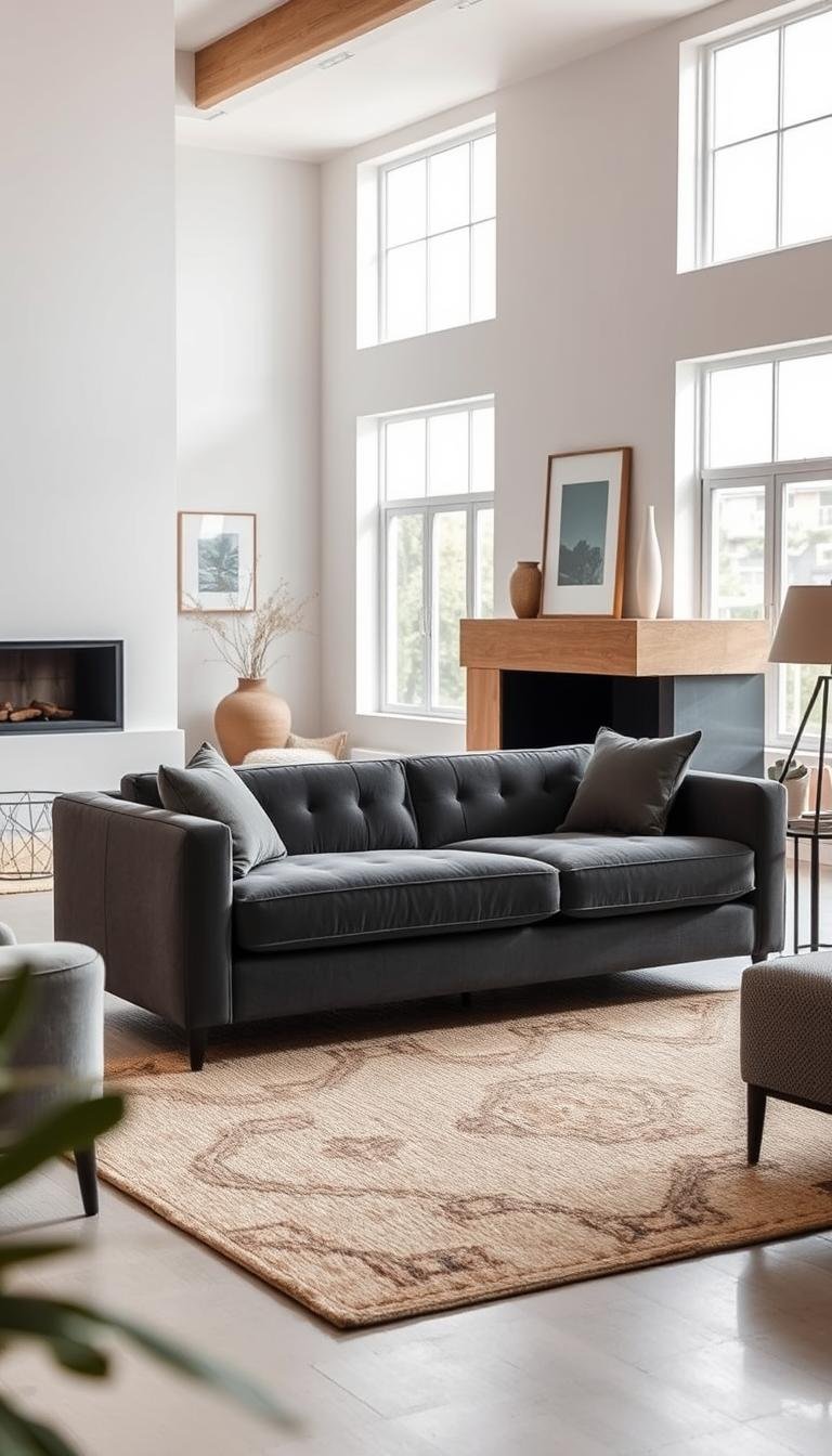
Your living room deserves a centerpiece that blends style with versatility. A dark gray sofa offers just that. It serves as a perfect neutral base for countless design approaches.
This adaptable piece can shift from urban chic to cozy comfort with simple changes. Think fun throw pillows or textured blankets. The color itself brings calm and balance to your space.
Gray influences more than just looks. It can affect your mood and even make a room feel cooler. This shade pairs beautifully with both bold colors and soft neutrals.
You can easily refresh your look by swapping accessories. This makes a gray sofa a long-lasting choice for any home. It supports everything from modern farmhouse to coastal themes.
Let’s explore how to maximize this elegant foundation. We’ll cover color pairing, texture mixing, and lighting tips to create your ideal space.
Why a Charcoal Grey Couch is Your Best Design Decision
Choosing furniture for your home involves balancing beauty with daily life. A dark gray sofa stands out as a smart pick for both style and function. It brings a calm, elegant base to your room that works with any look.
The Ultimate Neutral for Any Style
This shade serves as a perfect background. It lets your other pieces shine while keeping everything cohesive. You can change your room’s feel just by switching accessories.
Gray works with warm tones like mustard or cool shades like teal. It fits minimalist, maximalist, and everything in between. This flexibility makes it a lasting choice for your space.
Interior designers often recommend neutral foundations. They say:
“A versatile base color allows for easy updates without replacing large pieces.”
Practical Elegance for Real Life
Dark gray fabric hides stains better than light options. It stays looking fresh between cleanings, even with pets or kids. This makes it ideal for busy households.
From personal experience, darker neutrals wear better over time. They don’t show every spill or speck of dust. You get more enjoyment with less stress.
- Resists visible stains and wear
- Requires less frequent deep cleaning
- Maintains its sophisticated appearance
- Works year-round with seasonal decor changes
This color choice saves money long-term. You won’t need to redecorate often to keep your space feeling current. It remains stylish through changing trends.
First Things First: Identify Your Couch’s Undertone

Before you pick throw pillows or wall colors, you need to know your sofa’s undertone. This step is crucial for creating a harmonious room. Getting it wrong can make your space feel off-balance.
Gray furniture can lean warm or cool. The undertone affects how other colors interact with it. You’ll want to match warm with warm and cool with cool.
Here’s a simple way to check your sofa’s undertone. Place a pure white sheet or paper next to it. See if the gray looks yellowish or bluish in comparison.
Lighting changes how we see color. Check your sofa in natural daylight and evening light. Note any shifts in its appearance.
Working with Warm, Taupe-like Greys
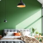
If your sofa has warm undertones, it will pair beautifully with earthy hues. Think mustard yellow, blush pink, or coral accents. These colors create a cozy, inviting atmosphere.
Metallic gold accessories complement warm grays perfectly. They add a touch of elegance without overwhelming the space. Consider gold picture frames or side tables.
Warm gray sofas work well with natural wood tones. Light oak or walnut furniture enhances the comfortable vibe. This combination feels both modern and timeless.
Styling Cool, Bluish-Tinted Greys
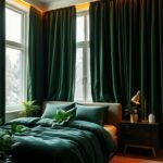
Cool-toned grays have a bluish or silvery cast. They pair best with jewel tones and crisp colors. Teal, navy blue, and mint green make excellent companions.
These colors create a calm, refreshing environment. They’re perfect for spaces where you want to relax and unwind. The combination feels both sophisticated and serene.
Silver and chrome accessories complement cool grays beautifully. They enhance the modern, crisp feeling of the color palette. Think metallic lamps or decorative objects.
| Undertone Type | Identification Method | Best Color Matches | Lighting Considerations |
|---|---|---|---|
| Warm (Taupe) | Looks slightly yellow/brown next to white | Mustard, blush, coral, gold | Appears warmer in yellow evening light |
| Cool (Bluish) | Looks slightly blue/silver next to white | Teal, navy, mint, hunter green | Appears cooler in blue daylight |
If you’re still unsure about your sofa’s undertone, try this test. Hold different colored fabric swatches against it. See which colors make the gray look its best.
Remember that wall color affects how your sofa appears. A warm beige wall can make a cool gray look warmer. Always test colors in your actual living space.
Some grays have mixed undertones that change with lighting. These versatile pieces can work with both warm and cool palettes. You have more flexibility with your decor choices.
Professional designers often use this undertone method. It helps create cohesive, polished-looking rooms. Your efforts will result in a perfectly balanced space.
Mastering the Art of Color Pairing
Color selection transforms your room from ordinary to extraordinary. The right combinations elevate your dark gray sofa into a design masterpiece. Understanding color relationships helps you create the exact mood you want.
Your choices affect how people feel in your space. Warm tones create energy and comfort. Cool shades bring calm and relaxation. Earth elements ground the room with natural balance.
Warm and Cozy: Mustard, Blush, and Coral
Warm-toned gray sofas love cheerful companions. Mustard yellow brings sunshine into your home. Blush pink adds soft romance to your seating area. Coral introduces playful energy that feels both fresh and familiar.
These colors work beautifully together in layers. Start with larger coral elements like area rugs. Add mustard through throw pillows and artwork. Use blush as your accent color in smaller decorative pieces.
Gold metallic details enhance warm color schemes. A gold side table or picture frame adds sophistication. These touches make your space feel intentionally designed rather than simply decorated.
Cool and Calming: Teal, Navy, and Mint
Cool gray sofas pair perfectly with refreshing hues. Deep teal creates depth and richness in your arrangement. Navy blue offers classic elegance that never goes out of style. Mint green brings a light, airy feeling to balance darker elements.
Layer these colors starting from your largest pieces. A navy blue armchair makes a strong style statement. Teal curtains frame windows beautifully while controlling light. Mint accessories provide pops of freshness throughout the room.
Silver and chrome accessories complement cool palettes perfectly. Metallic lamps and decorative objects enhance the sophisticated vibe. These finishes make colors appear more vibrant and intentional.
Earth Tones: Bringing in Greens and Browns
Nature-inspired colors create grounded, welcoming spaces. Olive green brings organic richness to your color story. Chocolate brown adds warmth and traditional elegance. These tones work with both warm and cool gray undertones.
Brown leather furniture introduces wonderful texture contrast. A cognac leather chair pairs beautifully with your neutral sofa. The combination feels both luxurious and completely approachable.
Add green through living plants and botanical prints. Large fiddle leaf figs make dramatic statements. Smaller succulents on side tables add life without overwhelming.
| Color Family | Recommended Shades | Best Placement | Mood Created |
|---|---|---|---|
| Warm Accents | Mustard, Blush, Coral | Pillows, Art, Rugs | Energetic & Inviting |
| Cool Companions | Teal, Navy, Mint | Furniture, Curtains, Accessories | Calm & Refreshing |
| Earth Elements | Olive Green, Chocolate Brown | Leather Pieces, Plants, Textiles | Grounded & Natural |
Balance bold colors with your neutral foundation. Use the 60-30-10 rule for best results. Your sofa represents 60% of the main color. Secondary colors take 30% through chairs and rugs. Accent colors get 10% in pillows and decor items.
Test colors in your actual lighting before committing. Paint samples on walls behind your sofa. Place fabric swatches directly on your seating. Observe how colors change throughout the day.
Create cohesive color stories that flow through the room. Repeat your accent colors in multiple locations. This creates visual harmony that feels professionally designed. Your space will feel both put-together and personally expressive.
Creating Dazzling Contrast with Your Walls

The wall color behind your sofa creates the foundation for your entire room’s atmosphere. This background choice dramatically affects how your centerpiece furniture appears. You can either make it stand out boldly or blend harmoniously.
Your approach depends on the mood you want to create. Do you prefer dramatic statements or subtle elegance? Both methods transform your space in completely different ways.
The “Pop” Effect Against Bright White
Bright white walls create maximum contrast with darker furniture. This combination makes your seating appear crisp and defined. The dramatic effect instantly draws attention to your sofa as the room’s focal point.
This approach works particularly well in smaller spaces. Light walls reflect more natural light, making rooms feel larger. The clean backdrop provides perfect flexibility for changing accessories seasonally.
Professional designers often recommend specific white paints for this purpose. Benjamin Moore’s Chantilly Lace offers a pure, bright white without cold undertones. Sherwin Williams’ High Reflective White maximizes light reflection for airy spaces.
The high-contrast look emphasizes architectural details beautifully. Moldings, trim work, and built-ins stand out against the bright background. This creates depth and dimension in your room design.
Soft and Subtle with Monochromatic Walls
Monochromatic schemes create sophisticated, cohesive environments. Choosing walls just slightly lighter or darker than your sofa achieves elegant harmony. This approach feels calm and intentionally designed.
Varying shades within the same color family add depth without contrast. Try a light gray sofa against charcoal walls for modern appeal. The subtle variation creates interest while maintaining unity.
Popular gray paint options include Benjamin Moore’s Revere Pewter for warm undertones. Sherwin Williams’ Repose Gray works well for balanced, neutral backgrounds. Classic Gray by Farrow & Ball offers soft, flexible lightness.
Monochromatic designs risk feeling flat without texture variation. Incorporate different materials to add visual interest. Natural elements prevent the space from feeling too designed or sterile.
| Design Approach | Wall Color Examples | Room Size Effect | Best For |
|---|---|---|---|
| High Contrast | Benjamin Moore Chantilly Lace, Sherwin Williams High Reflective White | Makes spaces feel larger and airier | Modern spaces, small rooms, architectural highlighting |
| Monochromatic | Benjamin Moore Revere Pewter, Sherwin Williams Repose Gray, Farrow & Ball Classic Gray | Creates intimate, cozy environments | Sophisticated looks, seamless flow, calming atmospheres |
| Tonal Variation | 2-3 shades lighter/darker than sofa color | Adds depth without changing perceived size | Layered designs, texture-focused spaces |
Always test paint colors with your actual furniture before committing. Paint large samples directly on your walls. Observe how colors change throughout the day under different lighting conditions.
Consider your room’s proportions when selecting wall colors. Lighter tones can make low ceilings feel higher. Darker shades can make large, empty rooms feel more intimate and cozy.
Balance monochromatic schemes with varied textures and materials. Add woven baskets, wooden elements, and metallic accents. These touches prevent your space from feeling one-dimensional.
Remember that wall color affects how your sofa’s undertones appear. Warm gray walls can make cool-toned furniture look more neutral. Test combinations thoroughly to achieve your desired effect.
Your wall choice ultimately sets the stage for everything else. It determines whether your sofa becomes the star or part of an ensemble cast. Both approaches can create beautiful, functional living spaces.
Charcoal Grey Couch Decor Ideas for a Sophisticated Vibe
Creating a truly captivating room involves mastering two essential skills. You need to understand shade layering and furniture harmony. These techniques transform your space from basic to breathtaking.
Your dark sofa becomes the hero that ties everything together. It bridges different eras and styles with effortless grace. Let’s explore how to make this magic happen in your home.
Layering Shades for Depth and Dimension
Think of your room like a beautiful painting. Artists use many shades to create depth and interest. You can do the same with your neutral palette.
Start with your darkest element—your seating. Build upward with progressively lighter tones. Warm gray walls make a perfect middle ground.
Add creamy white pillows and accessories for contrast. Rich wood furniture introduces natural warmth. This creates a sophisticated, layered look.
Repeat your gray tones throughout the space. Use similar shades in rugs, curtains, and artwork. This repetition creates visual harmony.
Vary your textures to enhance the effect. Combine soft velvet with gleaming metal accents. Add chunky knit throws for cozy contrast.
Unifying Diverse Furniture Styles
Your neutral sofa serves as the perfect peacemaker. It helps different furniture styles get along beautifully. This approach creates collected, personal spaces.
Try pairing midcentury modern chairs with a contemporary table. Your dark seating connects these distinct pieces. The result feels intentional and cohesive.
Balance proportions carefully when mixing styles. Ensure pieces relate in scale and visual weight. This maintains harmony despite different origins.
Create focal points through strategic arrangement. Place your most striking piece opposite your sofa. This establishes clear visual flow.
| Challenge | Solution | Visual Result |
|---|---|---|
| Mixing traditional and modern | Use neutral sofa as bridge | Cohesive, intentional space |
| Differing furniture scales | Balance with similar visual weight | Harmonious arrangement |
| Multiple wood tones | Unify with gray elements | Polished, put-together look |
| Various design eras | Repeat gray throughout space | Personal, collected aesthetic |
If your room feels disjointed, add more gray elements. A gray area rug or curtains can work wonders. These additions reinforce your color story.
Step back and view your space from different angles. Ensure your eye moves comfortably around the room. Adjust pieces until the flow feels natural.
Professional designers use these techniques regularly. They create spaces that feel both designed and lived-in. Your efforts will yield similarly beautiful results.
Remember that successful rooms tell a story. Your furniture collection reflects your personal journey. Your dark sofa helps all the chapters make sense together.
Textures Are Your Secret Weapon
Texture transforms your room from flat to fascinating. It adds depth and personality to your seating area. The right mix makes your space feel rich and inviting.
Your dark gray sofa becomes more interesting with varied touches. Different materials catch light in unique ways. They create visual movement that keeps the eye engaged.
Texture affects how we perceive color and comfort. Rough surfaces feel casual and organic. Smooth finishes appear more formal and polished.
Balance is key when working with multiple textures. Too many can feel busy and overwhelming. Too few might make your room appear bland.
Plush Velvet and Cozy Mohair
Velvet brings instant luxury to your furniture arrangement. This fabric reflects light beautifully across its surface. It makes your dark gray seating appear richer and deeper.
Mohair offers similar elegance with practical benefits. This durable fabric resists crushing and fading over time. It maintains its luxurious look even with regular use.
Pierre Frey mohair is a designer favorite for good reason. Its subtle sheen adds dimension without overwhelming. The texture complements both modern and traditional spaces.
Layer these plush textiles through pillows and throws. A velvet cushion adds sophistication to simpler fabrics. Mohair blankets provide warmth with visual interest.
Natural Weaves: Linen, Boucle, and Jute
Natural fibers bring organic texture to your decor. Linen offers casual elegance that works year-round. Its slightly rumpled look feels lived-in and comfortable.
Boucle fabric has seen a major resurgence recently. Its looped texture adds wonderful visual and tactile interest. This material works beautifully with neutral color schemes.
Jute and other rough weaves ground your arrangement. They add earthy contrast to smoother surfaces. These textures work particularly well in rustic or coastal spaces.
Consider a jute area rug under your seating group. It defines the space while adding natural texture. The contrast with plush fabrics creates balanced appeal.
Mixing Hard and Soft: Leather, Wood, and Metal
Successful rooms balance hard and soft elements. Leather introduces rich texture that develops character over time. It pairs beautifully with fabric upholstery.
Wood furniture adds warmth and organic variation. Different finishes and grains provide visual diversity. These natural elements make spaces feel grounded.
Metal details offer sleek contrast to softer textures. Chrome or brass accents catch light beautifully. They prevent your arrangement from feeling too heavy.
Try a wooden coffee table with metal legs. Add leather chairs beside your main seating. This combination creates layered visual interest.
| Texture Type | Best Applications | Light Effect | Maintenance Level |
|---|---|---|---|
| Velvet/Mohair | Pillows, upholstery, throws | Reflective, adds depth | Medium – requires occasional steaming |
| Natural Weaves | Rugs, curtains, slipcovers | Absorbs light, matte finish | Easy – most are machine washable |
| Leather | Accent chairs, ottomans | Subtle sheen, develops patina | Low – wipe clean regularly |
| Wood/Metal | Tables, frames, accessories | Varies by finish and material | Low – dust and occasional polish |
Start with three main textures in your space. Build from there if the room can handle more. Remember that negative space is also important.
Consider how textures feel as well as how they look. Your seating should invite relaxation and comfort. Surrounding elements should support this experience.
Texture can make large furniture feel less imposing. Rough, natural weaves break up solid color blocks. This helps your sofa integrate better with the room.
Current trends favor mixing multiple textures. The key is maintaining color cohesion throughout. Your dark gray foundation makes this easier to achieve.
Always test texture combinations in your actual space. View them under different lighting conditions. Adjust until the mix feels balanced and intentional.
The Power of Pillows and Throws
Accessories transform your seating from functional to fabulous. The right combinations create inviting comfort while expressing your personal taste. These elements work together to build a complete look.
Your neutral foundation welcomes endless creative possibilities. You can change the entire mood with simple swaps. This flexibility keeps your space feeling fresh and current.
Building a Cohesive Color Story
Start with your main accent colors in larger pieces. Use these hues in your rug or artwork first. Then repeat them through smaller decorative elements.
Choose two or three colors that work well together. Pull these from existing items in your room. This creates visual harmony throughout your space.
Professional designers often follow the 60-30-10 rule. Your sofa represents the dominant 60 percent. Secondary colors take 30 percent through chairs or curtains.
Accent colors get the remaining 10 percent. Use these in your pillows and decorative objects. This balanced approach feels both intentional and comfortable.
Introducing Pattern and Playfulness
Patterns add energy and movement to your arrangement. Mix different scales for the best visual interest. Combine large prints with smaller, busier designs.
Stripes and geometrics work well with organic florals. The contrast creates dynamic appeal. Your eye moves comfortably around the space.
Limit yourself to three patterns maximum. Too many can feel overwhelming and busy. Solid-colored pillows provide necessary visual rest.
Consider the mood you want to create. Bold patterns make strong style statements. Subtle designs offer more relaxed sophistication.
Seasonal rotations keep your home feeling current. Light, bright patterns work for spring and summer. Rich, textured options suit fall and winter.
Quality materials ensure long-lasting beauty. Down-filled pillows offer luxurious comfort. Synthetic blends provide practical durability.
Throw blankets add both warmth and texture. Drape them casually over your sofa arm. This creates an inviting, lived-in feeling.
DIY projects let you personalize your space. Recover existing pillows with new fabric. Mix patterns that reflect your unique style.
Your accessories should feel both beautiful and functional. They complete your room’s story while providing comfort. The right combinations make your house feel like home.
Lighting Up Your Dark Gray Sofa

Light transforms your room from ordinary to extraordinary. It highlights your seating’s best features while creating the perfect mood. Strategic lighting makes your space feel both larger and more inviting.
Your dark sofa benefits from thoughtful illumination. Proper placement prevents it from appearing too heavy or dark. You can create a balanced, beautiful environment with simple adjustments.
Maximizing Natural Light Placement
Position your furniture to capture available sunlight. Place your seating near windows without blocking the light flow. This simple move brightens the entire area.
North-facing windows provide soft, consistent light throughout the day. South-facing options offer stronger, more direct illumination. Understand your room’s orientation for best results.
Keep window treatments minimal during daylight hours. Sheer curtains filter light while maintaining privacy. They prevent harsh shadows while softening the atmosphere.
Rotate seating seasonally as sunlight patterns change. Summer sun reaches deeper into rooms than winter light. Adjust your arrangement to maximize year-round brightness.
Choosing Warm Artificial Lighting
Select bulbs that complement your sofa’s undertones. Warm white options (2700K-3000K) create cozy, inviting atmospheres. They make cool grays appear more neutral and welcoming.
Layer different lighting types for dimensional effect. Ambient lighting provides overall illumination for the room. Task lighting focuses on specific areas like reading nooks.
Accent lighting highlights architectural features or artwork. This combination prevents flat, uninteresting shadows. It makes your space feel professionally designed.
Table lamps with fabric shades offer soft, diffused light. They reduce harsh glare while adding decorative appeal. Place them strategically around your seating area.
Floor lamps illuminate dark corners effectively. Arc styles provide overhead light without ceiling fixtures. They create beautiful pools of light around your sofa.
| Lighting Type | Best Placement | Kelvin Rating | Visual Effect |
|---|---|---|---|
| Ambient Lighting | Ceiling fixtures, track lighting | 2700K-3000K | Overall warm illumination |
| Task Lighting | Side tables, behind sofa | 3000K-3500K | Focused brightness for activities |
| Accent Lighting | Above artwork, architectural features | 2700K-3000K | Highlighting specific elements |
| Natural Light Enhancement | Opposite windows, reflective surfaces | N/A | Amplified daylight effect |
Use mirrors to multiply natural and artificial light. Position them opposite windows or light sources. They bounce illumination around the room effectively.
Metallic accessories catch and reflect light beautifully. Silver trays or gold accents add sparkle to darker areas. They prevent your space from feeling too heavy.
Smart bulbs offer adjustable color temperatures. You can change lighting throughout the day as needed. Cool white for daytime activities, warm white for evenings.
Consider dimmer switches for ultimate control. They let you adjust brightness based on time of day or mood. This flexibility enhances your room’s versatility.
For challenging spaces with limited windows, use multiple light sources. Layer overhead lighting with several lamps throughout the room. This creates the illusion of natural light where little exists.
Selecting the Perfect Rug to Ground Your Space
Grounding your furniture arrangement starts with the perfect textile foundation. Your floor covering connects all elements into a cohesive living room design. It establishes the color story while providing comfort underfoot.
The right choice prevents your seating from floating in the space. It creates visual weight that balances your furniture arrangement. This foundation makes your entire room feel intentional and complete.
Light Rugs for an Airy Feel
Pale floor coverings create open, spacious environments. They reflect light beautifully throughout your space. This approach prevents darker furniture from dominating the visual field.
Cream, beige, or light gray options work wonderfully. They make small rooms appear larger and more inviting. The airy feeling enhances your overall living room ideas.
Natural fiber rugs like jute or sisal add texture. They provide visual interest without darkening the room. These materials are durable and family-friendly.
Dark or Patterned Rugs for Dimension
Bolder choices add depth and personality to your arrangement. Deep blue or patterned options create wonderful contrast. They ground light furniture while adding visual interest.
Patterns distract from stains and wear in high-traffic areas. They’re perfect for households with children or pets. Your design remains beautiful through daily life.
Geometric patterns modernize traditional spaces. Floral designs add softness and romance. The right pattern enhances your overall look.
Consider a pebble or slate-colored option for versatility. These tones work with both warm and cool color schemes. They provide cozy comfort while maintaining sophistication.
Material Recommendations for Every Lifestyle
Wool rugs offer natural stain resistance and durability. They feel luxurious underfoot and maintain appearance well. This material works for formal spaces and family rooms.
Synthetic fibers provide budget-friendly options. Polypropylene resists fading and stains beautifully. These are perfect for high-traffic areas.
Natural fibers bring organic texture to your decor. Jute, sisal, and seagrass add earthy appeal. They work well in casual, comfortable spaces.
| Material | Best For | Maintenance | Budget Range |
|---|---|---|---|
| Wool | Formal spaces, durability | Professional cleaning | $$$ |
| Polypropylene | High-traffic areas, families | Easy spot cleaning | $ |
| Natural Fibers | Casual spaces, texture | Vacuum only | $$ |
Proper Sizing and Placement Techniques
Your rug should frame your furniture arrangement beautifully. All front legs should rest on the textile surface. This creates visual connection between pieces.
For larger rooms, allow 18-24 inches of bare floor around edges. In smaller spaces, 8-12 inches works well. Proper proportions make your room ideas successful.
Rectangular rugs work best with standard sofa layouts. Round options soften angular furniture arrangements. Consider your space shape when selecting.
Pattern Mixing with Other Textiles
Combine different pattern scales for best results. Large rug patterns pair with smaller pillow prints. This creates dynamic visual interest without overwhelming.
Maintain color consistency across patterns. Pull two or three colors from your rug into other textiles. This creates cohesion throughout your space.
Solid-colored pillows provide visual rest between patterns. They prevent your arrangement from feeling too busy. Balance is key to successful pattern mixing.
Maintenance and Longevity Tips
Rotate your rug every 6-12 months to ensure even wear. This prevents traffic patterns from becoming permanent. Your investment lasts longer with proper care.
Address spills immediately with appropriate cleaners. Blot rather than rub to prevent damage. Different materials require specific cleaning approaches.
Use rug pads to prevent slipping and add cushioning. They protect both your rug and flooring underneath. This simple addition extends your textile’s life.
Professional cleaning every 1-2 years maintains appearance. Deep cleaning removes embedded dirt and allergens. Your furniture arrangement stays fresh and beautiful.
Layering Techniques for Added Comfort
Place smaller patterned rugs over larger neutral bases. This adds personality without commitment. You can change the top layer seasonally.
Layer over hardwood for added warmth and texture. Over carpet, choose contrasting textures for definition. This technique works in any sofa living room setup.
Different pile heights create interesting visual depth. Combine flat-weave with plush options for contrast. Your feet enjoy varied textures throughout the day.
Remember that your rug establishes the room’s foundation. It should complement rather than compete with your seating. The perfect choice makes your entire space feel cohesive and intentional.
Wall Art and Decor That Complements

Your walls offer the perfect canvas to express your personal style while enhancing your seating area. Thoughtful art placement creates visual interest and completes your room’s story. The right pieces can transform your space from ordinary to extraordinary.
Artwork introduces personality without overwhelming your neutral foundation. It adds layers of meaning and beauty to your living environment. You can change the entire mood with simple swaps.
Curating a Grey and Brown Gallery Wall
Creating a cohesive display requires careful planning and arrangement. Start by selecting pieces that share a common color story. Grey and brown tones work beautifully together.
Mix different art styles for visual interest. Combine black and white photography with sepia-toned prints. Add abstract pieces or line drawings for modern contrast.
Consider reproducing cherished personal photos. Transform digital memories into physical art pieces. This adds sentimental value to your decor.
Arrange your collection before hanging anything. Lay everything on the floor to find the perfect composition. This prevents unnecessary holes in your wall.
Maintain consistent spacing between frames. Two to three inches works well for most arrangements. This creates a unified look rather than random placement.
Choose frames that complement your color scheme. Dark wood frames enhance the grey and brown palette. Metallic options add subtle shine.
Matting can tie diverse pieces together. Use matching mats for consistency throughout your display. This technique works especially well with mixed art styles.
Using Art to Introduce Accent Colors
Artwork provides the perfect opportunity to bring in accent hues. Select pieces that feature your desired secondary colors. This method feels more intentional than random color additions.
Pull colors from existing elements in your room. Match art tones to your throw pillows or area rug. This creates harmony throughout your space.
Large statement pieces make bold color introductions. They become focal points that draw the eye upward. Balance them with smaller, more subtle works.
Textile art offers wonderful texture and color options. Woven wall hangings add softness to your arrangement. They work particularly well with modern furniture.
Consider creating your own artwork if you’re budget-conscious. DIY projects allow complete color control. They add personal meaning to your decor.
Affordable art options include printable digital files. Many online stores offer instant downloads. You can frame them according to your specific needs.
Seasonal art rotations keep your space feeling fresh. Switch pieces to reflect different times of year. This approach requires minimal investment.
“Art should complement your space, not compete with it. The right pieces enhance your furniture rather than overwhelm it.”
Place your sofa against an accent wall for maximum impact. This positioning creates a dedicated display area. Your seating becomes part of the overall composition.
Consider painting architectural details on your wall. Arches or geometric shapes add dimension. They frame your art collection beautifully.
Wallpaper offers another creative option. Choose patterns that incorporate your color scheme. This background makes your art pieces stand out.
Remember to view your arrangement from multiple angles. Ensure it looks balanced from different positions in the room. Adjust until everything feels perfectly placed.
Coffee Table and Accent Furniture Choices
Your accent furniture choices make or break your living room’s overall harmony. These pieces work with your main seating to create a complete, functional space. They add personality while serving practical needs.
Think beyond just looks when selecting these items. Consider how you’ll use them daily. The right choices enhance both style and comfort in your room.
Warming it Up with Natural Wood Tones
Natural wood brings organic warmth to cooler gray tones. A driftwood coffee table adds texture and character. It creates beautiful contrast with minimalist furniture.
Look for pieces with interesting grain patterns. These add visual interest without overwhelming your space. The natural variations make each piece unique.
Brown leather chairs complement gray sofas perfectly. They introduce rich texture and cozy appeal. Choose coordinating throw pillows to enhance the look.
Utilize existing architectural features when possible. Exposed brick or wooden beams add natural texture. Limewashing brick maintains earthy appeal without bright red tones.
Modern Edge with Glass and Metal
Glass and metal elements create sleek, contemporary contrast. A glass coffee table keeps the space feeling open and airy. It prevents visual weight in smaller rooms.
Metallic accents add subtle shine and sophistication. Chrome or brass details catch light beautifully. They work well with both warm and cool gray undertones.
Mix materials for balanced interest. Combine wood with metal or glass with acrylic. This creates depth while maintaining cohesion in your design.
Practical Selection Guidelines
Choose coffee tables that suit your sofa’s scale. The height should align with your seating surface. Allow 12-18 inches between pieces for comfortable movement.
Consider your room’s traffic patterns when arranging furniture. Create clear pathways for easy navigation. Group pieces to facilitate conversation and interaction.
Select accent chairs that complement rather than compete. They should support your overall color story. Vintage finds add character when balanced with newer pieces.
| Furniture Type | Best Material Pairings | Functional Considerations | Style Impact |
|---|---|---|---|
| Coffee Table | Wood with glass top, metal base | Height matches sofa, storage options | Defines seating area style |
| Accent Chairs | Leather, textured fabrics | Comfort level, scale appropriate | Adds personality and contrast |
| Side Tables | Mixed materials, matching sets | Reachable from seating, stable | Completes furniture grouping |
Finish choices affect how light interacts with your space. Matte surfaces absorb light for cozy atmospheres. Glossy finishes reflect light for brighter feels.
Textured pieces add tactile interest to your decor. They prevent flat, uninteresting surfaces. Mix smooth and rough textures for balanced appeal.
Arrange furniture to create intimate conversation areas. Face pieces toward each other rather than walls. This makes your space more inviting and functional.
Remember that your furniture should work together harmoniously. Each piece should feel intentional and connected. The result is a beautifully designed living space that serves your needs perfectly.
Embracing the Bold: Color Drenching

Dramatic paint choices create unforgettable spaces that feel both daring and cohesive. Color drenching wraps your room in a single bold hue from ceiling to floor. This technique makes your seating area feel immersive and intentional.
Your neutral sofa becomes the perfect anchor in these vibrant environments. It provides visual relief while letting the walls shine. This balance creates sophisticated drama without overwhelming.
Using Your Sofa to Balance a Bold Wall
Choose wall colors that complement your furniture’s undertones. Cool grays work beautifully with deep blues and greens. Warm grays pair nicely with rich terracottas or mustards.
Test paint samples at different times of day. Colors change dramatically under natural versus artificial light. Your final choice should look good in all lighting conditions.
Consider painting trim and ceilings the same color. This creates seamless flow that expands the perception of space. The effect feels both cozy and expansive.
Add contrasting elements to prevent monotony. Leather chairs introduce warm texture against cool walls. Metallic accents catch light and add subtle sparkle.
How to Layer in a Monochromatic Scheme
Vary textures to create depth within a single color family. Combine velvet pillows with woven throws and smooth ceramics. These differences add visual interest without introducing competing colors.
Play with different shades of your main color. Use darker tones for larger pieces and lighter versions for accents. This gradation creates natural dimension throughout your space.
Incorporate pattern through textiles and artwork. Geometric prints in similar hues add movement to your scheme. The patterns should feel related rather than random.
Use lighting strategically to enhance your color story. Warm bulbs make cool tones feel more inviting. Dimmers allow you to adjust the mood throughout the day.
| Element | Warm Color Scheme | Cool Color Scheme |
|---|---|---|
| Wall Color | Terracotta, mustard, rust | Navy, forest green, slate blue |
| Textile Accents | Cool-toned throws and pillows | Warm-toned blankets and cushions |
| Material Balance | Glass and chrome accessories | Wood and leather elements |
| Lighting Choice | 3000K warm white bulbs | 2700K soft white bulbs |
Small rooms benefit greatly from this approach. Reduced visual contrast makes spaces feel larger and more unified. The technique works particularly well in apartments and cozy homes.
Choose paint with subtle undertones that change with light. These complex colors create different moods throughout the day. Your room will feel dynamic rather than static.
Finish with strategic accessories that reinforce your scheme. Artwork in similar hues ties everything together. Metallic elements add necessary reflection in darker spaces.
Remember that bold doesn’t have to mean overwhelming. Your neutral foundation provides balance and sophistication. The result feels both dramatic and completely livable.
Crafting a Coastal Oasis Feel
Transform your space into a breezy retreat that whispers relaxation. Your dark sofa becomes the perfect anchor for this calming style. It creates a sophisticated foundation for coastal elements to shine.
This design approach brings vacation vibes into your daily life. Think soft textures and natural materials. The result feels both elegant and completely comfortable.
Pairing with Creams, Blues, and Wicker
Start with a creamy white palette for walls and larger textiles. This bright foundation mimics sandy beaches and sunlight. It makes your room feel airy and spacious.
Layer various blue tones through accessories and artwork. Soft sky blues and deeper navy shades work beautifully together. These colors reflect ocean hues in a subtle, sophisticated way.
Natural wicker furniture adds organic texture and warmth. Place a rattan chair opposite your main seating. This creates visual interest while maintaining the light, airy feel.
Jute or sisal rugs ground the space naturally. They bring earthy texture that prevents the design from feeling too cold. These materials are durable and family-friendly.
Enhancing Cool, Airy Undertones
Identify and emphasize your sofa’s cool blue undertones. This reinforces the coastal color story throughout your space. The effect feels intentional and professionally designed.
Choose accessories with similar cool undertones. Silver picture frames or chrome lamps work beautifully. They enhance the breezy, refreshing atmosphere.
Maximize natural light to amplify the airy feeling. Sheer curtains filter sunlight while maintaining privacy. They create soft, diffused illumination throughout the day.
Mirrors strategically placed opposite windows bounce light around the room. This makes spaces feel larger and more open. The technique works particularly well in smaller homes.
“The best coastal designs feel collected over time, not decorated all at once. They balance sophistication with comfortable, lived-in charm.”
Incorporate nautical elements tastefully through subtle details. Rope accents on pillows or driftwood sculptures add character. Avoid obvious theme-park style decorations.
Choose plants that enhance the coastal vibe. Palm varieties and air plants bring tropical freshness. They add life and movement to your arrangement.
Textured throws in lightweight fabrics complete the look. Drape them casually over your sofa arm. This creates an inviting, relaxed atmosphere.
| Element | Coastal Style Choice | Functional Benefit | Visual Impact |
|---|---|---|---|
| Wall Color | Soft white or pale blue | Maximizes light reflection | Creates airy, spacious feel |
| Textiles | Cotton, linen, lightweight wools | Breathable and comfortable | Adds texture and movement |
| Floor Covering | Natural fiber rugs | Durable and stain-resistant | Brings organic warmth |
| Accessories | Sea glass colors, natural materials | Easy to rotate seasonally | Adds personal character |
Balance cool colors with warm natural materials. Wood accents and woven baskets prevent sterility. The combination feels both fresh and inviting.
Choose lighting that enhances the coastal atmosphere. Wicker pendant lights or rope-wrapped lamps add theme-appropriate style. They provide functional illumination while reinforcing your design story.
Create that collected-over-time look by mixing old and new pieces. Vintage finds add character when balanced with contemporary elements. Your space will feel personally curated rather than store-bought.
Remember that true coastal style embraces imperfections. slightly weathered furniture and organic textures add charm. The result feels authentically comfortable and welcoming.
Achieving a Modern Farmhouse Look
Your home can blend rustic charm with contemporary elegance. This popular style mixes traditional comfort with clean lines. It creates a welcoming space that feels both fresh and familiar.
Your neutral seating becomes the perfect foundation. It bridges old and new elements beautifully. The result is a balanced, inviting living room.
Combining with Warm Woods and Cozy Textiles
Start with natural wood tones throughout your room. Reclaimed barn wood adds character and history. These pieces bring warmth to cooler gray tones.
Choose furniture with visible grain patterns. A chunky wood coffee table makes a great centerpiece. It grounds your seating arrangement naturally.
Layer cozy textiles for comfort and texture. Wool throws in neutral tones add softness. Burlap or linen pillows introduce rustic charm.
Consider a large area rug with natural fibers. Jute or sisal options work beautifully. They define the space while adding organic texture.
Adding Industrial and Rustic Touches
Metal accents provide wonderful contrast to wood elements. Black iron light fixtures add industrial edge. They complement both modern and traditional pieces.
Exposed brick walls bring authentic character to your design. If you don’t have real brick, consider peel-and-stick options. They create similar visual interest.
Concrete elements offer modern rustic appeal. A concrete side table or planters work well. These materials feel both raw and refined.
Incorporate architectural details where possible. Wood beams on the ceiling add farmhouse charm. Shiplap walls provide texture and pattern.
| Element Type | Farmhouse Examples | Industrial Touches | Visual Impact |
|---|---|---|---|
| Wood Features | Reclaimed barn wood, exposed beams | Metal brackets, iron hardware | Adds warmth and character |
| Textile Choices | Wool throws, linen pillows | Leather accents, canvas fabrics | Creates cozy, layered feel |
| Lighting Fixtures | Rustic chandeliers, lanterns | Edison bulbs, metal sconces | Adds both warmth and edge |
| Architectural Details | Shiplap walls, built-in shelving | Exposed ductwork, concrete floors | Enhances authentic character |
Balance modern clean lines with rustic charm. Choose furniture with simple silhouettes. Avoid pieces that feel too ornate or fussy.
Mix old and new pieces throughout your space. A vintage rug under modern seating works beautifully. This approach feels collected rather than designed.
Use warm, neutral color palettes throughout. Beige, oatmeal, and biscuit tones create cohesion. These colors work with both wood and metal elements.
Add personal touches through accent pieces. Family photos in simple frames feel authentic. Handmade items add unique character.
Your sofa living area becomes the heart of this style. It welcomes relaxation and connection. The finished look feels both stylish and completely livable.
Your Charcoal Grey Sofa: A Timeless Foundation for Endless Style
Your dark gray sofa is more than just furniture. It’s a versatile foundation that grows with your changing tastes. This neutral piece allows endless personal expression through simple accessory updates.
Its practical benefits make daily life easier. The color hides wear beautifully while maintaining elegance. You enjoy both style and function in one smart investment.
Refresh your look with seasonal pillow swaps or new art pieces. These small changes keep your space feeling current. Your sofa remains the constant through every style evolution.
Embrace textures and colors that reflect your personality. Mix velvet throws with natural woven elements. Add metallic accents for subtle sparkle and depth.
Your living room becomes a canvas for self-expression. The sophisticated base supports both bold experiments and subtle refinements. This flexibility ensures your space always feels authentically yours.
Reassess your arrangement periodically. Ensure it meets your functional needs and aesthetic preferences. Small adjustments maintain intentional, polished results.
Your investment piece offers years of design possibilities. It adapts to trends while maintaining timeless appeal. Create a home that truly reflects your unique story.