Welcome to your guide for creating a peaceful and stylish space. This earthy color brings nature’s calm right into your home.
Discover how this versatile shade transforms your area into a relaxing retreat. It works perfectly for both quiet moments and entertaining guests.
We’ll show you why this hue is a top pick for modern spaces. It blends elegance with natural charm effortlessly.
Learn to use this color on walls, furniture, and accents. Create a cohesive look that feels both fresh and timeless.
Get practical tips and real examples to make your design journey fun. Whether updating or starting fresh, achieve a space that’s uniquely yours.
Embrace these soothing vibes and turn your area into a personal sanctuary. It’s all about creating a home that reflects your style.
Why Sage Green is Your Perfect Choice for a Calming Living Room
Uncover why this muted green hue has become a favorite among designers for creating serene spaces. Its unique properties make it exceptional for crafting environments that promote well-being.
The Psychology Behind Sage Green’s Soothing Effect
This particular shade connects directly to nature’s tranquility. It evokes feelings of growth and balance without overwhelming your senses.
Color psychology shows soft greens reduce stress and anxiety. They create peaceful atmospheres perfect for unwinding after long days.
Silver undertones give it a cool, relaxed quality. This makes the color feel both refreshing and gently calming.
Design experts often note how this hue recharges mental energy. It transforms any area into a personal retreat for relaxation.
Versatility for Modern, Traditional, and Bohemian Styles
This color’s adaptability shines across various aesthetics. It works beautifully in contemporary and classic designs alike.
You can pair it with light furnishings like white or beige sofas. These combinations enhance the tranquil feel of your space.
| Design Style | How to Use This Color | Perfect Pairings |
|---|---|---|
| Modern | Use on walls for clean backdrop | Metallic accents, sleek furniture |
| Traditional | Rich wood tones complement it well | Classic patterns, antique pieces |
| Bohemian | Acts as neutral base for textures | Macrame, plants, mixed patterns |
| Coastal | Creates breezy, airy feeling | Natural fibers, light curtains |
The color serves as an excellent neutral foundation. You can add bold accents or keep decorations minimalist.
It adapts to both intimate spaces and expansive rooms. This flexibility makes it ideal for various layouts and preferences.
Choose shades that harmonize with your existing decor. The right tone creates cohesive, intentional design throughout your area.
Understanding the Subtle Variations of Sage Green Tones

Choosing the right shade can make all the difference in your space. These muted tones range from cool gray-greens to warmer yellow-tinged hues.
Each variation creates a unique atmosphere. You’ll want to pick one that matches your desired feel.
Cool-Toned Sage Greens with Gray and Blue Undertones
These shades have silver undertones that create a serene, modern vibe. They work beautifully in contemporary spaces.
Cool tones pair perfectly with grays and whites. This combination gives your area a crisp, clean look.
Consider Benjamin Moore Silver Sage for walls. It offers that calming gray-green effect.
These colors work well in rooms with plenty of natural light. They maintain their tranquil quality throughout the day.
Warm-Toned Sage Greens with Yellow and Mustard Undertones
Warmer shades bring coziness and richness to your design. They feature yellow and mustard undertones.
These tones create vintage charm in traditional or rustic spaces. Pair them with creams and browns for warmth.
Farrow & Ball Green Smoke offers beautiful warmth. It works wonderfully with wood furniture.
Warmer greens make rooms feel inviting and comfortable. They’re perfect for creating a cozy haven.
| Tone Type | Best For | Lighting Considerations | Sample Paint Colors |
|---|---|---|---|
| Cool-Toned | Modern, minimalist spaces | Works best with natural light | Benjamin Moore Silver Sage |
| Warm-Toned | Traditional, rustic designs | Enhances warm artificial lighting | Farrow & Ball Green Smoke |
| Blue-Undertone | Coastal, airy themes | Complements north-facing light | Sherwin-Williams Softened Green |
| Yellow-Undertone | Vintage, cozy atmospheres | Works with east/west light | Benjamin Moore Sage Wisdom |
Test paint samples at different times of day. Natural and artificial light change how colors appear.
Look at samples near your furniture and curtains. This helps ensure everything works together harmoniously.
Remember that larger areas make colors appear more intense. A small swatch might look different on a big wall.
These subtle differences impact your room’s overall mood. Choose carefully between cool retreat or warm haven.
Your Guide to Selecting the Ideal Sage Green Paint
Finding the perfect shade transforms your walls into a calming backdrop. This earthy hue brings nature’s tranquility indoors.
Your choice impacts the entire room’s atmosphere. It sets the tone for your decor and daily life.
Follow these simple steps to pick the right one. Avoid costly mistakes and achieve harmony.
Testing Paint Samples in Your Room’s Natural Light
Natural light changes how colors appear throughout the day. Your chosen shade might look different in morning versus evening.
Observe samples on your walls at various times. Notice how light alters the tone and intensity.
Use large swatches or sampling pots for accuracy. Small chips can be misleading on big surfaces.
Designer Michelle Boudreau recommends this approach. She creates timeless feels with careful testing.
Matching Paint Undertones to Your Existing Furniture
Undertones determine how your paint coordinates with other elements. Cool grays work with modern pieces.
Warmer yellows complement traditional wood furniture. This creates a cohesive look throughout your space.
Consider your curtains and textiles too. Linen and other fabrics should harmonize with the walls.
Artificial lighting also affects the final result. Choose warm bulbs to enhance cozy qualities.
- Test multiple samples on different walls
- Check colors near your largest furniture pieces
- Observe changes from morning to night
- Match undertones to your current decor style
- Use sampling pots before committing fully
This careful process ensures your paint choice feels right. You’ll create a balanced design that welcomes you home.
Transform Your Space with a Sage Green Accent Wall

An accent wall instantly elevates your room’s design. This simple change creates a stunning focal point. It adds character without overwhelming your entire space.
Choosing this earthy hue brings nature’s calm indoors. The muted tone provides perfect contrast against neutrals. You achieve depth and personality with minimal effort.
Choosing the Right Wall for Maximum Impact
Select a wall that naturally draws attention. The area behind your sofa works beautifully. Fireplace walls also make excellent choices.
Consider your room’s layout and lighting. Walls with windows create lovely light play. Solid walls offer bold, uninterrupted color.
Designer Sarah Richardson emphasizes placement importance.
“Your accent wall should enhance, not fight, your room’s architecture.”
Test different options before committing. Observe how light changes throughout the day. Ensure it complements your furniture arrangement.
Pairing Your Accent Wall with Playful Wallpaper Patterns
Combine solid color with patterned wallpaper for visual interest. This mix adds personality while maintaining cohesion. Peel-and-stick options make installation simple.
Choose patterns that incorporate similar green tones. Botanical prints work exceptionally well. Geometric designs offer modern contrast.
@ourmountainsidehome1 demonstrates this technique perfectly. They used sage green wallpaper for a vibrant look. The result feels both fresh and intentional.
| Wallpaper Style | Best Room Type | Complementary Colors |
|---|---|---|
| Botanical Prints | Spaces with natural light | Cream, beige, wood tones |
| Geometric Patterns | Modern contemporary rooms | White, gray, black accents |
| Textured Designs | Cozy intimate spaces | Linen, wool, natural fibers |
| Subtle Stripes | Narrow or small areas | Light neutrals, metallic touches |
Balance bold patterns with solid furnishings. Your accent wall should stand out without clashing. Maintain harmony through consistent color tones.
This approach works for both large and small rooms. Lighter shades make spaces feel more expansive. Deeper tones create cozy intimacy.
Remember to test samples before final decisions. Lighting affects how patterns and colors interact. Your perfect combination awaits discovery.
Create Depth and Character with Sage Green Built-Ins and Molding
Built-in features and architectural details offer perfect opportunities to enhance your space. Using this earthy hue adds sophistication and personality.
It creates visual interest while maintaining a calm atmosphere. Your room gains character without feeling overwhelming.
Painting Bookshelves for a Custom, Sophisticated Look
Painting built-ins creates a custom appearance that elevates your entire design. Book spines and decor items stand out beautifully against this muted backdrop.
@haydon_finch demonstrates this technique perfectly. Their shelving unit matches the wall color while making collections pop.
Choose shades that complement your existing wall color. This creates harmony throughout your space.
The right tone adds depth without dominating the room. It feels intentional and carefully planned.
Highlighting Architectural Details with a Muted Green Hue
Architectural molding gains new life when painted in this nature-inspired hue. Lines become more defined and visually interesting.
@cindymccorddesign shows how it deepens molding profiles. The effect adds dimension and elegance to any room.
This approach works wonderfully on chair rails, crown molding, and wainscoting. Each detail contributes to a cohesive design story.
Consider these benefits when planning your project:
- Creates a custom, high-end appearance
- Makes books and decor items stand out
- Adds depth to architectural features
- Hides wear and tear on frequently used surfaces
- Brings nature-inspired calm to built-in elements
Test your chosen shade on a small section first. Observe how it looks at different times of day.
Coordinate with other elements in your space. Matching tones create a unified, polished appearance.
Your built-ins and molding become standout features. They contribute to a thoughtfully designed environment.
Anchor Your Room with a Statement Sage Green Sofa

Your seating choice becomes the heart of your gathering space. A bold sofa in this earthy hue creates instant character and comfort.
It serves as both functional furniture and artistic statement. This piece sets the tone for your entire design scheme.
The Luxurious Appeal of a Velvet Sage Green Sectional
Velvet fabric adds rich texture and depth to your space. This material catches light beautifully throughout the day.
@marypattondesign showcases a creamy sage green sectional. It creates vintage vibes against white walls with patterned pillows.
The plush feel invites relaxation and casual gatherings. Your sofa becomes the comfortable centerpiece you’ll love.
Consider these benefits when selecting velvet:
- Adds sophisticated texture to your room
- Creates visual interest through light reflection
- Offers durable performance for daily life
- Provides cozy comfort for family moments
Using a Green Sofa to Break Up a Monochromatic Scheme
A single colorful piece can transform an all-neutral space. It adds visual balance without overwhelming your design.
@the.modberry demonstrates this technique perfectly. Their sage green sofa breaks up a mostly-white room beautifully.
The contrast creates focal points and movement. Your eyes travel around the space with natural ease.
Choose complementary tones for your other furniture. Wood accents and metallic finishes work particularly well.
Your sofa becomes the anchor that ties everything together. It provides a strong foundation for layered decor elements.
Practical considerations ensure long-term satisfaction:
Select fabrics that match your lifestyle needs. Performance velvets resist stains and wear beautifully.
Consider sectional versus traditional sofa styles. Your room layout determines the best configuration.
Accessorize with throw pillows and blankets. Mix textures like linen and wool for added dimension.
Your statement piece should reflect personal style while serving daily needs. It becomes the heart of your home.
Incorporate Sage Green Through Textiles and Soft Furnishings
Soft textiles offer an easy way to introduce this calming hue. They add color without permanent commitment.
You can experiment with different shades and textures. This approach creates a layered, inviting atmosphere.
These elements bring comfort and personality to your space. They work beautifully with existing furniture and walls.
Layering Throw Pillows in Various Textures and Patterns
Mix different fabrics for a rich, dimensional look. Combine linen, velvet, and geometric patterns.
@marypattondesign shows how patterned pillows enhance a sofa. They tie the room together with other decor elements.
Varying textures create visual interest and comfort. Your seating becomes more inviting and stylish.
Start with two or three pillows in complementary tones. Add more as you develop your color story.
This method lets you test the hue before bigger changes. You can easily swap pieces if your preferences evolve.
Choosing the Perfect Sage Green Curtains for Light Control
Window treatments serve both aesthetic and functional purposes. They manage lighting while adding softness.
Select fabrics like linen or silk for sophistication. These materials filter light beautifully throughout the day.
@stephperezstudio demonstrates how these curtains pop against contrast. They mixed seamlessly with bold furniture choices.
Consider your room’s natural light when selecting fabric weight. Lighter weaves work well in sun-filled spaces.
Your curtains can frame views while providing privacy. They become a subtle yet impactful design element.
Quick tips for textile success:
- Start with accent pillows before investing in larger pieces
- Choose curtain fabrics that complement your lighting needs
- Mix patterns while keeping color tones consistent
- Add throw blankets for extra comfort and color layers
- Coordinate textiles with existing wood tones and metals
These soft furnishings transform your area gradually. You create a cohesive look that feels intentional and welcoming.
Introduce Sage Green on Smaller Furniture Pieces

Smaller furniture offers a wonderful way to add this calming color to your home. You can create a cohesive look without overwhelming your space.
Accent chairs, ottomans, and storage pieces bring both style and function. They add personality while keeping your area organized and inviting.
These items let you experiment with different shades and textures. You can easily update your decor as your tastes change over time.
Styling with Accent Chairs and Ottomans for a Cohesive Look
Accent chairs and ottomans provide perfect pops of color. They add visual interest while serving practical purposes in your daily life.
@thomasguyinteriors used ottomans in a shade deeper than the wallpaper. This created a subdued, harmonious appearance throughout the room.
Choose pieces that complement your existing wall color and wood tones. The right selection ties everything together beautifully.
These smaller items offer flexibility in your design scheme. You can move them around or swap them out seasonally.
Selecting Functional Storage Pieces in Complementary Greens
Storage solutions in complementary greens keep your space organized. They enhance your decor while hiding clutter effectively.
Charlie Coull Design styled bookcases with subtle green accents. This made displayed items pop while maintaining a unified look.
Consider cabinets, baskets, or shelves in various shades. Mixing tones creates depth and prevents a flat color scheme.
Functional pieces should match your overall style and lighting needs. They contribute to a peaceful, well-ordered environment.
Benefits of using smaller furniture pieces:
- Adds color without dominating the space
- Provides flexibility for future updates
- Enhances functionality while improving decor
- Creates visual interest through varied shades
- Complements larger furniture and wall colors
These elements help you achieve a balanced, personalized design. They make your area feel both stylish and comfortably lived-in.
Embrace Nature by Pairing Sage Green with Wood and Stone
Bringing natural elements into your design creates a grounded, organic atmosphere. These materials work beautifully with this earthy hue to enhance your space.
They add texture and warmth while maintaining a calm environment. Your area feels connected to the outdoors while remaining comfortable.
Combining Green Walls with Warm Wooden Coffee Tables
Warm wood tones create perfect harmony with this muted color. They add richness and depth to your design scheme.
@hartinterior demonstrates this combination beautifully. Their sage green walls pair with wooden tables and stone lamps.
The result feels both serene and sophisticated. Natural materials enhance the calming vibe throughout the room.
Choose woods like oak or walnut for best results. Their warm undertones complement the green shades perfectly.
Creating a Fresh Contrast with Light Stone Fireplaces
Light stone elements provide stunning visual interest against green backgrounds. They create beautiful contrast while maintaining natural appeal.
@thecrazylifevlog shows how this pairing works. Their stone fireplace stands out against the walls beautifully.
This combination feels fresh and comforting. It mimics natural landscapes in an inviting, stylish way.
Consider marble or limestone for light options. Their cool tones balance the warmth of wood accents.
Quick tips for natural material success:
- Select wood tones that match your existing decor style
- Test stone samples against your wall color in different lighting
- Add plants to reinforce the nature-inspired theme
- Use rattan or woven elements for additional texture
- Keep the overall look cohesive with consistent color tones
These combinations create a tranquil, earthy environment. Your space becomes a peaceful retreat that reflects natural beauty.
Add Warmth and Sophistication with Metallic Accents

Metallic finishes bring a touch of elegance and warmth to your design. They beautifully complement the calming nature of your chosen color palette.
These accents add visual interest without overwhelming your space. They create a balanced, inviting atmosphere that feels both luxurious and comfortable.
Elevating Your Design with Gold and Brass Finishes
Gold and brass finishes introduce warmth to cooler green tones. They create a beautiful contrast that enhances your overall decor.
@thompsonbellinteriors demonstrates this technique perfectly. Their gold accents add richness against cool walls.
Consider these elements for incorporating metallic touches:
- Mirrors with gold frames that reflect light beautifully
- Brass table lamps that provide both function and style
- Decorative objects like vases or sculptures in metallic finishes
- Picture frames that highlight your favorite artwork
These details work together to create a cohesive glow throughout your area. They make your space feel more intentional and polished.
Selecting Lighting Fixtures and Hardware for a Cohesive Glow
Lighting plays a crucial role in showcasing metallic elements. The right fixtures enhance both ambiance and style.
@missmustardseed’s gold sconces beautifully tie together green and blue tones. They create a harmonious look that feels both fresh and timeless.
When selecting hardware and lighting, consider these tips:
- Choose warm metals like gold or brass for best results
- Ensure fixtures provide adequate illumination for your needs
- Select hardware that complements your existing furniture style
- Mix finishes subtly to add depth without creating visual clutter
Your choices should enhance rather than distract from your overall design. They contribute to a well-lit, inviting environment.
Metallic accents bring sophistication and warmth to your space. They create a beautiful balance with nature-inspired tones.
Inspiring Sage Green Living Room Color Combinations
Discover how to pair this versatile hue with other colors to create stunning visual effects. The right combinations can transform your space into a personalized retreat that reflects your unique style.
These pairings work beautifully across different design aesthetics. You can achieve everything from crisp modern looks to cozy traditional feels.
Crisp and Clean: Sage Green and White
This pairing creates a fresh, timeless vibe perfect for modern spaces. White walls provide a clean backdrop that makes your green elements pop.
@marypattondesign demonstrates this beautifully with white walls and a green sofa. The contrast feels both bright and calming throughout the room.
This combination works well in spaces with plenty of natural light. It creates an airy atmosphere that feels both spacious and inviting.
Earthy and Organic: Sage Green, Beige, and Brown
These natural tones enhance the earthy qualities of your chosen hue. They create a cozy, inviting atmosphere perfect for relaxation.
@ashleymontgomerydesign uses neutrals with natural scenery inspiration. The result feels grounded and connected to nature.
Wood accents and linen textiles complete this organic look. Your space becomes a comfortable haven for daily life.
Bold and Playful: Sage Green with Blue or Pink
For those who love vibrant energy, these pairings add excitement. They create visual interest while maintaining balance.
@danidazey’s pink and green combination feels beachy and fun. Vibrant rugs and accessories complete the playful look.
Blue accents bring a cool, refreshing contrast to warmer green tones. This works particularly well in coastal-inspired designs.
| Color Combination | Best For | Key Elements | Designer Example |
|---|---|---|---|
| Green + White | Modern, minimalist spaces | Clean lines, bright lighting | @marypattondesign |
| Green + Beige + Brown | Traditional, cozy atmospheres | Natural materials, wood tones | @ashleymontgomerydesign |
| Green + Blue | Coastal, refreshing themes | Nautical accents, light curtains | Various coastal designers |
| Green + Pink | Playful, energetic spaces | Bold patterns, vibrant accessories | @danidazey |
Balance your combinations using this hue as a base. Add accents in complementary colors for harmony and visual interest.
Choose accompanying shades based on your green’s undertones. Cool greens work with cool colors, while warm greens pair with warm tones.
Incorporate these schemes through walls, furniture, and textiles. Create a cohesive design that feels both personal and polished.
Your space becomes a reflection of your unique taste and lifestyle. These combinations offer endless possibilities for creative expression.
Incorporate Texture for a Rich, Layered Design
Texture brings your space to life by adding depth and visual interest. It creates a cozy, inviting atmosphere that feels both sophisticated and comfortable.
Layering different materials prevents your design from feeling flat. You achieve a balanced look that welcomes both eyes and touch.
Natural elements work beautifully with this calming color palette. They enhance the organic feel while providing tactile variety.
Mixing Materials Like Linen, Leather, and Rattan
Combining various textures creates a dynamic yet harmonious environment. Each material contributes unique qualities to your overall design.
Mary Patton Design demonstrates this approach perfectly. They paired natural textures with wooden coffee tables and leather furniture.
This combination enhances the organic feel throughout the space. It creates visual depth while maintaining a cohesive look.
Consider these material pairings for your room:
- Velvet sofas with rattan accent chairs
- Linen curtains paired with leather throw pillows
- Woven baskets alongside smooth ceramic vases
- Wood surfaces contrasting with soft textile elements
These combinations work together to create a rich, layered appearance. Your area becomes more interesting and inviting.
Using Textured Wallpaper for Added Dimension
Textured wallpaper instantly elevates your walls with sophisticated detail. It adds character without overwhelming your space.
@kiplinghouseinteriors used vertical shiplap for a modern cottage feel. This technique creates beautiful dimension against the calming color.
Beadboard and grasscloth options offer additional texture choices. Each style brings unique visual interest to your design.
Textured backgrounds make artwork and decor stand out beautifully. They provide a subtle yet impactful foundation for your entire room.
| Texture Type | Best Application | Visual Effect | Maintenance Level |
|---|---|---|---|
| Linen | Curtains, pillow covers | Soft, casual elegance | Easy care, machine washable |
| Leather | Accent chairs, ottomans | Rich, sophisticated contrast | Durable, ages beautifully |
| Rattan | Light fixtures, baskets | Natural, organic warmth | Dust regularly, avoid moisture |
| Velvet | Sofas, throw pillows | Luxurious depth and shine | Vacuum regularly, spot clean |
| Woven Textures | Rugs, wall hangings | Artisanal, dimensional interest | Shake out, occasional deep clean |
Balance smooth and rough textures throughout your design. This creates visual rhythm and prevents any single element from dominating.
Textured elements make your space feel more lived-in and personal. They add character that reflects your unique style and preferences.
Simple DIY projects can introduce texture without major changes. Woven baskets and textured throws offer easy updates to your decor.
Your layered design creates a welcoming environment for daily life. It feels both intentionally designed and comfortably natural.
Illuminate Your Sage Green Living Room for Ambiance
Proper lighting transforms your sage green space from ordinary to extraordinary. The right illumination enhances your color’s natural beauty while creating the perfect mood for relaxation and entertainment.
Both natural and artificial light work together to showcase your design. They highlight textures and create depth throughout your area.
Maximizing Natural Light to Enhance the Color
Natural light makes your chosen hue appear vibrant and true to its tone. Uncovered windows allow maximum sunlight to flood your space.
@marypattondesign demonstrates this beautifully with open windows. Their airy layout complements the sofa perfectly.
Light-colored window treatments reflect light without blocking it. Sheer linen curtains filter sunlight while maintaining brightness.
Position furniture to take advantage of natural light patterns. This ensures your color looks consistent throughout the day.
Choosing Warm Artificial Lighting for a Cozy Feel
Warm artificial lighting creates a cozy atmosphere that enhances your palette. LED bulbs with warm color temperatures work best.
These bulbs counteract any coolness in certain shades. They make your space feel inviting during evening hours.
Consider these lighting options for your design:
- Warm white LEDs (2700K-3000K color temperature)
- Dimmable fixtures for adjustable ambiance
- Table lamps with fabric shades for soft diffusion
- Floor lamps to illuminate darker corners
Layered lighting design combines different sources for optimal effect. Overhead fixtures provide general illumination throughout your room.
Table lamps offer task lighting for reading or hobbies. Accent lights highlight specific features or artwork.
Lighting can dramatically alter how your color appears. The same shade might look softer in morning light versus more intense under evening lamps.
Mirrors and reflective surfaces amplify both natural and artificial light. Strategic placement makes your space feel brighter and more expansive.
Glass tables and metallic accents bounce light around your room. They create beautiful sparkle while enhancing overall illumination.
Your lighting choices should work with your existing decor. They complement furniture and walls while creating harmonious contrast.
Experiment with different bulb types and placements. Find what makes your space feel most comfortable and inviting.
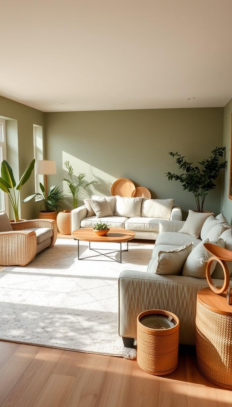
Accessorize Your Space with Plants and Natural Decor
Plants and natural elements bring your design to life. They add freshness and organic beauty to your area.
These touches reinforce the nature-inspired theme. They create a harmonious environment that feels both calm and vibrant.
Selecting Plants that Complement Your Green Tones
Choose plants with silver-green foliage or white flowers. These varieties enhance rather than compete with your walls.
@emmaandthegirls_ created a beautiful sitting nook. They used plants to highlight the color in a budget-friendly way.
Consider these plant options for your design:
- Snake plants with vertical silver-green leaves
- Peace lilies with elegant white blooms
- Pothos with variegated cream and green foliage
- Ferns with delicate light green fronds
These choices add visual interest without overwhelming your palette. They bring life and movement to your space.
Using Botanical Art and Natural Elements for Harmony
Botanical prints and natural materials complete your biophilic design. They create a fresh, calming atmosphere throughout your room.
Incorporate elements like stone accents or rattan baskets. These textures add depth while maintaining the organic feel.
@emmaandthegirls_ demonstrates how plants transform walls. Their approach adds color and life beautifully.
Benefits of incorporating natural decor:
- Boosts mood and reduces stress levels
- Creates a more relaxing environment
- Adds seasonal flexibility with easy swaps
- Enhances the overall aesthetic appeal
- Reinforces connection to nature
Place plants where they receive adequate light for growth. Consider their care needs when selecting locations.
Rotate accessories with the seasons to keep your look updated. This maintains freshness throughout the year.
Your space becomes a true reflection of nature’s beauty. It feels both intentionally designed and naturally welcoming.
Budget-Friendly Tips for Achieving the Sage Green Look
Creating your dream space doesn’t require a huge budget. With smart choices and creative approaches, you can transform your area affordably.
Focus on high-impact changes that make the biggest difference. Simple updates refresh your decor without breaking the bank.
DIY Projects: Painting Furniture and Fireplace Surrounds
Painting existing pieces gives them new life with minimal cost. This approach lets you experiment with different shades.
Mary Patton Design transformed a fireplace with a simple paint project. Their DIY approach created a fresh, cohesive look.
Start with smaller items like side tables or bookshelves. These pieces offer practice before tackling larger projects.
Key benefits of DIY painting projects:
- Cost-effective way to update your furniture
- Allows customization to match your exact preferences
- Provides satisfaction of creating something yourself
- Extends the life of existing pieces
Choose quality paint for better coverage and durability. Proper preparation ensures a professional-looking finish.
Strategic Swaps: Updating Pillows, Throws, and Art
Accessories offer the easiest way to introduce new colors. They provide flexibility to change your style seasonally.
Swap out pillow covers and throws for instant updates. Mix patterns and textures for added visual interest.
Artwork and wall decor refresh your walls affordably. Look for pieces that complement your chosen tones.
Consider these budget-friendly sourcing options:
- Thrift stores for unique, inexpensive finds
- DIY art projects using natural materials
- Seasonal sales at home decor stores
- Online marketplaces for secondhand items
Focus on high-visibility areas for maximum impact. Your seating area and walls offer great opportunities.
These changes create a refreshed feel without major investment. They let you evolve your style gradually over time.
Bringing Your Serene Sage Green Vision to Life
You now have all the tools to create your perfect peaceful retreat. From choosing paint to selecting textures, each step builds toward your dream space.
Start small with a throw pillow or paint sample. These simple changes begin your transformation journey. Your investment in this timeless hue offers lasting beauty and comfort.
Remember this color’s amazing versatility. It adapts to your evolving style over time. Mix elements confidently – its flexibility makes stunning results almost guaranteed.
Share your creations with design communities for fresh ideas. Keep your look current with seasonal accessory swaps. This maintains that fresh, intentional feel you love.
Your calming oasis awaits. This rewarding project brings daily joy and relaxation. Embrace the process and enjoy your beautiful, personal sanctuary.