Welcome to your guide for creating a serene and spacious retreat. A soft grey palette offers incredible versatility for your personal space. It creates a calming atmosphere that feels both open and inviting.
This elegant hue reflects natural light beautifully. It helps any area appear larger and more luminous. You can pair it with many colors and design styles for a custom look.
Whether you love modern minimalism or cozy cottage charm, this neutral shade works. It blends seamlessly with bold accents like vibrant blue or soft pink. Your room can feel both practical and luxurious.
We will explore paint choices, furniture, textiles, and decorative accents. Discover how to achieve a refresh or a full makeover. Let’s transform your space into a peaceful haven you’ll love.
Why a Light Grey Bedroom is Your Key to Serenity
Unlock the potential of a calming color scheme that promotes rest and relaxation in your personal space. This versatile neutral creates an environment where you can truly unwind after a long day.
The Soothing Power of a Neutral Palette
A soft neutral palette works wonders for reducing stress. It creates visual harmony that helps your mind settle into relaxation mode.
Psychologists recognize the calming effect of muted tones. They provide a comforting backdrop that doesn’t overstimulate your senses.
This versatile shade blends beautifully with other colors. You can create a harmonious look that feels both coordinated and personal.
Many designers prefer this approach for creating timeless spaces. Unlike trend-driven colors, this neutral choice won’t feel dated in a few years.
Making Your Space Feel Larger and Brighter
Light-colored surfaces have a remarkable ability to reflect natural illumination. This creates an airy atmosphere that feels more open and welcoming.
Even smaller rooms benefit from this optical effect. The space appears more expansive without any structural changes.
Practical advantages include better concealment of minor imperfections. This makes maintenance easier while maintaining a polished look.
Consider your room’s natural illumination when selecting tones. This ensures you maximize brightness throughout the day.
| Color Option | Light Reflection | Calming Effect | Versatility |
|---|---|---|---|
| Soft Neutral Tone | Excellent | High | Very High |
| Stark White | Excellent | Moderate | High |
| Dark Colors | Poor | Variable | Moderate |
| Bright Colors | Good | Low | Low |
Layering different shades of the same family adds depth without overwhelming your senses. This approach creates a luxurious feel that remains soothing and functional.
Your sleep sanctuary should be both beautiful and practical. This timeless choice helps you achieve a space that supports restful nights and peaceful mornings.
Understanding Undertones: The Secret to Choosing Your Grey

Your perfect shade awaits when you learn to speak the subtle language of undertones. These hidden color influences determine whether your space feels warm and cozy or cool and serene. Mastering this concept transforms your design approach completely.
Cool Undertones: Blues and Greens
Cool undertones create a tranquil atmosphere that feels refreshing and calm. Blues and greens work beautifully in spaces where you want to unwind and relax.
These shades pair exceptionally well with black accents and crisp white trim. They create a sophisticated look that feels both modern and timeless.
Search for “slate” tones online to find excellent examples with blue undertones. This approach helps you visualize the final result before making decisions.
Warm Undertones: Beiges and Lavenders
Warm undertones add comforting energy to your personal space. Beiges and lavenders create an inviting atmosphere that feels welcoming.
These shades work beautifully with gold accents and natural wood elements. They bring warmth without overwhelming the senses.
Consider blush pink accessories to enhance lavender undertones beautifully. This combination creates a soft, romantic feel that’s perfect for relaxation.
How to Test and Select the Perfect Shade
Always test your chosen shades in the actual room’s lighting conditions. Natural and artificial light dramatically change how colors appear throughout the day.
Purchase sample pots to paint large swatches on your walls. Live with them for a few days to observe how they change with different light conditions.
Don’t feel restricted to matching undertones perfectly throughout your space. Sometimes mixing warm wall tones with cool accent colors creates wonderful depth.
| Undertone Type | Mood Created | Best Pairings | Light Response |
|---|---|---|---|
| Cool (Blue/Green) | Tranquil & Serene | Black, White, Navy | Bright & Airy |
| Warm (Beige/Lavender) | Cozy & Inviting | Gold, Wood, Blush | Soft & Warm |
| Green Undertones | Fresh & Balanced | Plants, Natural Textures | Natural & Calm |
Understanding undertones helps you create a cohesive design that feels intentional. Your choices will work together harmoniously rather than fighting for attention.
Choose shades that align with your desired atmosphere and personal preferences. This ensures your space truly reflects your vision and feels like home.
Transform Your Walls with the Perfect Light Grey Paint
Your wall color sets the foundation for your entire space’s atmosphere. Choosing the right shade makes all the difference in creating your desired look.
The perfect paint selection can elevate your room from ordinary to extraordinary. It establishes the mood and complements your furniture and decor.
Top Paint Picks: From Candle Smoke to Moon Lily
Discover these exceptional paint options that work beautifully in any space. Each offers unique characteristics that create different atmospheres.
Candle Smoke delivers a bright, contemporary look with subtle blue undertones. This shade reflects natural illumination beautifully throughout the day.
Snow Storm offers warm, alluring tones with mauve notes. It pairs wonderfully with lilac and lavender accents for a soft, inviting feel.
Moon Lily provides versatile misty tones with purple warmth. This adaptable shade suits various design styles from modern to traditional.
Magical Moonlight introduces subdued lavender purple elegance. It adds subtle color interest while maintaining a serene atmosphere.
When to Leave Trim and Ceilings White for Definition
White trim creates beautiful contrast against your wall color. This crisp finish adds definition and visual interest to your space.
Leaving ceilings white can make rooms feel taller and more open. This technique works especially well in smaller spaces where height matters.
White elements balance painted surfaces beautifully. They prevent your room from feeling too monotonous or overwhelming.
Always test your chosen colors in your actual space. Observe how they interact with natural illumination at different times.
Mastering this combination transforms your walls into a dreamy backdrop. Your space will feel both coordinated and intentionally designed.
Create a Dreamy Backdrop with Textured Grey Walls

Transform your walls into a dimensional masterpiece with texture. These treatments add visual interest that flat paint cannot achieve. They create depth and character throughout your space.
Textured surfaces work beautifully as a neutral backdrop. They allow artwork and furniture to stand out beautifully. This approach adds sophistication without overwhelming your senses.
Using Shiplap or Reclaimed Wood for Dimension
Shiplap creates wonderful architectural interest in any space. Install it horizontally behind your bed for a stunning focal point. This treatment enhances the room’s structure beautifully.
Reclaimed wood with a subtle stain offers rustic charm. The weathered appearance brings warmth and character to your interior. Each piece tells its own unique story.
Consider rough-sawn wood for additional texture variation. Mix different wood types for a personalized design approach. This creates a unique look that feels both curated and intentional.
The Modern Patina of Limewashed Walls
Limewashing creates a beautiful, timeworn appearance on surfaces. Use warm tones for a soft, inviting patina effect. This technique works on both brick and drywall surfaces.
The finish allows walls to breathe naturally. This prevents moisture issues that can occur with regular paint. It’s a practical choice for maintaining healthy indoor air quality.
Consider brick-print wallpaper for a similar effect without permanent changes. This temporary solution offers flexibility for renters or those wanting easy updates. It provides texture without the commitment of actual masonry work.
Textured surfaces make any space feel cozier and more inviting. They balance minimalism with thoughtful detail. Your room will achieve both serenity and dimensional interest.
These wall treatments create a dreamy backdrop that enhances relaxation. They add depth without relying on color variations. This approach transforms your space into a truly special retreat.
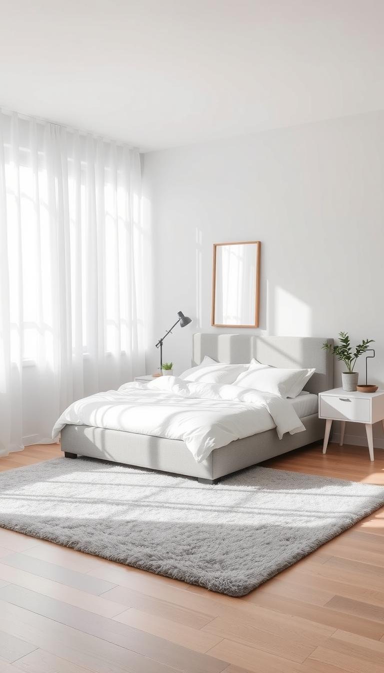
Anchor Your Space with a Light Grey Upholstered Bed
Your bed becomes the heart of your personal retreat. A soft upholstered frame creates a cozy and stylish centerpiece. It offers both comfort and visual appeal in your sleep space.
This furniture piece anchors the entire room’s design. It provides structure while maintaining a welcoming feel. You can build your decor around this key element.
Choosing Between Velvet, Linen, and Other Fabrics
Selecting the right fabric changes your bed’s entire personality. Velvet offers a luxurious and polished look. It feels soft to the touch and adds sophistication.
Linen provides a relaxed and breathable feel. This natural material works well in various climates. It creates a casual yet elegant atmosphere.
Consider cotton or synthetic blends for easy maintenance. These durable options withstand daily use beautifully. They offer practical benefits for busy households.
Mid-tone or charcoal frames provide lasting versatility. They coordinate with numerous bedding colors effortlessly. This choice ensures your investment remains relevant for years.
Styling Your Bed Frame with Complementary Bedding
White or off-white sheets create beautiful contrast against your frame. This combination highlights the bed’s elegant silhouette. It keeps the focus on your beautiful furniture piece.
Layer different textures for added depth and coziness. Quilts and throws introduce visual interest and warmth. This approach makes your sleeping area feel inviting.
Artwork or wall sconces above the headboard draw attention upward. This technique enhances your bed’s presence in the room. It creates a balanced and intentional design.
Wood or metal accents complement various style preferences. These elements add character without overwhelming the space. They work with both modern and traditional aesthetics.
| Fabric Type | Appearance | Maintenance | Best For |
|---|---|---|---|
| Velvet | Luxurious & Polished | Medium | Master Suites |
| Linen | Relaxed & Breathable | Easy | All Seasons |
| Cotton Blend | Versatile & Durable | Very Easy | Family Homes |
| Synthetic | Modern & Sturdy | Simple | High Use Areas |
Updating bedding offers an easy way to refresh your space seasonally. You can change colors and patterns without replacing your frame. This flexibility makes decorating fun and affordable.
Choosing the right fabric and styling creates a comfortable centerpiece. Your bed becomes both a functional and beautiful element. It transforms your room into a true sanctuary.
Layer Your Bed with Light Grey Sheets and Throws

Transform your sleeping area into a luxurious retreat with thoughtful textile choices. The right combination creates a welcoming sanctuary that invites relaxation.
Your bedding selection makes a significant impact on both aesthetics and comfort. It’s where style meets practical everyday living.
Mixing Shades and Textures for a Luxurious Look
Combine different tones from the same color family for depth. Pale mist to charcoal creates visual interest without overwhelming your space.
Texture variety adds tactile richness to your sleeping experience. Consider these beautiful combinations:
- Waffle weave cotton for breathable comfort
- Soft linen for relaxed elegance
- Plush velvet for winter warmth
- Crisp percale for summer coolness
Pattern mixing prevents monotony in an all-neutral scheme. Try subtle stripes with geometric prints or textured solids.
White elements provide crisp contrast against softer tones. This keeps your arrangement feeling fresh and clean.
The Practical Benefits of Grey Bedding
Neutral textiles offer excellent stain concealment properties. They maintain their appearance longer between washes.
This color family hides wrinkles better than brighter alternatives. Your bed looks neatly made with minimal effort.
Additional layers protect your investment from daily wear. A beautiful throw blanket safeguards your comforter from pets or children.
Versatility remains a key advantage of this palette. You can easily introduce new accent colors through pillows or decorative pieces.
| Bedding Element | Recommended Texture | Practical Benefit | Style Impact |
|---|---|---|---|
| Sheets | High-quality cotton | Durability & comfort | Foundation layer |
| Duvet Cover | Linen blend | Wrinkle resistance | Visual texture |
| Throw Blanket | Knit or woven | Protection layer | Cozy accent |
| Decorative Pillows | Mixed materials | Easy color changes | Personal style |
Your master retreat benefits from both elegance and functionality. This approach creates a sanctuary that feels both luxurious and lived-in.
Enjoy the perfect balance of style and practicality. Your sleeping space becomes a true reflection of thoughtful design.
Introduce Warmth and Contrast with Wood Accents
Natural elements bring life and comfort to your personal space. Wood introduces organic texture that beautifully balances cooler tones. It creates a welcoming atmosphere that feels both grounded and serene.
These natural touches add visual interest throughout your room. They complement painted surfaces while providing warmth. Your space gains character without losing its airy quality.
Choosing Light-Stained Furniture Pieces
Light wood tones maintain an open and spacious feeling. They reflect natural illumination while adding natural beauty. This approach keeps your room feeling bright and welcoming.
Consider pale oak or ash for nightstands and dressers. These materials offer durability and timeless appeal. They coordinate beautifully with various color schemes.
Mix different wood species for added depth and interest. Each piece brings unique grain patterns and characteristics. This creates a collected look that feels personal and intentional.
The Beauty of a Weathered Grey Wood Stain
Weathered finishes add rustic charm and character to your space. This treatment creates a timeworn patina that feels both elegant and casual. It works beautifully on bed frames, shelves, and accent pieces.
You can find furniture with built-in grey patina or create your own. Hardware stores offer various stain options for custom projects. This allows you to achieve exactly the look you want.
This finish works across multiple design styles from coastal to industrial. It adds versatility while maintaining a cohesive aesthetic. Your space feels both curated and comfortable.
“Wood brings nature’s warmth into our homes, creating spaces that feel both refined and relaxed.”
Consider these practical benefits of incorporating wood elements:
- Natural durability for everyday use
- Easy blending with existing decor elements
- Timeless appeal that won’t date quickly
- Texture variation that adds visual interest
| Wood Type | Appearance | Best Use | Maintenance Level |
|---|---|---|---|
| Light Oak | Natural & Warm | Furniture Pieces | Easy |
| Weathered Grey | Rustic & Textured | Accent Pieces | Low |
| Ash Wood | Smooth & Light | Bed Frames | Medium |
| Reclaimed Wood | Character-Rich | Decorative Items | Periodic |
Wood accents complete your space with natural warmth and character. They transform your room into a cozy retreat that feels both stylish and lived-in. Enjoy the perfect balance of elegance and comfort.
Define Your Flooring with a Soft Grey Rug

Your floor deserves as much attention as your walls and furniture. A carefully chosen rug transforms the entire atmosphere of your personal retreat. It adds both visual appeal and physical comfort underfoot.
This foundational piece brings everything together beautifully. It creates a cozy foundation that enhances your room’s serene vibe. You’ll appreciate the warmth and texture it provides daily.
Selecting the Right Pile and Texture
Consider your lifestyle when choosing rug materials. Low pile options offer easy cleaning and maintenance. They work well in high-traffic areas and with pets.
High pile rugs provide luxurious plushness underfoot. They feel wonderful when you step out of bed each morning. These create a truly indulgent experience in your space.
Wool offers natural durability and stain resistance. Synthetic blends provide affordable luxury and easy care. Choose what fits your cleaning preferences and budget.
Texture adds dimension to your overall design scheme. A chunky weave or subtle pattern introduces visual interest. This prevents your floor covering from appearing flat or boring.
Using a Rug to Anchor Your Bed and Furniture
Position a large rug under your bed to frame the sleeping area. Ensure it extends sufficiently on all sides. This creates a balanced look that feels intentional.
Your feet should land on soft surface when getting out of bed. This practical consideration enhances your morning routine. It adds comfort from your first step each day.
Furniture placement becomes more cohesive with proper anchoring. Nightstands and benches can sit partially on the rug. This unified approach makes your layout feel deliberate.
Contrast plays an important role in your selection. Pair a pale rug with dark flooring for definition. Alternatively, match similar tones for a seamless, expansive feel.
“A well-chosen rug is like the foundation of a room—it grounds everything while adding comfort and style.”
Consider these practical benefits for your master retreat:
- Excellent dirt and stain concealment between cleanings
- Added warmth during cooler months
- Sound absorption for a quieter environment
- Protection for your underlying flooring surface
| Rug Type | Pile Height | Best For | Maintenance |
|---|---|---|---|
| Low Pile | 0.25″-0.5″ | High Traffic Areas | Very Easy |
| Medium Pile | 0.5″-0.75″ | General Use | Easy |
| High Pile | 0.75″-1.5″ | Luxury Feel | Regular Care |
| Shag | 1.5″+ | Statement Pieces | High Maintenance |
Layering offers another creative approach to floor design. Place a smaller patterned rug over a larger neutral base. This adds depth while allowing easy style changes.
Your rug can introduce subtle patterns or additional shades. These elements complement your overall color palette beautifully. They add interest without overwhelming the space.
A well-chosen floor covering ties everything together perfectly. It creates a functional and stylish element in your retreat. Enjoy the enhanced comfort and completed look it provides.
Illuminate Your Sanctuary with Grey Lighting Fixtures
Lighting creates the perfect atmosphere in your personal retreat. The right fixtures enhance your space both day and night. They add function while elevating your overall design.
Your choice of illumination affects how colors appear throughout the day. It can make your space feel cozy or crisp. Proper placement ensures both beauty and practicality.
Matte Metal Lamps and Pendant Lights
Matte metal finishes offer a modern touch that complements various styles. They provide visual weight without feeling heavy. These fixtures blend seamlessly with your color scheme.
Brushed nickel and concrete finishes create cohesive looks. Smoked glass shades add subtle sophistication. These materials work beautifully with both warm and cool undertones.
Bedside lamps provide excellent task lighting for reading. Choose adjustable designs for personalized comfort. They should offer both style and functionality.
Pendant lights create wonderful ambient illumination. Hang them above nightstands or seating areas. They become artistic elements when not in use.
How Lighting Changes the Mood of Your Grey Palette
Bright illumination energizes your space during daytime hours. It highlights architectural details and artwork beautifully. This approach makes your room feel active and alert.
Softer lighting creates relaxation perfect for evenings. It adds warmth and depth to neutral surfaces. Your space transforms into a cozy retreat.
Dimmable options offer incredible flexibility. You can adjust brightness to match any occasion. This control lets you create the perfect atmosphere.
Placement matters for both function and style. Position task lights where you need them most. Ambient fixtures should provide even, comfortable illumination.
“Lighting design is not about the fixtures themselves, but about the quality of light they produce and how it makes a space feel.”
Energy-efficient options provide long-term benefits. LED bulbs last longer and use less power. They come in various color temperatures to match your needs.
Well-chosen illumination completes your sanctuary beautifully. It enhances your design while supporting daily activities. Your space becomes both practical and peaceful.
Elevate Your Walls with Grey and White Artwork

Your walls deserve the perfect finishing touches that complete your sanctuary. Artwork in soft tones adds personality while maintaining a peaceful atmosphere. It creates visual interest without overwhelming your serene space.
This approach brings your personal style into the room beautifully. You can express yourself while keeping the calming vibe intact. Thoughtful selections make your space feel both curated and comfortable.
Choosing Pieces that Complement without Overpowering
Scale matters when selecting artwork for your personal retreat. Choose pieces that fit your wall proportions perfectly. A single large piece above your bed creates a stunning focal point.
Smaller works work well in groupings or on narrower surfaces. They add detail without dominating the room’s appearance. Always consider how pieces interact with your existing furniture.
Frames play a crucial role in your overall aesthetic. Matching tones create a seamless, cohesive look throughout your space. Metallic options add elegant contrast that feels sophisticated.
Gallery walls offer wonderful opportunities for personal expression. Mix different sizes and orientations for dynamic interest. Keep a consistent color story to maintain harmony.
Creative Alternatives to Traditional Art
Think beyond conventional paintings and photographs for your walls. Textile hangings bring softness and texture to your space. They add warmth while maintaining visual lightness.
Mirrors serve both decorative and functional purposes beautifully. They reflect light and make rooms feel more expansive. Choose frames that complement your existing decor elements.
Collections of felt hats or other personal items create unique displays. These arrangements tell your story in a visually appealing way. They make your space feel truly one-of-a-kind.
Consider these creative options for your walls:
- Woven wall hangings for textural interest
- Antique mirrors with character-rich frames
- Floating shelves with small sculptural objects
- Macrame pieces for bohemian flair
Artwork can subtly introduce accent colors from your palette. A blush pink detail ties in with throw pillows across the room. Blue elements connect with other decorative touches throughout your space.
Hang pieces at eye level for optimal viewing pleasure. Proper lighting highlights your favorites beautifully. Adjustable spotlights or picture lights work wonderfully for this purpose.
Your selections should reflect your personal taste and experiences. Choose pieces that bring you joy and comfort. This makes your retreat feel uniquely yours.
Grey and white artwork completes your walls with sophistication. It adds the final layer that ties everything together perfectly. Your space becomes a truly finished masterpiece.
Incorporate Cozy Blush and Pink Accents
Soft pink touches bring delightful warmth to your cool-toned sanctuary. These gentle additions create a welcoming atmosphere that feels both personal and polished. They add personality without disrupting your peaceful retreat.
Blush tones work beautifully with various design elements. They introduce subtle energy while maintaining a serene environment. Your space gains depth and character through thoughtful color integration.
How Soft Pinks Add Warmth to a Cool Grey
Color theory explains why these combinations work so well. Warm pink undertones balance cool grey surfaces beautifully. This creates visual harmony that feels both intentional and inviting.
The contrast adds energy without overwhelming your senses. Your space maintains its calming quality while gaining warmth. This balanced approach feels sophisticated and cozy.
Muted pink shades keep the palette grown-up and elegant. They avoid childish associations while adding cheerfulness. Your retreat feels both refined and welcoming.
Using Throw Pillows and Blankets for Pops of Color
Textile accessories offer the easiest way to experiment with color. Dusty rose throw pillows create instant visual interest. They add comfort while introducing warm tones.
Blankets in blush tones provide both style and function. You can layer them for added warmth during cooler months. These pieces create removable color accents that change with seasons.
Consider these placement strategies for maximum impact:
- Pair blush pillows with charcoal bedding for contrast
- Drape a pink throw across your bench or chair
- Mix different pink tones for dimensional interest
- Combine textures like velvet and knit for richness
These accessories let you test colors without permanent commitment. You can easily swap them out as your preferences evolve.
Artwork and rugs provide additional opportunities for color integration. A blush area rug anchors your space with soft warmth. Pink elements in wall art tie everything together beautifully.
Metallic finishes gain enhanced warmth when paired with pink accents. Brass or copper details glow beautifully against blush tones. This combination creates a cohesive, luxurious feel.
Your personal retreat becomes more inviting through these warm additions. The space feels both designed and lived-in. You’ll enjoy the enhanced comfort and visual appeal.
| Accent Type | Color Impact | Practical Benefit | Style Effect |
|---|---|---|---|
| Throw Pillows | Subtle Warmth | Easy Seasonal Changes | Instant Color Pop |
| Blankets | Soft Contrast | Additional Warmth | Layered Texture |
| Artwork | Distributed Color | Personal Expression | Focal Points |
| Small Decor | Subtle Touches | Easy Updates | Completed Look |
Blush accents soften your overall palette beautifully. They make your sanctuary feel more personal and inviting. This approach elevates your design while maintaining serenity.
Enjoy experimenting with these warm additions to your space. They transform your retreat into a truly special haven. Your bedroom becomes both stylish and comforting.
Blend in Calming Blue Hues for a Tranquil Vibe
Introducing blue into your color scheme creates a wonderfully peaceful atmosphere. This combination feels both refreshing and deeply relaxing. It transforms your space into a true sanctuary.
Blue tones work beautifully with neutral backgrounds. They add visual interest without overwhelming your senses. Your room gains depth while maintaining its serene quality.
Pairing Light Grey with Navy and Dusty Blue
Navy offers striking contrast against softer backgrounds. It creates definition and sophistication in your design. This bold choice makes a strong style statement.
Dusty blue provides a softer, more subtle approach. It blends seamlessly with various neutral shades. This creates a harmonious and gentle atmosphere.
Both options deliver excellent calming effects. They promote relaxation and peaceful sleep. Your space becomes a true retreat from daily stress.
Achieving a Coastal or French Country Feel
Coastal style emerges through specific material choices. Weathered wood and natural linen create beachy vibes. Nautical accents complete this relaxed look.
French country design incorporates antique elements. Exposed beams and vintage furniture add character. This approach feels both timeless and inviting.
Consider these elements for each style:
- Coastal: striped textiles, sea glass colors, rope details
- French Country: ornate mirrors, floral patterns, distressed finishes
- Both Styles: layered textures, mixed materials, personal collections
Blue accents work beautifully in bedding and artwork. They create visual connections throughout your space. This cohesive approach feels intentional and polished.
Start with smaller decorative items before larger commitments. Throw pillows and vases offer easy introduction. You can adjust your palette as preferences evolve.
“Blue brings the calm of ocean and sky into our homes, creating spaces that breathe peace and tranquility.”
Multiple blue shades add wonderful depth to your design. Pale sky tones keep things airy and bright. Deep navy provides grounding and contrast.
This refreshing addition maintains your serene foundation. It enhances rather than changes your peaceful atmosphere. Your personal retreat becomes even more special.
Embrace Natural Light and Reflective Surfaces
Your sanctuary becomes brighter and more inviting when you welcome sunshine inside. Natural illumination transforms any area, making it feel open and airy. This approach enhances your serene atmosphere beautifully.
Reflective surfaces play a key role in maximizing brightness. They bounce illumination around your personal retreat. Your space gains both beauty and functionality.
Mirror Placement to Enhance Airiness
Strategic mirror positioning creates magical effects in your room. Place them opposite windows to capture and reflect outdoor views. This technique doubles the sense of space instantly.
Group smaller mirrors for artistic impact and light amplification. A gallery wall of various shapes adds decorative interest. It also spreads illumination throughout your area.
Full-length options make narrow rooms appear wider. They create depth while serving practical purposes. Your morning routine becomes more enjoyable with these additions.
Consider these placement strategies for maximum impact:
- Opposite windows to capture outdoor views
- Adjacent to seating areas for brightness
- Behind lamps to enhance artificial lighting
- In dark corners to eliminate shadows
Window Treatment Ideas to Maximize Light
Sheer curtains offer perfect light control with privacy maintenance. They filter harsh sunshine while keeping your space bright. These soft fabrics add movement and elegance.
Light-filtering shades provide adjustable illumination management. You can raise them completely for full brightness. Lower them partially for soft, diffused light.
Roman shades in pale colors maintain airy feelings. They stack neatly when not in use. This keeps your view unobstructed and open.
Choose window frames in matching wall colors. This creates seamless visual flow around glass areas. Your eyes move freely without interruption.
“The right window treatment balances illumination and privacy, creating spaces that feel both open and intimate.”
Multiple layers offer ultimate flexibility for different times. Combine sheer curtains with blackout liners for evening use. This system adapts to your daily needs perfectly.
Energy efficiency improves with proper natural light usage. You reduce artificial lighting needs during daytime hours. This creates cost savings and environmental benefits.
Your health and well-being improve with abundant sunshine exposure. Vitamin D absorption and mood enhancement occur naturally. Your sanctuary becomes a true wellness retreat.
With smart mirror placement and window treatments, you maximize brightness effectively. Your personal area feels more open, inviting, and refreshing. Enjoy the enhanced atmosphere daily.
Design a Functional and Stylish Grey Window Nook
Transform that sunny corner into your favorite spot for relaxation. A custom window seat adds charm and purpose to your personal area. It creates a cozy retreat right inside your room.
This feature makes excellent use of often-overlooked space. You gain both seating and storage in one smart solution. Your master retreat becomes more functional and inviting.
Building a Light Grey Upholstered Window Seat
Start with a sturdy base that can support weight comfortably. Plywood works well for constructing the main frame. Ensure proper measurements for a perfect fit.
Choose durable foam padding for comfort during long reading sessions. Two to four inches thickness provides ideal cushioning. This makes your nook truly enjoyable.
Select upholstery fabric that withstands daily use beautifully. Performance fabrics resist stains and fading effectively. They maintain their fresh appearance longer.
Consider built-in storage underneath for maximum efficiency. Hinged lids allow easy access to hidden compartments. This clever design keeps your space organized.
Styling with Throw Pillows for a Cozy Retreat
Layer different sizes and shapes for visual interest. Mix square and lumbar pillows along the backrest. This creates a comfortable and appealing look.
Combine various textures for added depth and warmth. Velvet, knit, and woven materials work beautifully together. They make your nook feel extra inviting.
Introduce complementary colors through pillow covers. Soft blues or blush pinks add subtle warmth. These accents enhance your overall design.
Add a small side table for practical functionality. It holds your book, tea, or reading glasses conveniently. This completes your mini retreat perfectly.
“A window seat isn’t just furniture—it’s a destination within your home that offers comfort, storage, and a connection to the outdoors.”
Your new nook becomes a cherished feature in your room. It offers a peaceful escape for reading or quiet reflection. Enjoy this beautiful addition to your personal space.
Personalize Your Space with Metallic Finishes
Metallic accents bring personality and polish to your personal retreat. These shiny details add structure and contrast against soft surfaces. They create focal points that draw the eye around your room.
Your choice of metal finishes reflects your unique style. Whether you prefer warm brass or cool nickel, these elements make your space feel complete. They add that final layer of sophistication.
Warm Touches of Brass and Copper
Warm metals introduce cozy energy to your color scheme. Brass and copper work beautifully with various undertones. They add richness without overwhelming your senses.
These finishes pair exceptionally well with natural wood elements. They create a harmonious look that feels both elegant and inviting. Your space gains depth and character.
Consider brass lamp bases or copper drawer pulls. These small touches make a big impact on your overall design. They bring warmth to cooler palettes.
Cool Accents with Brushed Nickel and Black Steel
Cool metals offer a modern, sleek contrast to your surfaces. Brushed nickel provides subtle shine without glare. Black steel creates striking definition against softer backgrounds.
These finishes enhance cool undertones beautifully. They work well in contemporary or minimalist spaces. Your room feels crisp and intentional.
Try black steel mirror frames or nickel light fixtures. These elements add sophistication without color. They reflect illumination to brighten your space.
Metallic finishes serve both decorative and practical purposes. They add durability to frequently touched items like hardware. Easy cleaning maintains their beautiful appearance.
Use these accents sparingly for maximum impact. Focus on key pieces that tie your room together. This approach keeps your design cohesive.
“Metallic details are like jewelry for your room—they add sparkle and personality without overwhelming the overall design.”
Mixing metals can create wonderful depth when done thoughtfully. Stick to two complementary tones for balance. This prevents your space from feeling disjointed.
Consider these placement ideas for metallic accents:
- Lighting fixtures for functional elegance
- Mirror frames to reflect light beautifully
- Hardware on furniture pieces for subtle shine
- Decorative objects on shelves or nightstands
Your metallic choices should reflect your personal style. Vintage lovers might prefer aged brass. Modern enthusiasts may choose polished nickel.
These finishes add luxury without additional colour. They elevate your master retreat with character and polish. Your space becomes truly special.
| Metal Type | Visual Effect | Best Pairings | Maintenance Level |
|---|---|---|---|
| Brass | Warm & Rich | Wood Elements, Warm Greys | Medium |
| Copper | Rosy & Inviting | Natural Textures, Soft Colors | Regular Polishing |
| Brushed Nickel | Cool & Subtle | Modern Furniture, Cool Tones | Easy |
| Black Steel | Bold & Defined | Minimalist Design, High Contrast | Low |
Metallic finishes complete your personal sanctuary beautifully. They add that final touch of refinement. Your space becomes both stylish and uniquely yours.
Bringing Your Airy Light Grey Bedroom Vision to Life
You now have all the tools to create your dream master retreat. This versatile color scheme offers endless possibilities for personal expression.
Start small with new bedding or a stylish rug. These changes make a big impact without major investment. Consider undertones and lighting when selecting your perfect shade.
Experiment with textures and accent colors to make the space uniquely yours. Balance light and dark elements for visual harmony. Your personal sanctuary should reflect your taste.
Remember that beautiful design happens at any budget. Use our ideas as inspiration for your own creative journey. Share your results and enjoy your new peaceful haven!