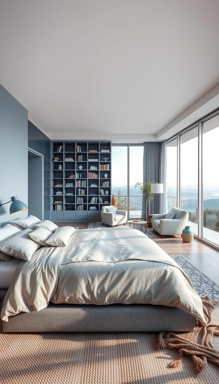
Imagine walking into your personal sanctuary after a long day. A space designed for pure relaxation welcomes you home. This retreat combines cool tranquility with soft elegance.
The color combination works beautifully in various decor styles. You can create a modern, minimalist, or classic room. It all depends on your personal choice.
Shades range from deep navy to soft baby blue. Charcoal to light grey tones offer incredible versatility. You can truly make the space feel like your own.
This article will guide your transformation journey. Discover actionable ideas to refresh your existing room or start from scratch. We cover everything from wall color to textiles.
These hues promote calmness and reduce stress. They help create a soothing bedroom feel that enhances your sleep experience. Get ready to be inspired!
Why a Blue and Grey Palette is Your Perfect Sleep Sanctuary

Discover the hidden power behind this popular color pairing that transforms ordinary rooms into peaceful retreats. This combination works magic in creating spaces that promote relaxation and better rest.
The Psychology Behind Calming Blues and Neutrals
Color psychology reveals why certain hues affect our mood. Cool tones have a calming effect on the nervous system. They help lower heart rates and reduce stress levels.
Research shows these specific shades promote tranquility. They create an environment perfect for unwinding after busy days. Your sleeping area becomes a true sanctuary for recovery.
According to color psychology experts, neutral backdrops reduce visual overload. This allows your mind to relax more completely. The result is deeper, more restorative sleep.
Versatility for Modern, Classic, and Minimalist Styles
This palette adapts beautifully to any design preference. You can achieve multiple looks with the same foundation. The flexibility makes it ideal for personal expression.
Consider these style approaches:
- Modern aesthetic: Pair deep navy with light neutral walls for contemporary appeal
- Classic elegance: Soft powder shades with medium neutrals create timeless beauty
- Minimalist approach: Muted tones with clean lines achieve serene simplicity
Sherwin Williams’ “On the Rocks” paint exemplifies perfect cool neutrality. It complements various accent colors beautifully. This specific shade works well in different room sizes.
Lighter tones make compact spaces feel more expansive. Darker variations add sophistication to larger areas. You can balance cool elements with warm wood finishes.
Your personal taste should guide final selections. The right combination will reflect your style while maintaining peaceful atmosphere. This ensures your space feels uniquely yours.
1. Transform Your Space with a Statement Accent Wall

Strategic wall treatments elevate your room’s design without overwhelming the space. This approach creates visual interest while maintaining the serene atmosphere you want.
Choosing Between Paint, Wallpaper, and Board & Batten
Three main options create stunning feature walls. Each brings unique character to your sleeping area.
Paint offers solid color impact with maximum flexibility. Sherwin Williams’ “On the Rocks” provides perfect cool neutrality. This shade complements various accent colors beautifully.
Wallpaper introduces patterns and textures. Farrow & Ball’s “Aranami” pattern adds movement without chaos. Select designs that complement your existing color scheme.
Board and batten treatments create architectural depth. These vertical elements add texture and sophistication. The clean lines work well with modern and traditional styles.
Strategic Placement for Maximum Impact
Position your feature wall behind the bed for natural focus. This placement makes your sleeping area the room’s centerpiece.
The arrangement enhances the overall layout. It draws attention to your most important furniture piece. This creates balanced visual weight throughout the space.
Consider room size when selecting colors. Darker shades like navy add drama to larger areas. Lighter tones maintain airiness in compact rooms.
Renter-Friendly Options for a Temporary Feature
You can achieve beautiful results without permanent changes. Several temporary solutions work wonderfully.
Removable wallpaper offers easy installation and removal. Modern options leave no residue behind. You can experiment with patterns risk-free.
Lightweight board and batten installations provide temporary texture. These systems use adhesive rather than nails. They create sophisticated looks without damage.
Always test materials on small areas first. Ensure they complement your existing color combinations. This approach maintains cohesive design throughout your home.
2. Layer Textiles for Ultimate Comfort and Style
Elevate your personal sanctuary through thoughtful textile selection that balances softness with sophisticated style. The right fabric combination transforms your resting area into a luxurious haven.
The Art of Mixing Sheets, Throws, and Pillows
Mastering fabric layering creates depth and interest in your sleeping quarters. Start with quality foundation pieces that provide both comfort and visual appeal.
Successful makeovers often begin with crisp white quilts or duvets. This bright base keeps the overall look fresh and airy. Then add personality through patterned elements.
Vary pillow sizes and arrangements for visual interest without clutter. Standard shams, euro pillows, and decorative accents create a balanced composition. Your sleeping surface remains functional yet beautifully appointed.
Combining Textures: Linen, Velvet, and Wool
Different materials offer unique benefits that enhance your tactile experience. Each fabric contributes to the overall comfort and aesthetic.
Linen provides excellent breathability for comfortable nights. Velvet adds a touch of luxury and sophistication. Wool offers warmth and cozy appeal during cooler months.
Mixing these textures creates a rich, inviting atmosphere. The combination feels intentional yet effortlessly comfortable. Your space becomes a true retreat for relaxation.
Your Go-To Formula: Crisp White + Patterned + Simple
A proven approach ensures beautiful results every time. This method creates cohesion while allowing personal expression.
Begin with basic white bedding as your foundation. Add patterned sheets in navy floral or geometric designs. Complete with solid velvet euro shams for elegant simplicity.
Consider adding a plush wool throw at the foot of your sleeping surface. This provides both warmth and a pop of texture. The arrangement feels curated yet comfortably inviting.
Experiment with your favorite combinations while maintaining color harmony. Personalize with textures and patterns that reflect your unique style. Your space will feel both cohesive and distinctly yours.
3. Select Furniture and Finishes That Tie the Room Together

Thoughtfully selected pieces bring together all elements of your personal sanctuary. The right furnishings create harmony between your color scheme and overall aesthetic.
Your furniture choices complete the transformation from basic sleeping area to cohesive retreat. Each piece should contribute to both function and visual appeal.
Choosing the Right Wood Tones to Balance Cool Hues
Warm wood finishes prevent your space from feeling too modern or cold. They add natural warmth that complements cool color palettes beautifully.
Antique wood nightstands create instant character. Their rich patina adds depth against lighter wall treatments. A secretary desk offers both storage and vintage charm.
Consider medium-toned woods like walnut or cherry. These provide warmth without overwhelming your scheme. They work well with both light and dark variations.
The Impact of a Luxe Velvet Headboard
A velvet headboard becomes the focal point of your sleeping area. This luxurious fabric adds texture and sophistication to your space.
Deep navy velvet creates dramatic contrast against neutral walls. The plush material invites relaxation and comfort. Your bed becomes the centerpiece it deserves to be.
This choice elevates the entire room’s aesthetic. It combines visual appeal with tactile pleasure. You create an inviting atmosphere perfect for unwinding.
How Metallic Accents Add a Polished Finish
Metallic details provide the perfect finishing touch to your design. They reflect light and add subtle sparkle throughout your space.
Silver lamps cast soft, ambient illumination. Gold picture frames add warmth to wall arrangements. These elements create visual interest without overwhelming.
Consider a grey and gold vanity for your dressing area. Silver hardware on furniture pieces ties everything together. The combination feels intentional and complete.
Placement matters for both function and aesthetics. Ensure nightstands complement your bed’s scale. Leave enough walking space around larger pieces.
Mix wood and metal elements for balanced appeal. This approach enhances your chosen palette beautifully. Your room will feel both cohesive and thoughtfully designed.
Choose furniture that supports relaxation and organization. Functional pieces contribute to a clutter-free environment. Your sanctuary should feel both beautiful and practical.
4. Illuminate Your Retreat with Strategic Lighting

Lighting transforms your personal space from functional to fabulous. The right illumination creates mood and enhances your room’s design. Strategic choices make your area feel both practical and peaceful.
Creating Ambiance with Dimmable and Layered Lights
Dimmable fixtures offer incredible flexibility for different needs. Adjust brightness from bright reading light to soft evening glow. This control helps maintain your space’s serene atmosphere.
Layered illumination combines multiple light sources. Use overhead fixtures for general brightness. Add task lighting for specific activities like reading.
Accent lights highlight architectural features or artwork. This approach creates depth and visual interest. Your room feels both functional and inviting.
Selecting Lampshades in Your Color Palette
Choose shades that complement your existing scheme. Navy or charcoal tones blend seamlessly with your decor. This creates cohesive visual flow throughout the space.
Consider material and opacity for different effects. Fabric shades diffuse light softly. Metal or glass options create more direct illumination.
Your selection should enhance rather than compete. The right choice supports your overall design vision. Everything works together harmoniously.
Positioning Lights for Function and Relaxation
Place bedside lamps on nightstands for convenient access. This provides perfect reading light without glare. Wall sconces save surface space while adding style.
Consider these placement strategies:
| Location | Fixture Type | Purpose |
|---|---|---|
| Nightstands | Table lamps | Reading and ambient light |
| Wall above bed | Sconces | Space-saving task light |
| Ceiling | Dimmable fixture | General illumination |
| Floor corners | Torchere lamps | Ambient upward light |
Smart bulbs offer additional customization options. Change color temperature throughout the day. Cool white for mornings, warm tones for evenings.
String lights add whimsical charm above headboards or windows. They create soft, diffused illumination perfect for relaxation. This touch makes your space feel cozy and personal.
Always test bulb brightness before finalizing choices. Ensure lights provide sufficient illumination for tasks. Balance function with soothing atmosphere creation.
5. Incorporate Natural Elements and Artistic Touches

Personal touches transform your sleeping area from a designed space into your personal haven. These final details add life and character while maintaining the peaceful atmosphere you’ve created.
Using Plants to Soften and Complement the Scheme
Greenery brings vitality to your color combination. Plants like snake plants or ferns add organic texture. They create beautiful contrast against your wall treatments.
These natural elements improve air quality while promoting calm. Their vibrant green hues complement both light and dark shades. Choose varieties that thrive in indoor conditions.
Place potted plants on nightstands or floating shelves. Black ceramic pots keep the focus on your foliage. This approach maintains visual cohesion throughout your room.
Choosing Wall Art that Enhances the Serene Mood
Artwork personalizes your space while reinforcing the tranquil mood. Select pieces that echo your color palette for cohesive design.
Abstract prints with soft blue accents create visual interest. Landscapes with misty grey tones enhance the peaceful atmosphere. These choices make your walls feel intentionally curated.
Hang artwork above your bed or on prominent walls. This placement creates a natural focal point. Your selections should reflect personal taste while maintaining serenity.
Keeping Accessories Neutral to Let Colors Shine
Neutral accessories prevent visual clutter in your sleeping area. They allow your chosen palette to remain the star of the show.
White table lamps provide illumination without competing. Natural wood frames add warmth to your artwork. These subtle choices support rather than dominate.
The “less is more” philosophy works beautifully here. Each piece should feel intentional and purposeful. Your space maintains its relaxing atmosphere while expressing personality.
For additional inspiration on balancing natural elements with your color scheme, explore these blue and grey bedroom ideas that demonstrate perfect harmony between organic touches and designed spaces.
Bringing Your Dream Blue and Grey Bedroom to Life
Your journey to a peaceful retreat begins with small steps. A simple rug or new bedding can refresh your space instantly.
This versatile color combination suits any style. Try different shades and textures to match your taste. Even a single accent wall makes a big impact.
Remember: less decor creates more calm. Monochromatic layering keeps your room stylish yet serene.
Start today with one change you love. Share your progress and explore more ideas for your entire home!