Welcome to your ultimate guide for crafting a personal sanctuary that feels both soft and playful. This style offers a fresh alternative to dark colors that might feel too heavy in your space.
Discover how this design can transform your room from a simple sleeping area into a mature, inviting retreat. It works beautifully when upgrading to a queen-size bed, creating a cozy and elegant vibe.
Explore a wide range of shades, from delicate light tones to more vibrant options. Each color brings a unique feeling to your home, allowing for true personal expression.
Get ready to dive into practical tips and creative inspiration. These ideas will help you achieve a look that reflects your style and makes you feel completely at ease.
Understanding the Pink Bedroom Aesthetic

This captivating color scheme offers more than just visual appeal – it creates an emotional connection to your space. The right shades can transform your room into a personal sanctuary that feels both comforting and inspiring.
What Makes Pink Work in Bedroom Design
Design professionals love this color for its remarkable versatility. Different shades evoke distinct emotions, from calming serenity to vibrant energy.
Light tones create an airy, spacious feel. They make small rooms appear larger and more open. Deeper hues add warmth and intimacy to your space.
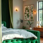
The color works beautifully with various complementary tones. Pairing it with brown creates earthy balance, while green accents bring natural freshness.
Different Vibes: From Soft Serenity to Playful Energy
Your choice of shade dramatically affects the room’s atmosphere. Pale pinks offer tranquil relaxation, perfect for unwinding after long days.
Bolder colors inject playful energy and personality. These vibrant options make strong style statements that reflect confident tastes.
Benjamin Moore’s Pink Starburst creates dramatic impact. Their peachy tones deliver sophisticated warmth for mature aesthetics.
Why Pink Bedrooms Are Trending Now
Interior design trends strongly favor personalized spaces. People want rooms that express individual style rather than following neutral conventions.
The desire for joyful, uplifting environments drives this popularity. After years of minimalist grays, homeowners crave color and character.
This trend represents a shift toward emotional design. Spaces should feel good, not just look good. For more pink apartment aesthetic bedroom ideas, explore creative combinations that work for various room sizes.
Designers note how easily this color adapts to different lifestyles. It works for both playful children’s rooms and elegant master suites.
Choosing Your Perfect Pink Shades
Finding the right color palette transforms your space into a personal retreat. The shades you select set the entire mood and atmosphere.
Each tone creates a different emotional response. Your choice depends on the feeling you want to create.
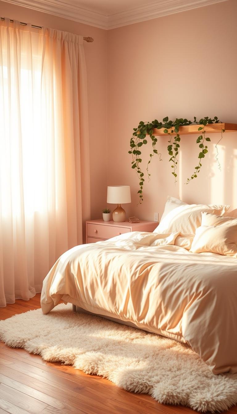
Light Pinks for a Soft, Airy Feel
Soft pastel colors make rooms feel larger and more open. They reflect light beautifully and create a calming environment.
These gentle hues work especially well in smaller spaces. They provide an inviting atmosphere without overwhelming the senses.
Bold Hot Pinks for Maximum Impact
Vibrant shades make a powerful style statement. They energize your space with confidence and personality.
Benjamin Moore’s Pink Starburst creates dramatic visual interest. This intense color works best as an accent rather than full coverage.
Peachy and Mauve Tones for Warmth
Warmer options offer sophisticated elegance. French & French’s peachy pink delivers universally flattering warmth.
Mauve tones reveal subtle pink undertones in sunlight. They create serene backgrounds that adapt to changing light conditions.
Mixing Multiple Pink Shades
Layering different colors adds depth and dimension. You can create visual interest without creating chaos.
Start with a base shade and build from there. Add accents through decor items and textiles for a cohesive look.
| Shade Type | Best Use | Paint Recommendation | Room Vibe |
|---|---|---|---|
| Light Pink | Small spaces, ceilings | Soft Blush by Sherwin-Williams | Airy, spacious |
| Hot Pink | Accent walls, decor | Pink Starburst by Benjamin Moore | Energetic, bold |
| Peachy Tones | Full rooms, bedding | French & French Peach | Warm, inviting |
| Mauve Tones | Versatile backgrounds | Mauvey Beige by Behr | Serene, adaptable |
Consider how natural light affects your chosen colors throughout the day. Test samples on different walls before committing.
The right combination creates harmony between walls, furniture, and accessories. Your space should feel balanced and intentionally designed.
Wall Treatments and Color Combinations

Transform your personal space with creative wall treatments that elevate your design vision. The right approach can completely change how your room feels and functions.
Thoughtful color combinations create harmony between different elements. They help your space feel intentionally designed and personally meaningful.
Painting Techniques for Pink Walls
Color drenching creates a cohesive look using one shade throughout. This technique makes your space feel unified and thoughtfully designed.
Designed paint rollers add subtle patterns and texture to surfaces. They create visual interest without overwhelming your room’s aesthetic.
Consider these effective painting approaches:
- Use deeper shades in alcoves or niches for soft dimension
- Apply warm neutrals on adjacent walls to make your feature color stand out
- Test samples in different light conditions before final decisions
Creating Contrast Walls with Complementary Colors
Pair your main shade with complementary tones for visual balance. This approach adds depth and character to your personal space.
Green accents bring natural freshness that works beautifully. Earthy browns create sophisticated warmth and grounding energy.
The pink and chocolate brown stripe combination offers playful energy with softened elegance. It creates visual interest without feeling overwhelming.
Wallpaper Patterns for Pink Bedrooms
Select designs that enhance your aesthetic without creating visual clash. The right pattern can elevate your entire room’s design.
Floral prints bring organic beauty and softness to walls. Geometric shapes offer modern structure and contemporary appeal.
Consider scale when choosing patterns for your space. Larger designs work best in spacious rooms, while smaller patterns suit compact areas.
Accent Walls vs. Full Room Coverage
Accent walls make bold statements without overwhelming your space. They’re perfect for introducing vibrant colors in measured doses.
Full room coverage creates immersive, enveloping environments. This approach works well with softer, more neutral shades.
Key considerations for your decision:
- Room size – smaller spaces often benefit from lighter full coverage
- Natural light availability – well-lit rooms handle deeper colors better
- Existing furniture and decor – ensure colors complement your pieces
- Personal preference – choose what makes you feel most comfortable
Starting with a contrast wall offers an accessible way to experiment. You can always expand your color scheme later if desired.
Selecting Furniture for Your Pink Space

Your furniture choices make or break the overall feel of your room. The right pieces balance vibrant colors while adding function and style.
Neutral tones in furniture create harmony with bold walls. They let your color scheme shine without visual competition.
Designers often recommend warm neutrals for larger items. These choices establish a sophisticated foundation for your decor.
Bed Frame Choices That Complement Pink
Select a bed frame that enhances rather than fights your wall color. Neutral upholstered options create soft contrast.
Wooden designs add natural warmth to your space. Lighter finishes maintain an airy feel, while darker woods offer dramatic contrast.
Consider these popular frame materials:
- Upholstered frames in cream or beige
- Light oak or birch wood finishes
- Black metal frames for modern contrast
- White washed wood for coastal vibes
Storage Solutions in Neutral Tones
Storage pieces should blend seamlessly with your design. Choose dressers and nightstands in calming neutral shades.
Cream and taupe finishes create elegant functionality. They provide necessary storage without distracting from your color theme.
Many designers recommend built-in options for small spaces. These maximize function while maintaining clean lines.
Mixing Wood Tones with Pink Decor
Wood finishes bring natural warmth to colorful spaces. The right tones enhance rather than compete with your walls.
Light woods complement softer pink shades beautifully. They maintain that airy, open feeling you want to achieve.
Darker woods create striking contrast with vibrant colors. This combination works particularly well in larger rooms.
“The combination of blush tones with light wood elements creates a cocoon-like atmosphere that feels both modern and comforting” – Architectural Digest
Queen Bed Styling for Mature Pink Aesthetics
Upgrading to a queen bed instantly elevates your room’s sophistication. The larger scale creates a more luxurious feel.
Layer bedding in complementary neutral tones. Add textured throws and pillows for depth and comfort.
Consider these styling techniques:
- Use a neutral upholstered headboard
- Layer bedding in cream, white, or taupe
- Add metallic accents for subtle shine
- Include functional nightstands with adequate storage
| Furniture Type | Recommended Finish | Style Effect | Room Size Suitability |
|---|---|---|---|
| Bed Frame | Cream Upholstery | Soft Contrast | All Sizes |
| Dresser | Light Oak | Natural Warmth | Medium to Large |
| Nightstands | Taupe Finish | Elegant Function | All Sizes |
| Storage Bench | Dark Walnut | Dramatic Contrast | Large Rooms |
Your furniture should create a cohesive look that feels intentional. Every piece should contribute to your overall design vision.
For more inspiration on balancing colors with furniture, explore this guide on decorating with pink tones from Architectural Digest.
Decor Elements That Enhance Your Pink Theme

The right accessories transform your space from simply colored to completely cohesive. Thoughtful decor choices bring harmony and personality to your design vision.
These finishing touches create balance between bold walls and functional furniture. They make your room feel intentionally designed rather than randomly assembled.
Textiles: Bedding, Curtains and Rugs
Soft fabrics add comfort while reinforcing your color story. Choose textiles that complement rather than compete with your walls.
Neutral bedding creates a calming foundation for vibrant spaces. Cream or taupe sheets and comforters soften bold color schemes.
Consider these textile combinations:
- Linen curtains in warm white for light diffusion
- Plush area rugs in complementary neutral tones
- Layered throw blankets for texture and warmth
- Mix of matte and shiny fabrics for visual interest
Art and Wall Decor Selection
Your wall art should enhance rather than fight your color scheme. Choose pieces that introduce complementary colors or personal themes.
Black and white photography creates sophisticated contrast. Landscape art with green elements brings natural balance.
Gallery walls allow for personal expression. Mix framed photos with abstract pieces for curated elegance.
Green Accents for Natural Balance
Plants and green decor create refreshing contrast with warm tones. They bring life and organic beauty to your space.
Potted plants add height and texture to corners and surfaces. Choose varieties that thrive in your room’s light conditions.
Green throw pillows or artwork introduce nature-inspired hues. These accents create harmony without overwhelming your design.
“The combination of botanical elements with soft pink creates a serene, nature-inspired retreat that feels both fresh and comforting”
Personal Touches That Make It Yours
Your space should reflect your personality and experiences. Incorporate items that tell your story and spark joy.
Display cherished photos in elegant frames. Include travel souvenirs or handmade items that hold meaning.
Custom artwork or family heirlooms add unique character. These personal elements make your room truly yours.
Remember that your space should evolve with you. Add new pieces as your tastes and experiences grow.
Lighting Strategies for Pink Bedrooms

Light transforms your room’s atmosphere more than any other design element. The right approach can make your space feel completely different at various times of day.
Strategic lighting enhances both function and mood in your personal retreat. It works beautifully with various color schemes to create your desired vibe.
Natural Light Enhancement Techniques
Sunlight makes colors appear more vibrant and true to their actual shade. Sheer curtains diffuse harsh light while maintaining brightness throughout your space.
Position mirrors opposite windows to amplify natural illumination. This simple trick bounces light around the room, making it feel larger and more open.
Consider these effective methods for maximizing daylight:
- Keep window treatments minimal during daytime hours
- Use reflective surfaces like metallic decor pieces
- Choose lighter wall shades for better light reflection
- Trim outdoor foliage that might block sunlight
Artificial Lighting for Different Moods
Layer different light sources to create versatile atmospheres. Soft ambient lighting establishes a cozy foundation for relaxation.
Task lighting provides focused illumination for reading or other activities. Choose fixtures that complement your overall decor style.
Dimmer switches offer excellent control over intensity levels. They allow you to adjust brightness based on time of day or desired mood.
How Lighting Affects Pink Tones
Different light sources dramatically change how colors appear in your space. Natural sunlight tends to warm up peachy tones, making them feel richer.
Artificial lighting can alter color perception depending on bulb temperature. Warm white bulbs enhance cozy vibes, while cool whites create modern contrast.
“Always test paint samples under both natural and artificial light before finalizing your color scheme. The same shade can look completely different under various lighting conditions.”
Choosing Lamps and Fixtures
Select pieces that match your overall design aesthetic while providing adequate illumination. Modern sconces offer sleek functionality without occupying surface space.
Vintage table lamps add character and nostalgic charm to your room. Consider scale when choosing fixtures – larger rooms can handle bigger statement pieces.
Popular lighting choices include:
- Adjustable wall sconces for reading nooks
- Overhead fixtures with dimming capabilities
- Portable lamps for flexible placement options
- LED strip lighting for subtle accent effects
Your lighting choices should work together to create a harmonious environment. The right combination makes your space feel intentionally designed and personally comforting.
Bringing Your Pink Bedroom Vision to Life
Creating your dream space starts with confidence in your choices. Let your personal style guide every decision from color selection to final decor touches.
Use the ideas and inspiration shared here as a helpful guide. Combine different shades with neutral furniture for a balanced look.
Remember to play with light and add unique personal items. These elements make your room truly feel like home.
With thoughtful planning, you can achieve a soft yet vibrant vibe. Your space will become a comforting retreat you love.