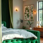
Your living space reflects your personality and sets the tone for your home. Choosing the right hues can completely transform how this area feels and functions.
Colors influence your emotions and daily experience. They can make a room feel more open, cozy, or energizing.
Today’s interior design blends current trends with classic appeal. The perfect scheme balances personal taste with smart design principles.
This guide will help you find combinations that work in any light. You’ll learn to create a space that is both inviting and uniquely yours.
We’ll explore how shades affect psychology and offer specific recommendations. Get ready to discover practical tips you can use right away.
Think about your current room. What atmosphere do you want to create?
Why Your Living Room’s Color Scheme Matters More Than You Think
Many people underestimate how much wall tones affect their everyday experience. Design experts confirm that hues in your home significantly impact your emotional state. Imagine the difference between a bright red bedroom and a calming blue one – this same principle applies to your gathering area.
The Psychological Impact of Color on Your Mood
Different shades trigger specific emotional responses in your living space. Warm tones like reds and oranges create energy and excitement. They can make a room feel vibrant and stimulating.
Cool colors like blues and greens promote calmness and relaxation. These hues work well in spaces where you want to unwind after a long day. The psychological effects of color aren’t just theoretical concepts.
Research consistently shows how various hues affect our mental state. This knowledge helps you create an environment that supports your well-being.
Your color choices can dramatically alter how a room feels. They can make spaces appear larger or smaller than they actually are. Some schemes create warmth while others feel more formal or casual.
| Color Family | Emotional Effect | Best For | Considerations |
|---|---|---|---|
| Reds & Oranges | Energy, excitement, warmth | Social spaces, accent walls | Can feel overwhelming in large amounts |
| Blues & Greens | Calmness, relaxation, peace | Reading areas, relaxation zones | Cool tones may feel too cold in north-facing rooms |
| Yellows | Happiness, optimism, cheer | Morning spaces, kitchens | Bright yellows can cause eye strain |
| Neutrals | Balance, sophistication, calm | Overall schemes, background tones | Provide flexibility for changing accents |
| Purples | Creativity, luxury, mystery | Creative spaces, accent pieces | Darker shades can feel somber if overused |
Color as the Foundation of Your Design Style
Your selected palette establishes the foundation for your entire design aesthetic. It influences furniture selections, artwork choices, and accessory decisions. Professional designers use color to create specific atmospheres and experiences.
Color schemes greatly influence the perception of space in your home. They can highlight architectural features or create visual flow between rooms. Consistent palettes throughout your home create cohesion and harmony.
When choosing colors, consider both current trends and timeless appeal. This balance ensures long-term satisfaction with your design choices. Understanding color psychology helps you create a space that supports your desired lifestyle.
The right scheme makes your living area feel intentionally designed rather than accidentally decorated. It transforms a simple room into a reflection of your personal style and comfort needs.
First Things First: How to Choose Your Perfect Palette
Finding the right scheme for your home starts with understanding your environment. Light and atmosphere work together to create your ideal space.
Assessing Your Room’s Natural Light
Your living room’s light exposure changes everything. North-facing windows give cool, soft light all day. South-facing ones bring warm, bright sunshine.
Watch how light moves across your space. Notice morning versus afternoon differences. This helps you pick shades that look great at all times.
Strong sunlight can handle deeper hues. Pale tones might look faded in bright rooms. Cool colors balance intense sunlight beautifully.
North-facing rooms often need warmth. Rich tones make these spaces feel cozier. They counter the naturally cool light.
Defining the Mood You Want to Create
Think about how you use your gathering area. Do you relax there after work? Host friends for game nights?
Your activities guide your atmosphere needs. Quiet reading corners benefit from calm shades. Entertainment spaces can handle energetic tones.
Ask yourself key questions:
- Do I want to feel relaxed or energized here?
- Should the space feel formal or casual?
- What emotions do I want to experience daily?
Your answers shape your perfect palette. They ensure your scheme supports your lifestyle.
The Golden Rule: Always Test Your Paint Samples
Never skip this crucial step! Colors change under different lighting. They look different on walls versus small chips.
Benjamin Moore offers great sampling options. Try their 8 oz. samples or Peel & Stick versions. Test multiple shades side by side.
Paint large sections on different walls. Light affects colors throughout the room. Check samples at morning, noon, and night.
Look at samples against your furniture. See how they work with flooring and decor. Live with them for a few days before deciding.
The right shade makes your space feel intentional and harmonious.
This process prevents costly mistakes. It ensures you love your final choice for years.
Modern Color Palettes for Living Rooms That Boost Style and Mood
The secret to a great living space lies in balance. A neutral base lets bold accents shine without overwhelming your room.
Layering Bold Accents with Grounded Neutrals
Start with neutral walls and large furniture pieces. These create a calm background for your design.
Add personality through colorful accessories and art. This approach gives you flexibility to change styles later.
Choose one or two accent colors that complement your neutrals. They should create harmony rather than conflict.
- Warm neutrals work well with earthy accents
- Cool grays pair beautifully with blues and greens
- Creamy whites accept almost any color combination
This layering method creates visual depth and interest. Your room feels designed rather than decorated.
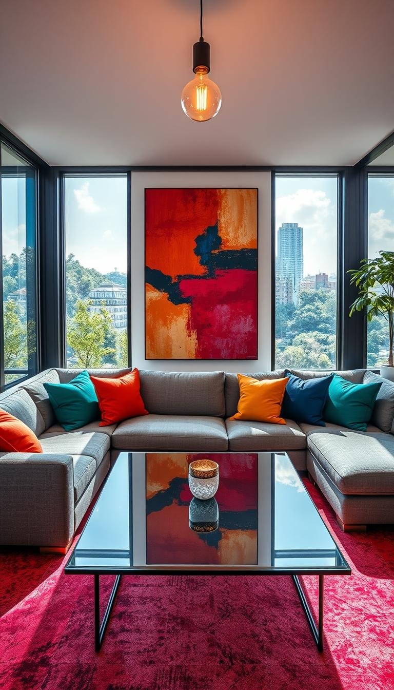
Pulling Inspiration from a Signature Piece
Designer Gray Walker recommends a smart approach. “Invest in one object that speaks to you—art, rug, fabric, an accessory—and pull colors from that piece. A great color scheme evolves from an anchor that guides the color direction.”
Look at your favorite artwork or rug. Notice the dominant and supporting colors. These become your palette foundation.
Use a color wheel to identify complementary shades. This ensures your selections work well together.
Test these colors in your actual space. Lighting changes how they appear on walls and furniture.
| Inspiration Piece | Dominant Colors | Accent Options | Neutral Pairings |
|---|---|---|---|
| Abstract Art | Blue, gold, white | Mustard yellow, navy | Light gray, warm white |
| Oriental Rug | Burgundy, navy, cream | Deep green, gold | Beige, soft white |
| Textile Pattern | Sage green, terracotta | Deep blue, mustard | Warm gray, off-white |
| Decorative Vase | Emerald green, gold | Deep purple, crimson | Charcoal, cream |
Adjust your palette based on room lighting and size. Darker rooms might need lighter versions of your colors.
This method creates a personal and cohesive look. Your space reflects your taste while following design principles.
1. The Moody Modern Palette

Create a space that feels both dramatic and deeply personal. This palette combines sophisticated neutrals with rich, warm accents.
It works especially well in rooms with plenty of natural light. The contrast between dark and light elements adds visual interest.
Core Colors: Cool Gray, Bold Black, Oxblood, Cognac
Cool gray serves as your main neutral. It provides a calm, sophisticated backdrop for other hues.
Benjamin Moore’s Stonington Gray or Farrow & Ball’s Cornforth White offer perfect gray bases. These shades work with various accent colors beautifully.
Bold black adds definition without overwhelming your room. Use it on trim, furniture, or accent walls for modern edge.
Oxblood brings rich, dramatic warmth that balances cooler elements. This deep red-brown tone creates cozy sophistication.
Cognac leather tones add natural texture and vintage character. They introduce warmth through furniture and accessories.
Vibe: Grounded, Dramatic, and Deep
This combination creates a grounded yet dramatic atmosphere. It feels both contemporary and timeless in your home.
The deep tones work together to make spaces feel intimate. They create a welcoming environment for relaxation.
Your room maintains modern appeal through careful balance. Light elements prevent the scheme from feeling too heavy.
How to Bring This Palette Home
Start with cool gray on your main walls. This creates your neutral foundation.
Add black through statement furniture pieces or window frames. These elements define your space’s architecture.
Introduce oxblood through textiles and accessories. Throw pillows, curtains, or artwork work perfectly.
Incorporate cognac through leather chairs or decorative items. These pieces add warmth and texture.
Balance darker elements with light-colored flooring or area rugs. This prevents your room from feeling too closed in.
Layer lighting throughout your space. Combine overhead lights with table and floor lamps.
Choose metallic accents in brass or gold finishes. These add brightness against darker backgrounds.
“The key is balance—let each color play its role without dominating the entire space.”
Test your paint choices in different lighting conditions. Observe how colors change throughout the day.
This approach creates a deeply personal and stylish environment. Your living area will feel both dramatic and perfectly comfortable.
2. The Warm & Retro Palette
Retro-inspired hues bring warmth and character to your gathering space without feeling dated. This approach blends 1970s optimism with today’s design sensibilities for a truly unique look.
Rich marigold takes center stage alongside earthy brown tones. Cool gray-blue and crisp ivory provide balancing contrast that keeps the scheme feeling current.
Core Colors: Rich Marigold, Shades of Brown, Gray-Blue
Rich marigold yellow captures 1970s optimism while feeling fresh today. This warm golden tone brings sunshine into your space without overwhelming it.
Choose marigold shades with mustard undertones rather than bright lemon. These deeper versions feel more sophisticated and less overwhelming.
Earthy browns provide grounding and warmth reminiscent of mid-century design. Think chocolate, caramel, and coffee tones rather than flat browns.
Gray-blue adds contemporary balance to warmer retro tones. This cool hue prevents the palette from feeling too heavy or dated.
Vibe: Nostalgic, Balanced, and On-Trend
This combination creates a space that feels both comforting and stylish. It nods to the past while firmly staying in the present.
The warmth makes your room feel inviting and cozy. The balance ensures it never becomes a theme room.
You get character without commitment to a specific era. The look feels intentional rather than accidental.
Incorporating Retro Flair Without Overdoing It
Start with neutral walls in warm white or light gray. These provide a clean backdrop for retro accents.
Add marigold through smaller elements like throw pillows or artwork. This lets you experiment before committing to larger pieces.
Use brown tones for furniture or area rugs. These grounded elements anchor your space beautifully.
Introduce gray-blue through curtains or accent walls. This cool tone balances the warmth perfectly.
Mix retro colors with clean-lined modern furniture. This prevents your space from feeling stuck in the past.
Choose one or two retro patterns rather than multiple. Geometric prints or subtle florals work beautifully.
Balance bold colors with plenty of neutral space. This ensures your room remains livable and relaxing.
| Color Type | Benjamin Moore | Sherwin-Williams | Best Use |
|---|---|---|---|
| Rich Marigold | Golden Straw 2152-50 | Forsythia SW 6674 | Accent walls, accessories |
| Warm Brown | Chestnut Brown 1232 | Carob Brown SW 7518 | Furniture, flooring |
| Gray-Blue | Boothbay Gray HC-165 | Sleepy Blue SW 6225 | Trim, curtains |
| Neutral Base | White Dove OC-17 | Alabaster SW 7008 | Main walls, ceiling |
Lighting plays a crucial role in this palette. Warm bulb temperatures enhance the retro feel without making colors look muddy.
Add brass or gold fixtures for authentic period charm. These metallic accents complement the warm tones beautifully.
Remember to test colors in your actual space. Natural light changes how these hues appear throughout the day.
“The best retro spaces mix vintage colors with contemporary pieces—this creates depth and prevents theme-room effect.”
This approach gives you a space full of character and warmth. Your room will feel both nostalgic and perfectly current.
3. The Subtle Jewel Tones Palette

Jewel tones create magic when used with restraint. These softened versions bring richness without overwhelming your space.
They work beautifully in rooms where you want warmth and sophistication. The key lies in balancing saturation with calm neutrals.
Core Colors: Barely-There Ruby, Subdued Sapphire, Crisp White
Barely-there ruby offers warmth without intense red energy. Think soft raspberry or muted cranberry rather than bright ruby.
This shade adds emotional warmth to your gathering area. It feels inviting without dominating your visual field.
Subdued sapphire provides cool sophistication and balance. This gentle blue-green tone creates depth without feeling cold.
It works wonderfully alongside warmer elements in your room. The combination feels both grounded and interesting.
Crisp white keeps everything fresh and light. It prevents deeper tones from making your space feel too dark.
This clean background allows jewel tones to shine beautifully. Your room maintains airiness despite rich accents.
Vibe: Warm, Saturated, and Surprisingly Calm
This combination creates a surprisingly peaceful atmosphere. The muted saturation feels both rich and relaxing.
Your space gains character without losing comfort. It feels intentionally designed rather than overly decorated.
The palette works well for various activities. It supports both quiet relaxation and social gatherings.
Using Jewel Tones as Accents, Not Overload
Start with crisp white on your main walls. This creates your neutral foundation.
Add jewel tones through textiles and accessories. Throw pillows, curtains, and artwork work perfectly.
Layer different intensities for visual depth. Combine lighter and darker versions of your chosen hues.
Balance rich colors with natural materials. Wood tones and stone elements ground the scheme beautifully.
Choose furniture in neutral fabrics and finishes. These pieces let your accents take center stage.
| Jewel Tone Type | Bold Version | Subtle Version | Best Application |
|---|---|---|---|
| Ruby Reds | Deep Crimson | Muted Raspberry | Throw pillows, artwork |
| Sapphire Blues | Royal Blue | Soft Blue-Green | Curtains, vases |
| Emerald Greens | Bright Emerald | Dusty Sage | Accent chairs, plants |
| Amethyst Purples | Deep Purple | Lavender Gray | Decorative objects, textiles |
Consider these paint options for subtle effects:
- Benjamin Moore’s Raspberry Ice (soft ruby)
- Sherwin-Williams Rain (gentle sapphire)
- Farrow & Ball All White (crisp neutral)
Choose furniture with clean lines and simple profiles. Mid-century modern or contemporary pieces work well.
Add texture through bouclé fabrics and natural fibers. These elements enhance the calming quality.
“Subtle jewel tones act like spices in cooking—they enhance rather than overwhelm the main ingredients.”
Test your colors in different lighting conditions. Observe how they change throughout the day.
This approach creates a space that feels both rich and restful. Your living area will showcase personal style without sacrificing comfort.
4. The Warm High-Contrast Palette
This scheme offers a perfect blend of drama and comfort. It creates visual excitement while maintaining a welcoming atmosphere.
You get modern edge without sacrificing coziness. The combination works in various architectural settings.
Core Colors: Charcoal Gray, Crisp White, Cognac, Exposed Brick
Charcoal gray serves as your foundation. It provides depth while remaining surprisingly neutral.
This versatile shade works on walls or large furniture. It creates a sophisticated backdrop for other elements.
Crisp white delivers bright contrast and freshness. It prevents darker tones from feeling heavy.
Use it on trim, ceilings, or accent pieces. This clean shade enhances the modern feel.
Cognac leather introduces warmth and vintage character. Its rich brown-orange tones add organic texture.
This works beautifully on sofas or chairs. It brings comfort and personality to your space.
Exposed brick offers natural warmth and architectural interest. Its varied tones add depth and history.
This element provides visual texture without additional decoration.
Vibe: Edgy, Modern, and Full of Character
This combination feels both contemporary and inviting. The high contrast creates dramatic impact.
Your room gains sophistication without feeling cold. Warm elements balance the bold contrast perfectly.
The look works particularly well in spaces with interesting architecture. It highlights features rather than hiding them.
Balancing Contrast with Warm Textures
Start with charcoal gray on your main walls. This creates your dramatic foundation.
Add crisp white through trim and ceiling paint. This provides the necessary contrast.
Introduce cognac through leather furniture pieces. A sofa or armchair works beautifully.
Incorporate exposed brick if available. If not, consider brick veneer or similar textures.
Layer additional textures through textiles and accessories. Wool throws, velvet pillows, and natural rugs add comfort.
Balance is key to making this scheme work. Too much contrast can feel overwhelming.
Use warm lighting to enhance the cozy atmosphere. Soft white bulbs work better than cool daylight options.
“High contrast needs warmth to feel livable—texture is your secret weapon for comfort.”
Consider these paint options for your project:
| Color Type | Benjamin Moore | Sherwin-Williams | Best Application |
|---|---|---|---|
| Charcoal Gray | Kendall Charcoal HC-166 | Iron Ore SW 7069 | Main walls, accent wall |
| Crisp White | Chantilly Lace OC-65 | Extra White SW 7006 | Trim, ceiling, furniture |
| Warm Neutral | Revere Pewter HC-172 | Agreeable Gray SW 7029 | Secondary walls, flooring |
Choose artwork that complements rather than competes. Black and white photography works beautifully.
Metallic accents in brass or gold add warmth. Use these on lighting fixtures or decorative objects.
Plants bring natural softness to the contrast. They add life and organic texture.
Test your paint choices in different lighting. Observe how colors change throughout the day.
This approach creates a space full of personality. Your room will feel both dramatic and perfectly comfortable.
5. The Crisp Classic Palette

Some schemes feel instantly familiar yet completely fresh. This combination balances tradition with contemporary energy.
It brings together cheerful warmth and cool sophistication. Your room gains personality without losing timeless appeal.
Core Colors: Marigold Yellow, Barely-There Blue, White, Dark Gray
Marigold yellow adds sunny energy to your gathering area. This warm golden tone feels cheerful without overwhelming your space.
Choose soft marigold rather than bright lemon shades. These gentler versions work better in various lighting conditions.
Barely-there blue provides cooling balance and freshness. This soft blue-gray tone creates depth without feeling cold.
It works beautifully alongside warmer elements in your room. The combination feels both grounded and interesting.
Crisp white delivers clean brightness throughout your scheme. It prevents deeper tones from making your room feel too dark.
This clean background allows other hues to shine beautifully. Your space maintains airiness despite colorful accents.
Dark gray adds sophistication and grounds brighter colors. Use it on furniture or architectural details for definition.
Vibe: Playful, Fresh, and Timeless
This combination creates a space that feels both lively and restful. It balances energy with calm sophistication.
Your room gains character without losing comfort. It feels intentionally designed rather than overly decorated.
The palette works well for various activities. It supports both quiet relaxation and social gatherings.
Choosing the Right Upholstery for a Colorful Pop
Colorful seating makes a strong style statement. It adds personality without dominating your entire room.
Start with neutral walls and flooring. These create a calm background for bold furniture pieces.
Choose upholstery in your main accent colors. A marigold sofa or blue armchair works beautifully.
Consider performance fabrics for family spaces. These materials handle daily use while maintaining beauty.
“Colorful furniture should complement rather than compete—let it be the star against a neutral backdrop.”
Balance bold pieces with simpler designs. Clean-lined furniture keeps the look feeling current.
Add texture through throw pillows and blankets. These elements enhance comfort and visual interest.
Layer additional colors through accessories and art. This creates depth without overwhelming your space.
| Furniture Type | Color Option | Neutral Pairing | Room Placement |
|---|---|---|---|
| Sofa | Soft Marigold | Dark Gray Rug | Center of room |
| Armchair | Barely-There Blue | White Walls | Reading corner |
| Ottoman | Dark Gray | Marigold Pillows | Conversation area |
| Side Chairs | White | Blue Accents | Dining space |
Test fabric samples in your actual lighting. Colors change under different light conditions.
Consider maintenance when choosing bold upholstery. Some shades show wear more than others.
This approach creates a space full of personality. Your room will feel both playful and perfectly sophisticated.
6. The Cozy Cottage Palette
Imagine stepping into a space that wraps you in comfort like a favorite blanket. This palette creates instant warmth through carefully chosen hues that work together beautifully.
It blends traditional charm with contemporary livability. Your room feels both nostalgic and perfectly current.
Core Colors: Warm Camel, Shades of Blue, Dusty Pink
Warm camel serves as your foundational neutral. It provides earthy warmth without overwhelming your space.
This versatile shade works on walls or larger furniture pieces. It creates a cozy backdrop for other elements.
Shades of blue add freshness and balance. Soft sky blues or muted navy tones work beautifully.
These cool hues prevent the scheme from feeling too heavy. They bring a breath of fresh air to warmer tones.
Dusty pink introduces soft romantic accents. This gentle hue adds cottagecore charm without being too sweet.
Use it sparingly for the perfect touch of whimsy. It pairs wonderfully with both camel and blue tones.
Vibe: Charming, Sweet, and Undeniably Inviting
This combination creates an atmosphere that feels both comforting and cheerful. It welcomes you home with open arms.
Your space gains character without losing functionality. It feels intentionally designed rather than themed.
The palette supports both relaxation and social gatherings. It works beautifully for various daily activities.
The Key Role of Florals and Patterns
Patterns add depth and personality to softer color schemes. They prevent your room from feeling too flat or monotonous.
Floral designs bring natural beauty indoors. They enhance the cottage aesthetic beautifully.
Mix patterns in cohesive ways for the best results. Combine different scales for visual interest.
“Patterns act like punctuation in design—they add rhythm and interest to softer color stories.”
Consider these pattern mixing techniques:
- Pair large-scale florals with small checks or stripes
- Use similar color families across different patterns
- Balance busy patterns with solid textile elements
Vintage pieces enhance the cottage feel beautifully. Look for unique items with character and history.
Balance cozy elements with modern functionality. Choose furniture that offers both comfort and practicality.
| Color Type | Benjamin Moore | Sherwin-Williams | Best Application |
|---|---|---|---|
| Warm Camel | Manchester Tan HC-81 | Accessible Beige SW 7036 | Main walls, large furniture |
| Soft Blue | Breath of Fresh Air 806 | Rainwashed SW 6211 | Accent walls, textiles |
| Dusty Pink | First Light 2102-70 | Mellow Coral SW 6323 | Accessories, artwork |
| Crisp White | White Dove OC-17 | Alabaster SW 7008 | Trim, ceilings |
Textiles complete your cottage look beautifully. Layer throw pillows and blankets for added comfort.
Window treatments should enhance coziness. Soft curtains in complementary patterns work well.
Choose area rugs that anchor your space. Natural fibers add texture and warmth.
Test your paint choices in different lighting. Observe how colors change throughout the day.
This approach creates a space full of charm and comfort. Your room will feel both inviting and uniquely yours.
7. The Desert Modern Palette

Discover a scheme that captures the warmth of sun-drenched landscapes with clean, minimalist appeal. This approach brings earthy charm into your home without overwhelming your space.
It blends simplicity with natural warmth beautifully. Your room gains character while maintaining a calm atmosphere.
Core Colors: Crisp White, Siena, Coral, Burnt Orange
Crisp white forms your clean foundation. It creates a bright backdrop that keeps everything feeling fresh.
This shade prevents warmer tones from feeling too heavy. Your space maintains airiness despite rich accents.
Siena brings earthy sophistication to your design. This warm terracotta tone adds natural warmth.
It works beautifully on accent walls or larger furniture. The hue creates depth without darkening your room.
Coral introduces playful energy in soft doses. This gentle pink-orange shade feels cheerful yet sophisticated.
Use it through accessories or artwork for perfect pops. It complements both white and siena beautifully.
Burnt orange delivers deeper desert warmth. This rich tone adds dimension and sunset-inspired charm.
It works wonderfully alongside lighter elements. The combination feels both grounded and interesting.
Vibe: Clean, Warm, and Minimalist with Southwest Charm
This combination creates a space that feels both inviting and intentionally designed. It balances simplicity with natural character.
Your room gains warmth without losing modern appeal. The look feels current rather than themed.
The palette works particularly well in sun-filled spaces. Natural light enhances the desert-inspired tones beautifully.
Adding Personality with Earthy Accents
Natural materials complete your desert modern look. Wood, leather, and stone add texture and authenticity.
Choose furniture with clean lines and simple profiles. These pieces keep the aesthetic feeling minimalist.
Layer textiles in complementary tones and textures. Woven blankets and natural fiber rugs work perfectly.
Add plants that enhance the natural vibe. Cacti and succulents bring desert charm without cliché.
Metallic accents in brass or copper add warmth. Use these on lighting fixtures or decorative objects.
Artwork should complement rather than compete. Abstract pieces with earthy tones work beautifully.
“Desert modern isn’t about theme—it’s about capturing warmth and light through thoughtful simplicity.”
Consider these paint options for your project:
| Color Type | Benjamin Moore | Sherwin-Williams | Best Application |
|---|---|---|---|
| Crisp White | Chantilly Lace OC-65 | Extra White SW 7006 | Main walls, ceiling |
| Siena | Terracotta AF-290 | Copper Mountain SW 6356 | Accent walls, furniture |
| Coral | Caliente AF-290 | Coral Reef SW 6606 | Accessories, artwork |
| Burnt Orange | Spice AF-255 | Emberglow SW 6597 | Textiles, decor |
Lighting enhances both modern and natural aspects. Warm white bulbs complement earthy tones beautifully.
Layer different light sources throughout your space. Combine overhead lighting with table and floor lamps.
Test your paint choices in actual lighting conditions. Observe how colors change throughout the day.
This approach creates a space full of warmth and character. Your room will feel both inviting and perfectly balanced.
8. The Coastal Neutrals Palette
Coastal-inspired hues bring breezy elegance to your home. This timeless approach creates spaces that feel both fresh and endlessly comfortable.
White and blue-gray combinations remain popular for good reason. They adapt beautifully to various design styles and personal preferences.
Your gathering area gains sophistication without feeling formal. The look works equally well for family living and elegant entertaining.
Core Colors: White, Ivory, Blue-Gray
White forms your bright, clean foundation. It creates an airy backdrop that makes rooms feel larger.
Choose whites with subtle undertones for depth. Cool whites work well in sun-filled spaces.
Ivory adds warmth without yellow tones. This creamy neutral prevents starkness while maintaining brightness.
It works beautifully alongside cooler elements. Your space gains dimension through layered neutrals.
Blue-gray introduces subtle color interest. This versatile hue maintains neutral flexibility while adding character.
Use it through accessories or accent pieces. The shade brings coastal charm without theme.
Vibe: Serene, Classic, and Foolproof
This combination creates a peaceful atmosphere. Your room feels both relaxing and intentionally designed.
The palette works beautifully in various lighting conditions. It adapts to north-facing or south-facing rooms equally well.
You get timeless appeal with contemporary freshness. The look never feels dated or overly trendy.
Using Textures to Create Depth in a Neutral Space
Texture prevents neutral schemes from feeling flat. It adds visual interest without introducing additional colors.
Layer different materials throughout your space. Combine smooth surfaces with rough textures for balance.
Natural elements enhance the coastal feel beautifully. Rattan, sea grass, and weathered wood add organic charm.
These materials bring warmth and character. They prevent your design from feeling too perfect or sterile.
Consider these textural combinations:
- Smooth linen curtains with nubby wool throws
- Polished wood tables with woven sea grass rugs
- Glossy ceramic vases with matte finished accessories
Artwork and accessories add personal touches. Choose pieces that complement rather than compete with your serene vibe.
Black and white photography works particularly well. It adds contrast without disrupting the calm atmosphere.
| Color Type | Benjamin Moore | Sherwin-Williams | Best Application |
|---|---|---|---|
| Bright White | Chantilly Lace OC-65 | Extra White SW 7006 | Ceilings, trim |
| Warm White | White Dove OC-17 | Alabaster SW 7008 | Main walls |
| Blue-Gray | Gray Owl OC-52 | Sleepy Blue SW 6225 | Accent walls, textiles |
| Ivory | Decorator’s White OC-149 | Dover White SW 6385 | Furniture, accessories |
Window treatments should enhance airiness. Light-filtering curtains maintain privacy while maximizing natural light.
Choose simple hardware in matte finishes. Black or oil-rubbed bronze adds definition without shine.
Lighting plays a crucial role in this scheme. Layer overhead fixtures with table and floor lamps.
Warm white bulbs complement the neutral tones. They prevent colors from appearing too cool or sterile.
“The best neutral spaces balance simplicity with thoughtful details—texture is your secret weapon for depth.”
Test your paint choices in actual lighting. Observe how whites change throughout the day.
North-facing rooms might need warmer whites. South-facing spaces can handle cooler tones.
This approach creates a timeless and comfortable environment. Your room will feel both serene and uniquely personal.
9. The Forest Floor Palette

Nature’s most inspiring hues come together in this earthy combination that transforms your gathering area. This approach brings outdoor beauty inside with sophisticated elegance.
Earth-toned schemes create warm, dimensional spaces that feel both current and timeless. They work beautifully in various lighting conditions throughout your home.
Core Colors: Warm Brown, Soft Yellow, Olive Green, White
Warm brown provides a rich, grounding foundation reminiscent of soil and wood. This versatile shade works on walls or larger furniture pieces.
It creates cozy depth without overwhelming your space. The earthy tone anchors your entire color scheme beautifully.
Soft yellow adds sunlight-like warmth and brightness to your interior. This gentle hue prevents the palette from feeling too heavy.
It brings cheerful energy without overwhelming other elements. The soft tone works well in various lighting conditions.
Olive green brings natural freshness and connection to the outdoors. This versatile green hue adds sophistication to earthy combinations.
It creates visual interest while maintaining natural harmony. The shade works beautifully alongside both warm and cool elements.
White prevents the scheme from feeling too dark or heavy. This crisp neutral adds brightness and balance.
It keeps your space feeling airy and intentionally designed. The clean tone allows other colors to shine.
Vibe: Earthy, Dimensional, and Perfect for Fall
This combination creates a space that feels both grounded and inviting. Your room gains character through natural inspiration.
The palette works particularly well in spaces with garden views or abundant natural light. Sunlight enhances the earthy tones beautifully.
You get dimensional interest without overwhelming patterns. The look feels both current and timeless in approach.
Making a Statement with a Green Upholstered Sofa
Designers recommend going all-out with a green upholstered sofa as a bold statement piece. This anchor item establishes your natural theme with confidence.
Choose olive green or sage tones for sophisticated appeal. These shades work beautifully with warm brown and soft yellow accents.
Balance your statement sofa with neutral elements throughout the room. Light walls and natural textiles prevent overwhelming effects.
Consider performance fabrics for family living areas. These materials handle daily use while maintaining beautiful appearance.
“A green sofa acts as the anchor in forest-inspired spaces—it establishes the theme while allowing flexibility in other elements.”
Incorporate natural textures and organic materials throughout your design. Wood elements, stone accents, and woven textiles enhance the earthy feel.
Layer different materials for dimensional interest. Combine smooth surfaces with textured elements for balanced appeal.
Consider these paint options for achieving forest-inspired warmth:
- Benjamin Moore’s Grant Beige (warm brown)
- Sherwin-Williams Butter Up (soft yellow)
- Farrow & Ball Bancha (olive green)
- Benjamin Moore Chantilly Lace (crisp white)
This approach creates a space that feels both natural and intentionally designed. Your room will showcase personal style with earthy sophistication.
10. The Cozy Cool Palette
Imagine stepping into a room that feels like a gentle breeze on a summer afternoon. This combination brings together refreshing cool tones with just enough warmth to keep things comfortable.
Your gathering area becomes a peaceful retreat perfect for unwinding. The scheme creates a serene environment that supports relaxation and calm conversations.
Cool palettes naturally create tranquil spaces. They lower energy levels and promote peaceful moments.
These hues work beautifully in rooms with plenty of natural light. They help balance strong sunlight while maintaining airy freshness.
Core Colors: Soft Blue-Gray, Aegean Blue, Mauve, White
Soft blue-gray provides your main cooling effect. This versatile shade feels refreshing without appearing cold.
It works beautifully on walls or larger furniture pieces. The tone creates a calm backdrop for other elements.
Aegean blue adds richer color interest and depth. This deeper blue tone brings sophistication to your scheme.
Use it through accessories or accent pieces. The shade creates visual focus without overwhelming.
Mauve introduces necessary warmth to prevent chilliness. This gentle pink-purple hue balances cooler tones perfectly.
It brings cozy energy to your space. The color works through textiles or decorative items.
White maintains brightness and freshness throughout. This crisp neutral keeps everything feeling light and airy.
It prevents deeper tones from making your room feel too dark. Your space maintains openness and clarity.
Vibe: Calming with a Necessary Touch of Warmth
This combination creates a space that feels both refreshing and inviting. Cool tones promote relaxation while warm accents add comfort.
Your room gains sophistication without feeling formal. The look works beautifully for various daily activities.
The palette adapts well to different lighting conditions. It feels equally comfortable in morning light or evening ambiance.
You get timeless appeal with contemporary freshness. The scheme never feels dated or overly trendy.
Unifying Your Palette with Florals and Drapery
Textiles play a crucial role in tying cool colors together. They add pattern and texture while enhancing cohesion.
Floral designs incorporate multiple palette colors beautifully. Choose patterns that feature your core hues.
These prints bring whimsical charm to your space. They prevent the scheme from feeling too minimalist.
Drapery introduces softness and pattern at windows. Flowing fabrics add movement and elegance.
Choose curtains that incorporate your color story. This creates visual harmony throughout your room.
Consider these techniques for adding warmth:
- Wood tones through furniture or accessories
- Brass or gold metallic accents
- Warm white lighting throughout your space
- Textured throws and pillows in mauve tones
Balance is key to making this scheme work. Too much coolness can feel uninviting.
Layer different light sources for evening warmth. Table lamps with soft white bulbs enhance coziness.
“Cool palettes need warmth to feel livable—textiles and lighting are your secret weapons for comfort.”
These paint options achieve cozy cool sophistication:
| Color Type | Benjamin Moore | Sherwin-Williams | Best Application |
|---|---|---|---|
| Soft Blue-Gray | Gray Owl OC-52 | Sleepy Blue SW 6225 | Main walls, large furniture |
| Aegean Blue | Van Deusen Blue HC-156 | Naval SW 6244 | Accent walls, accessories |
| Mauve | Raspberry Ice 2113-60 | Mauve Finery SW 6284 | Textiles, artwork |
| Crisp White | Chantilly Lace OC-65 | Extra White SW 7006 | Trim, ceiling, furniture |
Test your paint choices in actual lighting conditions. Observe how colors change throughout the day.
North-facing rooms might need warmer versions of cool tones. South-facing spaces can handle brighter variations.
This approach creates a space that feels both refreshing and comfortable. Your room will become a peaceful retreat for daily living.
Selecting the Best Paint for Your Living Room Project
The final layer of your design vision comes down to paint selection. Your color choices deserve the perfect finish to bring them to life beautifully.
Different sheens create various effects in your space. They influence both appearance and durability for daily living.
Matte Finishes for Light Control and a Soft Effect
Flat paint offers a matte finish with zero gloss. It excels at hiding flaws and imperfections on your walls.
This finish absorbs light instead of reflecting it. Uneven surfaces appear more uniform and smooth.
Designers often choose flat finishes for living areas. They create a soft, sophisticated effect throughout your room.
Benjamin Moore’s Flat White Dove creates a beautiful foundation. It complements fabrics and other finishes effortlessly.
Matte paint works especially well in older homes. It helps disguise character marks and texture variations.
Durable Paints for High-Traffic Family Spaces
Your gathering area needs paint that can handle daily life. Family spaces require formulations that resist wear.
Look for paints with stain-release technology. These allow easy removal of everyday spills and scuffs.
Benjamin Moore’s Regal® Select Interior offers excellent durability. Its proprietary formula stands up to active households.
Higher sheens provide more protection than flat finishes. Eggshell or satin offer good compromise between matte look and durability.
Consider your specific needs when selecting sheens:
- Flat: Best for low-traffic areas and ceiling applications
- Eggshell: Gentle sheen for moderate-use walls
- Satin: Easy cleaning for family spaces and trim
- Semi-gloss: Highest durability for doors and windows
Quality paint affects color depth and overall finish. Better formulations provide richer color and smoother application.
Proper preparation ensures professional results. Clean walls thoroughly and repair any imperfections before painting.
Test your sheen choice in different lighting conditions. Observe how light interacts with the finish throughout the day.
“The right paint finish enhances your color scheme while providing practical benefits for daily living.”
Whether hiring professionals or DIY, communication matters. Ensure everyone understands the desired finish and application methods.
Your paint selection completes your design vision. It brings your color scheme to life with both beauty and functionality.
Your Next Steps to a Beautifully Painted Living Room
Now you have the knowledge to transform your space with confidence. Remember that your room should balance psychological, physical, and practical comfort.
Start with how you actually use the area daily. Consider traffic patterns, lighting changes, and your personal routines.
Create a simple project timeline and budget. Visit local paint stores for personalized advice and sampling options.
Test your final choices in different lighting conditions. Live with them for a few days before committing.
Trust your instincts while applying smart design principles. Good preparation leads to results you’ll love for years.
Your perfect scheme will make daily living more enjoyable. Share your success stories and inspire others!