Welcome to your guide for creating a vibrant, personal retreat. Your sleep space should reflect your personality while promoting relaxation.
Many people fear using bright hues in their interior. They worry the room might feel too energetic for rest. This guide shows you how to balance bold palettes with calming elements.
You’ll discover professional techniques for combining colors like hot pink with deep emerald. Learn how to layer textures with plush bedding and velvet accents. These ideas create depth without overwhelming your senses.
We’ll explore how different colors affect your mood and sleep quality. You’ll gain practical knowledge to transform your space into a stylish sanctuary. Get ready to embrace a lively yet peaceful environment.
Understanding Color Psychology for a Restful Retreat
Your sleep space deserves more than just basic decoration. The right color palette can transform your room into a personal sanctuary. It’s not just about looks—it’s about how colors make you feel.
Many people think bright colors are too stimulating for sleep. But science shows otherwise. When used correctly, vibrant hues can actually help you relax and recharge.
How Bold Colors Can Actually Promote Relaxation
Strong colors create energy in your space. This energy doesn’t have to keep you awake. It can make your room feel alive and comforting.
Hot pink walls bring excitement and joy. They make your bedroom feel uplifting and positive. Emerald green adds luxury and calmness. It feels rich and peaceful at the same time.
Canary yellow brings sunshine into your room. It creates a happy, youthful environment. These colors work together to balance energy and peace.
Choosing Hues That Uplift and Energize Your Space
Pick colors that match your personality and needs. Warm tones like coral and yellow feel cozy and inviting. Cool tones like blue and green feel fresh and calming.
Pastel versions of bold colors offer gentle options. Pistachio green feels soft and natural. Lavender brings quiet relaxation. These lighter shades work well in smaller spaces.
Deeper shades create beautiful contrast. Olive green feels earthy and stable. Ochre yellow brings warmth and richness. These colors ground your scheme and add depth.
| Color Family | Psychological Effect | Best Use In Room |
|---|---|---|
| Warm Tones (Pink, Yellow) | Energy, Happiness, Comfort | Accent Walls, Bedding |
| Cool Tones (Green, Blue) | Calm, Luxury, Freshness | Large Surfaces, Furniture |
| Pastel Versions | Softness, Gentleness, Peace | Small Spaces, Accessories |
| Rich Shades | Depth, Grounding, Contrast | Trim Work, Statement Pieces |
Remember that your personal reaction matters most. Choose colors that make you feel good. Your bedroom should reflect your unique style and needs.
The right combination creates a space that both energizes and relaxes. You’ll love waking up in a room that feels perfectly you. That’s the power of good interior design.
Mastering the Art of Balance in a Bold Space

Creating a vibrant room requires careful thought about harmony. You want your space to feel exciting but still peaceful. The secret lies in finding the right mix of bold and quiet elements.
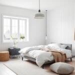
Professional decorators use neutral backgrounds to let bright colors pop. This approach prevents your room from feeling too busy. It creates a comfortable environment where you can truly unwind.
The Crucial Role of Neutral Backdrops
Neutral elements act like a calming foundation for your room. Think of soft ivory walls or crisp white bedding. These quiet surfaces give your eyes a place to rest.
Your bold colors become the stars against this gentle background. They stand out without fighting for attention. This creates visual hierarchy in your space.
Try using neutral flooring or area rugs under colorful furnishings. This technique grounds your entire color scheme. It makes your room feel put together and intentional.
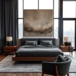
Grounding Your Scheme with Darker Tones
Darker colors add depth and stability to your room. Charcoal gray or deep brown work beautifully. These rich tones make your space feel cozy and complete.
Black furniture pieces anchor your composition perfectly. A sleek dresser or nightstand adds refined elegance. These elements provide balance against vibrant walls.
White or neutral-colored furniture tempers bold color choices. Paired with metallic accents, they create modern contrast. Chrome lamps or silver frames offer visual breaks in your scheme.
| Balancing Element | Purpose | Recommended Use |
|---|---|---|
| Neutral Walls | Create calming foundation | Ivory or soft white paint |
| White Bedding | Provide visual rest space | Crisp cotton or linen sets |
| Dark Furniture | Anchor the composition | Black dressers or nightstands |
| Metallic Accents | Add modern contrast | Chrome lamps or silver frames |
| Neutral Flooring | Ground the color scheme | Beige rugs or natural wood |
Remember to distribute color intensity throughout your room. Place brighter elements where you want energy. Use quieter tones where you need calm.
This careful distribution creates a harmonious environment. Your space will feel both exciting and restful. That’s the perfect balance for your personal retreat.
Colorful Yet Modern: Bold Bedroom Design Tips That Work
Your vibrant sleep space needs more than just color to feel complete. Texture adds richness that makes your room inviting. It creates a multi-sensory experience beyond visual appeal.
Layering Textures for Tactile Richness
Start with your bedding as the foundation. Choose plush fabrics that feel wonderful against your skin. These create immediate comfort when you enter your room.
Add a velvet headboard for luxurious contrast. This fabric catches light beautifully throughout the day. It brings sophistication to your sleeping area.
Graphic rugs anchor your space with pattern and texture. They define areas while adding visual interest underfoot. Choose designs that complement your color choices.
Combine different fabric types throughout your room. Smooth linens work well against plush velvets. This variation keeps your space interesting yet cohesive.
Textured wall art adds dimension without competing. It provides visual breaks in your colorful scheme. Choose pieces that enhance rather than overwhelm.
Incorporating Metallic Finishes for a Touch of Glamour
Metallic accents bring sophistication to your room. Gold, silver, or chrome finishes add reflective quality. They catch and bounce light around your space.
These finishes help balance bold color choices. They provide neutral moments in your vibrant scheme. This creates harmony throughout your room.
Glass elements offer another way to add shine. Emerald glass lamps provide beautiful color play. They become functional art pieces in your space.
Lacquered furniture introduces modern contrast. White nightstands with glossy surfaces reflect light. They keep your room feeling fresh and bright.
Metallic details follow current maximalist trends beautifully. They add curated elegance to bold color stories. Your room feels both personal and polished.
Creating a Graphic Look with Stripes and Blocks

Your space gains energy through clever pattern play. Graphic elements bring structure and excitement to your room. They create visual interest while maintaining a clean, contemporary feel.
Design expert Alex Alonso from Mr Alex Tate Design shares his insight.
“For a bold statement, it’s all about the technique or application of different colors rather than the shades themselves. For a design-forward application, go for a graphic style.”
This approach transforms ordinary surfaces into artistic statements. Your room becomes a curated showcase of personal style.
Using Paint Techniques for a Dynamic Statement Wall
Your walls become the perfect canvas for creative expression. Paint techniques offer endless possibilities for customization. They turn simple surfaces into focal points that command attention.
Consider weave-style striped walls using multiple paint shades. This technique creates movement and depth through color interaction. Four different tones can work together in harmonious rhythm.
Vertical stripes make ceilings appear higher. Horizontal stripes widen smaller spaces. Diagonal patterns add energetic dynamism to your room.
Color blocking creates modern geometric interest. Paint large sections in contrasting hues for dramatic effect. This method defines areas within your space beautifully.
Always test your pattern on a small section first. Use painter’s tape for crisp, clean lines between colors. This ensures professional-looking results you’ll love.
Introducing Geometric Patterns Through Rugs and Textiles
Floor coverings and fabrics extend your graphic theme throughout the room. They add pattern without permanent commitment. These elements can be changed as your style evolves.
Checkerboard rugs intensify your graphic motif effectively. They anchor the room’s visual rhythm with strong pattern repetition. This creates cohesion between different areas.
Geometric pillows complement painted patterns wonderfully. They add smaller-scale interest to larger design statements. Mix pattern sizes for layered visual appeal.
Window treatments with linear designs reinforce your theme. Striped curtains echo wall patterns for unified look. They frame your space with intentional style.
Remember to balance complex patterns with solid areas. This prevents visual overload and gives eyes places to rest. Your room feels curated rather than chaotic.
Graphic elements work beautifully with bold color choices. They create contemporary dynamism in your personal retreat. Your space becomes both visually exciting and perfectly restful.
Making a Statement with Your Headboard
Your headboard becomes the centerpiece of your personal sanctuary. This furniture piece sets the tone for your entire sleep space. It offers a wonderful way to express your unique style while adding comfort.
Designer Emma Jesberg explains the power of creative elements:
“Based on the idea that colors and shapes can inspire and persuade cheerfulness, this is an environment that will foster creativity, artistic energy, and imagination.”
Your headboard choice makes an instant impact. It can transform an ordinary bed into something extraordinary. This focal point draws attention and creates conversation.
Selecting Luxurious Fabrics Like Velvet
Velvet stands out as a premium choice for headboard textiles. This fabric adds depth and sophistication to your space. Its soft texture invites touch and creates visual warmth.
The plush nature of velvet softens bold color choices beautifully. Rich jewel tones appear more approachable in this material. Your room gains elegance without feeling too formal.
Consider a deep pink velvet headboard for dramatic effect. This color brings energy while the fabric provides comfort. The combination creates a welcoming atmosphere.
Velvet works with various design styles from traditional to contemporary. It adds tactile richness that complements other room elements. Your space feels cohesive and carefully curated.
Choosing Bold Shapes and Saturated Colors
Unique shapes make your headboard an instant statement piece. Consider arched, geometric, or asymmetrical designs. These forms add architectural interest to your room.
Oversized headboards create dramatic impact in larger spaces. Smaller rooms benefit from tailored shapes that maximize space. Your choice should complement your room’s proportions.
Saturated colors bring vitality and personality to your sleep environment. Deep emerald or vibrant coral make beautiful statements. These hues work well against neutral walls.
Your headboard colors should coordinate with other room accents. This creates harmony throughout your space. The result feels intentional and perfectly balanced.
Remember that your headboard sets the scene for other colorful details. It establishes the color story for your entire room. Choose shades that make you happy every time you enter.
Using Your Bed as a Canvas for Color

Your sleeping area becomes a personal expression zone through creative bedding choices. This approach lets you showcase your personality while maintaining comfort. The art of bedscaping transforms ordinary sleep spaces into vibrant showcases.
Genevieve Rosen explains this creative process beautifully:
“Bedding has become about self-expression, and you can change the look of your bedroom completely with a colorful new set of pillowcases or contrasting fitted sheet.”
This method offers flexibility for seasonal updates and style experiments. You can refresh your space without major renovations.
The Art of Bedscaping with Layered Bedding
Bedscaping involves strategic arrangement of your sleeping area’s textiles. This technique creates visual depth and tactile richness. Your bed becomes the room’s focal point through careful layering.
Start with foundation pieces like fitted sheets and mattress covers. These base layers set the stage for your color story. Choose quality fabrics that feel wonderful against your skin.
Add middle layers with decorative sheets and lightweight blankets. These pieces introduce pattern and additional color tones. They create visual interest while maintaining comfort.
Finish with top layers like throws and accent pillows. These elements provide the final decorative touches. They complete your bed’s transformed appearance.
Each layer contributes to the overall aesthetic impact. The combination creates a rich, inviting sleeping environment.
Starting with Complementary Tonal Layers
Begin your bedscaping journey with harmonious color combinations. Complementary tones create cohesive visual appeal. They work together without competing for attention.
Rosen suggests starting with green variations for beautiful results. Olive, sage, and pistachio greens blend wonderfully. These nature-inspired hues create calming yet vibrant energy.
Consider these professional layering techniques:
| Layer Type | Color Function | Recommended Textiles |
|---|---|---|
| Base Layer | Foundation Color | Fitted sheets, mattress cover |
| Middle Layer | Complementary Tones | Flat sheets, lightweight blankets |
| Top Layer | Accent Hues | Throws, decorative pillows |
| Finishing Touch | Pattern Introduction | Pillowcases, bolsters |
Gradually introduce brighter colors through smaller accessories. Pillowcases offer an easy way to test new hues. They provide pops of color without overwhelming your scheme.
Coordinate your bedding palette with other room elements. This creates harmony throughout your personal space. Your bed becomes the central color element in your overall design.
Remember that bedding choices allow for easy experimentation. You can change your room’s mood with simple textile swaps. This flexibility makes bedscaping an enjoyable creative process.
Don’t Forget the Fifth Wall: Painting Your Ceiling
Your ceiling offers incredible potential for creative expression. Many people overlook this surface when planning their room’s look. Patrick O’Donnell from Farrow & Ball shares his expert insight.
“The ceiling is often overlooked as a decorating opportunity. However, it can be a great area for a little decorative flourish.”
He recommends painted ceiling ideas that harmonize with your room’s other elements. This approach transforms predictable white spaces into something special.
Your ceiling becomes the perfect canvas for artistic experimentation. Simple techniques like stripes offer an easy way to begin. This design choice adds personality overhead.
Using the Ceiling for a Decorative Flourish
Think of your ceiling as your room’s crowning glory. This surface provides amazing opportunities for visual impact. A painted ceiling creates unexpected depth and character.
Color drenching makes your space feel intentional and cohesive. This technique involves painting your ceiling the same color as your walls. The result feels sophisticated and complete.
Dark colors create cozy, intimate atmospheres overhead. Light tones make your room feel larger and more spacious. Your choice depends on the mood you want to create.
Stripes offer a simple method for ceiling experimentation. They add graphic interest without overwhelming your space. This pattern works beautifully in various room sizes.
Harmonizing the Ceiling Color with Your Wall Scheme
Your ceiling color should complement your overall scheme. Choose tones that enhance rather than compete with your walls. This creates visual harmony throughout your space.
Lighter ceiling colors than your walls create height illusion. This technique works wonderfully in rooms with lower ceilings. It makes your space feel more open and airy.
Consider your room’s existing color palette carefully. Select ceiling shades that coordinate with your current elements. This approach ensures everything feels connected.
For more inspiration on ceiling transformation techniques, explore this guide on the fifth wall concept. It offers professional approaches that balance fun with sophistication.
Remember that your ceiling contributes significantly to room ambiance. Thoughtful paint choices create cohesive interior environments. Your fifth wall becomes an integral part of your overall design story.
Enhancing Architectural Details with Color

Your room’s structural features offer wonderful opportunities for creative expression. Many people overlook these built-in elements when planning their space. Architectural details can become your secret weapon for adding personality.
Interior designer Henri Fitzwilliam-Lay shares his professional approach:
“For this project, we wanted to inject a sense of excitement and playfulness into the room. By keeping the walls relatively neutral and instead applying bold, glossy color to the architraves and cornicing, the effect is both refined and fun. The colored trim draws the eye to architectural details and allows color to pop in a controlled way.”
This technique creates visual interest without overwhelming your space. It adds sophistication through thoughtful color placement.
Painting Trims, Doors, and Cornicing for a Pop of Personality
Your trim work provides the perfect canvas for bold paint choices. Door frames, baseboards, and crown molding become artistic statements. These elements frame your room with intentional style.
Choose vibrant hues that complement your overall scheme. The contrast against neutral walls creates dynamic visual appeal. This approach highlights your room’s architectural character beautifully.
Consider these professional techniques for maximum impact:
- Select high-gloss finishes for reflective quality
- Use painter’s tape for crisp, clean lines
- Test colors in different lighting conditions
- Coordinate trim colors with other room accents
Your doors become focal points when painted in bold shades. This transforms functional furniture into decorative statements. The effect feels both playful and polished.
Creating a Refined yet Fun Effect with Glossy Finishes
Glossy paint creates a luxurious effect on architectural details. The reflective surface catches light throughout the day. This adds dimension and movement to your space.
High-gloss finishes offer practical benefits too. They’re easier to clean and maintain than matte options. This makes them perfect for high-touch areas like door frames.
The shine creates visual breaks in your color story. It provides balance against matte wall surfaces. Your room feels carefully curated and complete.
Glossy accents work with various interior styles. They add contemporary flair to traditional spaces. Modern rooms gain extra sophistication through this technique.
This approach represents smart design thinking. It maximizes impact while maintaining harmony. Your space feels exciting yet perfectly balanced.
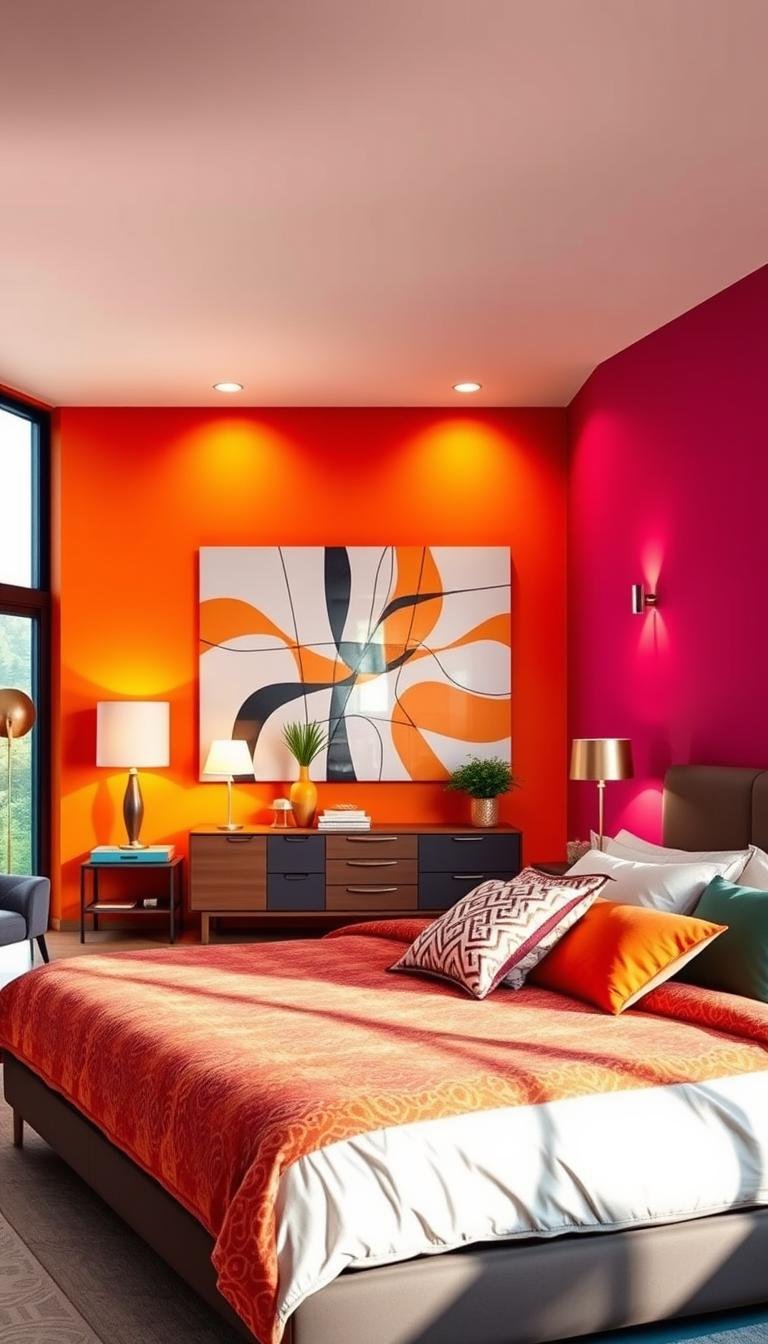
Dynamic Duo: Chic Mix of Hot Pink, Emerald, and Canary Yellow
Some color combinations create magic in your personal space. The trio of hot pink, emerald, and canary yellow brings energy and sophistication together. This palette transforms ordinary rooms into extraordinary retreats.
These three colors work in perfect harmony. Each hue brings its own special quality to your environment. Together they create a balanced yet exciting atmosphere.
Energy of Hot Pink Walls
Hot pink walls make a powerful statement in your room. This vibrant shade creates an uplifting backdrop for your space. It fills your environment with positive energy.
The color psychology behind pink connects to joy and creativity. It makes your room feel alive and inspiring. This shade works beautifully as a dominant feature.
Balance the intensity with neutral flooring and white trim. These elements prevent the space from feeling overwhelming. Your room maintains harmony while expressing personality.
Luxury of an Emerald Velvet Headboard
An emerald velvet headboard adds rich texture to your scheme. This deep green brings sophistication and calmness to your space. The plush fabric feels luxurious against your skin.
Velvet catches light differently throughout the day. It creates changing visual interest in your room. This element becomes a focal point of comfort.
The emerald color complements the hot pink beautifully. It provides a cooling contrast to the warm pink tones. Your space feels both exciting and grounded.
Vibrancy of Canary Yellow Bedding
Canary yellow bedding injects fresh energy into your room. This sunny hue brings warmth and happiness to your sleeping area. It creates a youthful, cheerful atmosphere.
Yellow works psychologically to uplift your mood. It makes waking up in the morning feel more joyful. This color adds the final vibrant touch to your trio.
Layer different yellow tones for depth and interest. Combine mustard accents with brighter canary shades. This creates a rich, coordinated look.
| Color Element | Psychological Effect | Recommended Placement |
|---|---|---|
| Hot Pink Walls | Energy, Creativity, Joy | Dominant background surfaces |
| Emerald Headboard | Luxury, Calm, Sophistication | Bed focal point, texture accent |
| Canary Yellow Bedding | Happiness, Warmth, Youthfulness | Layered textiles, accessories |
| Neutral Elements | Balance, Rest, Harmony | Flooring, trim, smaller furniture |
This color combination represents current design trends perfectly. It appeals to those who love making bold statements. The palette feels both contemporary and timeless.
Remember to distribute these hues throughout your space. Use accessories to repeat colors in different areas. This creates cohesion in your overall scheme.
Your room becomes a showcase of personal style and confidence. This vibrant combination makes every day feel special. You’ll love spending time in your newly transformed space.
Daring Contrast: Deep Purple, Chartreuse, and Crimson
Some color combinations create instant drama and sophistication in your personal space. The trio of deep purple, chartreuse, and crimson offers a bold statement that transforms ordinary rooms into extraordinary retreats.
This palette brings together rich depth, vibrant energy, and warm accents. Each hue plays a distinct role in creating visual interest. Together they form a harmonious yet exciting environment.
Sophistication of Deep Purple Walls
Deep purple walls create an enveloping atmosphere in your bedroom. This rich color brings regal elegance and dramatic depth to your space. It makes your room feel both cozy and sophisticated.
The psychological impact of purple connects to creativity and luxury. It stimulates imagination while providing a sense of security. Your sleeping area becomes a sanctuary of inspired relaxation.
Balance the intensity with strategic lighting and metallic accents. These elements prevent the space from feeling too dark. Your room maintains its inviting quality while expressing bold personality.
Energy of a Chartreuse Upholstered Bed
A chartreuse upholstered bed injects vibrant energy into your scheme. This lively green-yellow color creates beautiful contrast against deep purple backgrounds. It becomes the focal point of your sleeping area.
The textured fabric adds tactile richness to your bedroom environment. Upholstered surfaces feel inviting and comfortable. This element brings both visual and physical warmth to your space.
Chartreuse works psychologically to uplift and energize. It makes your room feel fresh and dynamic. This hue balances the depth of purple with its vibrant character.
Warmth of Crimson Accent Pillows
Crimson accent pillows introduce warmth and visual intrigue to your scheme. This rich red color complements both purple and chartreuse beautifully. It creates a cohesive color story throughout your space.
These accessories provide the final layer of your palette. They add pops of intensity that complete the visual narrative. Your bedding becomes a showcase of thoughtful design.
The psychological effect of crimson connects to passion and energy. It brings emotional warmth to your sleeping environment. This hue makes your space feel both exciting and comforting.
Persian-style rugs elegantly synthesize these bold hues. Their intricate patterns incorporate similar tones throughout the design. This creates visual cohesion while adding textural richness underfoot.
Black furniture pieces anchor this dramatic scheme with refined elegance. They provide neutral moments that balance the vibrant colors. Metallic accents in gold or brass enhance the sophisticated combination.
This approach represents professional design thinking at its best. It creates visually intriguing spaces that feel both daring and harmonious. Your bedroom becomes a true reflection of confident personal style.
Harmonious Fusion: Indigo, Tangerine, and Lime
Discover how three vibrant shades can transform your personal space into a harmonious retreat. This color combination brings together depth, energy, and freshness in perfect balance.
Indigo provides rich sophistication while tangerine adds playful warmth. Lime introduces crisp vitality that completes the palette. Together they create a dynamic yet cohesive environment.
Depth of Indigo Accent Walls
Indigo walls create dramatic backdrops that enhance your room’s dimension. This deep blue-purple color adds luxurious depth without feeling overwhelming.
Use indigo on a single accent wall for maximum impact. This approach creates a focal point while maintaining balance. The rich tones work beautifully against lighter surfaces.
Indigo’s psychological effect connects to intuition and creativity. It makes your space feel both contemplative and inspiring. This hue establishes a sophisticated foundation for your scheme.
Playfulness of Tangerine Textiles
Tangerine textiles inject joyful energy into your sleeping area. This warm orange shade brings sunshine and vitality to your environment.
Consider tangerine bedding or window treatments for bold statements. These elements create focal points that draw attention beautifully. The vibrant colors work perfectly against indigo backgrounds.
Layer different orange hues for added dimension. Combine tangerine with coral or peach accents. This creates visual interest while maintaining cohesion.
Freshness of Lime Contrast Pillows
Lime accent pillows provide the perfect finishing touch to your scheme. This zesty green color adds freshness and vibrancy to your space.
Use lime pillows to create beautiful contrast against tangerine textiles. The complementary tones enhance each other beautifully. Your bedroom gains energy through this dynamic pairing.
Lime’s psychological effect connects to renewal and vitality. It makes your space feel alive and optimistic. This final element completes your harmonious color story.
Striped rugs elegantly weave these three hues together. They create visual cohesion while anchoring your entire palette. Abstract art incorporating multiple colors adds dynamic effects throughout your space.
White furniture provides the perfect temper for this bold combination. It offers visual breaks that prevent overwhelming intensity. Your bedroom maintains sophistication while expressing playful personality.
This approach represents professional thinking at its best. It creates expressive, trendsetting environments that feel both intentional and inviting. Your space becomes a true reflection of confident personal style.
Incorporating Pattern Without Overwhelm

Patterns bring life and movement to your personal space. They add visual interest without needing extra color. The key lies in using them strategically for maximum impact.
Many people worry about patterns competing or clashing. Professional techniques help you avoid this common pitfall. You can create sophisticated spaces that feel both lively and harmonious.
“Using just one pattern is a really impactful way to create a tasteful, chic space,” says Alexandra Childs. “I always choose two main colors to start a scheme, and bring in a third color to offset these. Varying the scale of a pattern like a stripe will help to create a layered, harmonious aesthetic and stop different pieces vying for attention.”
The “Pattern Sprinkling” Technique for Cohesion
Pattern sprinkling creates visual rhythm throughout your room. This method involves repeating the same pattern in different areas. It creates unity without monotony.
Start with your chosen color palette as foundation. Select patterns that incorporate these hues. This ensures everything works together beautifully.
Childs recommends beginning with two main colors. Add a third shade for balance and contrast. This approach builds a sophisticated color story.
Apply your pattern across various room elements. Use it in textiles, accessories, and even wall treatments. This creates a cohesive look that feels intentional.
The technique prevents visual competition between patterns. Everything feels connected rather than chaotic. Your space maintains harmony while expressing personality.
Varying the Scale of a Single Pattern
Scale variation adds depth to your interior design. Use the same pattern in different sizes throughout your room. This creates layered interest without overwhelming.
Stripes work particularly well for this approach. Large stripes on curtains make a bold statement. Smaller stripes on pillows provide subtle reinforcement.
This method stops elements from fighting for attention. Each piece contributes to the overall aesthetic. Your room feels curated rather than crowded.
Consider these applications for scale variation:
- Overscale pattern on area rugs or curtains
- Medium scale on bedding or upholstery
- Small scale on throw pillows or decorative accessories
The approach works with any pattern you love. Geometric designs, florals, or abstracts all benefit. Your space gains personality without clutter.
Remember that pattern placement affects room perception. Larger patterns can make small spaces feel expansive. Smaller patterns add detail without dominating.
Your room becomes a showcase of thoughtful design. Patterns enhance rather than overwhelm your color scheme. You achieve that perfect balance of excitement and calm.
Refining Your Scheme with Thoughtful Accents
Your bold room reaches its full potential through careful finishing touches. These final details transform good spaces into extraordinary ones. They add depth and personality without overwhelming your vision.
Interior stylist Sam Grigg shares valuable insight about this process.
“It might feel counterintuitive, but in a bold room with only one or two colors, adding another hue can stop it feeling too matchy-matchy. Soft furnishings and decorative accessories are the best way to layer in additional colors. The key is to make sure the new shades don’t feel random. In a green bedroom, yellow works beautifully as they’re often seen together in nature.”
This approach creates visual complexity while maintaining harmony. Your space feels curated rather than contrived.
Using Soft Furnishings to Layer in Additional Hues
Soft textiles offer the perfect method for introducing new colors. They provide flexibility and easy changes to your room’s mood. These elements create visual interest through texture and pattern.
Consider throw pillows in complementary shades for your bedding. They add pops of color without permanent commitment. This way lets you experiment with different combinations.
Area rugs bring new tones to your floor space. They anchor your scheme while adding warmth underfoot. Choose patterns that incorporate your existing palette.
Window treatments introduce vertical color elements. Curtains or blinds in coordinating shades frame your space beautifully. They create cohesion from floor to ceiling.
Choosing Accent Colors That Feel Connected, Not Random
Select accents that naturally complement your main colors. Look to nature for inspiration on harmonious combinations. Green and yellow work together because they appear in natural settings.
Consider your room’s existing furniture and finishes. Choose accessories that enhance rather than compete with these elements. This creates a unified look throughout your space.
Use a color wheel to find complementary or analogous shades. These relationships ensure your additions feel intentional. Your interior maintains balance while gaining complexity.
Sam Grigg’s approach prevents that matchy-matchy effect perfectly. Additional hues break up monotony and add energy. Your room feels lively yet perfectly composed.
This thoughtful design process creates spaces that truly reflect your personality. Every element works together in harmonious conversation. Your bedroom becomes a sanctuary of intentional beauty.
Embracing the Bold and Beautiful Bedroom of Your Dreams
Your personal sanctuary awaits transformation through thoughtful color choices. The right combination creates a space that feels both exciting and peaceful.
Remember that successful design isn’t about avoiding vibrant hues. It’s about using them in clever ways throughout your interior. Furniture and textiles play crucial roles in your overall scheme.
Even the most energetic bedroom can feel serene with proper balance. Trust your instincts and embrace the journey of creating a room that reflects your unique personality.
You now have the knowledge to build a space that’s both visually striking and personally comforting. Your dream environment is within reach through these creative ideas.