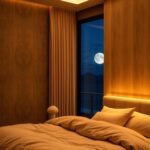
Welcome to your ultimate guide for creating a serene and stylish sleeping space. This color is known for its calming qualities, making it perfect for relaxation.
You can choose from soft sky tones to deep navy shades. Each brings a unique feel to your personal retreat.
Incorporate this versatile hue through accent pillows, artwork, or bold wall colors. Explore real-life examples like Pendleton throws or textured wallpaper for depth.
Find more inspiration on our Pinterest board featuring various shades and combinations.
Prepare to transform your room into a sanctuary with our curated ideas. Start your journey to a dream space with professional design tips.
Why Blue is the Ultimate Choice for Your Bedroom Sanctuary
Have you ever wondered why this particular hue dominates so many dream spaces? Science backs its calming properties. Studies show it can lower heart rates and reduce stress levels.
This makes it perfect for creating a peaceful retreat. Your personal sanctuary deserves this soothing touch.
Versatility is another key advantage. Whether your style leans modern or traditional, this color adapts beautifully. It works with minimalist schemes and eclectic designs alike.
Trends come and go, but this shade remains timeless. From soft turquoise to rich royal tones, it consistently appears in designer portfolios. Interior expert Phoebe Howard often uses subtle variations for their restful qualities.
The color naturally evokes tranquility. It reminds us of peaceful skies and calm oceans. This connection enhances your sleep environment’s overall feel.
Strategic use can also alter perceptions of your room. Lighter tones paired with good lighting create an airy, spacious vibe. Even smaller areas can benefit from this visual expansion.
Consider these popular approaches designers recommend:
| Design Approach | Visual Effect | Recommended For |
|---|---|---|
| Light tones + natural light | Creates airy, open feel | Small spaces |
| Deep shades + warm accents | Adds cozy sophistication | Large rooms |
| Minimal accents + neutral base | Provides subtle tranquility | Any room size |
You don’t need to commit fully to enjoy the benefits. Even small additions like artwork or throws can transform your space’s aesthetic. These touches introduce calmness without overwhelming.
Ultimately, this color creates a sanctuary that feels both personally calming and visually appealing. It’s a choice that serves both relaxation and style.
Finding Your Perfect Shade: From Sky Blue to Navy

Choosing the ideal calming tone can transform your personal space into a true sanctuary of relaxation and style. The spectrum offers endless possibilities, from airy light tones to rich dramatic hues.
Each shade creates a different atmosphere in your sleeping area. Your selection should reflect both your personality and the room’s natural lighting conditions.
Soft and Serene: Light Blues for a Classic Look
Light tones like sky blue create an airy, open feeling that many find relaxing. These soft shades resemble beautiful daylight and peaceful skies.
Popular paint choices include Benjamin Moore’s Sweet Bluette and Sherwin Williams’ Olympus White. These hues work particularly well in smaller spaces, making them appear larger and more inviting.
The timeless appeal of these colors creates a classic look that never goes out of style. They pair beautifully with whites and creams for a clean, fresh aesthetic.
As one designer noted,
Light tones bring the outdoors inside, creating a continuous connection with nature that enhances relaxation.
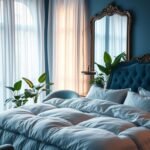
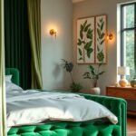
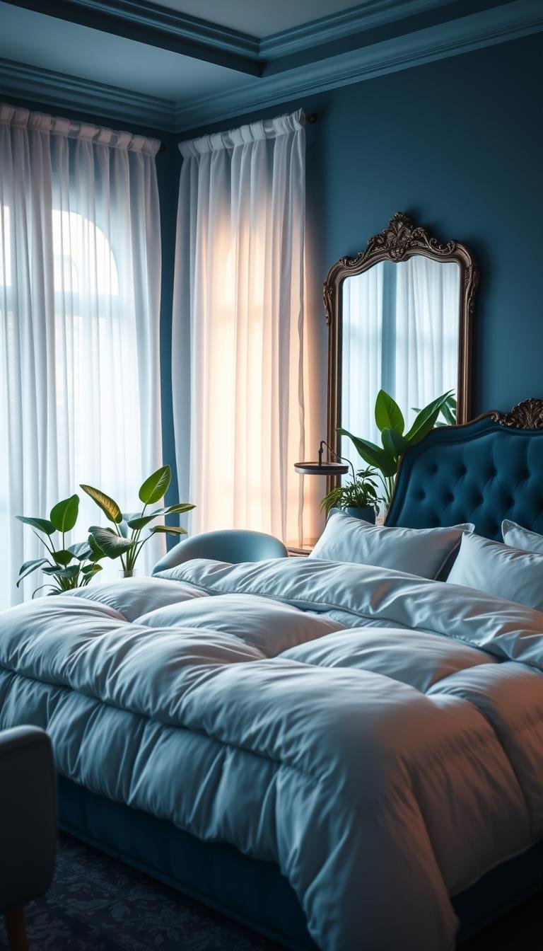
Bold and Moody: Deep Blues for a Dramatic Feel
For those seeking more drama, deep shades like navy or sapphire add rich character and sophistication. These intense colors create a cozy, intimate atmosphere perfect for a moody retreat.
Royal blue makes a particularly striking statement when used on accent walls or with luxurious textiles. The depth of these hues absorbs light, creating a sense of intimacy and luxury.
Pair these bold shades with warm accents like gold metallic touches or soft blush tones. This creates beautiful contrast while maintaining the room’s calming qualities.
Real homes showcase navy walls with cream bedding for elegance or midnight tones with black accents for modern drama. Tufted headboards in these deep shades exude luxury and sophistication.
| Shade Type | Visual Effect | Best For | Complementary Colors |
|---|---|---|---|
| Light Tones | Airy, spacious feel | Small rooms, natural light | Whites, creams, light woods |
| Deep Tones | Cozy, intimate atmosphere | Large spaces, evening use | Gold accents, warm neutrals |
Always test your chosen hue with samples in your actual space. Observe how the color changes throughout the day with different lighting conditions.
Whether you prefer calm and classic or dramatic and daring, your perfect shade awaits. Select one that truly reflects your personality for a space you’ll love waking up in every day.
Transforming Your Space with a Blue Accent Wall
Your walls offer the perfect canvas for creating dramatic visual interest while maintaining a peaceful atmosphere. A strategically placed accent wall can completely redefine your room’s character without overwhelming the space.
This approach lets you make a bold statement while keeping the overall feel balanced and relaxing. You get maximum impact with minimal commitment.
Creating Depth with Textured Wallpaper
Textured wallpaper adds both visual and tactile dimension to your space. Options like grasscloth or floral patterns bring elegance and sophistication.
Navy grasscloth creates a nautical feel that’s both timeless and contemporary. Blue-and-white striped patterns offer coastal vibes that feel fresh and airy.
These textured options work beautifully behind your bed or on a feature wall. They create depth that flat paint simply cannot achieve.
Using Paint to Define Your Space
Painting techniques can dramatically alter how your room feels and functions. A single wall in midnight blue creates an instant focal point behind your bed.
Painting trim in lighter shades draws eyes outward, making spaces appear larger. This technique defines areas without physical dividers.
Consider pastel blue on textured concrete walls for a contemporary, serene look. This approach works particularly well in modern spaces seeking calm sophistication.
| Wall Treatment | Visual Effect | Best Placement | Style Match |
|---|---|---|---|
| Textured Wallpaper | Adds depth and dimension | Behind bed, feature wall | Traditional to modern |
| Accent Wall Paint | Creates strong focal point | Bed backdrop, seating area | All design styles |
| Painted Trim | Expands visual space | Window frames, baseboards | Coastal, cottage |
| Concrete Finish | Modern serenity | Any wall surface | Contemporary minimalist |
Always pair your blue walls with light furniture and neutral bedding. This balance lets the color shine while maintaining harmony throughout your space.
Choose finishes that complement your personal style—matte for modern simplicity, glossy for added glamour. Your transformed space will welcome you with renewed energy and style.
Making a Statement with Blue Bedroom Furniture

Your sleeping space deserves furniture that makes a strong visual impact. The right pieces can transform your room into a personal sanctuary.
Selecting bold furniture creates an instant focal point. This approach anchors your entire color scheme beautifully.
The Impact of a Blue Upholstered Headboard
An upholstered headboard adds both luxury and comfort to your space. Velvet or fabric options create a soft, inviting feel.
Tufted navy designs offer regal elegance. They work well against neutral walls for striking contrast.
These pieces provide excellent back support for reading or relaxing. They also absorb sound, enhancing your room’s peaceful atmosphere.
Choosing a Blue Bed Frame as a Focal Point
Your bed frame serves as the room’s centerpiece. A navy platform blue bed makes a dramatic statement.
Consider wooden frames with blue finishes for rustic charm. Modern spaces benefit from sleek, minimalist designs.
Match your frame with complementary nightstands or dressers. This creates a cohesive look throughout your bedroom.
Always measure your space before selecting furniture. Larger frames dominate spacious rooms, while smaller options suit cozy areas.
Layering Textiles for a Cozy Blue Bedding Scheme
Transform your sleep sanctuary with the art of textile layering. This approach creates depth and comfort through strategic combinations.
Your bedding scheme becomes a personal expression of style. It also enhances your relaxation experience every night.
Mixing Patterns and Shades in Your Linens
Combine different prints for visual interest without clutter. Stripes, florals, and geometric patterns work well together.
Vary your tones from light periwinkle to deep indigo. This creates harmony while adding dimension to your look.
Start with neutral sheets as your foundation. White or cream bases let your blue accents stand out beautifully.
Adding Texture with Throws and Pillows
Introduce tactile elements through chunky knit throws and velvet pillows. These pieces provide both comfort and style.
Layer throws at the foot of your bed for easy adjustment. They add an extra style element while being functional.
Consider seasonal changes in your textile choices. Lighter fabrics work for summer, while heavier textures suit winter months.
| Textile Type | Visual Effect | Comfort Level | Best Placement |
|---|---|---|---|
| Linen Sheets | Natural, relaxed look | Breathable comfort | Base layer |
| Velvet Pillows | Luxurious accent | Soft texture | Bed front |
| Chunky Throw | Cozy appearance | Warm coverage | Foot of bed |
| Quilted Spread | Traditional elegance | Medium weight | Top layer |
Personalize your space with monogrammed shams or custom pillows. These touches make your bedding uniquely yours.
Choose high-quality fabrics for durability and luxury. Natural materials like cotton and linen enhance your relaxation experience.
Real homes showcase navy bedding with burnt orange accents for warmth. Blue-gray combinations offer sophisticated elegance.
Your layered textiles create a welcoming retreat you’ll love returning to each evening.
Incorporating Blue Through Curtains and Window Treatments

Your windows become design opportunities with the right fabric choices. Curtains add both function and style to your personal space.
They control light levels while enhancing your room’s overall decor. The right selection makes a significant visual impact.
Choose shades that complement your existing color scheme. Navy curtains against light walls create beautiful contrast.
This approach adds depth without overwhelming your space. It creates a cohesive look throughout your room.
Properly hung treatments can alter room proportions. Floor-length drapes make ceilings appear higher.
Small spaces benefit from this visual trick. It creates an airier, more open feel instantly.
Consider these popular material options for different effects:
- Sheer fabrics for soft, filtered light
- Velvet for drama and complete light blocking
- Linen blends for casual, relaxed elegance
Patterned curtains add interest to neutral rooms. Stripes or subtle prints work particularly well.
They provide visual texture without clutter. This maintains your space’s peaceful atmosphere.
Match your window treatments with other elements. Coordinating with bedding or accent chairs creates harmony.
Hardware choices complete your look. Brass rods add warmth while black offers modern contrast.
Layering treatments increases functionality. Roman shades under curtains allow flexible light control.
Proper length ensures elegance. Slight pooling creates luxury while clean breaks offer modernity.
Your windows frame both light and views beautifully. Treat them as key features in your design plan.
Using Rugs to Anchor Your Blue Color Palette
Your floor space offers a powerful opportunity to complete your room’s visual story. A well-chosen rug pulls everything together while adding comfort underfoot.
This foundation piece defines your space’s boundaries beautifully. It creates a cohesive look that ties all elements together.
Select shades that complement your existing palette. A navy rug against light walls creates stunning contrast.
Patterns add visual interest without overwhelming your space. Geometric designs or subtle stripes work particularly well.
These patterns can echo other elements in your room. They create harmony throughout your entire design.
Texture plays a crucial role in your selection. Plush options offer luxurious comfort underfoot.
Natural materials like seagrass with blue tones bring organic warmth. They add depth to your overall style.
Proper sizing ensures your rug frames your sleeping area perfectly. It should extend beyond your bed with adequate exposure.
Real homes showcase various approaches successfully:
- Persian rugs with blue accents for traditional elegance
- Modern abstract patterns for contemporary spaces
- Playful designs in children’s rooms for fun atmosphere
- Luxurious high-pile options for primary sleeping areas
Consider maintenance when making your selection. Darker shades hide stains better for busy households.
Lighter tones require more care but add brightness to your space. Choose what works best for your lifestyle.
Layer rugs over carpet for added dimension. This technique creates visual depth and interest.
Use single rugs on hardwoods to define your color theme clearly. Both approaches enhance your room’s overall feel.
Your chosen rug becomes the foundation of your personal sanctuary. It completes your vision while providing daily comfort.
Art and Decor: The Finishing Touches for Your Blue Room

Your final decorative elements bring everything together beautifully. These finishing touches add personality and complete your room’s overall look.
Thoughtful decor creates a space that feels uniquely yours. It transforms a designed room into a personal sanctuary.
Choose artwork that complements your color scheme. Ocean scenes or abstract pieces reinforce your chosen palette.
These prints add visual interest without overwhelming your space. They create focal points that draw the eye naturally.
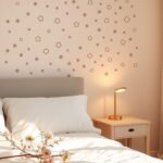
Consider various decorative accents throughout your room. Vases, sculptures, and trinkets add subtle color touches.
Gold-framed nautical paintings create coastal vibe. Blue batik textiles offer bohemian flair for eclectic spaces.
Mirrors with colored frames serve dual purposes. They reflect light while adding functional decor.
Select items that match your personal style. Modern pieces suit contemporary rooms. Antique options work for traditional spaces.
Real homes show how these elements tie spaces together. Turquoise vases draw eyes upward in rooms with high ceilings.
Add personal touches with custom elements. Family photos in colored mats create sentimental value.
DIY art projects offer unique customization. They ensure your space reflects your individual taste.
Balance is crucial when arranging decorative items. Leave negative space to avoid visual clutter.
Each piece should stand out on its own. This approach maintains your room’s peaceful atmosphere.
Lighting enhances your decorative elements dramatically. Spotlights highlight artwork beautifully.
Colored lampshades create ambient color effects. They add soft glow during evening hours.
Consider this comparison of decorative approaches:
| Decor Type | Visual Impact | Style Match | Placement Tips |
|---|---|---|---|
| Wall Art | Creates focal points | All styles | Eye level viewing |
| Sculptures | Adds dimensionality | Modern, eclectic | Shelves, tables |
| Functional Decor | Combines style and use | Any room | Where needed |
| Textile Accents | Softens spaces | Bohemian, traditional | Chairs, shelves |
Your decorative choices complete your room’s transformation. They add those final layers that make your space feel complete.
Experiment with arrangements until everything feels just right. Your perfect aesthetic awaits through these thoughtful additions.
How to Mix Multiple Shades of Blue Cohesively
Mastering the art of combining different tones creates a space that feels both dynamic and harmonious. Your room becomes a symphony of related colors that work together beautifully.
Analogous shades—those next to each other on the color wheel—create natural harmony. This approach ensures your various tones blend seamlessly rather than clash.
Start with a base hue and build around it with lighter and darker variations. A navy wall might pair with medium-toned bedding and sky-colored accents.
Real homes showcase stunning combinations like periwinkle curtains with cobalt throws. These layered approaches create depth while maintaining visual calm.
Texture helps differentiate similar shades. Matte walls with glossy decor pieces create interest through finish variations.
Consider this approach for your color scheme:
- Choose 3-5 related tones from light to dark
- Assign each to different elements (walls, furniture, accessories)
- Maintain clear value contrast between light and dark options
- Use mostly solid colors to emphasize the tonal progression
Test your selections in natural light before committing. Different lighting conditions can dramatically alter how colors interact.
Create a mood board with fabric swatches and paint samples. This visual plan ensures your multi-tone palette works harmoniously.
Remember that successful mixing creates cozy, lively spaces without chaos. Your layered approach should feel intentional and refined.
The most beautiful rooms have depth and dimension through thoughtful color layering.
Avoid overcrowding with too many patterns. Let your graduated color story take center stage in your personal sanctuary.
Classic Pairings: Combining Blue with White and Cream

Discover the timeless elegance of pairing blue white combinations for a sophisticated space. This classic approach creates serene environments that feel both fresh and perfectly balanced.
The crisp coastal vibe works beautifully in airy rooms with abundant natural light. You achieve this look through strategic color placement and thoughtful design choices.
Incorporate cream elements to introduce warmth and soften the contrast. This creates cozier atmospheres while maintaining that clean, classic feel.
Real homes showcase navy walls with bright white trim and cream bedding. This combination offers sophisticated charm that welcomes you daily.
Use white as your foundation for blue accents throughout the space. White walls provide the perfect backdrop for furniture and decorative pieces.
This pairing works across various style preferences. Traditional spaces might feature wainscoting, while modern rooms use minimalist lines.
Choose complementary tones for optimal harmony. Light blues pair beautifully with off-whites, while deeper shades work with bright whites.
Add texture through linen fabrics or knitted cream throws. These elements enhance both visual interest and physical comfort.
Accessorize with metallic touches in silver or gold finishes. These additions provide elegant highlights throughout your space.
Maintain visual balance through the 60-30-10 distribution rule. This means 60% blue, 30% white, and 10% cream elements.
| Application | Color Ratio | Visual Effect | Best For |
|---|---|---|---|
| Walls + Trim | Blue walls, white trim | Crisp definition | Traditional spaces |
| Bedding Scheme | Cream base, blue accents | Soft sophistication | Cozy atmospheres |
| Furniture Focus | White room, blue furniture | Modern statement | Contemporary design |
| Accessory Emphasis | Neutral base, blue decor | Subtle elegance | Small spaces |
This timeless combination creates spaces that feel both personally comforting and visually appealing. It’s a choice that never goes out of style.
Experiment with different shades until you find your perfect balance. Your classic sanctuary awaits through these harmonious pairings.
Unexpected Combos: Blue with Warm Accent Colors
Think outside the box with vibrant pairings that bring personality to your space. Warm accent colors create exciting contrasts with cool tones.
These combinations add energy or romance depending on your chosen shades. They transform your room into a unique expression of your personal style.
Strategic placement ensures balance throughout your design. Use these pops of warmth to highlight key areas without overwhelming.
Adding Energy with Orange and Yellow Pops
Bright orange and yellow accents inject lively energy into your room. These vibrant choices create cheerful, uplifting atmospheres.
Mustard yellow lamps against navy walls make a striking statement. Teal bedding with vibrant orange pillows adds playful contrast.
These combinations work particularly well in spaces needing personality. They bring warmth and vitality to cooler color schemes.
Consider burnt orange with deep navy for sophisticated energy. This pairing maintains elegance while adding visual interest.
Introducing Romance with Blush and Pink Tones
Soft pink and blush accents introduce romantic elegance to your space. They beautifully soften deeper blue shades for chic sophistication.
Sapphire walls with blush velvet benches create luxurious contrast. Periwinkle curtains with pink floral arrangements offer delicate balance.
These pairings work wonderfully in master suites seeking intimacy. They create cozy, inviting environments perfect for relaxation.
Dusty rose throw pillows against powder blue bedding add subtle romance. This combination feels both modern and timeless.
Follow the 70-30 rule for optimal balance in your color palette. Use 70% of your main shade and 30% accent colors.
This approach maintains harmony while allowing creative expression. Your space feels cohesive yet personally distinctive.
| Accent Color | Mood Created | Best Blue Pairing | Application Ideas |
|---|---|---|---|
| Mustard Yellow | Energetic, cheerful | Navy, cobalt | Lamps, artwork, throw pillows |
| Burnt Orange | Warm, sophisticated | Deep navy, teal | Rugs, decorative objects, bedding accents |
| Blush Pink | Romantic, elegant | Sapphire, royal | Velvet benches, curtain trim, accent chairs |
| Soft Pink | Delicate, calming | Sky, periwinkle | Floral arrangements, pillow covers, wall art |
Choose accent pieces that allow for easy updates and flexibility. Throw pillows, area rugs, and artwork offer simple ways to experiment.
Pair these combinations with neutral elements like white bedding or wood furniture. This grounds your color scheme while letting accents shine.
Experiment with different shades to find your perfect match. Your unique combination will create a space that truly reflects your personality.
Designing a Blue Bedroom Aesthetic on a Budget
Budget-conscious decorators can achieve stunning results with thoughtful blue accents and repurposed items. Your dream space becomes accessible through creative solutions and strategic updates.
Begin with affordable changes that make immediate impact. Throw pillows, blankets, or artwork introduce color without major investment.
Painting an accent wall yourself offers dramatic transformation at minimal cost. This single change redefines your room’s entire vibe.
Second-hand shopping reveals hidden treasures for your space. Look for dressers, curtains, or decorative pieces that need minor refreshing.
Focus your bedding as the room’s centerpiece. Affordable options in various shades create cohesive look without renovation.
Real homes showcase how duvets or area rugs refresh spaces instantly. These elements provide maximum visual impact for minimal expense.
DIY projects add personal touch while keeping costs low. Painting existing furniture or creating custom art makes your space uniquely yours.
Concentrate on one area rather than overhauling everything. Create a “blue zone” around your bed or favorite reading corner.
Combine new budget finds with existing neutral elements. This approach creates intentional design that feels complete and harmonious.
Prioritize pieces that deliver the most visual reward. Headboards or window treatments often provide the greatest transformation per dollar.
Your beautiful blue bedroom aesthetic emerges through these smart ideas. You create sanctuary without straining your finances.
Ideas for Small Spaces: Making Blue Work for You
Your compact sleeping area deserves the same stylish treatment as larger rooms. With smart choices, you can create an inviting retreat that feels spacious and intentional.
Light tones work wonders in tight quarters. Soft sky or powder shades on walls make your space appear larger and more open.
These airy colors reflect natural and artificial light beautifully. They create a bright atmosphere that enhances your room‘s perceived size.
Deeper navy accents add sophistication without overwhelming. Use them in bedding, decorative pillows, or area rugs for controlled impact.
Strategic placement makes all the difference. One accent wall in a rich tone creates depth while maintaining openness throughout your design.
Mirrors amplify both light and color elements beautifully. They create the illusion of expanded space while reflecting your chosen palette.
Multi-functional furniture serves dual purposes in compact areas. Storage beds or nightstands maximize utility while incorporating your color scheme.
Real homes showcase clever solutions for tight quarters:
- Floor-to-ceiling curtains lengthen window proportions
- Area rugs define sleeping zones without physical dividers
- Floating shelves provide display space without footprint
- Light-colored flooring enhances the airy feel
Keep patterns small and subtle to prevent visual clutter. Solid colors with texture variations work best in limited space.
Proper lighting ensures your chosen shades shine their brightest. Natural light enhances lighter tones, while warm bulbs complement deeper accents.
Your small room can achieve big design impact with these thoughtful approaches. Every choice should enhance both function and visual appeal.
Remember that less often becomes more in compact areas. Strategic color placement creates a cohesive feel without overcrowding.
Your personalized retreat awaits, regardless of square footage. These ideas help you maximize both style and comfort in your cherished space.
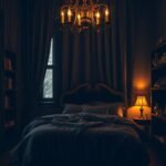
Lighting Tips to Enhance Your Blue Bedroom’s Vibe
Light transforms your space more than any other element. It changes how colors appear and creates different moods throughout the day.
Your lighting choices dramatically affect your room’s overall feel. They can make cool tones appear warmer or brighter.
Warm white bulbs soften any color scheme beautifully. They create a cozy, inviting atmosphere perfect for relaxation.
Natural light brightens lighter shades during daytime hours. It makes your space appear fresh and airy.
Consider these popular lighting approaches:
- Gold lamps against navy walls for glamorous contrast
- Pendant lights with modern schemes for clean lines
- Dimmer switches for adjustable mood settings
- Blue lampshades or LED strips for color reinforcement
Position lights to highlight your favorite features. Spotlights can emphasize artwork or accent walls effectively.
Real homes showcase beautiful examples. Chandeliers with crystal elements complement coastal themes perfectly.
Nautical-style fixtures enhance maritime-inspired spaces. They add character while providing functional illumination.
Layered lighting creates depth and dimension throughout your personal sanctuary.
Choose fixture finishes that match your style. Brass offers warmth while black provides modern contrast.
Combine overhead, task, and accent lighting for balance. This approach ensures both beauty and functionality.
Your perfect look emerges through thoughtful illumination choices. They complete your space’s transformation.
Maintaining Balance: Avoiding an Overwhelming Feel
Creating harmony in your space means finding the perfect equilibrium between colors. You want your room to feel inviting, not overpowering.
Neutral elements provide essential visual relief. Think cream bedding against navy walls or white trim breaking up bold tones.
Distribute your main color evenly throughout the room. Avoid concentrating it in one area to maintain visual balance.
Texture variety adds depth without extra color. Combine smooth walls with rough textiles or glossy decor pieces.
Designers often follow the 60-30-10 rule for perfect proportion:
- 60% dominant color
- 30% secondary color
- 10% accent color
Test your design in different lighting conditions. Natural and artificial light can change how colors interact.
Step back and assess your space objectively. If it feels too intense, add more neutrals or introduce complementary accents.
Your final scheme should create a peaceful retreat that welcomes you home. The right balance makes all the difference.
Bringing Your Dream Blue Bedroom to Life
Your journey to a peaceful personal retreat begins with a clear vision and thoughtful planning. Start by gathering ideas from various sources to create mood boards that reflect your desired look.
Incorporate elements from coastal, modern, or traditional styles to craft a unique space. Real homes showcase how this versatile hue creates both serene retreats and bold statements.
Take action step by step through painting, furnishing, and accessorizing. Enjoy the process and make adjustments as needed to achieve perfect balance.
Your final design should reflect your personality while providing daily comfort. Embrace this transformation into a calming sanctuary you’ll love.