Welcome to your journey toward creating a sleep space that’s anything but boring. You’re about to discover how to combine subtle elegance with sophisticated design.
Many people misunderstand this color as bland. When properly styled, it creates the most serene and stylish sanctuary.
This timeless choice has become popular for those seeking neutral environments. It serves as the perfect foundation for various approaches.
These concepts can transform your room into a relaxing retreat. They maintain visual interest while promoting calmness.
Get ready to reframe your outlook on this versatile palette. Discover its incredible potential for creating beautiful spaces.
We’ll guide you through every aspect of designing your perfect sleep haven. You’ll learn practical tips and find inspiration.
This color works wonderfully with bedding, furniture, and accessories. It helps create a cohesive and beautiful look that stands the test of time.
Why Beige is the Perfect Choice for Your Bedroom Retreat
Transform your sleeping quarters into a peaceful haven with this often-underestimated color palette. Many people mistakenly view this neutral as boring, but when styled with intention, it creates extraordinary results.
This foundation shade serves as your design canvas. It welcomes various textures, patterns, and accent colors beautifully. You can build upon it to create any aesthetic you desire.
People gravitate toward this palette for sleep spaces because it promotes deep relaxation. The calming atmosphere it creates is ideal for unwinding after long days. Your personal sanctuary should feel both neutral and serene.
The versatility of these tones accommodates diverse design approaches. Whether you prefer minimalist simplicity or maximalist richness, this foundation works perfectly. It adapts to your unique preferences effortlessly.
Small sleeping areas benefit particularly well from this choice. Lighter tones can make compact spaces feel more expansive and airy. This visual expansion adds valuable breathing room to your environment.
This neutral plays wonderfully with other colors too. Consider these sophisticated combinations:
- Classic black and white for crisp contrast
- Navy blue for nautical elegance
- Various greens for earthy sophistication
- Warm terracotta for cozy vibes
Unlike trendy colors that come and go, this choice remains timeless. Your space will maintain its stylish appeal for years without needing constant updates. It’s an investment in long-term beauty.
Different shades create distinct moods within your retreat. Warm variations foster cozy intimacy, while cooler tones promote serene tranquility. You control the emotional temperature of your space.
This background serves as the perfect stage for your favorite pieces. Artwork, decorative items, and personal collections stand out beautifully against this neutral canvas. Your treasures become the stars of the show.
Design professionals frequently recommend this foundation for good reason. It provides incredible flexibility for future decor changes. As your tastes evolve, this adaptable base remains relevant and beautiful.
Start with a Serene Base: Beige Wall Color Ideas

Your walls create the foundation for your entire sleep sanctuary. Choosing the right neutral tones sets the stage for everything that follows.
These hues offer incredible versatility while maintaining a calming atmosphere. They work beautifully with various furniture styles and decor choices.
Choosing the Right Shade for Your Light and Space
Natural illumination dramatically affects how your wall color appears. North-facing rooms benefit from warmer undertones to add coziness.
South-facing spaces handle cooler variations beautifully. They prevent the room from feeling too warm during sunny days.
Test paint samples on different walls at various times. Observe how the color changes throughout the day before making your final decision.
Consider your existing flooring and furniture finishes too. Warm wood tones pair wonderfully with creamy beiges. Cool grays work best with taupe-inspired shades.
Creating a Focal Point with a Beige Accent Wall
An accent wall adds depth without overwhelming your space. It draws attention to your bed or another important feature.
Choose a slightly deeper tone from your main palette. This creates subtle contrast while maintaining harmony throughout the room.
Crisp white molding enhances your accent wall beautifully. It frames the space and adds architectural interest to your design.
This technique works wonderfully behind your headboard. It creates a sophisticated backdrop that makes your bedding stand out.
Different paint sheens affect how light interacts with your walls. Matte finishes hide imperfections beautifully. Satin offers easy cleaning for busy households.
The Foundation of Comfort: Sophisticated Beige Bedding
Your sleeping sanctuary deserves the perfect foundation. Quality bedding transforms your space into a cozy retreat that welcomes you each night.
This neutral palette creates harmony throughout your room. It builds upon your wall color for a seamless look that feels both intentional and relaxing.
Many design experts recommend starting with your bedding as the centerpiece. As noted in our guide to creating stylish spaces, the right combination of textures prevents monotony while adding warmth.
Mixing Textures in Your Linens for Added Depth
Create visual interest by combining different fabrics. Smooth cotton sheets pair beautifully with crisp linen duvet covers.
Add soft velvet pillows for tactile variety. This mix creates dimension without introducing competing colors.
Consider these texture combinations:
| Base Layer | Middle Layer | Accent Texture |
|---|---|---|
| High-thread-count cotton | Linen duvet cover | Velvet throw pillows |
| Silk pillowcases | Matelassé coverlet | Knit blanket |
| Percale sheets | Quilted bedspread | Faux fur accent |
The contrast between surfaces adds quiet sophistication. It prevents your space from feeling flat while maintaining serenity.
Layering with a Plush Beige Comforter or Throw
Build comfort through strategic layers. Start with your fitted sheet and build upward.
Add a plush comforter as your main warmth layer. Choose one in a complementary shade to create tonal depth.
Finish with a beige throw at the foot of your bed. This final touch adds both style and extra coziness for cooler nights.
Minimalist designs often feature these simple yet effective layers. They provide physical comfort while maintaining visual simplicity.
Your completed look should feel inviting and luxurious. The right combination transforms your sleep experience completely.
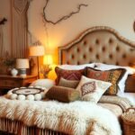
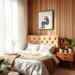
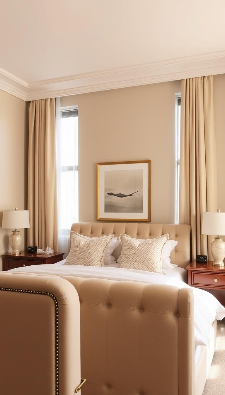
Anchor the Room with a Statement Beige Headboard

Your bed deserves a centerpiece that commands attention. A well-chosen headboard becomes the visual anchor for your entire space.
This key element establishes your room’s personality. It creates a strong focal point that draws the eye immediately.
Selecting the right style transforms your sleeping area completely. It sets the tone for all other design decisions.
Upholstered and Tufted Headboards for a Luxe Feel
Upholstered options provide exceptional comfort and elegance. They offer plush backing perfect for reading or relaxing.
Tufted details add architectural sophistication to your space. The dimensional pattern creates visual interest without overwhelming.
Velvet variations feel incredibly luxurious against your skin. They catch light beautifully throughout the day.
These pieces work wonderfully with crisp white bedding. The combination creates a clean yet sophisticated look.
Using a Beige Headboard as Your Design Canvas
This neutral foundation complements countless color schemes. It serves as an excellent starting point for your decor.
Your headboard becomes the perfect backdrop for various pillows. You can change accents seasonally without major updates.
Different materials create distinct moods within your room. Consider these popular options and their effects:
| Material Type | Style Effect | Best For |
|---|---|---|
| Fabric Upholstery | Soft and inviting | Cozy traditional spaces |
| Leather | Modern and sleek | Contemporary designs |
| Wood | Warm and natural | Rustic or minimalist rooms |
| Patterned Fabric | Subtle statement | Adding quiet interest |
Coordinate your selection with other room elements carefully. Curtains, rugs, and furniture should harmonize beautifully.
Your choice becomes the foundation for building your complete design concept. Everything else flows from this central piece.
Incorporating Warmth and Texture with Area Rugs
Your floor deserves as much attention as your walls and furniture. A well-chosen area rug transforms your room into a cozy retreat.
These floor coverings add physical comfort and visual appeal. They bring softness underfoot while enhancing your overall design.
The right selection creates harmony throughout your space. It ties furniture together and defines your sleeping area beautifully.
Different materials offer unique benefits for your room. Some provide cushioning while others add visual interest through patterns.
Consider these practical advantages too. Rugs help absorb sound for a quieter environment. They also protect your flooring from daily wear.
The Timeless Appeal of a Natural Jute Rug
Natural fiber options bring organic charm to your space. Jute remains a perennial favorite for good reason.
This material never goes out of style. It introduces neutral tones perfectly while adding earthy texture.
Coastal-inspired spaces benefit particularly from jute rugs. They create that light, airy feeling many people love.
These rugs work wonderfully with various design approaches. They complement both modern and traditional furniture effortlessly.
Jute offers excellent durability for busy households. It withstands regular use while maintaining its beautiful appearance.
Layering Rugs for a Cozy, Collected Look
Double your comfort and style with strategic layering. This technique adds depth and personality to your floor.
Start with a larger neutral base rug. Then add a smaller patterned or textured piece on top.
Earth-toned accents work beautifully over beige carpets. They create visual interest without overwhelming your space.
This approach lets you define specific areas within your room. It helps anchor your furniture arrangement effectively.
Consider these popular texture combinations:
- Flat-weave base with plush shag accent
- Natural jute foundation with patterned wool layer
- Sisal base with soft sheepskin overlay
Layering provides practical benefits too. It adds extra cushioning and warmth under your feet.
Your layered look should feel intentional yet comfortable. The right combination makes your space feel collected over time.
Selecting Complementary Furniture in Wood and Neutral Tones

Your furniture choices build upon your foundation to create a complete design. They should work together to form a harmonious environment.
Wood pieces bring natural warmth to your space. They add organic texture that balances smooth surfaces beautifully.
Neutral tones create a cohesive look throughout your room. They allow other elements to shine while providing visual calmness.
Your selection should reflect your personal style. Consider both aesthetics and functionality when making decisions.
Light Wood Pieces for a Scandi or Japandi Vibe
Light wood creates an airy, open feeling in your space. It works wonderfully with minimalist design approaches.
Scandinavian style emphasizes clean lines and simplicity. Light oak or ash furniture fits this aesthetic perfectly.
Japandi blends Japanese minimalism with Scandinavian coziness. Natural wood tones and neutral colors define this look.
These styles focus on functionality and beauty. Each piece should serve a purpose while enhancing your room’s appearance.
Consider these light wood options:
- Platform beds with slim profiles
- Floating nightstands for visual lightness
- Simple dressers with clean lines
- Minimalist benches or stools
Mixing Beige Accent Furniture Like Nightstands
Accent pieces add personality without overwhelming your space. They provide opportunities to introduce subtle variations.
Nightstands offer both style and function beside your bed. Choose pieces that complement your overall color scheme.
Contemporary designs make sleek statements with clean shapes. They create visual interest through form rather than decoration.
Matching tones create a seamless flow throughout your room. Your furniture should feel collected rather than overly coordinated.
Different materials work well together when they share similar tones. Wood and painted pieces can coexist beautifully.
Your accents should enhance rather than compete with your foundation. They complete the look while maintaining serenity.
Frame Your View: The Impact of Beige Curtains
Your windows deserve framing that enhances both privacy and style. The right window treatments complete your room’s design story beautifully.
Quality drapery controls sunlight while maintaining soft, diffused illumination. This creates a serene atmosphere perfect for relaxation.
Darker variations add depth and sophistication to your window treatments. Taupe-inspired shades work particularly well for this elegant look.
Coordinate your curtains with bedding for a cohesive design. The combination of these neutral tones creates a no-fail mix that always works.
Layering techniques enhance both function and style. Consider pairing sheer white panels with heavier drapes for dreamy effects.
Your window treatments contribute to room insulation too. They help with temperature control and sound absorption for better sleep.
Proper sizing makes windows appear larger and more substantial. Fullness and length create elegant folds that enhance your space.
Hardware selection completes your window treatment design. Choose rods and finials that complement your overall style.
These fabric elements introduce pattern or texture opportunities. They maintain your color scheme while adding visual interest.
Professional installation makes your room feel polished. Well-hung drapery creates clean lines and perfect proportions.
Consider these popular curtain types and their benefits:
| Curtain Type | Light Control | Style Effect | Best Use |
|---|---|---|---|
| Blackout Drapery | Complete darkness | Luxurious and substantial | Light-sensitive sleepers |
| Sheer Panels | Soft diffusion | Airy and romantic | Daytime privacy |
| Textured Weaves | Medium filtration | Organic and tactile | Adding dimension |
| Patterned Designs | Variable control | Subtle statement | Visual interest |
Your window treatments serve as the finishing touch to your space. They frame your view while completing your sophisticated design.
Accessorize with Pillows and Throws for a Cohesive Look

Your finishing touches transform a good design into a great one. Thoughtful accessories bring everything together beautifully.
These elements add personality and comfort to your space. They create that collected-over-time feeling everyone loves.
Your choices should enhance your existing color scheme. They introduce subtle variations while maintaining harmony.
Matching Pillows to Your Wall Color
Create visual flow by coordinating soft furnishings with your walls. This technique makes your space feel intentionally designed.
Select pillow covers in similar tones to your paint. The connection between vertical and horizontal surfaces feels sophisticated.
Vary sizes and shapes for added interest. Standard squares mix wonderfully with lumbar or bolster options.
Consider these popular combinations:
- Cream walls with oatmeal linen pillows
- Taupe walls with sand-colored velvet accents
- Greige walls with mushroom-toned cotton covers
The right match creates a serene environment. Everything feels connected yet visually engaging.
Adding a Chunky Knit Beige Throw for Texture
Introduce cozy dimension with a beautifully textured throw. This element adds both style and practical comfort.
Chunky knits provide wonderful tactile interest. They feel luxurious while maintaining neutral sophistication.
Drape your throw across the foot of your bed. This placement makes it accessible while looking inviting.
Choose a shade that complements your headboard. The connection between these elements feels intentional.
Your throw serves multiple purposes throughout the year. It provides warmth during cooler months and visual interest always.
This accessory completes your layered bedding perfectly. It adds that final touch of comfort and style.
Elevate Your Space with Metallic Accents in Gold and Brass
Metallic details transform your neutral foundation into something extraordinary. They add that special touch of glamour without overwhelming your serene environment.
Gold and brass accents create beautiful contrast against softer tones. They prevent your space from feeling too uniform while maintaining elegance.
These finishes bring wonderful warmth to your overall design. They complement rather than compete with your existing palette.
Strategic placement makes all the difference. Consider these impactful pieces for your room:
- Floor lamps that cast beautiful ambient light
- Full-length mirrors that add drama and depth
- Nightstand accessories that provide functional elegance
- Lighting fixtures that become artistic statements
- Decorative objects that catch and reflect light
Metallic surfaces bounce light around your space beautifully. This creates a brighter, more dynamic atmosphere throughout the day.
Different finishes create distinct moods within your room. Polished brass feels contemporary and sleek. Brushed gold offers softer sophistication.
Antique finishes bring vintage charm to your design. They work wonderfully with traditional or transitional style approaches.
Balance is key when incorporating these elements. Too many metallic pieces can feel overwhelming. Too few might not make enough impact.
Your metallic accents should enhance your overall look. They create cohesion between furniture, bedding, and accessories.
These thoughtful touches make your space feel luxurious and complete. They demonstrate careful attention to detail in your design process.
Add Depth and Character with Wall Paneling and Molding
Your walls hold incredible potential for adding personality to your space. Architectural details like paneling and molding bring sophistication without overwhelming your serene palette.
These features create visual interest through structure rather than color. They add dimension and elegance to any room.
Many homeowners discover these elements transform ordinary walls into extraordinary features. They provide that custom-built look everyone desires.
Your design gains character through these thoughtful additions. They make your space feel intentionally curated and complete.
DIY Picture Frame Molding for Architectural Interest
Picture frame molding offers an achievable weekend project with dramatic results. You create elegant boxes that add instant sophistication.
This technique builds dimension through simple geometric patterns. The shadow lines created by the molding add subtle texture.
You can easily install this using basic tools from any hardware store. Pre-made molding strips make the process straightforward.
Consider these popular approaches for your project:
| Pattern Style | Wall Size Recommendation | Visual Effect |
|---|---|---|
| Uniform Squares | Medium to Large Walls | Classic and balanced |
| Vertical Rectangles | Narrow Walls | Height-enhancing |
| Asymmetric Design | Statement Walls | Modern and dynamic |
| Traditional Panels | Formal Spaces | Elegant and timeless |
Your finished project will make your walls feel professionally designed. The added depth creates a luxurious atmosphere.
Using Chair Rail Molding to Break Up Walls
Chair rail molding provides another excellent option for adding character. This horizontal element divides your wall into visually appealing sections.
Traditional placement sits approximately 32 inches from the floor. This height creates perfect proportions for most rooms.
You maintain design flexibility with your finishing choices. Many people paint the molding white for crisp contrast.
Others match it to their wall color for subtle sophistication. Both approaches work beautifully within neutral schemes.
This feature particularly enhances rooms with higher ceilings. It brings visual balance to tall vertical spaces.
Your room gains architectural interest through this simple addition. It demonstrates thoughtful attention to detail in your design.
Introducing Pops of Color to Complement Your Beige Palette
Your neutral foundation deserves thoughtful color accents that enhance its beauty. These additions bring personality without disrupting the serene atmosphere you’ve created.
Strategic color choices make your design feel intentional and complete. They provide visual interest while maintaining harmony throughout your space.
The most successful rooms use accent colors to create depth and dimension without overwhelming the primary palette.
Pairing with Navy Blue for a Bold Contrast
Navy blue creates stunning visual impact against softer neutral tones. This combination feels both dramatic and sophisticated.
An accent wall in deep blue makes a powerful statement. It draws attention while providing beautiful contrast to your overall look.
This bold approach works particularly well behind the bed. It creates a dramatic backdrop that makes your bedding stand out beautifully.
Smaller navy accents through pillows or artwork offer flexibility. You can change them easily if you want to refresh your style.
Weaving in Greens and Blacks for Earthy Sophistication
Earth tones bring natural elegance to your neutral foundation. Deep greens and rich blacks work wonderfully for this organic look.
These colors create a grounded, sophisticated atmosphere. They feel both timeless and contemporary in their appeal.
Accessories provide the perfect way to introduce these hues. Consider these effective options for adding earthy tones:
| Color Type | Recommended Items | Style Effect | Best Placement |
|---|---|---|---|
| Forest Green | Throw pillows, living branches | Nature-inspired calm | Bed, shelves, windowsill |
| Charcoal Black | Blankets, picture frames | Modern sophistication | Bed foot, walls, nightstands |
| Olive Green | Ceramics, decorative objects | Earthy warmth | Dresser, floating shelves |
| Jet Black | Light fixtures, hardware | Dramatic contrast | Ceiling, doors, accessories |
Balance remains crucial when working with darker accents. Too many can feel heavy, while too few might not make enough impact.
Your color choices should reflect your personal style. They make the room feel uniquely yours while maintaining its peaceful quality.
These thoughtful touches complete your design beautifully. They demonstrate careful attention to detail in creating your perfect sanctuary.
Bringing in Life and Contrast with Artwork and Decor

Your walls and surfaces offer the perfect canvas for personal expression. Thoughtful decorative elements transform your space from beautiful to truly captivating.
These final touches add personality and character to your environment. They create visual interest while maintaining your serene foundation.
Artwork introduces pattern and color in controlled doses. It prevents monotony while enhancing your overall design.
Decorative objects bring texture and dimension to your surfaces. They make your room feel collected rather than overly designed.
Choosing Abstract and Botanical Prints
Abstract artwork creates modern sophistication against neutral backgrounds. These pieces add movement and energy without overwhelming your space.
Botanical prints bring natural beauty into your personal sanctuary. They introduce organic patterns that feel both timeless and fresh.
Palm leaf patterns make particularly striking statements. Their bold shapes create drama while complementing your color scheme.
Consider these effective approaches for your wall art:
| Art Style | Frame Choice | Wall Placement | Visual Impact |
|---|---|---|---|
| Large Abstract | Minimal black frame | Above headboard | Modern focal point |
| Botanical Print | Natural wood frame | Gallery wall | Organic elegance |
| Palm Pattern | White matte frame | Statement wall | Tropical sophistication |
| Mixed Media | Floating frame | Reading nook | Textural interest |
Your artwork should feel proportional to your wall space. Large pieces anchor rooms beautifully. Smaller works create intimate moments.
Groupings offer another excellent option for visual impact. Create gallery walls that tell your personal story.
Styling Shelves with Ceramics and Natural Elements
Shelves provide wonderful opportunities for decorative expression. They let you display cherished objects while adding personality.
Ceramic pieces introduce beautiful texture and form. Their smooth surfaces catch light beautifully throughout the day.
Natural elements bring organic warmth to your arrangements. Branches, stones, and dried grasses add earthy sophistication.
Create balanced vignettes that feel both intentional and effortless. Consider these effective combinations:
- Stacked books with a small ceramic vase
- Wooden bowl with collected stones
- Grouped candles with fresh branches
- Artisanal objects with personal photographs
Your nightstand deserves special attention too. Combine functional items with decorative pieces for both beauty and practicality.
A reading lamp might pair with a small sculpture. Your alarm clock could sit beside a beautiful stone.
These thoughtful arrangements make your space feel uniquely yours. They demonstrate your personal style while maintaining serenity.
Remember to leave some breathing room between objects. Negative space allows each piece to shine beautifully.
Exploring Beige Bedroom Styles: From Minimalist to Maximalist
Your personal sanctuary can express any aesthetic you love. This versatile foundation adapts beautifully to various approaches.
From clean simplicity to rich complexity, these tones work across many styles. You can create a space that truly reflects your personality.
Creating a Minimalist Beige Sanctuary
Clean lines and simplicity define this approach. It focuses on essential elements without unnecessary decoration.
Your color palette remains intentionally limited. You use subtle variations of the same family throughout the room.
Furniture features simple silhouettes and functional design. Every piece serves a purpose while maintaining visual calmness.
Storage solutions stay hidden or minimally visible. This creates an uncluttered environment that promotes mental clarity.
Your overall look feels both serene and intentional. It provides a peaceful retreat from busy daily life.
Embracing the “Quiet Luxury” Beige Aesthetic
This approach combines understated elegance with exceptional comfort. It focuses on quality materials and subtle sophistication.
Plush fabrics create a sense of indulgence throughout your space. Soft velvets, smooth silks, and fine linens work beautifully.
Metallic accents add gentle sparkle without overwhelming. Gold or brass details provide refined touches of luxury.
Your atmosphere feels both elevated and welcoming. It balances sophistication with comfortable relaxation.
Every element demonstrates careful consideration and quality. Your room becomes a truly special personal retreat.
Designing a Cozy Rustic Retreat with Beige
Natural materials and textured surfaces define this welcoming style. It brings organic warmth into your personal sanctuary.
Wood elements show their natural grain and character. They add earthy beauty that feels both authentic and comforting.
Textured fabrics introduce visual and tactile interest. Chunky knits, woven blankets, and natural linens work perfectly.
Your color palette incorporates various earthy tones. These create a grounded, nature-inspired environment.
The overall feeling is warm, inviting, and perfectly comfortable. It’s like wrapping yourself in a gentle hug each night.
These different approaches demonstrate incredible versatility. You can choose the one that best matches your personal preferences.
Your foundation color adapts beautifully to each distinct design. It maintains its serene quality while supporting various aesthetics.
You might even mix elements from different styles. This creates a uniquely personal space that feels authentically yours.
The best part? You can evolve your look over time. This adaptable foundation makes future changes simple and enjoyable.
Practical Tips for Layering and Curating Your Beige Bedroom
Mastering the art of layering transforms your personal retreat from basic to beautiful. This technique creates depth and warmth while maintaining that serene atmosphere you love.
Start with your foundation pieces first. Your walls, flooring, and large furniture form the base of your design. Build upward from these essential elements.
Texture mixing prevents monotony in neutral spaces. Combine different materials for visual and tactile interest. Your bedding offers the perfect starting point.
Consider these effective layering combinations:
- Crisp cotton sheets with a nubby linen duvet
- Plush rug over hardwood or tile flooring
- Sheer curtains behind heavier drapery panels
- Mixed throw pillows in various fabrics
Create visual hierarchy through strategic placement. Larger items anchor your space. Medium pieces build upon them. Smaller accessories complete the look.
Your room should feel balanced rather than busy. Edit your layers until everything feels intentional. Remove anything that doesn’t contribute to the overall harmony.
Seasonal changes refresh your environment easily. Swap lighter linens for warmer options in cooler months. Change accent pillows or throws for quick updates.
Lighting creates another important layer. Combine overhead, task, and ambient sources. This approach makes your space more functional and inviting.
Pattern mixing adds subtle interest when done carefully. Choose designs that share similar color tones. Keep scales varied but complementary.
Practical maintenance keeps your layered textiles looking fresh. Follow care instructions for each material type. Regular rotation extends the life of your pieces.
Curating means selecting items with purpose and meaning. Choose pieces that work together harmoniously. Your space should tell your personal story.
This thoughtful approach creates a sanctuary that feels both designed and lived-in. You achieve that perfect balance of serenity and style.
Your Journey to a Subtle Yet Sophisticated Sleep Space
Your journey toward a peaceful personal retreat has reached its beautiful conclusion. You’ve transformed your room into a sanctuary that feels both calm and carefully curated.
This neutral foundation offers incredible versatility for your evolving tastes. It serves as the perfect backdrop for your favorite artwork and personal treasures.
Remember that thoughtful layering creates depth and warmth in your environment. Mixed textures and strategic accents prevent monotony while maintaining serenity.
Your investment in quality pieces pays off daily through enhanced comfort. This timeless approach ensures your space remains stylish for years.
Celebrate your ability to create a truly personalized haven. Your retreat now reflects your unique story while providing peaceful restoration.
Enjoy your beautifully designed sanctuary every single day. It welcomes you with quiet elegance and lasting comfort.