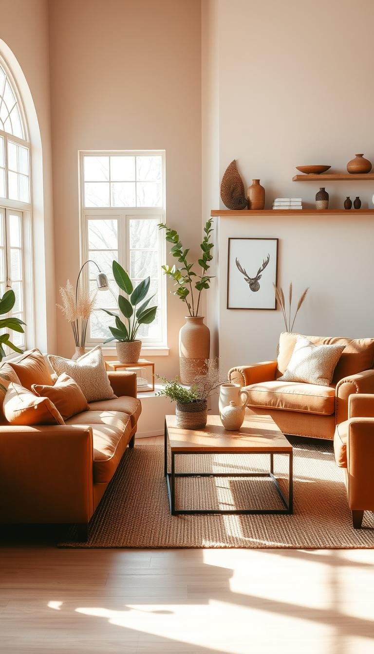
Creating a warm and inviting space starts with choosing the perfect color foundation. Brown and beige are timeless neutrals that work beautifully together.
These warm tones create a cozy atmosphere in your home. They form a harmonious palette that feels both elegant and comfortable.
This classic combination has evolved from Tuscan styles to modern interior design. Today’s approach focuses on balanced shades and layered textures.
Understanding undertones is key to achieving a cohesive look. Proper balance between these colors creates depth and dimension in your living room.
This guide will show you professional techniques for blending these hues. You’ll learn to create a design that feels current yet timeless.
Why Brown and Beige Are a Timeless Living Room Combo
Some color pairings stand the test of time, effortlessly bridging decades of design evolution. Brown and beige represent this enduring quality in interior spaces.
These neutrals peaked in early 2000s Tuscan styles. Today, they enjoy a fresh revival in contemporary design. The combination feels both nostalgic and current.
Neutral palettes never truly fade from style. They serve as stable foundations for any space. You can update looks with accessories rather than complete overhauls.
Brown offers unique depth that black cannot achieve. It provides warmth that gray often lacks. This creates romantic, intimate atmospheres in your home.
Designer Michelle Salz-Smith demonstrates this beautifully. She blends brown and beige spectra into dynamic palettes. The results feel both current and timeless.
Some worry brown-based interiors appear dated. Proper styling keeps these colors fresh and modern. The right accessories and textures make all the difference.
Warm neutrals create psychological comfort. They make rooms feel cozy and welcoming. Guests naturally feel at ease in these spaces.
Architectural Digest continues featuring brown and beige schemes as sophisticated choices. These combinations represent timeless elegance in home design.
This color pairing works well in living rooms. Comfort and warmth are primary considerations here. The combination supports the room’s essential function.
Many homeowners rediscover beautiful brown woods. They appreciate beige fabrics after years of painting over natural tones. This rediscovery brings character back into spaces.
The versatility of these hues allows endless creativity. You can achieve both traditional and contemporary looks. Proper balance creates wonderful dimension throughout your room.
Understanding the Brown and Beige Color Spectrum
Mastering these earthy neutrals begins with recognizing their subtle complexities. The secret lies not in the colors themselves but in their underlying tones.
Every shade carries hidden characteristics that determine how it interacts with your space. These undertones create either harmony or discord in your room’s design.
Warm Undertones vs. Cool Undertones
Warm undertones bring red, yellow, or orange influences to your palette. These create cozy, inviting atmospheres in your living room.
Cool undertones introduce green, gray, or blue characteristics. These can feel fresh and modern when used intentionally.
Mahogany-rich browns with red undertones work beautifully. Avoid orange-toned browns that can feel dated. Even browns with green undertones can create sophisticated spaces.
Testing paint in your actual light conditions is crucial. Natural light can transform neutral brown into greenish-brown depending on your windows.
Selecting Shades that Work in Harmony
Choose shades that share similar undertones throughout your space. This creates a cohesive color story that feels intentional.
Farrow & Ball’s London Clay pairs wonderfully with lighter beige tones. Benjamin Moore’s Mocha Brown offers rich depth. Sherwin-Williams’ Dark Clove provides sophisticated contrast.
Different times of day change how colors appear in your room. Morning light reveals different tones than evening illumination.
Seasonal light variations also affect your palette. Winter light creates different effects than summer sunlight.
Use tonal variation for visual interest while maintaining harmony. Lighter and darker shades from the same family work well together.
Understanding color wheels helps avoid mixing warm and cool undertones accidentally. This knowledge ensures your space feels balanced and inviting.
How to Mix Brown and Beige in Living Room Decor the Right Way
Establishing a beautiful neutral foundation requires thoughtful layering. The most successful rooms begin with a light base and build depth gradually.
This approach creates visual harmony while maintaining flexibility. You can refresh your space easily as styles evolve.
Start with a Dominant Neutral Base
Begin with lighter beige tones on your largest surfaces. Walls, ceilings, and major furniture pieces form this foundation.
Choose a paint color that complements your natural light. Warmer beiges work well in north-facing rooms. Cooler tones suit sun-drenched spaces.
Your sofa often serves as the anchor piece. A neutral upholstered piece provides versatility. You can change accent colors seasonally.
Designer Amber Lewis frequently uses this technique. She creates airy, inviting rooms with light foundations. The results feel both current and timeless.
Layer in Accents from the Opposite End of the Spectrum
Introduce darker browns through carefully chosen accents. These elements add dimension and visual interest.
Consider these strategic additions:
- Rich leather accent chairs
- Dark wood side tables
- Textured throw pillows
- Artwork with deeper tones
- Wood trim and architectural details
Follow the 60-70% light to 30-40% dark ratio. This balance creates comfortable contrast without overwhelming your space.
Smaller rooms might need more light tones. Larger spaces can handle deeper colors. Adjust based on your specific conditions.
Repeat both hues throughout your living room. This creates cohesive flow rather than isolated color zones.
Your eye should move naturally through the space. Strategic placement guides attention to focal points.
This method offers wonderful flexibility. You can update decor without major renovations. Simply change accessories as trends evolve.
Choosing Your Foundational Furniture Pieces

Your furniture forms the backbone of your living space. Selecting the right pieces creates a foundation that lasts for years.
Strategic choices make your room feel both cohesive and personal. They establish the core color story throughout your space.
The Versatility of a Beige Sofa
A beige sofa serves as the perfect neutral anchor. It provides incredible flexibility for changing your decor over time.
This foundational piece allows other elements to shine. Textures and accents stand out against this calm background.
Seasonal updates become simple with this approach. Just switch throw pillows and accessories for fresh looks.
Light beige tones reflect natural light beautifully. They make smaller spaces feel more open and airy.
Many designers recommend performance fabrics for durability. These materials handle daily use while maintaining their elegant appearance.
Incorporating Brown Leather for Elegance
Brown leather pieces bring sophisticated warmth to your interior. They develop beautiful character as they age.
Full-grain leather offers the best quality and durability. It develops a rich patina that adds dimension over time.
Balance is key in compact rooms. Pair heavier leather with lighter fabrics to avoid overwhelming your space.
Mix modern and traditional styles for collected appeal. A contemporary sofa with classic leather chairs works well together.
Coordinate wood tones with your leather selections. This creates harmony throughout your furniture arrangement.
Regular conditioning keeps leather looking its best. Use appropriate cleaners for your specific leather type.
These pieces become family heirlooms that gain beauty with age. They tell the story of your home through their evolving character.
Designing Your Walls for Maximum Impact
Your wall choices set the stage for your entire space. They create the backdrop that makes your furniture and decor shine beautifully.
Thoughtful wall design transforms ordinary rooms into extraordinary spaces. The right approach enhances your living room‘s character and warmth.
Beige Walls with Brown Architectural Accents
Soft beige walls create an airy, expansive feeling in your home. They reflect natural light beautifully throughout the day.
Add rich coffee brown to trim and molding for refined elegance. This combination highlights architectural features with sophistication.
The contrast between light walls and dark trim adds wonderful dimension. It frames your space like a beautiful picture.
Built-in shelves or cabinets in deeper tones work well too. They become functional art pieces against lighter walls.
The Power of a Brown Accent Wall
A single accent wall can completely transform your room’s personality. Placed behind your sofa, it creates dramatic contrast.
Designer Michelle Salz-Smith demonstrates this technique masterfully. She uses charcoal accent walls behind tan sofas to modernize spaces.
Choose the wall that naturally draws attention first. Typically this contains your room’s focal point or main seating area.
For rooms with abundant light, consider color-drenching with brown paint. This technique uses the same shade on walls, trim, and ceiling.
Color-drenching creates a cozy, intimate atmosphere that feels enveloping. It’s perfect for creating a comfortable retreat.
“An accent wall behind key furniture creates instant drama and depth. It’s one of the most transformative changes you can make.”
Test paint colors in your actual space at different times. Natural light changes how beiges and browns appear throughout the day.
Farrow & Ball’s London Clay offers a sophisticated earthy tone. Benjamin Moore’s French Press provides rich, coffee-inspired depth.
Balance your wall colors with other room elements. Your walls should complement rather than compete with your furniture.
Lighter beige walls generally make rooms feel larger and airier. Deeper browns create intimacy and coziness.
Your wall palette forms the foundation of your interior design. Choose shades that reflect your personal style while creating harmony.
Layering Textures to Add Depth and Dimension

Texture transforms your neutral palette from flat to fascinating. It creates visual interest that makes your space feel complete and inviting.
Different materials catch light in unique ways. This adds movement and life to your room‘s design.
Think of texture as your secret weapon against monotony. It gives your eyes places to explore throughout your home.
Incorporating Natural Materials: Wood and Jute
Natural elements bring organic warmth to your interior. Wood surfaces add rich character that manufactured materials can’t match.
Jute and sisal introduce earthy texture underfoot. These natural fibers complement both beige and brown hues beautifully.
Consider these natural additions:
- Reclaimed wood coffee table
- Jute area rug
- Rattan accent chairs
- Woven storage baskets
- Natural fiber throw blankets
These materials develop patina over time. They tell the story of your living through gentle aging.
Designer Amber Lewis often layers natural textures. She creates spaces that feel both refined and relaxed.
Mixing Soft Textiles: Knits, Velvet, and Leather
Soft fabrics add comfort and luxury to your decor. Mixing different textiles prevents your scheme from feeling one-dimensional.
Knitted throws bring cozy comfort to your sofa. They invite relaxation and casual elegance.
Velvet upholstery gives dimension to deeper shades. Its subtle sheen plays with natural light throughout the day.
Leather accents offer sophistication and durability. They develop beautiful character with use over years.
Balance is key when combining textures. Pair heavy knits with smooth leather for visual harmony.
Seasonal changes keep your look fresh year-round. Light linens work for summer, while velvet and wool suit winter.
Textured elements also improve acoustics in open homes. They absorb sound, making rooms feel more comfortable.
“Texture is what gives a room its soul. Without it, even the most beautiful color scheme falls flat.”
Your layered approach should feel intentional yet effortless. Let textures guide the eye through your space naturally.
They highlight key furniture and architectural features. This creates visual pathways that feel both designed and lived-in.
Selecting the Perfect Floor Rug to Anchor the Space
Your floor covering serves as the foundation that ties everything together. The right choice creates visual harmony while defining functional areas in open layouts.
Area rugs establish boundaries in open-concept spaces. They create intimate seating arrangements within larger rooms. This definition makes your living room feel more intentional.
Natural fiber options provide excellent texture underfoot. They complement various styles while adding organic appeal.
Proper sizing ensures your rug enhances rather than overwhelms. The right proportions create balance throughout your space.
Using a Neutral Sisal or Jute Base Layer
Natural fiber rugs offer versatile foundation options. Sisal and jute provide earthy texture that works well with any decor.
These materials bring organic warmth to your interior. They create neutral backgrounds that highlight other elements.
Consider these benefits:
- Excellent durability for high-traffic areas
- Natural sound absorption in open homes
- Subtle texture that adds visual interest
- Timeless appeal that never goes out of style
- Easy coordination with various colors
Designer Amber Lewis often uses natural fiber bases. She creates layered looks that feel both refined and relaxed.
These rugs develop beautiful patina over time. They tell the story of your living through gentle aging.
Layering with a Patterned Brown and Beige Rug
Layering adds dimension and cozy warmth to your space. A patterned rug over a natural base creates visual depth.
This technique allows you to incorporate both colors beautifully. Patterns can balance brown and beige tones harmoniously.
Choose patterns that complement your overall palette. Traditional oriental designs offer classic elegance. Modern geometric patterns provide contemporary flair.
Organic patterns bring natural movement to your floor. These designs feel both current and timeless.
Proper sizing prevents a cluttered appearance. Your top rug should be appropriately scaled to your furniture arrangement.
| Room Size | Base Rug Size | Top Rug Size | Placement Tips |
|---|---|---|---|
| Small (10×12 ft) | 8×10 ft | 5×7 ft | Center under seating area |
| Medium (12×15 ft) | 9×12 ft | 6×9 ft | Allow 18-24″ border around |
| Large (15×20 ft) | 10×14 ft | 8×10 ft | Define multiple seating areas |
Pattern scale affects how your room feels. Larger patterns can make spaces appear more expansive. Smaller patterns create intimate, cozy atmospheres.
Maintenance matters with light beige rugs. Regular vacuuming prevents dirt buildup. Professional cleaning preserves your investment.
Spot cleaning addresses spills immediately. Use appropriate cleaners for your specific rug materials.
“Layering rugs creates instant coziness and acoustic comfort. It’s one of the easiest ways to transform a room’s feel.”
Your layered rug approach should feel intentional. Let patterns guide the eye through your space naturally.
They reinforce your color scheme while adding visual interest. This creates beautiful dimension underfoot.
Illuminating Your Space with Light and Contrast

Light transforms how your colors appear throughout the day. It brings life to your neutral palette and enhances every texture.
Proper illumination prevents your scheme from feeling flat. It creates beautiful dimension and highlights architectural features.
Your lighting choices affect both function and mood. They make your room feel inviting during daylight hours. Evening lighting creates cozy intimacy for relaxation.
Choosing Window Treatments for Soft Light Diffusion
Window coverings control how natural light enters your space. They filter sunlight to enhance your warmth.
Light beige linen curtains brighten north-facing rooms. They provide soft diffusion that complements wood accents.
Sheer fabrics allow sunlight while maintaining privacy. They create gentle illumination throughout your interior.
Consider these window treatment options:
- Linen curtains for filtered light
- Roman shades for clean lines
- Sheer panels for maximum light diffusion
- Wood blinds for texture contrast
Your treatments should complement your wall color. Lighter shades make spaces feel more open.
Heavy draperies can darken smaller rooms. Opt for lighter materials in compact homes.
Strategic Lighting to Highlight Textures and Tones
Layered lighting creates depth throughout your design. It combines different sources for balanced illumination.
Ambient lighting provides overall brightness. Task lighting focuses on specific areas. Accent lighting highlights special features.
Warm bulb temperatures (2700K-3000K) enhance browns and beiges. They create cozy atmospheres in your home.
Use directed light to showcase textures. Spotlights can emphasize accent walls or artwork.
Mirrors bounce light around darker rooms. They maximize natural illumination from windows.
Consider this lighting guide for different needs:
| Lighting Type | Purpose | Placement | Bulb Temperature |
|---|---|---|---|
| Ambient | General illumination | Ceiling fixtures | 2700-3000K |
| Task | Specific activities | Floor lamps, sconces | 3000-3500K |
| Accent | Highlight features | Track lighting, spots | 2700-3000K |
Dimmer switches offer flexibility throughout the day. Bright light suits daytime activities. Softer lighting creates evening ambiance.
Dark accent walls need extra illumination. Additional light sources prevent these areas from feeling too heavy.
“Lighting is the jewelry of the room. It can make or break your color scheme’s effectiveness.”
Your lighting should feel intentional yet natural. It guides the eye through your space beautifully.
Incorporating Wood Tones for Natural Warmth
Wood elements bring organic character to your neutral scheme. They add natural texture that enhances your overall design beautifully.
These materials create warmth that complements both brown and beige palettes. The right wood tones bridge these colors seamlessly.
Natural walnut offers excellent versatility. Its dark gray veining connects to gray accents easily. This makes it perfect for modern interior design.
Reclaimed barnwood brings unique character. Its darker gray patina adds rustic charm. Each piece tells its own story through grain patterns.
Matching and Contrasting Wood Finishes
Intentional mixing creates depth without chaos. Choose wood tones that share similar undertones. This approach maintains cohesion throughout your space.
You can also create deliberate contrast for visual interest. Pair light oak with dark walnut pieces. This adds dimension to your room‘s design.
Consider these balancing techniques:
- Repeat similar wood shades in different pieces
- Use wood accents throughout your living room
- Coordinate furniture finishes with floor materials
- Balance dark and light wood elements evenly
Your eye should move naturally between wood pieces. They should feel connected rather than random.
Using Reclaimed Wood for Character
Reclaimed materials bring history into your home. They offer texture that new wood cannot replicate. Each piece has unique markings from its past life.
Beautiful Habitat demonstrates this approach masterfully. They use reclaimed barnwood in master bedroom designs. The results feel both rustic and refined.
These pieces work particularly well with neutral colors. Their natural patina complements beige walls beautifully. The combination feels organic and intentional.
Many homeowners embrace natural wood finishes today. They strip paint to reveal original beauty underneath. This trend celebrates material authenticity.
Proper maintenance keeps your wood pieces looking their best. Regular cleaning preserves their natural character. Occasional conditioning protects against drying.
“Wood is the most humanly compatible material. It brings warmth, history, and soul to any space it inhabits.”
Your wood elements should enhance your overall look. They create natural transitions between colors and textures. This harmony makes your space feel complete.
Creating Focal Points with Decorative Accents

Thoughtful accessories complete your neutral scheme with personality. They transform your room from simply decorated to fully designed.
These finishing touches create visual connections throughout your space. They bridge color gaps and add depth to your interior.
Strategic placement draws attention to key areas beautifully. Your eyes naturally move toward these curated collections.
Throw Pillows and Blankets in Coordinating Hues
Soft textiles bring comfort and color harmony to your sofa. They reinforce your palette while adding cozy texture.
Choose pillows that blend both brown and beige tones. This creates visual continuity across your furniture.
Gray accents offer modern contrast against lighter beige upholstery. They feel fresh and contemporary in traditional schemes.
Orange pillows introduce warm spice to neutral backgrounds. They energize the space without overwhelming it.
Consider these layering techniques:
- Mix different sizes for visual interest
- Combine various textures like knit and velvet
- Repeat colors throughout your room
- Seasonal swaps keep your look current
Blankets drape beautifully over chairs and sofas. They invite relaxation while adding another color layer.
Artwork and Decor that Bridges the Color Gap
Wall selections should complement rather than compete with your neutral backdrop. Choose pieces that incorporate both your main hues.
Artwork containing brown and beige tones creates visual harmony. It connects your color story from floor to ceiling.
Metallic accents add subtle shine to your scheme. Brass or bronze elements work particularly well with warm neutrals.
Ceramic vases and decorative objects bring organic texture. Their natural finishes enhance your overall design.
Designer Michelle Salz-Smith demonstrates this approach masterfully. She uses artwork to create sophisticated focal points.
Follow this guide for balanced accessory placement:
| Room Area | Accessory Type | Color Strategy | Placement Tips |
|---|---|---|---|
| Coffee Table | Decorative trays, books | Mix brown and beige elements | Keep height low for visibility |
| Shelving | Art objects, framed photos | Repeat colors from other areas | Stagger heights for interest |
| Walls | Artwork, mirrors | Incorporate both main hues | Eye level placement works best |
| Seating Areas | Pillows, throws | Coordinate with nearby pieces | Odd numbers create balance |
Your accessories should feel intentional yet effortless. They tell your personal story while enhancing your design.
Seasonal updates keep your space feeling fresh. Simply change a few pieces to reflect current trends.
This approach offers wonderful flexibility. You can refresh your look without major investments.
“The right accessories are like jewelry for your room—they complete the outfit and make it shine.”
Balance decorative elements throughout your living area. Distribute visual weight evenly for comfortable harmony.
Your finished space will feel both designed and lived-in. It represents your personal style while maintaining cohesive beauty.
Mixing Finishes: The Matte and Glossy Balance
Surface finishes transform how your eyes perceive color throughout your space. The right combination adds sophisticated dimension to your neutral palette.
Matte surfaces absorb light beautifully. They create soft, cozy atmospheres in your home. Glossy finishes reflect illumination for glamorous touches.
This intentional mixing prevents flat appearances in monochromatic schemes. Your room gains visual interest through varied surface treatments.
Where to Use Matte Finishes for Coziness
Matte paint on walls creates wonderful warmth. It absorbs rather than reflects natural light. This approach makes colors appear deeper and richer.
Upholstered furniture benefits from matte textures. Your sofa feels more inviting with non-reflective fabrics. These surfaces prioritize comfort throughout your living room.
Consider these matte applications:
- Flat paint on large wall surfaces
- Fabric upholstery on seating pieces
- Natural fiber rugs underfoot
- Wood finishes with satin or matte sealants
Matte elements create calm backgrounds in your design. They allow glossy accents to shine beautifully against them.
Where to Use Glossy Finishes for a Touch of Glamour
Glossy surfaces introduce reflective brilliance to your interior. They catch light beautifully throughout the day.
Smaller accents benefit from high-shine treatments. Side tables and decorative objects gain sophistication. These pieces become focal points in your room.
Trim and molding in glossy paint add elegance. They highlight architectural details with refined contrast. This technique works particularly well with matte walls.
Designer projects demonstrate successful combinations. Matte beige walls paired with glossy brown trim create depth. A matte fabric sofa with glossy wood table adds dimension.
Glossy finishes require regular maintenance. They show fingerprints and dust more easily. Gentle cleaning preserves their reflective quality.
Test finish combinations in your actual space. Observe how they interact with both daylight and evening illumination. Different light conditions affect their appearance.
Balance glossy and matte elements throughout your design. Let shiny surfaces guide the eye naturally. Matte areas provide comfortable visual resting points.
“The interplay between matte and glossy finishes creates rhythm in a room. It’s like musical notes—some soft, some bright—coming together in perfect harmony.”
Your finish selection should feel intentional yet effortless. It enhances your color story while adding sophisticated textures.
Blending Vintage and Contemporary Styles

Your living space gains unique character when you mix eras thoughtfully. Combining vintage charm with modern comfort creates a collected, personal atmosphere that feels both timeless and current.
This approach celebrates history while embracing today’s comforts. It tells your story through carefully chosen pieces from different periods.
Curating Pieces for a Collected, Lived-In Look
Select items that complement rather than match perfectly. Look for pieces with natural character and history that enhance your neutral palette.
A vintage brown wood trunk makes excellent storage beside modern beige armchairs. This combination adds charm while promoting sustainability through repurposed items.
Many designers now celebrate natural wood tones previously hidden under paint. These pieces bring authentic warmth that new furniture cannot replicate.
Consider these successful combinations:
- Modern beige sofas with antique brown wood coffee tables
- Contemporary artwork in vintage frames
- Mid-century modern chairs with current textiles
- Rustic wood shelves holding modern decor items
Focus on common elements like color, scale, or material to create cohesion. Similar wood tones or neutral hues bridge different eras beautifully.
Your space should feel intentionally collected rather than randomly assembled. Each piece should contribute to the overall harmony.
Designers expertly balance old and new elements throughout the room. Neither style dominates but rather complements the other.
This layered approach creates wonderful dimension in neutral spaces. It adds visual interest while maintaining your color story.
“The most interesting rooms tell a story through their furnishings. They mix generations and styles to create spaces that feel both designed and lived-in.”
Source vintage pieces that function well in modern living. Consider proportion, condition, and how they’ll serve your daily needs.
Your finished space will reflect personal meaning while maintaining cohesive beauty. It represents your unique style through carefully blended elements.
Introducing Pops of Color for a Vibrant Contrast
Your neutral foundation becomes truly dynamic when you introduce strategic color accents. These vibrant touches prevent your scheme from feeling monotonous while maintaining its elegant foundation.
Thoughtful color additions bring personality and visual interest to your space. They create focal points that guide the eye beautifully throughout your room.
Proper balance ensures your accents enhance rather than overwhelm. They should complement your core palette while adding fresh energy.
Using Greenery to Refresh the Neutral Palette
Indoor plants bring natural vitality to your beige and brown foundation. They introduce fresh green tones that complement warm neutrals beautifully.
Tall plants like fiddle leaf figs create vertical interest in corners. Smaller succulents add texture to tables and shelves throughout your home.
According to NASA’s Clean Air Study, many common houseplants improve indoor air quality. They naturally filter toxins while adding organic beauty to your interior.
Consider these plant options for different light conditions:
- Snake plants for low-light areas
- Monstera for medium to bright spaces
- ZZ plants for consistent growth
- Pothos for trailing greenery
Greenery provides natural contrast that feels both refreshing and harmonious. It brings life to your neutral palette without competing with other elements.
Adding Bold Hues for Personality and Spice
Strategic bold colors transform your neutral foundation into a personalized space. They add spice and character while maintaining overall harmony.
Brown serves as an excellent grounding color for vibrant accents. It feels less severe than black or gray while providing rich depth.
Choose accent hues that complement warm undertones in your palette. Earthy tones work particularly well with beige and brown foundations.
Designer Jake Arnold demonstrates this approach masterfully. He uses terra cotta reds and mossy greens to add warmth to neutral spaces.
Amber Lewis incorporates subtle color accents through artwork and textiles. Her designs feel both current and timeless with these personal touches.
Consider this guide for successful color integration:
| Accent Color | Psychological Impact | Best Placement | Lighting Considerations |
|---|---|---|---|
| Terra Cotta Red | Adds energy and warmth | Throw pillows, artwork | Enhances evening coziness |
| Mossy Green | Creates calm, natural feel | Plants, ceramic accents | Complements natural light |
| Spicy Orange | Brings cheerful energy | Accent chairs, books | Brightens north-facing rooms |
| Cornflower Blue | Adds cool contrast | Glassware, textiles | Balances warm artificial light |
Repeat accent colors throughout your space for cohesion. This creates visual connections rather than random color placement.
Seasonal changes keep your look fresh throughout the year. Simply switch pillows and accessories to reflect different times.
Test colors in your actual lighting before committing. Observe how they interact with both brown and beige elements at different times.
“Color accents are like punctuation in a sentence—they give rhythm and emphasis to your neutral foundation.”
Your finished space will feel both designed and personally meaningful. It represents your unique style while maintaining cohesive beauty.
Expert Tips for a Perfectly Balanced Room
Professional designers know that perfect harmony comes from careful testing and thoughtful repetition. These techniques transform good design into exceptional interior spaces that feel both intentional and inviting.
Your living room deserves this level of attention to detail. Small adjustments make significant impacts on your overall look.
Testing Paint Colors in Your Specific Light
Never choose paint colors from small chips alone. Your room‘s unique lighting conditions dramatically change how colors appear throughout the day.
Natural light from windows can transform neutral brown into greenish-brown. This depends on what’s outside your window—trees, buildings, or open sky.
Designer Amber Lewis always tests large samples on multiple walls. She observes them at different times to see true color behavior.
Follow these professional testing techniques:
- Paint 2×2 foot samples on different walls
- Observe colors morning, noon, and evening
- Check under artificial lighting at night
- Live with samples for 2-3 days minimum
Chris Loves Julia emphasizes this process in their projects. They make final decisions only after thorough observation.
Your home‘s orientation affects light quality. North-facing rooms receive cooler light. South-facing spaces get warmer illumination.
Adjust your palette based on testing results. You might need warmer beiges or cooler browns than originally planned.
Repetition of Colors for Harmony
Color repetition creates visual harmony throughout your space. This technique makes your design feel cohesive and intentional.
Professional designers use the same shades in different applications. This creates rhythm without monotony in your interior.
Repeat your main hues through various elements:
- Wall paint and furniture fabrics
- Throw pillows and area rug patterns
- Artwork and decorative accents
- Wood finishes and trim colors
This approach works particularly well in open-concept homes. It creates flow between your living room and adjacent spaces.
Vary applications to maintain interest. Use the same shade in different textures and finishes. This adds dimension while maintaining harmony.
Designer projects show beautiful repetition techniques. They might use similar tones in upholstery, artwork, and decor. The results feel polished and professional.
Create a color story that makes visual sense. Choose colors that relate to each other intentionally. Avoid random selection that feels accidental.
Your neutral palette becomes more dynamic with thoughtful repetition. It guides the eye naturally through your room.
“Color repetition is the secret weapon of professional designers. It creates cohesion that makes spaces feel intentionally designed rather than accidentally decorated.”
This technique ensures your living room scheme works harmoniously with adjacent areas. Your entire home feels connected through thoughtful color flow.
Your Journey to a Warm and Welcoming Living Room
Your living room transformation begins with embracing timeless neutrals. This journey creates a space that reflects your personal style while offering lasting appeal.
These earthy hues provide a flexible foundation for your interior design. You can refresh your look with simple accessory changes rather than complete renovations.
The process unfolds gradually, allowing your palette to evolve naturally. Trust your instincts when selecting beige and brown color combinations.
Your finished decor will radiate authentic warmth and comfort. This approach creates a room that truly feels like home.