Welcome to a journey that will completely refresh your personal sanctuary. Your sleeping quarters deserve attention to detail, and one element often gets overlooked.
That element is the entryway to your room. This guide explores how a simple coat of color can transform this functional piece into a stunning focal point.
You will discover how to choose hues, techniques, and styles that complement your existing decor. This accessible DIY project can dramatically change your room’s ambiance without major renovation.
We will walk through various stunning concepts that make any sleeping area burst with personality. Each idea comes with practical tips from professional designers.
Think of this surface as a canvas for creative expression rather than just a practical item. Proper color application enhances the overall flow and aesthetic harmony of your space.
Get ready to explore specific concepts that follow in our comprehensive guide. Your home is about to get a beautiful, personalized upgrade!
Why Your Bedroom Door Deserves a Makeover
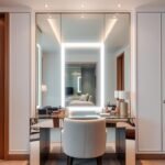
Your entryway to the sleeping area is more than just a functional piece. It’s the first thing you see each morning and the last at night. This surface deserves attention because it frames your personal retreat.
A fresh coat of color can completely shift the vibe of your space. Unlike large renovations, this update is quick and budget-friendly. You can achieve a dramatic change with minimal effort.
Many people believe these features should blend into the background. But interior experts disagree. A thoughtfully designed entry can become a stunning focal point.
“Your entry sets the psychological tone for your entire room. It welcomes you into a space of calm and comfort.”
Color choices impact how light moves through your room. Lighter shades reflect natural light, making the space feel airy. Darker tones add depth and sophistication to your layout.
This element helps create visual harmony between your furniture, walls, and floors. When chosen well, it ties everything together for a cohesive look. Your room feels intentionally designed rather than accidental.
Professional designers emphasize the transformative power of this simple update. It’s one of the most cost-effective ways to refresh your personal sanctuary. You invest little but gain significant aesthetic returns.
Consider these benefits of giving your entry a new look:
- Enhances the overall flow and ambiance of your space
- Creates a strong first impression of your personal area
- Maximizes natural light distribution throughout the room
- Requires minimal investment compared to full renovations
Your sleeping quarters should reflect your personality and provide comfort. Updating this feature helps achieve both goals beautifully. Explore more bedroom entry design inspiration to find what resonates with your style.
| Design Approach | Impact on Room Feel | Cost Level |
|---|---|---|
| Color Coordination | Creates harmony and flow | Low |
| Light-Enhancing Hues | Makes space feel larger | Low |
| Bold Statement Colors | Adds personality and focus | Medium |
| Professional Finish | Elevates entire room’s look | Medium |
Remember that this project doesn’t require professional help. With basic tools and quality materials, you can achieve stunning results. Your home deserves these thoughtful touches that enhance daily living.
This simple change brings new energy to your personal space. It demonstrates how small details contribute significantly to your room’s overall design. Start planning your update today and transform your sanctuary.
How to Choose the Perfect Paint Color for Your Bedroom Door

Selecting the right hue for your entryway can feel overwhelming with so many options available. This decision impacts your entire space’s aesthetic and emotional feel.
Let’s break down the process into manageable steps. You’ll learn how to create harmony between your existing decor and new color choice.
Professional designers emphasize the transformative power of this simple update. Justyna Korczynska, Senior Designer at Crown Paints, notes:
“Paint is the quickest and most effective way to add instant impact and change the mood and atmosphere of a room. The darker the color the more light it absorbs – so reds, plums and terracottas will visually bring walls inwards, making a room look warm and inviting.”
Considering Your Existing Room Palette
Start by assessing your current color scheme. Look at walls, furniture, and flooring to identify dominant tones.
The 60-30-10 rule helps create balanced spaces. Your walls typically represent 60% of the color, upholstery 30%, and accents 10%.
Your entryway usually falls into the 30% category. It should complement rather than compete with other elements.
Consider these approaches for color harmony:
- Match your trim: Creates seamless flow between architectural elements
- Complement wall colors: Choose analogous colors from the same family
- Create intentional contrast: Use complementary colors for dramatic effect
Test samples directly on the surface at different times of day. Natural lighting changes how colors appear throughout daylight hours.
The Psychology of Color: Setting the Right Mood
Colors influence emotions and perceptions in powerful ways. Your choice should align with the vibe you want to create.
Blue tones promote calm and relaxation – perfect for sleeping spaces. Green shades bring natural balance and tranquility.
Warm colors like terracotta and plum add cozy warmth. These darker shades absorb light, creating intimate atmospheres.
Consider your room’s orientation when selecting intensity. North-facing rooms benefit from warmer tones to counter cool light.
South-facing spaces handle cooler colors well with abundant natural light. Always test your preferred shade in your actual lighting conditions.
Digital color tools help visualize options before committing. Many paint brands offer apps that show colors in virtual rooms.
Remember that saturation levels affect ambiance deeply. Muted tones create softer feels while bright hues make bold statements.
Coordinate your choice with fixed elements like flooring and trim. This ensures your new color integrates beautifully with existing features.
Discover 25 Door Painting Ideas Bedroom Designs That Pop

Discover how simple color changes can completely redefine your room’s character. This collection showcases professional approaches that transform ordinary entries into stunning focal elements.
Each concept includes specific product recommendations from top brands. You’ll find technical tips and style compatibility notes for every idea.
Idea 1: Creamy White Elegance
Mountain Peak White by Benjamin Moore creates sophisticated warmth. This creamy shade works beautifully with both modern and traditional spaces.
It reflects light wonderfully while maintaining cozy appeal. Perfect for rooms with limited natural lighting.
Idea 2: Blue-Gray Serenity
Smokestack Gray offers peaceful sophistication. This blue-gray blend creates calming energy in your sanctuary.
It pairs exceptionally well with natural wood tones and crisp white trim. Consider this for north-facing rooms needing warmth.
Idea 3: Clean White Revival
Cloud White provides bright freshness without starkness. This clean white makes spaces feel larger and more open.
It’s ideal for small rooms or those with minimal natural light. The neutral base allows colorful decor to shine.
Idea 4: Stately Blue Contrast
Newburg Green (a sophisticated blue) creates beautiful contrast against light walls. This stately shade adds depth without overwhelming.
It works particularly well in rooms with high ceilings. The color brings traditional elegance to contemporary spaces.
Idea 5: Calming Neutrals with a Half-Wall
Wimborne White by Farrow & Ball offers gentle neutrality. This approach creates visual interest through partial painting.
Paint the lower portion for a unique look that maintains airiness. Perfect for creating definition in open floor plans.
Idea 6: Blue on Blue Harmony
Needlepoint Navy by Sherwin-Williams creates depth through tonal variation. Use slightly different blue shades for walls and entry.
This monochromatic scheme feels cohesive and intentionally designed. It’s particularly effective in coastal-inspired spaces.
Idea 7: Light Gray Backdrop
Smoke Embers provides soft neutral backdrop for colorful decor. This light gray has warm undertones that prevent coldness.
It serves as excellent foundation for bold artwork or vibrant textiles. The versatile shade complements most design styles.
Idea 8: Light Tan for Built-Ins
Savage Ground by Farrow & Ball blends beautifully with built-in features. This light tan creates seamless integration with surrounding elements.
It’s perfect for rooms with architectural detailing or paneling. The earthy tone adds warmth without dramatic contrast.
Idea 9: Rich Green on Natural Wood
Lehigh Green makes stunning statement against wood grains. This rich green creates nature-inspired sophistication.
It works exceptionally well in spaces with hardwood floors or beams. The deep hue adds luxury feel to rustic designs.
Idea 10: Soft Pink Glow
Intimate White by Sherwin-Williams offers subtle pink undertones. This soft hue creates gentle warmth and romantic ambiance.
It reflects light beautifully during golden hour. Perfect for creating soft, inviting atmosphere in personal spaces.
Idea 11: Moody Green Cocoon
Muddled Basil creates intimate, enveloping feeling. This moody green works beautifully in rooms with ample natural light.
It pairs wonderfully with brass hardware and natural textures. The deep shade adds sophistication to minimalist designs.
Idea 12: Warm Neutral Backdrop
In the Cloud by Porter Paints provides versatile warm neutral. This flexible shade works with countless color schemes.
It serves as perfect background for evolving decor preferences. The warmth prevents sterile feeling in contemporary spaces.
Idea 13: Soft Gray-Green Serenity
Contemplation by Behr offers peaceful gray-green balance. This soothing shade creates spa-like tranquility.
It works beautifully in rooms with natural materials and organic textures. The color promotes relaxation and calm energy.
Idea 14: Dusty Pink Earthiness
Setting Plaster by Farrow & Ball provides earthy pink sophistication. This dusty tone adds warmth without overwhelming sweetness.
It complements both modern and vintage design elements beautifully. The unique shade creates memorable personality.
Idea 15: Textured Neutral Plaster
Brooks Roman Clay by Portola Paints adds dimensional texture. This plaster finish creates artistic, handcrafted appearance.
It works particularly well in Mediterranean or rustic inspired spaces. The texture adds interest while maintaining neutral palette.
Idea 16: Rich Cocoa Brown
Pine Cone Brown by Benjamin Moore offers deep, chocolate sophistication. This rich brown creates cozy, enveloping atmosphere.
It pairs beautifully with cream tones and natural wood elements. Perfect for creating intimate, library-like feeling.
Idea 17: Sophisticated Gallery Green
Calke Green by Farrow & Ball provides museum-worthy elegance. This sophisticated green adds artistic credibility.
It works exceptionally well in spaces with art collections or sculptures. The color creates gallery-like ambiance.
Idea 18: Coastal Blue Ceiling Accent
Lullaby by Sherwin-Williams creates beach-inspired serenity. Use this coastal blue for unexpected ceiling accent.
It adds vacation-like feeling to your personal space. The light blue reflects brightness throughout the room.
Idea 19: Warm Off-White Balance
Alabaster by Sherwin-Williams offers perfect warm white balance. This off-white provides cleanliness without sterility.
It works beautifully in rooms with mixed light sources. The warmth creates inviting, comfortable atmosphere.
Idea 20: Two-Tone Navy and White
Combine Decorators White and Mark Twain Gray Brick for dynamic contrast. This two-tone approach adds architectural interest.
It’s perfect for traditional homes with paneled entries. The combination feels both classic and contemporary.
Idea 21: Painted Furniture as a Focal Point
Extend your color scheme to matching furniture pieces. This creates cohesive, intentionally designed look throughout.
Choose pieces that complement rather than match exactly. The coordinated approach feels professional and polished.
Idea 22: Bold Geometric Patterns
Add personality with painted geometric designs. Use painter’s tape for crisp, clean lines and shapes.
This approach works particularly well on flat-panel entries. It adds artistic flair without permanent commitment.
Idea 23: Chalkboard Door for Creativity
Transform your entry into functional art surface. Chalkboard paint allows daily creative expression.
It’s perfect for family homes or creative spaces. The functional element adds playful personality.
Idea 24: Decoupage for Personalized Texture
Add dimensional interest with decoupage techniques. Use wallpaper scraps or decorative papers for custom look.
This approach creates truly unique, personal statement. It works beautifully on smooth, flat surfaces.
Idea 25: Metallic Accents for a Touch of Glam
Add metallic details for sophisticated shimmer. Use gold or silver leaf accents for luxury effect.
This works particularly well on panel details or edges. The metallic touch catches light beautifully.
Each concept offers unique way to personalize your space. Consider your existing decor and lighting conditions when choosing.
Remember that proper preparation ensures professional-looking results. Always test colors in your actual space before committing.
Color Inspiration: Palettes to Transform Your Space

Choosing colors for your room involves more than picking a single shade. It’s about creating complete color systems that work together. These palettes set the emotional tone and visual harmony of your personal area.
Professional designers organize colors by their psychological impact and style compatibility. This approach helps you create cohesive designs rather than random choices.
Each palette offers specific feelings and functions. You can mix shades within families for depth and interest.
Consider your existing furniture and lighting when selecting palettes. Natural and artificial light changes how colors appear throughout the day.
Paint experts at Lick note:
“Green is known to calm the mind and provide a restful backdrop. While calming blue is another color that will create a soothing bedroom vibe and a restful night’s sleep.”
Whites and Neutrals for a Clean Canvas
White and neutral palettes offer incredible versatility for your space. They create calm backgrounds that let other elements shine.
These colors reflect light beautifully, making rooms feel larger and brighter. They work with any design style from modern to traditional.
Consider these popular options:
- Warm Whites: Benjamin Moore’s White Dove adds gentle warmth without yellow tones
- Cool Whites: Sherwin-Williams Extra White provides crisp, clean brightness
- Complex Neutrals: Farrow & Ball’s School House White offers subtle gray undertones
Neutral palettes create perfect backdrops for natural wood elements and colorful decor. They allow easy updates without repainting entire rooms.
These shades work particularly well in rooms with multiple light sources. They maintain consistent appearance under both natural and artificial lighting.
Blues and Grays for a Calming Vibe
Blue and gray families create peaceful, serene environments perfect for relaxation. These colors lower heart rates and promote restful sleep.
Lighter blues make spaces feel airy and open. Darker shades add sophistication and depth to your design.
Gray tones offer modern neutrality with emotional coolness. They pair beautifully with both warm and cool accent colors.
Excellent choices include:
- Pale Sky Blue: Behr’s Sky High creates uplifting freshness
- Medium Gray-Blue: Sherwin-Williams Sleepy Blue provides perfect balance
- Deep Navy: Benjamin Moore’s Hale Navy adds dramatic contrast
These colors work well in south-facing rooms with abundant natural light. They help balance warmth from sunlight while maintaining cool tranquility.
Greens for a Nature-Inspired Retreat
Green palettes connect your space to the calming power of nature. These colors reduce stress and create restorative environments.
Lighter greens bring freshness and vitality to rooms. Darker greens add richness and sophistication to your design.
Green works beautifully with natural materials like wood and stone. It creates harmonious flow between indoor and outdoor elements.
Consider these nature-inspired options:
- Fresh Mint: Benjamin Moore’s Sweet Spring offers cheerful brightness
- Sage Green: Farrow & Ball’s Breakfast Room Green provides earthy elegance
- Forest Green: Sherwin-Williams Rookwood Dark Green adds deep luxury
These shades work particularly well in rooms with limited natural light. They add life and energy without overwhelming the space.
Pinks and Terracottas for Warmth and Energy
Warm color families add energy and comfort to your personal space. These shades create inviting atmospheres that feel both lively and relaxing.
Pink tones range from soft blushes to vibrant magentas. They add playful energy while maintaining sophistication.
Terracottas and earthy oranges bring warmth and organic feeling. These colors work beautifully with natural materials and textiles.
As paint experts note:
“For a more energetic color, pink is a shade that will have you bouncing out of bed.”
Excellent warm choices include:
- Soft Blush: Sherwin-Williams Innocence provides gentle warmth
- Dusty Rose: Farrow & Ball’s Setting Plaster adds earthy sophistication
- Rich Terracotta: Benjamin Moore’s Burnt Orange offers vibrant energy
These palettes work beautifully in north-facing rooms that need extra warmth. They complement both modern and traditional design elements beautifully.
Remember to test colors in your actual space before final decisions. Lighting conditions dramatically affect how colors appear throughout the day.
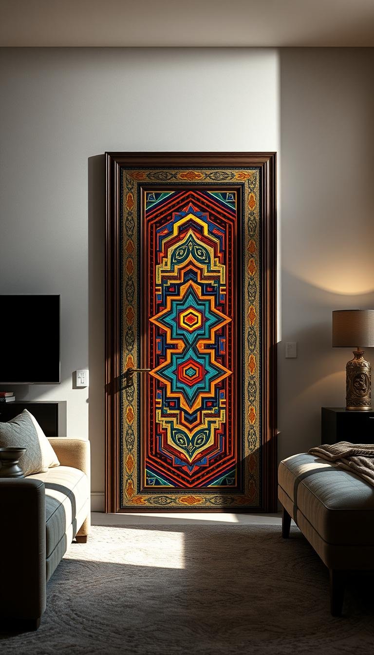
Creating a Focal Point with Your Painted Door

Your entry can become the star of your personal space with smart color choices. A strong visual anchor transforms how you experience your room.
Interior experts know the power of intentional focal points. These elements guide your eye and create visual hierarchy. Your painted surface offers perfect opportunity for this design strategy.
Strategic placement matters for maximum impact. Position colorful entries where they naturally draw attention. This creates flow through your space.
Color contrast makes surfaces stand out beautifully. Dark hues against light walls create dramatic effect. Light tones against dark backgrounds offer fresh modern vibe.
Decorative details add personality to your space. Consider adding molding or unique hardware. These touches elevate your basic surface into art piece.
Unusual finishes create memorable moments. Metallic accents or textured paints add depth. These special treatments make your entry conversation starter.
Balance remains crucial with bold choices. Justyna Korczynska, Senior Designer at Crown Paints, advises:
“Working with bold, dark colors should be all about balance. Always make sure you incorporate neutral and pale features into the room, whether that’s through furniture, accessories or other paint colors, that will light up the space.”
Use your colorful surface to highlight architectural features. It can emphasize interesting trim or unique proportions. This approach celebrates your room’s existing character.
Psychological impact matters at your room’s entrance. A strong visual element sets positive tone for your space. It creates welcoming atmosphere that feels intentionally designed.
Professional projects show successful examples. Many homes use colorful entries as primary design feature. These spaces feel cohesive and thoughtfully planned.
Choose between subtle or dramatic approaches. Your overall interior style guides this decision. Minimalist spaces might prefer whisper of color.
Bold personalities can embrace vibrant statements. Either approach creates intentional living environment. Your choice reflects personal style.
Coordinate with other attention-grabbing elements. Ensure your colorful surface complements rather than competes. This creates harmonious visual experience.
Small spaces benefit greatly from this approach. A strong focal point makes compact rooms feel designed. It adds personality without overwhelming limited square footage.
These ideas work across various homes and styles. They provide fresh inspiration for your personal space. Your room deserves this thoughtful touch.
Remember that preparation ensures beautiful results. Test your colors and consider overall balance. Your efforts will create stunning transformation.
Beyond the Door: Painting Panels, Furniture, and Floors

Your creative journey doesn’t stop at the entryway. Many surfaces in your personal space can benefit from colorful updates. This approach creates complete harmony throughout your entire room.
Wall panels offer wonderful opportunities for artistic expression. These architectural elements add depth and character to any space. Proper preparation ensures beautiful, lasting results.
Start by cleaning surfaces thoroughly with mild detergent. Sand any rough areas gently to create smooth canvas. Apply high-quality primer specifically designed for your material.
Choose finishes that complement your overall aesthetic. Semi-gloss works beautifully on panels for easy cleaning. Matte finishes hide imperfections on older surfaces.
Furniture transformations bring incredible personality to your space. That dated dresser or nightstand gets new life with fresh color. Even your bed frame can become stunning focal point.
Consider these popular furniture painting techniques:
- Chalk paint: Requires minimal prep work and offers matte finish
- Milk paint: Provides vintage look with authentic character
- High-gloss enamel: Creates durable, wipeable surface for daily use
Painted floors represent growing trend in interior design. This bold choice adds unique personality to your personal area. It works particularly well in spaces with good natural lighting.
Floor painting requires specific products for durability. Use floor enamel designed for high-traffic areas. Proper sealing protects your beautiful work from daily wear.
Create cohesive color stories throughout your space. Connect your entry color to other elements subtly. This approach makes your room feel intentionally designed.
Consider these expert techniques for different surfaces:
| Surface Type | Recommended Paint | Drying Time | Maintenance Level |
|---|---|---|---|
| Wood Panels | Acrylic Latex | 4-6 hours | Low |
| Furniture | Chalk or Milk Paint | 2-4 hours | Medium |
| Flooring | Floor Enamel | 24 hours | High |
| Ceiling | Flat Latex | 2-3 hours | Low |
Safety remains crucial during painting projects. Ensure proper ventilation throughout your workspace. Open windows and use fans to circulate fresh air.
Wear appropriate protective gear during application. Masks prevent inhalation of fumes and particles. Gloves protect your skin from chemicals and stains.
Timeline estimates help plan your projects effectively. Panel painting typically takes 2-3 days with drying time. Furniture projects might require 3-5 days for complete transformation.
Floor projects demand patience and careful planning. Allow at least 5-7 days for proper curing. Avoid placing furniture until completely dry.
Maintenance keeps your painted surfaces looking fresh. Use gentle cleaners specifically formulated for painted surfaces. Avoid abrasive scrubbing that might damage your finish.
Touch-up paint helps address minor scratches or chips. Keep small amounts of your original color for quick fixes. This preserves your beautiful work for years.
These techniques bring new energy to your entire space. They transform tired elements into beautiful features. Your room becomes complete, harmonious sanctuary.
Remember that color connects all elements beautifully. Your choices create specific mood and atmosphere. Every surface contributes to your overall living experience.
This comprehensive approach makes your space truly special. It reflects personal style and creative vision. Your home becomes expression of your unique personality.
DIY Painting Techniques for a Professional Finish
Transform your entryway with expert methods that deliver stunning results. Proper techniques make all the difference between amateur and professional outcomes.
You can achieve beautiful finishes without hiring professionals. These methods work for various surfaces throughout your space.
Essential Prep Work for a Flawless Coat
Preparation determines your final look more than any other step. Start by removing hardware like handles and hinges.
Clean surfaces thoroughly with mild soap and warm water. Remove all grease, dirt, and dust particles. Let everything dry completely before sanding.
Light sanding creates perfect adhesion surface. Use 120-grit sandpaper for smooth, even texture. Wipe away dust with tack cloth afterward.
Apply high-quality primer specifically designed for your material. This ensures even color absorption and prevents bleed-through. Let primer dry completely according to manufacturer instructions.
For previously painted surfaces, check for lead content if built before 1978. Safety always comes first in any DIY project.
Choosing the Right Finish: Matte, Eggshell, or Gloss?
Paint finishes dramatically affect your final effect and maintenance needs. Each option offers unique advantages for different applications.
Matte finish provides non-reflective, velvety appearance. It hides imperfections beautifully on older surfaces. This option requires careful cleaning as it marks easily.
Eggshell offers slight sheen between matte and satin. It provides excellent durability for high-traffic areas. This versatile choice works well throughout most homes.
Satin finish delivers soft glow with good washability. It resists moisture and stains effectively. Many designers recommend this for frequently used entries.
Semi-gloss creates noticeable shine with excellent durability. It withstands frequent cleaning and handling. This practical option works well in family spaces.
High-gloss offers dramatic reflective quality and maximum durability. It highlights architectural details beautifully. This bold choice makes strong style statement.
Consider chalk paint for minimal preparation requirements. This specialty product levels and seals itself during application. It provides excellent coverage with less effort than traditional options.
Chalk paint works wonderfully on furniture pieces too. Painting a wardrobe or bedside table becomes manageable project. Even beginners can achieve professional-looking results.
Application techniques vary based on your desired outcome. Brushing works best for detailed areas and edges. Rolling covers large, flat surfaces quickly and evenly.
Spraying delivers smoothest possible finish but requires masking. Always work in well-ventilated areas when spraying. Protect surrounding surfaces from overspray.
Maintain wet edge to avoid lap marks and streaks. Work in manageable sections from top to bottom. Apply thin, even coats rather than thick layers.
Allow proper drying time between coats. Most paints need 4-6 hours before recoating. Follow manufacturer recommendations for best results.
Clean tools immediately after use for longevity. Store leftover paint properly for future touch-ups. Label containers with color name and date.
Your beautiful work will last years with proper technique. These methods ensure professional-quality finish every time.
Design Styles to Guide Your Door Painting Project
Your personal space deserves a cohesive look that reflects your unique taste. Different design approaches offer various ways to achieve harmony throughout your room.
Understanding these styles helps you make informed choices. Each brings distinct characteristics that influence color selection and finishes.
Your entryway becomes integral part of your overall interior scheme. It should complement rather than conflict with your existing decor.
Let’s explore popular aesthetics that might inspire your project. You’ll discover how each style influences surface treatments and color palettes.
Modern Minimalist
This design approach celebrates simplicity and functionality. Clean lines and uncluttered spaces define the minimalist style.
Choose neutral colors with subtle undertones for your surface. Soft grays, warm whites, and muted beiges work beautifully.
Matte or eggshell finishes maintain the understated elegance. Avoid glossy surfaces that might create visual noise.
Scandinavian influences bring soothing elements to minimalist spaces. Light wood tones and functional details enhance the serene atmosphere.
Metallic accents add sophisticated shimmer without overwhelming. Brass or chrome hardware provides perfect finishing touch.
This style creates calming backdrop for your personal sanctuary. It promotes relaxation through visual simplicity.
Rustic and Farmhouse Charm
Rustic design embraces natural materials and vintage appeal. Weathered finishes and distressed techniques work wonderfully.
Natural wood tones showcase beautiful grain patterns. If painting, choose colors that mimic aged patinas.
Soft greens, warm grays, and creamy whites complement this style. They echo colors found in nature and traditional settings.
Consider techniques that add character and history. Light distressing or glazing creates timeworn appearance.
Farmhouse charm combines practicality with cozy aesthetics. Simple panel designs and classic hardware complete the look.
This style brings warmth and authenticity to your space. It creates inviting atmosphere that feels both lived-in and loved.
Coastal and Airy
Coastal design captures the relaxed feeling of seaside living. Light, airy colors dominate this refreshing style.
Soft blues, sandy neutrals, and crisp whites create beachy vibe. These colors reflect natural light beautifully.
Weathered finishes suggest sun-bleached wood and salt air. Matte or satin finishes maintain the casual elegance.
Nautical influences might include subtle stripe patterns. Keep these details minimal for sophisticated approach.
This style makes your space feel bright and expansive. It brings vacation-like serenity to your daily living.
Boho Chic and Eclectic
Boho style celebrates personal expression and global influences. Vibrant colors and pattern mixing define this adventurous approach.
Don’t be afraid to experiment with bold hues. Rich terracottas, deep blues, and spicy oranges create exciting contrast.
Eclectic design allows mixing elements from various styles. Your surface becomes canvas for creative experimentation.
Consider decorative techniques like stenciling or decoupage. These add personal touch and visual interest.
This style reflects your unique personality and travels. It creates space that feels truly individual and inspired.
Each design approach offers distinct mood and functionality. Consider how these styles align with your existing furniture and decor.
Many homes successfully blend elements from multiple styles. This creates personalized look that feels cohesive yet unique.
| Design Style | Recommended Colors | Finish Type | Hardware Style |
|---|---|---|---|
| Modern Minimalist | Warm Whites, Soft Grays | Matte, Eggshell | Sleek Metal, Minimalist |
| Rustic Farmhouse | Muted Greens, Creamy Whites | Distressed, Satin | Black Iron, Vintage |
| Coastal Airy | Soft Blues, Sandy Neutrals | Matte, Weathered | Brass, Nautical |
| Boho Eclectic | Vibrant Hues, Earth Tones | Varied, Textured | Mixed Materials, Global |
Your surface treatment significantly affects room perception. Lighter colors make spaces feel larger and airier.
Darker shades create cozy, intimate atmospheres. Consider your room’s size and natural lighting when choosing.
Many online resources offer further design inspiration. Pinterest and design blogs showcase real-life examples.
Remember that your personal preference matters most. Choose colors and styles that make you happy every day.
Your space should reflect your personality and provide comfort. These design approaches help achieve both goals beautifully.
Considering Your Room’s Size and Lighting
Your space dimensions and light conditions greatly influence color choices. These factors determine how colors appear and affect your room’s overall feel.
Smart selections can transform your area dramatically. They either expand perceived space or create cozy intimacy.
Understanding these principles helps you make informed decisions. Your entryway becomes integral to your room’s visual harmony.
Tips for Making a Small Bedroom Feel Larger
Light colors work wonders in compact spaces. They reflect available light and create airy openness.
Choose pale shades with subtle undertones. Soft grays, warm whites, and gentle blues expand visual boundaries.
Consider these effective techniques:
- Monochromatic schemes: Use similar tones throughout for seamless flow
- High-gloss finishes: Reflect light and add depth to small areas
- Vertical patterns: Create illusion of height with subtle stripes
Mirror-like effects from glossy surfaces bounce light around. This makes your space feel more spacious and bright.
Keep hardware and trim in similar light tones. This maintains visual continuity without breaking sight lines.
Using Color to Enhance Natural Light
Light direction significantly affects color perception. North-facing rooms receive cool, soft light throughout the day.
These spaces benefit from warm undertones. They counterbalance the naturally cool light quality.
South-facing rooms enjoy warm, bright light. They handle both cool and warm colors beautifully.
As design expert Justyna Korczynska notes:
“The darker the color the more light it absorbs – so reds, plums and terracottas will visually bring walls inwards, making a room look warm and inviting.”
Test paint samples at different times. Colors change appearance under morning, noon, and evening light.
Consider these lighting solutions:
- Limited windows: Use light-reflective colors and glossy finishes
- Uneven light: Balance with strategic artificial lighting placement
- Artificial bulbs: Choose full-spectrum bulbs for truest color rendering
Dark colors create intimate atmospheres in well-lit spaces. They absorb light and make rooms feel cozy and enclosed.
Gloss levels significantly impact light reflection. Higher sheen bounces more light around your space.
Balance natural and artificial light effects. Choose colors that work well under both conditions for consistent appearance.
Your room’s unique characteristics guide final choices. Always test colors in your actual space before committing.
How to Balance Your New Door Color with Bedroom Decor
Creating harmony between your entryway and room design makes your space feel intentional. A well-balanced color scheme ties everything together beautifully.
Marianne Shillingford, Creative Director at Dulux, shares expert insight:
“Layering colors together and allowing one color to meet another just beyond the corner of the room has an amazing effect on a space. It makes a room feel less like a box and more like a gallery for the things in your life that you really care about, including your favourite colors. Use one color as a predominant backdrop and then add painted details in colors which are inspired by the things that are staying in the room.”
The 60-30-10 rule helps distribute colors throughout your space. Walls typically cover 60% of visible area. Furniture and larger items make up 30%. Accents and decorative elements complete the remaining 10%.
Your entryway usually falls into the 30% category. It should complement rather than compete with other elements. This creates visual flow throughout your personal area.
Bold entry colors need careful balancing with surrounding decor. Pair vibrant hues with neutral walls and furniture. This prevents overwhelming your space with too much intensity.
Consider these techniques for successful color integration:
- Choose wall colors that share undertones with your entry hue
- Select bedding and textiles that pick up accent colors
- Use artwork that bridges color differences between elements
- Incorporate natural wood tones to soften color transitions
Hallway transitions require special attention. Your entry color should flow naturally into adjacent spaces. Consider continuing your color scheme slightly beyond the frame.
This technique creates seamless movement between areas. It makes your entire home feel connected and thoughtfully designed.
Accessories and textiles help tie your color story together. Throw pillows, rugs, and curtains can echo your entry hue. This creates repetition that feels intentional rather than accidental.
Even small decorative items can reinforce your color choices. Vases, picture frames, and books add subtle color connections throughout your space.
Fixed elements like flooring or trim might limit your options. Work with these existing features rather than against them. Choose entry colors that complement these permanent aspects.
Natural materials interact uniquely with painted surfaces. Wood grains and stone textures add organic balance to solid colors. They prevent your space from feeling too manufactured or perfect.
After painting, you might need to adjust other decor elements. Sometimes a simple accessory change creates better balance. Don’t be afraid to experiment with different arrangements.
Mood boards help visualize color relationships before committing. Collect paint samples, fabric swatches, and material samples. Arrange them together to see how they interact.
Digital tools offer excellent color planning assistance. Many paint brands provide room visualization apps. These help you test color combinations in virtual settings.
Professional designers use systematic approaches to color harmony. They consider light reflection, spatial relationships, and emotional impact. You can apply these same principles to your space.
| Color Challenge | Balancing Solution | Visual Effect |
|---|---|---|
| Bold Entry with Neutral Room | Add matching accent pillows and art | Creates intentional focal point |
| Mismatched Fixed Elements | Choose transitional color that bridges both | Creates harmonious flow |
| Small Space with Dark Color | Use light-reflective accessories nearby | Prevents overwhelming feeling |
| Multiple Color Styles | Use natural materials as common denominator | Creates cohesive eclectic look |
Your personal space should reflect your unique style while feeling balanced. Color coordination creates this sense of harmony throughout your room.
Remember that successful design often involves subtle adjustments. Small changes can dramatically improve how colors work together in your space.
Your Next Steps to a Bedroom You’ll Love
Now you have the inspiration and tools to refresh your personal space. A fresh coat of paint brings new life and vibe to your room.
Start by choosing a shade that matches your decor and desired mood. Test samples on your surface at different times of day. This ensures the color looks perfect in your actual lighting.
Gather quality brushes, primer, and your chosen paint. Clean and sand the surface well before starting. Apply thin, even coats for a professional look.
This affordable update makes a big effect in your home. It adds personality without a full renovation. Your bedroom becomes a true reflection of your style.
Share your finished project online to inspire others. Keep extra paint for future touch-ups. Enjoy your beautiful, transformed space!