Welcome to your journey toward a more vibrant home! Your living space should reflect your personality and bring you joy every day.
The right color choices can completely transform how a room feels. They create energy, warmth, and inspiration in your environment.
You don’t need to be a designer to create beautiful spaces. This guide makes colorful decor accessible to everyone.
Forget about major renovations. With smart choices and bold creativity, you can achieve amazing results.
We’ll explore walls, furniture, and accessories that spark happiness. Your personal style should guide every decision.
Whether you have a cozy apartment or spacious home, these ideas work everywhere. Embrace experimentation and make your space uniquely yours!
Why It’s Time to Embrace Color in Your Living Room
Science reveals a powerful truth about our surroundings: color directly shapes your emotional experience. The hues you choose for your space do more than please the eye – they influence your mental state in profound ways.
After years of minimalist design dominating the interior landscape, people are rediscovering the joy of personal expression. Your home should reflect your unique personality, not follow trends that don’t spark happiness.
The Psychology of Color and Mood
Different colors trigger specific emotional responses that science continues to validate. Research shows that surrounding yourself with certain hues can actually change your brain chemistry.
Blue environments promote calmness and relaxation, making them perfect for reducing daily stress. Yellow spaces generate mental energy and optimism, brightening your entire day.
Green tones create a sense of balance and renewal, connecting you to nature’s restorative power. Red accents stimulate excitement and passion, adding dynamic energy to any room.
These aren’t just design theories – they’re psychological facts backed by numerous studies. The right color palette can literally improve your quality of life.
Moving Beyond the Neutral Trend
Neutrals dominated design for years because they felt safe and universally acceptable. However, this approach often creates spaces that lack personality and emotional depth.
The limitation of all-neutral schemes is their inability to truly reflect who you are. They may look sophisticated, but they rarely feel personally meaningful or inspiring.
We’re experiencing a cultural shift toward more expressive home environments. People want spaces that tell their story and spark creativity rather than blend in anonymously.
Overcoming color fears is easier than you think. Start with small accents rather than painting all your walls at once. Test samples and see how different tones make you feel throughout the day.
Remember: adding color demonstrates confidence, not chaos. It allows for authentic self-expression that neutrals simply cannot provide. Your home should be your sanctuary, not a showroom.
Colorful environments have been shown to reduce stress and increase feelings of happiness. They stimulate creative thinking and make spaces feel more inviting to both residents and guests.
Moving beyond neutrals opens up a world of personal expression. It transforms your living area from a generic space into a true reflection of your identity and joy.
How to Choose Your Living Room’s Color Palette
Creating your perfect color scheme begins with understanding what truly makes you happy. Your personal preferences should guide every decision rather than following fleeting trends. This approach ensures your space feels authentically yours for years to come.
Finding Colors That Spark Joy for You
Start by considering colors that trigger positive memories or emotions. Think about your favorite places, artworks, or even clothing items. These personal connections often reveal your true color preferences.
Consider how different tones make you feel throughout the day. Natural light changes how colors appear in your home. Test samples at various times to see their true character.
Your existing furniture and decor elements matter too. Look at pieces you already love and build around them. This creates harmony between new and existing elements.
Create a mood board with fabric swatches, paint chips, and inspiration images. Digital tools like Pinterest help visualize combinations before committing. This prevents costly mistakes and ensures cohesion.
Remember that personal associations often trump design rules. If cerulean blue reminds you of childhood summers, embrace it! These emotional connections create spaces that feel deeply personal.
Understanding the 60-30-10 Rule for Balance
This classic design principle creates visual harmony through mathematical proportions. It divides your color scheme into three distinct roles for balanced results.
The dominant color covers about 60% of your space. This typically includes walls, large furniture, and area rugs. Choose a tone you love seeing everywhere.
Secondary colors make up 30% of the visual weight. These appear in upholstery, curtains, and medium-sized elements. They should complement your main hue beautifully.
Accent colors claim the remaining 10% for punctuation. Use these in throw pillows, artwork, and small accessories. This is where you can experiment with bold choices.
| Percentage | Color Role | Application Examples | Living Room Implementation |
|---|---|---|---|
| 60% | Dominant Color | Walls, sofa, large rug | Soft gray walls, neutral sectional |
| 30% | Secondary Color | Curtains, chairs, bookshelves | Deep blue accent chair, patterned curtains |
| 10% | Accent Color | Pillows, art, accessories | Mustard yellow throw pillows, vibrant artwork |
Adjust color intensity based on your room’s size and lighting. Smaller spaces often benefit from lighter, airier tones. North-facing rooms might need warmer hues to feel inviting.
Consider using a color wheel to find complementary schemes. Opposite colors create dynamic contrast while analogous tones offer subtle harmony. Both approaches work within the 60-30-10 framework.
Always test your palette in the actual space before finalizing. Paint large swatches on different walls to observe color changes throughout the day. Live with them for a few days to ensure they feel right.
Balance bold choices with neutral elements for visual rest. Even the most vibrant schemes need calming areas for the eyes to pause. This creates rhythm and prevents overwhelming feelings.
Your final palette should tell a cohesive story throughout the space. Each color should relate to others in some way, creating harmony rather than chaos. This thoughtful approach yields professional-looking results.
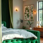
Make a Bold Statement with an Accent Wall
An accent wall transforms your space instantly. It creates a powerful focal point without overwhelming the entire room. This design choice adds personality and architectural interest.
Your accent wall becomes the star of your interior. It draws attention and sets the mood for the whole area. This approach works in any size space.
Choosing the Perfect Wall for Maximum Impact
Select the wall that naturally draws your eye when entering. This is usually the one behind your sofa or facing the entrance. It should have minimal interruptions like windows or doors.
Consider the wall’s purpose in your room layout. An accent wall can define separate areas in open-concept spaces. It creates visual boundaries without physical dividers.
Architectural features matter too. Walls with fireplaces or built-in shelves make excellent candidates. They already serve as natural focal points.
Exploring Paint vs. Wallpaper for Your Statement
Paint offers flexibility and affordability. You can easily change colors later. It works well for simple color-blocking techniques.
Wallpaper provides texture and complex patterns. Modern options like KunstLoft collections offer stunning designs. Their ‘Luxe Geometry’ and ‘Retro Geometric’ patterns create instant drama.
Consider these factors when deciding:
| Factor | Paint | Wallpaper |
|---|---|---|
| Cost | Budget-friendly | Higher investment |
| Installation | DIY-friendly | Professional recommended |
| Durability | Easy touch-ups | Long-lasting |
| Design Options | Solid colors | Patterns and textures |
| Commitment Level | Easy to change | More permanent |
Murals create breathtaking focal points. They tell stories through art. Geometric patterns add modern energy through sharp lines and repetition.
Color-blocking uses bold paint colors in geometric shapes. It creates custom looks without wallpaper. This technique works well on feature walls.
Choose colors that complement your existing decor. Pull hues from your rug, artwork, or accessories. This creates cohesion throughout the space.
Balance bold walls with neutral elements. Your accent wall should stand out without competing. Use calming tones on adjacent walls and furniture.
The right accent wall doesn’t just decorate space—it defines character and creates emotional resonance.
Different colors create different moods. Deep blues feel calming and sophisticated. Vibrant yellows bring energy and optimism.
Patterns affect perception too. Large patterns make walls feel closer. Small patterns create depth and movement.
Budget-friendly options include:
- Paint samples and tester pots
- Removable wallpaper panels
- DIY stenciling techniques
- Wall decals and stickers
Professional designers often use accent walls to solve layout challenges. They might use dark colors to make large rooms feel cozier. Light colors can make small spaces appear larger.
Always test your choice in different lighting. Observe how it looks at various times of day. Live with samples for a few days before deciding.
Anchor the Room with a Vibrant Area Rug

Your floor covering serves as the foundation that brings everything together. A well-chosen rug establishes visual harmony while adding personality to your space.
Rugs provide both comfort and style underfoot. They create a cohesive look that ties furniture arrangements together beautifully.
Selecting Patterns: Moroccan, Abstract, and Floral
Different pattern styles create distinct moods in your room. Moroccan designs feature geometric motifs that add cultural richness.
Abstract patterns offer modern artistic expression. They work well with contemporary furniture and bold color schemes.
Floral designs bring natural beauty indoors. Large-scale blooms make dramatic statements while smaller patterns create subtle charm.
Consider these popular options from KunstLoft:
- Lost and Found: Bohemian-inspired patterns with layered colors
- Arcadia: Nature-inspired motifs with organic shapes
- Morena: Rich, warm tones with intricate detailing
Choose patterns that complement your existing decor. Pull colors from your artwork or throw pillows for coordination.
How to Layer Rugs for Added Texture and Interest
Layering creates depth and dimension underfoot. Start with a larger neutral base rug for foundation.
Add a smaller patterned rug on top for visual interest. This technique allows you to experiment with bold patterns safely.
Consider these layering combinations:
- Jute base with wool patterned top
- Sisal foundation with colorful kilim
- Neutral shag with geometric overlay
Different materials add varied textures to your space. Wool provides softness while natural fibers offer organic appeal.
Maintenance matters for long-lasting beauty. Choose materials that suit your lifestyle and cleaning preferences.
Rugs define functional areas in open layouts. They create visual boundaries without physical dividers.
Your floor covering adds acoustic comfort and warmth. It absorbs sound while making hard surfaces more inviting.
Remember that rugs offer flexible decor solutions. You can easily swap them for seasonal refreshes or new inspiration.
Incorporate Furniture Pieces That Pop
Your furniture choices make powerful statements about your personal style. Gone are the days of perfectly matched sets that lack personality. Today’s approach celebrates individuality through bold, expressive pieces.
Statement furniture creates instant focal points in your space. These pieces become conversation starters while reflecting your unique taste. They transform ordinary rooms into extraordinary living environments.
Starting Small: Ottomans, Chairs, and Consoles
Begin your colorful journey with manageable investments. Smaller pieces let you experiment without overwhelming your space. They offer flexibility for future changes.
An ottoman serves multiple functions while adding vibrant color. Choose one in emerald green or sapphire blue for instant impact. Use it as extra seating, a coffee table, or footrest.
Accent chairs provide perfect opportunities for bold expression. Try a sunshine yellow armchair beside a neutral sofa. This creates balance while making the chair stand out beautifully.
Console tables offer vertical space for color experimentation. A cherry-red console behind your sofa adds depth and interest. Style it with complementary accessories for cohesion.
These smaller investments help you build confidence with color. You can always move them to different rooms later. This approach reduces commitment anxiety while maximizing style impact.
Mixing and Matching for an Eclectic Vibe
Eclectic design celebrates thoughtful combination rather than perfect matching. It creates spaces that feel collected over time rather than bought all at once. This approach reflects authentic personal history.
Combine different eras and styles for dynamic energy. Pair a mid-century modern chair with a traditional velvet sofa. Use color as the unifying element between diverse pieces.
Consider these successful combinations:
- Cobalt blue sofa with mustard yellow armchairs
- Cherry-red coffee table against soft pastel walls
- Teal console table with coral accent chairs
Vintage and secondhand pieces add character and sustainability. Hunt for unique items at local thrift stores or online marketplaces. These finds often become cherished conversation pieces.
Balance bold furniture with neutral background elements. Let your vibrant pieces shine against calm walls and flooring. This prevents visual overload while maintaining energy.
Different materials enhance color impact through texture. Velvet intensifies color depth while leather offers sophisticated shine. Natural woods provide warm contrast to bright hues.
Your furniture choices affect mood through color psychology. Blue pieces promote calm relaxation in seating areas. Yellow items generate optimism and mental energy throughout your space.
Remember that cohesion comes from repetition rather than matching. Repeat accent colors in different pieces throughout the room. This creates visual harmony without uniformity.
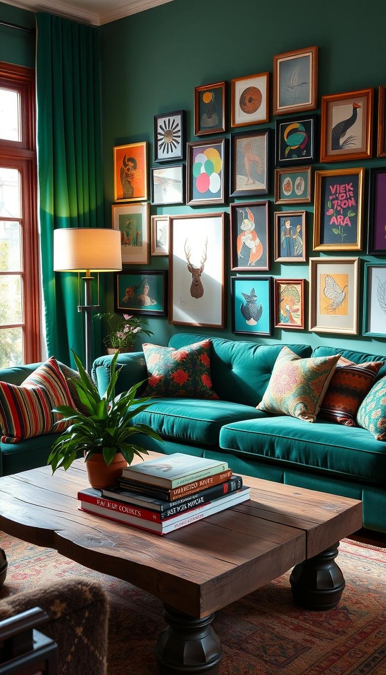
Express Yourself with Vibrant Wall Art

Your walls hold incredible potential for personal expression. They offer the perfect canvas to showcase your unique taste and transform your entire interior. Choosing the right pieces creates an instant focal point that reflects your personality.
Art brings energy and character to any space. It tells your story through color and imagery. The right selection can completely change how a room feels.
You don’t need to be a professional designer to create stunning displays. With some basic guidance, anyone can achieve gallery-worthy results. Your choices should spark joy every time you see them.
Curating a Cohesive Gallery Wall
Gallery walls create dynamic visual interest through thoughtful arrangement. Start by selecting pieces that share a common element. This could be color tones, frame styles, or subject matter.
Consider these popular KunstLoft collections for inspiration:
- ‘Magic Encounter’ by Monet offers soft, dreamy hues
- ‘Elixir of Youth’ paintings feature vibrant, energetic colors
- ‘Earthy Tones 1’ provides natural, grounded shades
- ‘Moon and Shapes’ introduces geometric modernism
- XXL oil paintings make dramatic statements
Arrange your pieces on the floor first to visualize the layout. This prevents unnecessary nail holes and frustration. Mix sizes and orientations for visual balance.
Use these spacing guidelines for professional results:
| Wall Size | Recommended Art Size | Ideal Spacing | Frame Style |
|---|---|---|---|
| Small (under 6 ft) | 16×20″ to 24×36″ | 2-3 inches between pieces | Thin, minimal frames |
| Medium (6-10 ft) | 24×36″ to 36×48″ | 3-4 inches between pieces | Mixed frame widths |
| Large (over 10 ft) | 36×48″ or larger | 4-6 inches between pieces | Bold, substantial frames |
Frames play a crucial role in your overall look. Match frame colors to other metallic elements in your room. Black frames create modern contrast while gold adds warmth.
Tying Art Colors into Your Overall Decor Scheme
Your artwork should complement your existing color palette. Pull one or two dominant colors from your pieces. Use these hues in throw pillows, area rugs, or accessories.
This creates visual harmony throughout your space. It makes your art feel integrated rather than separate. The connection should feel natural, not forced.
Consider these techniques for seamless integration:
- Match artwork blues with ceramic vases or bookshelf items
- Echo painting greens in plant arrangements or textiles
- Repeat accent colors from art in small decorative objects
Oversized pieces work well above sofas or consoles. They anchor furniture arrangements beautifully. Smaller works create intimate moments in reading nooks.
Budget-friendly options include:
- Digital prints from online galleries
- DIY canvas paintings using acrylics
- Secondhand finds from local markets
- Printable art from creative commons sources
Remember that personal connection matters most. Choose pieces that speak to you emotionally. Your art should make you happy every day.
Experiment with different arrangements until it feels right. Your wall display will evolve over time. Add new pieces as you discover artists you love.
Play with Patterns Using Textiles and Throw Pillows
Your soft furnishings offer the easiest path to dramatic transformation. They provide instant personality without permanent commitment or major expense.
Textiles create visual movement and depth throughout your space. They add comfort while keeping your eyes engaged with beautiful details.
The right combinations make your area feel curated and complete. They bring cozy elegance that welcomes both residents and guests.
Mixing Florals, Stripes, and Geometrics Fearlessly
Combining different patterns might feel intimidating at first. The secret lies in maintaining color harmony across all elements.
Start with your largest pattern as the foundation. This could be a floral curtain or geometric area rug. Build smaller patterns around this anchor piece.
Successful pattern mixing follows these simple formulas:
- Large floral + small stripe + solid texture
- Bold geometric + subtle organic + neutral base
- Classic stripe + modern abstract + traditional motif
Maintain consistent color tones across different patterns. This creates cohesion despite varied designs. Your eyes will naturally connect the elements.
Vary pattern scales for visual interest. Combine large, medium, and small designs throughout your space. This prevents competition between elements.
The Power of Throws and Curtains to Add Dimension
Window treatments frame your space with vertical color elements. They draw the eye upward while controlling light and privacy.
Curtains in bold patterns make architectural statements. They can make ceilings appear higher and rooms feel grander.
Throws add instant coziness and casual elegance. Drape them over sofas or chairs for inviting comfort. They provide warmth during cooler months.
Apply the 60-30-10 rule to your textile selections:
| Percentage | Color Role | Textile Applications |
|---|---|---|
| 60% | Dominant Color | Sofa, curtains, large rug |
| 30% | Secondary Color | Accent chairs, smaller textiles |
| 10% | Accent Color | Throw pillows, decorative throws |
Rotate textiles seasonally for fresh inspiration. Lightweight linens work beautifully in summer. Switch to wool and velvet for winter months.
Consider material durability for high-use areas. Performance fabrics resist stains while maintaining beauty. Natural fibers offer breathability and texture.
Layer different textiles for dimensional interest. Combine knits with wovens and smooth with textured fabrics. This creates rich visual depth throughout your space.
Your throw pillows provide the perfect accent punctuation. Mix sizes and shapes for custom arrangements. They offer affordable opportunities for color experimentation.
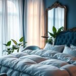
Invite Nature Inside with Lush Greenery

Plants bring dynamic beauty that evolves with the seasons. They offer living color that changes and grows alongside your personal style. This natural approach creates authentic charm in your home.
Greenery provides more than visual appeal. It transforms the atmosphere through movement and life. Your space gains organic energy that artificial decor cannot replicate.
Selecting Plants for Color and Air Purification
Choose plants based on your light conditions and maintenance preferences. Some species thrive in bright natural light while others prefer shaded areas.
Colorful foliage extends beyond basic green varieties. Croton plants offer vibrant reds, oranges, and yellows. Purple heart plants provide deep violet tones.
Chinese evergreens display beautiful pink and silver patterns. They adapt well to various lighting situations. These plants clean your air while adding visual interest.
Air-purifying species remove toxins and increase oxygen levels. Snake plants filter air effectively and require minimal care. Peace lilies reduce mold spores and volatile compounds.
Research shows plants lower stress and boost mood. They create calming environments that promote relaxation. This natural therapy enhances your daily experience.
Using Colorful Planters as Double Accents
Plant containers offer additional opportunities for expression. Choose pots that complement your plant’s foliage and your room’s palette. This creates cohesive beauty throughout your space.
Mix different planter materials for textural interest. Ceramic pots provide glossy sophistication. Terracotta offers earthy warmth and natural appeal.
Consider these arrangement techniques for visual impact:
- Group plants at varying heights using stands and shelves
- Create focal points with large statement plants in bright containers
- Use trailing plants in hanging planters for vertical interest
- Combine different leaf textures and shapes for dynamic displays
Rotate plants seasonally to maintain vibrant appearances. Some species offer seasonal color changes or blooming periods. This keeps your decor fresh and evolving.
Proper care ensures plants remain healthy and beautiful. Follow watering guidelines specific to each species. Most plants benefit from regular dusting of their leaves.
Plants don’t just decorate space—they breathe life into it, creating environments that nurture both body and spirit.
Choose plant sizes appropriate for your available area. Large floor plants make dramatic statements in spacious rooms. Smaller tabletop varieties work perfectly in compact areas.
Unusual displays create memorable moments in your home. Try mounting air plants on decorative driftwood. Create terrariums with colorful stones and miniature plants.
This biophilic approach connects you to nature’s restorative power. It brings outdoor benefits inside your living environment. Your home becomes a sanctuary of growth and renewal.
Experiment with Color Zoning for Function
Your home deserves smart organization that feels beautiful. Color zoning uses paint and decor to define areas without walls. This approach creates visual order while maintaining an open feel.
Think of your space as having different activity zones. Each area serves a specific purpose in your daily life. Color helps distinguish these functions naturally.
This technique works especially well in open floor plans. It creates structure without sacrificing light or movement. Your room gains both organization and style.
Defining a Reading Nook or Play Area with Hue
Create dedicated spots for specific activities through color choices. A reading corner might feature calming sage green walls. Add a mustard yellow armchair for contrast and comfort.
Children’s play areas benefit from energetic primary colors. Use red, blue, and yellow to stimulate creativity and fun. These hues naturally define the zone’s purpose.
Consider these functional color suggestions:
| Space Purpose | Recommended Colors | Psychological Effect | Implementation Tips |
|---|---|---|---|
| Reading/Relaxation | Sage green, soft blue | Calming, focused | Use on walls behind seating |
| Play/Activity | Primary colors | Energetic, creative | Apply to storage units or accent walls |
| Dining | Warm oranges, reds | Appetite-stimulating | Use on ceiling or lower wall sections |
| Work/Study | Deep blue, gray-green | Concentrated, serious | Paint built-in shelves or desk area |
Your color choices should match each area’s emotional needs. Calm spaces deserve soothing tones. Active zones benefit from vibrant energy.
Use furniture and rugs to reinforce color zones. A blue area rug can define a conversation area. Colored bookshelves might mark a study space.
Creating Visual Flow Without Physical Dividers
Maintain harmony between different color zones. Choose hues that relate through tone or intensity. This creates cohesion despite variety.
Use a consistent trim color throughout your space. White or neutral moldings unite different wall colors beautifully. They provide visual rest between zones.
Consider these techniques for rental properties:
- Use large colorful rugs to define areas
- Install removable wallpaper panels
- Paint furniture pieces rather than walls
- Use tall bookshelves as color dividers
Lighting enhances your color zoning effect. Use focused task lighting in work areas. Install soft ambient lights in relaxation zones.
Small spaces benefit greatly from this approach. Color zoning makes compact areas feel more organized and purposeful. It creates the illusion of separate rooms without construction.
Professional designers often use this technique in studio apartments. They might paint the sleeping area a restful blue. The living zone could feature energizing yellow accents.
Your color zoning should feel intuitive to navigate. Visitors should naturally understand each area’s purpose. The flow between zones should feel effortless and logical.
Experiment with samples before committing. Paint large poster boards with your chosen colors. Move them around to test different zoning arrangements.
Remember that color creates emotional boundaries. Your relaxation space should feel distinct from your work area. This separation improves both productivity and relaxation.
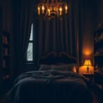
Discover the Impact of a Moody Dark Palette

Deep, rich colors create an instant atmosphere of sophistication and intimacy. These dramatic tones transform ordinary spaces into extraordinary sanctuaries.
Dark palettes offer surprising versatility in interior design. They work beautifully in both large rooms and cozy spaces when implemented thoughtfully.
Using Deep Blues, Greens, and Purples for Intimacy
Certain colors naturally foster a sense of closeness and comfort. Deep blues like Benjamin Moore’s Admiral Blue create cocoon-like environments perfect for relaxation.
Rich greens bring nature’s depth indoors. Trailing Vines by Benjamin Moore offers a dark olive with charcoal gray undertones. This complex color adds sophistication without feeling overwhelming.
Hague Blue by Farrow & Ball creates lush, livable spaces with historical charm. Its deep blue-green tone works beautifully in both traditional and modern settings.
Purple tones offer regal warmth and creative inspiration. These colors stimulate imagination while maintaining cozy intimacy.
Gray-brown shades create speakeasy sophistication. They offer neutral flexibility while maintaining dramatic impact.
Balancing Dark Walls with Light and Texture
Successful dark rooms rely on strategic contrast and dimensional interest. Light-colored trim and ceilings prevent spaces from feeling closed in.
Metallic accents add reflective quality to deep tones. Brass, gold, or silver elements catch light beautifully against dark backgrounds.
Layered lighting creates essential brightness variation. Combine overhead fixtures with table lamps and sconces for balanced illumination.
Textures prevent flatness in monochromatic schemes. Velvet upholstery, woven textiles, and natural wood add tactile interest.
Mirrors strategically amplify available light. Place them opposite windows to maximize natural brightness throughout your space.
Professional designers often use these techniques:
- Matte finishes absorb light for deeper color saturation
- Semi-gloss trim reflects light along edges
- Multiple light sources at different heights
- Light-colored flooring to ground dark walls
Your dark palette should feel intentional, not accidental. Every element should contribute to the overall mood and functionality.
Harness the Calming Power of Earthy Tones
Nature’s palette offers some of the most soothing colors for your home. These grounded hues create peaceful environments that reduce daily stress and promote relaxation. Earthy tones bring organic beauty indoors while maintaining modern sophistication.
You can transform any space into a serene retreat with these natural colors. They work beautifully in various lighting conditions and design styles. Your home gains warmth and character through thoughtful implementation.
Bringing Serenity In with Sage Green and Terracotta
Sage green creates tranquil environments perfect for relaxation. This soft hue reduces anxiety while adding subtle color interest. It pairs beautifully with both warm and cool complementary tones.
Consider these successful combinations:
- Sage green walls with creamy white trim
- Terracotta accents against sage green backgrounds
- Mustard yellow textiles with sage green furniture
Terracotta brings authentic warmth to your decor. This earthy orange-red tone evokes natural clay and sun-baked earth. It creates cozy atmospheres that feel both rustic and refined.
These colors work particularly well in spaces with abundant natural light. Morning sun enhances their subtle undertones beautifully. Evening artificial lighting maintains their comforting presence.
Incorporating Natural Materials like Wood and Jute
Natural materials enhance earthy color schemes through texture and authenticity. Wood elements add organic warmth and visual interest. Choose pieces with visible grain patterns for maximum character.
Jute and other natural fibers provide rustic texture underfoot. They create casual elegance that complements earthy tones perfectly. These materials bring tactile dimension to your space.
Consider these material combinations:
| Material | Best Uses | Complementary Colors | Maintenance Level |
|---|---|---|---|
| Reclaimed Wood | Floors, tables, shelves | Sage green, terracotta | Moderate |
| Jute | Rugs, baskets, textiles | Warm neutrals, earthy tones | Easy |
| Natural Stone | Countertops, accents | All earthy palettes | Low |
| Ceramic | Planters, accessories | Terracotta, sage green | Very easy |
Layering different textures creates depth and visual interest. Combine smooth ceramics with rough-hewn wood pieces. Add woven textiles for additional tactile appeal.
These natural elements support biophilic design principles. They connect you to nature’s restorative power indoors. Your home becomes a sanctuary of peace and tranquility.
Balance earthy materials with modern design elements. Clean-lined furniture prevents rustic overload. Metallic accents add contemporary sophistication to natural schemes.
Earthy tones don’t just decorate—they transform spaces into havens of calm that nurture both body and spirit.
Your color choices should create cohesive harmony throughout the room. Repeat earthy tones in different elements for visual continuity. This approach yields professional-looking results that feel authentically yours.
Create Warmth and Energy with Sunny Yellows and Ochres

Sunny tones transform your environment with instant cheerfulness and vitality. These hues bring natural brightness that feels both uplifting and comforting throughout your day.
Yellow stimulates mental activity and optimism according to color psychology. It creates spaces that spark creativity while reducing feelings of gloom. This makes it perfect for areas where you want positive energy.
Different yellow shades create distinct atmospheres in your home. Pale lemon feels fresh and airy in small spaces. Golden mustard adds rich warmth to larger rooms.
Ochre offers sophisticated depth with earthy brown undertones. It provides welcoming energy without overwhelming your senses. This versatile shade works beautifully in various lighting conditions.
Choosing the Right Shade to Avoid Overpowering
Consider your room’s size and natural light before selecting tones. Smaller spaces benefit from softer, paler yellows. These create openness without visual weight.
North-facing rooms need warmer golden yellows to feel inviting. These tones compensate for limited natural light. South-facing spaces can handle cooler lemon shades.
Test paint samples at different times of day. Yellow changes dramatically under artificial lighting. Evening illumination often intensifies its warmth.
Professional designers recommend these specific tones:
- Benjamin Moore’s Hawthorne Yellow: Soft golden tone for traditional spaces
- Sherwin-Williams’ Optimistic Yellow: Clean bright shade for modern interiors
- Farrow & Ball’s India Yellow: Rich historical pigment with depth
- Behr’s Lemon Drop: Fresh contemporary option for small areas
Balance strong yellows with plenty of white trim and ceilings. This prevents the color from feeling overwhelming. It creates visual relief while maintaining brightness.
Use yellow strategically rather than everywhere. An accent wall or colorful furniture piece makes impact without dominance. This approach controls the energy level perfectly.
Pairing Yellow with Complementary Blues
Blue creates beautiful contrast with yellow tones on the color wheel. This combination feels both energetic and balanced simultaneously. It prevents garishness while maintaining vibrancy.
Deep navy grounds bright yellow accents with sophistication. Try navy sofa cushions with yellow throw pillows. This creates dynamic visual interest.
Soft sky blue offers gentle complement to pale yellows. These work well in bedrooms or relaxation spaces. They maintain calmness with subtle energy.
Consider these successful pairing techniques:
| Yellow Tone | Complementary Blue | Best Application | Visual Effect |
|---|---|---|---|
| Lemon Yellow | Robin’s Egg Blue | Coastal-inspired spaces | Fresh and breezy |
| Golden Mustard | Deep Navy | Traditional interiors | Rich and grounded |
| Ochre | Slate Blue | Modern schemes | Earthy sophistication |
| Sunflower Yellow | Turquoise | Bohemian styles | Playful and vibrant |
Incorporate both colors through accessories and textiles first. Blue and yellow patterned pillows test the combination safely. You can always expand the palette later.
Add neutral elements between strong color pairings. White or gray areas prevent visual competition. They allow both hues to shine without conflict.
Yellow and blue together create spaces that feel both energized and serene—a perfect balance for modern living.
Remember that lighting affects both colors throughout the day. Morning sun enhances yellow’s warmth while evening light deepens blue tones. This natural variation adds dynamic beauty.
Your final combination should feel harmonious and intentional. Both colors should complement rather than compete. This creates spaces that uplift and inspire daily.
Add a Touch of Playfulness with Pastel Hues
Subtle pastel palettes offer sophisticated playfulness for modern homes. These soft tones create environments that feel both cheerful and serene throughout your day.
Pastels work beautifully in various design styles from minimalist to maximalist. They bring gentle color without overwhelming your senses. This approach creates spaces that inspire calm creativity.
Soft Pinks, Blues, and Lavenders for a Serene Feel
Specific pastel shades create distinct atmospheric effects in your home. Blush pink adds warm romance to any room. It pairs beautifully with natural materials and metallic accents.
Soft blue tones promote relaxation and mental clarity. These cool shades work well in bedrooms and reading nooks. They create peaceful retreats from daily stress.
Lavender offers spiritual calm with subtle sophistication. This hue balances warm and cool undertones perfectly. It creates spaces that feel both grounded and dreamy.
Consider these professional combinations for different moods:
| Desired Mood | Primary Pastel | Complementary Shades | Best Room Application |
|---|---|---|---|
| Romantic Calm | Blush Pink | Soft Gray, Cream | Bedrooms, Sitting Areas |
| Mental Clarity | Powder Blue | White, Light Wood | Home Offices, Libraries |
| Creative Inspiration | Lavender | Sage Green, Pearl | Studios, Craft Spaces |
These color ideas help you achieve specific emotional effects. They transform ordinary spaces into personalized sanctuaries.
Using Pastels to Enhance Natural Light in a Room
Pastel shades possess remarkable light-reflecting qualities. They bounce natural illumination around your space effectively. This creates brighter, more expansive-looking rooms.
North-facing rooms benefit greatly from warm pastels. Peach and soft yellow tones compensate for limited sunlight. They make spaces feel warmer and more inviting.
South-facing rooms can handle cooler pastel shades. Mint green and light blue balance abundant natural light. They prevent spaces from feeling overly bright.
Professional designers use these techniques for light enhancement:
- Paint ceilings in lighter pastel shades than walls
- Use glossy finishes on trim to reflect maximum light
- Place mirrors opposite windows with pastel walls
- Choose sheer pastel curtains for light diffusion
Pastels make small rooms appear larger through light manipulation. They create airy, open feels in compact spaces. This optical effect works without structural changes.
Balance pastels with neutral elements for depth. Beige or cream trim provides visual grounding. Natural wood tones add warmth to cool pastel schemes.
Pastels don’t dilute color—they refine it, creating spaces that feel both expansive and intimate simultaneously.
Your pastel palette should feel intentional and sophisticated. Choose shades that complement your natural lighting conditions. Test samples at different times before final decisions.
This approach creates rooms that feel bright and spacious year-round. You’ll enjoy enhanced natural light without overwhelming brightness.
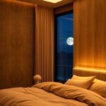
Illuminate Your Space with Strategic Lighting
Light transforms everything in your home. It changes how colors appear and creates different feelings throughout the day. Your lighting choices affect both function and atmosphere dramatically.
Natural and artificial sources work together beautifully. They create layers that adapt to your needs and moods. This approach makes your space more versatile and inviting.
Maximizing Natural Light for Vibrancy
Sunlight makes colors richer and textures more visible. It brings energy and life into your room naturally. Proper window treatments help control this valuable resource.
Choose sheer curtains that diffuse light softly. They maintain privacy while allowing brightness to enter. Light-colored walls reflect illumination further into your space.
Position mirrors opposite windows to bounce light around. This technique makes rooms feel larger and brighter. It enhances your color scheme without additional fixtures.
Keep window glass clean for maximum light transmission. Even thin dirt layers can reduce incoming brightness significantly. Regular cleaning maintains optimal illumination.
Layered Artificial Lighting for Mood and Ambiance
Different light sources serve various purposes in your room. Overhead fixtures provide general illumination for overall visibility. Task lighting focuses on specific areas like reading nooks.
Ambient lighting creates warmth and atmosphere throughout your space. Table lamps and floor lamps offer flexible options for different moods. They can be moved and adjusted as needed.
Consider these lighting layers for complete coverage:
- General overhead lights for overall brightness
- Task lamps for specific activities
- Accent lights to highlight artwork or features
- Ambient lighting for mood creation
Dimmer switches allow adjustable intensity throughout the day. They help transition from bright morning light to soft evening ambiance. This flexibility supports different activities and moods.
Choose bulb colors that complement your room’s palette. Warm white tones (2700K-3000K) create cozy, inviting atmospheres. Cool white bulbs (3500K-4100K) offer energizing, focused light.
LED options provide energy efficiency and long life. They come in various color temperatures to match your needs. Many are dimmable for added control over your environment.
Lighting fixtures should complement your decor style. Choose designs that enhance rather than compete with your colorful elements. They become part of your overall aesthetic story.
Great lighting doesn’t just illuminate space—it sculpts atmosphere and transforms experience throughout the day.
Use directional lights to highlight specific colorful elements. Picture lights emphasize artwork beautifully. Spotlights can make vibrant furniture pieces stand out dramatically.
Balance is key between natural and artificial sources. During daytime, maximize free sunlight whenever possible. As darkness falls, transition smoothly to your layered artificial scheme.
Your final lighting plan should feel intuitive and flexible. It should support various activities while maintaining visual comfort. This approach creates spaces that truly work for your lifestyle.
Layer Textures to Add Depth and Coziness
Texture creates sensory richness that transforms flat color schemes into multidimensional experiences. These tactile elements build environments that feel complete and personally satisfying beyond visual appeal alone.
Your space gains character through thoughtful material combinations. Different surfaces interact with light uniquely, creating dynamic shadows and highlights throughout the day.
Mixing Velvet, Knits, Wool, and Leather
Combining different materials creates visual harmony through contrast. Smooth velvet against chunky knits offers both luxury and casual comfort.
Consider these successful pairings for various effects:
- Velvet cushions on a wool sofa for luxury contrast
- Leather chairs with knitted throws for balanced warmth
- Silk curtains against rough-hewn wood for organic elegance
Each material brings unique qualities to your room. Velvet provides rich depth and light absorption. Knits offer cozy softness and dimensional interest.
Wool adds natural warmth and durability for high-use areas. Leather introduces sophistication and develops character over time.
The Role of Textures in a Colorful Scheme
Textures affect how we perceive color in your space. Matte surfaces absorb light, making colors appear deeper and richer. Glossy finishes reflect light, creating brighter, more vibrant effects.
Rough textures add visual weight to lighter colors. Smooth surfaces make dark tones feel more accessible and less overwhelming.
This interaction between surface and color creates sophisticated depth. Your palette gains complexity without additional hues.
Consider these professional texture combinations:
| Material Combination | Visual Effect | Best Room Application | Comfort Level |
|---|---|---|---|
| Velvet + Glass | Modern luxury | Formal living areas | Medium comfort |
| Wool + Wood | Organic warmth | Family rooms | High comfort |
| Leather + Metal | Industrial chic | Home offices | Medium comfort |
| Knit + Rattan | Bohemian casual | Sunrooms, reading nooks | High comfort |
Balance smooth and rough elements throughout your space. This creates rhythm and prevents sensory overload. Your eyes naturally move between different surfaces.
Functional areas benefit from specific texture choices. High-traffic zones need durable, easy-clean materials. Relaxation areas deserve soft, inviting surfaces.
Layering textures makes spaces feel collected over time. This approach creates authenticity that cannot be achieved with matching sets.
Texture is the silent partner to color—it adds soul to your scheme and makes rooms feel truly lived-in and loved.
Your texture selections should complement your lifestyle and preferences. Choose materials that feel good to touch and suit your daily needs.
Experiment with samples before committing to large pieces. Touch fabric swatches and compare material combinations in your actual space.
This tactile approach ensures your room feels as good as it looks. You create environments that welcome both residents and guests with genuine warmth.
Your Journey to a More Colorful and Joyful Home
Your home should be a true reflection of your personality and bring you daily happiness. The choices you make in your space directly impact your mood and overall sense of well-being.
Remember that there are no strict rules—only what feels right for you. Trust your instincts and choose hues that spark genuine joy and inspiration.
Start small if you’re hesitant. Add vibrant pillows or a bold piece of art. These reversible changes let you experiment without pressure.
Embrace the process of discovery. Rearrange, adjust, and play until your room feels authentically yours. Your environment should tell your unique story.
Colorful surroundings boost energy, warmth, and positivity. They transform daily living into a more uplifting experience.
Your home is your canvas. Paint it with confidence, creativity, and joy.