Welcome to your personal guide on creating a stylish and cozy retreat. Your room should reflect your unique taste while maximizing comfort.
We’ll explore how smart color schemes can turn your space into a peaceful sanctuary. Whether you love bold statements or soft neutrals, there’s a perfect match for you.
This article shares practical tips and inspiration from top designers. You’ll learn to pair shades for furniture, walls, and accents with confidence.
Choosing the right palette sets the mood and improves functionality. Natural light and room size play key roles in your decisions.
Let’s begin this colorful journey to give your home a fresh, cohesive look. Get ready to create a space that brings daily joy and relaxation!
Why Your Bedroom Color Scheme Matters So Much
The hues you choose for your personal retreat do more than just decorate walls—they shape your daily experience. Your palette creates an atmosphere that either welcomes relaxation or adds unnecessary stress. This decision becomes the foundation for your entire room’s character.
Colors speak to our emotions in powerful ways. Cool tones like soft blues and gentle greens naturally calm your nervous system. Warm shades such as peach or soft yellow bring cheerful energy to your mornings.
Setting the Mood for Relaxation and Comfort
Your sleeping environment should feel like a true sanctuary from daily pressures. The right tones help melt away tension and prepare your mind for rest. This isn’t just about aesthetics—it directly affects your sleep quality and overall wellness.
Soft neutrals create a serene backdrop that feels instantly peaceful. You can always add personality with vibrant accents through decor items. The goal is achieving balance between calm foundation and personal expression.
Test paint samples at different times to see how light changes their appearance. Natural illumination can dramatically alter how colors feel throughout the day. This ensures your chosen palette always feels right in your space.
How Color Influences Your Perception of Space
Light shades work magic in smaller rooms by creating an airy, expanded feeling. They reflect available light to make your area appear more spacious. This approach works particularly well if your room lacks large windows.
Deeper tones add cozy intimacy to larger spaces that might feel too expansive. They create a welcoming embrace that makes your room feel like a protective cocoon. The key is matching the color intensity to your room’s proportions.
Remember that your personal sanctuary should reflect what makes you feel most at peace. Trust your emotional response when selecting shades that resonate with your spirit. The perfect palette will enhance your daily joy and relaxation.
How to Choose the Perfect Palette for Your Space

Creating a harmonious personal retreat requires thoughtful consideration of several key factors. Your ideal color palette should work with your room’s unique characteristics while expressing your personality.
Let’s explore how to make smart choices that transform your space into a true sanctuary. These practical tips will help you build a cohesive look that feels both beautiful and uniquely yours.
Considering Your Room’s Natural Light
Natural illumination dramatically affects how colors appear throughout the day. North-facing spaces receive cooler light that benefits from warm tones to create balance. South-facing areas handle cooler shades beautifully with their abundant sunlight.
Test your paint colors at different times to see how they transform. Morning light shows colors differently than evening artificial lighting. This prevents surprises after you’ve committed to your selections.
Matching Colors to Your Bedroom’s Size
Room proportions play a crucial role in your color decisions. Lighter shades like soft gray or cream make compact areas feel more spacious. They reflect available light to create an airy, open atmosphere.
Deeper hues add wonderful depth to larger spaces without feeling overwhelming. Rich navy or maroon can create intimate, cocoon-like comfort in big rooms. Always consider how colors affect your perception of space.
Aligning Colors with Your Personal Style
Your personal sanctuary should reflect what makes you feel most at peace. Whether you prefer modern minimalism or vintage charm, select shades that resonate with your spirit. This ensures your space feels authentically yours.
Draw inspiration from items you already love, like patterned bedding or favorite accessories. A beautiful duvet can serve as the perfect starting point for your entire scheme. Build around colors that bring you joy and relaxation.
| Room Feature | Recommended Tones | Visual Effect |
|---|---|---|
| North-facing windows | Warm undertones (peach, cream) | Counters cool light, adds warmth |
| South-facing windows | Cool undertones (blue, green) | Balances abundant sunlight |
| Small space | Light shades (soft gray, white) | Creates airy, expanded feeling |
| Large area | Deep hues (navy, maroon) | Adds cozy intimacy |
| Existing bold furniture | Neutral walls | Allows pieces to stand out |
| Colorful walls | Subdued furnishings | Creates balanced harmony |
Remember to consider color undertones when making your selections. Warm undertones (reds, yellows) create coziness, while cool undertones (blues, greens) offer tranquility. This understanding helps you achieve your desired ambiance.
Ultimately, aim for a harmonious balance that makes your space functional, beautiful, and a true reflection of your taste. Trust your instincts—the perfect palette will enhance your daily experience and bring you lasting joy.
The Timeless Elegance of Black and White
Some pairings never go out of style, and the classic duo of black and white tops that list. This powerful combination brings sophistication and drama to any personal space.
It creates a striking visual impact that feels both modern and timeless. You can achieve anything from moody intimacy to bright, graphic energy.
Using Black as Your Lead Hue for a Moody Feel
Choose black for your dominant shade to create depth and intimacy. This approach works beautifully on an accent wall or large furniture pieces.
Dark surfaces absorb light, making your space feel cozy and protected. It’s perfect for crafting a sensual retreat that whispers luxury.
Balance is key when working with such a strong color. Too much darkness can feel heavy, so strategic placement matters most.
Incorporating White Accents for a Crisp Contrast
Introduce crisp white elements to brighten and balance the depth of black. Bedding, trim, and decorative items work perfectly for this purpose.
These light touches prevent the room from feeling too dark while maintaining elegance. They create visual interest through beautiful contrast.
Consider metallic accents like brass or gold for added warmth. A touch of blush pink can make the scheme feel more approachable and soft.
This timeless color scheme offers endless inspiration for your home design. It proves that monochromatic doesn’t mean boring when you play with different hues and textures.
Vintage Charm with Muted Pink and Sage Green
Nothing captures timeless elegance quite like the delicate dance between soft pink and gentle green. This pairing brings a sense of nostalgic comfort to your personal space while maintaining modern sophistication.
When done right, these tones create a welcoming atmosphere that feels both fresh and familiar. The key lies in choosing the right shades and balancing them perfectly.
Selecting Adult-Appropriate Shades of Pink and Green
Choose muted variations that feel sophisticated rather than sugary sweet. Think dusty rose instead of bubblegum pink. Consider sage or olive green rather than bright lime.
These softer hues create a calming environment perfect for relaxation. They work beautifully in any home setting without feeling childish.
Test your colors in different lighting before committing. Natural light shows how these tones shift throughout the day.
Balancing the Palette to Avoid a Childlike Vibe
Add neutral elements to ground your color scheme. Cream walls or tan rugs provide balance and maturity.
Distribute colors thoughtfully across your space. A sage green headboard paired with blush bedding creates harmony.
Incorporate texture through fabrics and materials. Linen curtains or a woven rug add depth to your design.
Draw inspiration from designers who specialize in this aesthetic. Their work shows how to use these accents with sophistication.
This approach creates a serene retreat that feels both grown-up and inviting. Your space will radiate warmth and character without overwhelming sweetness.
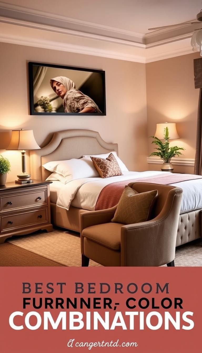
Warm and Earthy Burnt Orange and Tan Neutrals
Earth tones create an instant connection to nature within your personal space. This combination brings warmth and vitality while maintaining a grounded feeling.
Burnt orange offers rich depth with its brown undertones that feel both vibrant and sophisticated. Paired with tan neutrals, it creates a harmonious balance that works beautifully.
Pairing with Warm-Undertone Neutrals for Cohesion
Choose tan neutrals with warm undertones to complement the orange’s richness. Cool whites or grays might clash with the brown shades in your orange.
This approach ensures everything in your room feels connected and intentional. The result is a cohesive look that flows naturally from wall to furniture.
Test your colors together in different lighting conditions. Natural light shows how these tones interact throughout the day.
Creating a Cozy and Inviting Atmosphere
This palette excels at making your space feel snug and welcoming. The warm tones naturally create a sense of comfort and relaxation.
Use burnt orange on accent walls or bedding to inject energy. Let tan neutrals dominate larger surfaces like walls or floors for balance.
Add texture through wool throws or wooden furniture pieces. These elements enhance the earthy vibe and make your room feel layered.
Designers like its_all_about_the_house on Instagram show how versatile this combination can be. Their work demonstrates sophisticated applications that feel both current and timeless.
Start with orange accessories if you’re hesitant about commitment. Pillows or art pieces let you test the waters before larger investments.
This scheme works beautifully year-round when balanced properly. It brings autumn warmth without feeling seasonal or dated.
Tranquil and Soothing Hunter Green and Crisp White

There’s something magical about bringing the peaceful essence of the forest into your personal sanctuary. This elegant pairing creates an atmosphere that feels both grounded and refreshingly airy.
Hunter green brings nature-inspired calm that soothes your senses after a long day. The crisp white elements add brightness that prevents the space from feeling too dark.
Ideal for Midcentury Modern or Moody Themes
This color scheme works beautifully with midcentury modern furniture’s clean lines. The deep green hues evoke sophistication while maintaining approachable warmth.
For moody themes, hunter green creates depth without overwhelming your space. It pairs perfectly with wood tones and metallic accents for added character.
Instagram account renovating_number_16 showcases how this combination creates a serene escape. Their design approach demonstrates its versatility across different room sizes.
Using White to Brighten and Balance the Deep Green
Incorporate crisp white through walls, trim, or bedding to create beautiful contrast. This balancing act ensures your space feels light and inviting rather than heavy.
The white elements reflect natural light, enhancing the green’s richness throughout the day. This works particularly well in rooms with good sunlight exposure.
Consider using green on an accent wall or larger furniture pieces. Let white dominate the overall backdrop to maintain that airy feeling you love.
Add natural elements like plants or wood accents to complement the earthy vibe. These touches enhance the tranquil ambiance while adding texture.
This versatile approach creates a timeless look that feels both restful and stylish. Your space becomes a true retreat that welcomes relaxation every day.
Cheerful and Energetic Pink, Orange, and White
Sometimes your personal space needs a burst of joyful energy to start each day with positivity. This vibrant trio creates an atmosphere that feels both playful and sophisticated when balanced correctly.
Pink and orange sit close together on the color wheel, creating natural harmony. Adding white prevents these lively shades from overwhelming your senses. The result feels energetic yet perfectly restrained.
How White Breaks Up Two Vivid, Adjacent Colors
White acts as a visual breather between these warm, vibrant tones. It creates separation that prevents the colors from blending into one overwhelming mass.
Think of white as your neutral foundation that grounds the entire scheme. It provides clean contrast that makes both pink and orange appear more intentional. This approach maintains sophistication while embracing boldness.
Instagram creator helloimaubs demonstrates how this balance creates fun yet mature spaces. Their work shows careful execution that feels both lively and refined.
Creating a Happy, Mood-Lifting Environment
This combination naturally boosts your morning energy and overall mood. The warm tones stimulate positivity while white keeps everything feeling fresh.
Choose softer shades of coral pink and peach orange for adult-friendly appeal. Avoid neon tones that might feel too youthful for your personal retreat.
Use vibrant hues in accessories like throw pillows or artwork. Let white dominate larger elements like walls or bedding for balance. This creates pops of energy without overwhelming your space.
Rooms with ample natural light enhance this scheme beautifully. Sunlight makes the colors glow while maintaining their softness. Your space will feel alive and inviting throughout the day.
“White helps to break up the two vivid shades and keeps the combo restrained and not overwhelming.”
This approach turns your room into a joyful beginning to each day. It’s perfect for those seeking energy and positivity in their personal sanctuary.
Understated Patriotism with Navy, White, and Red Accents

Certain palettes carry a sense of heritage and quiet pride without shouting for attention. This combination brings classic American spirit into your space with sophistication and grace.
It feels timeless rather than trendy, creating a look that lasts for years. You achieve a personal retreat that honors tradition while feeling completely current.
Studio Peake demonstrates how this approach works beyond seasonal decor. Their designs show refined elegance that feels appropriate year-round.
Letting Blues and Whites Take Center Stage
Build your foundation with deep navy and clean white elements. These two shades create a balanced backdrop that feels both strong and serene.
Navy walls or large furniture pieces add wonderful depth to your room. They create a cozy atmosphere that welcomes relaxation after long days.
White trim, bedding, or area rugs keep everything feeling bright and airy. This prevents darker elements from making your space feel too heavy.
The contrast between these shades establishes a classic, clean aesthetic. It works beautifully in various styles from coastal to modern themes.
Weaving in Subtle Red Accents for a Tranquil Feel
Introduce red through small, intentional touches rather than large statements. Pillows, artwork, or decorative objects work perfectly for this purpose.
Choose muted shades like burgundy or brick red for sophisticated impact. These tones add warmth without creating jarring contrast.
Remember that red is naturally energetic and attention-grabbing. Using it sparingly maintains the tranquil mood you want for sleeping.
This approach keeps your space feeling calm and restful rather than overly bold. The red becomes a special detail rather than the main event.
| Element | Recommended Use | Visual Impact |
|---|---|---|
| Navy | Walls or large furniture | Adds depth and sophistication |
| White | Trim, bedding, or rugs | Creates brightness and balance |
| Red accents | Pillows or small decor | Adds warmth and personality |
| Muted red tones | Burgundy or brick shades | Maintains serene atmosphere |
| Distribution | 80% navy/white, 20% red | Ensures peaceful environment |
This palette lets you express personal pride in an elegant, understated way. Your home becomes a beautiful reflection of timeless style and comfort.
It proves that patriotic themes can feel sophisticated when executed with restraint. You create a space that feels both meaningful and perfectly peaceful.
Soft and Subtle Peach Paired with Warm Tan
Imagine waking up to the soft glow of peach against warm tan neutrals. This combination creates instant warmth without overwhelming your senses.
The gentle pairing works beautifully in spaces where you want comfort without bold statements. It feels both fresh and familiar at the same time.
Your sleeping area becomes a sanctuary of subtle elegance with this approach. The tones work together to create a harmonious environment.
Making Peach the Focal Point Against Neutral Walls
Let peach take center stage through strategic placement around your room. An accent wall behind your bed makes a beautiful statement.
Bedding in soft peach shades draws immediate attention while maintaining serenity. These elements become the stars of your space.
Tan walls provide the perfect neutral backdrop that enhances peach’s vibrancy. This balance prevents the scheme from feeling too sweet.
Achieving a Soothing Yet Cheery Ambiance
This palette creates a wonderful mood that feels both calming and uplifting. You get the best of both worlds in your personal retreat.
The combination works particularly well in rooms with good natural light. Sunlight makes the colors glow softly throughout the day.
Instagram creator classycasita demonstrates how this scheme feels modern and comforting. Their approach shows sophisticated execution.
Choose tan neutrals with warm undertones to complement peach beautifully. Cool tones might create unwanted contrast in your space.
Add texture through linen bedding or wool throws for extra coziness. These elements deepen the inviting feel of your room.
| Application Area | Recommended Use | Visual Effect |
|---|---|---|
| Walls | Tan neutral base | Creates warm foundation |
| Accent wall | Soft peach highlight | Adds focal point interest |
| Bedding | Peach patterns or solids | Brings cheerful energy |
| Textiles | Linen or wool textures | Adds depth and comfort |
| Natural light | Maximize exposure | Enhances color glow |
This versatile approach works with various decor styles from minimalist to bohemian. It offers a fresh take on neutral schemes for your home.
The palette creates a welcoming atmosphere that feels both restful and gently energizing. Your space becomes a true retreat for daily renewal.
Glamorous Depth with Deep Maroon and Gold Accents

Transform your space into a lavish retreat with deep maroon and metallic gold touches. This sophisticated pairing brings dramatic elegance to any room while maintaining cozy comfort.
The rich burgundy tones create a moody atmosphere that feels both intimate and luxurious. Gold elements add sparkle without overwhelming your senses.
Instagram creator maritfolland showcases how this combination creates hotel-inspired luxury. Their approach demonstrates perfect balance between drama and refinement.
Using Maroon on an Accent Wall or in Bedding
Apply deep maroon to one focal wall behind your bed for instant impact. This creates a stunning backdrop that anchors your entire space.
Choose burgundy bedding for a softer approach that still delivers rich color. Velvet textures enhance the luxurious feel of this deep hue.
Balance the darkness with lighter elements like cream or soft gray. This prevents your room from feeling too heavy while maintaining sophistication.
Maroon interior design works beautifully with various materials and textures. Silk curtains or wool throws add depth to your overall look.
Incorporating Gold for a Touch of Luxury
Add gold through carefully selected hardware and lighting fixtures. Bedside lamps with gold bases create warm, inviting illumination.
Choose framed mirrors or decorative objects for subtle metallic accents. These elements catch light beautifully throughout the day.
Remember that less is more when working with such a bold metal. A few well-placed pieces maintain refinement without feeling excessive.
This palette works best in rooms with moderate natural light. The deep colors feel enveloping and intimate rather than overwhelming.
“Gold accents should be used sparingly to maintain refinement—think framed mirrors or bedside lamps rather than overwhelming metallic surfaces.”
Your space becomes a dramatic retreat that exudes warmth and luxury. This approach proves that bold choices can create both comfort and style.
The Classic Coastal Feel of Navy and Crisp White
There’s a timeless charm to navy and crisp white that feels both fresh and sophisticated. This pairing brings a sense of calm elegance to your space, reminiscent of seaside retreats and clean modern design.
It works beautifully in various settings, from beach cottages to urban apartments. The contrast creates visual interest while maintaining a serene atmosphere.
Instagram creator jennifer.paro demonstrates how this scheme balances nautical themes with contemporary style. Her approach shows versatility across different room sizes and lighting conditions.
Navy for Depth and White for a Sleek Contrast
Deep navy adds wonderful richness to your walls or larger furniture pieces. It creates a cozy, enveloping feeling that makes your room feel intimate.
Crisp white elements provide bright balance against the darker tones. They reflect natural light to keep everything feeling airy and open.
Use navy on an accent wall to create a stunning focal point. White bedding or trim maintains that fresh, clean look you love.
This combination works well in any light situation. White brightens darker rooms, while navy adds cool sophistication to sun-filled spaces.
Perfect for Both Coastal and Modern Themes
For coastal vibes, incorporate natural materials like rattan or light wood. These elements enhance the seaside feel without overwhelming the palette.
Modern themes benefit from keeping the color scheme simple and focused. Clean lines and minimal patterns maintain that contemporary aesthetic.
The versatility of this duo makes it popular among homeowners. It creates an inviting environment that feels both relaxing and stylish.
You can easily adapt the look to match your personal taste. Add texture through woven baskets or linen textiles for extra character.
| Design Element | Coastal Approach | Modern Approach |
|---|---|---|
| Wall color | Navy accent wall | Navy feature wall |
| Textiles | Rattan accessories | Minimal patterns |
| Lighting | Natural materials | Clean lines |
| Accents | Sea-inspired decor | Metallic touches |
| Overall feel | Relaxed seaside | Sleek contemporary |
This easy-to-live-with palette brings daily joy to your home. It offers that perfect blend of coastal charm and modern sophistication.
Your space becomes a peaceful retreat with just a hint of seaside inspiration. The colors work together to create harmony and style.
Muted and Vintage Green, White, and Soft Gray

Step into a space where time stands still with gentle greens and calming grays. This elegant combination brings nostalgic charm to your personal retreat without feeling dated.
These soft tones work together to create a peaceful atmosphere that welcomes relaxation. The palette feels both fresh and familiar, offering timeless appeal.
Designer Anne Sage demonstrates how this scheme achieves serene beauty with vintage character. Her approach shows thoughtful balance between color and comfort.
Combining Washed-Out Greens with Blue-Gray Tones
Choose muted green shades that feel soft and weathered rather than bright. These gentle tones create instant calm in your sleeping area.
Pair them with blue-gray variations for harmonious blending. The cool undertones work beautifully together without competing for attention.
This approach creates a neutral yet interesting palette perfect for rest. You achieve sophistication without bold statements.
Incorporate these colors through paint, bedding, or decorative accents. Ensure they blend smoothly for cohesive design.
Using Creamy White Walls to Warm Up Cool Colors
White walls with creamy undertones prevent cool greens from feeling too chilly. They add warmth that makes your space inviting.
This balance creates comfort while maintaining the scheme’s elegant vibe. Your bedroom feels both serene and snug.
The creamy background enhances the muted colors throughout the day. Natural light makes everything glow softly.
This palette adapts easily to rooms with varying light conditions. The soft appeal remains consistent from morning to evening.
Add vintage decor items like antique frames or distressed furniture. These touches enhance the theme and add character.
This approach creates understated beauty that avoids overwhelming patterns. Your space becomes a nostalgic retreat for peaceful moments.
For more inspiration on neutral schemes, explore bedroom color ideas that balance vintage charm with modern comfort.
Scandinavian Simplicity with White and Natural Wood
Discover the beauty of clean lines and natural materials that create a peaceful retreat. This approach brings calm organization to your space while maintaining warmth and character.
Scandinavian design focuses on functionality without sacrificing style. It creates an environment that feels both modern and timelessly comfortable.
Black & Blooms demonstrates how this scheme balances minimalism with cozy appeal. Their work shows the perfect harmony between simplicity and comfort.
Preventing White from Feeling Too Stark or Cold
Pure white surfaces can sometimes feel clinical without proper balancing. Natural wood elements add essential warmth and texture to prevent this.
Incorporate wooden furniture pieces like bedside tables or bed frames. These additions bring organic character that softens the overall look.
Textiles play a crucial role in adding softness to your space. Wool throws and cotton rugs introduce comfort while maintaining the clean aesthetic.
Layer different white tones to create depth rather than flatness. Creamy whites work beautifully with brighter variations for visual interest.
Choosing Light or Dark Wood Tones for Different Feels
Light woods like birch or pine keep your space feeling airy and bright. They reflect natural light beautifully while adding subtle warmth.
These lighter tones work particularly well in smaller rooms. They create an expanded feeling that makes your area appear more spacious.
Darker stains like walnut or ebony provide grounded sophistication. They add depth and intimacy to larger spaces that might feel too expansive.
Your choice depends on the atmosphere you want to create. Lighter woods feel fresh and modern, while darker options feel cozy and traditional.
“Wood accents prevent white from feeling too stark—adding both warmth and texture to create balanced simplicity.”
This palette works beautifully in various room sizes and light conditions. It adapts to your space while maintaining its serene character.
Add personal touches through plants or artwork for individual expression. These elements enhance the natural vibe without overwhelming the minimal aesthetic.
Your space becomes a tranquil haven that promotes relaxation and order. This timeless approach creates lasting comfort and style.
Best Bedroom Furniture Color Combinations for a Moody Aesthetic
Transform your personal space into a sophisticated retreat with dramatic depth and cozy intimacy. This approach creates an environment that feels both luxurious and wonderfully comfortable.
A moody palette works beautifully when you balance strong dark tones with lighter elements. The contrast prevents your room from feeling overwhelming while maintaining that rich, enveloping atmosphere.
Balancing Bold Black Paint with Lighter Grays and Whites
Black serves as a powerful anchor in your design scheme. Pair it with soft grays and clean whites to create beautiful contrast and maintain visual balance.
Use black on an accent wall or larger furniture pieces for dramatic impact. Surround these dark elements with lighter shades to keep everything feeling airy and open.
Instagram creator devon_grace_interiors demonstrates how this approach achieves sophisticated coziness. Their work shows perfect harmony between drama and comfort.
Preventing the Room from Feeling Too Dark or Overwhelming
Strategic placement ensures your space feels enriching rather than oppressive. Focus dark paint colors on specific areas rather than covering everything.
Incorporate reflective surfaces like mirrors or metallic accents to bounce light around. These elements enhance brightness while maintaining the moody vibe.
This aesthetic works best in rooms with some natural light exposure. The illumination makes black feel rich and luxurious rather than heavy.
Add texture through velvet bedding or woven textiles for extra dimension. These touches break up the monochromatic scheme and add visual interest.
Your bedroom becomes a dramatic statement that still feels like a comfortable retreat. It’s perfect for those who love bold design with cozy appeal.
Dynamic Neutral Interest with Tan and White Layers
Tan and white create a beautiful alternative to all-white spaces. This palette offers warmth and depth while keeping things simple and elegant.
Varying shades build visual interest without overwhelming your senses. Light and dark tones work together for a cohesive yet dynamic look.
Layer these colors through bedding, rugs, and furniture pieces. Mix textures to add richness and prevent a flat appearance.
Hannah Tyler Designs shows how this scheme feels both inviting and sophisticated. The subtle variations create character far from bland.
This approach works with any decor style from modern to rustic. Add natural elements like plants or wood to enhance the organic feel.
Your home becomes a calming retreat with personalized style. It offers peace and visual appeal in perfect balance.