Welcome to your complete guide for choosing window treatments that elevate your bedroom’s style. This warm, earthy hue has become a favorite for creating peaceful retreats.
Designers and homeowners love this color for its timeless elegance. It brings a sophisticated calm to any room.
You will discover how different shades and fabrics work in your space. Learn to create a sanctuary that feels both stylish and restful.
This guide covers everything from measuring to maintenance. Get ready to make choices that boost both beauty and function in your personal haven.
Why Taupe Curtains Are the Perfect Choice for Your Bedroom
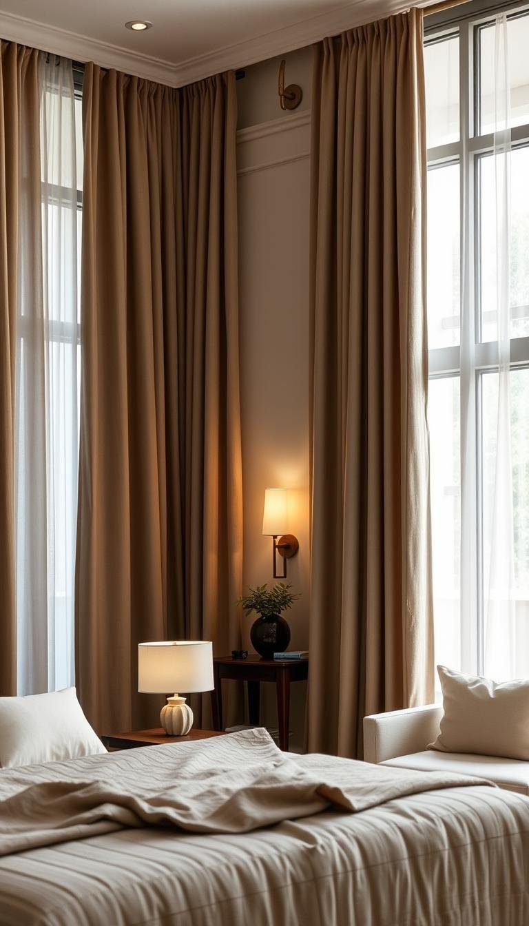
Imagine stepping into a space that instantly melts away your stress. This warm, earthy hue creates a sanctuary where you can truly unwind. It’s neither too stark nor too playful—just perfectly balanced.
Design experts love this color for its psychological benefits. It reduces visual clutter and helps your mind settle after a busy day.
Creating a Calming and Serene Atmosphere
Your sleep quality improves in a restful environment. This versatile color filters harsh light while maintaining a soft glow.
Different shades create unique moods. Lighter tones feel airy and open. Deeper variations add cozy intimacy.
As noted in our guide to neutral curtains, these window treatments “create a serene and peaceful atmosphere, making them perfect for bedrooms.”
| Taupe Shade | Light Effect | Mood Created |
|---|---|---|
| Light Taupe | Brightens room | Airy and spacious |
| Medium Taupe | Soft diffusion | Balanced and calm |
| Dark Taupe | Cozy filtering | Intimate and secure |
Timeless Style That Never Goes Out of Fashion
This color offers incredible versatility. It complements both minimalist and maximalist design approaches beautifully.
The right texture adds depth to your look. Pair with cream walls or wooden furniture for a cohesive style.
You’ll appreciate how these window treatments maintain their elegance year after year. They serve as a perfect backdrop for changing accessories and decor.
Your space deserves this harmonious balance of function and beauty. These treatments transform ordinary rooms into personal retreats.
Understanding Taupe: More Than Just a Color

This beautiful hue goes far beyond a simple description. It’s a sophisticated blend that creates warmth and depth in your space.
Think of it as a chameleon shade that adapts to your decor. It bridges the gap between cool grays and warm browns perfectly.
The Versatile Spectrum of Taupe Shades
You’ll discover an entire range from light greige to deep chocolate variations. Each shade brings its own personality to your room.
The complex undertones create remarkable depth. You might notice subtle hints of gray, brown, pink, or green in different lighting.
These variations add sophistication to your color palette. They work beautifully with wood furniture and various textures.
“Taupe’s magic lies in its ability to be both neutral and interesting simultaneously – it provides background harmony while adding subtle visual interest.”
Consider these popular shade categories for your space:
| Shade Name | Undertone Dominance | Best For Rooms With |
|---|---|---|
| Light Greige | Gray with beige | Limited natural light |
| Medium Mushroom | Brown with gray | Mixed lighting conditions |
| Deep Chocolate Taupe | Rich brown base | Abundant sunlight |
How Lighting Affects Your Taupe Curtains’ Appearance
Natural light transforms this color throughout the day. Morning sun reveals warm tones while evening light emphasizes cooler aspects.
Artificial lighting plays an equally important role. Warm bulbs enhance the richness while cool bulbs can make it appear more gray.
Testing samples in your actual space is crucial. Observe them at different times before making final decisions.
Your room’s orientation determines the best shade choice. North-facing rooms need warmer tones while south-facing spaces can handle cooler variations.
Use lighting to enhance rather than fight against your window treatments’ natural beauty. The right combination creates a perfect focal point.
This approach ensures your neutral palette maintains consistency across all lighting conditions. Your space will feel cohesive and intentionally designed.
The Definitive Benefits of Taupe Curtains for Modern Neutral Bedrooms
Imagine your bedroom as a blank canvas waiting for your personal touch. These versatile window treatments offer remarkable advantages that transform ordinary rooms into extraordinary spaces.
They provide the perfect foundation for your decor vision. You’ll discover how they enhance both aesthetics and functionality in your personal sanctuary.
Seamlessly Blending with Your Existing Decor
This remarkable color acts like a design chameleon. It adapts beautifully to whatever style you already love in your room.
You can pair it with soft pastels like blush pink or olive green. The combination creates a sophisticated yet inviting atmosphere.
These treatments create visual continuity between different elements. They help your furniture, walls, and accessories feel connected.
“The true magic happens when your window treatments become the unifying element that ties everything together seamlessly.”
Consider these wonderful blending features:
- Creates harmony between contrasting pieces
- Works with both warm and cool color tones
- Complements various textures from linen to velvet
- Bridges traditional and contemporary design elements
Providing a Sophisticated Backdrop for Accents
Your favorite decorative items deserve the perfect stage. These treatments provide that ideal background without competing for attention.
Artwork, accent pillows, and decorative objects pop against this neutral foundation. Your special pieces become the stars of the show.
Even bold furniture pieces feel balanced rather than overwhelming. The room maintains its calm atmosphere while showcasing personality.
Professional designers use these techniques:
- Choose treatments slightly lighter or darker than your walls
- Layer textures to add depth and dimension
- Use the window treatment as an anchor point
- Allow other elements to shine against the neutral background
Small bedrooms gain visual space through this approach. The continuous color flow makes rooms feel larger and more open.
Your space becomes a curated collection rather than a random assortment. Every item feels intentionally placed and beautifully displayed.
Choosing the Right Fabric for Your Taupe Curtains

Selecting the perfect fabric makes all the difference in achieving both style and comfort. Your material choice affects how light filters through and how the drapery hangs.
Different textiles bring unique qualities that can elevate your room’s overall aesthetic. Consider both appearance and practical needs when making your selection.
Linen for a Relaxed, Breathable Feel
Linen creates a casual, airy atmosphere perfect for bedrooms. This natural fiber allows air circulation while softening sunlight.
The slightly textured weave adds visual interest without overwhelming your space. It works beautifully with various color palettes and design styles.
This material pairs wonderfully with textured bedding like waffle weave or matelassé. Add a chunky knit throw in cream or oatmeal for extra coziness.
Velvet for Luxurious Depth and Texture
Velvet offers rich texture and superior light-blocking capabilities. The dense weave creates a sense of luxury and warmth.
This fabric adds dimensional interest to your room’s decor. It works particularly well with deeper taupe shades.
Velvet’s weight gives it an elegant drape that enhances any window. It provides excellent privacy and light control for restful sleep.
Sheer Materials for Soft, Diffused Light
Sheer fabrics maintain privacy while allowing beautiful filtered light. They create a soft glow that enhances your room’s ambiance.
These lightweight textiles work well for layering with other window treatments. They add movement and airiness to your space.
Sheers complement various wall colors and furniture finishes. They help create a cohesive look throughout your bedroom.
Consider these factors when selecting your material:
- Weight affects how the fabric hangs and blocks light
- Weave pattern influences both appearance and function
- Maintenance requirements vary by fabric type
- Texture coordinates with other room textiles
Your fabric choice should match both your aesthetic preferences and practical needs. The right material enhances your room’s comfort and style.
Selecting the Ideal Taupe Shade for Your Space
Choosing the perfect shade transforms your room’s entire feel. The right selection can make your space feel larger, cozier, or more balanced.
Your existing color scheme and furniture finishes play crucial roles. Consider how different tones interact with your room’s unique elements.
Light Taupe to Brighten and Open Up the Room
Lighter shades create an airy, spacious atmosphere perfect for smaller rooms. They reflect natural light beautifully while maintaining warmth.
These tones work wonderfully with cream walls and light wood furniture. They make ceilings feel higher and spaces more open.
Consider light greige for north-facing rooms that need extra brightness. The gray-beige balance adds sophistication without darkness.
Test samples at different times of day before committing. Natural light changes how colors appear throughout the day.
I learned this the hard way after repainting an entire wall. Now I always test swatches in multiple room locations.
Dark Taupe for a Cozy, Dramatic Statement
Deeper shades create intimate, cocoon-like environments perfect for master bedrooms. They add rich depth and sophistication.
Dark chocolate tones work beautifully with dramatic accents and artwork. They provide a stunning backdrop for your favorite decorative art pieces.
These shades suit rooms with abundant natural light. They prevent spaces from feeling too bright or sterile.
Create mood boards to visualize how shades work together. Include fabric samples, paint chips, and photos of your existing furniture.
Consider these factors when selecting your perfect shade:
- Room size and ceiling height
- Amount of natural light available
- Existing wall colors and flooring
- Warm versus cool undertones preference
Your home deserves the perfect shade that suits both your style and practical needs. The right choice creates harmony throughout your space.
Key Features to Look for in Quality Taupe Curtains

Investing in quality window treatments means looking beyond just color and style. Superior drapery offers specific benefits that enhance your room’s comfort and longevity.
You’ll want to examine construction details that affect both appearance and function. These elements determine how well your treatments perform over time.
Light Filtering and Blackout Capabilities
Medium-sheer options diffuse natural light beautifully. They create a soft, serene atmosphere perfect for daytime relaxation.
You can always layer these with opaque panels in a slightly darker shade. This combination offers flexible light control throughout the day.
Consider these light control options:
- Sheer fabrics for soft diffusion and privacy
- Room-darkening materials for reduced glare
- Complete blackout options for maximum light blockage
The right choice depends on your sleep preferences and room orientation. North-facing spaces might need less light control than south-facing rooms.
Durability and Fabric Weight
Heavier materials like velvet offer superior durability and insulation. They maintain their appearance through years of use.
Lighter fabrics provide graceful movement and airiness. They work well in humid climates or frequently used spaces.
Examine these construction elements for quality assessment:
- Double-stitched hems for reinforced edges
- Weighted bottoms for improved drape
- Quality lining for enhanced durability
- Reinforced header styles for smooth operation
Your fabric’s density affects both insulation properties and overall appearance. Denser weaves typically offer better temperature regulation.
Ease of Maintenance and Cleaning
Different materials require varying care approaches. Some need professional cleaning while others handle machine washing.
Consider your lifestyle when selecting maintenance requirements. Busy households might prefer easy-care options over high-maintenance luxury fabrics.
These factors affect cleaning ease:
- Fiber content (natural vs. synthetic blends)
- Weave tightness and texture complexity
- Presence of special treatments or coatings
- Lining type and attachment method
Regular dusting extends time between deep cleanings. Gentle vacuuming with brush attachment works well for most materials.
Always check manufacturer recommendations before cleaning. Some fabrics shrink or lose texture with improper care.
Measuring Your Windows for a Perfect Fit
Getting the measurements right transforms good window treatments into great ones. Precise dimensions ensure your panels hang beautifully and function perfectly.
You’ll want to gather a metal tape measure, paper, and pencil. Avoid cloth tapes as they can stretch and give inaccurate readings.
Always measure each window individually. Even identical-looking windows can have slight variations in size.
Determining the Right Curtain Length
Length choices create different visual effects in your space. Each option brings its own personality to your window treatment.
Consider these standard length options for your panels:
| Length Style | Measurement Point | Visual Effect |
|---|---|---|
| Sill Length | Ends at windowsill | Clean, casual look |
| Apron Length | 4-6 inches below sill | Traditional elegance |
| Floor Length | ½ inch above floor | Modern sophistication |
| Puddle Length | 6-16 extra inches | Dramatic luxury |
Floor-length styles make ceilings appear higher. They work beautifully in most bedroom settings.
Measure from your rod position down to your desired endpoint. For puddle styles, add extra length for that luxurious pool of fabric.
“The right length can make or break your window treatment’s appearance – always measure twice and cut once!”
Calculating Optimal Width for Fullness
Width measurements determine how full and luxurious your panels appear. Proper fullness prevents that stretched, skimpy look nobody wants.
Your rod width plays a crucial role in this calculation. Mount brackets 4-6 inches beyond each side of the window frame.
This placement allows panels to stack completely off the glass. It maximizes natural light when open.
For standard fullness, multiply your rod width by 1.5 to 2. This creates those beautiful, soft folds everyone loves.
Consider these width guidelines from standard curtain sizes:
- Small windows: 40-50 inches wide per panel
- Standard windows: 40-54 inches wide per panel
- Large windows/doors: 45-60 inches wide per panel
Always account for trim, moldings, and architectural details. These elements affect how your final treatment will look.
Your room deserves panels that enhance rather than fight against its architecture. Proper measurements create harmony throughout your space.
Styling Your Taupe Curtains with Neutral Bedroom Walls
Your wall color creates the perfect backdrop for showcasing beautiful window treatments. The right combination enhances your room’s entire look and feel.
Neutral walls provide a calming foundation that lets your drapery shine. They create harmony throughout your personal space.
Pairing with Soft Whites and Creams
Soft white walls create a clean, classic contrast that never feels dated. This combination draws attention to architectural features like trim and window frames.
The crisp white background makes your window treatment stand out beautifully. It creates a fresh, airy environment perfect for relaxation.
Cream tones add warmth while maintaining that light, open feeling. They work wonderfully with various shades of drapery fabric.
Consider these professional testing techniques before committing:
- Paint large swatches directly on your walls
- Observe colors at different times of day
- View combinations under both natural and artificial light
- Test against your existing furniture and flooring
Complementing Warm Gray Tones
Warm gray walls create sophisticated, contemporary looks that feel both modern and inviting. This combination works beautifully in today’s Neutral Bedrooms.
The gray backdrop allows your window treatment to become a focal point. It creates depth and dimension throughout your space.
Different texture combinations add visual interest without overwhelming. Try linen drapery against matte walls for a cohesive style.
Monochromatic schemes using varying tones create elegant harmony. Layer lighter and darker variations throughout your room.
“The most successful rooms balance warm and cool elements – taupe provides that perfect middle ground that works with both white and gray palettes.”
Your window treatment can unify disparate elements in complex color schemes. It acts as the connecting thread that brings everything together beautifully.
Incorporating Texture and Pattern
Think about how texture and pattern can transform your room from simple to spectacular. These elements add personality and depth to your space without overwhelming it.
You can create a rich, layered look that feels both cozy and stylish. The right combinations make your window treatments stand out beautifully.
Subtle Weaves for Added Visual Interest
Subtle weaves bring sophistication to your window treatments. They catch the light in unique ways throughout the day.
Linen textures work wonderfully with natural materials. They complement wood furniture and add organic charm.
Consider these textural options for your space:
- Linen weaves for casual, breathable elegance
- Herringbone patterns for subtle geometric interest
- Basketweave textures for added dimension
- Slub fabrics for organic, natural variation
These textures work within a neutral palette while adding depth. They prevent your space from feeling flat or one-dimensional.
Geometric and Organic Patterns
Patterns can elevate your window treatments from background to focal point. The key is choosing designs that enhance rather than dominate.
Geometric patterns bring structured elegance to your room. They work beautifully with modern furniture and clean lines.
Organic patterns like florals or abstracts add softness. They create movement and flow within your space.
Follow these professional pattern mixing techniques:
- Choose one dominant pattern and smaller supporting designs
- Maintain consistency within your color palette
- Vary pattern scales from large to small
- Use solid textures as visual resting points
Patterns affect how natural light filters through your space. Smaller patterns diffuse light softly while larger designs create more dramatic effects.
Your room gains character through thoughtful pattern selection. The right choices create harmony throughout your personal sanctuary.
Accessorizing and Layering Your Window Treatment

The right accessories transform functional window coverings into design statements. These finishing touches complete your vision while adding practical benefits.
You can create a custom look that works perfectly for your specific needs. Layering different materials gives you complete control over light and privacy throughout the day.
Combining opaque drapes with sheers in slightly darker tones creates beautiful depth. This approach offers both aesthetic appeal and functional flexibility.
Using Layered Sheers and Drapes
Layering provides the ultimate solution for changing light conditions. Sheers filter harsh sunlight while maintaining privacy during daytime hours.
Your heavier drapes offer complete darkness for restful sleep at night. This combination works beautifully in any bedroom environment.
Consider these professional layering techniques:
- Install double rods for easy operation of both layers
- Choose complementary rather than matching tones
- Ensure both layers move smoothly without interference
- Maintain consistent length for a polished appearance
This approach maximizes your light control options. You can adjust each layer independently throughout the day.
Selecting Curtain Rods and Hardware
Your hardware choices significantly impact the overall look of your window treatment. The right selection complements rather than competes with your design.
Metallic touches like brass hardware introduce warmth and sophistication. These finishes coordinate beautifully with other metal elements in your bedroom.
Consider these popular hardware options:
| Finish Type | Visual Effect | Best With These Styles | Maintenance Level |
|---|---|---|---|
| Polished Brass | Warm and luxurious | Traditional, transitional | Medium (shows fingerprints) |
| Matte Black | Modern and dramatic | Contemporary, industrial | Low (hides smudges) |
| Brushed Nickel | Subtle and versatile | All design styles | Low (durable finish) |
| Natural Wood | Warm and organic | Rustic, Scandinavian | Medium (may need polishing) |
Your hardware should match the scale of your window and treatment. Larger windows need sturdier rods for proper support.
Installation quality affects both appearance and function. Proper mounting ensures smooth operation and prevents sagging over time.
“The hardware you choose speaks volumes about your attention to detail – it’s the jewelry that completes your window treatment outfit.”
Coordinate finishes with other metal elements in your space. Consistent metals throughout create a cohesive design story.
Your bedroom gains sophistication through these thoughtful finishing touches. The right combinations elevate your entire space beautifully.
Coordinating Taupe Curtains with Your Bedding and Furniture
Your bedroom becomes a harmonious retreat when all elements work together beautifully. The right coordination creates a space that feels both intentional and inviting.
This warm neutral shade acts as the perfect bridge between different elements. It brings together wood tones, textiles, and other finishes seamlessly.
Matching with Wood Furniture Tones
Different wood finishes can sometimes clash in a room. This versatile color helps balance various tones from light oak to dark walnut.
It works wonderfully with beige furniture and cream accents. The combination creates a soft, cohesive design that feels both modern and timeless.
Consider these professional matching techniques:
- Choose window treatments that complement rather than match exactly
- Use this color to connect lighter and darker wood pieces
- Add cream-colored cushions to create visual harmony
- Incorporate a plush area rug in blended tones
Your room gains sophistication through these thoughtful connections. Every piece feels intentionally chosen and beautifully placed.
Creating a Cohesive Look with Your Textiles
Your bedding and other fabrics should work with your window treatments. This creates a layered, textured look that feels both cozy and stylish.
Bold patterns become more manageable against this neutral background. The color provides visual rest while letting your favorite patterns shine.
Different materials work beautifully together:
| Bedding Material | Coordinating Effect | Best Room Style |
|---|---|---|
| Crisp Cotton | Clean and fresh | Modern minimalist |
| Luxurious Linen | Relaxed elegance | Cozy retreat |
| Soft Velvet | Rich texture | Dramatic sanctuary |
Your wall color plays a supporting role in this coordination. It provides the perfect backdrop for your carefully chosen colors and textures.
“The most successful bedrooms use taupe as the unifying thread that connects disparate elements into a harmonious whole.”
Your overall palette should feel balanced and restful. This approach creates a personal sanctuary that reflects your unique style while maintaining peacefulness.
Every element from furniture to fabrics works together beautifully. Your bedroom becomes a true reflection of thoughtful decor choices.
Using Taupe Curtains to Enhance Natural Light

You can transform how sunlight enters your bedroom with the right window treatments. These versatile panels work with natural illumination rather than fighting against it.
Medium-sheer options create beautiful light diffusion throughout your space. They maintain privacy while allowing that soft, golden glow everyone loves.
Your room gains both function and beauty through strategic light management. Discover how to make natural illumination work perfectly for your needs.
Maximizing Morning Sunlight
Morning light brings energy and warmth to your personal sanctuary. The right window treatment enhances this beautiful natural resource.
Position your panels to capture the first rays of daylight. Open them fully during early hours to flood your space with brightness.
Sheer materials filter harsh glare while maintaining illumination. They create a soft, welcoming atmosphere perfect for starting your day.
Consider these professional techniques for morning light optimization:
- Install curtain rods wider than your window frame
- Choose lightweight fabrics that stack compactly
- Use tiebacks to keep panels fully open during daylight hours
- Select warm-toned hardware that complements morning light
Your morning routine becomes more enjoyable with perfect lighting. The right approach makes your space feel energized yet peaceful.
Creating a Soft Glow in the Evening
Evening light requires a different approach than morning illumination. You want soft diffusion that creates a cozy, intimate atmosphere.
Partially closed panels filter sunset rays beautifully. They reduce glare while maintaining that warm, golden hour glow.
Heavier fabrics work wonderfully for evening light control. They create depth and richness as daylight fades.
Your evening scheme should promote relaxation and comfort. The right light quality helps you unwind after a long day.
These materials affect evening light differently:
| Material Type | Light Diffusion | Evening Atmosphere | Best Room Orientation |
|---|---|---|---|
| Linen Blend | Soft, even glow | Relaxed and casual | East or West facing |
| Cotton Voile | Delicate filtering | Romantic and subtle | West facing |
| Silk Blend | Warm radiance | Elegant and luxurious | Any orientation |
| Textured Weave | Patterned light | Artistic and dimensional | South facing |
Your home deserves that perfect evening ambiance. The right window treatment creates magical sunset moments every day.
Experiment with different opening positions during twilight hours. Small adjustments create big changes in light quality and mood.
Your personal sanctuary becomes more inviting through thoughtful light management. Every evening feels special with perfectly diffused illumination.
Addressing Common Taupe Curtain Challenges
Sometimes your beautiful window treatments can surprise you with unexpected color shifts. You might notice pink, green, or gray tones appearing under different lighting conditions.
This happens because this versatile hue contains complex undertones. Understanding how to work with these variations helps create the perfect atmosphere.
Managing Undertones (Pink, Green, Gray)
Lighting dramatically affects how colors appear throughout the day. Morning light might reveal warm pink tones while evening illumination emphasizes cooler gray aspects.
Natural materials like jute or sisal rugs can help neutralize unwanted pink tones. Their organic textures add visual interest while creating color balance.
Consider these professional solutions for challenging undertones:
- Test samples in your actual space at different times
- Use complementary colors to counteract dominant undertones
- Layer textures to distract from color variations
- Choose heavier fabrics like velvet that show less color shift
I learned this lesson when my custom treatments looked perfectly neutral in the store but revealed pink tones at home. Now I always test before committing.
Ensuring Color Consistency Across the Room
Creating harmony between your window treatments and other elements requires careful planning. You want everything to work together beautifully.
Color boards help visualize how different materials interact. Include fabric swatches, paint chips, and flooring samples.
Consider these techniques for maintaining consistency:
- Choose your window treatment first as the color anchor
- Select wall colors that complement rather than match exactly
- Use area rugs to bridge different color temperatures
- Incorporate accessories that repeat your main shade
The right contrast creates depth without conflict. Your room gains sophistication through thoughtful color relationships.
Every element should feel intentionally chosen. This approach makes your space feel cohesive and professionally designed.
“The most successful rooms embrace color variations rather than fighting them – these subtle differences add depth and character to your space.”
Your personal sanctuary deserves this attention to detail. The right combinations create a beautiful statement that feels both intentional and inviting.
Caring for and Maintaining Your Taupe Curtains
Keeping your window treatments looking fresh requires proper care techniques. Different materials need specific cleaning approaches to maintain their beauty.
Regular maintenance preserves that rich, sophisticated appearance you love. Your investment deserves protection through thoughtful cleaning routines.
Routine Cleaning and Dusting
Weekly dusting prevents dirt buildup between deep cleanings. Use a soft brush attachment on your vacuum for gentle surface cleaning.
Different fabrics require unique care schedules. Linen needs more frequent attention than synthetic blends.
Consider this maintenance schedule for various materials:
| Material Type | Dusting Frequency | Deep Cleaning | Special Considerations |
|---|---|---|---|
| Linen | Weekly | Professional dry clean | Prone to wrinkling |
| Velvet | Bi-weekly | Steam cleaning | Brush nap direction |
| Cotton Blend | Weekly | Machine wash cold | Check colorfastness |
| Polyester | Monthly | Machine wash gentle | Resists wrinkles |
Always check manufacturer labels before cleaning. Some treatments have special coatings or finishes.
Rotate panels periodically for even wear. This prevents one side from fading faster than the other.
Handling Stains and Spills
Act quickly when accidents happen. Blot stains instead of rubbing to prevent spreading.
Test cleaning solutions on hidden areas first. Some products might affect the rich color differently than expected.
These techniques work well for common stains:
- Water-based stains: Blot with cold water and mild detergent
- Oil-based stains: Use cornstarch to absorb before cleaning
- Ink marks: Rubbing alcohol on cotton swab (test first)
- Food spills: Enzyme cleaner for organic materials
For stubborn marks, consider professional cleaning. Experts understand how to treat delicate patterns and textures.
“Always address stains immediately – the longer they set, the harder they are to remove completely from delicate fabrics.”
Prevention works better than treatment. Keep drinks and food away from your window areas.
Your beautiful room deserves protection from accidental damage. Proper care keeps everything looking fresh.
Seasonal changes offer perfect opportunities for deep cleaning. Take down treatments during spring or fall cleaning.
Proper storage prevents creases and color fading. Use breathable cotton bags rather than plastic containers.
Your bedroom sanctuary maintains its peaceful atmosphere through consistent care. These routines preserve that perfect neutral bedroom aesthetic you’ve created.
Where to Shop for the Best Taupe Curtains
Finding the perfect window treatments requires knowing where to look for quality options. You want retailers that offer excellent selection and reliable customer service.
Different stores cater to various budgets and style preferences. You’ll discover options from budget-friendly to luxury designer collections.
Evaluating Retailers and Online Stores
Online shopping offers convenience and extensive selection. You can browse thousands of options from home.
Physical stores let you see and feel materials in person. This helps assess texture and color accuracy.
Consider these factors when choosing where to shop:
- Return policies and exchange options
- Sample programs for color matching
- Customer review quality and quantity
- Shipping costs and delivery timelines
Reputable retailers provide detailed product specifications. They include fabric content, weight, and care instructions.
Look for stores with responsive customer service. This ensures help if questions or issues arise.
Understanding Price Points and Quality
Price often reflects material quality and construction details. Higher costs typically mean better durability.
Premium options feature reinforced stitching and quality lining. These elements extend your window treatment’s life.
Budget-friendly choices work well for temporary solutions. They offer good style without major investment.
Consider this value comparison across price ranges:
| Price Category | Typical Features | Best For | Expected Lifespan |
|---|---|---|---|
| Budget ($20-50 per panel) | Basic construction, limited color options | Rental properties, children’s rooms | 1-3 years |
| Mid-range ($50-150 per panel) | Better fabrics, some custom options | Most residential applications | 3-7 years |
| Premium ($150+ per panel) | Custom sizing, luxury materials, detailed workmanship | Forever homes, designer spaces | 7+ years |
Your room’s overall style should guide your budget decisions. Investment pieces deserve higher quality materials.
Sometimes mid-priced options offer the best value. They balance quality and affordability beautifully.
“The sweet spot for most homeowners falls in the mid-range category – you get excellent quality without designer prices.”
Your shopping experience should feel confident and informed. The right retailer makes all the difference.
You create a beautiful environment through thoughtful purchases. Every element contributes to your perfect style.
Transforming Your Bedroom into a Neutral Sanctuary
Your perfect personal retreat comes together with the final design touches. This warm, earthy hue creates harmony throughout your space.
It serves as the ideal backdrop that ties all elements together beautifully. Your room gains both sophistication and comfort.
This versatile shade works wonderfully with your existing wood furniture and decor. It brings warmth without overwhelming your color palette.
Properly chosen window treatments filter natural light perfectly. They create soft illumination that enhances your room’s atmosphere.
Subtle pattern and texture add visual interest without distraction. Your space maintains its peaceful neutral palette.
These treatments become a stunning focal point in your design. They complete your sanctuary with timeless elegance.
Your investment continues serving your lifestyle for years. Enjoy a space that feels both beautiful and perfectly functional.