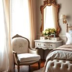
Imagine stepping into your personal sanctuary. A place where calm washes over you the moment you enter. This is the power of a thoughtfully designed personal space.
Choosing the right color sets the entire mood. A sophisticated neutral shade offers incredible versatility. It ranges from soft, airy tones to deep, dramatic hues.
This adaptability makes it perfect for creating a serene and chic retreat. Whether your style leans cozy or luxurious, this palette provides an elegant foundation.
We will explore inspiring concepts to transform your room. You’ll discover how to blend this hue with other neutrals and vibrant accents. The possibilities for your home are truly endless.
Get ready to create a dreamy oasis that balances relaxation with impeccable style. Your perfect look awaits.
Why Gray is the Perfect Choice for Your Bedroom
Your bedroom should be a peaceful retreat where you can truly unwind. The right color scheme creates a soothing atmosphere perfect for restful sleep. This neutral shade offers incredible versatility for your personal space.
Light tones make any room feel airy and more spacious. This works especially well in smaller areas or spaces with limited natural light. You can create an open, breathable environment that feels inviting.
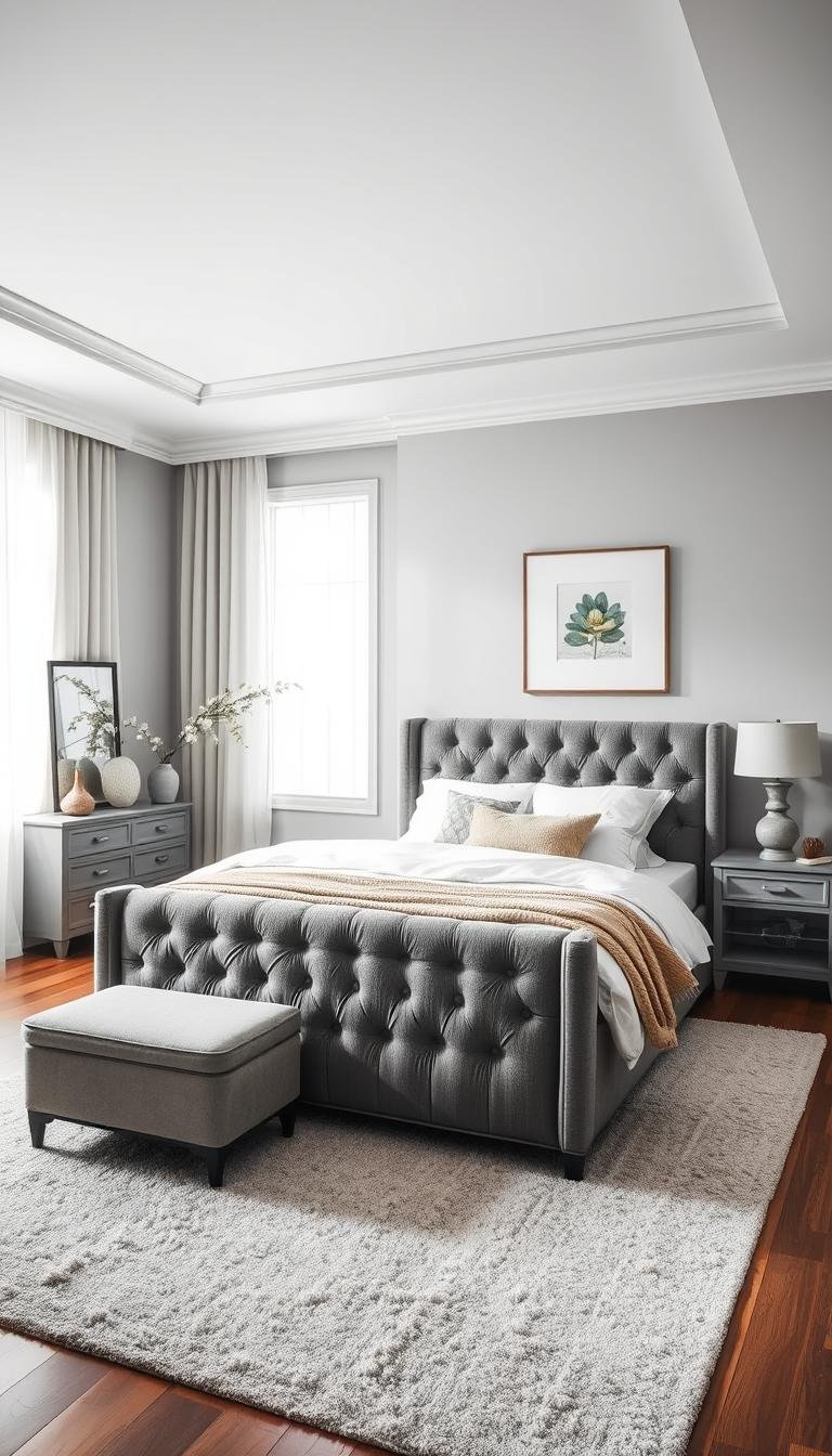
Deeper shades add sophistication without overwhelming your senses. When balanced properly, charcoal and slate tones bring drama and depth. These rich colors create a luxurious feel in your sleeping area.
This versatile hue pairs beautifully with countless other colors. It complements neutral partners like white and beige perfectly. You can also add vibrant accents like pink or yellow for personality.
| Shade Type | Room Effect | Best For | Color Pairings |
|---|---|---|---|
| Light Gray | Airy, spacious feel | Small rooms, limited light | White, pastels, soft blues |
| Medium Gray | Balanced, calming | Most bedroom sizes | Beige, navy, muted greens |
| Charcoal/Dark Gray | Dramatic, sophisticated | Large spaces, accent walls | Gold, rust orange, deep blue |
| Greige (Gray+Beige) | Warm, inviting | Traditional, rustic styles | Cream, brown, terra cotta |
The color adapts to various design aesthetics seamlessly. From modern minimalist to rustic farmhouse, it fits any home’s character. Your personal style shines through this flexible foundation.
This timeless choice remains elegant year after year. Unlike trend-driven colors, it doesn’t date quickly. You make a smart long-term investment in your decor.
Practical benefits include forgiveness with stains and wear. Lighter variations particularly hide everyday marks well. This makes the color ideal for families or frequently used spaces.
Different undertones create distinct moods in your room. Blue-tinged versions evoke tranquility and peace. Green-based shades pair wonderfully with natural elements like wood and plants.
The neutral backdrop allows easy updates over time. You can refresh your look simply by changing accessories or bedding. This adaptability keeps your space feeling current and fresh.
Understanding Gray Undertones: Warm, Cool, and Greige

Have you ever painted a wall gray only to find it looks completely different than expected? The secret lies in those subtle undertones that transform your space.
These hidden hues dramatically affect your room’s mood. Choosing the right undertone creates your perfect color scheme.
The Serenity of Cool Grays
Cool grays carry blue or purple undertones. They create a peaceful, calming atmosphere perfect for relaxation.
Slate shades work wonderfully in minimalist spaces. They pair beautifully with blue accents and crisp white trim.
This combination evokes a spa-like retreat. It’s ideal for coastal-inspired designs or anyone seeking tranquility.
Consider your room’s natural light when choosing. Cool tones enhance north-facing rooms with soft, indirect light.
The Warmth of Greige and Beige-Toned Grays
Warm grays feature beige, brown, or green undertones. Greige specifically blends gray with beige for a cozy feel.
These shades add welcoming warmth to your space. They work beautifully with traditional or rustic decor styles.
Pair warm grays with natural wood furniture. Add metallic gold accents for a luxurious touch.
Green-undertoned grays complement living plants perfectly. They create a harmonious, earthy atmosphere.
South-facing rooms benefit from warm undertones. They soften harsh sunlight while maintaining brightness.
Mixing undertones can create wonderful depth. Try blue-toned accessories with beige-based walls.
Understanding these subtle differences helps you build a cohesive palette. Your space will feel balanced and intentionally designed.
How to Build Your Gray Bedroom Color Palette
Building a cohesive color scheme starts with selecting the right foundation shade. Your choice depends on room size, natural light, and desired atmosphere. Light tones create airy spaciousness, while deeper shades add dramatic sophistication.
Consider your room’s dimensions when choosing wall paint. Smaller spaces benefit from pale variations that expand visually. Larger rooms can handle charcoal or slate for added depth.
Natural lighting dramatically affects how your chosen shade appears. North-facing rooms work well with cooler tones. South-facing spaces often need warmer undertones to balance bright sunlight.
Complementary colors complete your personalized style. Neutrals like white or cream maintain serene calmness. Bold accents like yellow or pink inject vibrant energy.
Varying tones within the same family prevents flatness. Try dark furniture against light walls for contrast. Mix medium shades in bedding and accessories for harmony.
Texture adds visual interest to your palette. Natural wood brings warmth to cool schemes. Velvet or linen fabrics provide tactile richness.
Test paint samples in your actual space before committing. Observe how colors change throughout the day. Different lighting conditions reveal subtle undertones.
Extend your palette beyond wall treatments. Incorporate your foundation shade in rugs and upholstery. This creates layered cohesion throughout the space.
Small rooms benefit from light-dominant schemes. Accent walls in deeper tones add focus without overwhelming. This technique maintains open feeling while adding depth.
Maintain balance using the 60-30-10 design rule. Your primary color should cover about 60% of the space. Secondary tones occupy 30%, with accents completing the final 10%.
Popular combinations offer different moods. Gray with rusty red creates cozy warmth. Paired with blue, it evokes relaxed coastal vibes.
Your final palette should reflect personal preference while maintaining harmony. The right combination transforms your sleeping area into a perfect retreat.
Your Guide to 25 Gray Bedroom Ideas That Feel Timeless and Modern

Discover inspiring concepts that transform your personal space. Each design offers unique character and charm. You can find the perfect match for your home.
These creative approaches showcase incredible versatility. From elegant framed details to cozy textures, there’s something for everyone. Let these ideas spark your imagination.
1. The Elegant Framed Wallpaper Look
Maxime Vandal and Richard Ouellette created sophistication in a Montreal apartment. They used framed Zoffany wallcovering panels on soft walls. This approach adds elegance without full coverage.
Your guest space gains instant refinement. The framed sections create artistic focal points. This technique works beautifully behind the bed or on accent walls.
2. The Dusky Charcoal Sanctuary
Stephen Shubel designed a California cottage retreat with deep walls. Blackout curtains combat bright light perfectly. Faux-book wallpaper creates wonderful space illusion.
Your sleeping area becomes a true sanctuary. The rich shade promotes restful relaxation. This scheme works especially well in brighter climates.
3. The Cozy and Textural Retreat
Alison Victoria brought Parisian luxury to a Chicago space. Leather accents and a fur throw add wonderful warmth. The design emulates a luxury hotel feel.
Your room gains incredible tactile richness. These elements create inviting comfort. You’ll love spending time in this cozy retreat.
4. The Industrial Flannel Statement
Robert Stilin lined master walls in wool flannel from Holland & Sherry. This Tribeca loft gained industrial flair and warmth. The material adds unique richness.
Your urban space gets distinctive character. Flannel provides both visual and tactile interest. This approach suits modern industrial aesthetics perfectly.
5. The Light and Bright Californian Vibe
Frances Merrill used neutral tones in an Ojai escape. Texture-focused design creates calm serenity. The space feels airy and incredibly peaceful.
Your home captures that relaxed West Coast feeling. Light shades make the room feel spacious. Natural materials enhance the tranquil atmosphere.
6. The Beachy Ocean-Inspired Palette
Joe Lucas chose an ocean-inspired scheme in Hermosa Beach. Gray, cerulean, and indigo create coastal harmony. The palette evokes peaceful waterfront views.
Your space gains refreshing aquatic energy. These cool tones promote relaxation. You’ll feel like you’re on permanent vacation.
7. The Nautical Shiplap Bunk Room
The same California house features ship-like sleeping quarters. Shiplap walls and a brass ladder create maritime charm. This bunk room sleeps seven with surfer style.
Your family space gets fun nautical character. The design maximizes sleeping capacity beautifully. Kids will adore this adventurous theme.
8. The Dramatic Scenic Wallpaper Backdrop
Juan Carretero used scenic Anthropologie paper in a Catskills home. The dramatic backdrop creates dreamy atmosphere. Black-and-white accents highlight the beautiful pattern.
Your room gains incredible visual impact. The large-scale design becomes an artistic statement. This approach works best as a single accent wall.
9. The Modern Metallic-Silver Spa Retreat
David Mann painted walls and ceiling in metallic-silver shade. This New York City space feels like a luxury spa. The finish creates a soothing glow throughout.
Your urban retreat gains contemporary elegance. The metallic effect adds subtle shimmer. This look promotes ultimate relaxation.
10. The Scandinavian Soft Wallpaper Touch
Liliane Hart used soft Engblad & Co. paper in a Sag Harbor home. The guest space gained Scandinavian simplicity. Clean lines and subtle patterns create serenity.
Your space achieves Nordic calmness. The minimalist approach feels both cozy and spacious. This style works beautifully in smaller rooms.
11. The Warm Silk-Clad Historical Elegance
Nina Farmer warmed a historic Boston space beautifully. Brown and sepia tones complement silk-and-abaca wallcovering. The room feels both elegant and inviting.
Your traditional home gains rich sophistication. Silk adds luxurious texture and subtle shine. This approach honors historical character perfectly.
12. The Rustic Washed-Out Plank Wall
Susan Ferrier used rough-cut plank pine in an Alabama lake house. The purposefully weathered look creates rustic charm. Velvet bed hangings add contrasting elegance.
Your retreat gains wonderful organic character. The washed-out finish feels both casual and refined. This style suits vacation homes beautifully.
13. The Romantic and Dreamy Canopy
Joe Lucas designed a Los Angeles space with soft blue shades. Weathered wood and Idarica Gazzoni fabric curtains create romance. The canopy bed becomes a dreamy focal point.
Your room transforms into a romantic escape. The flowing fabrics add movement and softness. This look feels both timeless and contemporary.
14. The Airy Linen Canopy Addition
Maxwell Ryan and Rebecca Robertson chose a linen canopy from Etsy. Their Hamptons master bedroom gained airy softness. The neutral treatment maintains spacious feeling.
Your sleeping area feels light and breathable. Natural linen adds texture without weight. This approach enhances relaxation perfectly.
15. The Global-Inspired Pop of Color
Vern Yip added citrine yellow to a gray-and-tan palette. His Florida guest house gained joyful energy. Global travels inspired these vibrant accents.
Your space gets personality and warmth. The bright pops create visual excitement. This scheme feels both sophisticated and playful.
16. The Classic Farmhouse Combination
Heather Chadduck Hillegas designed a Birmingham farmhouse retreat. Pleated lamp shades and a four-post bed create tradition. Soft fabrics enhance the relaxing atmosphere.
Your home gains comfortable familiarity. The combination feels both rustic and refined. This style welcomes you with open arms.
17. The Textured Wallcovering for Coziness
Jeff Andrews chose textured wallcovering for Kaley Cuoco’s guest space. The treatment creates wonderful coziness. Masculine and feminine elements balance perfectly.
Your room gains dimensional interest. Texture adds depth without pattern. This approach feels both modern and comfortable.
18. The Graphic Layered Furniture Look
Jeff Andrews used blue-gray paint in his Los Angeles home. Layered slate and charcoal furniture create graphic impact. The modern scheme feels both cohesive and dynamic.
Your space achieves contemporary sophistication. The layered approach adds depth and interest. This look suits urban dwellings perfectly.
19. The All-American Patriotic Scheme
Alexandra Angle used Farrow & Ball’s Lamp Room Gray wainscoting. An antique flag inspired the patriotic color scheme. Red, white, and blue create vibrant energy.
Your room gains bold American spirit. The classic combination feels both timeless and fresh. This approach celebrates traditional roots beautifully.
20. The New Traditional Pattern Mix
Kirsten Fitzgibbons and Kelli Ford used contemporary floral paper. Pale taupe-gray with gingham check creates pattern harmony. The New York apartment bedroom balances femininity perfectly.
Your space achieves updated tradition. The mixed patterns feel both classic and current. This approach adds personality without overwhelm.
21. The Gray and Yellow Energy Boost
This vibrant combination brings cheerful energy to your space. Sunny yellow accents create instant happiness. The scheme feels both sophisticated and playful.
Your room gains wonderful visual excitement. The contrast between cool and warm tones works beautifully. This palette promotes positive moods.
22. The Maximalist Bedding Statement
Bold patterns and rich colors create dramatic impact. Your bed becomes the undeniable focal point. The layered look feels both luxurious and inviting.
Your space gains personality and vibrancy. This approach lets you express individual style freely. The result is truly unforgettable.
23. The Gray Velvet Headboard Luxury
Plush velvet adds incredible tactile luxury. Your headboard becomes a sophisticated statement piece. The material catches light beautifully.
Your room gains instant elegance. Velvet provides both visual and physical comfort. This choice feels both modern and timeless.
24. The Gray and Pink Feminine Modern
This combination balances softness with sophistication. Blush pink accents create gentle warmth. The scheme feels both contemporary and romantic.
Your space achieves delicate strength. The palette works beautifully in master or guest rooms. This approach feels both fresh and timeless.
25. The Gray and Gold Glamorous Decor
Metallic gold accents add dazzling glamour. Your space gains luxurious sparkle. The combination feels both opulent and comfortable.
Your room achieves red-carpet elegance. Gold accessories catch and reflect light beautifully. This look creates unforgettable sophistication.
| Idea Number | Style Category | Key Elements | Room Size Suitability |
|---|---|---|---|
| 1-5 | Elegant & Refined | Framed wallpaper, textured walls, luxury materials | Medium to large spaces |
| 6-10 | Coastal & Relaxed | Nautical elements, light tones, natural textures | All room sizes |
| 11-15 | Traditional & Romantic | Canopy beds, historical references, soft fabrics | Medium to large spaces |
| 16-20 | Modern & Graphic | Pattern mixing, layered furniture, bold accents | All room sizes |
| 21-25 | Colorful & Dramatic | Vibrant accents, maximalist approaches, metallic touches | Medium to large spaces |
The right design transforms your bedroom into a personal sanctuary that reflects your unique style while providing ultimate comfort.
These concepts demonstrate incredible versatility. You can mix elements from different ideas. Create a space that truly represents your personality.
Remember to consider your room’s specific characteristics. Light, size, and architectural features influence your choices. The perfect combination awaits your discovery.
Mixing Textures and Patterns for Depth
Have you noticed how some spaces feel flat while others invite you to touch everything? The secret lies in thoughtful layering of different surfaces. Your sleeping area gains incredible dimension through this approach.
Combining various materials prevents monotony in your color scheme. Velvet pillows against linen bedding create wonderful contrast. A wooden nightstand adds natural warmth beside smooth painted walls.
Patterns introduce exciting visual interest to your space. Geometric area rugs anchor the room with dynamic energy. Striped bedding provides rhythm without overwhelming your senses.
Jeff Andrews demonstrated this beautifully in Kaley Cuoco’s guest room. Textured wallcoverings created instant coziness and depth. This approach transforms any space into a welcoming retreat.
Layer different shades through your textiles and accessories. Knitted throws in charcoal add richness to light gray quilts. Mixing tones within the same family creates sophisticated harmony.
Balance bold patterns with solid foundations. If you choose dramatic wallpaper, keep bedding simple. Use patterned accents in pillows or art rather than large pieces.
Small rooms benefit from subtle texture variations. Linen curtains add softness without visual weight. A herringbone area rug provides pattern interest without clutter.
Combine smooth and rough elements for tactile appeal. A sleek headboard pairs wonderfully with chunky knit blankets. Faux fur rugs add warmth underfoot against cool flooring.
Your choices should complement the overall style of your space. Modern designs might incorporate metallic touches and glossy surfaces. Rustic styles work beautifully with woven materials and natural wood.
This sensory approach makes your room more inviting and comfortable. You create an environment that feels both visually interesting and physically pleasurable. The result is a space you’ll love spending time in.
Selecting the Right Furniture for a Gray Bedroom

Your furniture choices make or break the entire room’s atmosphere. They add personality and function to your sleeping space. The right pieces enhance your chosen color scheme beautifully.
Consider your walls when selecting each item. Darker walls need lighter furniture for balance. Lighter walls can handle deeper, richer pieces.
Your bed naturally becomes the room’s centerpiece. Choose a frame that reflects your personal style. It should complement your overall design vision.
Upholstered options offer incredible versatility. Gray velvet or linen adds subtle luxury. These materials pair well with various bedding colors.
Wood pieces bring wonderful warmth to your space. Natural grain or gray-stained finishes work beautifully. They create cozy contrast against cool walls.
Metal frames suit industrial-inspired designs perfectly. Their sleek profiles reduce visual weight. This approach maintains an airy, open feeling.
Small spaces demand smart furniture choices. Slim-profile pieces save precious floor area. Built-in storage maximizes functionality beautifully.
Consider these essential furniture elements:
- Nightstands with drawers keep essentials organized
- A bench at the foot provides seating and style
- Matching dressers maintain cohesive harmony
- Statement headboards create dramatic focal points
Texture plays a crucial role in your selections. Mix materials for visual and tactile interest. This layering prevents flatness in your scheme.
Your furniture should reflect the room’s overall character. Choose pieces that align with your design style. The result feels intentional and perfectly balanced.
Remember scale when arranging your space. Oversized furniture overwhelms smaller rooms. Proper proportions ensure comfortable movement.
Your choices transform the area into a personalized retreat. Each piece contributes to the room’s function and beauty. You create a space that truly feels like home.
Lighting Tips to Enhance Your Gray Space
Have you considered how illumination transforms your personal retreat? The right lighting strategy reveals the true beauty of your color choices. It creates atmosphere and highlights your favorite design elements.
Different bulbs dramatically affect how your walls appear. Cool-toned lights enhance blue undertones in your scheme. Warm bulbs bring out beige or green undertones beautifully.
Layered illumination creates the perfect ambiance. Start with overhead fixtures for general brightness. Add task lighting like bedside lamps for reading comfort.
Accent lights provide that special touch. Wall sconces offer focused glow without occupying surface space. They create wonderful visual interest on textured surfaces.
Metallic fixtures add warmth against cool backdrops. Brass or gold finishes create lovely contrast. These elements become stylish focal points in your room.
Natural illumination presents unique considerations. Sun-filled spaces might make pale shades read as white. Use crisp white trim to define your chosen tone.
Consider these lighting strategies for different effects:
- Sculptural pendant lights draw eyes upward, making ceilings appear higher
- Dimmable options let you adjust mood throughout the day
- Strategic spots highlight architectural features or artwork
- Mirrors reflect existing illumination, brightening smaller areas
Your fixtures should complement your overall decor style. Modern spaces suit sleek, minimalist designs. Traditional rooms shine with classic chandeliers or sconces.
Remember functionality alongside aesthetics. Choose pieces that provide adequate illumination for daily activities. Your space should work beautifully day and night.
The perfect lighting plan transforms your retreat. It enhances colors, creates mood, and highlights special elements. You’ll love how your room comes to life after dark.
Incorporating Accent Colors with Gray

What if your peaceful retreat could also spark joy with vibrant personality? Accent colors bring energy to your serene space. They create focal points without overwhelming the calm atmosphere.
Your foundation shade provides the perfect neutral backdrop. It allows bold or subtle pops to shine beautifully. You maintain relaxation while adding personal expression.
Choose accent shades that complement your wall’s undertones. Warm grays pair wonderfully with fiery oranges or rich reds. Cool tones work beautifully with teal or soft blue touches.
Vern Yip demonstrated this perfectly with citrine yellow accents. His global-inspired approach created joyful energy. The vibrant pop transformed the space while maintaining elegance.
Use the 60-30-10 design rule for balanced harmony. Your main color should cover about 60% of the room. Secondary neutrals occupy 30%, with accent shades completing the final 10%.
This approach prevents overwhelming your senses. It creates visual interest without chaos. Your space feels both exciting and restful.
Introduce accent colors through manageable elements. Throw pillows offer easy seasonal updates. Artwork creates focal points without permanent commitment.
Area rugs anchor the space with pattern and color. Small decor items provide playful touches. You can change these elements as your style evolves.
Metallic accents add glamorous sophistication. Gold or copper elements catch light beautifully. They create luxurious contrast against matte surfaces.
These touches work with any undertone beautifully. They bring warmth to cool schemes. They enhance richness in warm palettes.
Natural elements provide organic warmth. Living plants introduce green vitality. Wood accessories add earthy texture.
These touches work with any color scheme. They create harmonious balance in your retreat. Your space feels connected to nature.
| Accent Color | Best With Undertones | Room Mood Created | Implementation Ideas |
|---|---|---|---|
| Yellow | Warm or Cool | Joyful, Energetic | Throw pillows, art, small decor items |
| Pink | Cool | Soft, Romantic | Bedding, curtains, accent chairs |
| Teal/Blue | Cool | Calm, Serene | Rugs, wall art, ceramic accessories |
| Orange/Rust | Warm | Cozy, Inviting | Blankets, pottery, decorative objects |
| Metallic Gold | Warm | Luxurious, Glamorous | Light fixtures, mirror frames, hardware |
| Green | Any | Fresh, Natural | Plants, botanical prints, textiles |
Create cohesion through repeated color elements. Choose two or three accent shades maximum. Use them in multiple items throughout your space.
This repetition creates visual harmony. It makes your design feel intentional and polished. Your room tells a cohesive color story.
Personalization remains the most important consideration. Select accents that reflect your unique personality. Your space should feel authentically yours.
Whether you prefer bold vibrancy or subtle sophistication, accent colors transform your retreat. They add that perfect finishing touch to your personalized sanctuary.
DIY Ideas: From Limewash to Accent Walls
Ready to roll up your sleeves and transform your space with your own hands? Personal DIY projects let you create a truly unique retreat that reflects your style perfectly.
Limewash offers a beautiful way to achieve that timeworn European look. This eco-friendly paint alternative creates a breathable finish that prevents moisture damage. The subtle variation in shade adds instant character to your walls.
Create a stunning focal point with an accent wall. Shiplap installation adds wonderful texture and dimension. Reclaimed wood arranged in geometric patterns creates incredible visual interest.
Gray stain provides an excellent alternative to traditional paint. Apply it to wood furniture or floors for a weathered, rustic look. This technique complements your gray walls beautifully while adding natural warmth.
DIY wallpaper installation transforms your room with personality. Choose from damask, geometric, or striped patterns. Peel-and-stick options make application simple and commitment-free.
These creative elements let you experiment without overwhelming your entire space. You can test different techniques on smaller areas first. This approach builds confidence before tackling larger projects.
Always prioritize safety during your DIY adventures. Ensure proper ventilation when working with stains or paints. Follow manufacturer instructions carefully for best results and durability.
Your personal touches make the scheme truly yours. Embrace the creative process and enjoy making your mark. The result will be a bedroom that feels authentically personal and perfectly yours.
Small Space Solutions with Gray

Does your compact sleeping area feel cramped and limited? Smart design choices can transform even the tiniest personal retreat. Light colors work wonders in these challenging spaces.
A pale shade on your walls creates an airy, open feeling. It reflects light better than dark colors, making your room appear larger. This approach works particularly well in smaller bedrooms.
Keep your ceiling bright white for maximum effect. This helps light gray walls register properly as gray rather than white. The contrast adds height and dimension to your space.
Built-in storage maximizes every inch of your area. Custom shelves utilize awkward nooks perfectly. A window seat with hidden compartments provides both seating and organization.
Choose multi-functional furniture pieces wisely. A desk that doubles as a nightstand saves precious floor space. An ottoman with storage inside reduces visual clutter effectively.
Scale matters tremendously in compact rooms. Select smaller-profile pieces that fit proportionally. Avoid oversized items that overwhelm your limited area.
Light paint is wonderfully forgiving with everyday wear. It hides fingerprints and minor stains better than pure white. This makes it ideal for kids’ rooms or high-traffic spaces.
Strategic mirrors create the illusion of more room. They bounce light around, enhancing your color scheme. Position them opposite windows for maximum brightness.
Vertical elements draw eyes upward beautifully. Tall bookcases utilize height rather than floor space. Hanging art creates visual interest without consuming precious square footage.
Keep your color palette simple and cohesive. Use your neutral base with minimal accent colors. This prevents visual chaos in your compact retreat.
Sheer curtains maintain an airy, open look. They filter light softly while preserving outside views. This approach enhances the spacious feeling.
Remember that less truly becomes more in small spaces. Focus on clean lines and uncluttered surfaces. Your compact bedroom will feel calm, organized, and surprisingly spacious.
Maintaining a Cohesive and Balanced Look
Creating harmony in your personal retreat requires thoughtful balance and cohesion. Your sleeping space should feel intentionally designed yet completely comfortable. The right approach makes your room both beautiful and functional.
Balance begins with your color distribution. Use lighter tones on walls with darker accents for contrast. This creates visual interest without overwhelming your senses.
Repeat colors and patterns throughout your space for harmony. Match your bedding with curtain colors for a pulled-together look. This repetition creates a seamless flow between different elements.
Maintain a consistent color palette with your neutral foundation. Choose two or three supporting colors maximum. This simplicity prevents a disjointed appearance.
Symmetry brings classic elegance to your arrangement. Use matching nightstands and lamps on either side of your bed. This balanced approach feels both organized and inviting.
Natural materials add instant warmth to your scheme. Wood furniture brings organic texture against smooth walls. Jute rugs provide earthy contrast to soft bedding.
Combine different textures evenly across your room. Mix smooth velvet pillows with rough linen throws. This creates both visual and tactile interest.
Ensure your bed remains the focal point of the space. Arrange other elements to support this central feature. Your attention should naturally gravitate toward this area.
Infuse personal touches while maintaining overall balance. Display artwork or photos that reflect your unique style. These elements make the space truly yours.
| Design Style | Balance Technique | Color Combination | Texture Mix |
|---|---|---|---|
| Modern Minimalist | Symmetrical furniture placement | Light walls with charcoal accents | Smooth surfaces with metallic touches |
| Cozy Traditional | Repeated pattern elements | Medium tone with cream trim | Plush fabrics with wood grains |
| Industrial Chic | Contrasting material weights | Dark foundation with rust pops | Rough metals with soft textiles |
| Coastal Relaxed | Balanced light distribution | Pale base with blue accents | Natural fibers with smooth finishes |
White trim helps define your wall color beautifully. It creates crisp contrast that enhances your chosen shade. This technique works with any undertone.
Remember that cohesion doesn’t mean perfection. Your space should reflect your personality while feeling harmonious. The result is a bedroom that truly feels like home.
Bringing Your Dream Gray Bedroom to Life
Your journey to a beautiful personal retreat starts with a solid plan. Choose a soothing shade based on its undertones to set the right mood. Then build your color palette with complementary hues and varied textures.
Consider practical aspects like lighting and furniture selection. Layer different materials for depth and visual interest. Don’t forget to test paint samples in your actual space before committing.
Small changes make big impacts. Add gray bedding or create an accent wall to begin your transformation. These simple updates refresh your room’s entire look.
For more inspiration, explore these gray bedroom ideas that showcase various design approaches. Your perfect sanctuary awaits your personal touch.
Embrace the process and enjoy creating a space that truly reflects your style. Your dream bedroom becomes a reality with thoughtful planning and creative expression.