Your bedroom should be your personal sanctuary, yet it’s often the most neglected space in home decor. Since guests rarely see this room, many people settle for disjointed aesthetics that lack cohesion.
The right color scheme can completely transform your sleeping environment without breaking your budget. Instead of creating a chaotic rainbow of hues, professional designers recommend using just 2-4 carefully selected shades.
This limited approach creates a calm, serene vibe that promotes relaxation and better sleep. Your chosen palette extends beyond just wall paint to include textiles, accessories, and decorative accents.
We’ve gathered inspiring combinations that interior experts adore. These suggestions will help you create a cohesive look that reflects your personal style while setting the perfect mood for your retreat.
Discover how to incorporate beautiful tones through bedding, artwork, and other elements. Let’s explore these expert-approved combinations that can turn your space into the peaceful sanctuary you deserve.
Transform Your Bedroom into a Designer Retreat
Your personal retreat deserves as much design consideration as any other space in your home. Even though it’s private, this room significantly impacts your daily relaxation and sleep quality.
Why Your Bedroom Deserves a Color Scheme
A thoughtful palette creates visual harmony throughout your space. It brings together furniture, textiles, and decorations into one cohesive look.
Psychologically, coordinated hues promote calmness and reduce stress. Your brain appreciates the organized environment when you’re trying to unwind.
Professional designers understand that limited shades create serenity. They typically work with just 2-4 tones for maximum impact.
More Than Just Paint: Creating a Cohesive Vibe
Your scheme extends far beyond wall treatments. Consider how bedding, curtains, and area rugs contribute to the overall aesthetic.
Accessories like throw pillows and artwork introduce color without commitment. You can easily update these elements as your tastes evolve.
The right combination should reflect your personality while maintaining restful energy. Whether you prefer serene neutrals or energetic statements, consistency is key.
Here’s how different approaches can transform your space:
| Design Approach | Primary Elements | Secondary Accents | Overall Vibe |
|---|---|---|---|
| Paint-Focused | Wall treatment, ceiling | Trim, architectural details | Architectural, defined |
| Textile-Driven | Bedding, window treatments | Pillows, throws, rugs | Soft, layered |
| Accessory-Based | Artwork, lighting | Decorative objects, books | Personal, eclectic |
| Balanced Blend | Equal distribution | All elements coordinated | Professional, cohesive |
Remember that natural light affects how tones appear throughout the day. Test your selections at different times before finalizing decisions.
This strategic approach gives you designer results without the high cost. Your sanctuary will feel intentionally crafted rather than randomly assembled.
How to Use These 20 Room Color Ideas Bedroom Palettes Designers Love

Ready to transform your sleeping space? These expert combinations serve as springboards for your personal journey. Start by identifying which palettes resonate with your unique style.
Consider your existing furniture and decor when selecting a scheme. Your bed frame, nightstands, and flooring should complement rather than clash with your new tones.
Always test your paint color choices before committing. Purchase sample pots from brands like Benjamin Moore or Farrow & Ball. Apply large swatches to your walls.
Observe how the shade changes throughout the day. Natural and artificial light dramatically affect how hues appear in your environment.
Digital visualization tools offer another excellent testing method. Many paint companies provide apps that show colors in your space through augmented reality.
Build your palette through layers rather than all at once. Begin with your wall color as the foundation. Then add coordinating bedding and window treatments.
Introduce accent pieces through throw pillows and artwork. These smaller elements bring personality without overwhelming the space.
Balance bold statements with calming neutrals. A vibrant accent wall might pair beautifully with soft gray or creamy white on other surfaces.
Experiment with complementary color combinations. Deep blue with warm wood tones creates incredible depth. Soft green with peach accents feels both fresh and cozy.
Mix and match ideas from different palettes to create something uniquely yours. Perhaps you love one combination’s main hue but prefer another’s accent colors.
Remember that small changes make big impacts. New bedding or a single statement piece can refresh your retreat without a complete overhaul.
“Your personal sanctuary should reflect what makes you feel most at peace. Use these ideas as inspiration, but always trust your instincts about what feels right for your home.”
The ultimate goal is creating a space where you genuinely love spending time. Your bedroom should feel like a true retreat that supports relaxation and restful sleep.
The Ultimate Cocoon: Deep Blue and Warm Accents
Designer Ali Henrie showcases how a bold blue shade can make your room feel like a cocoon. This approach creates an intimate setting that promotes rest and relaxation.
Benjamin Moore’s Knoxville Gray
This deep blue paint color envelops your space in a serene, sophisticated vibe. It acts as a strong foundation for your personal retreat.
Knoxville Gray has a rich depth that makes walls feel closer and cozier. It’s perfect for crafting a snug environment where you can unwind.
Designer: Ali Henrie
Ali Henrie selected this hue for its ability to evoke a cocoon-like feeling. She balanced the cool blue with warm, inviting accents throughout the space.
Rust-colored linens and wooden furniture introduce warmth against the cool walls. These elements create a harmonious blend that feels both dramatic and calming.
Vintage equine artwork inspired by a horse’s chestnut coat ties the palette together. This thoughtful detail adds personality and cohesion to the design.
Proper lighting prevents the space from feeling too dark. Use layered light sources to maintain a bright, inviting atmosphere.
| Color Element | Warm Accent | Overall Effect |
|---|---|---|
| Deep Blue Walls | Rust Bedding | Cozy Contrast |
| Wood Nightstand | Terracotta Textiles | Natural Warmth |
| Vintage Artwork | Brown Decor | Personalized Touch |
Consider terracotta or brown textiles if you want a similar look. This palette suits anyone seeking a restful yet statement-making retreat.
Henrie’s masterful mix of cool and warm tones offers a blueprint for your own project. Embrace this idea to transform your space into a true sanctuary.
Art-Inspired Vibrancy: St. Giles Blue Accent Wall
Art can be a powerful starting point for your personal retreat. It brings emotion and personality into your design process.
One designer found inspiration in a master’s work to craft a truly unique space.
Farrow and Ball’s Bold Hue
Farrow & Ball’s St. Giles Blue makes a dramatic statement. This vibrant paint color captures attention without feeling overwhelming.
Its rich saturation creates depth and energy. The shade works beautifully as a focal point against lighter surfaces.
This particular hue maintains its character in different lighting conditions. It feels both lively and comforting throughout the day.
Designer: Lara Apelian Studio
Lara Apelian looked to Picasso’s beach paintings for inspiration. She translated artistic energy into a livable bedroom environment.
The blue wall serves as the room’s artistic centerpiece. Neutral furnishings and natural textures provide balance around it.
This approach proves that bold colors belong in restful spaces. The right choice can feel both energizing and peaceful.
Consider an accent wall if you want to experiment with stronger hues. This method lets you make a statement without overwhelming your entire space.
Your personal retreat should reflect what inspires you most. Whether through art, nature, or memory—let it guide your design decisions.
“Color should tell a story about the people who live there. Don’t be afraid to choose shades that speak to your personal journey.”
This creative use of color demonstrates how to blend artistry with comfort. Your sleeping environment can be both inspiring and perfectly restful.
Balanced and Restful: Warm Gray and Soft Blue
Sometimes the most peaceful spaces come from subtle combinations. A thoughtful mix of warm neutrals and soft tones creates harmony without demanding attention.
This approach builds a foundation that feels both current and timeless. Your personal sanctuary benefits from this balanced energy.
Color Atelier’s Moonspoon
Color Atelier’s Moonspoon offers a unique paint color option. This warm stone gray contains subtle undertones that prevent it from feeling cold.
As a lime-based paint, it provides a beautiful matte finish with depth. The formula is eco-friendly and creates healthier indoor air.
This particular shade works beautifully in various lighting conditions. It maintains its warmth even in north-facing rooms with less natural light.
Apply this wall color throughout your space for a cohesive look. The result is a soothing background that complements many design styles.
Pair Moonspoon with soft blue textiles for a restful environment. Bedding, curtains, or accent pillows in powder blue create perfect harmony.
This combination achieves balance without being too cool. The warm gray base provides warmth while blue accents add freshness.
Consider these elements when building your palette:
| Primary Element | Recommended Finish | Complementary Accents |
|---|---|---|
| Walls (Moonspoon) | Matte lime paint | Soft blue textiles |
| Ceiling | Flat white | Minimal contrast |
| Wood elements | Natural finish | Warm brown tones |
| Textiles | Cotton, linen | Various blue shades |
Texture plays a key role in this scheme. Layer different materials to add visual interest without introducing more colors.
Try a chunky knit throw or woven basket alongside your blue bedding. These elements enhance the cozy vibe while maintaining simplicity.
This idea works particularly well for those who prefer neutral spaces. It creates an inviting retreat that feels designed rather than decorated.
The combination proves that you don’t need bold statements to create impact. Sometimes the most powerful design choices are the subtlest ones.
“The right neutral palette creates a canvas for living rather than just looking. Your space should support your life, not distract from it.”
Experiment with different blue hues to find your perfect match. From sky blue to dusty slate, each shade creates a slightly different mood.
This approach achieves a designer look through careful coordination. Your bedroom becomes a calm oasis that welcomes you home.
Energetic Pops: Creamy White and Red Accents

Bold colors can feel intimidating in your personal sanctuary. Many people worry vibrant tones might disrupt the peaceful atmosphere they want to create.
Designer Ginny Macdonald shows how to add energy without overwhelming your space. Her clever approach uses a neutral foundation with strategic pops of color.
Designer: Ginny Macdonald
Ginny Macdonald chose creamy white for all major surfaces. This warm neutral paint color creates a calm backdrop throughout the space.
She then introduced red through small, changeable elements. This strategy adds energy without permanent commitment.
The creamy white wall color has subtle warm undertones. These undertones complement red accents beautifully.
Your bedroom maintains a restful mood with this balanced approach. The white base prevents the environment from feeling too stimulating.
Consider these flexible ways to incorporate color pops:
- Red throw pillows on your bed
- Artwork with red elements
- A small accent rug
- Decorative objects on shelves
This design idea offers incredible versatility. You can easily swap red for other colors when your tastes change.
The neutral foundation works with any shade you want to try. Your room can evolve without repainting.
Ginny’s approach proves that bold hues belong in sleep spaces. When balanced properly, they add personality without sacrificing peace.
This palette works particularly well in interior settings with good natural light. The creamy white reflects illumination beautifully.
“A neutral base gives you freedom to play with color. Your personal retreat should reflect your current passions while allowing room to grow.”
Experiment with different red tones to find your perfect match. From cherry to burgundy, each choice creates a unique vibe.
This clever idea lets you make a statement while keeping your sanctuary feeling like a true retreat.
Sophisticated Sunshine: Happy Yellow and Neutrals
Sunny hues can transform your personal retreat into a joyful sanctuary. When used thoughtfully, yellow brings energy and warmth without feeling overwhelming.
This cheerful tone creates an uplifting environment that welcomes you each morning. The key lies in balancing brightness with calming neutrals for a refined look.
Designer: Pandora Taylor
U.K. designer Pandora Taylor demonstrates how to incorporate yellow with sophistication. She used sunny curtains and a lemony coverlet as her primary color elements.
Gray wallpaper and a creamy headboard temper the vibrancy perfectly. This combination prevents the space from skewing too juvenile while maintaining elegance.
Foliage-inspired wallpaper adds subtle pattern without competing with the bold hue. Natural materials like wood and linen enhance the organic feel.
Taylor’s approach shows that yellow belongs in adult spaces when handled correctly. The result feels both cheerful and perfectly serene.
Consider these elements for a similar effect in your own retreat:
| Color Element | Neutral Balance | Overall Effect |
|---|---|---|
| Yellow Curtains | Gray Wallpaper | Energy with Calm |
| Lemony Coverlet | Creamy Headboard | Brightness with Softness |
| Sunny Accents | Natural Textures | Vibrancy with Grounding |
Using yellow in soft goods rather than wall treatment offers flexibility. You can easily change these elements as your tastes evolve.
Muted yellow shades work best for a softer look. Choose buttery or pale lemon tones over bright primary yellows.
This palette suits anyone wanting a cheerful yet refined environment. The combination uplifts your mood without overwhelming your senses.
If you’re hesitant, start with small yellow accessories. A throw pillow or artwork can introduce the hue without commitment.
“Yellow brings instant happiness to a space when balanced properly. It’s about finding that sweet spot between energy and tranquility.”
Natural light enhances yellow’s warm qualities throughout the day. Your space will feel inviting from morning to evening.
This approach proves that vibrant colors can create sophisticated retreats. Your personal sanctuary can be both joyful and perfectly peaceful.
A Dreamy Duo: Soft Pink and Navy Blue

Some color combinations feel both timeless and fresh at the same time. The pairing of soft pink with deep navy creates a space that is both romantic and grounded.
This dreamy duo brings warmth and sophistication to your personal sanctuary. It offers a feminine touch without feeling overly sweet or childish.
Little Greene’s Light Peachblossom
Little Greene’s Light Peachblossom is a delicate paint color with subtle warmth. This soft pink shade creates a dreamy atmosphere on your walls.
The hue has enough depth to feel intentional rather than washed out. It provides a beautiful backdrop that enhances natural light throughout the day.
This particular wall color works beautifully in various bedroom settings. Its gentle quality promotes calmness and relaxation in your space.
Designer Pandora Taylor balanced this pink with navy blue accents throughout the room. A dark blue headboard and light fixture provide striking contrast against the soft walls.
This combination creates visual interest while maintaining harmony. The navy elements ground the space and prevent it from feeling too delicate.
Powder blue textiles and navy fringe on blush pillows tie the palette together beautifully. These details show thoughtful design and attention to color relationships.
Mixing different blue shades adds depth and sophistication to your environment. From navy to powder blue, each tone contributes to the overall vibe.
Consider this approach if you want a feminine retreat with substance. The combination feels both romantic and perfectly balanced.
Soft pinks are naturally calming and work well in sleep spaces. They create a soothing mood that welcomes relaxation.
Use pink on your wall surfaces and introduce blue through furniture or decor. This distribution creates balance throughout your bedroom.
You can easily adapt this idea to your existing home decor. The colors work with various wood tones and textures.
“The magic happens in the details—like navy fringe on a pink pillow. These small touches show how colors can conversationally relate throughout a space.”
Experiment with complementary hues for a harmonious look in your personal setting. This choice offers both visual interest and peaceful energy.
The designer’s attention to detail demonstrates how to create a cohesive interior. Your bedroom color story can be both beautiful and functional.
Unexpected Warmth: Sky Blue, Burgundy, and Brown
Sometimes the most memorable spaces come from combinations you wouldn’t expect. Designer Ryia Jose proves that cool blues can feel wonderfully warm when paired with rich burgundy and earthy brown tones.
This approach creates a welcoming atmosphere that feels both fresh and cozy. Your personal sanctuary benefits from this balanced energy that surprises and delights.
Sherwin-Williams’ Waterloo & Blustery Sky
Sherwin-Williams’ Waterloo and Blustery Sky offer two beautiful sky blue paint color options. These calming shades create a serene backdrop on your walls.
Waterloo has a slightly deeper tone that adds sophistication. Blustery Sky feels airy and light, perfect for creating an open sense of space.
Both hues work beautifully in various lighting conditions. They maintain their calming qualities throughout the day.
Designer: Ryia Jose of Kin & Kasa
Ryia Jose embraced a hands-on approach to create this unique environment. She personally crafted many elements through DIY projects.
Panel molding, wallpaper installation, and ceiling beadboard were all her handiwork. She even upholstered the bed and created custom curtains.
This personal touch adds character and warmth to the space. Your home gains unique personality when you incorporate handmade elements.
Jose balanced the cool blues with burgundy and brown accents throughout. A vintage kantha quilt and jute rug introduce earthy warmth.
Artwork with rich tones ties the palette together beautifully. These elements create visual interest while maintaining harmony.
Consider this approach for your guest bedroom. The combination feels both inviting and refreshing for visitors.
Brown textiles and natural fiber rugs ground the scheme perfectly. They add cozy texture that makes the room feel lived-in and welcoming.
“DIY elements bring soul to a space. When you create something with your own hands, it carries an energy that store-bought items simply can’t match.”
This design idea celebrates the creativity of mixing unconventional colors. Your personal retreat can be both unique and perfectly balanced.
Take inspiration from this hands-on approach to interior design. Your bedroom color story becomes more meaningful when you add personal touches.
For more inspiring combinations, explore these bedroom color schemes that transform ordinary spaces into extraordinary retreats.
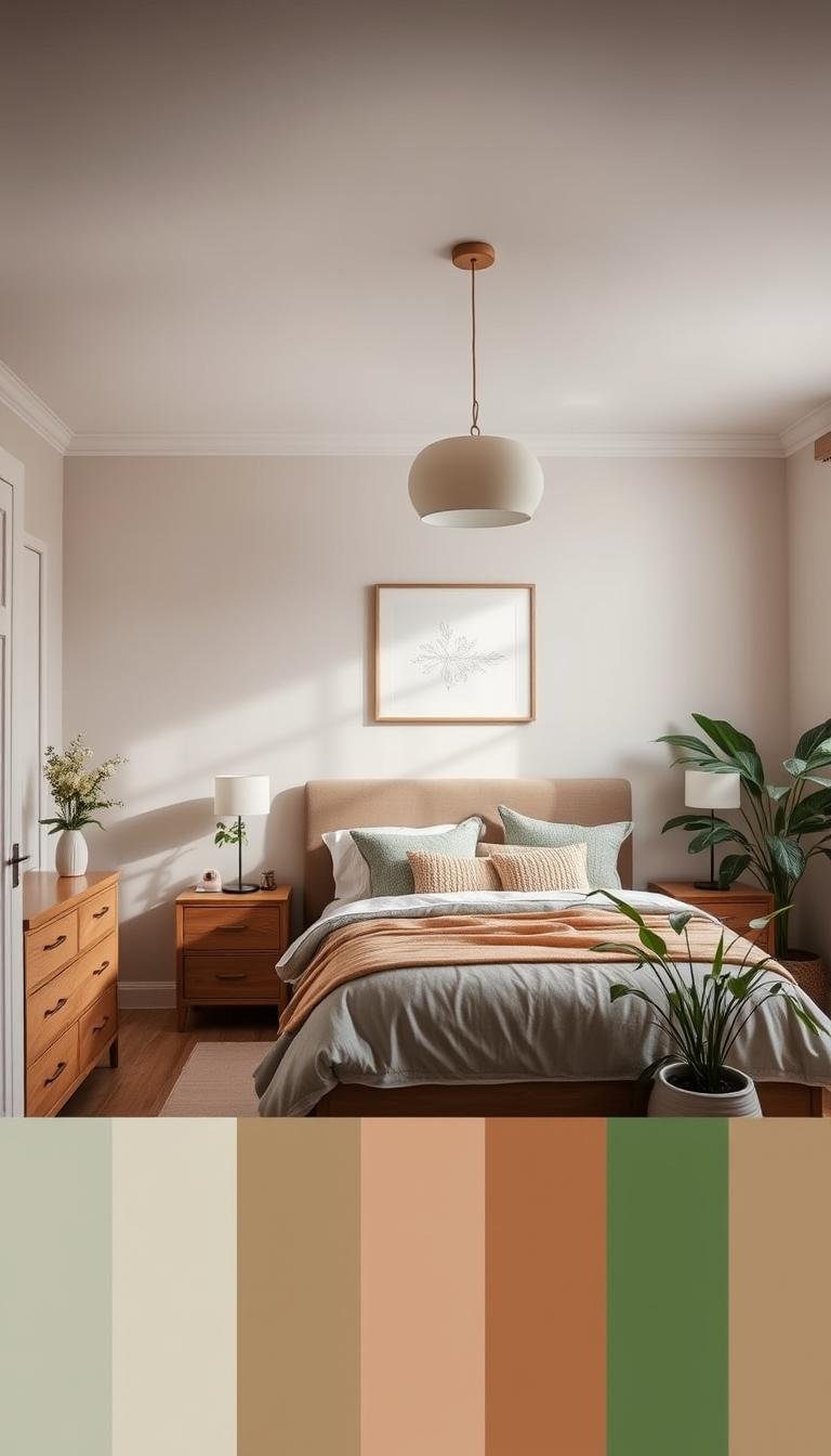
Organic Warmth: Peach-Pink and Natural Textures

A peachy-pink paint color wraps your space in gentle warmth. This soft hue creates a calming mood that feels both inviting and restful.
It offers a beautiful glow that enhances natural light throughout the day. Your bedroom becomes a cozy retreat with this welcoming wall color.
Natural textures enhance the organic warmth of this palette. A jute rug adds earthy texture underfoot. Wood elements bring natural beauty to your space.
Woven shades filter light beautifully while adding visual interest. These materials create a laidback vibe that feels effortlessly stylish.
Teal and green accents prevent the room from looking one-note. These cool tones provide perfect contrast against warm peach walls.
Consider these elements for a balanced design:
- Peach-pink on your main walls
- Natural fiber rug for texture
- Wood furniture or ceiling beams
- Teal throw pillows or artwork
- Green plants for fresh accents
This choice works particularly well in sun-filled spaces. The peach shade reflects illumination beautifully throughout the day.
Incorporate woven materials and living plants for added organic charm. These elements enhance the natural sense of your personal environment.
Peach-pink is flattering and soothing, making it ideal for sleep areas. The color promotes relaxation while maintaining visual interest.
This idea suits anyone who loves earthy, cozy settings. It creates a welcoming bedroom that feels both stylish and comfortable.
“Mixing colors and textures creates depth and personality in your space. The combination of warm peach with natural elements feels both current and timeless.”
Your home benefits from this harmonious blend of colors and materials. The result is a peaceful space that welcomes you each day.
Choose hues that evoke warmth and comfort for your personal retreat. This approach creates an inviting environment that supports restful sleep.
Experiment with different peach shades to find your perfect match. From soft blush to warm coral, each tone creates a unique vibe.
This design demonstrates how to create interest through careful mixing. Your bedroom color story becomes both beautiful and functional.
Cozy and Balanced: Dove Wing White
White walls create a perfect canvas for your personal expression. They offer a clean backdrop that lets your favorite elements shine.
Benjamin Moore’s Dove Wing provides warmth and versatility. This popular neutral works beautifully in various lighting conditions.
Benjamin Moore’s Versatile Neutral
Dove Wing is a warm white paint color with subtle gray undertones. It avoids the sterile feeling of cooler whites.
This particular shade creates coziness while maintaining brightness. Your space feels inviting rather than clinical.
The hue works well with both natural and artificial light. It maintains its warmth throughout different times of day.
Consider Dove Wing for your main walls and ceiling. This creates a seamless look that makes your room feel larger.
Designer: Lara Apelian Studio
Lara Apelian chose this wall color to balance client artwork. The neutral background allows pieces to stand out without competition.
She created a restful environment adjacent to brighter living areas. The white paint provides visual calmness.
This approach demonstrates how white can be warm and inviting. Your bedroom becomes a peaceful retreat with this thoughtful choice.
Artwork and personal items gain importance against this simple background. They become focal points that tell your unique story.
“The right white creates harmony between architectural elements and personal collections. It’s about finding balance between simplicity and personality.”
Dove Wing’s subtle undertones work with various colors. You can easily incorporate different accents over time.
This neutral suits those wanting a clean, timeless look. It provides flexibility for changing design preferences.
Consider these elements when using white in your space:
| Design Element | Recommended Approach | Visual Effect |
|---|---|---|
| Wall Treatment | Dove Wing throughout | Cohesive, expansive |
| Artwork Display | Various sizes and styles | Personal, curated |
| Textural Elements | Natural fibers, woven items | Depth, interest |
| Color Accents | Pillows, throws, decor | Flexible, changeable |
Natural textures prevent white from feeling flat. Incorporate linen bedding or a jute rug for added dimension.
Your bedroom benefits from this versatile palette. The result is a peaceful environment that supports relaxation.
White makes your space feel larger and more open. It reflects light beautifully throughout the day.
This idea offers endless possibilities for personalization. Your home becomes a true reflection of your style.
Experiment with different white shades to find your perfect match. Each tone creates a unique mood and vibe.
Modern Dreamscape: Lavender Accents and Grasscloth

Lavender brings a soft, dreamy quality to your personal space. This gentle hue creates a calming atmosphere perfect for relaxation. Designer Christina Kim shows how to use it in modern ways.
She focuses on strategic placement rather than overwhelming the room. This approach keeps the vibe fresh and contemporary.
Designer: Christina Kim
Christina Kim chose a lavender headboard as her focal point. This unexpected touch adds personality without commitment. The piece stands out against neutral surroundings.
Grasscloth wallpaper covers the main surfaces. Its natural texture adds depth and reduces echo. Your space feels both cozy and sophisticated.
Black nightstands provide bold contrast against soft tones. They ground the scheme with modern elegance. This combination feels balanced and intentional.
Kim’s sparing use of lavender makes it more impactful. Small doses create interest without overwhelming your senses. The result feels both dreamy and refined.
Consider these elements for a similar effect:
| Design Element | Material/Finish | Overall Contribution |
|---|---|---|
| Headboard | Lavender upholstery | Focal point, softness |
| Wall Treatment | Neutral grasscloth | Texture, sound absorption |
| Nightstands | Black lacquer | Contrast, modernity |
| Textiles | White bedding, gray throws | Balance, comfort |
Lavender is naturally calming for sleep environments. It promotes relaxation while adding visual interest. This hue works well in various lighting conditions.
If painting walls feels too bold, start with accessories. Throw pillows or artwork introduce color gently. You can always expand your palette later.
This idea suits those wanting a subtle pop of color. The combination feels modern yet completely restful. Your retreat gains personality without sacrificing peace.
Balance pastels with neutrals for the best results. Too much soft color can feel overwhelming. Contrast keeps your space feeling grounded.
“Focal points like headboards offer perfect opportunities for color experimentation. They make strong statements without permanent commitment.”
Kim’s innovative use of color and texture inspires new possibilities. Your personal environment can be both beautiful and functional.
Consider focal pieces for introducing bold choices. They become conversation starters in your private sanctuary.
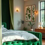
Nature’s Embrace: Green Mural and Velvet Bed
Bringing the outdoors inside creates a tranquil sanctuary that feels both fresh and grounding. A nature-inspired approach wraps your space in organic beauty that promotes deep relaxation.
Designer: Clara Jung of Banner Day Interiors
Clara Jung selected a Schumacher green mural wallpaper for its peaceful quality. This wall color alternative brings lush botanical energy into your personal space.
The mural creates an immersive environment without permanent paint commitment. It serves as artistic inspiration while maintaining a restful mood.
An emerald velvet bed anchors the room with rich texture. This luxurious piece becomes the design focal point against the botanical backdrop.
Peach and rust pillows provide warm accents that break up the green hues. These complementary tones add depth and visual interest.
Natural materials enhance the organic vibe throughout your retreat. Wood elements and woven textures complete the earthy palette.
Consider this balanced approach for your own bedroom:
| Design Element | Material/Finish | Contribution to Space |
|---|---|---|
| Wall Treatment | Green mural wallpaper | Nature-inspired backdrop |
| Bed Frame | Emerald velvet upholstery | Textural grounding point |
| Accent Pillows | Peach and rust fabrics | Warm color breaks |
| Natural Elements | Wood, woven materials | Organic texture balance |
Green promotes relaxation and connection to nature. This shade creates a calming environment perfect for sleep.
Wallpaper offers an excellent way to incorporate bold colors. You can make a dramatic statement without painting all your walls.
This idea suits those wanting an immersive, nature-connected setting. The combination feels both luxurious and perfectly serene.
Balance pattern with solid colors for the best results. Too much visual stimulation can disrupt peaceful energy.
“Nature-inspired designs create spaces that feel both grounded and uplifting. The combination of green with warm accents brings balance and harmony to your personal retreat.”
Your home gains unique personality with this artistic approach. The mural becomes a conversation piece in your private sanctuary.
Experiment with different green shades to find your perfect match. From emerald to sage, each hue creates a distinct mood.
This design demonstrates how to create drama through careful mixing. Your bedroom color story becomes both beautiful and functional.
Playful and Bold Palettes
Ready to inject some personality into your personal retreat? Sometimes your space calls for something more vibrant than traditional neutrals. These energetic combinations bring life and character while maintaining comfort.
Bold choices create memorable environments that reflect your unique style. They transform ordinary rooms into extraordinary expressions of individuality.
Chartreuse, Orangey-Pink, and Yellow-Green
This lively trio brings cheerful energy to your sleeping environment. Chartreuse offers a fresh, zesty quality that feels both modern and fun.
Orangey-pink introduces warmth and playfulness to the mix. It balances the brightness with its cozy, inviting tone.
Yellow-green completes the palette with its sunny disposition. Together, these hues create an uplifting atmosphere that still feels restful.
Consider using these vibrant tones in your textiles and accessories. Throw pillows, artwork, or a colorful rug can introduce these shades without overwhelming your space.
Balance these brights with neutral furniture and bedding. White or light gray surfaces provide a calming foundation for the energetic colors.
Moody Mauve Purple and Mossy Green
For a more sophisticated bold approach, try this earthy combination. Moody mauve brings depth and richness to your walls or accent pieces.
Mossy green introduces natural tranquility and organic warmth. These deeper hues create a cozy, intimate environment perfect for relaxation.
This palette works beautifully in rooms with ample natural light. The colors gain depth and dimension throughout the day.
Consider using mauve on an accent wall behind your bed. Pair it with mossy green bedding or window treatments for a harmonious look.
Natural wood elements complement both shades beautifully. They add warmth and texture to the sophisticated color story.
Both palettes offer exciting ways to express your personality through color. They create distinctive environments that feel both personal and designed.
Remember to test your chosen shades in your actual space. Lighting conditions dramatically affect how these hues appear throughout the day.
These combinations reflect current interior trends while allowing for personal expression. Your home becomes a true reflection of your unique style.
“Bold colors invite emotion and personality into your space. Don’t be afraid to choose shades that make you feel something special every time you enter the room.”
Have fun experimenting with these vibrant ideas in your personal retreat. The right combination can transform your environment into something truly extraordinary.
Serene Neutrals for a Timeless Base
Neutral tones create a peaceful foundation for your personal retreat. They offer versatility that works with any decor style you love.
These calming shades provide a perfect backdrop for your favorite elements. Your space feels both intentional and effortlessly stylish.
Warm Taupe and Mauvey Beige
Warm taupe brings earthy sophistication to your walls. This paint color has subtle gray undertones that prevent it from feeling too brown.
Mauvey beige introduces a soft, rosy warmth that feels inviting. These shades work beautifully together in various lighting conditions.
Both hues create a cozy environment that promotes relaxation. They provide a neutral background that doesn’t compete with your decor.
Consider these colors for a soothing bedroom atmosphere. They work particularly well in spaces with limited natural light.
Steely Gray and Warm White
Steely gray offers a clean, contemporary base for your space. This versatile shade has enough depth to feel intentional rather than flat.
Warm white provides brightness without sterility. Its subtle yellow undertones create a welcoming mood throughout your room.
Together, these neutrals establish a timeless palette that won’t date. You can easily update accents as trends change.
This combination works well with various wood tones and textures. It creates a harmonious environment that feels both fresh and comfortable.
Neutral paint creates a calm setting that supports restful sleep. Your retreat becomes a peaceful oasis away from daily stress.
These colors allow for easy decor changes over time. You can switch accents without repainting your entire space.
Consider the undertones in your chosen shades. Warm hues work best in north-facing rooms with cooler light.
Cooler tones balance south-facing spaces with abundant sunshine. Test samples at different times to find your perfect match.
Pair neutral walls with interesting textures for depth. Woven blankets, linen bedding, and natural fiber rugs add visual interest.
Artwork and decorative objects stand out against simple backgrounds. Your personal items become focal points in the design.
This approach creates a sophisticated vibe that feels both curated and comfortable. Your home gains a cohesive look that flows beautifully.
| Neutral Type | Best For | Complementary Accents | Overall Effect |
|---|---|---|---|
| Warm Taupe | Cozy, intimate spaces | Cream, navy, forest green | Earthly sophistication |
| Mauvey Beige | Soft, romantic settings | Sage green, soft blue, white | Gentle warmth |
| Steely Gray | Modern, clean aesthetics | Black, white, pops of color | Contemporary crispness |
| Warm White | Bright, airy environments | Natural wood, various colors | Versatile freshness |
Always sample your chosen paint color before committing. Observe how it changes throughout the day in your specific space.
Neutrals provide a safe yet stylish choice for any bedroom size. They make small rooms feel larger and more open.
These timeless ideas create a foundation that lasts for years. Your personal retreat remains beautiful through changing trends.
“The right neutral doesn’t mean boring—it means creating a canvas that lets your life become the artwork. Your space should support your story, not overwhelm it.”
Experiment with different neutral shades to find your perfect match. Each hue creates a unique mood and atmosphere.
This design approach offers both beauty and functionality. Your bedroom color story becomes a peaceful backdrop for daily life.
How to Choose Your Perfect Bedroom Paint Color
Selecting the right paint color for your personal space requires thoughtful consideration. This decision impacts your daily comfort and the overall feel of your environment.
Taking time to plan ensures you’ll love your choice for years. Let’s explore key factors that guide this important selection process.
Determine the Mood You Want to Create
Your desired atmosphere guides your color selection. Different hues create distinct emotional responses in your space.
Cool tones like blue and green promote calmness and relaxation. These shades work well in spaces meant for unwinding.
Warm colors create coziness and intimacy. They make your room feel inviting and comfortable.
Consider how you want to feel when entering your bedroom. Your emotional response should guide your final choice.
Consider Your Room’s Light and Size
Natural light dramatically affects how paint appears in your environment. North-facing rooms receive cooler light throughout the day.
South-facing spaces enjoy warmer, brighter illumination. Test your shade in different lighting conditions before deciding.
Room dimensions influence your color selection too. Darker hues can make large rooms feel cozier and more intimate.
Lighter tones help small spaces feel more open and airy. They reflect light beautifully throughout your setting.
The Importance of a Patch Test
Always test your wall color before committing to gallons. Paint large swatches directly on your walls.
Observe how the shade changes throughout the day. Morning, noon, and evening light create different appearances.
Use sample pots from quality brands like Benjamin Moore or Farrow & Ball. These small investments prevent costly mistakes.
Digital visualization tools offer another testing method. Many paint companies provide apps that show colors in your space.
Consider these testing strategies for best results:
| Testing Method | Best For | Considerations |
|---|---|---|
| Physical Swatches | Seeing true color representation | Test on multiple walls |
| Digital Tools | Quick visualizations | Screen colors may vary |
| Sample Pots | Accurate color testing | Apply two coats for true color |
| Time Observation | Understanding light changes | Check at different times |
Your personal preference and existing decor should guide decisions. The right hue should complement your furniture and textiles.
Take your time with this important process. Rushing often leads to disappointment and extra work.
“Testing paint colors in your actual space is non-negotiable. The same shade looks completely different in every home due to unique light conditions and surroundings.”
This careful approach ensures your bedroom becomes the peaceful retreat you deserve. Your perfect color choice awaits through patient testing.
Ready to Create Your Own Color Story?
You now have all the inspiration needed to craft your perfect personal retreat. These designer approaches show how paint transforms any space.
Remember that your bedroom should reflect what makes you happy. Choose colors that create your ideal mood.
Start with small changes if you feel unsure. New bedding or an accent wall can refresh your environment easily.
Experimenting with different shades should be fun and rewarding. Trust your instincts about what feels right for your home.
Share your results and continue exploring new ideas. Your beautifully designed space will enhance your daily life.